


在Flutter开发中,我们可以通过定义主题(Theme),复用颜色和子体,从而让整个APP的设计看起来更一致
1. Theme主题的使用
Theme分为:全局Theme和局部Theme
主题有两个作用:
- 设置了主题之后,某些Widget会自动使用主题的样式(比如AppBar的颜色)
- 将某些样式放到主题中统一管理,在应用程序的其它地方直接引用
1.1 全局Theme
全局Theme会影响整个app的颜色和字体样式。
使用起来非常简单,只需要想MaterialApp构造器中传入ThemeData即可
- 如果没有设置Theme,Flutter将会使用预设的样式。
- 当然我们可以对它进行定制
import 'package:flutter/cupertino.dart';
import 'package:flutter/material.dart';

void main() {
  runApp(MyApp());
}

class MyApp extends StatelessWidget {
  @override
  Widget build(BuildContext context) {
    // TODO: implement build
    return MaterialApp(
      title: "Flutter Theme",
      //全局主题
      theme: ThemeData(
        // 亮度 : light:整个屏幕都白色   dark: 整个屏幕都是黑色
        brightness: Brightness.dark,
        //2.primarySwatch传入不是Color, 而是MaterialColor(包含了primaryColor和accentColor)
        primarySwatch: Colors.purple,
        //主题颜色:导航/底部的TabBar
        primaryColor: Colors.orange,
        // 4.accentColor(次要颜色): 单独设置FloatingActionButton\Switch
        accentColor: Colors.deepPurpleAccent,
        // 5.卡片主题
        cardTheme:CardTheme(
          color: Colors.greenAccent,
          elevation: 10,
          shape: Border.all(width: 3, color: Colors.red),
          margin: EdgeInsets.all(10)
        ),
        // 6.按钮主题
        buttonTheme: ButtonThemeData(
          minWidth: 10,
          height: 25,
          buttonColor: Colors.yellow
        ),
        // 7.文本主题, 这里可以设置文本的不同的主题,然后在使用的地方调用
          //例子: Text("Hello World", style: Theme.of(context).textTheme.bodyText1,)
        textTheme: TextTheme(
          bodyText2: TextStyle(fontSize: 16, color: Colors.red),
          bodyText1: TextStyle(fontSize: 60),

          headline5: TextStyle(fontSize: 50),
          headline4: TextStyle(fontSize: 16),
          headline3: TextStyle(fontSize: 18),
          headline2: TextStyle(fontSize: 20),
        )
      ),
      home: GYHomePage()
    );
  }
}


class GYHomePage extends StatelessWidget {
  @override
  Widget build(BuildContext context) {
    // TODO: implement build
    return Scaffold(
      appBar: AppBar(title: Text("首页"),),
      body: Center(
        child: Column(
          children: <Widget>[
            Text("Hello World"),
            Text("Hello World", style: TextStyle(fontSize: 14),),
            Text("Hello World", style: TextStyle(fontSize: 20),),
            Text("Hello World", style: Theme.of(context).textTheme.bodyText1,),
            Text("World", style: Theme.of(context).textTheme.headline5,),
            Switch(value: true, onChanged: (value) {},),
            CupertinoSwitch(value: true, onChanged: (value) {}, activeColor: Colors.red,),
            RaisedButton(child: Text("RRRRRR"), onPressed: () {},),
            Card(child: Text("你好啊,李银河", style: TextStyle(fontSize: 50),),)
          ],
        ),
      ),
      bottomNavigationBar: BottomNavigationBar(
        items: [
          BottomNavigationBarItem(
              title: Text("首页"),
              icon: Icon(Icons.home)
          ),
          BottomNavigationBarItem(
              title: Text("分类"),
              icon: Icon(Icons.category)
          )
        ],
      ),
      floatingActionButton: FloatingActionButton(
        child: Icon(Icons.add),
        onPressed: () {
        },
      ),
    );
  }
}

2022-02-25更新内容:做项目的时候我想自定义导航栏的背景颜色,之前项目是设置的primarySwatch属性, 是可以有效的, 但是该属性是MaterialColor类型的, 发现该类智能设置固定的一些颜色,不能自定义别的颜色, 于是我注释掉该属性, 单独设置primaryColor属性的值, 修改导航栏背景颜色,但是发现不起作用, 经过网上查找一些资料,发现需要设置主题中的colorScheme属性, 设置该属性中的primary(导航栏背景颜色属性),发现可以修改了。(示例:const ColorScheme.light(primary: Color(0xFF252525), onPrimary: Colors.white))colorScheme属性占用还有许多其它的属性,想更全面了解,可以去看API
1.2 局部Theme
如果某个具体的Widget不希望使用全局的Theme,而希望自己来定义,应该怎么做?
- 非常简单,只需要在widget的父节点位置包裹一下Theme即可
创建另外一个新的页面, 页面中使用新的主题
- 在新的页面的Scaffold外,包裹了一个Theme,并且设置data为一个新的ThemeData
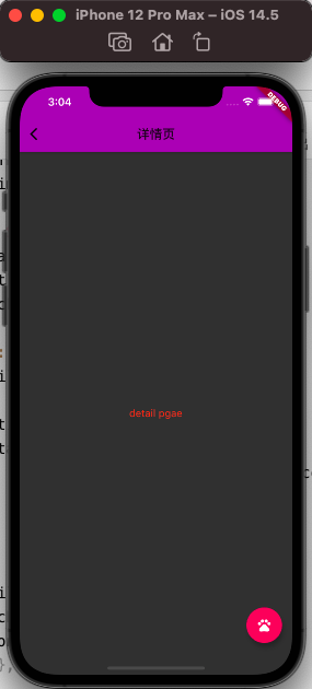
class GYDetailPage extends StatelessWidget {
  @override
  Widget build(BuildContext context) {
    return Theme(
      data: ThemeData(
		//这里可以设置你新的主题
	)
      child: Scaffold(
        appBar: AppBar(
          title: Text("详情页"),
          backgroundColor: Colors.purple,
        ),
        body: Center(
          child: Text("detail pgae"),
        ),
       ),
    );
  }
}

//右下角floatingActionButton的点击事件
floatingActionButton: FloatingActionButton(
        child: Icon(Icons.add),
        onPressed: () {
          Navigator.of(context).push(MaterialPageRoute(
              builder: (ctx) {
                return GYDetailPage();
              }
          ));
        },
      ),
但是很多时候我们并不是想完全使用一个新的主题,而是在之前的主题基础之上进行修改:
class GYDetailPage extends StatelessWidget {
  @override
  Widget build(BuildContext context) {
    return Theme(
    //在原主题的基础上进行修改
      data: Theme.of(context).copyWith(
          primaryColor: Colors.purple
      ),
      child: Scaffold(
        appBar: AppBar(
          title: Text("详情页"),
          backgroundColor: Colors.purple,
        ),
        body: Center(
          child: Text("detail pgae"),
        ),
        //在原主题的基础上进行修改
        floatingActionButton: Theme(
          data: Theme.of(context).copyWith(
              colorScheme: Theme.of(context).colorScheme.copyWith(
                  secondary: Colors.pink
              )
          ),
          child: FloatingActionButton(
            child: Icon(Icons.pets),
            onPressed: () {
            },
          ),
        ),
      ),
    );
  }
}
2. 黑暗Theme适配
2.1 darkTheme
目前很多应用程序都需要适配黑暗模式,Flutter中如何做到适配黑暗模式的适配了?
事实上MaterialApp中有Theme和darkTheme两个参数:
- 按照下面的写法,我们已经默认适配了黑暗主题
class MyApp extends StatelessWidget {
  @override
  Widget build(BuildContext context) {
    // TODO: implement build
    return MaterialApp(
      title: "Flutter Theme",
      theme: ThemeData.light(),
      darkTheme: ThemeData.dark(),
      home: GYHomePage()
    );
  }
}

2.2 开发中适配
在开发中为了能适配两种主题(设置更多的主题)我们可以封装一个AppTheme
- 公共的样式抽取成常量
- 封装一个亮色主题
- 封装一个黑暗主题
class GYAppTheme {
  static const double smallFontSize = 16;
  static const double normalFontSize = 22;
  static const double largeFontSize = 24;

  //正常模式下的文本颜色
  static final Color norTextColors = Colors.red;
  //黑暗模式下的颜色
  static final Color darkTextColors = Colors.green;


  static final ThemeData norTheme = ThemeData(
      primarySwatch: Colors.yellow,
      textTheme: TextTheme(
          bodyText2: TextStyle(fontSize: normalFontSize, color: norTextColors)
      )
  );

  static final ThemeData darkTheme = ThemeData(
      primarySwatch: Colors.grey,
      textTheme: TextTheme(
          bodyText2: TextStyle(fontSize: normalFontSize, color: darkTextColors)
      )
  );
}
在MaterialApp中决定使用哪一个主题
class MyApp extends StatelessWidget {
  // This widget is the root of your application.
  @override
  Widget build(BuildContext context) {
    return MaterialApp(
      title: 'Flutter Demo',
      theme: GYAppTheme.lightTheme,
      darkTheme: GYAppTheme.darkTheme,
      home: HYHomePage(),
    );
  }
}


 1万+
1万+


 被折叠的 条评论
为什么被折叠?
被折叠的 条评论
为什么被折叠?
 到【灌水乐园】发言


