


核心内容
- 主题色替换
- windicss + css + element-plus
- windicss + css +element-plus (兼容windicss opacity 属性)
- 换肤 vitepress + windicss + css
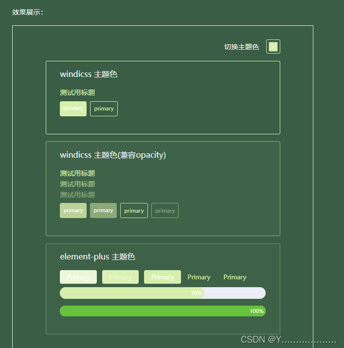
主题适配效果展示


换肤效果展示:

一: 主题色替换
1. windicss + css + element-plus
步骤一:定义需要覆盖的element-plus 的 css 变量:element-plus官网 css 主题覆盖
:root{
  --el-color-primary: #3434ce;
  --el-color-primary-light-9: #3434ce;
  --el-color-primary-light-8: #4646cc;
  --el-color-primary-light-7: #4a4ace;
  --el-color-primary-light-5: #5252bb;
  --el-color-primary-light-3: #575792;
  --el-button-active-color: #3434ce;
}
windicss 中使用css 变量:配置windi.config.ts
// windi.config.ts
module.exports = {
  theme: {
    extend: {
      colors: {
        primary: "var(--el-color-primary)", // 直接使用element-plus 的主题变量
      },
    },
  },
};
通过 setProperty 修改css变量值
document.documentElement.style.setProperty(varName, varValue);注意:以上方案可实现windicss使用css 变量实现 主题替换(不能兼容windicss opacity), 但是通常系统中会用到不同透明度的主题色,那么我们使用如上方案就需求定义不同透明度的主题色,然后在windicss中设置不同的颜色值,如element-plus 内置变量:
--el-color-primary: #3434ce;
--el-color-primary-light-9: #3434ce;
--el-color-primary-light-8: #4646cc;
--el-color-primary-light-7: #4a4ace;
--el-color-primary-light-5: #5252bb;
--el-color-primary-light-3: #575792;
--el-button-active-color: #3434ce;
但是实际使用windicss 时,只需要一个主题色, 其他不同透明度的颜色根据opacity来设置 比如:class="bg-primary bg-opacity-10",兼容opacity方案如下:
2. windicss + css +element-plus (兼容windicss opacity 属性)
rgba:使用透明度时只能识别, 0, 0, 0 ,格式的颜色值, 所以定义css变量不能直接取16位颜色值(可使用方法转换颜色值得到数值: 转换方法附在文章末尾)
:root{
  --wi-color-primary: 52, 52, 206;
}
// windi.config.ts
function color(variable: string) {
return (val: any) => {
if (val.opacityValue === undefined) {
return `rgb(var(${variable}))`;
}
return `rgba(${variable}, ${val.opacityValue})`;
};
}
module.exports = {
theme: {
extend: {
colors: {
primary: color("var(--wi-color-primary)"), // 兼容opacity
},
},
},
};二: 换肤
定义 css 变量以及 多套主题 css 变量值: 覆盖需要替换的 vitepress 内置变量
:root {
  --vp-c-bg: #fff;
  --vp-c-text-1: #000;
  --vp-sidebar-bg-color: #f6f6f7;
}
[data-theme="theme1"] {
  --vp-c-bg: #fdfefe;
  --vp-c-text-1: #054b8d;
  --vp-sidebar-bg-color: #e1e8ef;
}
[data-theme="theme2"] {
  --vp-c-bg: #eaeaef;
  --vp-c-text-1: #05058f;
  --vp-sidebar-bg-color: #fff;
}
[data-theme="theme3"] {
  --vp-c-bg: #395e45;
  --vp-c-text-1: #f5f5f5;
  --vp-sidebar-bg-color: #7b8d81;
}
windicss 使用主题变量, .md 案例中windicss 生效必须配置include
module.exports = {
  extract: {
    include: ["**/*.{md,vue}", ".vitepress/**/*.{ts,md,vue}"],
  },
  theme: {
    extend: {
      colors: {
        bg: color("var(--vp-c-bg)"),
        text: color("var( --vp-c-text)"),
        sidebar: color("var(--vp-sidebar-bg-color)"),
      },
    },
  },
};
setAttribute 修改 data-theme 属性值
document.documentElement.setAttribute("data-theme", theme.value);三:主题替换完整代码:(附加)
<!--
 * @Description: 主题适配案例
 * @Author: ym
 * @Date: 2023-11-23 19:10:44
 * @LastEditTime: 2023-12-05 16:27:09
-->
<template>
  <div class="w-[80%] min-w-[600px] mx-auto p-8">
    <div class="flex justify-end items-center">
      <span class="mr-4">切换主题色</span>
      <el-color-picker v-model="colorThem" @change="onChange"/>
    </div>
    <div class="card border border-primary1 ">
      <div class="title"> windicss 主题色</div>
      <div class="text-primary1">
          测试用标题
      </div>
      <div class="flex py-2">
        <div class="bg-primary1 text-white text-xs p-2 mr-2 rounded">primary</div>
        <div class="border border-primary1 text-primary text-xs p-2 mr-2 rounded">primary</div>
      </div>
    </div>
    <div class="card bg-primary bg-opacity-4 border border-primary border-opacity-55">
      <div class="title"> windicss 主题色(兼容opacity)</div>
      <div class="text-primary">
          测试用标题
      </div>
      <div class="text-primary text-opacity-70">
        测试用标题
      </div>
      <div class="text-primary text-opacity-50">
        测试用标题
      </div>
      <div class="flex py-2">
        <div class="bg-primary bg-opacity-80 text-white text-xs p-2 mr-2 rounded">primary</div>
        <div class="bg-primary bg-opacity-50 text-white text-xs p-2 mr-2 rounded">primary</div>
        <div class="border border-primary border-opacity-90 text-primary  text-xs p-2 mr-2 rounded">primary</div>
        <div class="border border-primary border-opacity-50 text-primary text-opacity-50 text-xs p-2 mr-2 rounded">primary</div>
      </div>
    </div>
    <div class="card bg-primary bg-opacity-3 border border-primary border-opacity-35 ">
      <div class="title"> element-plus 主题色</div>
      <div>
        <el-button type="primary" disabled>Primary</el-button>
        <el-button type="primary" plain disabled>Primary</el-button>
        <el-button type="primary">Primary</el-button>
        <el-button type="primary" link>Primary</el-button>
        <el-button type="primary" text>Primary</el-button>
      </div>
      <div>
        <el-progress class="py-2" :text-inside="true" :stroke-width="26" :percentage="70" />
        <el-progress
        class="py-2"
          :text-inside="true"
          :stroke-width="24"
          :percentage="100"
          status="success"
        />
      </div>
    </div>

  </div>

</template>
<script setup lang="ts">
import { ref, onMounted } from 'vue'
import { useCssVar, newColorWithOpacity } from './cssVar'
const themConfig: {[key: string]: number} = {
  '--el-color-primary': 1,
  '--el-color-primary-light-9': 0.9,
  '--el-color-primary-light-8': 0.8,
  '--el-color-primary-light-7': 0.7,
  '--el-color-primary-light-5': 0.5,
  '--el-color-primary-light-3': 0.3,
  '--el-button-active-color': 0.9,
}
const { setCssVar } = useCssVar('--el-color-primary', '#3434ce');
const colorThem = ref('#3434ce')
const onChange = (val: string) => {
  Object.keys(themConfig).forEach(e => {
    if (themConfig[e] === 1) {
      setCssVar(e, val)
      setCssVar('--wi-color-primary', newColorWithOpacity(val, 1, true))
    } else {
      const _color = newColorWithOpacity(val, themConfig[e])
      setCssVar(e, _color)
    }
  })
}
</script>
<style lang="scss" scoped>
.card{
  @apply my-4  px-8 pb-8 rounded
}
.title{
  @apply text-lg py-4

}
</style>
// cssVar.ts
import { reactive, watch } from "vue";
export function useCssVar(varName: string, initialValue: string) {
const cssVars = reactive({
[varName]: initialValue,
});
const setCssVar = (varName: string, value: string) => {
cssVars[varName] = value;
document.documentElement.style.setProperty(varName, value);
};
return {
cssVars,
setCssVar,
};
}
/**
* 将16进制的色值,根据透明度换算为新的颜色值
* @param color 16位的色值
* @param opacity 透明度
* @param isRgbNumber 是否为rgba色值
*/
export const newColorWithOpacity = (color: string, opacity: number, isRgbNumber = false) => {
const hex = color.replace(/^#/, "");
const r = parseInt(hex.substr(0, 2), 16);
const g = parseInt(hex.substr(2, 2), 16);
const b = parseInt(hex.substr(4, 2), 16);
// 计算新的RGB值
const newR = Math.round((1 - opacity) * 255 + opacity * r);
const newG = Math.round((1 - opacity) * 255 + opacity * g);
const newB = Math.round((1 - opacity) * 255 + opacity * b);
// 将新的RGB值转换为16位颜色值
const newColor = `#${newR.toString(16).padStart(2, "0")}${newG.toString(16).padStart(2, "0")}${newB
.toString(16)
.padStart(2, "0")}`;
return isRgbNumber ? `${newR},${newG},${newB}` : newColor;
};


 1640
1640


 被折叠的 条评论
为什么被折叠?
被折叠的 条评论
为什么被折叠?
 到【灌水乐园】发言


