


在做分类项目的时候(包括目标检测),经常会涉及到数据集的预处理,这里我将把一些自己写的工具脚本代码开源出来供大家使用,后期也将不定时的更新。
相关功能:
1.分类任务one-hot标签转单标签
2.数据集中各个类别的统计
3.数据集中图片宽、高分布,宽高比分布
4.针对数据集中极端宽高比的图片进行可视化
1.one-hot标签转单标签
比如我们数据集的格式为以下格式,label是one-hot形式。
image1_path.png 1 0 0 # 1 0 0 是猫
image2_path.png 0 1 0 # 0 1 0是狗
image3_path.png 0 0 1 # 0 0 1是鸟
现在需要将one-hot转为单类别的。比如:0-猫,1-狗,2-鸟,也就是以下形式:
image1_path.png 0
image2_path.png 1
image3_path.png 2
......
代码如下:
其中train和test是训练集和测试集的,根据自己的需求去修改相关路径。
# 1 0 0-> 0 猫
# 0 1 0-> 1 狗
# 0 0 1-> 2 鸟

train = False
test = False

if train:
    label_list_path = 'or_train.txt' # one-hot数据集的txt路径
    txt_path = '/train.txt' # 处理后的保存路径
elif test:
    label_list_path = 'or_test.txt' # one-hot.txt 路径
    txt_path = '/test.txt' # 处理后的保存路径
with open(label_list_path, 'r') as f:
    lines = f.readlines()
f.close()

label_list = []
for line in lines:
    image_path = line[:-7]
    one_hot_label = line[len(image_path)+1:].strip()
    label = ''

    if one_hot_label == '1 0 0': # 猫
        label = '0'
    elif one_hot_label == '0 1 0': # 狗
        label = '1'
    elif one_hot_label == '0 0 1': # 鸟
        label = '2'
    label_list.append(image_path + ' ' + label)

file = open(txt_path,'w')
for label in label_list:
    file.write(label + '\n')
file.close()
2.数据集中各个类别的统计
可以统计各个类别的数量并打印,其中txt_path是数据集的txt文件,同样,根据实际情况进行修改。
def label_count(txt_path):
    '''
    函数功能:统计数据集中各个类别的数量以及在整个数据集中的占比
    txt_path:label_list.txt路径,要求label是单标签,不能是one-hot形式
    '''
    all_targets = 0
    class1 = 0  # 记录类别1的数量
    class2 = 0  # 记录类别2的数量
    class3 = 0  # 记录类别3的数量
    with open(txt_path, 'r') as f:
        lines = f.readlines()
    f.close()
    for line in lines:
        label = line.split()[1]
        if label != '':
            all_targets += 1
        if label == '0':  # 猫
            class1 += 1
        elif label == '1':  # 狗
            class2 += 1
        elif label == '2':   # 鸟
            class3 += 1
    print("总目标数量:{}".format(all_targets))
    print("0-猫:{},占比{:.2f}%".format(class1, (class1 / all_targets)*100))
    print("1-狗:{},占比{:.2f}%".format(class2, (class2 / all_targets)*100))
    print("2-鸟:{},占比{:.2f}%".format(class3, (class3 / all_targets)*100))
    return (class1, class2, class3)
打印效果如下:
总目标数量:100928
0-猫:20570,占比20.38%
1-狗:15288,占比15.15%
2-鸟:65070,占比64.47%
如果还想将各个类的数量以柱状图的形式显示,那么代码如下:
def plot_bar(data):
    '''
    函数功能:将每个类的数量在柱状图中显示出来
    '''
    class_names = ['猫', '狗', '鸟']
    # 类别数量
    counts = [x for x in data]
    # 绘制柱状图
    plt.bar(class_names, counts)

    # 添加标签
    for i in range(len(class_names)):
        plt.text(i, counts[i], str(counts[i]), ha='center', va='bottom')
    # 设置标题和坐标轴标签
    plt.title('目标类别数量')
    plt.xlabel('类别')
    plt.ylabel('数量')

    # 显示图形
    plt.show()
3.数据集中图片宽、高分布,宽高比分布
比如想统计数据集中所有数据的宽高分布以及宽高比分布。代码如下:
其中root_path是数据集的根目录路径,txt_path是数据集的txt路径。这个需要根据自己实际情况进行代码的修改,只要可以从txt中完整的读取图片即可。
def Dataset_shape_distribution(root_path, txt_path):
    with open(txt_path, 'r') as f:
        lines = f.readlines()
    f.close()
    widths = []  # 存储所有图像的w
    heights = []  # 存储所有图像的h

    for line in lines:
        image_path = root_path + '/' + line.split()[0]
        img = Image.open(image_path)
        w, h = img.size
        widths.append(w)
        heights.append(h)

    # 计算宽高比
    aspect_ratios = [widths[i] / heights[i] for i in range(len(widths))]

    # --------------获取宽高比的频数和bins--------------------------------
    hist, bins = np.histogram(aspect_ratios, bins=50)
    # 找到频数最多的范围
    max_freq_index = np.argmax(hist)  # 获取频数最大值的索引
    most_common_range = (bins[max_freq_index], bins[max_freq_index + 1])  # 根据索引获取对应范围
    print("宽高比分布主要的范围为:",np.around(most_common_range,decimals=2))

    hist_w, bins_w = np.histogram(widths, bins=50)
    max_freq_w_index = np.argmax(hist_w)  # 获取频数最大值的索引
    most_common_w_range = (bins_w[max_freq_w_index], bins_w[max_freq_w_index + 1])  # 根据索引获取对应范围
    print("宽分布主要的范围为:", np.around(most_common_w_range, decimals=2))

    hist_h, bins_h = np.histogram(heights, bins=50)
    max_freq_h_index = np.argmax(hist_h)  # 获取频数最大值的索引
    most_common_h_range = (bins_h[max_freq_h_index], bins_w[max_freq_h_index + 1])  # 根据索引获取对应范围
    print("高分布主要的范围为:", np.around(most_common_h_range, decimals=2))

    # 如果要归一化显示
    # min_width = min(widths)
    # max_width = max(widths)
    # min_height = min(heights)
    # max_height = max(heights)
    # normalized_widths = [(w - min_width) / (max_width - min_width) for w in widths]
    # normalized_heights = [(h - min_height) / (max_height - min_height) for h in heights]

    # -------------------------plot 部分-----------------------------------------------
    # 以直方图形式展现w和h的分布
    # bins:指定直方图显示的条数
    plt.hist(widths, bins=50, alpha=0.5, color='b', edgecolor='black')
    plt.title('Datasets Width Distribution')
    plt.xlabel('Width')
    plt.ylabel('Count')
    plt.show()
    # 绘制高的分布
    plt.hist(heights, bins=50, alpha=0.5, color='b', edgecolor='black')
    plt.title('Datasets Height Distribution')
    plt.xlabel('Height')
    plt.ylabel('Count')
    plt.show()

    # 绘制散点图
    #plt.scatter(normalized_widths, normalized_heights, s=0.9)
    plt.scatter(widths, heights, s=0.9)
    plt.xlabel('Width')
    plt.ylabel('Height')
    plt.title('Width vs Height Distribution')
    plt.show()

    # 绘制宽高比直方图
    plt.hist(aspect_ratios, bins=50, edgecolor='black')
    plt.xlabel('Aspect Ratio')
    plt.ylabel('Count')
    plt.title('宽高比分布')
    plt.show()

    # 绘制宽高比分布范围最多直方图
    plt.hist(aspect_ratios, bins=50, edgecolor='black')
    plt.xlabel('Aspect Ratio')
    plt.ylabel('Count')
    plt.title('宽高比分布')
    # 绘制最常见范围
    plt.axvspan(most_common_range[0], most_common_range[1], color='r', alpha=0.5)
    # 显示图形
    plt.show()
输出形式如下:
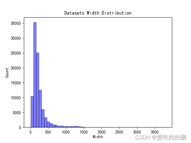
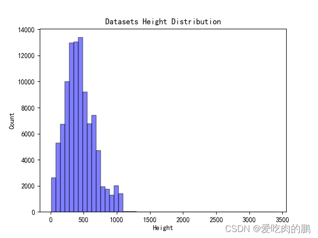
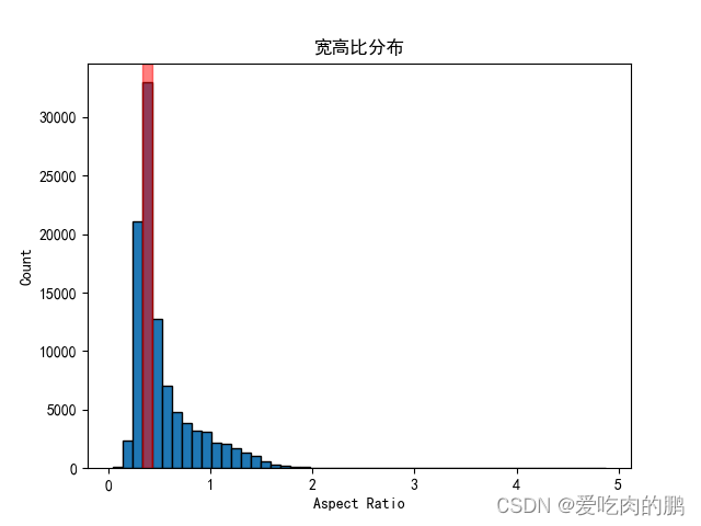
宽高比分布最大的范围为: [0.33 0.43]
宽分布最大的范围为: [ 80.72 156.44]
高分布最大的范围为: [411.84 535.04]
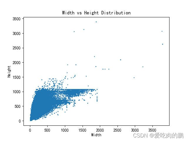
同时会将数据集中的宽、高分、宽高比布绘制如下:
4.针对数据集中极端宽高比的图片进行可视化
从3中的宽高比分布中可以看到有些数据的宽高比存在极端,那么我们可以将这些极端数据显示出来,看看这些都是什么样的数据。代码如下:
其中root_path是根目录,txt_path是数据集txt路径,save_path是保存路径,whr_thre是宽高比阈值,会将小于该阈值的图片保存在save_path中。同样根据自己项目修改这些路径参数。
def Extreme_data_display(root_path, txt_path, save_path, whr_thre=1.5):
    '''
    通过对数据集宽高比进行分析,设置宽高比阈值显示对应的图片(可以将一些宽高比比较极端的数据显示出来)
    '''
    with open(txt_path) as f:
        lines = f.readlines()
    f.close()
    for line in lines:
        image_path = root_path + '/' + line.split()[0]
        img = Image.open(image_path)
        w, h = img.size
        ratio = w / h
        #if whr_thre <= ratio:
        if whr_thre >= ratio:
            img.save(save_path + line.split()[0].split('/')[-1])
至于为什么做极端数据的可视化,比如在行人检测中,有些图像呈现“细条状”,如果存在大量的这类样本,会影响网络的训练。比如下面这种:


 被折叠的 条评论
为什么被折叠?
被折叠的 条评论
为什么被折叠?
 到【灌水乐园】发言


