


在android日常开发中,使用自定义drawable文件夹,使用shape,selector,layer-list绘制出drawable文件进行应用是十分常见的。需要稍微总结下:
1、shape的使用
顾名思义shape是形状的意思,就是android中提供的自定义绘制drawable形状的一个机制,我跟ios讨论过,他们没有这个,嘿嘿黑,顿时觉得很方便有木有。
<?xml version="1.0" encoding="utf-8"?>
<shape xmlns:android="http://schemas.android.com/apk/res/android"   android:shape="rectangle"<!--如果不写默认为矩形,也可以选则line,oval-->
>

    <!-- 圆角 -->
    <corners
        <!--四个角的弧度 -->
        android:radius="10dp"
        <!--左上圆角弧度,右上圆角弧度,左下角弧度,右下角弧度 -->
        android:topLeftRadius="2dp"
        android:topRightRadius="2dp"
        android:bottomLeftRadius="2dp"
        android:bottomRightRadius="2dp"/>

    <!-- 渐变 -->
    <gradient
         <!-- 开始渐变 -->
        android:startColor="@android:color/white"
         <!-- 中间渐变 -->
        android:centerColor="@android:color/blue"
         <!-- 最后渐变 -->
        android:endColor="@android:color/black"
        android:useLevel="true"
        <!-- 默认为线性渐变 -->
        android:type="linear"
         <!-- 渐变角度,必须为45的整数倍,0是左到右,180是右到左,90下到上,270上到下。45也可以类推-->
        android:angle="45"
         <!-- 指定渐变为径向渐变 -->
        android:type="radial"
        <!-- 渐变中心点 -->
        android:centerX="0"
        android:centerY="0"
         <!-- 指定渐变为径向渐变角度 -->
        android:gradientRadius="90"/>

    <!-- 间距 -->
    <padding
        android:left="2dp"
        android:top="2dp"
        android:right="2dp"
        android:bottom="2dp"/>

    <!--宽度和高度 -->
    <size
        android:width="50dp"
        android:height="50dp"/>

    <!-- 填充 -->
    <solid
        android:color="@android:color/white"/>

    <!-- 描边 -->
    <stroke
        android:width="2dp"
        android:color="@android:color/black"
         <!-- 默认为0,虚线的宽度,0即为实线 -->
        android:dashWidth="1dp"
         <!-- 默认为0,虚线的间隔宽度 -->
        android:dashGap="2dp"/>
  <!-- 温馨提醒,android4.0可能显示不出来,是因为默认开启了硬件加速。android:layerType="software"需要引用的控件加这个即可 -->

</shape>
2、selector的使用
selector顾名思义就是选择的意思。多用在切换状态时候,切换drawable或者文字颜色。
<?xml version="1.0" encoding="utf-8" ?>
<selector xmlns:android="http://schemas.android.com/apk/res/android">
<!-- 默认时的背景图片-->
  <item android:drawable="@drawable/defaultimg" />
<!-- 没有焦点时的背景图片 -->
  <item android:state_window_focused="false"
        android:drawable="@drawable/defaultimg" />
<!-- 非触摸模式下获得焦点并单击时的背景图片 -->
  <item android:state_focused="true"     android:state_pressed="true"
  android:drawable= "@drawable/defaultimg2" />
<!-- 触摸模式下单击时的背景图片-->
<item android:state_focused="false" android:state_pressed="true"   android:drawable="@drawable/defaultimg3" />
<!--选中时的图片背景-->
  <item android:state_selected="true"   android:drawable="@drawable/defaultimg4" />
<!--获得焦点时的图片背景-->
  <item android:state_focused="true"   android:drawable="@drawable/defaultimg5" />
  <!--checkbox或者radiobutton选中时候的图片,本人用的最多的地方 -->
   <item android:state_checked="true" android:drawable="@drawable/addselect"/>
</selector>

是不是很方便,我们直接在写xml文件就可以定义好按钮的状态。是不是再也不用考虑在java代码中切换那些样式了。对了,这个ios的也没有哟哟哟
3、layer-list的使用
其实就是个数据集合,可以作为adapter的数据集,当然可以实现两张图片的叠加。看下进度条中的源码也是通过layer-list来实现的 style=”@android:style/Widget.ProgressBar.Horizontal”:

<style name="Widget.ProgressBar.Horizontal">
        <item name="indeterminateOnly">false</item>
        <item name="progressDrawable">@drawable/progress_horizontal</item>
        <item name="indeterminateDrawable">@drawable/progress_indeterminate_horizontal</item>
        <item name="minHeight">20dip</item>
        <item name="maxHeight">20dip</item>
        <item name="mirrorForRtl">true</item>
    </style>
主要是这一句
<item name="progressDrawable">@drawable/progress_horizontal</item>
看下源码:
<?xml version="1.0" encoding="utf-8"?>
<!-- Copyright (C) 2008 The Android Open Source Project

     Licensed under the Apache License, Version 2.0 (the "License");
     you may not use this file except in compliance with the License.
     You may obtain a copy of the License at

          http://www.apache.org/licenses/LICENSE-2.0

     Unless required by applicable law or agreed to in writing, software
     distributed under the License is distributed on an "AS IS" BASIS,
     WITHOUT WARRANTIES OR CONDITIONS OF ANY KIND, either express or implied.
     See the License for the specific language governing permissions and
     limitations under the License.
-->

<layer-list xmlns:android="http://schemas.android.com/apk/res/android">

    <item android:id="@android:id/background">
        <shape>
            <corners android:radius="5dip" />
            <gradient
                    android:startColor="#ff9d9e9d"
                    android:centerColor="#ff5a5d5a"
                    android:centerY="0.75"
                    android:endColor="#ff747674"
                    android:angle="270"
            />
        </shape>
    </item>

    <item android:id="@android:id/secondaryProgress">
        <clip>
            <shape>
                <corners android:radius="5dip" />
                <gradient
                        android:startColor="#80ffd300"
                        android:centerColor="#80ffb600"
                        android:centerY="0.75"
                        android:endColor="#a0ffcb00"
                        android:angle="270"
                />
            </shape>
        </clip>
    </item>

    <item android:id="@android:id/progress">
        <clip>
            <shape>
                <corners android:radius="5dip" />
                <gradient
                        android:startColor="#ffffd300"
                        android:centerColor="#ffffb600"
                        android:centerY="0.75"
                        android:endColor="#ffffcb00"
                        android:angle="270"
                />
            </shape>
        </clip>
    </item>

</layer-list>
总结:可以看到的是,这里也是用layer-list实现两张图片的叠加来实现进度条的效果。
那么我们自定义水平进度条的样式,嘿嘿黑,其实很简单。
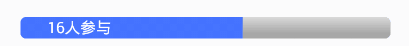
1、进度条的xml,用自己的style
 <ProgressBar
                android:id="@+id/progress_count"
                style="@style/mProgress_horizontal"
                android:layout_width="match_parent"
                android:layout_height="45px"
                android:layout_marginLeft="40px"
                android:layout_marginRight="40px"
                android:progress="0"
                android:secondaryProgress="10" />
2、其实你看出来了,那个style是重点,用自己的”android:progressDrawable”
<style name="mProgress_horizontal">
        <item name="android:indeterminateOnly">false</item>
        <!-- progress_horizontal -->
       <item name="android:progressDrawable">@drawable/progressbar_horizontal
        </item>
        <item name="android:indeterminateDrawable">
            @android:drawable/progress_indeterminate_horizontal
        </item>
    </style>
3、是的,就是这个layer-list,我们复制源码,改下颜色。是的,你只需要替换下item为图片或者,你完全只需要改成你心仪的色值。
<?xml version="1.0" encoding="utf-8"?>
<layer-list xmlns:android="http://schemas.android.com/apk/res/android">
<!-- 背景颜色 -->
    <item android:id="@android:id/background">
        <shape>
            <corners android:radius="5dip" />
            <gradient
                android:startColor="@color/linecolor"
                android:centerColor="@color/textcolorgray"
                android:centerY="0.75"
                android:endColor="@color/textcolorgray"
                android:angle="270"
                />
        </shape>
    </item>
<!-- 覆盖在进度条上的颜色,就是后面追加的进度 -->
    <item android:id="@android:id/secondaryProgress">
        <clip>
            <shape>
                <corners android:radius="5dip" />
                <gradient
                    android:startColor="@color/blue"
                    android:centerColor="@color/blue"
                    android:centerY="0.75"
                    android:endColor="@color/blue"
                    android:angle="270"
                    />
            </shape>
        </clip>
    </item>
<!-- 进度条初始值的颜色 -->
    <item android:id="@android:id/progress">
        <clip>
            <shape>
                <corners android:radius="5dip" />
                <gradient
                    android:startColor="@color/blue"
                    android:centerColor="@color/blue"
                    android:centerY="0.75"
                    android:endColor="@color/blue"
                    android:angle="270"
                    />
            </shape>
        </clip>
    </item>


</layer-list>
4、还有呢?目前就用到这些,当做笔记记录下来,以备不时之需,如果你有更多的使用场景或者需要加入进来的标签,欢迎拍砖~我的内心是欣喜的,因为ios那边不能使用这些便捷的标签。当然我们可以想象使用java进行这些例如背景颜色,虚线等的自定义。不过,这是最便捷的方法了~


 扫一扫
扫一扫
 2508
2508

 被折叠的 条评论
为什么被折叠?
被折叠的 条评论
为什么被折叠?
 到【灌水乐园】发言


