


Support Design Library 之 TabLayout 使用与分析
TabLayout的布局
Android自2.x时代以来,虽然也不断有官方的Tab实现方式,但往往不尽如人意:要么API太复杂难用,要么性能太差。于是Github 上不断有开源的控件出现,这次SupportDesignLibrary里面的实现就看做是Google参考他们而官方化的产物吧。
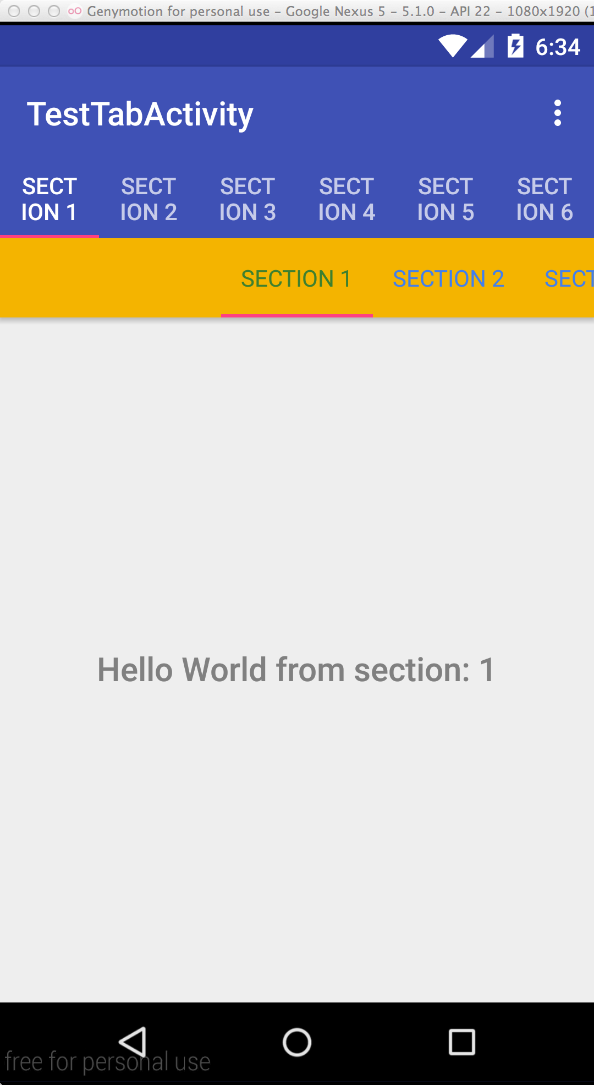
效果如图:
XML 布局
        <android.support.design.widget.TabLayout
            android:id="@+id/tabs"
            app:tabSelectedTextColor="@color/gplus_color_1"
            app:tabBackground="@color/gplus_color_2"
            app:tabTextColor="@color/gplus_color_3"
            app:tabMode="scrollable"
            app:tabGravity="fill"
            app:tabContentStart="300dp"
            app:tabTextAppearance="@style/TextAppearance.AppCompat.Body1"
            android:background="@color/gplus_color_2"
            android:layout_width="match_parent"
            android:layout_height="wrap_content"/>
属性解释:
- app:tabSelectedTextColor:Tab被选中字体的颜色
- app:tabTextColor:Tab未被选中字体的颜色
- app:tabIndicatorColor:Tab指示器下标的颜色
- app:tabBackground:每一个Tab选项卡的背景色
- app:tabMode:Tab的布局模式,分为
scrollable和fixed; - app:tabGravity:Tab上的布局方式:分别为:
center和fill; - app:tabContentStart;第一个选项卡距离左边多远开始排列
- app:tabTextAppearance;tab上文字的样式。
- …..
TabLayout的主要函数
Tablyout的主要方法:
| 方法 | 说明 |
|---|---|
| addTab(TabLayout.Tab tab, boolean setSelected) | 添加一个Tab到该Tabayout中 |
| addTab(TabLayout.Tab tab, int position) | 添加一个Tab到该Tabayout中 |
| addTab(TabLayout.Tab tab, int position, boolean setSelected) | 添加一个Tab到该Tabayout中 |
| addTab(TabLayout.Tab tab) | 添加一个Tab到该Tabayout中 |
| getSelectedTabPosition() | 返回当前被选中的Tab的位置 |
| getTabAt(int index) | 获得处于参数index位置的Tab |
| getTabCount() | 返回已经添加上来的Tab的给个数 |
| getTabGravity() | 获得Tab的布局重心。center:居中;fill:撑满空间; |
| getTabMode() | 返回该TabLayout当前所使用的布局模式。scrollable:可滑动;fixed:固定的; |
| getTabTextColors() | 返回Tab上文字的颜色,包含各种状态的(normal、selected); |
| newTab() | 创建一个新的TabLayout.Tab实例 |
| removeAllTabs() | 清空所有Tab |
| removeTab(TabLayout.Tab tab) | 删除一个Tab。 |
| removeTabAt(int position) | 删除指定位置的Tab |
| setOnTabSelectedListener(TabLayout.OnTabSelectedListener onTabSelectedListener) | 添加一个Tab切换时的事件监听。 |
| setScrollPosition(int position, float positionOffset, boolean updateSelectedText) | 设置滚动位置(待研究) |
| setSelectedTabIndicatorColor(int color) | 设置选中的Tab的底部指示器的颜色 |
| setSelectedTabIndicatorHeight(int height) | 设置选中的Tab的底部指示器的高度 |
| setTabGravity(int gravity) | 设置该TabLayout中Tab的布局重心。center:居中;fill:撑满空间; |
| setTabMode(int mode) | 设置该TabLayout当前所使用的布局模式。scrollable:可滑动;fixed:固定的;一般在Tab过多时候生效 |
| setTabTextColors(ColorStateList textColor) | 设置Tab上文字的颜色,包含各种状态的(normal、selected); |
| setTabTextColors(int normalColor, int selectedColor) | 设置Tab上文字的颜色,包含各种状态的(normal、selected); |
| setTabsFromPagerAdapter(PagerAdapter adapter) | 根据给出的PagerAdapter填充该TabLayout。 |
| setupWithViewPager(ViewPager viewPager) | 用一个ViewPager一站式设置该TabLayout。 |
TabLayout的使用之配合ViewPager一步到位
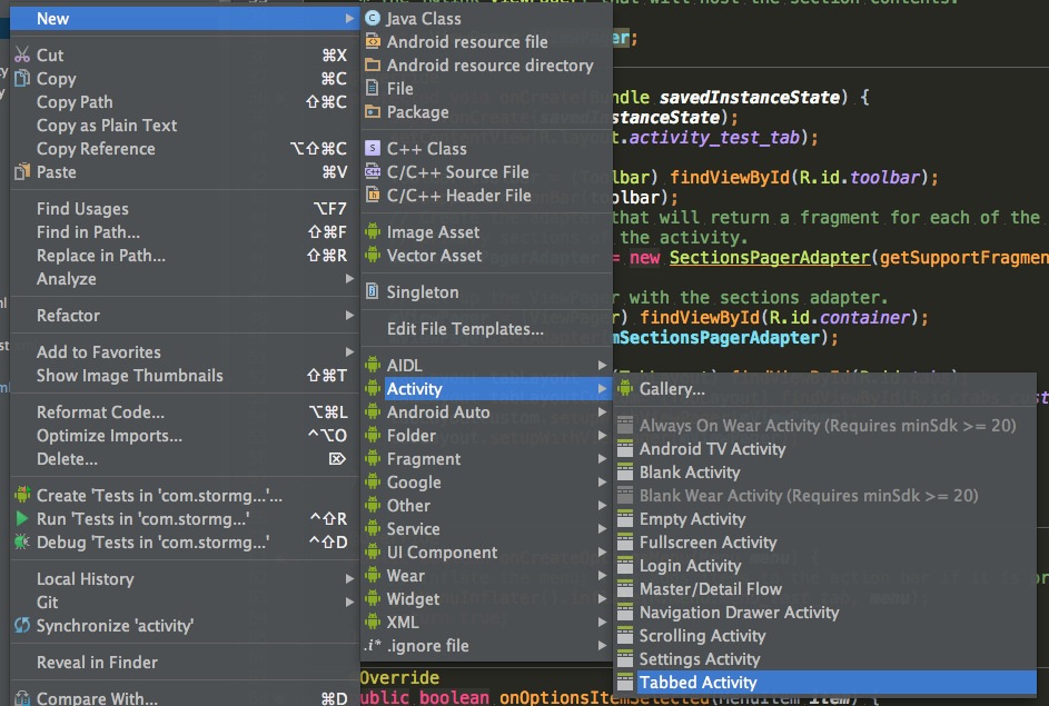
在最新的AndroidStudio中创建一个带有Tablayout的Activity异常简单:
一般情况下,Tablayout都是配合ViewPager使用。
        mSectionsPagerAdapter = new SectionsPagerAdapter(getSupportFragmentManager());
        mViewPager = (ViewPager) findViewById(R.id.container);
        mViewPager.setAdapter(mSectionsPagerAdapter);

        TabLayout tabLayout = (TabLayout) findViewById(R.id.tabs);
        tabLayout.setupWithViewPager(mViewPager);
TabLayout的使用之自定义Tab布局
TabLayout.Tab tab1=tabLayout.newTab();
        tab1.setIcon(R.mipmap.ic_launcher);
        TabLayout.Tab tab2=tabLayout.newTab();
        tab2.setText("Tab2");
        TabLayout.Tab tab3=tabLayout.newTab();
        tab3.setCustomView(R.layout.v_tab_icon_text);
        ((ImageView)tab3.getCustomView().findViewById(R.id.tab_icon)).setImageDrawable
              (getResources().getDrawable(R.mipmap.home_tabbar_icon_profile_normal));
        tabLayout.setOnTabSelectedListener(this);
        tabLayout.addTab(tab1);
        tabLayout.addTab(tab2);
        tabLayout.addTab(tab3);
@Override
public void onTabSelected(TabLayout.Tab tab) {
switch (tab.getPosition()){
case 2:
((ImageView)tab.getCustomView().findViewById(R.id.tab_icon)).setImageDrawable
(getResources().getDrawable(R.mipmap.home_tabbar_icon_profile_press));
break;
}
}
@Override
public void onTabUnselected(TabLayout.Tab tab) {
switch (tab.getPosition()){
case 2:
((ImageView)tab.getCustomView().findViewById(R.id.tab_icon)).setImageDrawable
(getResources().getDrawable(R.mipmap.home_tabbar_icon_profile_normal));
break;
}
}
@Override
public void onTabReselected(TabLayout.Tab tab) {
}R.layout.v_tab_icon_text布局文件:
<?xml version="1.0" encoding="utf-8"?>
<LinearLayout xmlns:android="http://schemas.android.com/apk/res/android"
android:orientation="vertical"
android:layout_width="wrap_content"
android:layout_height="wrap_content">
<ImageView
android:id="@+id/tab_icon"
android:src="@mipmap/ic_launcher"
android:layout_gravity="center_horizontal"
android:layout_width="20dp"
android:layout_height="20dp"/>
<TextView
android:id="@+id/tab_title"
android:text="自定义Tab视图"
android:textColor="@color/gplus_color_4"
android:layout_gravity="center_horizontal"
android:layout_width="wrap_content"
android:layout_height="wrap_content"/>
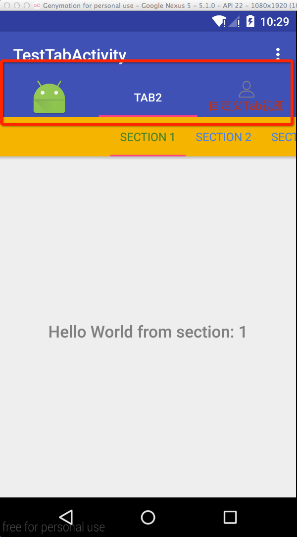
</LinearLayout>最终效果图:
本示例项目的源码地址:https://github.com/StormGens/SGTeambition.git
Tablayout的源码分析
请看后续博文。


 2939
2939

 被折叠的 条评论
为什么被折叠?
被折叠的 条评论
为什么被折叠?
 到【灌水乐园】发言


