


@Styles仅仅应用于静态页面的样式复用,stateStyles可以依据组件的内部状态的不同,快速设置不同样式。这就是我们本章要介绍的内容stateStyles(又称为:多态样式)。
说明
多态样式仅支持通用属性。如果多态样式不生效,则该属性可能为组件的私有属性,例如:[fontColor]、[TextInput]组件的[backgroundColor]等。此时,可以通过[attributeModifier]动态设置组件属性来解决此问题。
概述
stateStyles是属性方法,可以根据UI内部状态来设置样式,类似于css伪类,但语法不同。ArkUI提供以下五种状态:
- focused:获焦态。
- normal:正常态。
- pressed:按压态。
- disabled:不可用态。
- selected10+:选中态。
说明
获焦态目前仅支持通过外接键盘的tab键、方向键触发。不支持嵌套滚动组件场景按键走焦。
使用场景
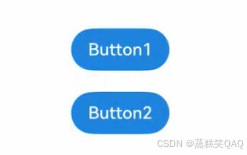
基础场景
下面的示例展示了stateStyles最基本的使用场景。Button1处于第一个组件,Button2处于第二个组件。按压时显示为pressed态指定的黑色。使用Tab键走焦,先是Button1获焦并显示为focus态指定的粉色。当Button2获焦的时候,Button2显示为focus态指定的粉色,Button1失焦显示normal态指定的蓝色。
@Entry
@Component
struct StateStylesSample {
  build() {
    Column() {
      Button('Button1')
        .stateStyles({
          focused: {
            .backgroundColor('#ffffeef0')
          },
          pressed: {
            .backgroundColor('#ff707070')
          },
          normal: {
            .backgroundColor('#ff2787d9')
          }
        })
        .margin(20)
      Button('Button2')
        .stateStyles({
          focused: {
            .backgroundColor('#ffffeef0')
          },
          pressed: {
            .backgroundColor('#ff707070')
          },
          normal: {
            .backgroundColor('#ff2787d9')
          }
        })
    }.margin('30%')
  }
}
图1 获焦态和按压态
@Styles和stateStyles联合使用
以下示例通过@Styles指定stateStyles的不同状态。
@Entry
@Component
struct MyComponent {
  @Styles normalStyle() {
    .backgroundColor(Color.Gray)
  }

  @Styles pressedStyle() {
    .backgroundColor(Color.Red)
  }

  build() {
    Column() {
      Text('Text1')
        .fontSize(50)
        .fontColor(Color.White)
        .stateStyles({
          normal: this.normalStyle,
          pressed: this.pressedStyle,
        })
    }
  }
}
图2 正常态和按压态

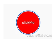
在stateStyles里使用常规变量和状态变量
stateStyles可以通过this绑定组件内的常规变量和状态变量。
@Entry
@Component
struct CompWithInlineStateStyles {
  @State focusedColor: Color = Color.Red;
  normalColor: Color = Color.Green

  build() {
    Column() {
      Button('clickMe').height(100).width(100)
        .stateStyles({
          normal: {
            .backgroundColor(this.normalColor)
          },
          focused: {
            .backgroundColor(this.focusedColor)
          }
        })
        .onClick(() => {
          this.focusedColor = Color.Pink
        })
        .margin('30%')
    }
  }
}
Button默认normal态显示绿色,第一次按下Tab键让Button获焦显示为focus态的红色,点击事件触发后,再次按下Tab键让Button获焦,focus态变为粉色。
图3 点击改变获焦态样式


 扫一扫
扫一扫


 2100
2100

 被折叠的 条评论
为什么被折叠?
被折叠的 条评论
为什么被折叠?
 到【灌水乐园】发言


