


在实际的小程序开发中,UI的设计不可能总是原生组件就可以,你还需要自定义组件来使用,比如我们Android最常见的一个圆角dialog,在我们小程序开发中,模拟器中,真机IOS上完全没有问题,然而在我们Android真机上显示出来可是一个跟Android原生的AlertDialog差不多的样式,这可不是我们需要的效果,那么很明显我们需要自己定义组件来实现,还有其他奇奇怪怪的页面设计;不过还好的是,在微信小程序上自定义组件是一件比较容易的事,下面我们来看看吧
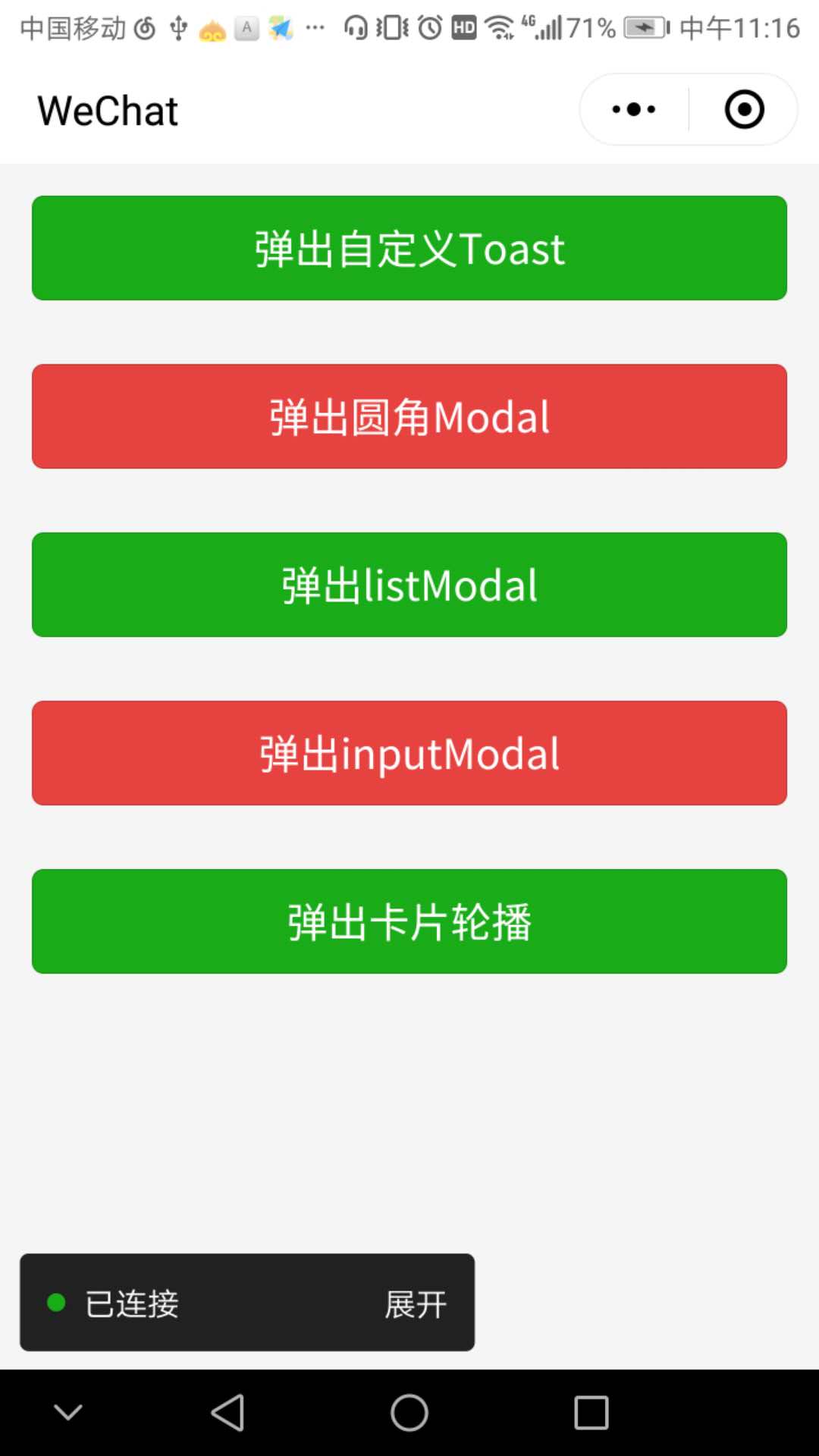

弹出卡片轮播

 ,因为很多东西需要个性化,比如字体的大小,颜色等等,所以自定义组件还是很必要学会的,下面我们就来学习一下小程序的组件自定义吧
1.圆角Modal
首先创建一个目录,比如roundModal文件夹,然后右键创建Component,定义好组件的名字,同样生成了4个文件:roundModal.js,roundModal.json,roundModal.wxml,roundModal.wxss;
(1)下面先看roundModal.wxml;
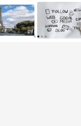
看上面第二幅图,可以知道,它的整体结构可以划归为一个半透明的底层,加上一个对话框;
<!--components/roundModal.wxml-->
<!-- 弹窗 -->
<
view
hidden
=
'{{hiddenModal}}'
class
=
'modal-container'
>
<!-- 蒙层 -->
<
view
class
=
'modal-mask'
bindtap
=
'_modal_mask_click'
></
view
>
<!-- 对话框 -->
<
view
class
=
'modal-box'
>
<!-- 标题 -->
<
view
class
=
'title'
hidden
=
'{{hideTitle}}'
style
=
'font-size:{{titleSize}};color:{{titleColor}}'
>
{{modalTitle}}
</
view
>
<!-- 内容 -->
<
view
class
=
'content-container'
>
<
text
class
=
'modal-content-text'
hidden
=
'{{hideContent}}'
style
=
'font-size:{{contentSize}};color:{{contentColor}}'
>
{{modalContent}}
</
text
>
</
view
>
<!-- slot 节点,用于承载组件使用者提供的wxml结构。简单来说就是调用页面需要在这个自定义组件中添加自己xml布局 -->
<
slot
name
=
"customView"
></
slot
>
<!-- 横向分割线 -->
<
view
style
=
'width:100%;height:2rpx;background:#eee'
></
view
>
<!-- 按钮容器 -->
<
view
class
=
'btn-container'
>
<!-- 左按钮 -->
<
view
class
=
'btn-left-style'
bindtap
=
'_clickLeftBtn'
hidden
=
'{{hideLeftBtn}}'
>
{{leftText}}
</
view
>
<!-- 竖向分割线 -->
<
view
class
=
'divider'
hidden
=
'{{hideDivider}}'
></
view
>
<!-- 右按钮 -->
<
view
class
=
'btn-right-style'
bindtap
=
'_clickRightBtn'
hidden
=
'{{hideRightBtn}}'
>
{{rightText}}
</
view
>
</
view
>
</
view
>
</
view
>
(2)roundModal.wxss,在wxss中描述样式,其中明显可以看到这应该是一个层叠结构,所以需要一个位置属性position和一个描述层级属性z-index,在这里我简单的说一下,
postion:位置属性,有4个定位类型:static , absolute, relative, fixed;其中static 是默认的,元素框正常生成,块级元素生成一个矩形框,作为文档流的一部分,行内元素则会创建一个或多个行框,置于其父元素中;absolute:绝对定位,元素框从文档流完全删除,生成绝对定位的元素(脱离父块)不再从属于父块,该元素位置通过left,right,top,bottom,或者margin来定位,如果其父块也包含有position属性(absolute,relative,fixed),那么它的定位还会依照父类做为参照物,left,right,top,bottom都是以它父亲节点来定位,否则,以此类推,直到最外层的视窗为基准;relative:相对定位,简单来说就是相对于其原位置进行定位;fixed:固定定位,类似于将position设置为absolute,不过它的定位已经固定死为视窗本身为基准的;z-index属性用于调整定位时重叠块的上下位置,当块设置了position属性时,该值便可以设置各块置渐的重叠高低关系,默认值为0,值越大,代表块在更上面
/* components/roundModal.wxss */
.modal-container
{
width:
750
rpx
;
}
.modal-mask
{
width:
100%
;
height:
100%
;
position:
fixed
;
z-index:
1000
;
background:
#000
;
opacity:
0.5
;
overflow:
hidden
;
}
.modal-box
{
width:
76%
;
overflow:
hidden
;
position:
fixed
;
top:
50%
;
left:
0
;
z-index:
1001
;
background:
#ccc
;
margin:
-150px
12%
0
12%
;
border-radius:
5px
;
background-color:
white
;
}
.title
{
font-size:
36
rpx
;
color:
#323232
;
margin-top:
20
rpx
;
padding:
15
rpx
;
text-align:
center
;
background-color:
gray
;
;
}
.content-container
{
/* 超出父盒子高度可滚动 */
overflow-y:
scroll
;
}
.modal-content-text
{
font-size:
30
rpx
;
text-align:
center
;
margin-top:
35
rpx
;
margin-bottom:
30
rpx
;
display:
block
;
color:
#808080
;
}
.btn-container
{
width:
100%
;
height:
88
rpx
;
display:
flex
;
flex-direction:
row
;
justify-content:
space-between
;
align-items:
center
;
box-sizing:
border-box
;
}
.btn-left-style
{
width:
49.8%
;
padding:
10
rpx
;
text-align:
center
;
color:
#323232
;
font-size:
36
rpx
;
/* flex-grow: 1 */
}
.divider
{
min-width:
2
rpx
;
height:
100%
;
background:
#eee
;
flex-grow:
1
}
.btn-right-style
{
width:
49.8%
;
font-size:
36
rpx
;
padding:
10
rpx
;
text-align:
center
;
color:
#1133f2
;
/* flex-grow: 1 */
}
(3)roundModal.json
很简单就两句代码
{
"component"
:
true
,
"usingComponents"
:
{}
}
(4)roundModal.js
// components/roundModal.js
Component
({
options
:
{
multipleSlots
:
true
// 在组件定义时的选项中启用多slot支持
},
/**
* 组件的属性列表
*/
properties
:
{
hiddenModal
:
{
type
:
Boolean
,
value
:
false
},
modalTitle
:
{
type
:
String
,
value
:
' '
},
modalContent
:
{
type
:
String
,
value
:
' '
},
leftText
:
{
type
:
String
,
value
:
' '
},
rightText
:
{
type
:
String
,
value
:
' '
},
// 添加更多的控制属性
hideTitle
:
{
type
:
Boolean
,
value
:
false
},
hideContent
:
{
type
:
Boolean
,
value
:
false
},
hideLeftBtn
:
{
type
:
Boolean
,
value
:
false
},
hideRightBtn
:
{
type
:
Boolean
,
value
:
false
},
hideDivider
:
{
type
:
Boolean
,
value
:
false
},
// 控制字体样式:比如大小,颜色
titleSize
:
{
type
:
String
,
value
:
"36rpx"
},
titleColor
:
{
type
:
String
,
value
:
"#323232"
},
contentSize
:{
type
:
String
,
value
:
"30rpx"
},
contentColor
:{
type
:
String
,
value
:
"#808080"
}
},
/**
* 组件的初始数据
*/
data
:
{
hiddenModal
:
true
,
hideTitle
:
false
,
hideContent
:
false
,
hideLeftBtn
:
false
,
hideRightBtn
:
false
,
hideDivider
:
false
,
},
/**
* 组件的方法列表
*/
methods
:
{
// 内部方法用下划线用于区分
// 点击左边按钮
_clickLeftBtn
:
function
()
{
//触发取消回调
this
.
triggerEvent
(
"cancelEvent"
)
},
_clickRightBtn
:
function
()
{
console
.
log
(
"点击右边按钮"
)
//触发成功回调
this
.
triggerEvent
(
"confirmEvent"
);
},
_modal_mask_click
:
function
()
{
// this.setData({
// hiddenModal:true
// })
this
.
triggerEvent
(
"maskEvent"
)
}
}
})
下面看调用的情况:
(1)在调用该自定义组件的页面的json文件里面,写明引用的组件名称以及其路径
{
"usingComponents"
:
{
"roundModal"
:
"../../components/roundModal/roundModal"
}
}
(2)在调用该组件的wxml文件里面,最好写在最外层的容器里第一个节点,隐藏与否就看hidden-modal的属性值
<!-- 调用modal组件 -->
<
roundModal
hidden-modal
=
"{{hiddenModal}}"
modal-title
=
"{{modalTitle}}"
modal-content
=
"{{modalContent}}"
left-text
=
"{{leftText}}"
right-text
=
"{{rightText}}"
bind:cancelEvent
=
"_clickLeftBtn"
bind:confirmEvent
=
"_clickRightBtn"
bind:maskEvent
=
"_modal_mask_click"
>
<!-- 自定义dialog内容view,默认是不显示出来的,只显示一般样式-->
</
roundModal
>
(3)在调用该组件的js文件里面,data内容里面添加一些modal控制属性
//自定义圆角Modal弹框:如果需要自定义设置字体颜色,大小,你只需要在自定义组件那边添加相关属性,并在wxml中引用即可,方式跟下面这些属性基本一致
hiddenModal
:
true
,
modalTitle
:
"提示"
,
modalContent
:
"为提高账户安全性,现需进行\r\n实名认证"
,
leftText
:
"取消"
,
rightText
:
"立即认证"
,
hideRightBtn
:
false
,
// isShowCustomView: true,
在你需要触发弹出Modal的时候通过setData({
hiddenModal:false
}),那么它就会显示出来,具体modal的方法通过bind:xxxEvent传递到调用页
// 下面是model回调过来的方法
_clickLeftBtn
()
{
this
.
setData
({
hiddenModal
:
true
})
},
_clickRightBtn
()
{
this
.
setData
({
hiddenModal
:
true
})
wx
.
navigateTo
({
url
:
'../logs/logs'
,
})
},
_modal_mask_click
()
{
console
.
log
(
"点击了蒙层"
)
},
好,基本上自定义组件的写法以及使用都是这样,大同小异吧,下面demo下载地址:
customModal


 122
122


 被折叠的 条评论
为什么被折叠?
被折叠的 条评论
为什么被折叠?
 到【灌水乐园】发言


