


组件gridview与android中gridview布局效果相同。
一、下面记录qt quick该组件的使用方法。
方法一:
// ContactModel.qml
import QtQuick 2.0

ListModel {

      ListElement {
          name: "1"
          portrait: "icons/ic_find.png"
      }
      ListElement {
          name: "2"
          portrait: "icons/ic_find.png"
      }
      ListElement {
          name: "3"
          portrait: "icons/ic_find.png"
      }
      ListElement {
          name: "4"
          portrait: "icons/ic_find.png"
      }

      ListElement {
          name: "5"
          portrait: "icons/ic_find.png"
      }
      ListElement {
          name: "6"
          portrait: "icons/ic_find.png"
      }
      ListElement {
          name: "7"
          portrait: "icons/ic_find.png"
      }
      ListElement {
          name: "8"
          portrait: "icons/ic_find.png"
      }
  }

// main.qml
import QtQuick 2.0
import QtQuick.Controls 2.3

Rectangle {
    id: main
    width: 720
    height: 360
    color: "#051f58"
    clip:true

    GridView {
          width: 628;
          height: 350
          cellWidth: 157;
          cellHeight: 154;
          anchors.left: parent.left
          anchors.leftMargin: 54
          anchors.top: parent.top
          anchors.topMargin: 35
          model: ContactModel {}
          delegate: Column {
              spacing: 10
              Image { source: portrait; anchors.horizontalCenter: parent.horizontalCenter }
              Text { text: name; anchors.horizontalCenter: parent.horizontalCenter;color: "#C6D0D6";font.pixelSize: 20;font.bold: true }
          }
      }
}
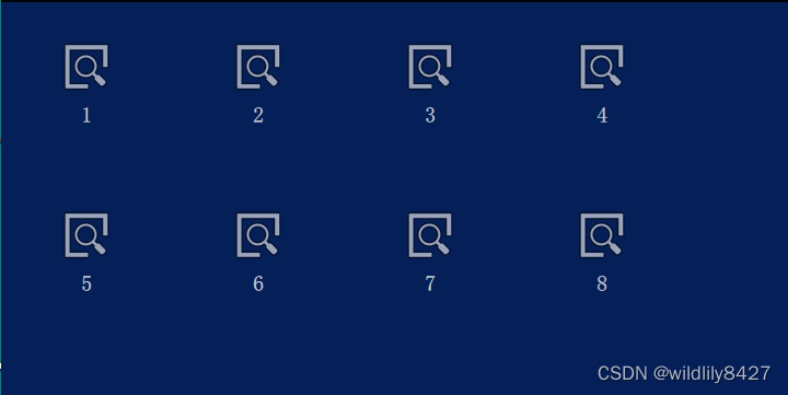
运行效果
方法二: 列表和代理分开。
// main.qml
import QtQuick 2.0
import QtQuick.Controls 2.3
import "../model"
import "../view"

Rectangle {
    id: mainPage1
    color: "#051f58"
    clip:true
    Component {
        id: contactDelegate
        Item {
            width: grid.cellWidth; height: grid.cellHeight

            Column {
                spacing: 10
                Image { source: portrait; anchors.horizontalCenter: parent.horizontalCenter }
                Text { text: name; anchors.horizontalCenter: parent.horizontalCenter;color: "#C6D0D6";font.pixelSize: 20;font.bold: true }
            }
        }
    }

    GridView {
        id:grid
        width: 628;
        height: 350
        cellWidth: 157;
        cellHeight: 154;
        anchors.left: parent.left
        anchors.leftMargin: 54
        anchors.top: parent.top
        anchors.topMargin: 35
        model: ContactModel {}
        delegate: contactDelegate;
    }
}
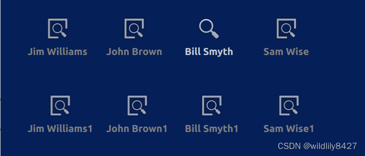
效果图如上。
我自己的需求,点击gridview的item,修改对应item的图片,并且改变该item的字体颜色。上述代码中,Image没有点击信号,gridview也没有点击事件,所以想到自定义一个可点击的图片按钮,相当于android 中ImageButton组件,替换上述代码中Image组件。
// ImageButton.qml
import QtQuick 2.0

Rectangle {
    id: bkgnd;
    property alias iconWidth: icon.width;
    property alias iconHeight: icon.height;
    property alias iconSource: icon.source;
    implicitWidth: iconWidth;
    implicitHeight: iconHeight;
    color: "transparent";

    signal clicked;

    Image {
        id: icon;
        anchors.left: parent.left;
        anchors.verticalCenter: parent.verticalCenter;
    }

    MouseArea {
        id: ma;
        anchors.fill: parent;
        hoverEnabled: true;
        onClicked: {
            bkgnd.clicked();
        }
    }

}

// ContactModel
import QtQuick 2.0
ListModel {

      ListElement {
          name: "Jim Williams"
          portrait: "../icons/ic_find.png"
          portraitS:"../icons/ic_search.png" // 添加点击时 图片效果
      }
      ListElement {
          name: "John Brown"
          portrait: "../icons/ic_find.png"
          portraitS:"../icons/ic_search.png"
      }
      ListElement {
          name: "Bill Smyth"
          portrait: "../icons/ic_find.png"
          portraitS:"../icons/ic_search.png"
      }
      ListElement {
          name: "Sam Wise"
          portrait: "../icons/ic_find.png"
          portraitS:"../icons/ic_search.png"
      }
      ListElement {
          name: "Jim Williams1"
          portrait: "../icons/ic_find.png"
          portraitS:"../icons/ic_search.png"
      }
      ListElement {
          name: "John Brown1"
          portrait: "../icons/ic_find.png"
          portraitS:"../icons/ic_search.png"
      }
      ListElement {
          name: "Bill Smyth1"
          portrait: "../icons/ic_find.png"
          portraitS:"../icons/ic_search.png"
      }
      ListElement {
          name: "Sam Wise1"
          portrait: "../icons/ic_find.png"
          portraitS:"../icons/ic_search.png"
      }
  }

// main.qml
import QtQuick 2.0
import QtQuick.Controls 2.3
import "../model"
import "../view"

Rectangle {
    id: mainPage1
    color: "#051f58"
    clip:true

    Component {
        id: contactDelegate
        Item {
            width: grid.cellWidth; height: grid.cellHeight

            Column {
                spacing: 10
                ImageButton {
                    onClicked: grid.currentIndex = index;
                    iconSource: grid.currentIndex === index ? portraitS :portrait; anchors.horizontalCenter: parent.horizontalCenter
                }
                Text { text: name; anchors.horizontalCenter: parent.horizontalCenter;color: grid.currentIndex === index ?"#C6D0D6" : "gray";font.pixelSize: 20;font.bold: true }
            }
        }
    }

    GridView {
        id:grid
        width: 628;
        height: 350
        cellWidth: 157;
        cellHeight: 154;
        anchors.left: parent.left
        anchors.leftMargin: 54
        anchors.top: parent.top
        anchors.topMargin: 35
        model: ContactModel {}
        delegate: contactDelegate;
    }
}
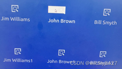
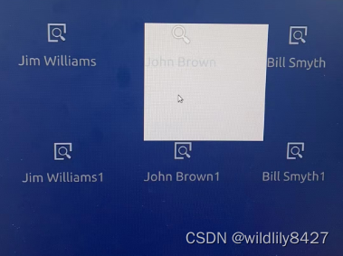
注意:代码中,index及currentIndex变量是GridView组件自带的属性。当点击item时,index自动改变。例如当点击第3个位置时,index = 3。
效果图:
模拟物理按键,右键,点击该按键,图标向右移动。代码如下:
Button{
        id: button;
        anchors.bottom: parent.bottom
        width: 100;
        height: 50;
        text: "right button"
        onClicked: {
            grid.moveCurrentIndexRight();
            console.log(" test current = " + grid.currentIndex);

        }
    }
对应方法还有:
moveCurrentIndexDown();
moveCurrentIndexLeft()
moveCurrentIndexUp()
二、上面记录因为Gridview没有Item的点击事件,所以自定义一个ImageButton实现Item点击。后面发现有ItemDelegate代码,可以和GridView一起使用,既可以完成与android中GridView相同效果。下面是代码:
// main.qml
 GridView {
            id:grid
            width: 1104;
            height: 536
            cellWidth: 276;
            cellHeight: 268;
            anchors.left: parent.left
            anchors.leftMargin: 88
            anchors.top: parent.top
            anchors.topMargin: 57

            model: ContactModel {}

            delegate: ItemDelegate {
                onClicked: {
                    console.log("test onclick");
                    grid.currentIndex = index;
                }

                Column {
                    spacing: 20
                    Image {
                        source: grid.currentIndex === index ? portraitS :portrait;
                        anchors.horizontalCenter: parent.horizontalCenter
                    }
                    Text { text: name; anchors.horizontalCenter: parent.horizontalCenter;color: grid.currentIndex === index ?"#C6D0D6" : "gray";font.pixelSize: 30; }
                }

            }

        }
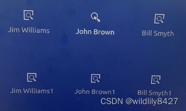
效果:
效果图中背景色自带白色,不美观。下面通过自定义ItemDelegate去掉点击效果。
// GridViewItemDelegate.qml
import QtQuick 2.0
import QtQuick.Controls 2.3
ItemDelegate {
    background: null
}
将main.qml中ItemDelegate替换成GridViewItemDelegate,效果图:
现在没有背景颜色了。但是 通过上图,发现Item点击的范围特别小,我们需要设置Item的点击范围为一个cell的大小。下面代码设置点击范围。
// GridViewItemDelegate.qml
import QtQuick 2.0
import QtQuick.Controls 2.3
ItemDelegate {
//    background: null
    property int itemWidth: 100 // 默认值
    property int itemHeight: 100 // 默认值
    width: itemWidth
    height: itemHeight
}

// main.qml
GridView {
            id:grid
            width: 1104;
            height: 536
            cellWidth: 276;
            cellHeight: 268;
            anchors.left: parent.left
            anchors.leftMargin: 88
            anchors.top: parent.top
            anchors.topMargin: 57

            model: ContactModel {}

            delegate: GridViewItemDelegate {
                itemWidth: grid.cellWidth
                itemHeight: grid.cellHeight
                onClicked: {
                    console.log("test onclick");
                    grid.currentIndex = index;
                }

                Column {
                    spacing: 20
                    Image {
                        source: grid.currentIndex === index ? portraitS :portrait;
                        anchors.horizontalCenter: parent.horizontalCenter
                    }
                    Text { text: name; anchors.horizontalCenter: parent.horizontalCenter;color: grid.currentIndex === index ?"#C6D0D6" : "gray";font.pixelSize: 30; }
                }

            }

        }
效果图:
以上:ItemDelegate + Gridview 实现布局及点击按键效果。


 413
413


 被折叠的 条评论
为什么被折叠?
被折叠的 条评论
为什么被折叠?
 到【灌水乐园】发言


