


文章目录
Material Design
本篇文章整理自郭霖大佬的《第一行代码》。
Material Design是Google设计工程师基于传统优秀的设计原则,结合丰富的创意和科学技术所开发的一套全新的界面设计语言,包含了视觉,运动,互动效果等特性。
使用Material Design原则设计的界面优美大气,但是他的设计规范是面向UI设计人员的,很多开发者不清楚也不了解什么效果才叫Material Design,就算了解了,很多效果也难实现,Google在2015年推出Design Support库,这个库对Material Design的规范开发了一套控件,后期Design Support改为Material库。
后续我们简称Material Design为MD,接下来学习一些控件的简单使用。
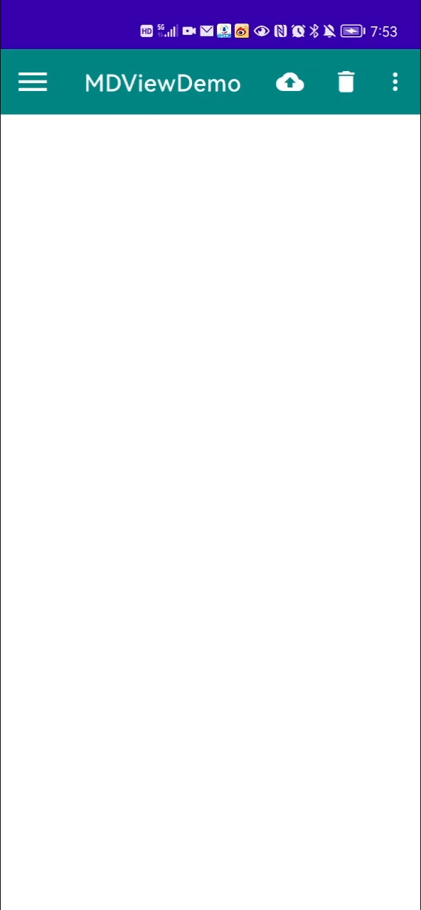
ToolBar
系统默认的为ActionBar,功能比较差,ToolBar是一种功能强大的Bar
使用如下:
MainActivity
override fun onCreate(savedInstanceState: Bundle?) {
    super.onCreate(savedInstanceState)
    setContentView(R.layout.activity_main)
    setSupportActionBar(toolbar)
}
activity_main
<?xml version="1.0" encoding="utf-8"?>
<LinearLayout android:layout_width="match_parent"
    android:layout_height="match_parent"
    xmlns:android="http://schemas.android.com/apk/res/android"
    xmlns:app="http://schemas.android.com/apk/res-auto">
    <androidx.appcompat.widget.Toolbar
        android:layout_width="match_parent"
        android:layout_height="?attr/actionBarSize"
        android:id="@+id/toolBar"
        android:background="@color/teal_700"
        android:theme="@style/ThemeOverlay.AppCompat.Dark.ActionBar"
        app:popupTheme="@style/Theme.AppCompat.Light"/>
</LinearLayout>
popupTheme设置弹出菜单的效果(最右边的三个点按钮)
style.xml
<style name="ToolBarPopupTheme" parent="ThemeOverlay.AppCompat.Light">
    <item name="android:colorBackground">@color/Grey700</item><!--设置背景颜色的-->
    <item name="android:textColorPrimary">@android:color/white</item><!--设置文字颜色的-->
    <item name="android:textSize">16sp</item><!--设置文字大小的-->
    <item name="actionOverflowMenuStyle">@style/OverflowMenuTheme</item><!--设置弹出位置的主题-->
    <item name="android:paddingEnd">-5dp</item>
</style>
<!--Toolbar弹出popup主题的设置-->
<style name="OverflowMenuTheme" parent="Widget.AppCompat.Light.PopupMenu.Overflow">
    <item name="overlapAnchor">false</item><!--这个属性设置为false,就能使得popup在Toolbar的下面显示-->
</style>
上面使用效果与普通Bar一样,下面加入一些菜单:
在res下创建menu目录,再创建toolbar.xml
toolbar.xml
<?xml version="1.0" encoding="utf-8"?>
<menu xmlns:android="http://schemas.android.com/apk/res/android"
    xmlns:app="http://schemas.android.com/apk/res-auto">
    <item
        android:id="@+id/backup"
        android:icon="@drawable/ic_backup"
        android:title="Backup"
        app:showAsAction="always" />
    <item
        android:id="@+id/delete"
        android:icon="@drawable/ic_delete"
        android:title="Delete"
        app:showAsAction="ifRoom" />
    <item
        android:id="@+id/settings"
        android:icon="@drawable/ic_settings"
        android:title="Settings"
        app:showAsAction="never" />
</menu>
showAsAction代表显示方式,常用的有三个值
-
always永远显示在ToolBar中,若屏幕不够则不显示 -
ifRoom空间足够则显示再ToolBar中,不够则显示在菜单中 -
never从永远显示在菜单中
ToolBar中的action按钮只会显示图标,菜单中的action只会显示文字
在MainActivity中添加代码
MainActivity
override fun onCreateOptionsMenu(menu: Menu?): Boolean {
    menuInflater.inflate(R.menu.toolbar, menu)
    return true
}

override fun onOptionsItemSelected(item: MenuItem): Boolean {
    when (item.itemId) {
        android.R.id.home -> drawerLayout.openDrawer(GravityCompat.START)
        R.id.backup -> Toast.makeText(this, "You clicked Backup", Toast.LENGTH_SHORT).show()
        R.id.delete -> Toast.makeText(this, "You clicked Delete", Toast.LENGTH_SHORT).show()
        //点击弹窗则出现菜单
        R.id.settings -> Toast.makeText(this, "You clicked Settings", Toast.LENGTH_SHORT).show()
    }
    return true
}
效果如下:

可以通过AndroidManifest.xml中activity的label标签修改标题
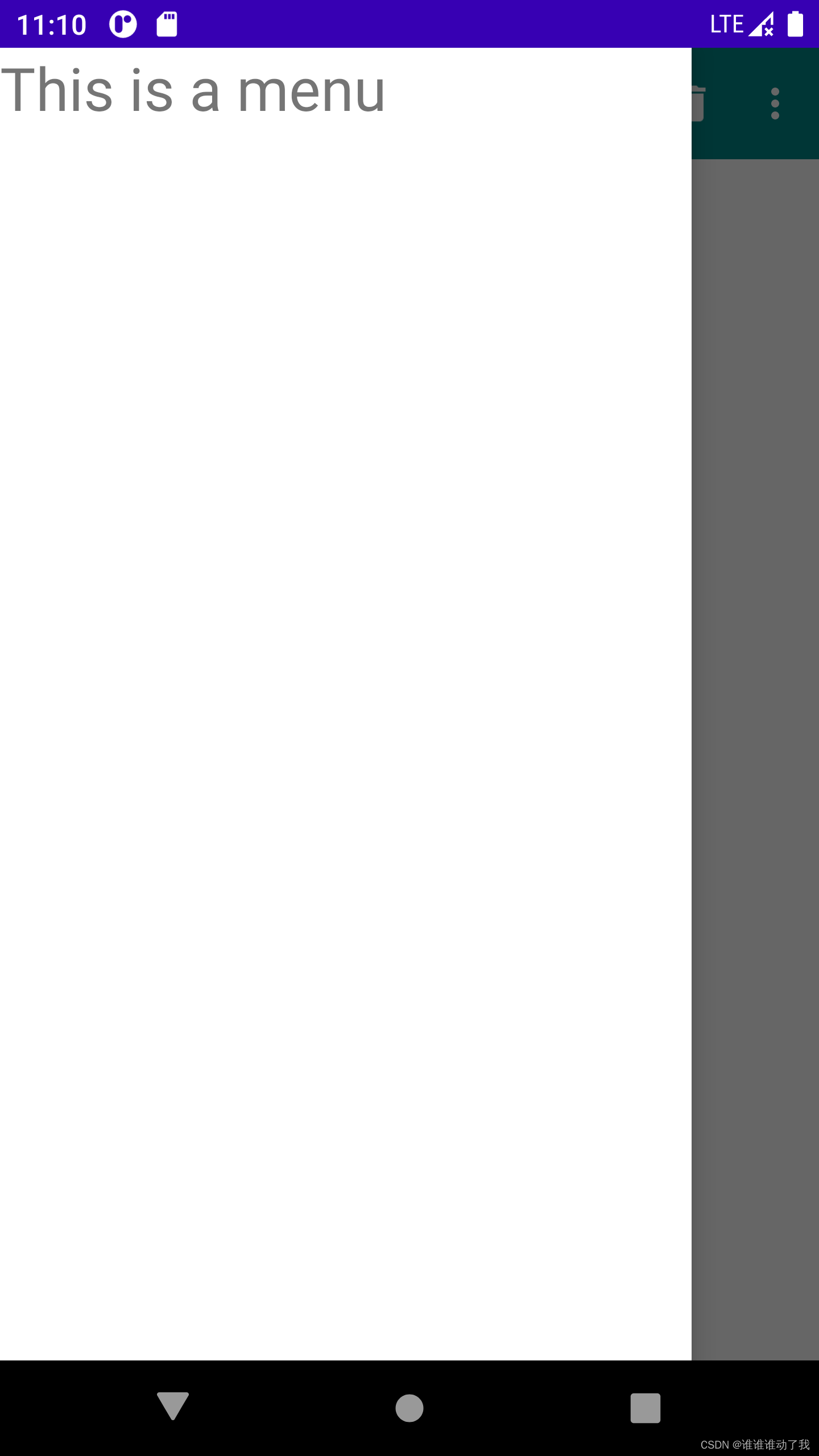
DrawerLayout
抽屉布局,可以左滑右滑显示菜单
在ToolBar的基础上加入DrawerLayout
修改activity_main.xml
activity_main.xml
<?xml version="1.0" encoding="utf-8"?>
<androidx.drawerlayout.widget.DrawerLayout
    android:layout_width="match_parent"
    android:layout_height="match_parent"
    android:id="@+id/drawerLayout"
    xmlns:android="http://schemas.android.com/apk/res/android"
    xmlns:app="http://schemas.android.com/apk/res-auto">
    <FrameLayout
        android:layout_width="match_parent"
        android:layout_height="match_parent">
        <androidx.appcompat.widget.Toolbar
            android:layout_width="match_parent"
            android:layout_height="?attr/actionBarSize"
            android:id="@+id/toolBar"
            android:background="@color/teal_700"
            android:theme="@style/ThemeOverlay.AppCompat.Dark.ActionBar"
            app:popupTheme="@style/ToolBarPopupTheme"/>
    </FrameLayout>
    <TextView
        android:layout_gravity="start"
        android:layout_width="match_parent"
        android:layout_height="match_parent"
        android:textSize="30sp"
        android:background="#fff"
        android:text="This is a menu" />

</androidx.drawerlayout.widget.DrawerLayout>
DrawerLayout需要三个布局,中左右,中间是主内容,左是左抽屉,右是右抽屉
layout_gravity属性则控制左右,start是跟随系统语言判断,中英文则是左,阿拉伯则为右
效果如下:
DrawerLayout不仅可以滑动触发还可以手动触发,结合上述的ToolBar,添加一个导航按钮
MainActivity修改如下:
class MainActivity : AppCompatActivity() {
    override fun onCreate(savedInstanceState: Bundle?) {
        ...
        supportActionBar?.let {
            //显示导航按钮
            it.setDisplayHomeAsUpEnabled(true)
            //设置导航按钮图标
            it.setHomeAsUpIndicator(R.drawable.ic_menu)
        }
    }
    ...

    override fun onOptionsItemSelected(item: MenuItem): Boolean {
        when (item.itemId) {
            //点击导航栏左侧按钮则弹出抽屉,start保持和xml中一致
            android.R.id.home -> drawerLayout.openDrawer(GravityCompat.START)
            ...
        }
        return true
    }
}
效果如下:
存在拖动范围太小的问题,后续还需改进
仅仅是上述的效果还是不够,抽屉太空旷了,借助NavigationView可以实现更炫酷的效果
NavigationView
现在实现比较酷炫的效果,我们导入一个圆角依赖
implementation 'de.hdodenhof:circleimageview:3.0.1'
查看qq的抽屉样式:
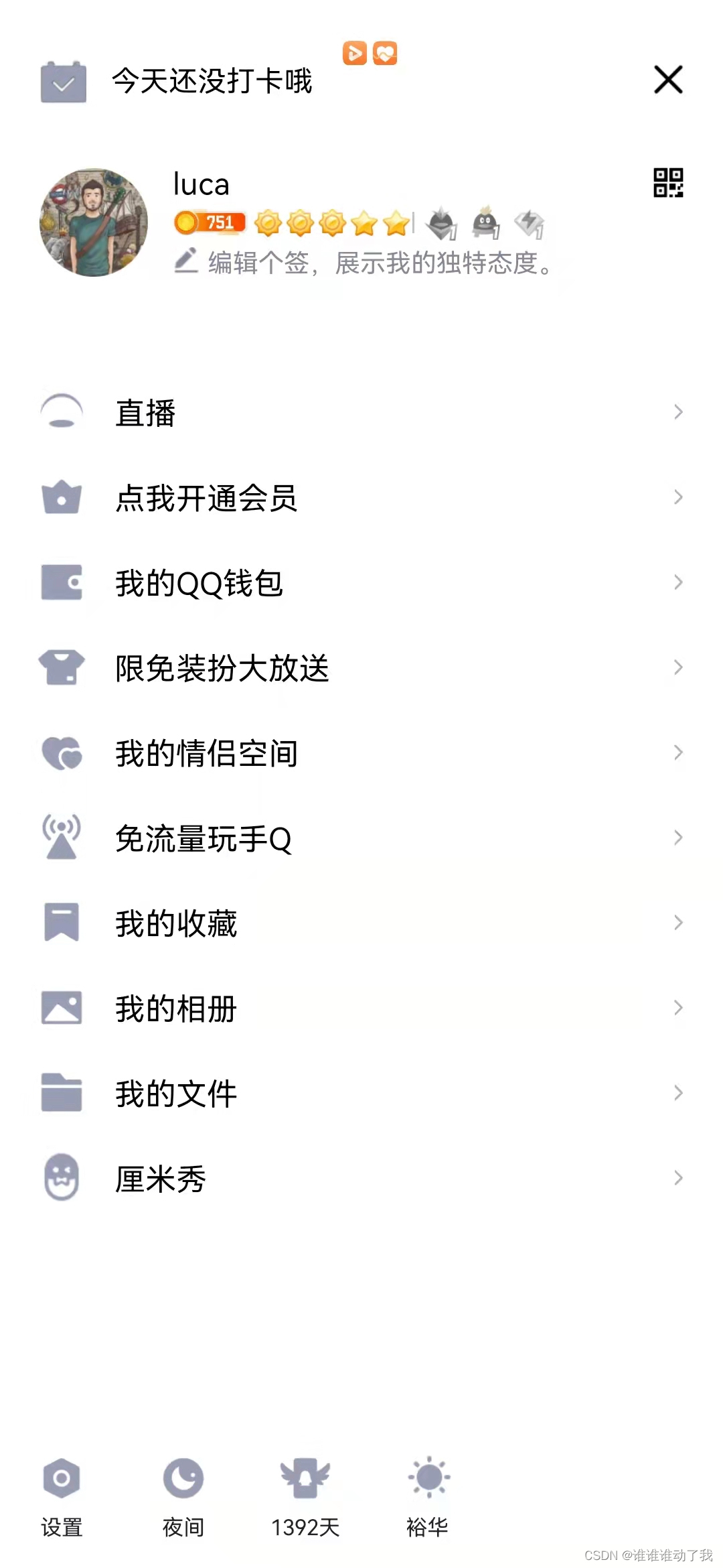
有头有尾,借助NavigationView也可以帮助我们实现这样的效果
使用NavigationView需要传入菜单和头部布局
在menu文件夹下创建nav_menu.xml
nav_menu.xml
<?xml version="1.0" encoding="utf-8"?>
<menu xmlns:android="http://schemas.android.com/apk/res/android">
    <group android:checkableBehavior="single">
        <item
            android:id="@+id/navCall"
            android:icon="@drawable/nav_call"
            android:title="Call" />
        <item
            android:id="@+id/navFriends"
            android:icon="@drawable/nav_friends"
            android:title="Friends" />
        <item
            android:id="@+id/navLocation"
            android:icon="@drawable/nav_location"
            android:title="Location" />
        <item
            android:id="@+id/navMail"
            android:icon="@drawable/nav_mail"
            android:title="Mail" />
        <item
            android:id="@+id/navTask"
            android:icon="@drawable/nav_task"
            android:title="Tasks" />
    </group>
</menu>
在layout中创建nav_header.xml
nav_header.xml
<?xml version="1.0" encoding="utf-8"?>
<RelativeLayout xmlns:android="http://schemas.android.com/apk/res/android"
    android:layout_width="match_parent"
    android:layout_height="180dp"
    android:padding="10dp"
    android:background="?attr/colorPrimary">

    <de.hdodenhof.circleimageview.CircleImageView
        android:id="@+id/iconImage"
        android:layout_width="70dp"
        android:layout_height="70dp"
        android:src="@drawable/nav_icon"
        android:layout_centerInParent="true" />

    <TextView
        android:id="@+id/mailText"
        android:layout_width="wrap_content"
        android:layout_height="wrap_content"
        android:layout_alignParentBottom="true"
        android:text="tonygreendev@gmail.com"
        android:textColor="#FFF"
        android:textSize="14sp" />

    <TextView
        android:id="@+id/userText"
        android:layout_width="wrap_content"
        android:layout_height="wrap_content"
        android:layout_above="@id/mailText"
        android:text="Tony Green"
        android:textColor="#FFF"
        android:textSize="14sp" />

</RelativeLayout>
CircleImageView是我们导入的依赖包中的控件
修改activity_main.xml加入NavigationView,用NavigationView替换TextView
activity_main.xml
<?xml version="1.0" encoding="utf-8"?>
<androidx.drawerlayout.widget.DrawerLayout
    android:layout_width="match_parent"
    android:layout_height="match_parent"
    android:id="@+id/drawerLayout"
    xmlns:android="http://schemas.android.com/apk/res/android"
    xmlns:app="http://schemas.android.com/apk/res-auto">
    <FrameLayout
        android:layout_width="match_parent"
        android:layout_height="match_parent">
        <androidx.appcompat.widget.Toolbar
            android:layout_width="match_parent"
            android:layout_height="?attr/actionBarSize"
            android:id="@+id/toolBar"
            android:background="@color/teal_700"
            android:theme="@style/ThemeOverlay.AppCompat.Dark.ActionBar"
            app:popupTheme="@style/ToolBarPopupTheme"/>
    </FrameLayout>
    <com.google.android.material.navigation.NavigationView
        android:id="@+id/navView"
        android:layout_width="match_parent"
        android:layout_height="match_parent"
        android:layout_gravity="start"
        app:menu="@menu/nav_menu"
        app:headerLayout="@layout/nav_header"/>

</androidx.drawerlayout.widget.DrawerLayout>
修改MainActivity
MainActivity
class MainActivity : AppCompatActivity() {

    override fun onCreate(savedInstanceState: Bundle?) {
        super.onCreate(savedInstanceState)
        setContentView(R.layout.activity_main)
        setSupportActionBar(toolBar)
        supportActionBar?.let {
            it.setDisplayHomeAsUpEnabled(true)
            it.setHomeAsUpIndicator(R.drawable.ic_menu)
        }
        //设置默认选择
        navView.setCheckedItem(R.id.navCall)
        //设置点击监听器
        navView.setNavigationItemSelectedListener {
            drawerLayout.closeDrawers()
            true
        }
    }

	...
}
效果如下:
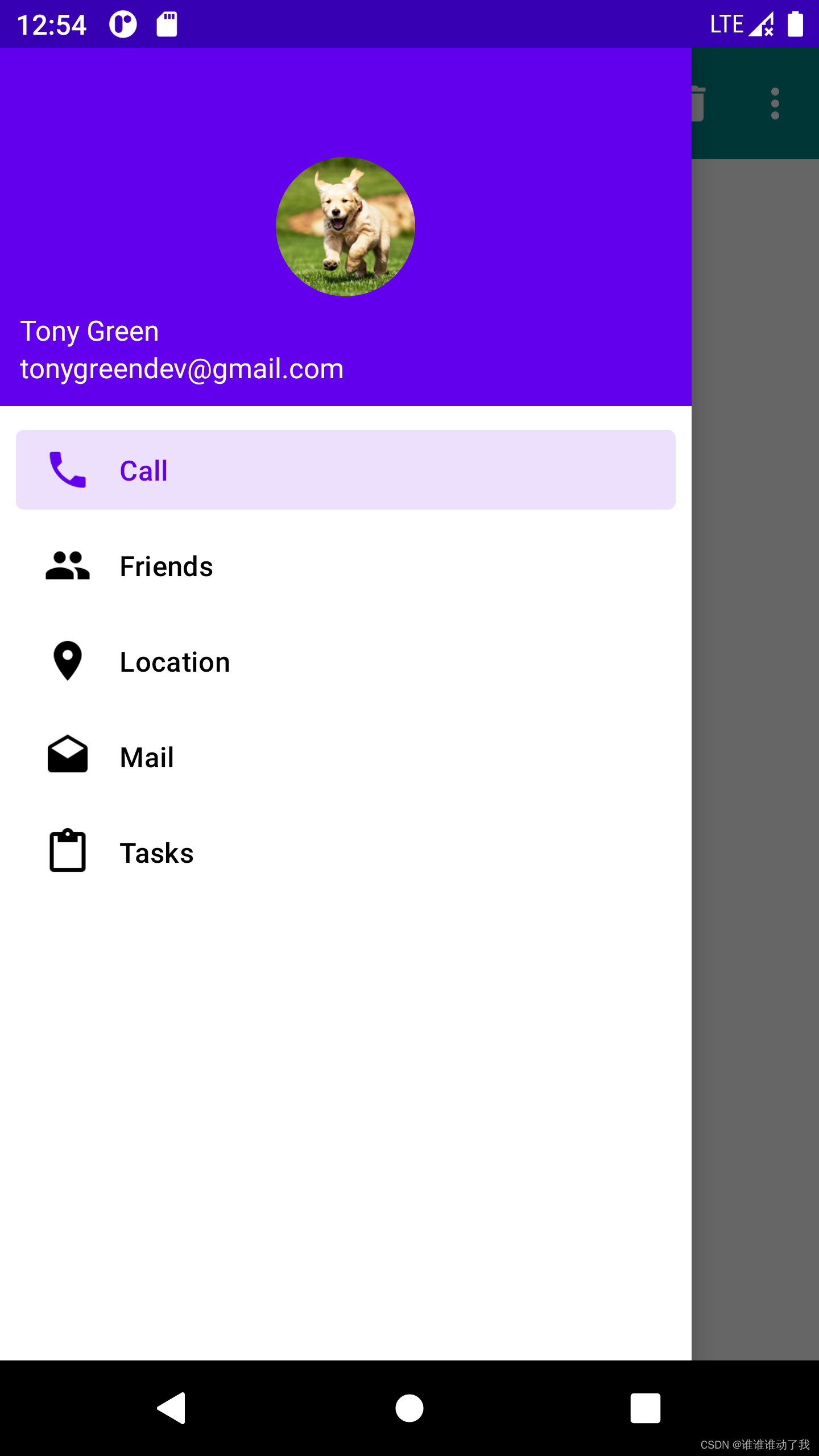
很拉风很酷
FloatingActionButton
MD设计规范中是存在Z轴概念的,Z越高代表着View的阴影越大,Z越低则投影效果更浓
Z的概念对应View的elevation属性
FloatingActionButton就是一个可悬浮的按钮,具体使用如下:
对上述activity_main.xml进行修改
activity_main.xml
<?xml version="1.0" encoding="utf-8"?>
<androidx.drawerlayout.widget.DrawerLayout
    android:layout_width="match_parent"
    android:layout_height="match_parent"
    android:id="@+id/drawerLayout"
    xmlns:android="http://schemas.android.com/apk/res/android"
    xmlns:app="http://schemas.android.com/apk/res-auto">
    <FrameLayout
        android:layout_width="match_parent"
        android:layout_height="match_parent">
        <androidx.appcompat.widget.Toolbar
            android:layout_width="match_parent"
            android:layout_height="?attr/actionBarSize"
            android:id="@+id/toolBar"
            android:background="@color/teal_700"
            android:theme="@style/ThemeOverlay.AppCompat.Dark.ActionBar"
            app:popupTheme="@style/ToolBarPopupTheme"/>
        <com.google.android.material.floatingactionbutton.FloatingActionButton
            android:id="@+id/fab"
            android:layout_width="wrap_content"
            android:layout_height="wrap_content"
            android:layout_gravity="bottom|end"
            android:layout_margin="16dp"
            android:elevation="8dp"
            android:src="@drawable/ic_done"/>
    </FrameLayout>
    ...

</androidx.drawerlayout.widget.DrawerLayout>
效果如下:
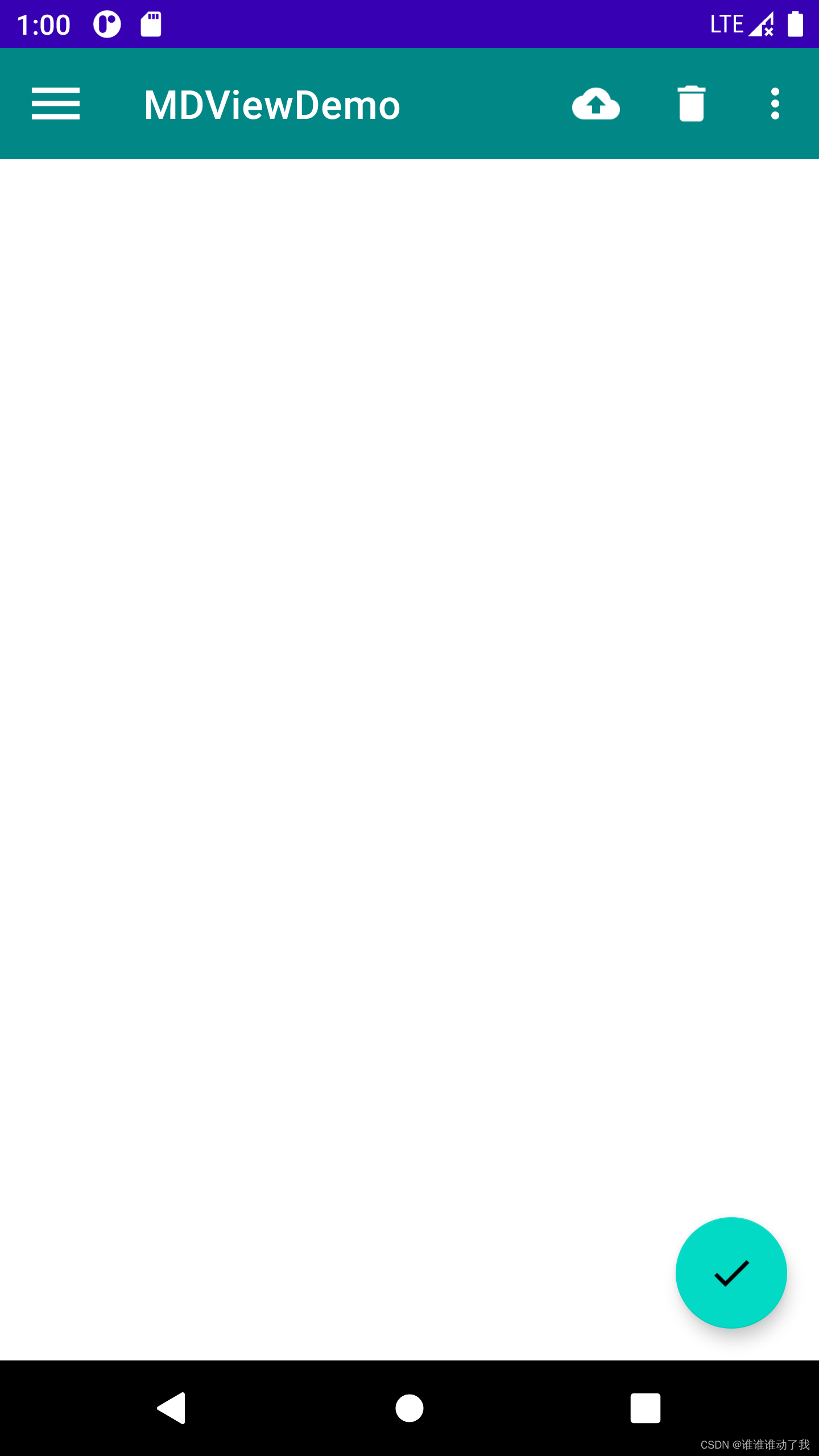
重点看他的阴影效果
如果像绑定点击事件则按照下面方式
fab.setOnClickListener {
    Toast.makeText(this, "fab click", Toast.LENGTH_SHORT).show()
}
Snackbar
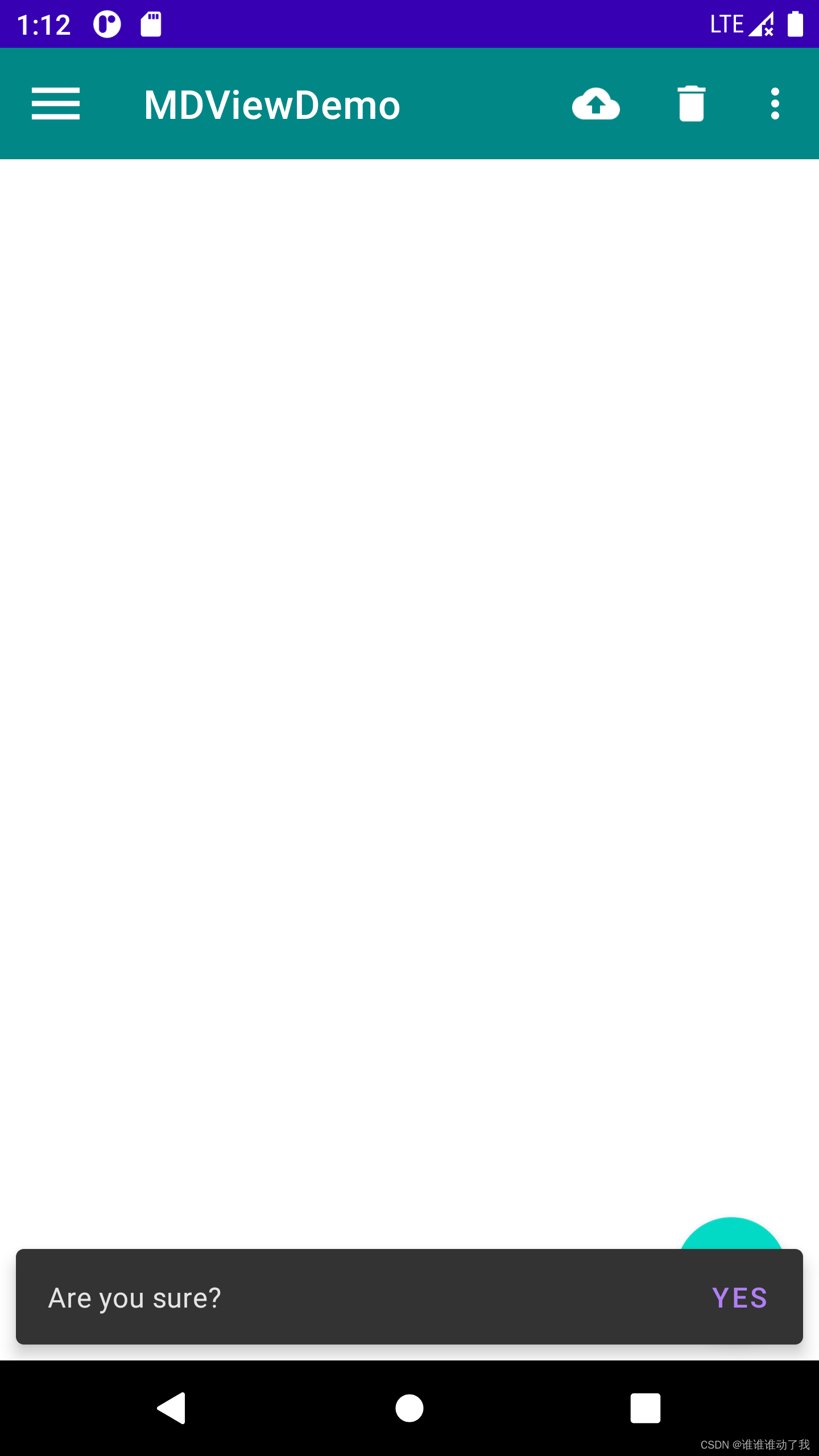
Snackbar类似于Toast,但是并不完全相同,视觉效果类似于Toast,功能类似于AlertDialog,我们修改上述悬浮按钮的点击事件替换成Snackbar
fab.setOnClickListener {
    Snackbar.make(it, "Are you sure?", Snackbar.LENGTH_SHORT)
        .setAction("YES") {
            Toast.makeText(this, "success", Toast.LENGTH_SHORT).show()
        }
        .show()
}
Snackbar的make需要传入一个view,任何一个都可,它会自动寻找最外层的View进行显示,第二个为显示的内容,第三个为显示时长
setAction用来设置一个动作,用于用户交互,show展示Snackbar
效果如下:
Snackbar把FloatingActionButton遮盖,这有点影响用户体验呀,使用CoordinatorLayout则可以解决此问题
CoordinatorLayout
CoordinatorLayout是协调者布局,可以监听全部子View的事件,比如上述中的Snackbar和FloatingActionButton,如果使用CoordinatorLayout,就可以协调两者的冲突,在Snackbar显示时FloatingActionButton自动向上偏移。
直接将上述抽屉布局中的FrameLayout替换成CoordinatorLayout即可,CoordinatorLayout本质也是一个FrameLayout
效果如下:
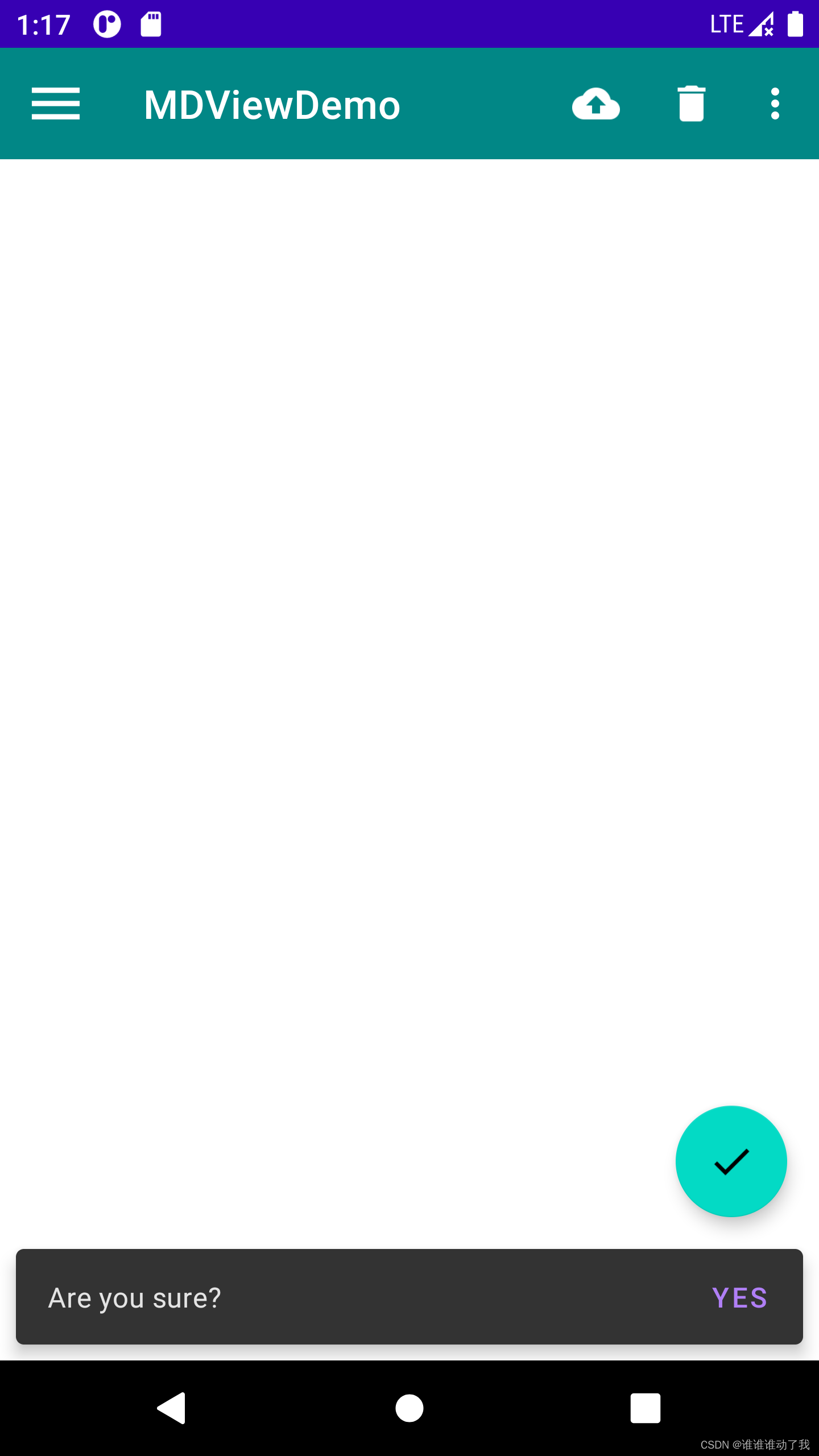
之所以能协调也是之前我们在Snackbar的make()方法中将FloatingActionButton传了过去,如果传别的View,那就不会有上述效果了。
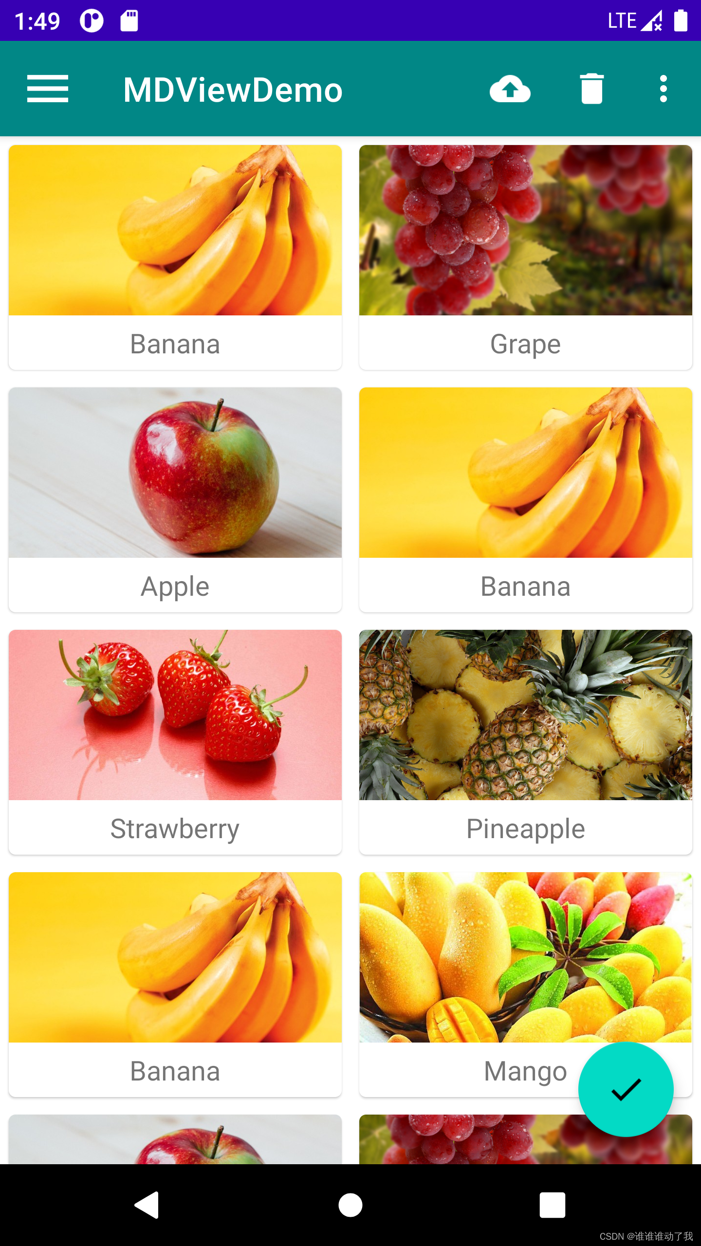
卡片式布局 MaterialCardView
主内容布局还很空旷,给中间加上内容
RecyclerView肯定跑不了,其ItemView使用MaterialCardView实现,修改activity_main.xml
activity_main.xml
<?xml version="1.0" encoding="utf-8"?>
<androidx.drawerlayout.widget.DrawerLayout
    android:layout_width="match_parent"
    android:layout_height="match_parent"
    android:id="@+id/drawerLayout"
    xmlns:android="http://schemas.android.com/apk/res/android"
    xmlns:app="http://schemas.android.com/apk/res-auto">
    <androidx.coordinatorlayout.widget.CoordinatorLayout
        android:layout_width="match_parent"
        android:layout_height="match_parent">
        ...
        <androidx.recyclerview.widget.RecyclerView
            android:id="@+id/recyclerView"
            android:layout_width="match_parent"
            android:layout_height="match_parent"/>
       ...
    </androidx.coordinatorlayout.widget.CoordinatorLayout>
    ...

</androidx.drawerlayout.widget.DrawerLayout>
RecyclerView的item使用卡片布局完成
itemView布局如下:
fruit_item.xml
<?xml version="1.0" encoding="utf-8"?>
<com.google.android.material.card.MaterialCardView
    xmlns:android="http://schemas.android.com/apk/res/android"
    xmlns:app="http://schemas.android.com/apk/res-auto"
    android:layout_width="match_parent"
    android:layout_height="wrap_content"
    android:layout_margin="5dp"
    app:cardCornerRadius="4dp">

    <LinearLayout
        android:orientation="vertical"
        android:layout_width="match_parent"
        android:layout_height="wrap_content">

        <ImageView
            android:id="@+id/fruitImage"
            android:layout_width="match_parent"
            android:layout_height="100dp"
            android:scaleType="centerCrop" />

        <TextView
            android:id="@+id/fruitName"
            android:layout_width="wrap_content"
            android:layout_height="wrap_content"
            android:layout_gravity="center_horizontal"
            android:layout_margin="5dp"
            android:textSize="16sp" />
    </LinearLayout>

</com.google.android.material.card.MaterialCardView>
MaterialCardView是一个FrameLayout,因此没有定位方法,我们需要在内部嵌套LinearLayout实现定位
其中app:cardCornerRadius设置卡片圆角弧度,
在ImageView中使用 android:scaleType属性,其作用是设置照片的缩放模式,由于照片长宽比例不同,为了让图片填充满整个ImageView,这里使用
centerCrop,保持原有比例填充满,多余的部分裁剪
创建RecyclerView的Adapter
FruitAdapter
class FruitAdapter(val context: Context, val fruitList: List<Fruit>) : RecyclerView.Adapter<FruitAdapter.ViewHolder>() {

    inner class ViewHolder(view: View) : RecyclerView.ViewHolder(view) {
        val fruitImage: ImageView = view.findViewById(R.id.fruitImage)
        val fruitName: TextView = view.findViewById(R.id.fruitName)
    }

    override fun onCreateViewHolder(parent: ViewGroup, viewType: Int): ViewHolder {
        val view = LayoutInflater.from(context).inflate(R.layout.fruit_item, parent, false)
        val holder = ViewHolder(view)
        holder.itemView.setOnClickListener {
            val position = holder.adapterPosition
            Log.d("FruitAdapter", fruitList[position].name)
        }
        return holder
    }

    override fun onBindViewHolder(holder: ViewHolder, position: Int) {
        val fruit = fruitList[position]
        holder.fruitName.text = fruit.name
        Glide.with(context).load(fruit.imageId).into(holder.fruitImage);
    }

    override fun getItemCount() = fruitList.size

}
修改MainActivity绑定数据并显示:
class MainActivity : AppCompatActivity() {

    val fruits = mutableListOf(Fruit("Apple", R.drawable.apple), Fruit("Banana", R.drawable.banana), Fruit("Orange", R.drawable.orange), Fruit("Watermelon", R.drawable.watermelon), Fruit("Pear", R.drawable.pear), Fruit("Grape", R.drawable.grape), Fruit("Pineapple", R.drawable.pineapple), Fruit("Strawberry", R.drawable.strawberry), Fruit("Cherry", R.drawable.cherry), Fruit("Mango", R.drawable.mango))

    val fruitList = ArrayList<Fruit>()

    override fun onCreate(savedInstanceState: Bundle?) {
        super.onCreate(savedInstanceState)
        setContentView(R.layout.activity_main)
        ...

        initFruits()
        val layoutManager = GridLayoutManager(this, 2)
        recyclerView.layoutManager = layoutManager
        val adapter = FruitAdapter(this, fruitList)
        recyclerView.adapter = adapter
    }
    private fun initFruits() {
        fruitList.clear()
        repeat(50) {
            val index = (0 until fruits.size).random()
            fruitList.add(fruits[index])
        }
    }

	...
}
运行效果如下:
发现Bar被遮挡,因为CoordinatorLayout是FrameLayout,如果不对子View进行定位,默认都会摆放在左上角。
有一种解决办法就是将RecyclerView往下偏移一个Bar的高度,但是我们使用的是CoordinatorLayout,它会有更好的解决方法。
借助AppBarLayout
AppBarLayout
他是一个垂直方向的LinearLayout,应用了MD的设计理念
使用如下:
将ToolBar使用AppBarLayout包裹。
修改activity_main
activity_main
<?xml version="1.0" encoding="utf-8"?>
<androidx.drawerlayout.widget.DrawerLayout
    android:layout_width="match_parent"
    android:layout_height="match_parent"
    android:id="@+id/drawerLayout"
    xmlns:android="http://schemas.android.com/apk/res/android"
    xmlns:app="http://schemas.android.com/apk/res-auto">
    <androidx.coordinatorlayout.widget.CoordinatorLayout
        android:layout_width="match_parent"
        android:layout_height="match_parent">
        <com.google.android.material.appbar.AppBarLayout
            android:layout_width="match_parent"
            android:layout_height="wrap_content">
            <androidx.appcompat.widget.Toolbar
                android:layout_width="match_parent"
                android:layout_height="?attr/actionBarSize"
                android:id="@+id/toolBar"
                android:background="@color/teal_700"
                android:theme="@style/ThemeOverlay.AppCompat.Dark.ActionBar"
                app:popupTheme="@style/ToolBarPopupTheme"/>
        </com.google.android.material.appbar.AppBarLayout>

        <androidx.recyclerview.widget.RecyclerView
            app:layout_behavior="@string/appbar_scrolling_view_behavior"
            android:id="@+id/recyclerView"
            android:layout_width="match_parent"
            android:layout_height="match_parent"/>
        ...
    </androidx.coordinatorlayout.widget.CoordinatorLayout>
    ...

</androidx.drawerlayout.widget.DrawerLayout>
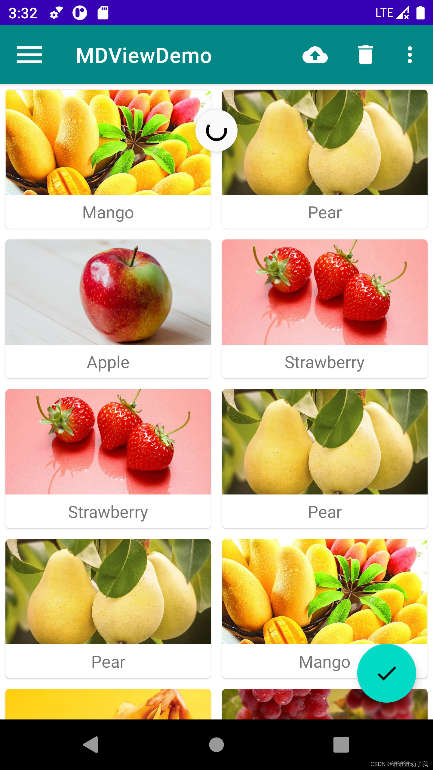
app:layout_behavior属性由Materual库提供,它表明CoordinatorLayout在协调布局时的行为,只有在CoordinatorLayout使用它才会生效,appbar_scrolling_view_behavior表明RecyclerView在滑动是需要和Bar进行协调,滑动事件会先交给Bar,Bar再决定给不给RecyclerView
效果如下:
滑动事件给了AppBarLayout,那么AppBarLayout就可以控制子View的MD效果,借助app:layout_scrollFlags属性
我们给ToolBar加入此属性
app:layout_scrollFlags="scroll|enterAlways|snap"
layout_scrollFlags有三种值:
-
scroll表示RecyclerView在向上滑动时ToolBar也向上滚动 -
enterAlwaysbi表示RecyclerView在向下滑动时ToolBar出现 -
snap会根据滑动的举例判读ToolBar显示还是隐藏
重新运行效果如下:
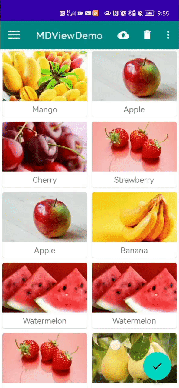
MD还提供了下拉刷新的功能,之前Git上的好多刷新效果都没有完整实现MD的设计理念,而Google给我们提供了MD效果的刷新
SwipRefreshLayout
使用时需导入下面依赖:
implementation "androidx.swiperefreshlayout:swiperefreshlayout:1.0.0"
使用SwiperefreshLayout包裹RecyclerView
<androidx.swiperefreshlayout.widget.SwipeRefreshLayout
    android:id="@+id/swipeRefresh"
    android:layout_width="match_parent"
    android:layout_height="match_parent"
    app:layout_behavior="@string/appbar_scrolling_view_behavior">
    <androidx.recyclerview.widget.RecyclerView
        app:layout_behavior="@string/appbar_scrolling_view_behavior"
        android:id="@+id/recyclerView"
        android:layout_width="match_parent"
        android:layout_height="match_parent"/>
</androidx.swiperefreshlayout.widget.SwipeRefreshLayout>
在MainActivity处理下拉刷新事件
class MainActivity : AppCompatActivity() {
    val fruits = mutableListOf(Fruit("Apple", R.drawable.apple), Fruit("Banana", R.drawable.banana), Fruit("Orange", R.drawable.orange), Fruit("Watermelon", R.drawable.watermelon), Fruit("Pear", R.drawable.pear), Fruit("Grape", R.drawable.grape), Fruit("Pineapple", R.drawable.pineapple), Fruit("Strawberry", R.drawable.strawberry), Fruit("Cherry", R.drawable.cherry), Fruit("Mango", R.drawable.mango))

    val fruitList = ArrayList<Fruit>()

    override fun onCreate(savedInstanceState: Bundle?) {
        super.onCreate(savedInstanceState)
        setContentView(R.layout.activity_main)
		...
        //设置刷新颜色
        swipeRefresh.setColorSchemeResources(R.color.black)
        //设只监听器
        swipeRefresh.setOnRefreshListener {
            refreshFruits(adapter)
        }
    }

    private fun refreshFruits(adapter: FruitAdapter) {
        thread {
            //模拟长时间操作
            Thread.sleep(2000)
            runOnUiThread {
                initFruits()
                adapter.notifyDataSetChanged()
                swipeRefresh.isRefreshing = false
            }
        }
    }
}
效果如下:
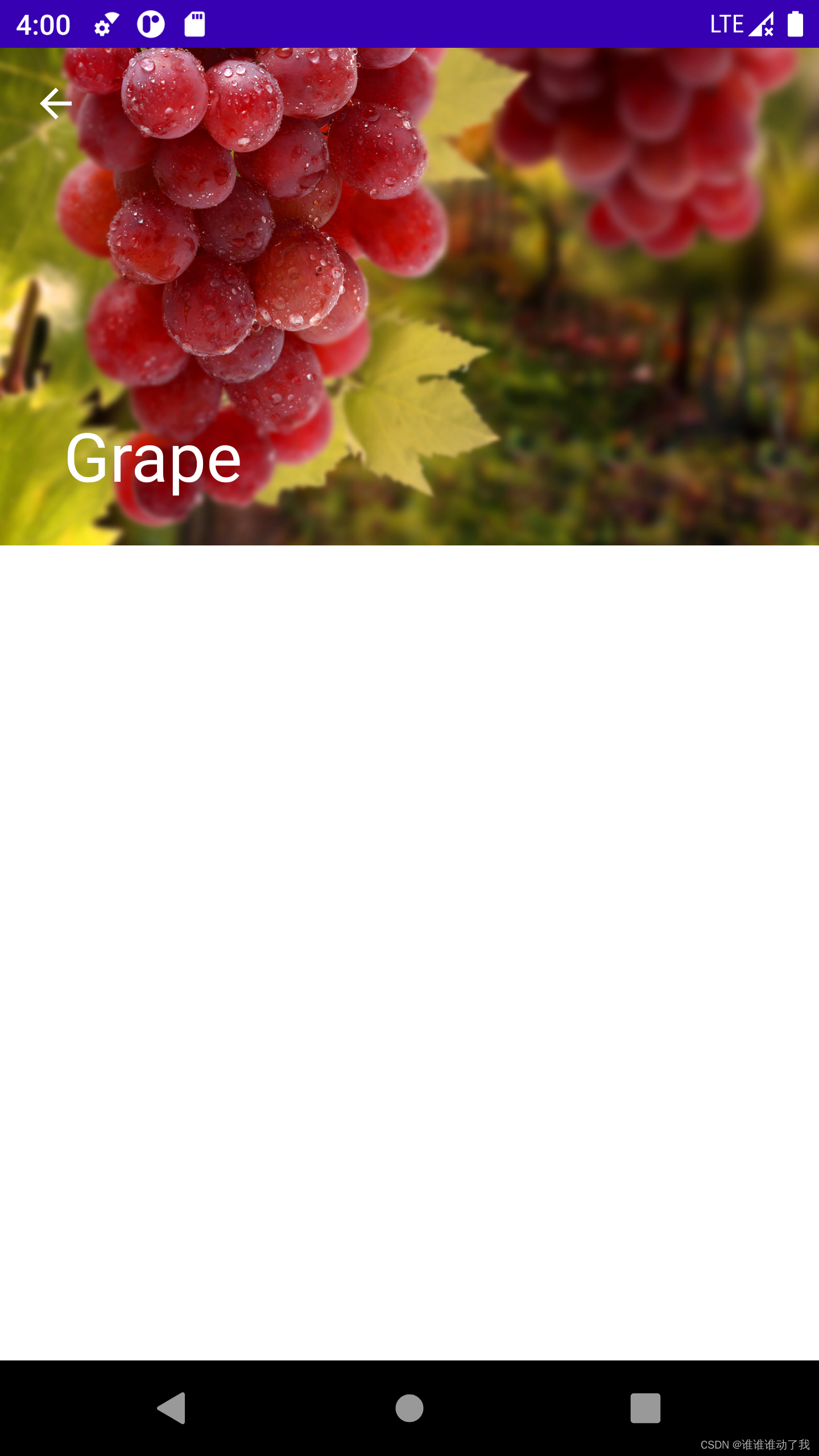
 ## 可折叠式标题栏
之前的标题栏我们使用的是ToolBar,ToolBar还不是太花里胡哨,下面就使用一个花里胡哨的标题栏实现一个水果详情页
创建新的布局文件
activity_main.xml
<androidx.coordinatorlayout.widget.CoordinatorLayout xmlns:android="http://schemas.android.com/apk/res/android"
    xmlns:tools="http://schemas.android.com/tools"
    android:layout_width="match_parent"
    android:layout_height="match_parent"
    xmlns:app="http://schemas.android.com/apk/res-auto">
    <com.google.android.material.appbar.AppBarLayout
        android:layout_width="match_parent"
        android:layout_height="250dp"
        android:id="@+id/appBar"
        tools:ignore="MissingConstraints">
        <com.google.android.material.appbar.CollapsingToolbarLayout
            android:layout_width="match_parent"
            android:layout_height="match_parent"
            android:id="@+id/collapsingToolbar"
            android:theme="@style/ThemeOverlay.AppCompat.Dark.ActionBar"
            app:contentScrim="@color/teal_700"
            app:layout_scrollFlags="scroll|exitUntilCollapsed">
            <ImageView
                app:layout_collapseMode="parallax"
                android:layout_width="match_parent"
                android:layout_height="match_parent"
                android:scaleType="centerCrop"
                android:id="@+id/fruitImageView"/>
            <androidx.appcompat.widget.Toolbar
                android:layout_width="match_parent"
                android:layout_height="?attr/actionBarSize"
                android:id="@+id/toolBar"
                app:layout_collapseMode="pin"/>

        </com.google.android.material.appbar.CollapsingToolbarLayout>
    </com.google.android.material.appbar.AppBarLayout>

</androidx.coordinatorlayout.widget.CoordinatorLayout>
CollapsingToolbarLayout嵌套在AppBarLayout中,contentScrim和layout_scrollFlags属性已经熟悉了,app:contentScrim="@color/teal_700"是指定折叠后的颜色,app:layout_scrollFlags="scroll|exitUntilCollapsed",scroll是跟随滑动,exitUntilCollapsed是折叠之后保留在界面上,不再移除。
CollapsingToolbarLayout的子VIew会包含app:layout_collapseMode属性,pin表示折叠过程位置不变,parallax表示折叠过程有错位偏移,效果会更好
编写FruitActivity,并在AndroidManifest.xml进行注册
FruitActivity
class FruitActivity : AppCompatActivity() {
    companion object {
        const val FRUIT_NAME = "fruit_name"
        const val FRUIT_IMAGE_ID = "fruit_image_id"
    }
    override fun onCreate(savedInstanceState: Bundle?) {
        super.onCreate(savedInstanceState)
        setContentView(R.layout.activity_fruit)
        val fruitName = intent.getStringExtra(FRUIT_NAME) ?: ""
        val fruitImageId = intent.getIntExtra(FRUIT_IMAGE_ID, 0)
        setSupportActionBar(toolBar)
        supportActionBar?.setDisplayHomeAsUpEnabled(true)
        collapsingToolbar.title = fruitName
        Glide.with(this).load(fruitImageId).into(fruitImageView)
    }

}
修改FruitAdapter添加点击事件
FruitAdapter
override fun onCreateViewHolder(parent: ViewGroup, viewType: Int): ViewHolder {
    val view = LayoutInflater.from(context).inflate(R.layout.fruit_item, parent, false)
    val holder = ViewHolder(view)
    holder.itemView.setOnClickListener {
        val position = holder.adapterPosition
        val intent = Intent(context, FruitActivity::class.java).apply {
            putExtra(FruitActivity.FRUIT_NAME, fruitList[position].name)
            putExtra(FruitActivity.FRUIT_IMAGE_ID, fruitList[position].imageId)
        }
        context.startActivity(intent)

    }
    return holder
}
效果如下:
下一步给Activity加入内容,布局使用NestedScrollView
NestedScrollView
NestedScrollView有相应嵌套滚动事件的能力,是ScrollView的升级版
修改activity_fruit.xml
activity_fruit.xml
<?xml version="1.0" encoding="utf-8"?>
<androidx.coordinatorlayout.widget.CoordinatorLayout xmlns:android="http://schemas.android.com/apk/res/android"
    xmlns:tools="http://schemas.android.com/tools"
    android:layout_width="match_parent"
    android:layout_height="match_parent"
    xmlns:app="http://schemas.android.com/apk/res-auto">
    <com.google.android.material.appbar.AppBarLayout
        android:layout_width="match_parent"
        android:layout_height="250dp"
        android:id="@+id/appBar"
        tools:ignore="MissingConstraints">
        ...
    </com.google.android.material.appbar.AppBarLayout>

    <androidx.core.widget.NestedScrollView
        android:layout_width="match_parent"
        android:layout_height="match_parent"
        app:layout_behavior="@string/appbar_scrolling_view_behavior">

        <LinearLayout
            android:orientation="vertical"
            android:layout_width="match_parent"
            android:layout_height="wrap_content">

            <com.google.android.material.card.MaterialCardView
                android:layout_width="match_parent"
                android:layout_height="wrap_content"
                android:layout_marginBottom="15dp"
                android:layout_marginLeft="15dp"
                android:layout_marginRight="15dp"
                android:layout_marginTop="35dp"
                app:cardCornerRadius="4dp">

                <TextView
                    android:id="@+id/fruitContentText"
                    android:layout_width="wrap_content"
                    android:layout_height="wrap_content"
                    android:layout_margin="10dp" />

            </com.google.android.material.card.MaterialCardView>

        </LinearLayout>

    </androidx.core.widget.NestedScrollView>

</androidx.coordinatorlayout.widget.CoordinatorLayout>
NestedScrollView与AppBarLayout平级,NestedScrollView内部嵌套了一个LinearLayout,LinearLayout内部包含一个CardView,其内部还有一个说明文字。
修改FruitActivity,加上返回和文字说明
class FruitActivity : AppCompatActivity() {
    companion object {
        const val FRUIT_NAME = "fruit_name"
        const val FRUIT_IMAGE_ID = "fruit_image_id"
    }
    override fun onCreate(savedInstanceState: Bundle?) {
        super.onCreate(savedInstanceState)
        setContentView(R.layout.activity_fruit)
        ...
        fruitContentText.text = generateFruitContent(fruitName)
    }

    override fun onOptionsItemSelected(item: MenuItem): Boolean {
        when (item.itemId) {
            android.R.id.home -> {
                finish()
                return true
            }
        }
        return super.onOptionsItemSelected(item)
    }

    private fun generateFruitContent(fruitName: String) = fruitName.repeat(500)

}
为了美观我们在加上悬浮按钮
<com.google.android.material.floatingactionbutton.FloatingActionButton
    android:layout_width="wrap_content"
    android:layout_height="wrap_content"
    android:layout_margin="16dp"
    android:src="@drawable/ic_comment"
    app:layout_anchor="@id/appBar"
    app:layout_anchorGravity="bottom|end" />
app:layout_anchor添加锚点,app:layout_anchorGravity锚点位置,上述效果是在bar的右下角
效果如下:

总结
MD控件是很美观大气的,更符合用户的体验,本篇文章只是学习其中常用控件的简单使用,后续笔者可能会发布某些控件原理的文章。
上述的Demo可以私信我。
✨ 原 创 不 易 , 还 希 望 各 位 大 佬 支 持 一 下 \textcolor{blue}{原创不易,还希望各位大佬支持一下} 原创不易,还希望各位大佬支持一下
👍 点 赞 , 你 的 认 可 是 我 创 作 的 动 力 ! \textcolor{green}{点赞,你的认可是我创作的动力!} 点赞,你的认可是我创作的动力!
⭐️ 收 藏 , 你 的 青 睐 是 我 努 力 的 方 向 ! \textcolor{green}{收藏,你的青睐是我努力的方向!} 收藏,你的青睐是我努力的方向!
✏️ 评 论 , 你 的 意 见 是 我 进 步 的 财 富 ! \textcolor{green}{评论,你的意见是我进步的财富!} 评论,你的意见是我进步的财富!


 1492
1492

 被折叠的 条评论
为什么被折叠?
被折叠的 条评论
为什么被折叠?
 到【灌水乐园】发言


