


More:http://www.w3cplus.com/content/css3-animation
CSS3属性中有关于制作动画的三个属性:Transform,Transition,Animation;
CSS3中的Animation与HTML5中的Canvas绘制动画/Flash/JavaScript以及jQuery制作出来的动画效果又不一样,只是有一点不足之处,我们运用Animation能创建自己想要的一些动画效果,但是有点粗糙。
"@Keyframes",我们把他叫做“关键帧”。可以自定义一些动画名称,规定什么时间做什么动作,这些细节用Transition就很难实现了,此时我们也需要这样的一个“关键帧”来控制。那么CSS3的Animation就是由“keyframes”这个属性来实现这样的效果。
下面来看一个列子:
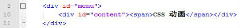
-------HTML-------
--------CSS--------
/* the CSS3 animation effect based on transition and the keyframe of animation */

@CHARSET "UTF-8";
* {
    text-align:center;
}

div#menu {
    width:auto;
    height:140px;
    margin:20px 20px;
    border:2px #d3c6a6;
    border-style: solid none;
}

div#content {
    width:120px;
    height:100px;
    background-color:#92B901;
    margin:20px 10px;
    position:absolute;

    border-radius:5px;    /* define the border radius of div */
    -o-border-radius:5px;
    -moz-border-radius:5px;
    -webkit-border-radius:5px;

    animation:tip 8s ease 0s 1;
    -o-animation:tip 8s ease 0s 1;
    -webkit-animation:tip 8s ease 0s 1;
    -moz-animation:tip 8s ease 0s 1;
}

div#content span {
    color:#fff;
    font: bold 18px Microsoft Yahei,SimHei,Arial;

    position:relative;
    left:3px;
    top:38px;
}

/* define the name of animation */
@keyframes tip {
    0% {
        left:30px;
        transform:rotate(0deg);
        background-color:#92B901;
    }

    25% {
        left:30px;
        transform:rotate(20deg);
        background-color:#33a3dc;
    }

    50% {
        left:1000px;
        transform:rotate(20deg);
    }

    75% {
        left:1000px;
        transform:rotate(0deg);
        background-color:#f173ac;
    }

    100% {
        left:30px;
        transform:rotate(-360deg);
    }
}
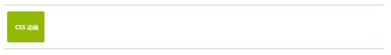
效果图:


 1066
1066

 被折叠的 条评论
为什么被折叠?
被折叠的 条评论
为什么被折叠?
 到【灌水乐园】发言


