


下面采用HTML+CSS+JavaScript实现模态框,并采用Flex布局和多媒体查询实现响应式。
一、模态框HTML代码
<!DOCTYPE html>
<html lang="en">
<head>
	<meta charset="UTF-8">
	<title>模态框实现</title>
	<link rel="stylesheet" href="css\modal.css" type="text/css">
</head>
<body>
<button class="btn" id="showModel">模态框展示</button>
<div id="modal" class="modal">
	<div class="modal-content">
		<header class="modal-header">
			<h4>模态框标题</h4>
			<span class="close">×</span>
		</header>
		<div class="modal-body">
			<p>HTML+CSS+JS原生实现响应式模态框演示!</p>
		</div>
		<footer class="modal-footer">
			<button id="cancel">取消</button>
			<button id="sure">确定</button>
		</footer>
	</div>
</div>
</body>
</html>二、模态框CSS代码
h4{
    margin-left: 20px;
}
p{
    text-align: center;
}
.btn{
    width: 100px;
    height: 35px;
    border-radius: 5px;
    font-size: 16px;
    color: white;
    background-color: cornflowerblue;
}
.btn:hover, .btn:focus{
    background-color: #95b4ed;
}
.modal{
    display: none;
    width: 100%;
    height: 100%;
    position: fixed;
    left: 0;
    top: 0;
    z-index: 1000;
    background-color: rgba(0,0,0,0.5);
}
.modal-content{
    display: flex;
    flex-flow: column nowrap;
    justify-content: space-between;
    width: 50%;
    max-width: 700px;
    height: 40%;
    max-height: 500px;
    margin: 100px auto;
    border-radius:10px;
    background-color:#fff;
    -webkit-animation: zoom 0.6s;
    animation: zoom 0.6s;
    resize: both;
    overflow: auto;
}
@-webkit-keyframes zoom{
    from {-webkit-transform: scale(0)}
    to {-webkit-transform: scale(1)}
}
@keyframes zoom{
    from {transform: scale(0)}
    to {transform: scale(1)}
}
.modal-header{
    box-sizing:border-box;
    border-bottom:1px solid #ccc;
    display: flex;
    justify-content: space-between;
    align-items: center;
}
.close{
    color: #b7b7b7;
    font-size: 30px;
    font-weight: bold;
    margin-right: 20px;
    transition: all 0.3s;
}
.close:hover, .close:focus{
    color: #95b4ed;
    text-decoration: none;
    cursor: pointer;
}
.modal-body{
    padding: 10px;
    font-size: 16px;
    box-sizing:border-box;
}
.modal-footer{
    box-sizing:border-box;
    border-top:1px solid #ccc;
    display: flex;
    padding: 15px;
    justify-content: flex-end;
    align-items: center;
}
.modal-footer button{
    width: 60px;
    height: 35px;
    padding: 5px;
    box-sizing: border-box;
    margin-right: 10px;
    font-size: 16px;
    color: white;
    border-radius: 5px;
    background-color: cornflowerblue;
}
.modal-footer button:hover, .modal-footer button:focus{
    background-color: #95b4ed;
    cursor: pointer;
}
@media only screen and (max-width: 700px){
    .modal-content {
        width: 80%;
    }
}模态框的显示通过animateion动画逐渐放大显示出来;
模态框响应式布局,首先设置整个模态框为flex容器,flex项目为header、body和footer,且主轴为纵向。header和footer模块又可用flex布局,flex容器为header和footer,flex项目为内部元素,主轴为水平方向。
多媒体media查询实现当屏幕小到一定程度时,模态框大小比例可适当放大。
三、模态框JavaScript代码
<script>
    var btn = document.getElementById('showModel');
    var close = document.getElementsByClassName('close')[0];
    var cancel = document.getElementById('cancel');
    var modal = document.getElementById('modal');
    btn.addEventListener('click', function(){
        modal.style.display = "block";
    });
    close.addEventListener('click', function(){
        modal.style.display = "none";
    });
    cancel.addEventListener('click', function(){
        modal.style.display = "none";
    });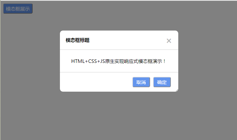
</script>四、效果展示
首先点击显示模态框,全屏最大显示:

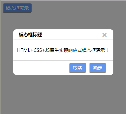
横向缩小浏览器窗口宽度时,模态框横向实现响应式显示。
纵向缩小浏览器窗口高度时,模态框纵向实现响应式显示。


 扫一扫
扫一扫


 被折叠的 条评论
为什么被折叠?
被折叠的 条评论
为什么被折叠?
 到【灌水乐园】发言


