


本篇文章主要针对多设备响应式布局来说明,由于现在的软件开发指定是不能只在一种设备上进行发布,像某种视频软件,手机、电视、平板、电脑上肯定都会部署
一、布局分析
刚刚直接说可能有点抽象,我们看图来了解一下我们本篇文章到底要干点什么
很明显,当我们的同样的代码运行在不同的设备上时需要呈现出一种不同的布局方式来适应设备变化下导致展示屏幕的长宽等样式,想要实现这一效果我们就要用到媒体查询技术
二、关键技术
媒体查询技术
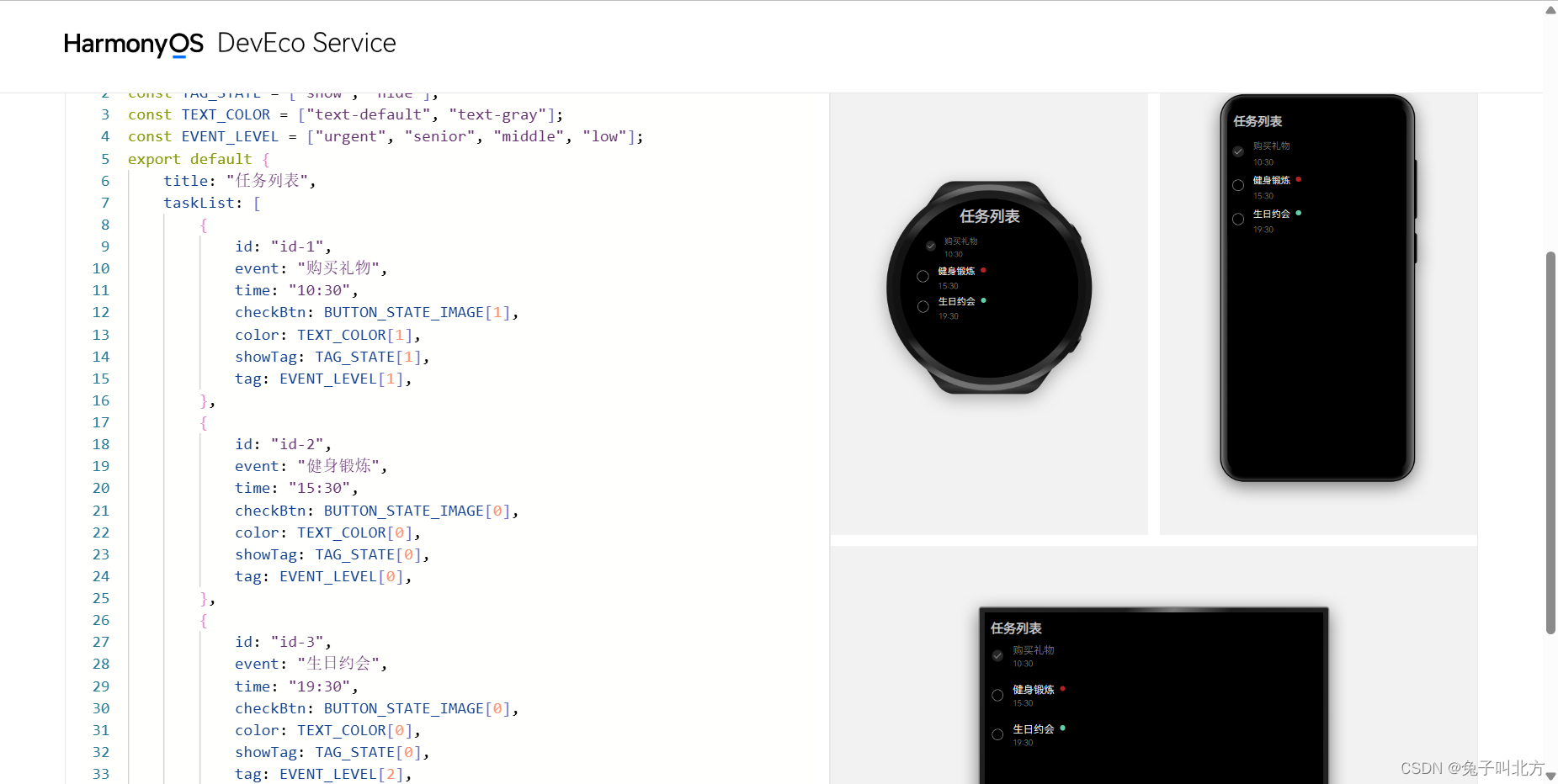
在2022 年 11 月 4 日的华为开发者大会 2022上,华为提出一次开发多端部署这一开发理念,我们在华为的一个体验网站内上也可以看到这八个字
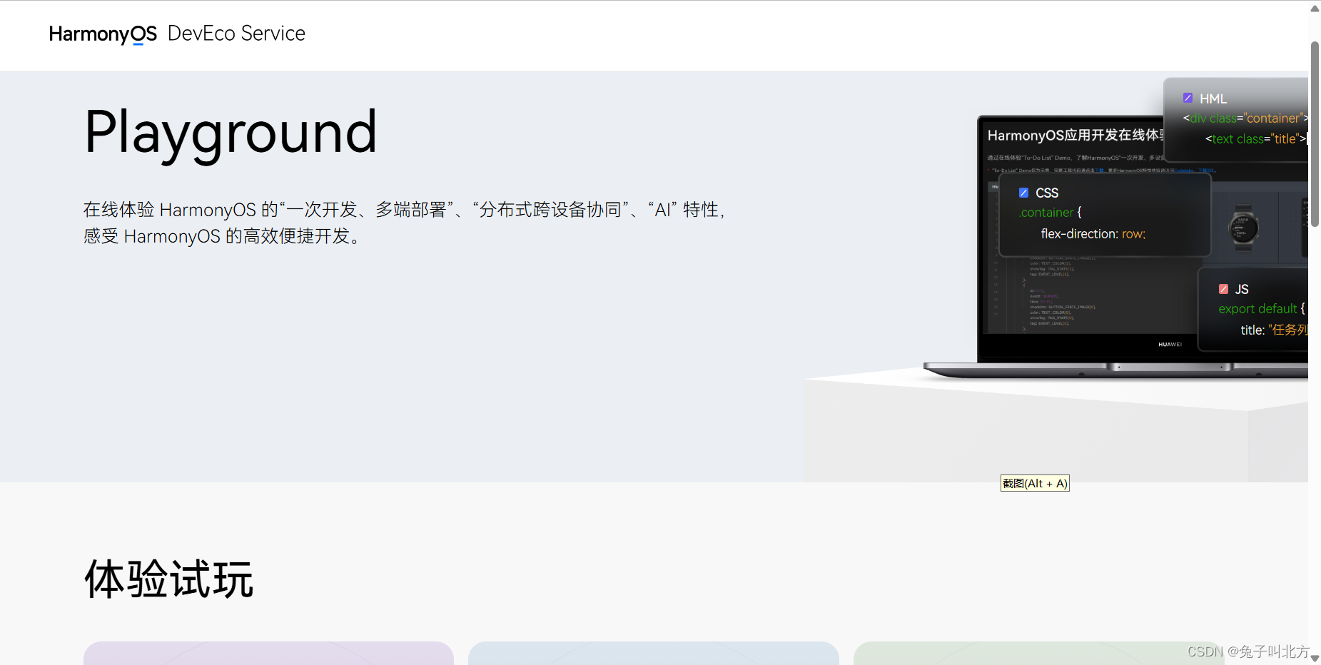
在这个体验页面我们就可以很清楚的了解这八个字的意思
如果有想了解这个网站的同学我会把这个链接放在这里 点我
使用媒体查询技术我们就可以很方便的获取到设备的信息,以此来修改我们的布局,下面时具体步骤
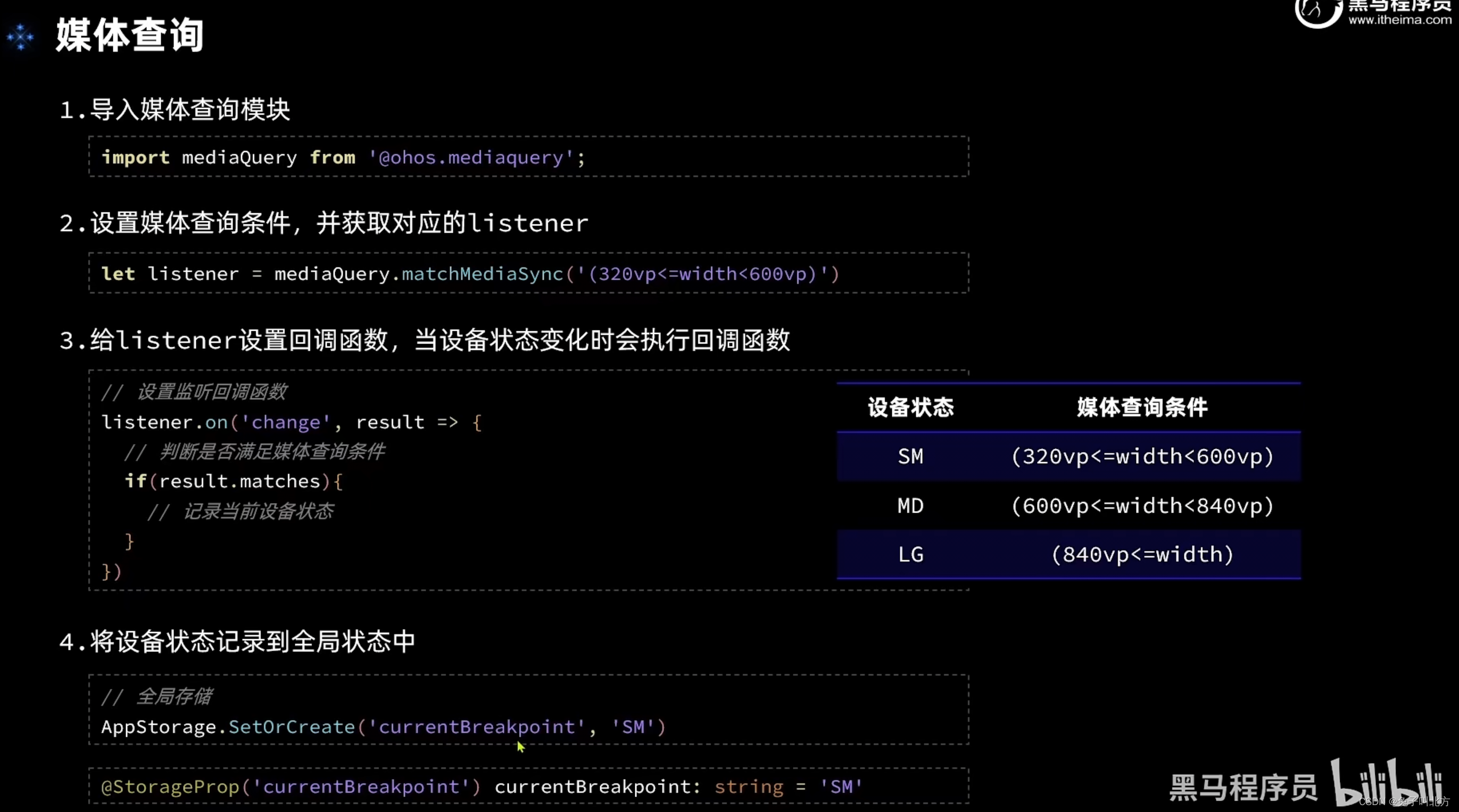
在华为开发者联盟中的开发文档中我们可以得到关于媒体查询技术的详细使用步骤,有想深入了解的同学我会把链接放在这里供大家使用没错点这里
三、正式开发
不知道你还记不记得,我们最早几篇文章给大家提到过的,黑马已经为我们的这个实战项目提供了很多的资源
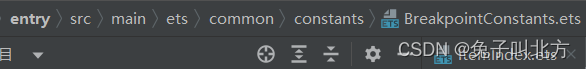
这个文件是黑马为这个项目提供的一个常量,并且在里面标记好了一些设备的状态
export default class BreakpointConstants {
  /**
   * 小屏幕设备的 Breakpoints 标记.
   */
  static readonly BREAKPOINT_SM: string = 'sm';

  /**
   * 中等屏幕设备的 Breakpoints 标记.
   */
  static readonly BREAKPOINT_MD: string = 'md';

  /**
   * 大屏幕设备的 Breakpoints 标记.
   */
  static readonly BREAKPOINT_LG: string = 'lg';

  /**
   * 当前设备的 breakpoints 存储key
   */
  static readonly CURRENT_BREAKPOINT: string = 'currentBreakpoint';

  /**
   * 小屏幕设备宽度范围.
   */
  static readonly RANGE_SM: string = '(320vp<=width<600vp)';

  /**
   * 中屏幕设备宽度范围.
   */
  static readonly RANGE_MD: string = '(600vp<=width<840vp)';

  /**
   * 大屏幕设备宽度范围.
   */
  static readonly RANGE_LG: string = '(840vp<=width)';

  static readonly BAR_POSITION: BreakpointType<BarPosition> = new BreakpointType({
    sm: BarPosition.End,
    md: BarPosition.Start,
    lg: BarPosition.Start,
  })
}
有了这样一个常量我们就可以编写一个工具类了,我们新建下图这样的一个ets文件
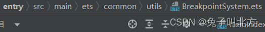
在这个工具类中我们去完成监听器的定义和使用
export default class BreakpointSystem{

  private smListener: mediaQuery.MediaQueryListener = mediaQuery.matchMediaSync(BreakpointConstants.RANGE_SM)
  private mdListener: mediaQuery.MediaQueryListener = mediaQuery.matchMediaSync(BreakpointConstants.RANGE_MD)
  private lgListener: mediaQuery.MediaQueryListener = mediaQuery.matchMediaSync(BreakpointConstants.RANGE_LG)

  smListenerCallback(result: mediaQuery.MediaQueryResult){
    if(result.matches){
      this.updateCurrentBreakpoint(BreakpointConstants.BREAKPOINT_SM)
    }
  }

  mdListenerCallback(result: mediaQuery.MediaQueryResult){
    if(result.matches){
      this.updateCurrentBreakpoint(BreakpointConstants.BREAKPOINT_MD)
    }
  }

  lgListenerCallback(result: mediaQuery.MediaQueryResult){
    if(result.matches){
      this.updateCurrentBreakpoint(BreakpointConstants.BREAKPOINT_LG)
    }
  }

  updateCurrentBreakpoint(breakpoint: string){
    AppStorage.SetOrCreate(BreakpointConstants.CURRENT_BREAKPOINT, breakpoint)
  }

  register(){
    this.smListener.on('change', this.smListenerCallback.bind(this))
    this.mdListener.on('change', this.mdListenerCallback.bind(this))
    this.lgListener.on('change', this.lgListenerCallback.bind(this))
  }

  unregister(){
    this.smListener.off('change', this.smListenerCallback.bind(this))
    this.mdListener.off('change', this.mdListenerCallback.bind(this))
    this.lgListener.off('change', this.lgListenerCallback.bind(this))
  }
}
我们在首页中声明它
private breakpointSystem: BreakpointSystem = new BreakpointSystem()
并且给它做一个初始化操作(函数注册)
  aboutToAppear(){
    this.breakpointSystem.register()
  }

  aboutToDisappear(){
    this.breakpointSystem.unregister()
  }
并且获取屏幕状态的变更
@StorageProp('currentBreakpoint') currentBreakpoint: string = BreakpointConstants.BREAKPOINT_SM
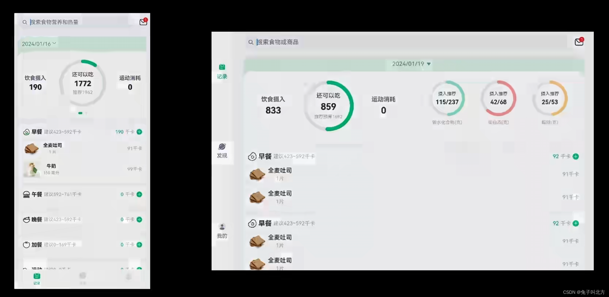
其实做到这个部分,页面随着设备的不同已经呈现出一种较为正常的状态(不是单纯的拉伸)
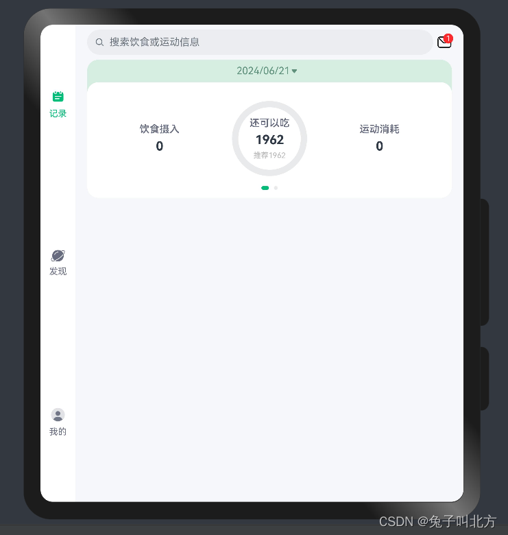
但是多设备响应式布局的响应式的意思就是在不同的设备上的样式等也会随之响应发生变化,那么接下来我们完成响应式布局,比如导航栏的位置、滑动页面等修改
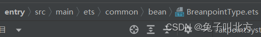
首先添加一个断点类型
declare interface BreakpointTypeOptions<T>{
  sm?:T,
  md?:T,
  lg?:T
}

export default class BreakpointType<T>{
  options: BreakpointTypeOptions<T>

  constructor(options: BreakpointTypeOptions<T>) {
    this.options = options
  }

  getValue(breakpoint: string): T{
    return this.options[breakpoint]
  }
}
对首页完成响应式布局
import BreakpointType from '../common/bean/BreanpointType'
import BreakpointConstants from '../common/constants/BreakpointConstants'
import { CommonConstants } from '../common/constants/CommonConstants'
import BreakpointSystem from '../common/utils/BreakpointSystem'
import RecordIndex from '../view/record/RecordIndex'

@Entry
@Component
struct Index {
  @State currentIndex: number = 0
  private breakpointSystem: BreakpointSystem = new BreakpointSystem()
  @StorageProp('currentBreakpoint') currentBreakpoint: string = BreakpointConstants.BREAKPOINT_SM

  @State isPageShow: boolean = false

  onPageShow(){
    this.isPageShow = true
  }
  onPageHide(){
    this.isPageShow = false
  }

  @Builder TabBarBuilder(title: ResourceStr, image: ResourceStr, index: number) {
    Column({ space: CommonConstants.SPACE_8 }) {
      Image(image)
        .width(22)
        .fillColor(this.selectColor(index))
      Text(title)
        .fontSize(14)
        .fontColor(this.selectColor(index))
    }
  }

  aboutToAppear(){
    this.breakpointSystem.register()
  }

  aboutToDisappear(){
    this.breakpointSystem.unregister()
  }

  selectColor(index: number) {
    return this.currentIndex === index ? $r('app.color.primary_color') : $r('app.color.gray')
  }

  build() {
    Tabs({ barPosition: BreakpointConstants.BAR_POSITION.getValue(this.currentBreakpoint) }) {
      TabContent() {
        RecordIndex({isPageShow: this.isPageShow})
      }
      .tabBar(this.TabBarBuilder($r('app.string.tab_record'), $r('app.media.ic_calendar'), 0))

      TabContent() {
        Text('发现页面')
      }
      .tabBar(this.TabBarBuilder($r('app.string.tab_discover'), $r('app.media.discover'), 1))

      TabContent() {
        Text('我的主页')
      }
      .tabBar(this.TabBarBuilder($r('app.string.tab_user'), $r('app.media.ic_user_portrait'), 2))

    }
    .width('100%')
    .height('100%')
    .onChange(index => this.currentIndex = index)
    .vertical(new BreakpointType({
      sm: false,
      md: true,
      lg: true
    }).getValue(this.currentBreakpoint))
  }
}
为滑动卡片完成响应式布局(平铺)
import BreakpointType from '../../common/bean/BreanpointType'
import BreakpointConstants from '../../common/constants/BreakpointConstants'
import { CommonConstants } from '../../common/constants/CommonConstants'
import DateUtil from '../../common/utils/DateUtil'
import RecordService from '../../service/RecordService'
import RecordVO from '../../viewmodel/RecordVO'
import StatsInfo from '../../viewmodel/StatsInfo'
import CalorieStats from './CalorieStats'
import DatePickDialog from './DatePickDialog'
import NutrientStats from './NutrientStats'

@Component
export default struct StatsCard {

  @StorageProp('selectedDate') selectedDate: number = DateUtil.beginTimeOfDay(new Date())
  @StorageProp('currentBreakpoint') currentBreakpoint: string = BreakpointConstants.BREAKPOINT_SM

  @Consume @Watch('handleRecordsChange') records: RecordVO[]
  @State info: StatsInfo = new StatsInfo()

  handleRecordsChange(){
    this.info = RecordService.calculateStatsInfo(this.records)
  }

  controller: CustomDialogController = new CustomDialogController({
    builder: DatePickDialog({selectedDate: new Date(this.selectedDate)})//回写到弹窗
  })
  build() {
    Column(){
      // 1.日期信息
      Row(){
        Text(DateUtil.formatDate(this.selectedDate))
          .fontColor($r('app.color.secondary_color'))
        Image($r('app.media.ic_public_spinner'))
          .width(20)
          .fillColor($r('app.color.secondary_color'))
      }
      .padding(CommonConstants.SPACE_8)
      .onClick(() => this.controller.open())

      // 2.统计信息
      Swiper(){
        // 2.1.热量统计
        CalorieStats({intake: this.info.intake, expend: this.info.expend})
        // 2.2.营养素统计
        NutrientStats({carbon: this.info.carbon, protein: this.info.protein, fat: this.info.fat})
      }
      .width('100%')
      .backgroundColor(Color.White)
      .borderRadius(CommonConstants.DEFAULT_18)
      .indicatorStyle({selectedColor: $r('app.color.primary_color')})
      .displayCount(new BreakpointType({
        sm: 1,
        md: 1,
        lg: 2
      }).getValue(this.currentBreakpoint))
    }
    .width(CommonConstants.THOUSANDTH_940)
    .backgroundColor($r('app.color.stats_title_bgc'))
    .borderRadius(CommonConstants.DEFAULT_18)
  }
}
四、最终效果
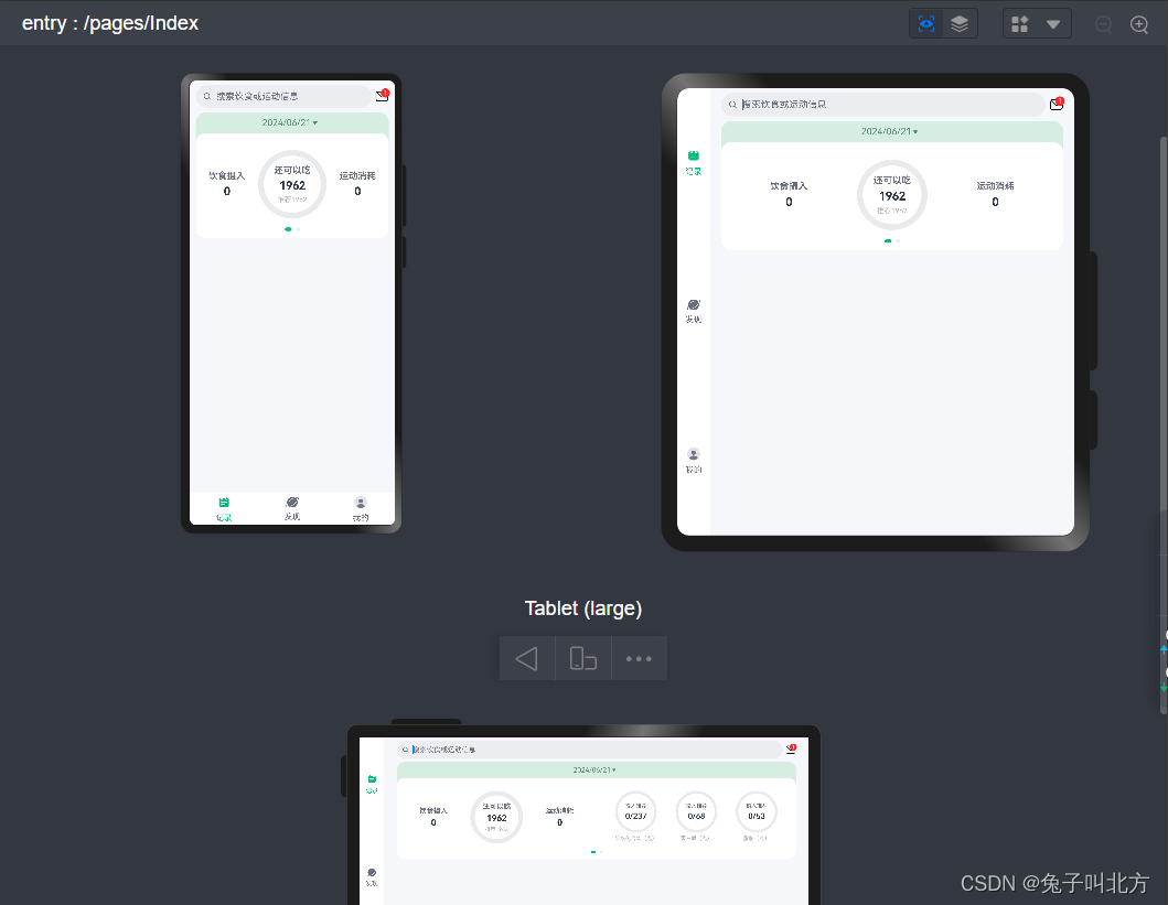
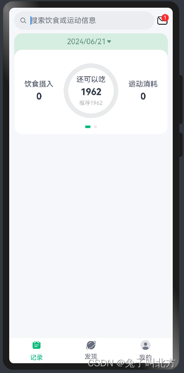
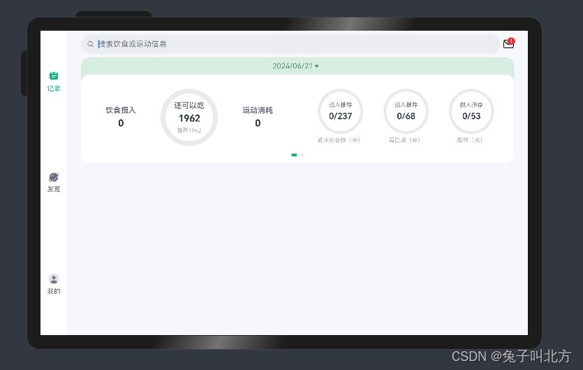
这一部分确实很麻烦,但是完成了这一步就代表你的软件可以非常正常的显示在不同的设备上,比如我们点开预览器来查看一下不同设备下的布局样式
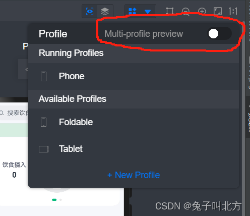
点击预览器
点这个
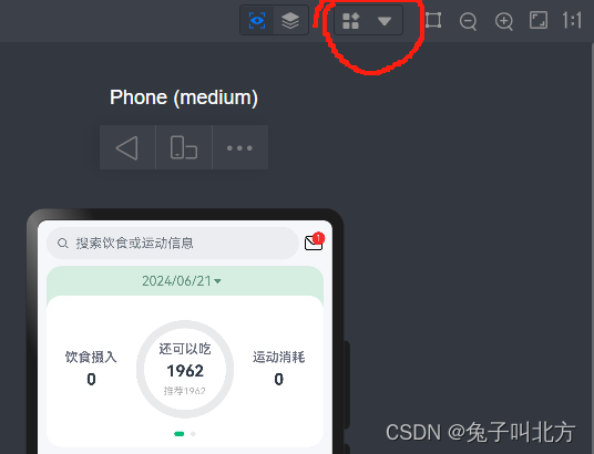
点这个
这样你就可以看到不同设备下的响应式布局了
OK,我们下篇文章接着讲,我们这里附上黑马程序员一次开发多端部署的视频链接,文章配合视频更好理解哦。


 1万+
1万+


 被折叠的 条评论
为什么被折叠?
被折叠的 条评论
为什么被折叠?
 到【灌水乐园】发言


