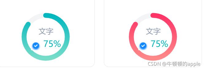
啥也不说,先看效果
1. 安装
npm install @antv/f2 --save
2. 在使用图标的页面引入
import F2 from '@antv/f2'
3. template中构建要渲染的容器(这里我循环渲染两个图形,通过动态绑定id区别要渲染的图)
<div class="common_wrap data_wrap">
	<div class="common_item item" v-for="(item, index) in 2" :key="index">
		<canvas :id="'data_chart' + index"></canvas>
	</div>
</div>
4. script中初始化容器(别忘了mounted中调用下面方法)
// 进度环形图(数据概览)
initDataChart() {
for(let i = 0; i < 2; i++) {
const chart = new F2.Chart({
id: `data_chart${i}`, // 动态容器id
pixelRatio: window.devicePixelRatio,
width: 92, // 渲染宽度
height: 92, // 渲染高度
padding: [0, 0, 0, 0] // 分别设置上、右、下、左边距
})
const data = [{
x: '1',
y: 85
}]
chart.source(data, {
y: {
max: 100,
min: 0
}
})
chart.axis(false) // 不展示x, y轴
chart.tooltip(false) // 不展示tooltip
chart.coord('polar', { // 环形图有色彩部分相关设置
transposed: true,
innerRadius: 0.8,
radius: 0.85
})
chart.guide().arc({ // 环形图底部相关设置
start: [0, 0],
end: [1, 99.98],
top: false,
style: {
lineWidth: 8,
stroke: 'rgba(195,201,212,0.2)'
}
})
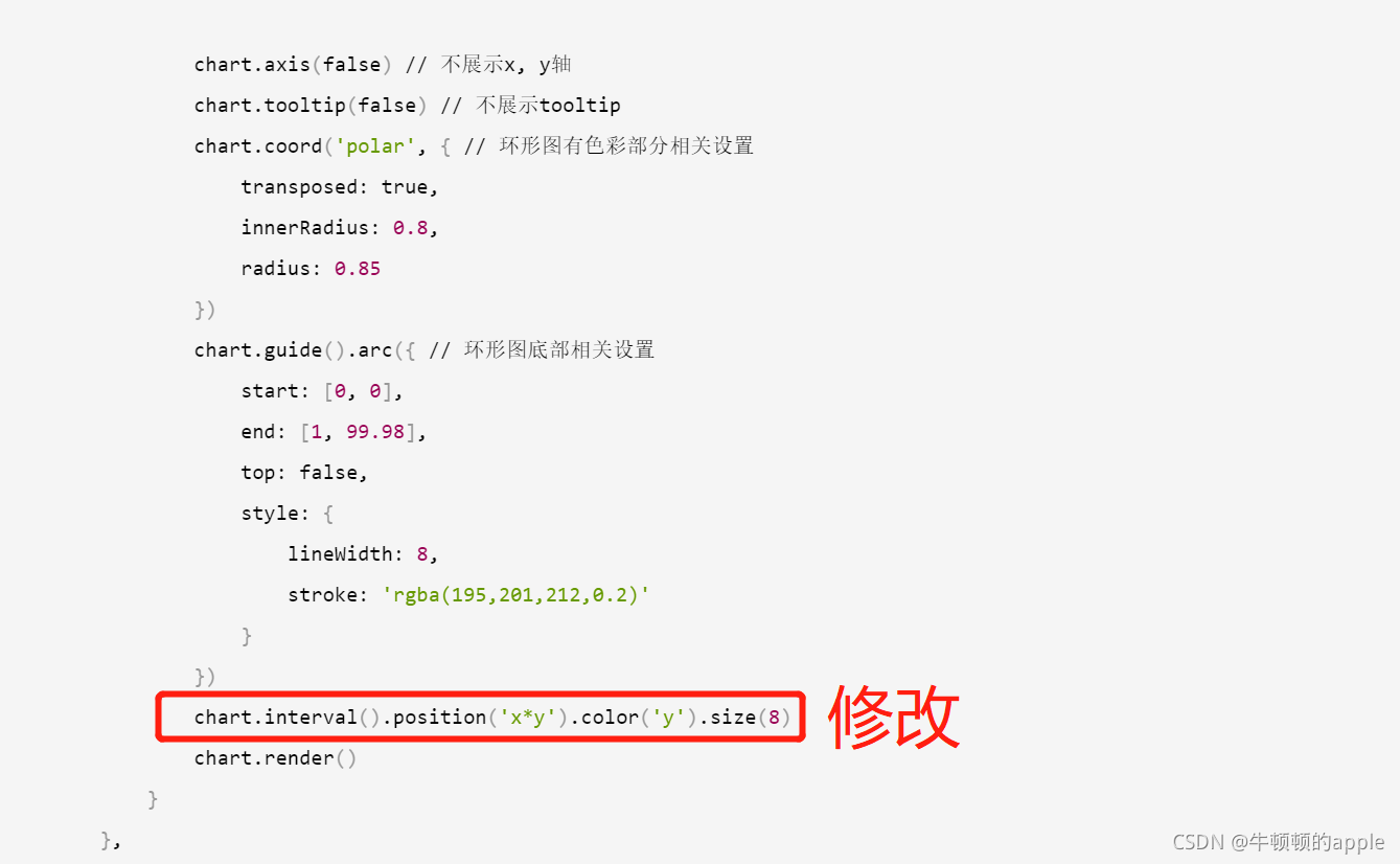
chart.interval().position('x*y').color('y').size(8)
chart.render()
}
},
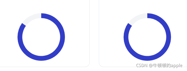
以上是初步渲染一个环形图样式,渲染出来将会是这样,此时没有达到我们想要的颜色渐变,圆角,插入自定义文字图片等,接下来我们就逐步来实现这些自定义功能
颜色渐变
修改上面代码为下面代码,因为是两个不同的,我们顺便区分下颜色
		if (i % 2 === 0) {
			chart.interval().position('x*y').color('l(90) 0:#00B7BF 1:#77DDC9').size(8)
		} else {
			chart.interval().position('x*y').color('l(90) 0:#FF3366 1:#FF8989').size(8)
		}
增加圆角
在上面循环之前,注入自定义的shape
// 在import引入处加入
const Shape = F2.Shape
const G = F2.G
const Util = F2.Util
const Global = F2.Global
const Vector2 = G.Vector2

initDataChart() {
	Shape.registerShape('interval', 'tick', {
		draw: function draw(cfg, container) {
			const points = this.parsePoints(cfg.points)
			const style = Util.mix({
				stroke: cfg.color
			}, Global.shape.interval, cfg.style)
			if (cfg.isInCircle) {
				let newPoints = points.slice(0)
				if (this._coord.transposed) {
					newPoints = [points[0], points[3], points[2], points[1]]
				}

				const _cfg$center = cfg.center,
					x = _cfg$center.x,
					y = _cfg$center.y

				const v = [1, 0]
				const v0 = [newPoints[0].x - x, newPoints[0].y - y]
				const v1 = [newPoints[1].x - x, newPoints[1].y - y]
				const v2 = [newPoints[2].x - x, newPoints[2].y - y]

				let startAngle = Vector2.angleTo(v, v1)
				let endAngle = Vector2.angleTo(v, v2)
				const r0 = Vector2.length(v0)
				const r = Vector2.length(v1)
				if (startAngle >= 1.5 * Math.PI) {
					startAngle = startAngle - 2 * Math.PI
				}

				if (endAngle >= 1.5 * Math.PI) {
					endAngle = endAngle - 2 * Math.PI
				}

				const lineWidth = r - r0
				const newRadius = r - lineWidth / 2

				return container.addShape('Arc', {
					className: 'interval',
					attrs: Util.mix({
						x,
						y,
						startAngle,
						endAngle,
						r: newRadius,
						lineWidth,
						lineCap: 'round'
					}, style)
				})
			}
		}
	})

// ...for 上面的for循环代码处
	for(let i = 0; i < 2; i++) {

	// 在配置颜色后面加入
		chart.interval().position('x*y').color('l(90) 0:#00B7BF 1:#77DDC9')
		.size(8)
		.shape('tick') // 这个也要加上
		.animate({
			appear: {
				duration: 1200,
				easing: 'cubicIn',
				animation: function animation(shape, animateCfg) { // !!!这里用来显示圆角的代码
					const startAngle = shape.attr('startAngle');
					const endAngle = shape.attr('endAngle');
					shape.attr('endAngle', startAngle);
					shape.animate().to(Util.mix({
						attrs: {
							endAngle
						}
					}, animateCfg)).onUpdate(function(frame) {
					});
				}
			}
		})
	}
}
自定义插入文字图片等
	chart.guide().html({
		position: [ '50%', '45%' ],
		html: `<div style="width: 250px;height: 40px;text-align: center;">
		<div style="font-family: PingFangSC-Regular;font-size: 12px;color: #8D99AE;margin-top: 6px;">自定义文字</div>
			<div style="font-family: PingFangSC-Medium;font-size: 14px;color: #00B7BF;">
			<img src="图片地址" style="width: 16px;height: 16px;" />
			75%
			</div>
		</div>`
	})
综上,完整代码如下:
initDataChart() {
	Shape.registerShape('interval', 'tick', {
		draw: function draw(cfg, container) {
			const points = this.parsePoints(cfg.points)
			const style = Util.mix({
				stroke: cfg.color
			}, Global.shape.interval, cfg.style)
			if (cfg.isInCircle) {
				let newPoints = points.slice(0)
				if (this._coord.transposed) {
					newPoints = [points[0], points[3], points[2], points[1]]
				}

				const _cfg$center = cfg.center,
					x = _cfg$center.x,
					y = _cfg$center.y

				const v = [1, 0]
				const v0 = [newPoints[0].x - x, newPoints[0].y - y]
				const v1 = [newPoints[1].x - x, newPoints[1].y - y]
				const v2 = [newPoints[2].x - x, newPoints[2].y - y]

				let startAngle = Vector2.angleTo(v, v1)
				let endAngle = Vector2.angleTo(v, v2)
				const r0 = Vector2.length(v0)
				const r = Vector2.length(v1)
				if (startAngle >= 1.5 * Math.PI) {
					startAngle = startAngle - 2 * Math.PI
				}

				if (endAngle >= 1.5 * Math.PI) {
					endAngle = endAngle - 2 * Math.PI
				}

				const lineWidth = r - r0
				const newRadius = r - lineWidth / 2

				return container.addShape('Arc', {
					className: 'interval',
					attrs: Util.mix({
						x,
						y,
						startAngle,
						endAngle,
						r: newRadius,
						lineWidth,
						lineCap: 'round'
					}, style)
				})
			}
		}
	})

	for(let i = 0; i < 4; i++) {
		const chart = new F2.Chart({
			id: `data_chart${i}`,
			pixelRatio: window.devicePixelRatio,
			width: 92,
			height: 92,
			padding: [0, 0, 0, 0] // 分别设置上、右、下、左边距
		})
		const data = [{
			x: '1',
			y: 85
		}]
		chart.source(data, {
			y: {
				max: 100,
				min: 0
			}
		})

		chart.axis(false)
		chart.tooltip(false)
		chart.coord('polar', {
			transposed: true,
			innerRadius: 0.8,
			radius: 0.85
		})
		chart.guide().arc({
			start: [0, 0],
			end: [1, 99.98],
			top: false,
			style: {
				lineWidth: 8,
				stroke: 'rgba(195,201,212,0.2)'
			}
		})
		chart.guide().html({
			position: [ '50%', '45%' ],
			html: `<div style="width: 250px;height: 40px;text-align: center;">
						<div style="font-family: PingFangSC-Regular;font-size: 12px;color: #8D99AE;margin-top: 6px;">文字</div>
						<div style="font-family: PingFangSC-Medium;font-size: 14px;color: #00B7BF;">
						<img src="图片地址" style="width: 16px;height: 16px;" />
						75%
						</div>
					</div>`
		})

		if (i % 2 === 0) {
			chart.interval().position('x*y').color('l(90) 0:#00B7BF 1:#77DDC9')
				.size(8)
				.shape('tick')
				.animate({
					appear: {
						duration: 1200,
						easing: 'cubicIn',
						animation: function animation(shape, animateCfg) {
							const startAngle = shape.attr('startAngle');
							const endAngle = shape.attr('endAngle');
							shape.attr('endAngle', startAngle);
							shape.animate().to(Util.mix({
								attrs: {
									endAngle
								}
							}, animateCfg)).onUpdate(function(frame) {
							});
						}
					}
				})
		} else {
			chart.interval().position('x*y').color('l(90) 0:#FF3366 1:#FF8989')
				.size(8)
				.shape('tick')
				.animate({
					appear: {
						duration: 1200,
						easing: 'cubicIn',
						animation: function animation(shape, animateCfg) {
							const startAngle = shape.attr('startAngle');
							const endAngle = shape.attr('endAngle');
							shape.attr('endAngle', startAngle);
							shape.animate().to(Util.mix({
								attrs: {
									endAngle
								}
							}, animateCfg)).onUpdate(function(frame) {
							});
						}
					}
				})
		}
		chart.render()
	}
}
我替你们把坑都踩完了,点个赞吧^^


 7799
7799


 被折叠的 条评论
为什么被折叠?
被折叠的 条评论
为什么被折叠?
 到【灌水乐园】发言


