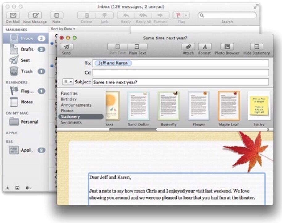
《iOS Human Interface Guidelines》——Case Study:From Desktop to iOS

案例学习:从桌面到iOS


iPad端的Keynote


桌面端的Keynote是一款强大的、灵活的创造世界级幻灯片的app。人们因Keynote很好地结合易于使用与无数细节打造的细粒度控制而喜爱它,比如动画和文本属性。


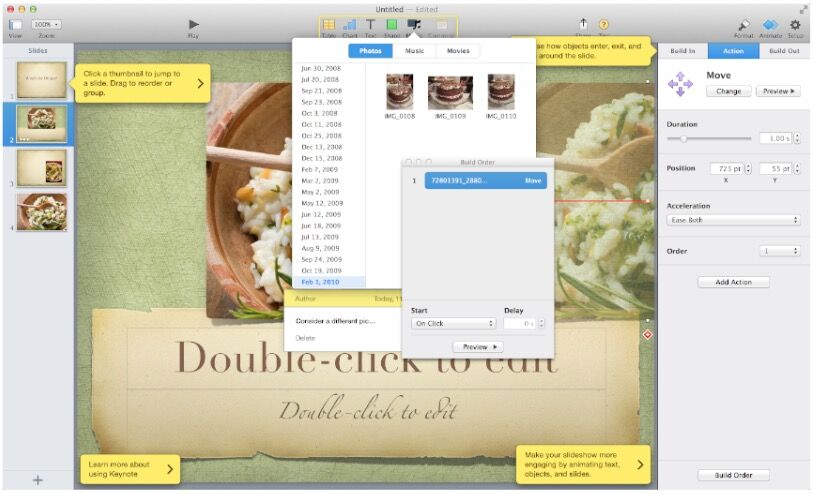
iPad端的Keynote把握了桌面端Keynote的精华,并通过创造如下的用户体验使其在iPad上宾至如归:

  • 专注于用户的内容
  • 降低复杂性而不减少功能
  • 提供快捷方式
  • 改编桌面端体验上熟悉的内容
  • 通过生动的动画提供反馈和交流

由于通过使用iPad原生的模式来提供期待的功能,Keynonte用户能够很快明白如何在iPad上使用app。新用户也能很容易地学会如何在iPad上使用Keynote,因为他们可以通过简单、自然的方式直接操控他们的内容。

Keynote从桌面端到iPad端的转变是基于无数从细微到深入的修改和重设计的。这里是一些最明显的适应性改编:

一个精简的工具栏。工具栏上只有少量的元素,但它们使用户能够始终获取他们创造内容所需要的功能和工具。


一个简化的、主次排列的检查器来响应用户的关注。iPad端的Keynote检查器会自动包含人们在修改所选中的物体的时候需要的工具和属性。基本上人们可以在检查器的第一页获取他们需要的所有内容。如果他们需要修改一些较少改变的属性,他们可以继续到别的检查器界面获取。


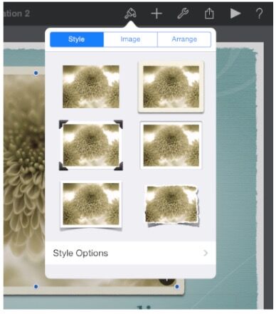
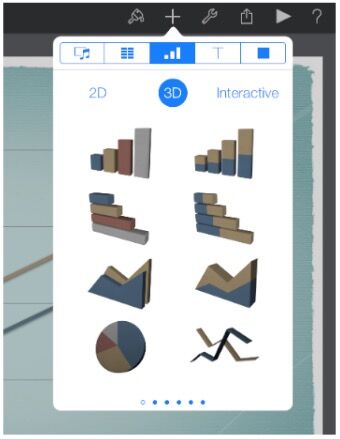
很多的预置风格集合。人们可以通过预置的风格来简单地改变物体的外观和感觉,例如图标和表格。除了颜色方案,每种集合都包括了对应风格的属性,比如表头和坐标轴标识,它们被设计成与所有主题相协调。


直接操控内容,并且配有合乎意义的动画。在iPad端的Keynote上,用户拖动幻灯片使其到新的位置,扭转物体使其旋转,以及点击图片来选中它。直接操控的印象为iPad端的Keynote执行的响应动画所加强。比如说,当用户移动幻灯片时,它会轻轻地震动一下,当他们将幻灯片放置到一个新的位置时,周围的幻灯片会像波纹一下向外扩展来给它提供空间。


iPhone端的邮件


在OS X系统中邮件是最高可见的、好用的以及受赞誉的app之一。它也是一个非常强大的创建、接收、排序、存储邮件;追踪行动项目和活动;创建备注和请帖的程序。桌面端的邮件使用了很多的视窗来呈现这些强大的功能。


iPhone端的邮件专注于桌面端邮件的核心功能,帮助人们接收、创建、发送和管理他们的邮件。iPhone端的邮件使用了如下为移动端体验定制的UI来提供这些浓缩的功能:

  • 流线型的外观使人们的内容前置居中
  • 为不同的任务设计不同的视图
  • 可以轻松缩放的直觉性的信息结构
  • 在需要的时候提供强大的编辑和管理工具
  • 使用精妙而有表现力的动画来与动作交互并提供反馈

要认识到iPhone端的邮件并不是一个比桌面端邮件更好的app,而是一个重新为移动端用户设计的邮件app。通过集中精力与桌面端的部分特性并使用愈加迷人的UI展示它们,当他们使用移动端的时候,iPhone端的邮件给予了人们邮件的核心体验。

为了使邮件的体验符合移动端的环境,iPhone端的邮件使用了很多关键的方式创新UI。

清晰的、高关注度的屏幕。每个屏幕都展示了邮件体验的一部分:账户列表、邮箱列表、邮件列表、邮件视图以及新建邮件视图。在一个屏幕上,用户可以滑动查看所有内容。


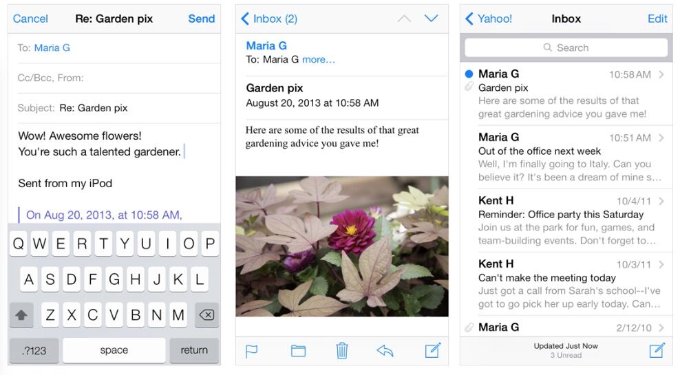
简单、可预测的导航。点击每一个屏幕,人们会从一般界面(账户列表)进入到特殊界面(邮件视图)。每个屏幕都展示了一个标题来告诉人们他们在哪,以及一个返回按钮使人们可以简单地回到之前的步骤。

简单、可点击的控件会在需要的时候显示。因为创建一封新邮件以及检查新邮件是人们也许会在任何环境下都想要的基本功能,iPhone端的邮件使它们在很多屏幕上均可获取。当人们查看一封邮件时,诸如回复、移动和删除功能都是可获取的,因为他门正在操作一封邮件。

不同的任务有不同类型的反馈。当人们删除一封邮件时,它会有进入删除按钮的动画。当人们发送一封邮件时,他们可以看到这个过程;当发送结束时,他们可以听到一声有特色的声音。通过查看邮件列表工具栏的精细文本时,人们可以瞥一眼就知道他们的邮箱上一次更新是什么时候。


iOS端的Web内容

iOS端的Safari提供了iOS设备中杰出的移动Web浏览体验。人们欣赏其简明的文字、锐利的图片以及通过旋转设备或点击屏幕来调整他们的界面的能力。

标准的网页能在iOS设备上良好地显示。特别是那些识别设备并且不使用插入式的网页可以在iPhone和iPad上都显示得很棒,即使需要调整也只是一点点。

除此之外,最成功的网页有以下特性:
  • 如果网页的宽度需要匹配设备的宽度的话,为设备设置合适的窗口
  • 不要使用CSS固定定位,这样当用户调整视图的时候内容就不会移出屏幕
  • 使用不依赖于点交互的基于触摸的UI

有时候,其他的修改也会合适。比如说,网页程序总是设置适当的窗口宽度并隐藏iOS端Safari的UI。查看Safari Web Content Guide中的Configuting the Viewport和Configuring Web Applications学习如何做这些修改。

网页也可以使用其他方式来使桌面Web体验适应iOS端的Safari:

协调iOS端Safari中的键盘。当键盘和格式助手可见的时候,iPhone中的Safari会在URL文本内容以下、键盘和格式助手以上的区域显示你的网页。

协调iOS端Safari中的弹出菜单控件。在桌面端的Safari中,包含大量内容的弹出菜单会像在OS X的app中一样显示;也就是说,菜单会打开来显示所有的内容,如果必须的话甚至会超出窗口的边界。而对于iOS端的Safari,弹出菜单是使用原生的元素显示的,因而提供了一个更好的体验。比如说,在iPhone上,弹出菜单通过一个选取器(一个用户可选的内容组成的列表)来显示。(查看Picker学习更多关于选取器控件的内容)。


本文翻译自 苹果官方开发文档

Introduction Introduction 9 At a Glance 9 Great iOS Apps Embrace the Platform and HI Design Principles 9 Great App Design Begins with Some Clear Definitions 10 A Great User Experience Is Rooted in Your Attention to Detail 10 People Expect to Find iOS Technologies in the Apps They Use 10 All Apps Need at Least Some Custom Artwork 11 Chapter 1 Platform Characteristics 13 The Display Is Paramount, Regardless of Its Size 13 Device Orientation Can Change 14 Apps Respond to Gestures, Not Clicks 14 People Interact with One App at a Time 15 Preferences Are Available in Settings 16 Onscreen User Help Is Minimal 16 Most iOS Apps Have a Single Window 17 Two Types of Software Run in iOS 17 Safari on iOS Provides the Web Interface 18 Chapter 2 Human Interface Principles 21 Aesthetic Integrity 21 Consistency 21 Direct Manipulation 22 Feedback 22 Metaphors 22 User Control 23 Chapter 3 App Design Strategies 25 Create an Application Definition Statement 25 1. List All the Features You Think Users Might Like 25 2. Determine Who Your Users Are 26 3. Filter the Feature List Through the Audience Definition 26 4. Don’t Stop There 26 Design the App for the Device 27 Embrace iOS UI Paradigms 27 Ensure that Universal Apps Run Well on Both iPhone and iPad 28 Reconsider Web-Based Designs 28 Tailor Customization to the Task 29 Prototype and Iterate 31 Chapter 4 Case Studies: Transitioning to iOS 33 From Mail on the Desktop to Mail on iPhone 33 From Keynote on the Desktop to Keynote on iPad 35 From Mail on iPhone to Mail on iPad 38 From a Desktop Browser to Safari on iOS 41 Chapter 5 User Experience Guidelines 47 Focus on the Primary Task 47 Elevate the Content that People Care About 48 Think Top Down 48 Give People a Logical Path to Follow 48 Make Usage Easy and Obvious 49 Use User-Centric Terminology 50 Minimize the Effort Required for User Input 50 Downplay File-Handling Operations 50 Enable Collaboration and Connectedness 51 De-emphasize Settings 52 Brand Appropriately 53 Make Search Quick and Rewarding 53 Entice and Inform with a Well-Written Description 54 Be Succinct 55 Use UI Elements Consistently 55 Consider Adding Physicality and Realism 56 Delight People with Stunning Graphics 57 Handle Orientation Changes 58 Make Targets Fingertip-Size 60 Use Subtle Animation to Communicate 61 Support Gestures Appropriately 62 Ask People to Save Only When Necessary 63 Make Modal Tasks Occasional and Simple 63 Start Instantly 64 Always Be Prepared to Stop 65 Don’t Quit Programmatically 65 If Necessary, Display a License Agreement or Disclaimer 65 For iPad: Enhance Interactivity (Don’t Just Add Features) 66 For iPad: Reduce Full-Screen Transitions 66 For iPad: Restrain Your Information Hierarchy 67 For iPad: Consider Using Popovers for Some Modal Tasks 69 For iPad: Migrate Toolbar Content to the Top 70 Chapter 6 iOS Technology Usage Guidelines 73 iCloud Storage 73 Multitasking 74 Notification Center 76 Printing 80 iAd Rich Media Ads 81 Quick Look Document Preview 87 Sound 88 Understand User Expectations 88 Define the Audio Behavior of Your App 89 Manage Audio Interruptions 93 Handle Media Remote Control Events, if Appropriate 94 VoiceOver and Accessibility 95 Edit Menu 96 Undo and Redo 98 Keyboards and Input Views 99 Location Services 99 Chapter 7 iOS UI Element Usage Guidelines 101 Bars 101 The Status Bar 101 Navigation Bar 102 Toolbar 105 Tab Bar 106 Content Views 108 Popover (iPad Only) 108 Split View (iPad Only) 111 Table View 113 Text View 121 Web View 122 Container View Controller 123 Alerts, Action Sheets, and Modal Views 123 Alert 123 Action Sheet 127 Modal View 130 Controls 133 Activity Indicator 133 Date and Time Picker 133 Detail Disclosure Button 134 Info Button 135 Label 135 Network Activity Indicator 136 Page Indicator 136 Picker 137 5 2011-10-12 | . 2011 Apple Inc. All Rights Reserved. CONTENTS Progress View 138 Rounded Rectangle Button 139 Scope Bar 139 Search Bar 140 Segmented Control 141 Slider 142 Stepper 143 Switch 143 Text Field 144 System-Provided Buttons and Icons 145 Standard Buttons for Use in Toolbars and Navigation Bars 145 Standard Icons for Use in Tab Bars 148 Standard Buttons for Use in Table Rows and Other UI Elements 149 Chapter 8 Custom Icon and Image Creation Guidelines 151 Tips for Designing Great Icons and Images 152 Tips for Creating Great Artwork for the Retina Display 153 Tips for Creating Resizable Images 154 Application Icons 155 Launch Images 157 Small Icons 159 Document Icons 160 Document Icon Specifications for iPhone 160 Document Icon Specifications for iPad 161 Web Clip Icons 163 Icons for Navigation Bars, Toolbars, and Tab Bars 164 Newsstand Icons 166 Document Revision History 169
评论
添加红包

请填写红包祝福语或标题

红包个数最小为10个

红包金额最低5元

当前余额3.43前往充值 >
需支付:10.00
成就一亿技术人!
领取后你会自动成为博主和红包主的粉丝 规则
hope_wisdom
发出的红包
实付
使用余额支付
点击重新获取
扫码支付
钱包余额 0

抵扣说明:

1.余额是钱包充值的虚拟货币,按照1:1的比例进行支付金额的抵扣。
2.余额无法直接购买下载,可以购买VIP、付费专栏及课程。

余额充值