


转载请标明出处:http://blog.csdn.net/donkor_/article/details/78819081
前言:
最近做了一个纯Kotlin开发的Android开源软件,“DeepNight-in-kotlin,陪你度过每一个深夜”,刚好用到了Material Design设计风格。功能完善好,代码简单贴一下,方便日后查看和使用。
本文demo包含以下要点:
DrawerLayout+NavigationView+ToolBar的使用
Fragment简单封装,实现懒加载
下面看下效果图。
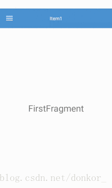
由上面的效果图可以看出,其中的布局包括3部分,主体布局,抽屉菜单未滑出时的显示布局 ,抽屉菜单的头部布局 ,抽屉菜单的菜单项布局
基本配置
在Project的 build.gradle 中的dependencies添加:
implementation 'com.android.support:design:26.1.0'主布局文件activity_main.xml
<?xml version="1.0" encoding="utf-8"?>
<android.support.v4.widget.DrawerLayout xmlns:android="http://schemas.android.com/apk/res/android"
    xmlns:app="http://schemas.android.com/apk/res-auto"
    android:layout_width="match_parent"
    android:layout_height="match_parent"
    android:id="@+id/drawer_layout">
    <!--主内容-->
    <include layout="@layout/toolbar_layout"/>
    <android.support.design.widget.NavigationView
        android:id="@+id/nav_view"
        android:layout_width="wrap_content"
        android:layout_height="match_parent"
        android:layout_gravity = "start"
        app:headerLayout="@layout/head_layout"
        app:itemBackground="?attr/colorPrimary"
        app:menu="@menu/menu">
    </android.support.design.widget.NavigationView>

</android.support.v4.widget.DrawerLayout>
注:可以看出除了DrawerLayout包裹了NavigationView控件,其中menu指的的是抽屉菜单菜项,headerLayout指的是抽屉菜单的头部布局
抽屉菜单header布局drawer_header.xml
<?xml version="1.0" encoding="utf-8"?>
<LinearLayout xmlns:android="http://schemas.android.com/apk/res/android"
    android:layout_width="match_parent"
    android:layout_height="match_parent"
    android:gravity="center"
    android:orientation="vertical"
    >

    <ImageView
        android:layout_width="wrap_content"
        android:layout_height="wrap_content"
        android:src="@mipmap/head_view"
        android:layout_marginTop="30dp"/>

    <TextView
        android:id="@+id/tv_user_name"
        android:layout_width="wrap_content"
        android:layout_height="wrap_content"
        android:layout_marginTop="10dp"
        android:text="Donkor" />
</LinearLayout>
抽屉菜单menu布局文件menu.xml
<?xml version="1.0" encoding="utf-8"?>
<menu xmlns:android="http://schemas.android.com/apk/res/android"
    xmlns:app="http://schemas.android.com/apk/res-auto">
    <group android:id="@+id/ground1">
        <item
            android:id="@+id/nav_item1"
            android:icon="@mipmap/icon_all"
            android:title="item1"
            app:showAsAction="ifRoom" />
    </group>
    <group android:id="@+id/ground2">
        <item
            android:id="@+id/nav_item2"
            android:icon="@mipmap/icon_bosom"
            android:title="item2"
            app:showAsAction="ifRoom" />
        <item
            android:id="@+id/nav_item3"
            android:icon="@mipmap/icon_buttocks"
            android:title="item3"
            app:showAsAction="ifRoom" />
        <item
            android:id="@+id/nav_item_stockings"
            android:icon="@mipmap/icon_stockings"
            android:title="item4"
            app:showAsAction="ifRoom" />
    </group>
</menu>
注:加了group的话,在drawerlayout里会以group为单位划线。
回过头,我们再来看看DrawerLayout下导入的toolbar_layout布局
<?xml version="1.0" encoding="utf-8"?>
<LinearLayout xmlns:android="http://schemas.android.com/apk/res/android"
    xmlns:app="http://schemas.android.com/apk/res-auto"
    android:layout_width="match_parent"
    android:layout_height="match_parent"
    android:orientation="vertical">

    <android.support.v7.widget.Toolbar
        android:id="@+id/toolbar"
        android:layout_width="match_parent"
        android:layout_height="wrap_content"
        android:background="@color/blue"
        app:contentInsetStart="0dp">

        <TextView
            android:id="@+id/tv_bar_title"
            android:layout_width="wrap_content"
            android:layout_height="wrap_content"
            android:layout_centerInParent="true"
            android:layout_gravity="center"
            android:text="Title"
            android:textColor="@android:color/white" />

    </android.support.v7.widget.Toolbar>

    <LinearLayout
        android:id="@+id/fl_content"
        android:layout_width="match_parent"
        android:layout_height="match_parent"
        android:orientation="vertical" />
</LinearLayout>
注:可以看到Toolbar控件包裹到TextView,该View用来做ToolBar标题。效果图中由于我们使用到了ToolBar的左侧图标,使用ToolBar自带的标题会导致标题不居中,所以不建议使用。底下的LinearLayout用作主体布局内容
注:综上Material Design的布局基本贴完。之后看下Theme自定义style。修改ToolBar左侧图标颜色
<resources>

    <!-- Base application theme. -->
    <style name="AppBaseTheme" parent="Theme.AppCompat.Light.NoActionBar">
        <!-- Customize your theme here. -->
        <item name="android:windowAnimationStyle">@style/AnimationActivity</item>
    </style>
    <!--Activity动画-->
    <style name="AnimationActivity" parent="@android:style/Animation.Activity">
        <item name="android:activityOpenEnterAnimation">@anim/slide_in_left</item>
        <item name="android:activityOpenExitAnimation">@anim/slide_out_left</item>
        <item name="android:activityCloseEnterAnimation">@anim/slide_in_right</item>
        <item name="android:activityCloseExitAnimation">@anim/slide_out_right</item>
    </style>
    <style name="AppTheme" parent="AppBaseTheme">
        <!-- Customize your theme here. -->
        <item name="colorPrimary">@android:color/white</item>
        <item name="colorPrimaryDark">@android:color/white</item>
        <!-- 溢出菜单图标颜色-->
        <item name="colorControlNormal">@android:color/white</item>
        <item name="colorAccent">@color/colorAccent</item>
        <item name="android:windowBackground">@android:color/white</item>
    </style>
</resources>
主布局Kotlin类MainActivity
package com.donkor.demo.materialdesign

import android.os.Bundle
import android.support.v4.app.Fragment
import android.support.v4.view.GravityCompat
import android.support.v7.app.ActionBarDrawerToggle
import android.support.v7.app.AppCompatActivity
import kotlinx.android.synthetic.main.activity_main.*
import kotlinx.android.synthetic.main.toolbar_layout.*

class MainActivity : AppCompatActivity() {

    private var firstFragment: FirstFragment? = null
    private var secondFragment: SecondFragment? = null
    private var threeFragment: ThreeFragment? = null

    override fun onCreate(savedInstanceState: Bundle?) {
        super.onCreate(savedInstanceState)
        setContentView(R.layout.activity_main)

        /*设置ActionBar
        *不使用toolbar自带的标题
        */
        toolbar.title = ""
        setSupportActionBar(toolbar)
        /*显示Home图标*/
        supportActionBar!!.setDisplayHomeAsUpEnabled(true)

        /*设置ToolBar标题,使用TestView显示*/
        tv_bar_title.text = "Item1"


        /*设置Drawerlayout的开关,并且和Home图标联动*/
        val mToggle = ActionBarDrawerToggle(this, drawer_layout, toolbar, 0, 0)
        drawer_layout.addDrawerListener(mToggle)
        /*同步drawerlayout的状态*/
        mToggle.syncState()


        /*设置监听器*/
        setListener()

        initFragment(savedInstanceState)
    }


    private fun initFragment(savedInstanceState: Bundle?) {
        if (savedInstanceState != null) {
            //异常情况
            val mFragments: List<Fragment> = supportFragmentManager.fragments
            for (item in mFragments) {
                if (item is FirstFragment) {
                    firstFragment = item
                }
                if (item is SecondFragment) {
                    secondFragment = item
                }
                if (item is ThreeFragment) {
                    threeFragment = item
                }
            }
        } else {
            firstFragment = FirstFragment()
            secondFragment = SecondFragment()
            threeFragment = ThreeFragment()
            val fragmentTrans = supportFragmentManager.beginTransaction()
            fragmentTrans.add(R.id.fl_content, firstFragment)
            fragmentTrans.add(R.id.fl_content, secondFragment)
            fragmentTrans.add(R.id.fl_content, threeFragment)
            fragmentTrans.commit()
        }
        supportFragmentManager.beginTransaction().show(firstFragment)
                .hide(secondFragment)
                .hide(threeFragment)
                .commit()
    }

    /*设置监听器*/
    private fun setListener() {
        nav_view.setNavigationItemSelectedListener { item ->
            when (item.itemId) {
                R.id.nav_item1 -> {
                    tv_bar_title.text = "Item1"
                    supportFragmentManager.beginTransaction().show(firstFragment)
                            .hide(secondFragment)
                            .hide(threeFragment)
                            .commit()
                }
                R.id.nav_item2 -> {
                    tv_bar_title.text = "Item2"
                    supportFragmentManager.beginTransaction().show(secondFragment)
                            .hide(firstFragment)
                            .hide(threeFragment)
                            .commit()
                }
                R.id.nav_item3 -> {
                    tv_bar_title.text = "Item3"
                    supportFragmentManager.beginTransaction().show(threeFragment)
                            .hide(firstFragment)
                            .hide(secondFragment)
                            .commit()
                }
            }
            drawer_layout.closeDrawer(GravityCompat.START)
            true
        }
    }
}
注:MainActivity中的注释写的很详细 ,这里不再做过多的解释
BaseFragment基类,实现懒加载
package com.donkor.demo.materialdesign

import android.os.Bundle
import android.support.v4.app.Fragment
import android.view.LayoutInflater
import android.view.View
import android.view.ViewGroup

/**
 * Created by donkor on 2017/12/16.
 */
abstract class BaseFragment : Fragment() {
    var rootView: View? = null
    override fun onCreateView(inflater: LayoutInflater?, container: ViewGroup?, savedInstanceState: Bundle?): View? {
        if (rootView == null) {
            rootView = inflater?.inflate(getLayoutResources(), container, false)
        }
        return rootView
    }

    override fun onViewCreated(view: View?, savedInstanceState: Bundle?) {
        super.onViewCreated(view, savedInstanceState)
        initView()
    }

    /**
     * 判断该Fragment是否显示在用户面前
     */
    override fun onHiddenChanged(hidden: Boolean) {
        super.onHiddenChanged(hidden)
        if (!hidden)
            loadData()

    }

    abstract fun getLayoutResources(): Int
    abstract fun initView()
    /**
     * 懒加载,当前Fragment显示的时候才进行网络请求
     * 如果数据不需要每次都刷新,可以先判断数据是否存在
     * 数据不存在 -> 进行网络请求    数据存在 -> 什么都不做
     */
    abstract fun loadData()

}
FirstFragment
class FirstFragment : BaseFragment() {
    override fun loadData() {
        //懒加载,当前Fragment显示的时候才进行网络请求
        //如果数据不需要每次都刷新,可以先判断数据是否存在
        //数据不存在 -> 进行网络请求    数据存在 -> 什么都不做
    }

    override fun getLayoutResources(): Int {
        return R.layout.fragment_frist
    }

    override fun initView() {
    }
}
Fragment的布局fragment_frist.xml
<?xml version="1.0" encoding="utf-8"?>
<LinearLayout xmlns:android="http://schemas.android.com/apk/res/android"
    android:layout_width="match_parent"
    android:layout_height="match_parent"
    android:orientation="vertical"
    android:layout_gravity="center"
    android:gravity="center">

   <TextView
       android:layout_width="wrap_content"
       android:layout_height="wrap_content"
       android:text="FirstFragment"
       android:textSize="25sp"/>
</LinearLayout>
注:SecondFragment、ThreeFragment的代码跟布局和FirstFragment类似,这里就不贴了。meun用到的icon如有需要则可以下载demo去拿。
DeepNight-in-kotlin项目使用地址:https://github.com/ChenYXin/DeepNight-in-kotlin
Demo_CSDN 下载地址 :http://download.csdn.net/download/donkor_/10161518
About me
Email :donkor@yeah.net
Android开发交流QQ群 : 537891203


 752
752


 被折叠的 条评论
为什么被折叠?
被折叠的 条评论
为什么被折叠?
 到【灌水乐园】发言


