


声明:版权所有,转载请联系作者并注明出处 http://blog.csdn.net/u013719780?viewmode=contents
博主简介:风雪夜归子(Allen),机器学习算法攻城狮,喜爱钻研Meachine Learning的黑科技,对Deep Learning和Artificial Intelligence充满兴趣,经常关注Kaggle数据挖掘竞赛平台,对数据、Machine Learning和Artificial Intelligence有兴趣的童鞋可以一起探讨哦,个人CSDN博客:http://blog.csdn.net/u013719780?viewmode=contents
数据可视化有助于理解数据,在机器学习项目特征工程阶段也会起到很重要的作用,因此,数据可视化是一个很有必要掌握的武器。本系列博文就对数据可视化进行一些简单的探讨。本文使用Python的seaborn对数据进行可视化。
In [1]:
%matplotlib inline

# standard
import matplotlib.pyplot as plt
import pandas as pd
import numpy as np

# I've got style,
# miles and miles
import seaborn as sns
sns.set()
sns.set_context('notebook', font_scale=1.5)
cp = sns.color_palette()
In [2]:
ts = pd.read_csv('data/ts.csv')

# casting to datetime is important for
# ensuring plots "just work"
ts = ts.assign(dt = pd.to_datetime(ts.dt))
ts.head()
Out[2]:
In [3]:
# in matplotlib-land, the notion of a "tidy"
# dataframe matters not
dfp = ts.pivot(index='dt', columns='kind', values='value')
dfp.head()
Out[3]:
In [4]:
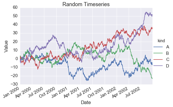
g = sns.FacetGrid(ts, hue='kind', size=5, aspect=1.5)
g.map(plt.plot, 'dt', 'value').add_legend()
g.ax.set(xlabel='Date',
         ylabel='Value',
         title='Random Timeseries')
g.fig.autofmt_xdate()
In [5]:
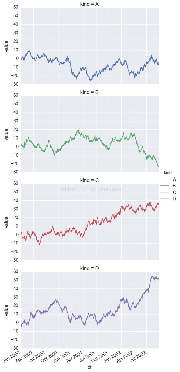
g = sns.FacetGrid(ts, row='kind', hue='kind', size=5, aspect=1.5)
g.map(plt.plot, 'dt', 'value').add_legend()

g.fig.autofmt_xdate()
In [6]:
df = pd.read_csv('data/iris.csv')
df.head()
Out[6]:
In [7]:
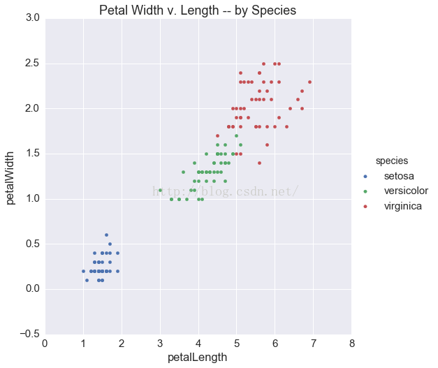
g = sns.FacetGrid(df, hue='species', size=7.5)
g.map(plt.scatter, 'petalLength', 'petalWidth').add_legend()
g.ax.set_title('Petal Width v. Length -- by Species')
Out[7]:
In [8]:
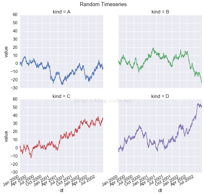
g = sns.FacetGrid(ts, hue='kind',
                  col='kind', col_wrap=2, size=5)

g.map(plt.plot, 'dt', 'value')
g.fig.autofmt_xdate()
g.fig.suptitle('Random Timeseries', y=1.01)
Out[8]:
In [9]:
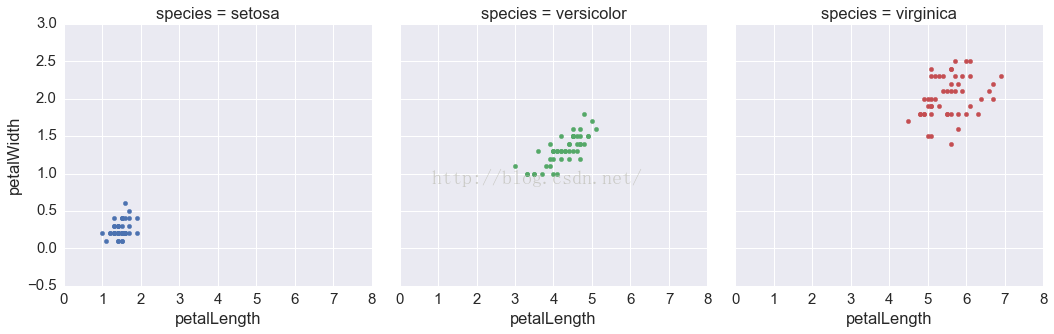
g = sns.FacetGrid(df, col='species', hue='species', size=5)
g.map(plt.scatter, 'petalLength', 'petalWidth')
Out[9]:
In [10]:
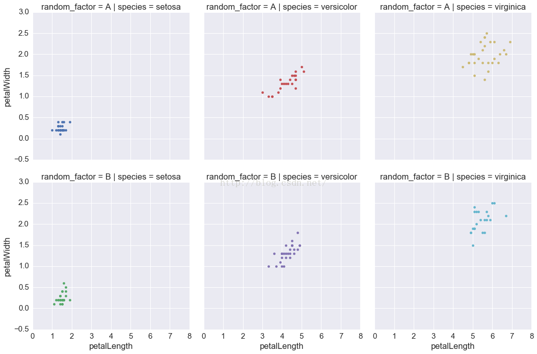
tmp_n = df.shape[0] - df.shape[0]/2

df['random_factor'] = np.random.permutation(['A'] * tmp_n + ['B'] * (df.shape[0] - tmp_n))
df.head()
Out[10]:
In [11]:
g = sns.FacetGrid(df.assign(tmp=df.species + df.random_factor).\
                      sort_values(['species', 'random_factor']),
                  col='species', row='random_factor', hue='tmp', size=5)
g.map(plt.scatter, 'petalLength', 'petalWidth')
Out[11]:
In [12]:
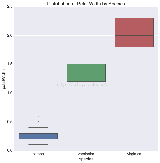
fig, ax = plt.subplots(1, 1, figsize=(10, 10))

g = sns.boxplot('species', 'petalWidth', data=df, ax=ax)
g.set(title='Distribution of Petal Width by Species')
Out[12]:
In [13]:
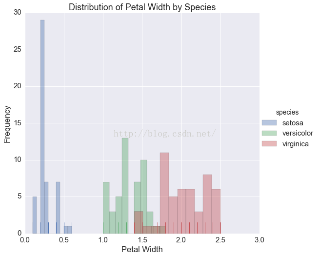
g = sns.FacetGrid(df, hue='species', size=7.5)

g.map(sns.distplot, 'petalWidth', bins=10,
      kde=False, rug=True).add_legend()

g.set(xlabel='Petal Width',
      ylabel='Frequency',
      title='Distribution of Petal Width by Species')
Out[13]:
In [14]:
df = pd.read_csv('data/titanic.csv')
df.head()
Out[14]:
In [15]:
dfg = df.groupby(['survived', 'pclass']).agg({'fare': 'mean'})
dfg
Out[15]:
In [16]:
died = dfg.loc[0, :]
print died

survived = dfg.loc[1, :]
print survived
In [17]:
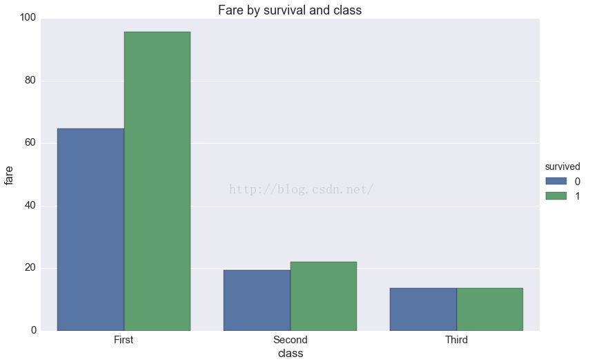
g = sns.factorplot(x='class', y='fare', hue='survived',
                   data=df, kind='bar',
                   order=['First', 'Second', 'Third'],
                   size=7.5, aspect=1.5, ci=None)
g.ax.set_title('Fare by survival and class')
Out[17]:
In [18]:
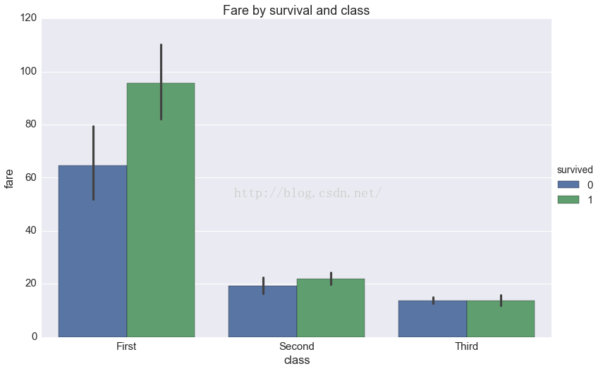
g = sns.factorplot(x='class', y='fare', hue='survived',
                   data=df, kind='bar',
                   order=['First', 'Second', 'Third'],
                   size=7.5, aspect=1.5)
g.ax.set_title('Fare by survival and class')
Out[18]:


 1万+
1万+


 被折叠的 条评论
为什么被折叠?
被折叠的 条评论
为什么被折叠?
 到【灌水乐园】发言


