


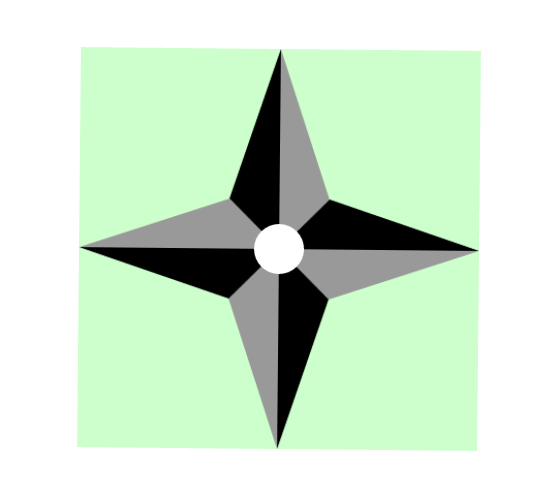
之前做的--纯CSS3手里剑模型动画绘制--太差劲了,重新学习了下各种几何图形的基础后优化了一下。
截图:
代码:
<!DOCTYPE HTML>
<html>
<head>
<meta charset="utf-8">
<title>纯CSS手里剑绘制优化1</title>
<style type="text/css">
.box {
width: 400px;
height: 400px;
margin: 100px auto;
position: relative;
background-color: #CFC;
transform-style: preserve-3d;
animation: rotateZ360 20s ease-in-out infinite;
}
/*想要让这个相册动起来,加一个动画就好了*/
@keyframes rotateZ360 {
from {
transform: rotateZ(0deg);
}
to {
transform: rotateZ(360deg);
}
}
.trh , .trh2, .trh3, .trh4{
width: 200px;
height: 200px;
margin: 0px;
padding: 0px;
float: left;
}
.trh > div:first-child{
width: 0;
height: 0;
border-top: 50px solid #999;
border-left: 50px solid transparent;
border-right: 150px solid transparent;
}
.trh > div:last-child{
width: 0;
height: 0;
border-left: 50px solid #000;
border-top: 50px solid transparent;
border-bottom: 150px solid transparent;
position: relative;
bottom: 50px;
}
.trh {
-webkit-transform: rotate(180deg);
-moz-transform: rotate(180deg);
-ms-transform: rotate(180deg);
-o-transform: rotate(180deg);
transform: rotate(180deg);
}
.trh2 > div:first-child{
width: 0;
height: 0;
border-top: 50px solid #999;
border-left: 50px solid transparent;
border-right: 150px solid transparent;
}
.trh2 > div:last-child{
width: 0;
height: 0;
border-left: 50px solid #000;
border-top: 50px solid transparent;
border-bottom: 150px solid transparent;
position: relative;
bottom: 50px;
}
.trh2 {
-webkit-transform: rotate(-90deg);
-moz-transform: rotate(-90deg);
-ms-transform: rotate(-90deg);
-o-transform: rotate(-90deg);
transform: rotate(-90deg);
}
.trh3 > div:first-child{
width: 0;
height: 0;
border-top: 50px solid #999;
border-left: 50px solid transparent;
border-right: 150px solid transparent;
}
.trh3 > div:last-child{
width: 0;
height: 0;
border-left: 50px solid #000;
border-top: 50px solid transparent;
border-bottom: 150px solid transparent;
position: relative;
bottom: 50px;
}
.trh3 {
-webkit-transform: rotate(90deg);
-moz-transform: rotate(90deg);
-ms-transform: rotate(90deg);
-o-transform: rotate(90deg);
transform: rotate(90deg);
}
.trh4 > div:first-child{
width: 0;
height: 0;
border-top: 50px solid #999;
border-left: 50px solid transparent;
border-right: 150px solid transparent;
}
.trh4 > div:last-child{
width: 0;
height: 0;
border-left: 50px solid #000;
border-top: 50px solid transparent;
border-bottom: 150px solid transparent;
position: relative;
bottom: 50px;
}
.center {
height: 50px;
width: 50px;
-moz-border-radius: 50%;
-webkit-border-radius: 50%;
border-radius: 50%;
position: relative;
background-color: #FFFFFF;
left: 175px;
top: 175px;
}
</style>
</head>
<body>
<div class="box">
<div class="trh">
<div></div>
<div></div>
</div>
<div class="trh2">
<div></div>
<div></div>
</div>
<div class="trh3">
<div></div>
<div></div>
</div>
<div class="trh4">
<div></div>
<div></div>
</div>
<div class="center"></div>
</div>
</body>
</html>


 扫一扫
扫一扫
 898
898

 被折叠的 条评论
为什么被折叠?
被折叠的 条评论
为什么被折叠?
 到【灌水乐园】发言


