echarts
echarts介绍
- echarts是用于前端展示图表的工具
- 例如展示一张柱状图,条形图,饼状图之类的数据显示
echarts使用
下载与导入
pnpm install echarts@5.1.2
import * as echarts from 'echarts'
创建一个图
- 首先创建一个<div>标签,获取该标签的dom属性,就是为该标签添加ref属性后,在ts中创建一个同名ref变量。记得设置高和宽,不然图片不显示
        <el-card style="height: 280px">
          <div ref="pointCharts" style="height: 230px;width: 100%"></div>
        </el-card>
const pointCharts = ref()
- 创建图标样式雏形,以下样式直接复制即可,date就是你要传入的数据,要集合类型。其中xAxis表示横轴坐标,yAxis是纵轴坐标,但是纵轴坐标可以自己生成,不需要我们设置即可。series就是每个纵轴坐标对应的数据。下面两个,starMessage.value.XXX,就是博主对应的数据
//定义一种图形
  const profit = reactive({
    title: {
      text: '近6个月用户增加数量',
      textStyle: {
        fontSize: 12,
        color: '#222222',
        fontFamily: 'Source Han Sans CN, Source Han Sans CN-Medium'
      },
      subtext: '用户数量',
      subtextStyle: {
        color: '#222222',
        fontFamily: 'Source Han Sans CN, Source Han Sans CN-Normal'
      }
    },
    grid: {
      left: '3%',
      right: '4%',
      bottom: '3%',
      containLabel: true
    },
    xAxis: [
      {
        type: 'category',
        data: starMessage.value.timeList,
        axisTick: {
          // 关掉x轴中间的分割线
          show: false
        },
        axisLine: {
          lineStyle: {
            //x轴线的颜色
            width: 0,
            color: '#999999'
          }
        },
        axisLabel: {
          // x轴上的文字颜色
          textStyle: {
            color: '#999999'
          }
        }
      }
    ],
    yAxis: [{}],
    series: [
      {
        name: 'Direct',
        type: 'line',
        barWidth: '45%',
        // 柱形图的颜色和外观设置
        itemStyle: {
          color: '#5d65e3',
          borderRadius: 50
        },
        // 高亮的图形样式和标签样式。
        emphasis: {
          itemStyle: {
            color: '#00ffb2' // 选中柱颜色
          }
        },
        data: starMessage.value.userCountList
      }
    ]
  })
- 实现组件的挂载,其中profit就是第二步中的创建的雏形
  //组件挂载
  const profitCharts = echarts.init(pointCharts.value)
  profitCharts.setOption(profit)
- 最终要的一步,为了让组件成功加载,将第二第三步骤封装到一个方法中
const Loading = () => {

//定义一种图形
  const profit = reactive({
    title: {
      text: '近6个月用户增加数量',
      textStyle: {
        fontSize: 12,
        color: '#222222',
        fontFamily: 'Source Han Sans CN, Source Han Sans CN-Medium'
      },
      subtext: '用户数量',
      subtextStyle: {
        color: '#222222',
        fontFamily: 'Source Han Sans CN, Source Han Sans CN-Normal'
      }
    },
    grid: {
      left: '3%',
      right: '4%',
      bottom: '3%',
      containLabel: true
    },
    xAxis: [
      {
        type: 'category',
        data: starMessage.value.timeList,
        axisTick: {
          // 关掉x轴中间的分割线
          show: false
        },
        axisLine: {
          lineStyle: {
            //x轴线的颜色
            width: 0,
            color: '#999999'
          }
        },
        axisLabel: {
          // x轴上的文字颜色
          textStyle: {
            color: '#999999'
          }
        }
      }
    ],
    yAxis: [{}],
    series: [
      {
        name: 'Direct',
        type: 'line',
        barWidth: '45%',
        // 柱形图的颜色和外观设置
        itemStyle: {
          color: '#5d65e3',
          borderRadius: 50
        },
        // 高亮的图形样式和标签样式。
        emphasis: {
          itemStyle: {
            color: '#00ffb2' // 选中柱颜色
          }
        },
        data: starMessage.value.userCountList
      }
    ]
  })

  //组件挂载
  const profitCharts = echarts.init(pointCharts.value)
  profitCharts.setOption(profit)
}
- 将该方法放如入到 onMounted中挂载,但是一定要添加await属性,为了防止接口调用完毕,组件就已经挂载,从而导致图片不显示
onMounted(async () => {
  //获取echarts的dom元素
  await getEcharts() //这个方法是从后端调用接口获取图中的是数据用的
  await Loading()
})
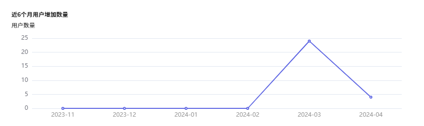
- 效果展示


 441
441

 被折叠的 条评论
为什么被折叠?
被折叠的 条评论
为什么被折叠?
 到【灌水乐园】发言


