


class NavBar extends StatefulWidget {
@override
_NavBarState createState() => _NavBarState();
}
class _NavBarState extends State {
List selected = [true, false, false, false, false];
void select(int n) {
for (int i = 0; i < 5; i++) {
if (i != n) {
selected[i] = false;
} else {
selected[i] = true;
}
}
}
@override
Widget build(BuildContext context) {
return Container(
height: 350.0,
child: Column(
children: [
NavBarItem(
icon: Feather.home,
active: selected[0],
touched: () {
setState(() {
select(0);
});
},
),
NavBarItem(
icon: Feather.list,
active: selected[1],
touched: () {
setState(() {
select(1);
});
},
),
NavBarItem(
icon: Feather.folder,
active: selected[2],
touched: () {
setState(() {
select(2);
});
},
),
NavBarItem(
icon: Feather.message_square,
active: selected[3],
touched: () {
setState(() {
select(3);
});
},
),
NavBarItem(
icon: Feather.settings,
active: selected[4],
touched: () {
setState(() {
select(4);
});
},
),
],
),
);
}
}
正如我们在上面的程序中看到的,我们可以假设,这些是按钮,所以我们可以使用 - “InkWell” - 小部件,它具有 Ontap() 函数,它被包裹着 - “材料”小部件,并取消材料小部件的默认颜色我们手动使颜色透明。当构造函数获得活动的 bool 变量值时,我们可以使用它来为主体 - “AnimatedContainer”设置动画,就像我在下面的代码中所做的那样。
NavigationBar/src/NavBarItems.dart
import ‘package:flutter/material.dart’;
class NavBarItem extends StatefulWidget {
final IconData icon;
final Function touched;
final bool active;
NavBarItem({
this.icon,
this.touched,
this.active,
});
@override
_NavBarItemState createState() => _NavBarItemState();
}
class _NavBarItemState extends State {
@override
Widget build(BuildContext context) {
return Material(
color: Colors.transparent,
child: InkWell(
onTap: () {
print(widget.icon);
widget.touched();
},
splashColor: Colors.white,
hoverColor: Colors.white12,
child: Container(
padding: EdgeInsets.symmetric(vertical: 3.0),
child: Row(
children: [
Container(
height: 60.0,
width: 80.0,
child: Row(
children: [
AnimatedContainer(
duration: Duration(milliseconds: 475),
height: 35.0,
width: 5.0,
decoration: BoxDecoration(
color: widget.active ? Colors.white : Colors.transparent,
borderRadius: BorderRadius.only(
topRight: Radius.circular(10.0),
bottomRight: Radius.circular(10.0),
),
),
),
Padding(
padding: EdgeInsets.only(left: 30.0),
child: Icon(
widget.icon,
color: widget.active ? Colors.white : Colors.white54,
size: 19.0,
),
),
],
),
),
],
),
),
),
);
}
}
========================================================================
此状态窗口小部件可帮助您维护宽高比,并充当标签,SharedFilesItem,ProjectStatisticScards的驱动程序小部件。
Dashboard/Dashboard.dart
import ‘package:flutter/material.dart’;
import ‘package:flutter_vector_icons/flutter_vector_icons.dart’;
import ‘package:google_fonts/google_fonts.dart’;
import ‘package:percent_indicator/circular_percent_indicator.dart’;
import ‘package:praum_project_web_app/Dashboard/src/ProjectProgressCard.dart’;
import ‘package:praum_project_web_app/Dashboard/src/ProjectStatisticsCards.dart’;
import ‘package:praum_project_web_app/Dashboard/src/SharedFilesItem.dart’;
import ‘package:praum_project_web_app/Dashboard/src/SubHeader.dart’;
import ‘package:praum_project_web_app/Dashboard/src/Tabs.dart’;
class DashBoard extends StatelessWidget {
@override
Widget build(BuildContext context) {
return Positioned(
left: 100.0,
child: Container(
height: MediaQuery.of(context).size.height,
width: MediaQuery.of(context).size.width * 0.63,
color: Colors.white,
child: Column(
crossAxisAlignment: CrossAxisAlignment.start,
children: [
Container(
margin: EdgeInsets.only(left: 30.0, top: 25.0, bottom: 10.0),
child: Text(
‘Ongoing Projects’,
style: GoogleFonts.quicksand(
fontWeight: FontWeight.bold,
fontSize: 20.0,
),
),
),
Tabs(),
Container(
margin: EdgeInsets.only(top: 5.0),
height: 200.0,
width: MediaQuery.of(context).size.width * 0.62,
child: Row(
mainAxisAlignment: MainAxisAlignment.spaceEvenly,
crossAxisAlignment: CrossAxisAlignment.center,
children: [
ProjectProgressCard(
color: Color(0xffFF4C60),
projectName: ‘The Maptrix’,
percentComplete: ‘34%’,
progressIndicatorColor: Colors.redAccent[100],
icon: Feather.moon,
),
ProjectProgressCard(
color: Color(0xff6C6CE5),
projectName: ‘Delivery Club’,
percentComplete: ‘78%’,
progressIndicatorColor: Colors.blue[200],
icon: Feather.truck,
),
ProjectProgressCard(
color: Color(0xffFAAA1E),
projectName: ‘Travel Comrode’,
percentComplete: ‘82%’,
progressIndicatorColor: Colors.amber[200],
icon: Icons.local_airport,
),
],
),
),
SubHeader(
title: ‘Shared Files’,
),
SharedFilesItem(
color: Colors.blue,
sharedFileName: ‘Company Guidelines’,
members: ‘28 members’,
et: ‘10 Oct 2019’,
fileSize: ‘2.3 MB’,
),
SharedFilesItem(
color: Colors.amber,
sharedFileName: ‘Company Policy’,
members: ‘30 members’,
et: ‘27 Sep 2019’,
fileSize: ‘4.2 MB’,
),
SharedFilesItem(
color: Colors.red,
sharedFileName: ‘Wireframes’,
members: ‘14 members’,
et: ‘08 Oct 2019’,
fileSize: ‘1.6 MB’,
),
SubHeader(
title: ‘Project Statistics’,
),
ProjectStatisticsCards(),
],
),
),
);
}
}
我们正在使用这个小部件来获取具有不同颜色的不同项目名称的进度条。我们使用 - “MouseRegion” - 小部件来更新小部件大小以使其看起来更好。
Dashboard/src/ProjectProgressCard.dart
import ‘package:flutter/material.dart’;
import ‘package:flutter_vector_icons/flutter_vector_icons.dart’;
import ‘package:google_fonts/google_fonts.dart’;
class ProjectProgressCard extends StatefulWidget {
final Color color;
final Color progressIndicatorColor;
final String projectName;
final String percentComplete;
final IconData icon;
ProjectProgressCard({
this.color,
this.progressIndicatorColor,
this.percentComplete,
this.projectName,
this.icon,
});
@override
_ProjectProgressCardState createState() => _ProjectProgressCardState();
}
class _ProjectProgressCardState extends State {
bool hovered = false;
@override
Widget build(BuildContext context) {
return MouseRegion(
onEnter: (value) {
setState(() {
hovered = true;
});
},
onExit: (value) {
setState(() {
hovered = false;
});
},
child: AnimatedContainer(
duration: Duration(milliseconds: 275),
height: hovered ? 160.0 : 155.0,
width: hovered ? 200.0 : 195.0,
decoration: BoxDecoration(
color: hovered ? widget.color : Colors.white,
borderRadius: BorderRadius.circular(15.0),
boxShadow: [
BoxShadow(
color: Colors.black12,
blurRadius: 20.0,
spreadRadius: 5.0,
),
]),
child: Center(
child: Column(
children: [
SizedBox(
height: 20.0,
),
Row(
children: [
SizedBox(
width: 18.0,
),
Container(
height: 30.0,
width: 30.0,
child: Icon(
widget.icon,
color: !hovered ? Colors.white : Colors.black,
size: 16.0,
),
decoration: BoxDecoration(
borderRadius: BorderRadius.circular(30.0),
color: hovered ? Colors.white : Colors.black,
),
),
SizedBox(
width: 13.0,
),
Container(
child: Text(
widget.projectName,
style: GoogleFonts.quicksand(
fontWeight: FontWeight.w500,
fontSize: 14.0,
color: hovered ? Colors.white : Colors.black,
),
),
),
],
),
SizedBox(
height: 15.0,
),
Row(
children: [
SizedBox(
width: 18.0,
),
Container(
height: 13.0,
width: 13.0,
child: Icon(
Feather.user,
size: 13.0,
color: hovered ? Colors.white : Colors.black,
),
),
SizedBox(
width: 8.0,
),
Container(
child: Text(
‘5 members’,
style: GoogleFonts.quicksand(
fontWeight: FontWeight.w500,
fontSize: 10.0,
color: hovered ? Colors.white : Colors.black,
),
),
),
],
),
SizedBox(
height: 5.0,
),
Row(
children: [
SizedBox(
width: 18.0,
),
Container(
height: 13.0,
width: 13.0,
child: Icon(
Feather.clock,
size: 13.0,
color: hovered ? Colors.white : Colors.black,
),
),
SizedBox(
width: 8.0,
),
Container(
child: Text(
‘15 Nov 2019’,
style: GoogleFonts.quicksand(
fontWeight: FontWeight.w500,
fontSize: 10.0,
color: hovered ? Colors.white : Colors.black,
),
),
),
],
),
Container(
margin: EdgeInsets.only(top: 8.0, left: 135.0),
child: Text(
widget.percentComplete,
style: GoogleFonts.quicksand(
fontWeight: FontWeight.w500,
fontSize: 12.5,
color: hovered ? Colors.white : Colors.black,
),
),
),
AnimatedContainer(
duration: Duration(milliseconds: 275),
margin: EdgeInsets.only(top: 5.0),
height: 6.0,
width: 160.0,
decoration: BoxDecoration(
color: hovered
-
? widget.progressIndicatorColor
- Color(0xffF5F6FA),
borderRadius: BorderRadius.circular(20.0),
),
child: Align(
alignment: Alignment.centerLeft,
child: AnimatedContainer(
duration: Duration(milliseconds: 275),
height: 6.0,
width:
(double.parse(widget.percentComplete.substring(0, 1)) /
160.0,
decoration: BoxDecoration(
color: hovered ? Colors.white : widget.color,
borderRadius: BorderRadius.circular(20.0),
),
),
),
),
],
),
),
),
);
}
}
这是共享文件部分,它在 Row() 中包含图标、文本和其他一些数据,正如您在给定代码中看到的那样,这非常简单
Dashboard/src/SharedFileItem.dart
import ‘package:flutter/material.dart’;
import ‘package:google_fonts/google_fonts.dart’;
class SharedFilesItem extends StatefulWidget {
final String sharedFileName;
final Color color;
final String members;
final String et;
final String fileSize;
SharedFilesItem({
this.color,
this.et,
this.fileSize,
this.members,
this.sharedFileName,
});
@override
_SharedFilesItemState createState() => _SharedFilesItemState();
}
class _SharedFilesItemState extends State {
bool hovered = false;
@override
Widget build(BuildContext context) {
return MouseRegion(
onEnter: (value) {
setState(() {
hovered = true;
});
},
onExit: (value) {
setState(() {
hovered = false;
});
},
child: AnimatedContainer(
duration: Duration(milliseconds: 275),
margin: EdgeInsets.only(bottom: 10.0, left: 40.0, right: 15.0),
padding: EdgeInsets.all(10.0),
decoration: BoxDecoration(
color: Colors.white,
borderRadius: BorderRadius.circular(10.0),
boxShadow: hovered
? [
BoxShadow(
color: Colors.black12,
blurRadius: 13.0,
spreadRadius: 0.0,
),
-
]
- []),
child: Column(
children: [
Container(
child: Row(
mainAxisAlignment: MainAxisAlignment.spaceBetween,
children: [
Row(
children: [
SizedBox(
width: 15.0,
),
Container(
height: 28.0,
width: 28.0,
decoration: BoxDecoration(
color: widget.color.withOpacity(0.2),
borderRadius: BorderRadius.circular(5.0),
),
child: Center(
child: Icon(
Icons.folder,
color: widget.color,
size: 15.0,
),
),
),
SizedBox(
width: 15.0,
),
Text(
widget.sharedFileName,
style: GoogleFonts.quicksand(
fontWeight: FontWeight.bold,
fontSize: 12.0,
),
),
],
),
Row(
mainAxisAlignment: MainAxisAlignment.spaceAround,
children: [
Padding(
padding: EdgeInsets.symmetric(horizontal: 30.0),
child: Text(
widget.members,
style: GoogleFonts.quicksand(
fontWeight: FontWeight.bold,
fontSize: 11.0,
color: Colors.black45,
),
),
),
Padding(
padding: EdgeInsets.symmetric(horizontal: 30.0),
child: Text(
widget.et,
style: GoogleFonts.quicksand(
fontWeight: FontWeight.bold,
fontSize: 11.0,
color: Colors.black45,
),
),
),
Padding(
padding: EdgeInsets.symmetric(horizontal: 30.0),
child: Text(
widget.fileSize,
style: GoogleFonts.quicksand(
fontWeight: FontWeight.bold,
fontSize: 11.0,
color: Colors.black87,
),
),
),
],
),
],
),
),
],
),
),
);
}
}
共享文件下方的下一个是项目统计信息,它可以由圆角矩形容器创建,并创建一个包含文本 1、2、3 的列,并用 Row() 将其包裹起来,并添加如下所示的 ProgressIndicator,
Dashboard/src/ProjectStatisticsCards.dart
import ‘package:flutter/material.dart’;
import ‘package:google_fonts/google_fonts.dart’;
import ‘package:percent_indicator/circular_percent_indicator.dart’;
class ProjectStatisticsCards extends StatelessWidget {
@override
Widget build(BuildContext context) {
return Row(
children: [
ProjectStatisticsCard(
count: ‘125’,
name: ‘All finished projects’,
descriptions: ‘2 projects out of time’,
progress: 0.75,
progressString: ‘75%’,
color: Color(0xffFAAA1E),
),
ProjectStatisticsCard(
color: Color(0xff6C6CE5),
count: ‘1105’,
name: ‘Customer interest’,
descriptions: ‘+ 576 new clients’,
progress: 0.68,
progressString: ‘68%’,
),
],
);
}
}
class ProjectStatisticsCard extends StatelessWidget {
final String count;
final String name;
final String descriptions;
final double progress;
final String progressString;
final Color color;
ProjectStatisticsCard({
this.count,
this.descriptions,
this.name,
this.progress,
this.progressString,
this.color,
});
@override
Widget build(BuildContext context) {
return Expanded(
child: Container(
margin: EdgeInsets.only(left: 40.0, right: 20.0),
padding: EdgeInsets.symmetric(horizontal: 20.0),
height: 85.0,
decoration: BoxDecoration(
color: color,
borderRadius: BorderRadius.circular(8.0),
),
child: Row(
mainAxisAlignment: MainAxisAlignment.spaceBetween,
children: [
Container(
child: Column(
crossAxisAlignment: CrossAxisAlignment.start,
mainAxisAlignment: MainAxisAlignment.center,
children: [
Text(
count,
style: GoogleFonts.quicksand(
fontSize: 20.0,
fontWeight: FontWeight.bold,
color: Colors.white,
),
),
Text(
name,
style: GoogleFonts.quicksand(
fontSize: 13.0,
fontWeight: FontWeight.w500,
color: Colors.white,
),
),
SizedBox(
height: 8.0,
),
Text(
descriptions,
style: GoogleFonts.quicksand(
fontSize: 10.0,
color: Colors.white,
),
),
],
),
),
CircularPercentIndicator(
radius: 55.0,
lineWidth: 4.5,
percent: progress,
circularStrokeCap: CircularStrokeCap.round,
center: Text(
progressString,
style: GoogleFonts.quicksand(
fontSize: 13.0,
fontWeight: FontWeight.w700,
color: Colors.white,
),
),
progressColor: Colors.white,
startAngle: 270,
backgroundColor: Colors.white54,
),
],
),
),
);
}
}
我们已经放下了将在 SubHeader() 组件中完成的每个部分的标题。我们需要用两个 Text 小部件实现一个 Row()。
注意:
我们需要使 mainAxisAlignment - SpacedBetween 和 CrossAxisAlignment - Center
Dashboard/src/SubHeader.dart
import ‘package:flutter/material.dart’;
import ‘package:google_fonts/google_fonts.dart’;
class SubHeader extends StatelessWidget {
final String title;
SubHeader({
this.title,
});
@override
Widget build(BuildContext context) {
return Container(
margin: EdgeInsets.only(
left: 30.0,
right: 30.0,
top: 5.0,
bottom: 15.0,
),
child: Row(
mainAxisAlignment: MainAxisAlignment.spaceBetween,
crossAxisAlignment: CrossAxisAlignment.center,
children: [
Text(
title,
style: GoogleFonts.quicksand(
fontWeight: FontWeight.bold,
fontSize: 14.0,
),
),
Text(
‘View All’,
style: GoogleFonts.quicksand(
fontWeight: FontWeight.bold,
fontSize: 10.0,
color: Colors.black45,
),
),
],
),
);
}
}
最后,我们可以完成中间部分或 DashBoard ,标签命名为 - “全部”、“当前”、“待定”和“已分类”。这与往常一样带有 4 个文本小部件的行。
Dashboard/src/Tabs.dart
import ‘package:flutter/material.dart’;
import ‘package:google_fonts/google_fonts.dart’;
class Tabs extends StatelessWidget {
@override
Widget build(BuildContext context) {
return Container(
margin: EdgeInsets.only(left: 32.0),
child: Row(
children: [
Text(
‘All’,
style: GoogleFonts.quicksand(
fontSize: 12.0,
),
),
SizedBox(
width: 15.0,
),
Container(
height: 25.0,
width: 70.0,
decoration: BoxDecoration(
color: Colors.black,
borderRadius: BorderRadius.circular(20.0),
),
child: Center(
child: Text(
‘Current’,
style: GoogleFonts.quicksand(
fontSize: 12.0,
color: Colors.white,
),
),
),
),
SizedBox(
width: 15.0,
),
Text(
‘Pending’,
style: GoogleFonts.quicksand(
fontSize: 12.0,
),
),
SizedBox(
width: 15.0,
),
Text(
‘Categorized’,
style: GoogleFonts.quicksand(
fontSize: 12.0,
),
),
],
),
);
}
}
=====================================================================================
让我们为日历部分创建一个驱动程序代码,其中一个 Column 包含三个有状态小部件,即
TopContainer()
CalendarSection()、
MeetingsSection()、
CalenderSpace/CalenderSpace.dart
import ‘package:flutter/material.dart’;
import ‘package:praum_project_web_app/CalendarSpace/src/CalendarSection.dart’;
import ‘package:praum_project_web_app/CalendarSpace/src/MeetingsSection.dart’;
import ‘package:praum_project_web_app/CalendarSpace/src/TopContainer.dart’;
class CalendarSpace extends StatelessWidget {
@override
Widget build(BuildContext context) {
return Align(
alignment: Alignment.centerRight,
child: Container(
color: Color(0xffF7F7FF),
height: MediaQuery.of(context).size.height,
width: MediaQuery.of(context).size.width * 0.28,
child: Column(
children: [
SizedBox(
height: 30.0,
),
TopContainer(),
CalendarSection(),
MeetingsSection(),
ClipRRect(
child: Image.asset(‘assets/image.png’,height: 300.0,width: 400.0,),
),
],
),
),
);
}
}
像我一样为周名和日期创建一个两个列表,然后创建一个容器(四舍五入),将这两个列表保存为一个列()。使阴影看起来不错
CalenderSpace/src/CalendarPellet .dart
import ‘package:flutter/material.dart’;
import ‘package:google_fonts/google_fonts.dart’;
List dates = [21, 22, 23, 24, 25, 26, 27];
List days = [‘M’, ‘T’, ‘W’, ‘T’, ‘F’, ‘S’, ‘S’];
class CalendarPellet extends StatelessWidget {
final int date;
final String day;
CalendarPellet({
this.date,
this.day,
自我介绍一下,小编13年上海交大毕业,曾经在小公司待过,也去过华为、OPPO等大厂,18年进入阿里一直到现在。
深知大多数前端工程师,想要提升技能,往往是自己摸索成长或者是报班学习,但对于培训机构动则几千的学费,着实压力不小。自己不成体系的自学效果低效又漫长,而且极易碰到天花板技术停滞不前!
因此收集整理了一份《2024年Web前端开发全套学习资料》,初衷也很简单,就是希望能够帮助到想自学提升又不知道该从何学起的朋友,同时减轻大家的负担。

既有适合小白学习的零基础资料,也有适合3年以上经验的小伙伴深入学习提升的进阶课程,基本涵盖了95%以上前端开发知识点,真正体系化!
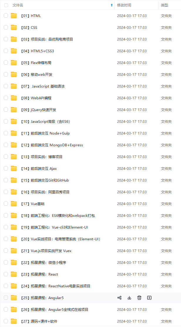
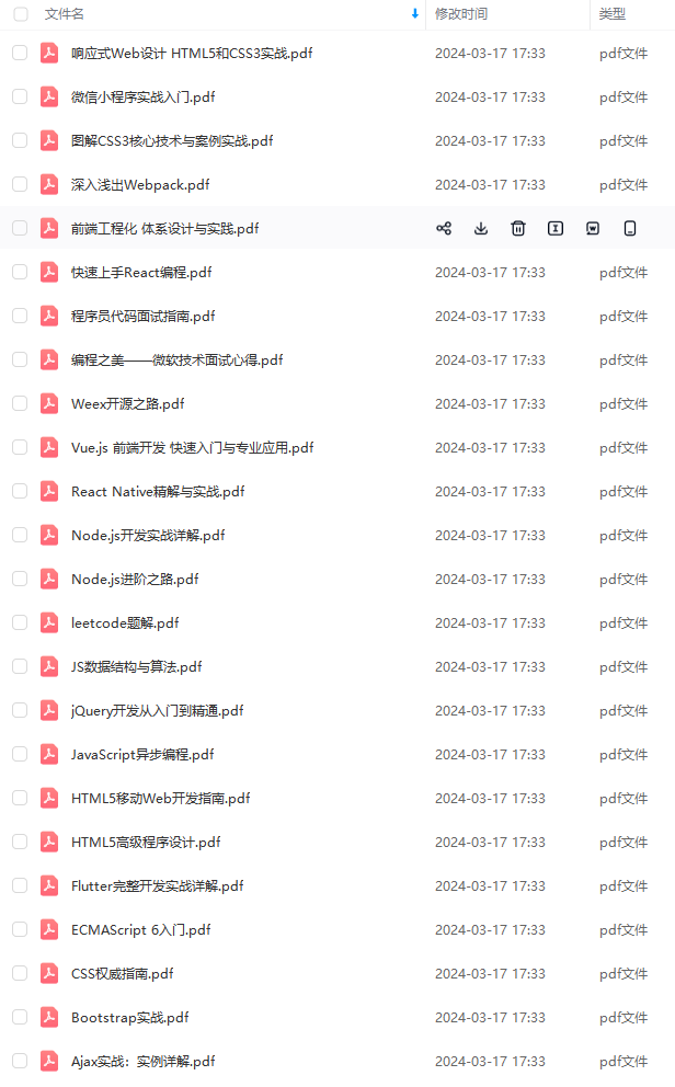
由于文件比较大,这里只是将部分目录截图出来,每个节点里面都包含大厂面经、学习笔记、源码讲义、实战项目、讲解视频,并且会持续更新!
如果你觉得这些内容对你有帮助,可以扫码获取!!(备注:前端)

最后


资料过多,篇幅有限,需要文中全部资料可以点击这里免费获取前端面试资料PDF完整版!
自古成功在尝试。不尝试永远都不会成功。勇敢的尝试是成功的一半。
class CalendarSpace extends StatelessWidget {
@override
Widget build(BuildContext context) {
return Align(
alignment: Alignment.centerRight,
child: Container(
color: Color(0xffF7F7FF),
height: MediaQuery.of(context).size.height,
width: MediaQuery.of(context).size.width * 0.28,
child: Column(
children: [
SizedBox(
height: 30.0,
),
TopContainer(),
CalendarSection(),
MeetingsSection(),
ClipRRect(
child: Image.asset(‘assets/image.png’,height: 300.0,width: 400.0,),
),
],
),
),
);
}
}
像我一样为周名和日期创建一个两个列表,然后创建一个容器(四舍五入),将这两个列表保存为一个列()。使阴影看起来不错
CalenderSpace/src/CalendarPellet .dart
import ‘package:flutter/material.dart’;
import ‘package:google_fonts/google_fonts.dart’;
List dates = [21, 22, 23, 24, 25, 26, 27];
List days = [‘M’, ‘T’, ‘W’, ‘T’, ‘F’, ‘S’, ‘S’];
class CalendarPellet extends StatelessWidget {
final int date;
final String day;
CalendarPellet({
this.date,
this.day,
自我介绍一下,小编13年上海交大毕业,曾经在小公司待过,也去过华为、OPPO等大厂,18年进入阿里一直到现在。
深知大多数前端工程师,想要提升技能,往往是自己摸索成长或者是报班学习,但对于培训机构动则几千的学费,着实压力不小。自己不成体系的自学效果低效又漫长,而且极易碰到天花板技术停滞不前!
因此收集整理了一份《2024年Web前端开发全套学习资料》,初衷也很简单,就是希望能够帮助到想自学提升又不知道该从何学起的朋友,同时减轻大家的负担。
[外链图片转存中…(img-hrdY5BWv-1712101113263)]
[外链图片转存中…(img-L5NmABi4-1712101113264)]
既有适合小白学习的零基础资料,也有适合3年以上经验的小伙伴深入学习提升的进阶课程,基本涵盖了95%以上前端开发知识点,真正体系化!
[外链图片转存中…(img-Po3A1Qeh-1712101113265)]
由于文件比较大,这里只是将部分目录截图出来,每个节点里面都包含大厂面经、学习笔记、源码讲义、实战项目、讲解视频,并且会持续更新!
如果你觉得这些内容对你有帮助,可以扫码获取!!(备注:前端)
最后
[外链图片转存中…(img-pL1XTFZp-1712101113265)]
[外链图片转存中…(img-Pc9U87Kf-1712101113266)]
资料过多,篇幅有限,需要文中全部资料可以点击这里免费获取前端面试资料PDF完整版!
自古成功在尝试。不尝试永远都不会成功。勇敢的尝试是成功的一半。


 2085
2085


 被折叠的 条评论
为什么被折叠?
被折叠的 条评论
为什么被折叠?
 到【灌水乐园】发言


