


 本文通过图表展示了2014年至2021年中国中医类医疗卫生机构的诊疗量变化,以及中药材消费者的年龄分布、药店中药饮片供应商占比和药品销售额结构。同时,代码还生成了柱状图、折线图、环形图和3D堆积柱状图等图形以直观呈现数据。
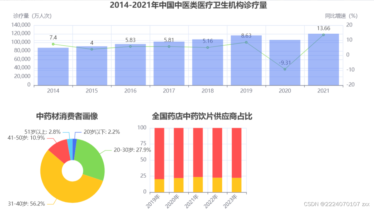
表1. 2014-2021年中国中医类医疗卫生机构诊疗量
| 年份(年) | 诊疗量(万人次) | 同比增速(%) |
| 2014 | 87430 | 7.40 |
| 2015 | 90912 | 4.00 |
| 2016 | 96225 | 5.83 |
| 2017 | 101885 | 5.81 |
| 2018 | 107147 | 5.16 |
| 2019 | 116390 | 8.63 |
| 2020 | 105764 | -9.13 |
| 2021 | 120215 | 13.66 |
表2. 中药材消费者画像数据
| 年龄 | 占比(%) |
| 20岁以下 | 2.2 |
| 20-30岁 | 27.9 |
| 31-40岁 | 56.2 |
| 41-50岁 | 10.9 |
| 51岁以上 | 2.8 |
表3. 全国药店中药饮片供应商占比情况
| 年份(年) | 跨国企业占比(%) | 本土企业占比(%) |
| 2019 | 20.3 | 79.7 |
| 2020 | 22.0 | 78.0 |
| 2021 | 23.5 | 76.5 |
| 2022 | 22.5 | 77.5 |
| 2023 | 22.3 | 77.7 |
表4. 全国药店药品销售额占比
| 药品类型 | 占比(%) |
| 化学药 | 33 |
| 中成药 | 45 |
| 生物制品 | 3 |
| 医疗器械 | 9 |
| 中药饮片 | 6 |
| 保健品 | 4 |
from pyecharts import options as opts
from pyecharts.charts import Bar, Line, Pie, Bar3D, Radar, Grid, Timeline# 表1数据
years = [2014, 2015, 2016, 2017, 2018, 2019, 2020, 2021]
treatment_volume = [87430, 90912, 96225, 101885, 107147, 116390, 105764, 120215]
growth_rate = [7.40, 4.00, 5.83, 5.81, 5.16, 8.63, -9.13, 13.66]# 表2数据
age_labels = ["20岁以下", "20-30岁", "31-40岁", "41-50岁", "51岁以上"]
age_percentage = [2.2, 27.9, 56.2, 10.9, 2.8]# 表3数据
supplier_years = [2019, 2020, 2021, 2022, 2023]
foreign_company_percentage = [20.3, 22.0, 23.5, 22.5, 22.3]
local_company_percentage = [79.7, 78.0, 76.5, 77.5, 77.7]# 表4数据
drug_types = ["化学药", "中成药", "生物制品", "医疗器械", "中药饮片", "保健品"]
drug_percentage = [33, 45, 3, 9, 6, 4]# 需求一:柱形图和折线图在同一个坐标系展示表1数据
bar_line_chart = (
Bar()
.add_xaxis(years)
.add_yaxis("诊疗量(万人次)", treatment_volume, yaxis_index=0)
.extend_axis(yaxis=opts.AxisOpts(name="同比增速(%)", type_="value", position="right"))
.set_global_opts(
title_opts=opts.TitleOpts(title="图1:表1数据展示"),
xaxis_opts=opts.AxisOpts(type_="category"),
yaxis_opts=opts.AxisOpts(name="诊疗量(万人次)", type_="value"),
)
.add(
series_name="同比增速(%)",
yaxis_index=1,
series_opts=opts.MarkLineOpts(data=[opts.MarkLineItem(type_="average")]),
data=growth_rate,
label_opts=opts.LabelOpts(is_show=False),
)
)# 需求二:环图展示表2数据
pie_chart = (
Pie()
.add("", [list(z) for z in zip(age_labels, age_percentage)])
.set_global_opts(title_opts=opts.TitleOpts(title="图2:表2数据展示"))
)# 需求三:堆积柱形图展示表3数据
bar3d_chart = (
Bar3D()
.add(
"",
[
[str(year), "跨国企业", foreign, 0] for year, foreign in zip(supplier_years, foreign_company_percentage)
]
+ [
[str(year), "本土企业", 0, local] for year, local in zip(supplier_years, local_company_percentage)
],
xaxis3d_opts=opts.Axis3DOpts(type_="category", data=supplier_years),
yaxis3d_opts=opts.Axis3DOpts(type_="category", data=["跨国企业", "本土企业"]),
zaxis3d_opts=opts.Axis3DOpts(type_="value"),
)
.set_global_opts(title_opts=opts.TitleOpts(title="图3:表3数据展示"))
)# 需求四:雷达图展示表4数据
radar_chart = (
Radar()
.add_schema(
schema=[
opts.RadarIndicatorItem(name=type, max_=100) for type in drug_types
]
)
.add(
"占比(%)",
[drug_percentage],
areastyle_opts=opts.AreaStyleOpts(opacity=0.5),
)
.set_series_opts(title_opts=opts.TitleOpts(title="图4:表4数据展示"))
)# 需求五:并行多图
grid_chart = (
Grid()
.add(
bar_line_chart,
grid_opts=opts.GridOpts(pos_left="5%", pos_right="20%", pos_top="5%", height="35%"),
)
.add(
pie_chart,
grid_opts=opts.GridOpts(pos_left="5%", pos_right="20%", pos_top="50%", height="35%"),
)
.add(
bar3d_chart,
grid_opts=opts.GridOpts(pos_left="55%", pos_right="5%", pos_top="5%", height="80%"),
)
.add(
radar_chart,
grid_opts=opts.GridOpts(pos_left="55%", pos_right="5%", pos_top="60%", height="35%"),
)
.set_global_opts(title_opts=opts.TitleOpts(title="图5:并行多图"))
)# 需求六:轮播多图
timeline_chart = (
Timeline()
.add(
bar_line_chart,
time_point=0,
options=opts.TimelineOpts(
axis_type="category",
auto_play=True,
is_loop=True,
is_show=True,
play_interval=2000,
),
)
.add(
pie_chart,
time_point=1,
options=opts.TimelineOpts(
axis_type="category",
auto_play=True,
is_loop=True,
is_show=True,
play_interval=2000,
),
)
.add(
bar3d_chart,
time_point=2,
options=opts.TimelineOpts(
axis_type="category",
auto_play=True,
is_loop=True,
is_show=True,
play_interval=2000,
),
)
.add(
radar_chart,
time_point=3,
options=opts.TimelineOpts(
axis_type="category",
auto_play=True,
is_loop=True,
is_show=True,
play_interval=2000,
),
)
)grid_chart.render("图5_并行多图.html")
timeline_chart.render("图6_轮播多图.html")
这段代码使用了 pyecharts 的 Pie 模块,设置了环形图的参数,并最终保存为 HTML 文件。你可以通过打开生成的 HTML 文件来查看图表。
代码如下:
from pyecharts import options as opts
from pyecharts.charts import Bar, Line, Pie, Bar3D, Radar, Grid, Timeline

# 表1数据
years = [2014, 2015, 2016, 2017, 2018, 2019, 2020, 2021]
treatment_volume = [87430, 90912, 96225, 101885, 107147, 116390, 105764, 120215]
growth_rate = [7.40, 4.00, 5.83, 5.81, 5.16, 8.63, -9.13, 13.66]

# 表2数据
age_labels = ["20岁以下", "20-30岁", "31-40岁", "41-50岁", "51岁以上"]
age_percentage = [2.2, 27.9, 56.2, 10.9, 2.8]

# 表3数据
supplier_years = [2019, 2020, 2021, 2022, 2023]
foreign_company_percentage = [20.3, 22.0, 23.5, 22.5, 22.3]
local_company_percentage = [79.7, 78.0, 76.5, 77.5, 77.7]

# 表4数据
drug_types = ["化学药", "中成药", "生物制品", "医疗器械", "中药饮片", "保健品"]
drug_percentage = [33, 45, 3, 9, 6, 4]

# 需求一:柱形图和折线图在同一个坐标系展示表1数据
bar_line_chart = (
    Bar()
    .add_xaxis(years)
    .add_yaxis("诊疗量(万人次)", treatment_volume, yaxis_index=0)
    .extend_axis(yaxis=opts.AxisOpts(name="同比增速(%)", type_="value", position="right"))
    .set_global_opts(
        title_opts=opts.TitleOpts(title="图1:表1数据展示"),
        xaxis_opts=opts.AxisOpts(type_="category"),
        yaxis_opts=opts.AxisOpts(name="诊疗量(万人次)", type_="value"),
    )
    .add(
        series_name="同比增速(%)",
        yaxis_index=1,
        series_opts=opts.MarkLineOpts(data=[opts.MarkLineItem(type_="average")]),
        data=growth_rate,
        label_opts=opts.LabelOpts(is_show=False),
    )
)

# 需求二:环图展示表2数据
pie_chart = (
    Pie()
    .add("", [list(z) for z in zip(age_labels, age_percentage)])
    .set_global_opts(title_opts=opts.TitleOpts(title="图2:表2数据展示"))
)

# 需求三:堆积柱形图展示表3数据
bar3d_chart = (
    Bar3D()
    .add(
        "",
        [
            [str(year), "跨国企业", foreign, 0] for year, foreign in zip(supplier_years, foreign_company_percentage)
        ]
        + [
            [str(year), "本土企业", 0, local] for year, local in zip(supplier_years, local_company_percentage)
        ],
        xaxis3d_opts=opts.Axis3DOpts(type_="category", data=supplier_years),
        yaxis3d_opts=opts.Axis3DOpts(type_="category", data=["跨国企业", "本土企业"]),
        zaxis3d_opts=opts.Axis3DOpts(type_="value"),
    )
    .set_global_opts(title_opts=opts.TitleOpts(title="图3:表3数据展示"))
)

# 需求四:雷达图展示表4数据
radar_chart = (
    Radar()
    .add_schema(
        schema=[
            opts.RadarIndicatorItem(name=type, max_=100) for type in drug_types
        ]
    )
    .add(
        "占比(%)",
        [drug_percentage],
        areastyle_opts=opts.AreaStyleOpts(opacity=0.5),
    )
    .set_series_opts(title_opts=opts.TitleOpts(title="图4:表4数据展示"))
)

# 需求五:并行多图
grid_chart = (
    Grid()
    .add(
        bar_line_chart,
        grid_opts=opts.GridOpts(pos_left="5%", pos_right="20%", pos_top="5%", height="35%"),
    )
    .add(
        pie_chart,
        grid_opts=opts.GridOpts(pos_left="5%", pos_right="20%", pos_top="50%", height="35%"),
    )
    .add(
        bar3d_chart,
        grid_opts=opts.GridOpts(pos_left="55%", pos_right="5%", pos_top="5%", height="80%"),
    )
    .add(
        radar_chart,
        grid_opts=opts.GridOpts(pos_left="55%", pos_right="5%", pos_top="60%", height="35%"),
    )
    .set_global_opts(title_opts=opts.TitleOpts(title="图5:并行多图"))
)

# 需求六:轮播多图
timeline_chart = (
    Timeline()
    .add(
        bar_line_chart,
        time_point=0,
        options=opts.TimelineOpts(
            axis_type="category",
            auto_play=True,
            is_loop=True,
            is_show=True,
            play_interval=2000,
        ),
    )
    .add(
        pie_chart,
        time_point=1,
        options=opts.TimelineOpts(
            axis_type="category",
            auto_play=True,
            is_loop=True,
            is_show=True,
            play_interval=2000,
        ),
    )
    .add(
        bar3d_chart,
        time_point=2,
        options=opts.TimelineOpts(
            axis_type="category",
            auto_play=True,
            is_loop=True,
            is_show=True,
            play_interval=2000,
        ),
    )
    .add(
        radar_chart,
        time_point=3,
        options=opts.TimelineOpts(
            axis_type="category",
            auto_play=True,
            is_loop=True,
            is_show=True,
            play_interval=2000,
        ),
    )
)

# 渲染图表
grid_chart.render("图5_并行多图.html")
timeline_chart.render("图6_轮播多图.html")
运行代码图:


 1万+
1万+


 被折叠的 条评论
为什么被折叠?
被折叠的 条评论
为什么被折叠?
 到【灌水乐园】发言


