


需求一: 请基于pyecharts,用柱形图和折线图在同一个坐标系展示表1数据,得到图1。
#导入需要的库
import numpy as np
import pyecharts.options as opts
#from pyecharts.globals import ThemeType
# 1. 导入需要的图表类(Bar,Line,Pie...)
from pyecharts.charts import Bar, Line,Grid
#from pyecharts import Overlap
x_value = ['2014','2015','2016','2017','2018','2019','2020','2021']
bar = (
    Bar()
    .add_xaxis(xaxis_data=x_value)              #导入X轴
    .add_yaxis(series_name="诊疗量(万人次)",    #柱形图图例名称
               y_axis=[87430,90912,96225,101885,107147,116390,105764,120215],    #柱形图数据
               yaxis_index=0,                  #表示y轴索引,用于拥有多个y轴的单表中
               label_opts = opts.LabelOpts(is_show=False),        #坐标轴标签配置项(柱子里的数字)
              )
    .set_global_opts(title_opts=opts.TitleOpts(title="2014-2021年中国中医类医疗卫生机构诊疗量",pos_left = '27%',pos_top = 15),   #设置图表标题及其位置
                     legend_opts=opts.LegendOpts(is_show=False),             #设置不显示图例
                     #axistick_opts=opts.AxisTickOpts(),
                     yaxis_opts=opts.AxisOpts(
                                              name="诊疗量(万人次)",min_=0, max_=130000,interval=50000,    #设置柱形图y轴名称和最大值,最小值和间距
#                                               name_rotate='90',name_location="center",name_gap=55,       #y轴名称的旋转角度,位置和大小
                                              axistick_opts = opts.AxisTickOpts(is_inside=False,           #轴刻度线往外
                                                                                is_show=True,),            #是否显示轴刻度线
                                              axisline_opts=opts.AxisLineOpts(is_show=True),               #是否显示轴线
                                             ),
                     tooltip_opts = opts.TooltipOpts(is_show = False),
    )
    .set_series_opts(
        itemstyle_opts=opts.ItemStyleOpts(           #图元样式配置项
            opacity=0.5                              #设置柱形图透明度:0.5
                                          )
                    )
    .extend_axis(
        yaxis=opts.AxisOpts(name = "诊疗量(万人次)",   #柱形图y轴名称
                            type_ = "value",
                            position = "left",         #柱形图y轴在左边显示
                            )
                )
    .extend_axis(
        yaxis=opts.AxisOpts(name = "同比增速(%)",   #柱形图y轴名称
                            type_ = "value",
                            position = "right",     #柱形图y轴在右边显示
                            min_=-20, max_=20,interval=10,       #设置柱形图y轴最大值,最小值和间距
                            axistick_opts = opts.AxisTickOpts(is_inside=False,  #轴刻度线往外
                                                              is_show=True,),   #是否显示轴刻度线
                                              axisline_opts=opts.AxisLineOpts(is_show=True),   #是否显示轴线
                                                              )
                            )
)
line = (
    Line()
    .add_xaxis(xaxis_data=x_value)     #导入x轴
    .add_yaxis(series_name="同比增速(%)",       #折线图图例名称
               y_axis=[7.40,4.00,5.83,5.81,5.16,8.63,-9.13,13.66],     #折线图数据
               yaxis_index=2,                #表示y轴索引,用于拥有多个y轴的单表中
               symbol="triangle",            #设置折线图折点为三角形
               symbol_size=[10,10],          #设置三角形的长度和宽度
               label_opts = opts.LabelOpts(is_show=False),        #坐标轴标签配置项(柱子里的数字)
              )
)
bar.overlap(line)
grid = Grid()
grid.add(bar,opts.GridOpts(),is_control_axis_index=True)
grid.render_notebook() #渲染到notebook中展示
需求二: 请基于pyecharts,用环图展示表2数据,得到图2。
#导入需要的库
import numpy as np
import pyecharts.options as opts
# 1. 导入需要的图表类(Bar,Line,Pie...)
from pyecharts.charts import Pie
L1 = ['20岁以下','20-30岁','31-40岁','41-50岁','51岁以上']
num = [2.2, 27.9, 56.2, 10.9, 2.8]
pie=(
    Pie()
    .add("",[list(z) for z in zip(L1,num)],radius=["40%", "75%"])
    .set_global_opts(title_opts=opts.TitleOpts(title="中药材消费者画像",pos_left = '40%',pos_top = 15),
                     legend_opts=opts.LegendOpts(is_show=False),
                    )

)
pie.render_notebook()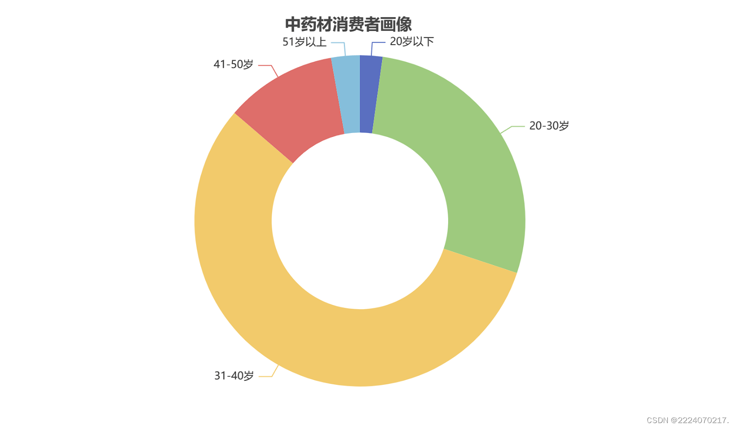
需求三: 请基于pyecharts,用堆积柱形图展示表3数据,得到图3。
#导入需要的库
import numpy as np
import pyecharts.options as opts
# 1. 导入需要的图表类(Bar,Line,Pie...)
from pyecharts.charts import Bar
data1 = np.array([20.3,22.0,23.5,22.5,22.3])   # 跨国企业占比
data2 = np.array([79.7,78.0,76.5,77.5,77.7])   # 本土企业占比
bar=(
    Bar()
    .add_xaxis(          ["2019年", "2020年", "2021年","2022年", "2023年"])
    .add_yaxis("商家A",  [20.3,22.0,23.5,22.5,22.3], stack=1,bar_width = "40%",
              label_opts = opts.LabelOpts(is_show=False),        #坐标轴标签配置项(柱子里的数字)
              )
    .add_yaxis("商家B",  [79.7,78.0,76.5,77.5,77.7], stack=1,bar_width = "40%",
              label_opts = opts.LabelOpts(is_show=False),        #坐标轴标签配置项(柱子里的数字)
              )
    .set_global_opts(title_opts=opts.TitleOpts(title="全国药店中药饮片供应商占比",pos_left = '35%',pos_top = 15),
                     legend_opts=opts.LegendOpts(is_show=False),
                     yaxis_opts=opts.AxisOpts(
                             name="",min_=0, max_=100,interval=25,    #设置柱形图y轴名称和最大值,最小值和间距
                                              )
                    )
)
bar.render_notebook()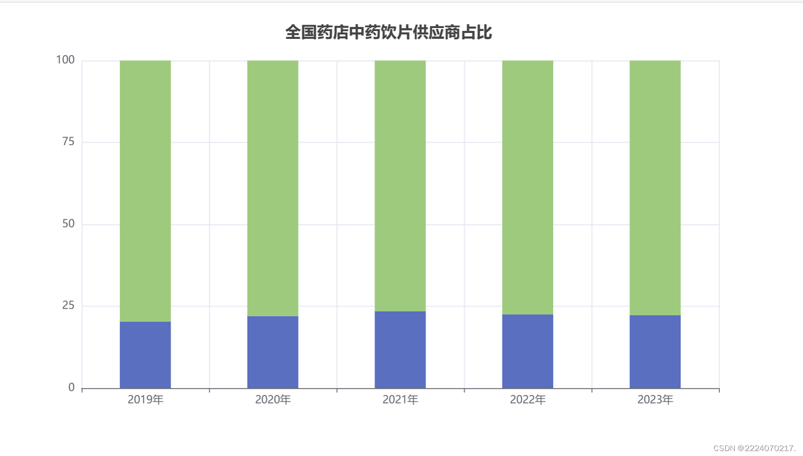
需求四: 请基于pyecharts,用雷达图展示表4数据,得到图4。
from pyecharts import options as opts
from pyecharts.charts import Radar

v1 = [[33,45,3,9,10]]
c = (
    Radar()
    .add_schema(
        schema=[
            opts.RadarIndicatorItem(name="生物制药", max_=50),
            opts.RadarIndicatorItem(name="中成药", max_=50),
            opts.RadarIndicatorItem(name="化学药", max_=50),
            opts.RadarIndicatorItem(name="中药饮片", max_=50),
            opts.RadarIndicatorItem(name="保健品", max_=50),
        ]
    )
    .add("", v1)
    .set_series_opts(label_opts=opts.LabelOpts(is_show=False),
                     areastyle_opts=opts.AreaStyleOpts(opacity=0.3))
    .set_global_opts(
        legend_opts=opts.LegendOpts(is_show=False),
        title_opts=opts.TitleOpts(title="全国药店药品销售额占比",pos_left = '40%',pos_top = '1%'),
    )
)
c.render_notebook()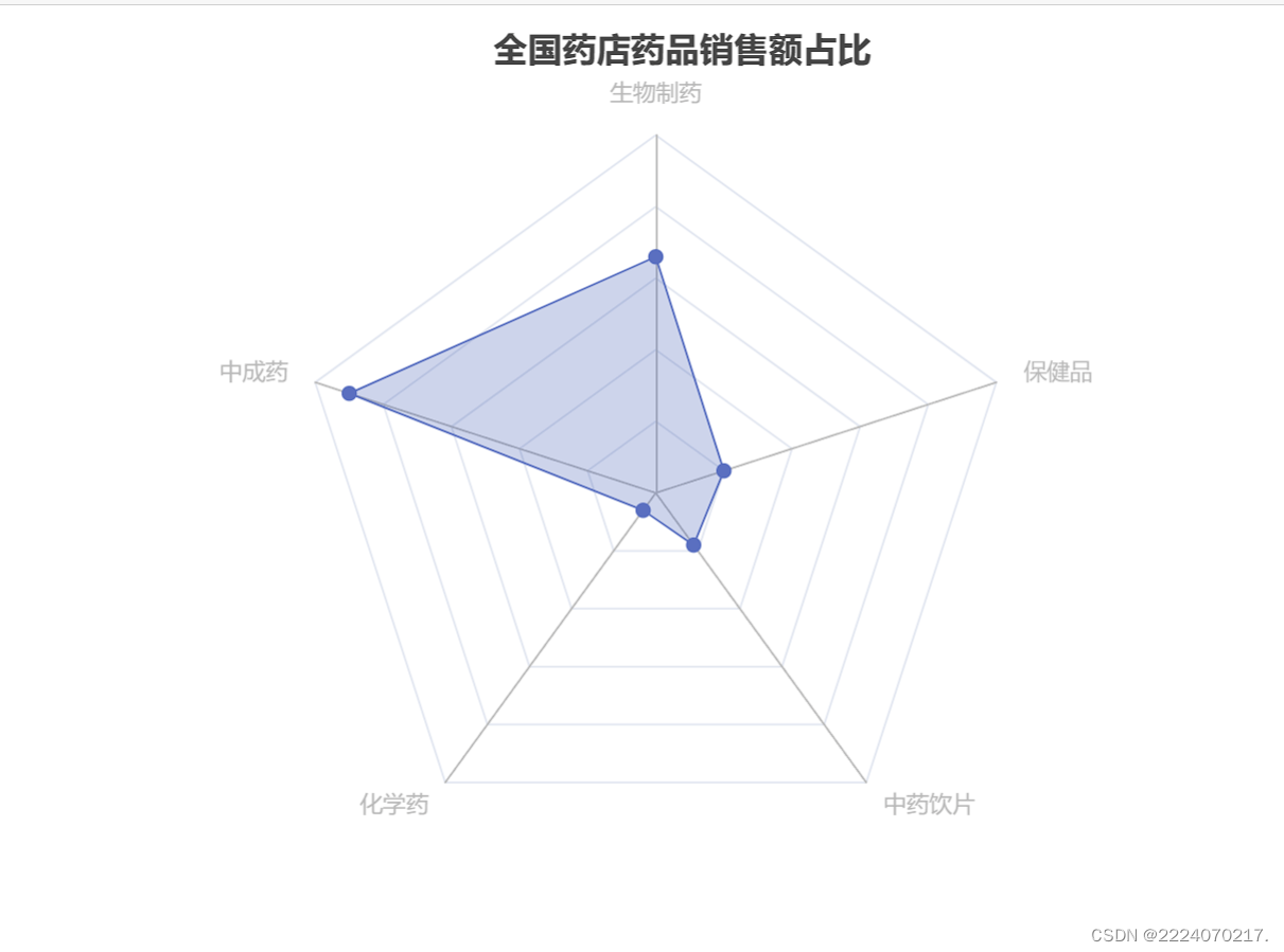
需求五: 将上述图1到图4,利用“并行多图”的方式排布,得到图5。(参考示意图)
#导入需要的库
import numpy as np
import pyecharts.options as opts
# 1. 导入需要的图表类(Bar,Line,Pie...)
from pyecharts.charts import Bar,Pie,Radar,Grid,Line

x_value = ['2014','2015','2016','2017','2018','2019','2020','2021']
bar = (
    Bar()
    .add_xaxis(xaxis_data=x_value)              #导入X轴
    .add_yaxis(series_name="诊疗量(万人次)",    #柱形图图例名称
               y_axis=[87430,90912,96225,101885,107147,116390,105764,120215],    #柱形图数据
               yaxis_index=0,                  #表示y轴索引,用于拥有多个y轴的单表中
               label_opts = opts.LabelOpts(is_show=False),        #坐标轴标签配置项(柱子里的数字)
              )
    .set_global_opts(title_opts=opts.TitleOpts(title="2014-2021年中国中医类医疗卫生机构诊疗量",pos_left = '27%',pos_top = 15),   #设置图表标题及其位置
                     legend_opts=opts.LegendOpts(is_show=False),             #设置不显示图例
                     #axistick_opts=opts.AxisTickOpts(),
                     yaxis_opts=opts.AxisOpts(
                                              name="诊疗量(万人次)",min_=0, max_=130000,interval=50000,    #设置柱形图y轴名称和最大值,最小值和间距
#                                               name_rotate='90',name_location="center",name_gap=55,       #y轴名称的旋转角度,位置和大小
                                              axistick_opts = opts.AxisTickOpts(is_inside=False,           #轴刻度线往外
                                                                                is_show=True,),            #是否显示轴刻度线
                                              axisline_opts=opts.AxisLineOpts(is_show=True),               #是否显示轴线
                                             ),
                     tooltip_opts = opts.TooltipOpts(is_show = False),
    )
    .set_series_opts(
        itemstyle_opts=opts.ItemStyleOpts(           #图元样式配置项
            opacity=0.5                              #设置柱形图透明度:0.5
                                          )
                    )
    .extend_axis(
        yaxis=opts.AxisOpts(name = "诊疗量(万人次)",   #柱形图y轴名称
                            type_ = "value",
                            position = "left",         #柱形图y轴在左边显示
                            )
                )
    .extend_axis(
        yaxis=opts.AxisOpts(name = "同比增速(%)",   #柱形图y轴名称
                            type_ = "value",
                            position = "right",     #柱形图y轴在右边显示
                            min_=-20, max_=20,interval=10,       #设置柱形图y轴最大值,最小值和间距
                            axistick_opts = opts.AxisTickOpts(is_inside=False,  #轴刻度线往外
                                                              is_show=True,),   #是否显示轴刻度线
                                              axisline_opts=opts.AxisLineOpts(is_show=True),   #是否显示轴线
                                                              )
                            )
)
line = (
    Line()
    .add_xaxis(xaxis_data=x_value)     #导入x轴
    .add_yaxis(series_name="同比增速(%)",       #折线图图例名称
               y_axis=[7.40,4.00,5.83,5.81,5.16,8.63,-9.13,13.66],     #折线图数据
               yaxis_index=2,                #表示y轴索引,用于拥有多个y轴的单表中
               symbol="triangle",            #设置折线图折点为三角形
               symbol_size=[10,10],          #设置三角形的长度和宽度
               label_opts = opts.LabelOpts(is_show=False),        #坐标轴标签配置项(柱子里的数字)
               z=3
              )
)

# 堆积图
# data1 = np.array([20.3,22.0,23.5,22.5,22.3])   # 跨国企业占比
# data2 = np.array([79.7,78.0,76.5,77.5,77.7])   # 本土企业占比
stack=(
    Bar()
    .add_xaxis(          ["2019年", "2020年", "2021年","2022年", "2023年"])
    .add_yaxis("商家A",  [20.3,22.0,23.5,22.5,22.3], stack=1,bar_width = "40%",
              label_opts = opts.LabelOpts(is_show=False),        #坐标轴标签配置项(柱子里的数字)
               xaxis_index = 1,
               yaxis_index = 3,
#                series_layout_by = "column",
              )
    .add_yaxis("商家B",  [79.7,78.0,76.5,77.5,77.7], stack=1,bar_width = "40%",
              label_opts = opts.LabelOpts(is_show=False),        #坐标轴标签配置项(柱子里的数字)
               xaxis_index = 1,
               yaxis_index = 3,
#                series_layout_by = "column",
              )
    .set_global_opts(title_opts=opts.TitleOpts(title="全国药店中药饮片供应商占比",pos_left = '40%',pos_top = '50%'),
                     legend_opts=opts.LegendOpts(is_show=False),
                     yaxis_opts=opts.AxisOpts(
                             name="",min_=0, max_=100,interval=25,    #设置柱形图y轴名称和最大值,最小值和间距
                                              )
                    )
)

# #环形图
L1 = ['化学药','中成药','生物制品','保健品','中药饮片','其他']
num = [33,45,3,9,6,4]
pie=(
    Pie()
    .add("",[list(z) for z in zip(L1,num)],radius=["15%", "30%"],center=["20%","75%"])
    .set_global_opts(
        title_opts=opts.TitleOpts(title="中药材消费者画像",pos_left = '10%',pos_top = '49%'),    #主标题和次标题
        legend_opts=opts.LegendOpts(is_show=False),
    )
)

# #雷达图
v1 = [[33,45,3,9,10]]
r = (
     Radar()
     .add_schema(
         schema=[
             opts.RadarIndicatorItem(name="生物制药", max_=50),
             opts.RadarIndicatorItem(name="中成药", max_=50),
             opts.RadarIndicatorItem(name="化学药", max_=50),
             opts.RadarIndicatorItem(name="中药饮片", max_=50),
             opts.RadarIndicatorItem(name="保健品", max_=50),
         ],center=["20%","75%"]
     )
     .add("", v1,)
     .set_series_opts(label_opts=opts.LabelOpts(is_show=False),
                      areastyle_opts=opts.AreaStyleOpts(opacity=0.3))
     .set_global_opts(
         legend_opts=opts.LegendOpts(is_show=False),
         title_opts=opts.TitleOpts(title="全国药店药品销售额占比",pos_left = '40%',pos_top = '1%'),
     )
)
grid = (
    # 1.创建一个Grid图表
    Grid()
    # 2.往Grid图表里面填充其他图表(Bar,Line,Scatter)
    # 通过联合调整pos_bottom, pos_top, pos_left, pos_right这四个参数,可以精细布局图表在整张画布中的位置

    .add(bar.overlap(line), grid_opts=opts.GridOpts(pos_bottom="55%",pos_top="10%",
                                                    pos_left="10%",pos_right="10%",
                                                    ),is_control_axis_index=True )

    .add(stack, grid_opts=opts.GridOpts(pos_bottom="10%",pos_top="58%",
                                     pos_left="38%",pos_right="30%"
                                     ),is_control_axis_index=True)

    .add(pie, grid_opts=opts.GridOpts(
                                      ))

#     .add(r, grid_opts=opts.GridOpts(
#                                      ))

    )
grid.render_notebook()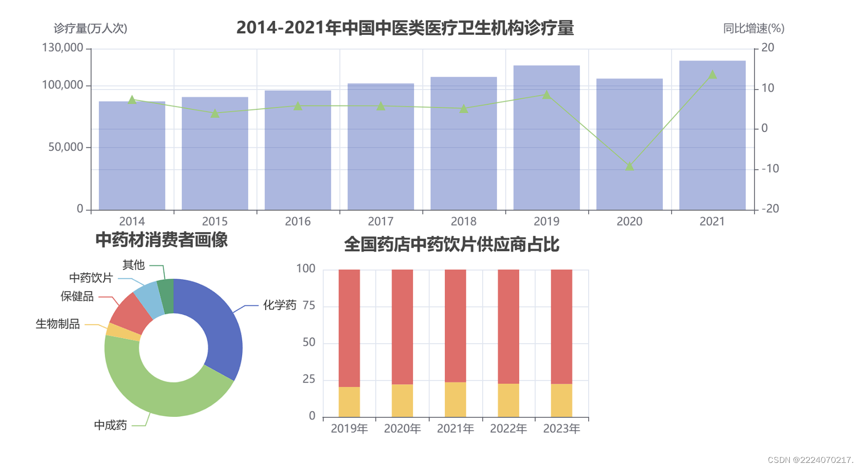
需求六: 将上述图1到图5,利用“轮播多图”的方式排布,得到图6。


 2944
2944


 被折叠的 条评论
为什么被折叠?
被折叠的 条评论
为什么被折叠?
 到【灌水乐园】发言


