


需要做如下这样的淘宝轮播图

代码示例:
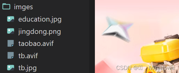
首先我需要点进官网,选中图片保存,在我们的编码器中建一个文件夹,命名为imges或其他你自己容易记住的名字。保存图片后命名为tb.jpg,命名原理同上,自己能找到即可。也要注意命名要规范
譬如这样:
<title>淘宝轮播图制作</title>
<style>
* {
margin: 0;
padding: 0;
}
li {
list-style: none;
}
.tb-promo {
position: relative;
width: 846px;
height: 472px;
background-color: pink;
margin: 100px auto;
}
.tb-promo img {
width: 846px;
height: 472px;
}
.prev {
position: absolute;
/* 加了绝对定位的盒子可以直接设置宽度和高度 */
left: 0;
/* 绝对定位的盒子垂直居中 */
top: 50%;
margin-top: -15px;
width: 30px;
height: 40px;
background-color: rgba(0, 0, 0, 0.3);
text-align: center;
line-height: 30px;
color: #fff;
text-decoration: none;
border-top-right-radius: 15px;
border-bottom-right-radius: 15px;
}
.next {
position: absolute;
/* 加了绝对定位的盒子可以直接设置宽度和高度 */
right: 0;
/* 绝对定位的盒子垂直居中 */
top: 50%;
margin-top: -15px;
width: 30px;
height: 40px;
background-color: rgba(0, 0, 0, 0.3);
text-align: center;
line-height: 30px;
color: #fff;
text-decoration: none;
border-top-left-radius: 15px;
border-bottom-left-radius: 15px;
}
.promo-nav {
position: absolute;
bottom: 10px;
margin-left: -35px;
left: 50%;
width: 80px;
height: 23px;
/* background-color: pink; */
background-color: rgba(255, 255, 255, 0.3);
border-radius: 10px;
}
.promo-nav li {
float: left;
width: 8px;
height: 8px;
background-color: #fff;
border-radius: 50%;
margin: 3px;
}
/* 不要忘记选择器权重问题 */
.promo-nav .selected {
background-color: #ff5000;
}
</style>
</head>
<body>
<div class="tb-promo">
<img src="./imges/tb.jpg" alt="">
<!-- 左侧按钮 -->
<a href="#" class="prev"><</a>
<!-- 右侧按钮 -->
<a href="#" class="next">></a>
<!-- 小圆点 -->
<ul class="promo-nav">
<li></li>
<li></li>
<li></li>
<li class="selected"></li>
<li></li>
</ul>
</div>
</body>
</html>
代码运行结果:


 580
580


 被折叠的 条评论
为什么被折叠?
被折叠的 条评论
为什么被折叠?
 到【灌水乐园】发言


