


 该博客围绕HarmonyOS商城列表案例展开实操总结。涵盖构建自定义组件封装页头、学习循环渲染与条件渲染、使用List组件改造页面、创建自定义构建函数封装列表项,还介绍了@Style和@Extend装饰器封装与引用样式,最后展示了源代码。
商城列表案例实操总结
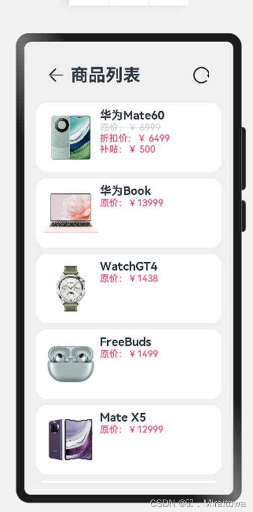
完成如下图展示效果:
一、构建自定义组件Header用于封装页头
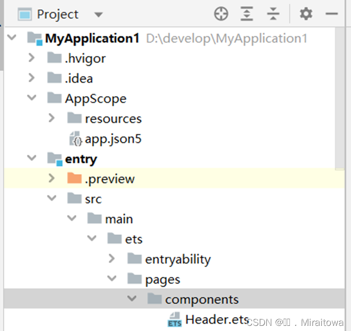
1.1在编译器中创建一个components目录,在目录下创建一个ArkTS 文件命名为Header
如下图:
代码展示如下:
@Component
struct Header {
build() {
}
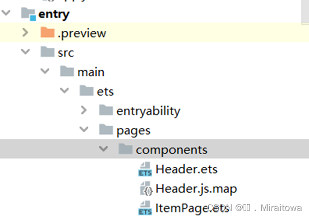
1.2 创建一个ArkTS 文件命名为ItemPage
如下图:
@Entry
@Component
struct ItemPage {
build(){
}
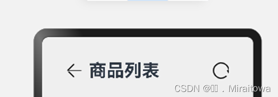
1.3 在Header页面中build()下建立Row()容器,并从左往右依次排列Image图片,Text文本组件,Image图片组件,利用space让其有间距
代码示例:
build() {
Row({
space:10}){
Image($r('app.media.jiantou')).width(30)
//如果需要传值
// Text("我是标题")
Text(this.title)
.fontSize(30)
.fontWeight(FontWeight.Bold)
Blank() //把剩余的空间都填充满
Image($r('app.media.shuaxin')).width(30)
}
.width('100%')//给row容器设置一个宽度
.padding(20)
}
1.4在Text文本内容和Image组件中添加Blank()组件,用于调节各个组件之间的距离,把剩余的空间都填充满。
Blank() //把剩余的空间都填充满
1.5定义title 标题变量,并传入标题数据
struct Header {
title:string //标题不能写死,在这里定义一个标题变量
build() {
Row({
space:10}){
Image($r('app.media.jiantou')).width(30)
Text(this.title)
.fontSize(30)
.fontWeight(FontWeight.Bold)
Blank() //把剩余的空间都填充满
Image($r('app.media.shuaxin')).width(30)
}
.width('100%')//给row容器设置一个宽度
.padding(20)
}
}
1.6对自定义组件Header进行导出处理
export struct Header {
title:string //标题不能写死,在这里定义一个标题变量
build() {
Row({
space:10}){
Image($r('app.media.jiantou')).width(30)
Text(this.title)
.fontSize(30)
.fontWeight(FontWeight.Bold)
Blank() //把剩余的空间都填充满
Image($r('app.media.shuaxin')).width(30)
}
.width('100%')//给row容器设置一个宽度
.padding(20)
}
}
1.7 在ItemPage中建立建立Column容器,导包并使用Header
struct ItemPage {
build() {
Row(){
Column({
space:10}){
Header({
title:'商品列表'})
导包使用:
//import 导入 Header
// import {Header} from './Header'
//加了default Header就不用再加上{ }了
import Header from './Header'
引用 Header Footer import {Header,Footer} from './Header'
export 对外有了一个访问的接口,是在Header的到出方法中添加default
则ItemPage就不用再导入加不用再加上{ }了。
如下例代码:
@Component
//export 对外有了一个访问的接口
export default struct Header {
title:string //标题不能写死,在这里定义一个标题变量
1.8 给Header和Item Page中添加属性,从而实现效果
.width('100%')//给row容器设置一个宽度
.padding(20)
ItemPage中Column容器属性
.width('100%')
.height('100%')
.backgroundColor('#EFEFEF')
.padding(20)
运行效果:
二、学习循环渲染,定义Item类并通过ForEach循环渲染界面
2.1定义ImageItem类,传入商品名称,图片、价格、折扣等变量实例化
//声明一个ImageItem类
class ImageItem {
name :string
image:ResourceStr
price:number
discount:number
//修改里面的值
setName(name:string){
// this.name =name+this.name
this.name =name
}
getName(){
return this.name
}
2.2定义构造函数传参
//定义构造函数
constructor( name :string,image:ResourceStr,price:number,discount:number=0) {
// ?: 非必选,设置可选参数
//赋值
this.name =name
this.image=image
this.price=price
this.discount=discount
}
若不写构造函数,只能使用new的方法来实现传入商品数据。
//若不写构造函数,只能使用new
//item:Item =new Item('华为Mate60',$r('app.media.mate60'),6999,500)
2.3定义一个数组,来传入商品的具体数据信息
struct ItemPage {
private list:Array<ImageItem> =[
new ImageItem('华为Mate60',$r('app.media.mate60'),6999,500),
new ImageItem('华为Book',$r('app.media.Book'),13999),
new ImageItem('WatchGT4',$r('app.media.WatchGT4'),1438),
new ImageItem('FreeBuds',$r('app.media.FreeBuds'),1499),
new ImageItem('Mate X5',
 最低0.47元/天 解锁文章


 扫一扫
扫一扫


 1万+
1万+

 被折叠的 条评论
为什么被折叠?
被折叠的 条评论
为什么被折叠?
 到【灌水乐园】发言


