


闹钟实操文档
一 、页面前期准备工作
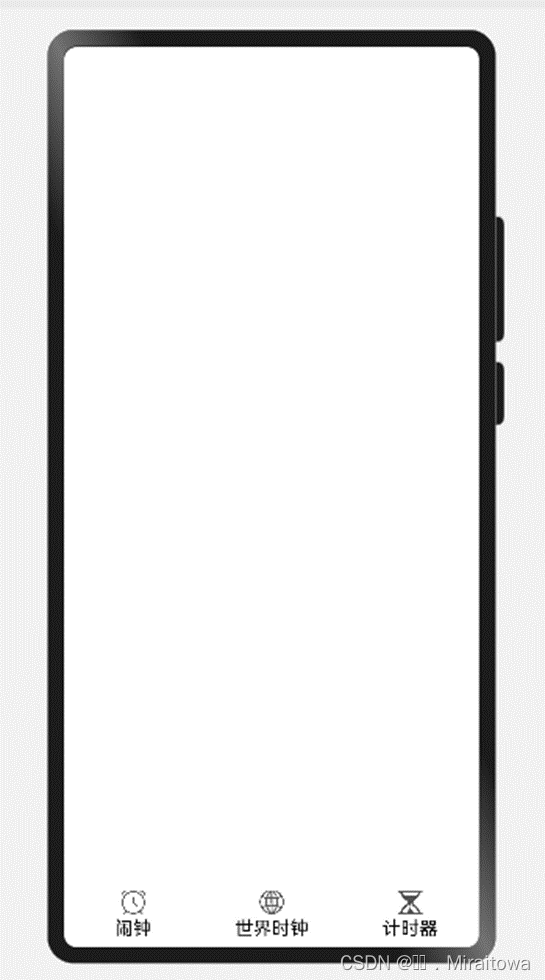
1.设置tabs下标签
设置自定义tab标签的内容属性,以及点击事件,为其设置标签的位置处于底部标签并且导入相应的图片。
代码如下:
Entry
@Component
struct Index {
@State currentIndex: number = 0
private tabsController: TabsController = new TabsController()
@Builder TabBuilder(title: string, image: Resource, selectImage: Resource, tag: number, badgeValue: number = 0) {
Column({ space: 3 }) {
Badge({ count: badgeValue, style: { badgeSize: 16 } }) {
Image(this.currentIndex == tag ? selectImage : image).size({ width: 25, height: 20 })
}
Text(title).fontColor(this.currentIndex == tag ? 'black' : '#000000')
}.width('100%').height('50').justifyContent(FlexAlign.Center)
.onClick(() => {
this.currentIndex = tag
this.tabsController.changeIndex(this.currentIndex)
})
}
build() {
Tabs({ barPosition: BarPosition.End, controller: this.tabsController }) {
TabContent() {
、
}
.tabBar(this.TabBuilder('闹钟', $r('app.media.clock'), $r("app.media.clock"), 0))
TabContent() {
}
.tabBar(this.TabBuilder('世界时钟', $r('app.media.world'), $r('app.media.world'), 1))
TabContent() {
}
.tabBar(this.TabBuilder('计时器', $r('app.media.jishiqi'), $r('app.media.jishiqi'), 2))
}
}
}
运行结果如下:
2.创建一个新的页面
新建一个子页面命名为ClockPage 用来封装
闹钟里面的内容,在其页面布局
代码示例:
@Component
export struct ClockPage {
build() {
Column(){
}
}
}
二 、绘制页面内容
所需要绘制的页面:
2.1 绘制页面头部内容
2.1.1设置顶部页面图片
导入相应的图片,为其设置属性,一定要给Column布局组件设置相应的高度,以及背景颜色,若不设置高度我们写的内容则不会按照我们想要的从上往下排版。
代码示例:
build() {
Column(){
Row(){
Image($r('app.media.gengduo')).width(20).height(40)
}.margin({left:300,top:20})
}.height('100%')
.backgroundColor('#F1F2F3')
}
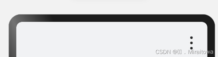
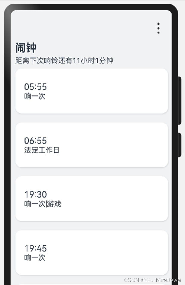
运行结果:
2.1.2 利用text组件输入文本内容
代码如下:
Column({space:5}){
Text('闹钟').fontSize(24).fontWeight(FontWeight.Bold)
Text('距离下次响铃还有11小时1分钟')
}.width('100%').height(60)
.alignItems(HorizontalAlign.Start) //设置文本内容在水平方向上从左开始排列
.padding(10)
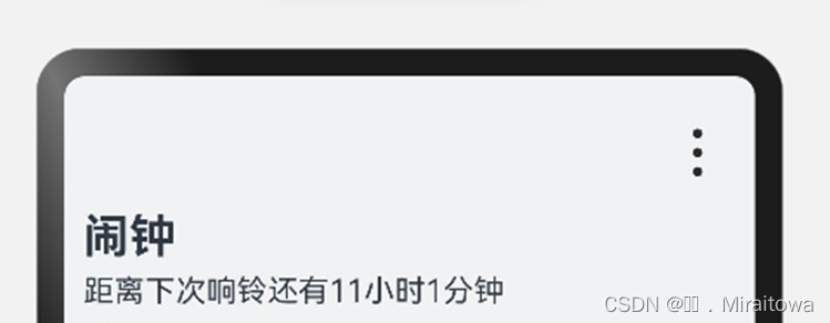
运行结果:
2.2描绘所设置的闹钟内容
2.2.1定义一个montent的类用来封装时间以及内容
代码示例:
class montent{
time:string
text:string
constructor( time:string,text:string) {
this.time=time
this.text=text
}
}
2.2.2 自定义一个Time的列表,并且在里面传入内容
代码示例:
@State Time:Array<montent>=[
new montent('05:55','响一次'),
new montent('06:55','法定工作日'),
new montent('19:30','响一次|游戏'),
new montent('19:45','响一次'),
new montent('19:55','响一次 | 下楼'),
new montent('19:55','响一次'),
new montent('20:00','响二次 |洗漱'),
new montent('22:00','响一次,签到'),
new montent('23:00','响一次,睡觉'),
]
2.2.3 设置统一的卡片样式,直接调用
代码示例:
//设置card()的样式 统一的卡片样式
@Styles function card() {
.width("95%")
.height(100)
.padding(20)
.margin(10)
.backgroundColor(Color.White)
.borderRadius(15)
.shadow({ radius: 6, color: "#1F000000", offsetX: 2, offsetY: 4 }) //阴影
}[倩黄1]
2.2.4 利用List组件实现滚动的效果,利用ForEach循环渲染
代码示例:
List(){
ForEach(this.Time,(item:montent)=>{
ListItem(){
Row() {
Column(){
Text(item.time).fontSize(20)
Text(item.text)
}.alignItems(HorizontalAlign.Start)
}.card()
}
})
}.layoutWeight(1) //设置权重,使其底部都能显示
运行代码结果:
2.2.5 在Row里面添加开关按钮
并且设按钮都处于关闭的状态
代码示例:
//设置开关按钮
Toggle({ type: ToggleType.Switch, isOn: false })
.selectedColor('#007DFF')
.switchPointColor('#FFFFFF')
.onChange((isOn: boolean) => {
console.info('Component status:' + isOn)
})
运行结果:
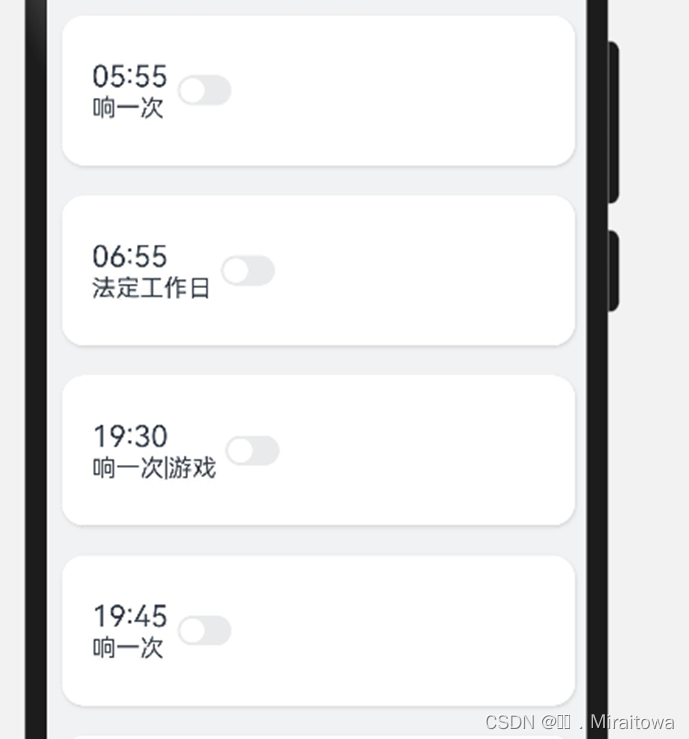
由上图可见,我们需要为其设置属性,让文本内容和开关按钮在两边
代码示例:
justifyContent(FlexAlign.SpaceBetween)
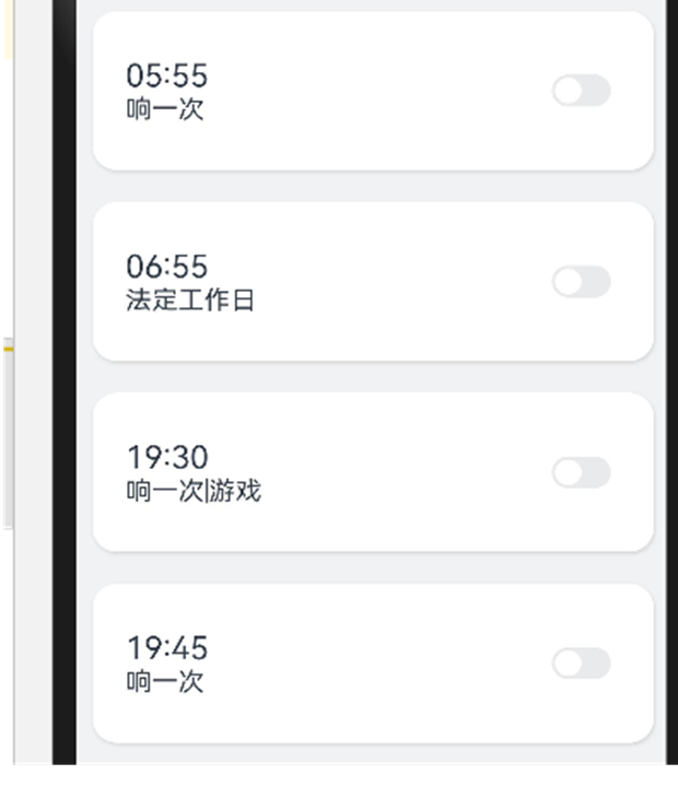
2.2.6整体代码:
List(){
ForEach(this.Time,(item:montent)=>{
ListItem(){
Row() {
Column(){
Text(item.time).fontSize(20)
Text(item.text)
}.alignItems(HorizontalAlign.Start)
//设置开关按钮
Toggle({ type: ToggleType.Switch, isOn: false })
.selectedColor('#007DFF')
.switchPointColor('#FFFFFF')
.onChange((isOn: boolean) => {
console.info('Component status:' + isOn)
})
}.card()
.justifyContent(FlexAlign.SpaceBetween)
}
})
}.layoutWeight(1)
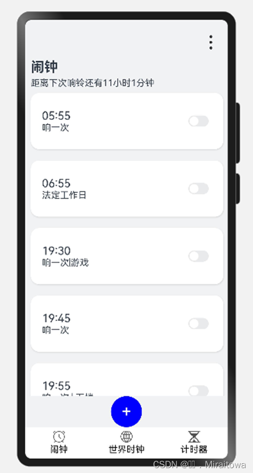
运行结果:
2.3设置添加按钮
代码示例:
Button('+', { type: ButtonType.Circle, stateEffect: false })
.width(55).height(55).backgroundColor(Color.Blue).fontSize(30)
运行结果:
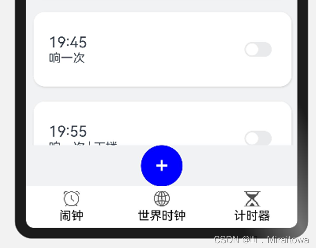
三 、设置点击事件
3.1头部设置菜单选项
需要的效果图:
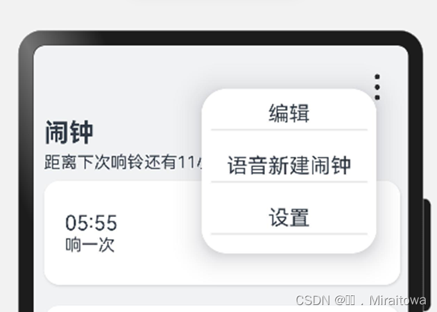
3.1.1 定义menu的一个类用来封装内容
代码示例:
class menu{
content :string
constructor( content :string) {
this.content = content
}
}
3.1.2 设置一个list 列表用来传入内容
代码示例:
@State list:Array<menu> =[
new menu('编辑'),
new menu('语音新建闹钟'),
new menu('设置'),
]
3.1.3 设置自定义菜单,利用ForEach 循环渲染内容
代码示例:
//设置的菜单
@Builder MenuBuilder() {
Flex({ direction: FlexDirection.Column, justifyContent: FlexAlign.Start, alignItems: ItemAlign.Start }) {
ForEach(this.list, (item:menu) => {
Column() {
Row() {
Text(item.content).fontSize(20)
}
.width('100%')
.height(30)
.justifyContent(FlexAlign.Center)
.align(Alignment.Center)
.onClick(() => {
console.log('成功')
})
Divider()
}.padding(5).height(50)
})
}.width(160)
}
3.1.4在图片下直接调用
代码示例:
Row(){
Image($r('app.media.gengduo')).width(20).height(40)
.bindMenu(this.MenuBuilder())
}.margin({left:300,top:20})
3.2按钮设置弹窗提示内容
效果图如下:
3.2.1 设置点击开关按钮,显示弹窗
代码示例:
//设置点击开关按钮,显示弹窗提示
.onClick(()=>{
AlertDialog.show({
message:'距离下次响铃还有10小时10分钟',
autoCancel: true,
alignment: DialogAlignment.Bottom,
gridCount: 7,
})
})
3.3添加按钮设置自定义弹窗
点击添加按钮
效果图如下:
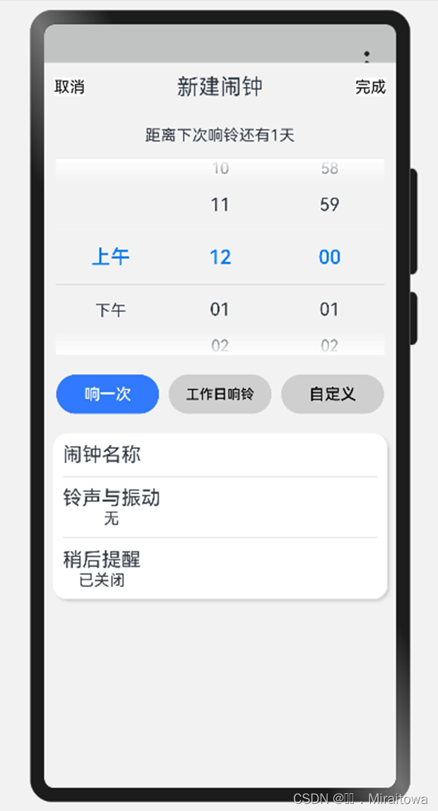
3.3.1 设置自定义弹窗的属性
在主页面里设置自定义弹窗
代码示例:
//自定义弹窗
dialogController: CustomDialogController = new CustomDialogController({
builder: CustomDialogExample({
cancel: this.onCancel,
confirm: this.onAccept,
}),
alignment: DialogAlignment.Bottom,// 可设置dialog的对齐方式,设定显示在底部或中间等,默认为底部显示
customStyle:true,
})
onCancel() {
console.info('Callback when the first button is clicked')
}
onAccept() {
console.info('Callback when the second button is clicked')
}
3.3.2 新建页面设置弹窗中的内容
新建一个CustomDialogExample的页面,并且利用export 导出
代码示例:
//动态中的“...”弹窗
@CustomDialog
export struct CustomDialogExample {
@State isMilitaryTime: boolean = false
private selectedTime: Date = new Date('2024-06-6T08:00:00:00')
controller: CustomDialogController
cancel: () => void
confirm: () => void
build() {
Column() {
}.backgroundColor('#F2F2F2').height('95%').width('100%')
// 设置弹窗的背景颜色 ,以及所需要的宽度和高度
}
}
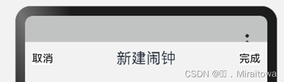
3.3.2.1 利用Text组件设置头部内容
添加文本内容,并且设置相应的点击事件
代码示例:
Row() {
Text('取消')
.onClick(() => {
this.controller.close()
this.cancel()
}).backgroundColor(0xffffff).fontColor(Color.Black)
Text('新建闹钟').fontSize(22)
Text('完成')
.onClick(() => {
this.controller.close()
this.confirm()
}).backgroundColor(0xffffff).fontColor(Color.Black)
}.width('100%').height(50)
.justifyContent(FlexAlign.SpaceBetween).padding(10)
运行结果:
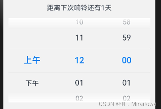
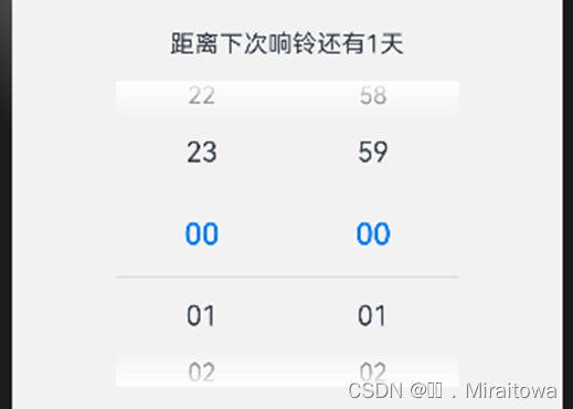
3.3.2.2 设置滚动选时
代码示例:
点击文本内容时会出现选时跳选
Text('距离下次响铃还有1天')
.onClick(() => {
this.isMilitaryTime = !this.isMilitaryTime
})
TimePicker({
selected: this.selectedTime,
})
.useMilitaryTime(this.isMilitaryTime) //展示时间是否为24小时制
.onChange((value: TimePickerResult) => {
this.selectedTime.setHours(value.hour, value.minute)
console.info('select current date is: ' + JSON.stringify(value))
})
运行结果:
点击之前:
点击之后:
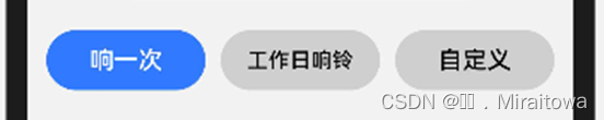
3.3.2.3 利用Button组件设置按钮
代码示例:
Row({space:10}){
Button('响一次', { type: ButtonType.Capsule, stateEffect: true }).backgroundColor(0x317aff).width('30%')
Button('工作日响铃', { type: ButtonType.Capsule, stateEffect: true }).backgroundColor('#CFCFCF').width('30%').fontColor(Color.Black)
Button('自定义', { type: ButtonType.Capsule, stateEffect: true }).backgroundColor('#CFCFCF').width('30%').fontColor(Color.Black)
}.padding(5)
运行结果:
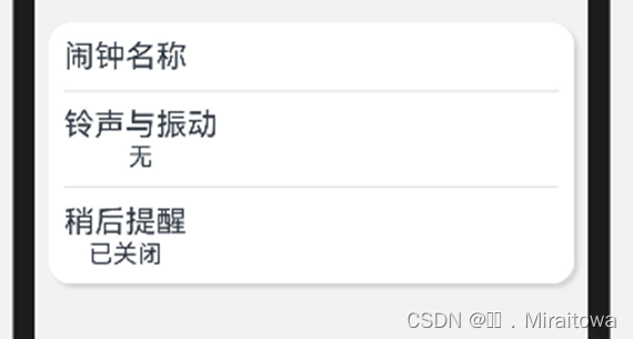
3.3.2.4 利用Text 组件设闹钟的名称以及其他内容
代码示例:
Row(){
Column({space:10}){
Text('闹钟名称').fontSize(20)
Divider()
Column(){
Text('铃声与振动').fontSize(20)
Text('无')
}
Divider()
Column(){
Text('稍后提醒').fontSize(20)
Text('已关闭')
}
}.alignItems(HorizontalAlign.Start)
}.width('95%').padding(10)
.backgroundColor(Color.White)
.borderRadius(15)
.shadow({ radius: 6, color: "#1F000000", offsetX: 8, offsetY: 8 })
运行结果:
3.3.2.5 在ClockPage 页面的添加按钮设置点击事件
代码示例:
Button('+', { type: ButtonType.Circle, stateEffect: false })
.width(55).height(55).backgroundColor(Color.Blue).fontSize(30)
.onClick(()=>{
this.dialogController.open()
})
3.3.3 弹窗内容的导入以及调用
在ClockPage 页面导入CustomDialogExample 页面
代码示例:
import {CustomDialogExample} from './CustomDialogExample'
由于是弹窗直接调用在页面末端即可
代码示例:
CustomDialogExample
3.3.4 弹窗的显示结果
整体代码:
//动态中的“...”弹窗
@CustomDialog
export struct CustomDialogExample {
@State isMilitaryTime: boolean = false
private selectedTime: Date = new Date('2024-06-6T08:00:00:00')
controller: CustomDialogController
cancel: () => void
confirm: () => void
build() {
Column({ space: 15 }) {
Row() {
Text('取消')
.onClick(() => {
this.controller.close()
this.cancel()
}).backgroundColor(0xffffff).fontColor(Color.Black)
Text('新建闹钟').fontSize(22)
Text('完成')
.onClick(() => {
this.controller.close()
this.confirm()
}).backgroundColor(0xffffff).fontColor(Color.Black)
}.width('100%').height(50)
.justifyContent(FlexAlign.SpaceBetween).padding(10)
Text('距离下次响铃还有1天')
.onClick(() => {
this.isMilitaryTime = !this.isMilitaryTime
})
TimePicker({
selected: this.selectedTime,
})
.useMilitaryTime(this.isMilitaryTime) //展示时间是否为24小时制
.onChange((value: TimePickerResult) => {
this.selectedTime.setHours(value.hour, value.minute)
console.info('select current date is: ' + JSON.stringify(value))
})
Row({space:10}){
Button('响一次', { type: ButtonType.Capsule, stateEffect: true }).backgroundColor(0x317aff).width('30%')
Button('工作日响铃', { type: ButtonType.Capsule, stateEffect: true }).backgroundColor('#CFCFCF').width('30%').fontColor(Color.Black)
Button('自定义', { type: ButtonType.Capsule, stateEffect: true }).backgroundColor('#CFCFCF').width('30%').fontColor(Color.Black)
}.padding(5)
Row(){
Column({space:10}){
Text('闹钟名称').fontSize(20)
Divider()
Column(){
Text('铃声与振动').fontSize(20)
Text('无')
}
Divider()
Column(){
Text('稍后提醒').fontSize(20)
Text('已关闭')
}
}.alignItems(HorizontalAlign.Start)
}.width('95%').padding(10)
.backgroundColor(Color.White)
.borderRadius(15)
.shadow({ radius: 6, color: "#1F000000", offsetX: 8, offsetY: 8 })
}.backgroundColor('#F2F2F2').height('95%').width('100%')
}
}


 1585
1585


 被折叠的 条评论
为什么被折叠?
被折叠的 条评论
为什么被折叠?
 到【灌水乐园】发言


