


实现水平居中和垂直居中的方法
一、水平居中
利用CSS布局
(1) 元素居中对齐
1.1 理论:要水平居中对齐一个元素(如 <div>), 可以使用 margin: auto;。
设置到元素的宽度将防止它溢出到容器的边缘。
元素通过指定宽度,并将两边的空外边距平均分配:
- 2 代码示例:
- <style>
- * {
- margin: 0;
- padding: 0;
- }
- .c {
- margin: auto;
- /* 设置元素的宽度将防止它溢出到容器的边缘 */
- width: 50%;
- border: 3px solid #73AD21;
- padding: 10px;
- }
- </style>
- </head>
- <body>
- <div class="c">
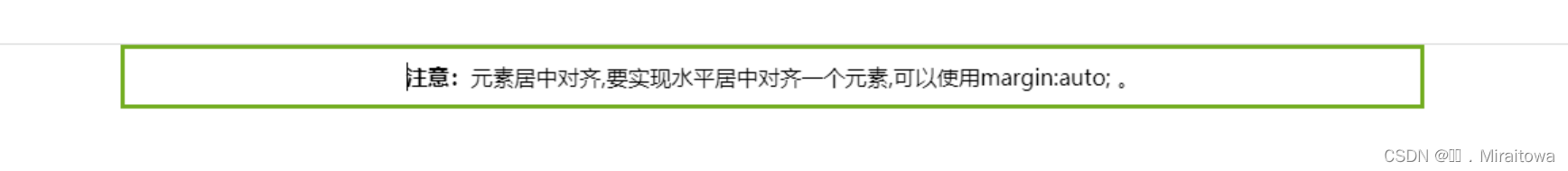
- <p ><b>注意:</b>元素居中对齐,要实现水平居中对齐一个元素,可以使用margin:auto; 。 </p>
- </div>
- </body>
- </html>
1.3 运行结果:

(2) 文本居中对齐
text-align:center; 对文本元素设置水平居中
代码示例:
.c {
margin: auto;
/* 设置元素的宽度将防止它溢出到容器的边缘 */
width: 50%;
border: 3px solid #73AD21;
padding: 10px;
text-align: center;
}
<div class="c">
<p><b>注意:</b>元素居中对齐,要实现水平居中对齐一个元素,可以使用margin:auto; 。 </p>
</div>
运行结果:
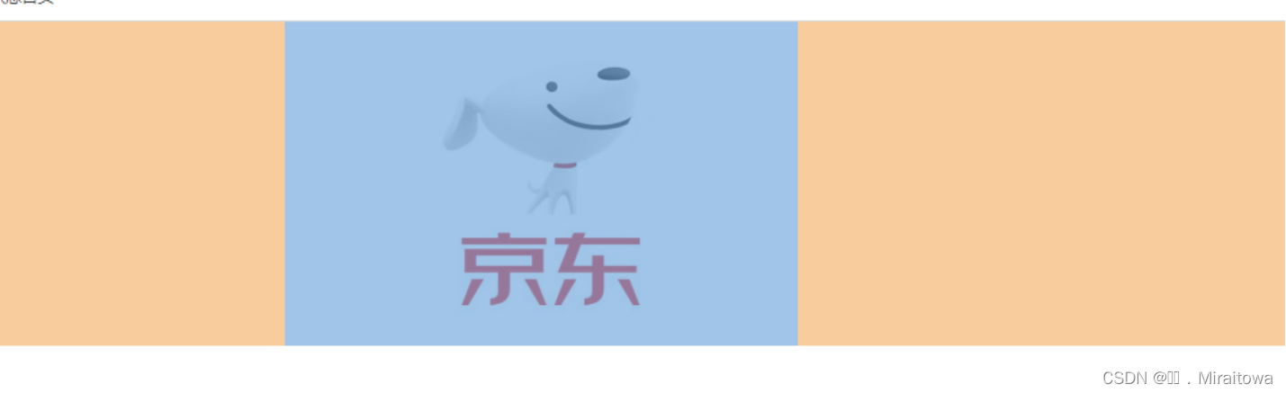
(3) 图片居中对齐
要让图片居中对齐, 可以使用 margin: auto; 并将它放到 块 元素中:
代码示例:
<style>
* {
margin: 0;
padding: 0;
}
img {
/* 块级元素 */
display: block;
margin: 0 auto;
}
<body>
<img src="./imges/jingdong.png" alt="">
</body>
代码运行结果:
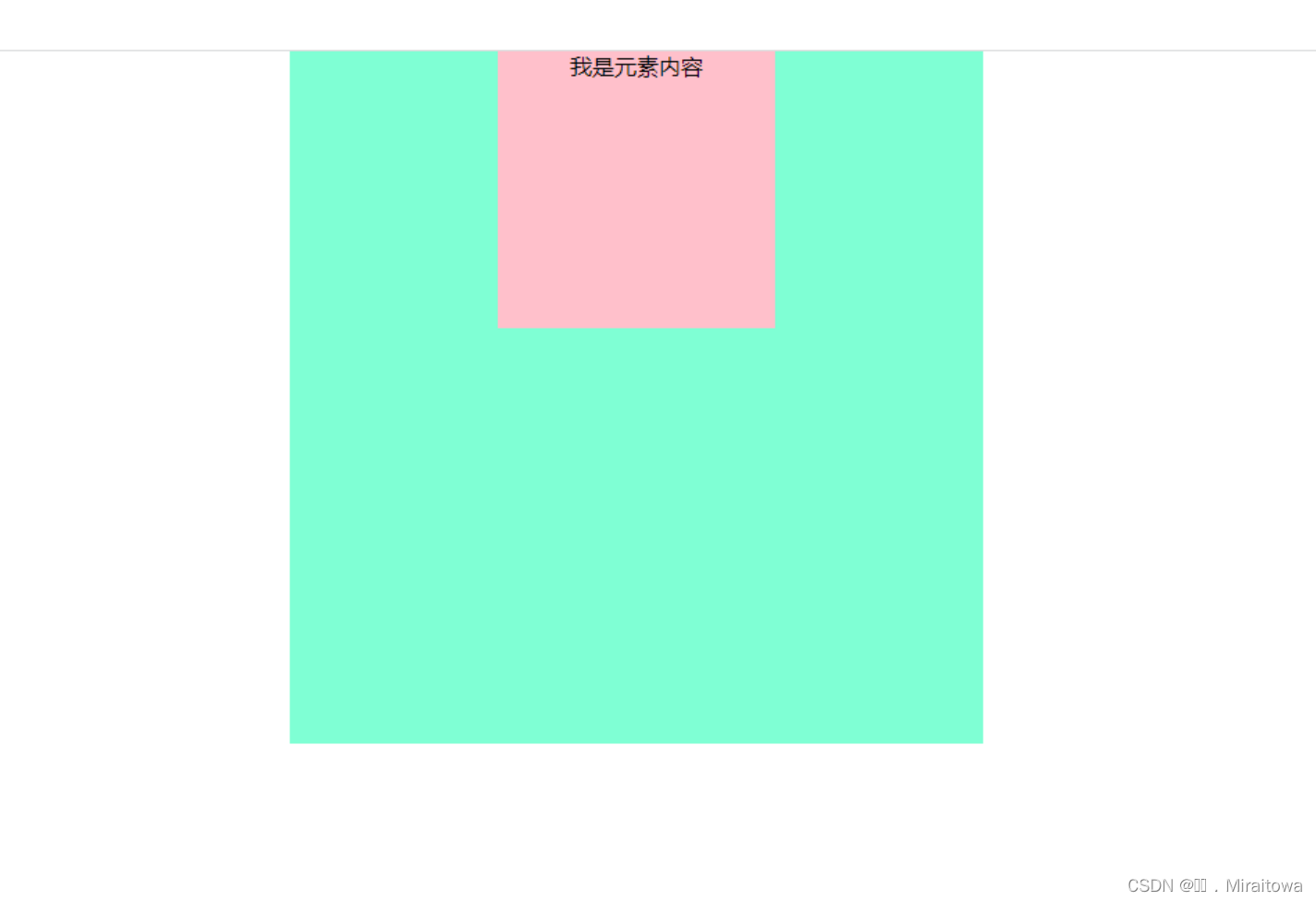
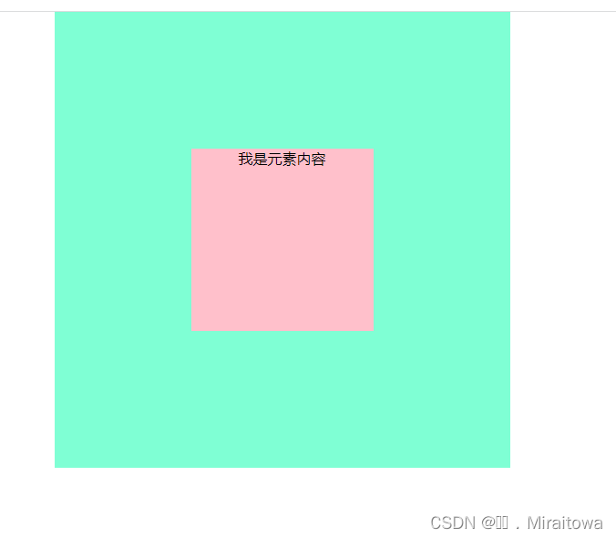
(4)使用position和transform
① 实现原理: position: absolute;给元素设置绝对定位,left: 50%;让其距离左边偏移父元素的50%,然后通过 transform: translate(-50%,);让其向左平移自身宽度的50%。从而实现一个水平居中的效果。
②代码示例:
<style>
* {
margin: 0;
padding: 0;
}
.box {
position: relative;
width: 500px;
height: 500px;
background-color: aquamarine;
/* 水平居中 */
margin: auto;
text-align: center;
}
.box p {
position: absolute;
height: 200px;
width: 200px;
background-color: pink;
/* 其左填充盒子宽度的50% */
left: 50%;
transform: translate(-50%);
}
</style>
body 部分
<div class="box">
<p>我是元素内容</p>
</div>
③ 运行结果:
二 、 垂直居中
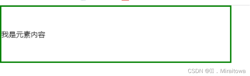
(1)垂直居中对齐 - 使用 padding
代码示例:
* {
margin: 0;
padding: 0;
}
.box {
width: 500px;
padding: 50px 0;
border: 3px solid green;
}
body 部分
<div class="box">
<p>我是元素内容</p>
</div>
运行结果:
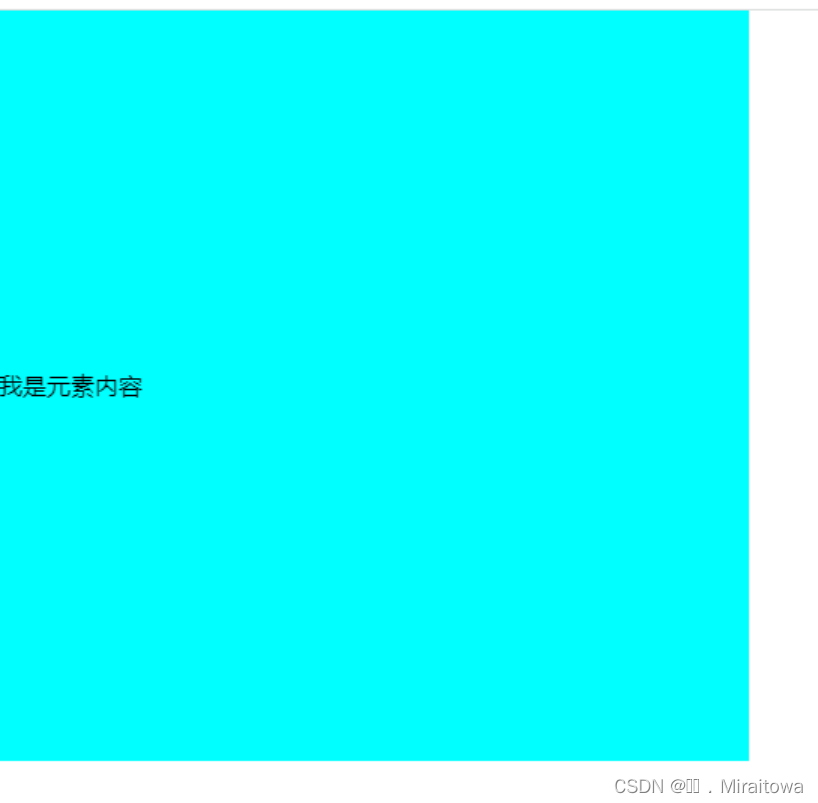
(2)垂直居中 - 使用 line-height
把行高line-height和高度height设置为一样,可以实现文本元素的垂直对齐,(该做法只适用于文本、行内块元素、行内元素的垂直居中,块元素的垂直居中不适用)案例代码:
.box {
width: 500px;
height: 500px;
background-color: aqua;
line-height: 500px;
}
body 部分
<div class="box">
<p>我是元素内容</p>
</div>
运行结果:
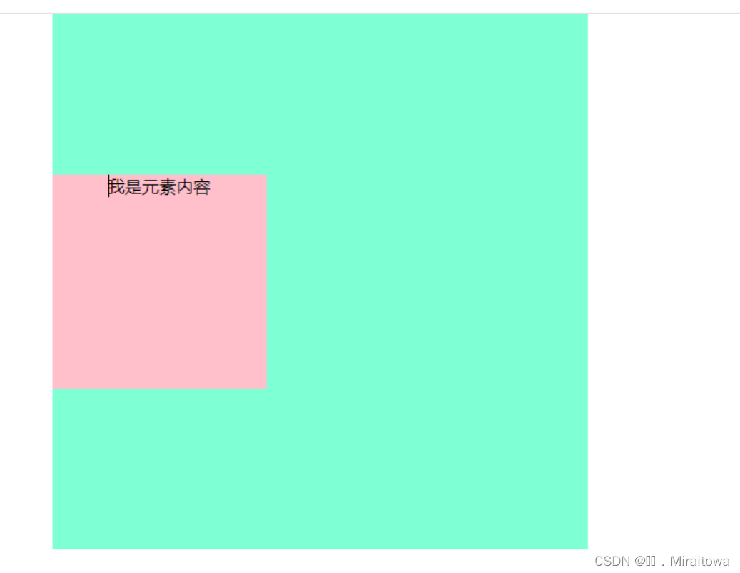
(3)垂直居中 - 使用 position 和 transform
- 使用该方法实现垂直居中的原理和上面所讲的水平居中类似,简而言之就是,先让元素向下移动父元素的50%,在向上移动自身的50%,从而移动到了父元素垂直方向的中间位置。
- 代码示例:
- .box {
- position: relative;
- width: 500px;
- height: 500px;
- background-color: aquamarine;
- /* 水平居中 */
- margin: auto;
- text-align: center;
- }
- .box p {
- position: absolute;
- height: 200px;
- width: 200px;
- background-color: pink;
- /* 其左填充盒子宽度的50% */
- top: 50%;
- transform: translate(0, -50%);
- }
运行结果: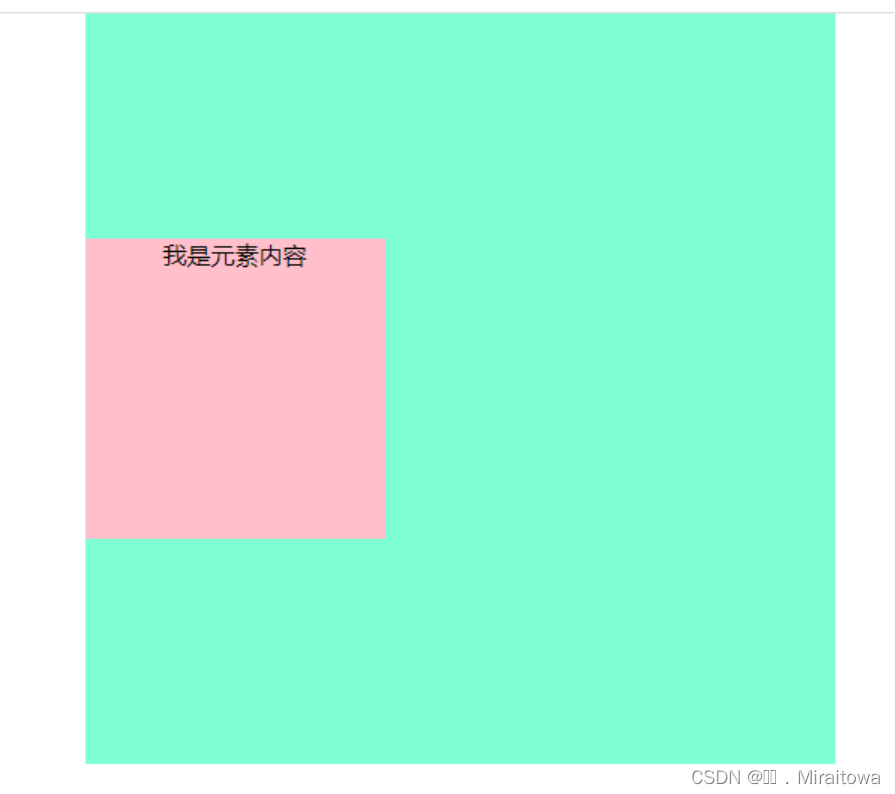
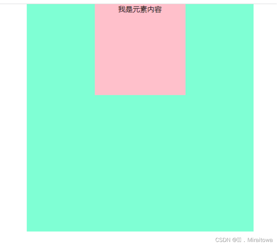
三、水平垂直居中 Flex布局
(1)flex布局中,通过设置侧轴上子元素排列方式为center,可以实现将元素垂直居中,适用于所有类型的元素。
.box {
display: flex;
/*设置主轴方向是水平方向*/
flex-direction: row;
/*设置侧轴上,子元素的排列方式为居中对齐*/
align-items: center;
position: relative;
width: 500px;
height: 500px;
background-color: aquamarine;
margin: auto;
text-align: center;
}
body部分
<div class="box">
<p>我是元素内容</p>
</div>
运行结果:
(2) flex布局中,通过设置侧轴上子元素排列方式为center,可以实现将元素水平居中,适用于所有类型的元素。
代码示例:
.box {
display: flex;
/*设置主轴方向是垂直方向*/
flex-direction: column;
/*设置侧轴上,子元素的排列方式为居中对齐*/
align-items: center;
position: relative;
width: 500px;
height: 500px;
background-color: aquamarine;
margin: auto;
text-align: center;
}
.box p {
position: absolute;
height: 200px;
width: 200px;
background-color: pink;
}
body部分
<div class="box">
<p>我是元素内容</p>
</div>
运行结果:
(3) flex 布局 实现水平居中同时也实现垂直居中,通过设置侧轴上子元素排列方式为center,可以实现将元素水平居中,通过justify-content 设置容器内的项目在主轴方向上的排列和对齐方式。
代码示例:
.box {
display: flex;
/*设置侧轴上,子元素的排列方式为居中对齐*/
align-items: center;
/*设置项目位于容器的中心,实现居中紧挨着填充的效果*/
justify-content: center;
position: relative;
width: 500px;
height: 500px;
background-color: aquamarine;
margin: auto;
text-align: center;
}
.box p {
position: absolute;
height: 200px;
width: 200px;
background-color: pink;
}
运行结果:


 100
100

 被折叠的 条评论
为什么被折叠?
被折叠的 条评论
为什么被折叠?
 到【灌水乐园】发言


