


本小节将以应用市场首页为例,介绍如何使用自适应布局能力和响应式布局能力适配不同尺寸窗口。
页面设计
一个典型的应用市场首页的UX设计如下所示。

观察应用市场首页的页面设计,不同断点下的页面设计有较多相似的地方。
据此,我们可以将页面分拆为多个组成部分。
- 底部/侧边导航栏
- 标题栏与搜索栏
- 运营横幅
- 快捷入口
- 精品应用

接下来我们逐一分析各部分的实现。
底部/侧边导航栏
在sm和md断点下,导航栏在底部;在lg断点下,导航栏在左侧。可以通过 Tab组件 的barPosition和vertical属性控制TabBar的位置,同时还可以通过barWidth和barHeight属性控制TabBar的尺寸。
import Home from '../common/Home';//组件请参考相关实例
import TabBarItem from '../common/TabBarItem';

@Entry
@Component
struct Index {
  @State currentIndex: number = 0;
  @StorageProp('currentBreakpoint') currentBreakpoint: string = 'md';
  @Builder
  tabItem(index: number, title: Resource, icon: Resource, iconSelected: Resource) {
    TabBarItem({
      index: index,
      currentIndex: this.currentIndex,
      title: title,
      icon: icon,
      iconSelected: iconSelected
    })
  }

  build() {
    // 设置TabBar在主轴方向起始或结尾位置
    Tabs({ barPosition: this.currentBreakpoint === "lg" ? BarPosition.Start : BarPosition.End }) {
      // 首页
      TabContent() {
        Home()
      }.tabBar(this.tabItem(0, $r('app.string.tabBar1'), $r('app.media.ic_home_normal'), $r('app.media.ic_home_actived')))
      TabContent() {}.tabBar(this.tabItem(1, $r('app.string.tabBar2'), $r('app.media.ic_app_normal'), $r('app.media.ic_app_actived')))
      TabContent() {}.tabBar(this.tabItem(2, $r('app.string.tabBar3'), $r('app.media.ic_game_normal'), $r('app.media.ic_mine_actived')))
      TabContent() {}.tabBar(this.tabItem(3, $r('app.string.tabBar4'), $r('app.media.ic_search_normal'), $r('app.media.ic_search_actived')))
      TabContent() {}.tabBar(this.tabItem(4, $r('app.string.tabBar4'), $r('app.media.ic_mine_normal'), $r('app.media.ic_mine_actived')))
    }
    .backgroundColor('#F1F3F5')
    .barMode(BarMode.Fixed)
    .barWidth(this.currentBreakpoint === "lg" ? 96 : '100%')
    .barHeight(this.currentBreakpoint === "lg" ? '60%' : 56)
    // 设置TabBar放置在水平或垂直方向
    .vertical(this.currentBreakpoint === "lg")
  }
}
另外在sm及lg断点下,TabBar中各个Item的图标和文字是按照垂直方向排布的,在md断点下,TabBar中各个Item的图标和文字是按照水平方向排布的。
@Component
export default struct TabBarItem {
  @StorageProp('currentBreakpoint') currentBreakpoint: string = 'md';

  build() {
    if (this.currentBreakpoint !== 'md' ) {
      // sm及lg断点下,tabBarItem中的图标和文字垂直排布
      Column() {
       // ...
      }.justifyContent(FlexAlign.Center).height('100%').width('100%')
    } else {
      // md断点下,tabBarItem中的图标和文字水平排布
      Row() {
       // ...
      }.justifyContent(FlexAlign.Center).height('100%').width('100%')
    }
  }
}
标题栏与搜索栏
标题栏和搜索栏,在sm和md断点下分两行显示,在lg断点下单行显示,可以通过栅格实现。在sm和md断点下,标题栏和搜索栏占满12列,此时会自动换行显示。在lg断点下,标题栏占8列而搜索栏占4列,此时标题栏和搜索栏在同一行中显示。

@Component
export default struct IndexHeader {

  @Builder searchBar() {
    Stack({alignContent: Alignment.End}) {
      TextInput({ placeholder: $r('app.string.search') })
        .placeholderColor('#FF000000')
        .placeholderFont({ size: 16, weight: 400 })
        .textAlign(TextAlign.Start)
        .caretColor('#FF000000')
        .width('100%')
        .height(40)
        .fontWeight(400)
        .padding({ top: 9, bottom: 9 })
        .fontSize(16)
        .backgroundColor(Color.White)

      Image($r('app.media.ic_public_search'))
        .width(16)
        .height(16)
        .margin({ right: 20 })
    }.height(56).width('100%')
  }

  @Builder titleBar() {
    Text($r('app.string.tabBar1'))
      .fontSize(24)
      .fontWeight(500)
      .fontColor('#18181A')
      .textAlign(TextAlign.Start)
      .height(56)
      .width('100%')
  }

  build() {
    // 借助栅格实现标题栏和搜索栏在不同断点下的不同布局效果。
    GridRow() {
      GridCol({ span: { xs: 12, lg: 8 } }) {
        this.titleBar()
      }
      GridCol({ span: { xs: 12, lg: 4 } }) {
        this.searchBar()
      }
    }
    .width('100%')
  }
}
运营横幅
不同断点下的运营横幅,sm断点下显示一张图片,md断点下显示两张图片,lg断点下显示三张图片。可以通过 Swiper组件的displayCount属性 实现目标效果。
@Component
export default struct IndexSwiper {
  @StorageProp('currentBreakpoint') currentBreakpoint: string = 'md';
  @Builder swiperItem(imageSrc:Resource) {
    Image(imageSrc)
      .width('100%')
      .aspectRatio(2.5)
      .objectFit(ImageFit.Fill)
  }

  build() {
    Swiper() {
      this.swiperItem($r('app.media.ic_public_swiper1'))
      this.swiperItem($r('app.media.ic_public_swiper2'))
      this.swiperItem($r('app.media.ic_public_swiper3'))
      // ...
    }
    .autoPlay(true)
    .indicator(false)
    .itemSpace(10)
    // 配置不同断点下运行横幅中展示的图片数量
    .displayCount(this.currentBreakpoint === 'sm' ? 1 : (this.currentBreakpoint === 'md' ? 2 : 3))
    .width('100%')
    .padding({ left: 12, right: 12, bottom: 16, top: 16 })
  }
}
快捷入口
在不同的断点下,快捷入口的5个图标始终均匀排布,这是典型的均分能力使用场景。
import { entranceIcons } from '../model/HomeData';
import { AllIcons } from '../model/HomeDataType';

@Component
export default struct IndexEntrance {
  build() {
    // 将justifyContent参数配置为FlexAlign.SpaceEvenly实现均分布局
    Row() {
      ForEach(entranceIcons, (icon: AllIcons) => {
        // 各快捷入口的图标及名称
        Column() {
          // ...
          }
      })
    }
    .width('100%')
    .height(64)
    .justifyContent(FlexAlign.SpaceEvenly)
    .padding({ left: 12, right: 12 })
  }
}
精品应用
随着可用显示区域的增加,精品应用中显示的图标数量也不断增加,这是典型的延伸能力使用场景。精品游戏的实现与精品应用类似,不再展开分析。
import { AppItem, MyAppSource } from '../model/HomeDataType';

@Component
export default struct IndexApps {
  private title?: Resource;
  @StorageProp('currentBreakpoint') currentBreakpoint: string = 'md';
  private apps: AppItem[] = [];
  @Builder
  appListHeader() {
    Row() {
      Text(this.title)
        .width(100)
        .fontSize(16)
        .textAlign(TextAlign.Start)
        .fontWeight(500)
      Blank()
      Text($r('app.string.more'))
        .fontSize(14)
        .textAlign(TextAlign.End)
        .fontWeight(400)
        .margin({ right: 2 })
      Image($r('app.media.ic_public_arrow_right'))
        .width(12)
        .height(18)
        .opacity(0.9)
        .objectFit(ImageFit.Fill)
    }
    .margin({ bottom: 9, top: 9 })
    .width('100%')
    .alignItems(VerticalAlign.Bottom)
  }

  @Builder
  appListItem(app:AppItem) {
    Column() {
      Image(app.image)
        .width(this.currentBreakpoint === 'lg' ? 80 : 56)
        .height(this.currentBreakpoint === 'lg' ? 80 : 56)
        .margin({ bottom: 8 })
      Text(app.title)
        .width(this.currentBreakpoint === 'lg' ? 80 : 56)
        .height(16)
        .fontSize(12)
        .textAlign(TextAlign.Center)
        .fontColor('#18181A')
        .margin({ bottom: 8 })
      Text($r('app.string.install'))
        .width(this.currentBreakpoint === 'lg' ? 80 : 56)
        .height(28)
        .fontColor('#0A59F7')
        .textAlign(TextAlign.Center)
        .borderRadius(this.currentBreakpoint === 'lg' ? 26 : 20)
        .fontWeight(500)
        .fontSize(12)
        .padding({ top: 6, bottom: 6, left: 8, right: 8 })
        .backgroundColor('rgba(0,0,0,0.05)')
    }
  }
  build() {
    Column() {
      this.appListHeader()
      // 借助List组件能力,实现延伸能力场景
      List({ space: this.currentBreakpoint === 'lg' ? 44 : 20}) {
        LazyForEach(new MyAppSource(this.apps), (app: AppItem)=> {
          ListItem() {
            // 每个应用的图标、名称及安装按钮
            this.appListItem(app)
          }
        })
      }
      .width('100%')
      .height(this.currentBreakpoint === 'lg' ? 140 : 120)
      .listDirection(Axis.Horizontal)
    }
    .width('100%')
    .height(this.currentBreakpoint === 'lg' ? 188 : 164)
    .padding({ bottom: 8, left: 12, right: 12 })
  }
}
运行效果
将上述各页面主要部分组合在一起后,即可完成整体页面开发。
import IndexSwiper from './IndexSwiper';
import IndexEntrance from './IndexEntrance';
import IndexApps from './IndexApps';
import { appList, gameList } from '../model/HomeData';
import IndexHeader from './IndexHeader';

@Component
struct IndexContent {
  // ...
  build() {
    List() {
      // 运营横幅
      ListItem() {
        IndexSwiper()
      }
      // 快捷入口
      ListItem() {
        IndexEntrance()
      }
      // 精品应用
      ListItem() {
        IndexApps({ title: $r('app.string.boutique_application'), apps: appList })
      }
      // 精品游戏
      ListItem() {
        IndexApps({ title: $r('app.string.boutique_game'), apps: gameList })
      }
    }
    .width("100%")
  }
}

@Entry
@Component
export default struct Home {
  // ...
  build() {
    Flex({ direction: FlexDirection.Column, justifyContent: FlexAlign.Start, alignItems: ItemAlign.Start }) {
      // 标题栏和搜索栏
      IndexHeader()
      // 运营横幅、快捷入口、精品应用、精品游戏等
      IndexContent()
    }
    .height('100%')
    .backgroundColor("#F1F3F5")
  }
}
本页面的实际运行效果如下图所示。

最后
小编也准备了一份联合鸿蒙官方发布笔记整理收纳的《鸿蒙开发学习笔记》,内容包含ArkTS、ArkUI、Web开发、应用模型、资源分类…等知识点。
【有需要的朋友,可以扫描下方二维码免费领取!!!】

《鸿蒙(HarmonyOS)开发学习指南》
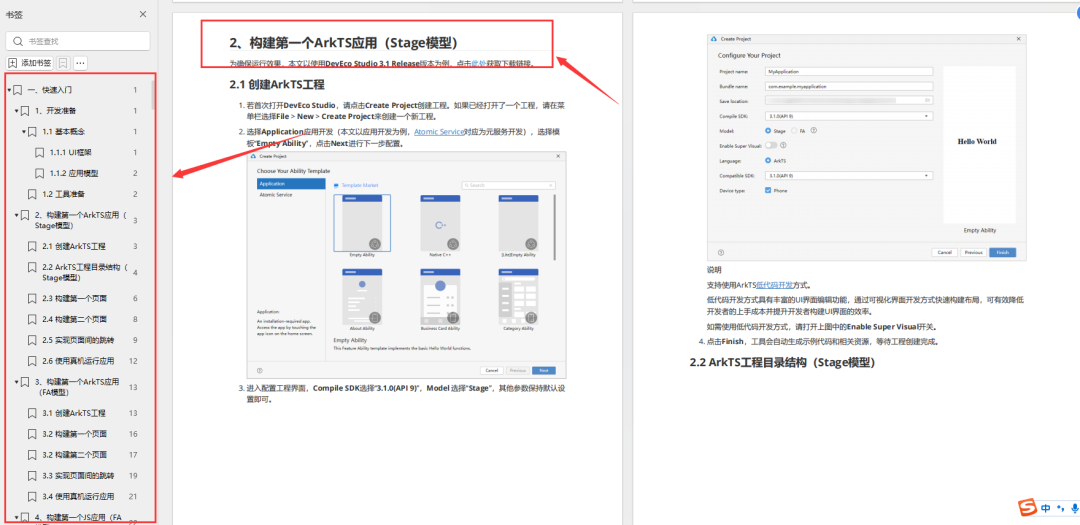
第一章 快速入门
1、开发准备
2、构建第一个ArkTS应用(Stage模型)
3、构建第一个ArkTS应用(FA模型)
4、构建第一个JS应用(FA模型)
5、…
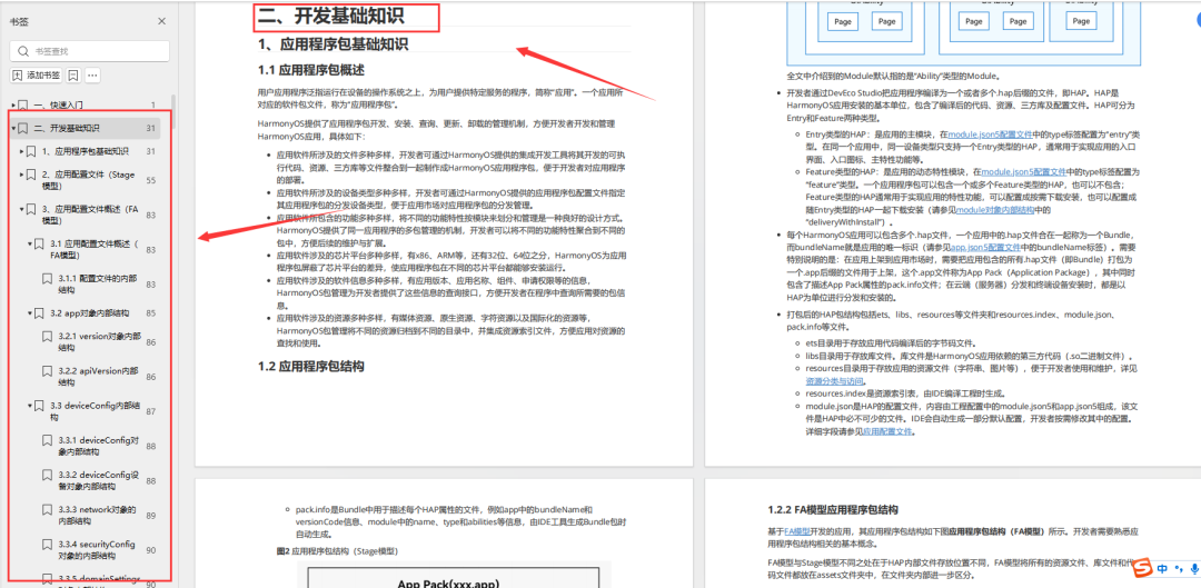
第二章 开发基础知识
1、应用程序包基础知识
2、应用配置文件(Stage模型)
3、应用配置文件概述(FA模型)
4、…
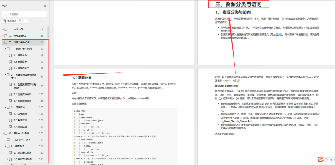
第三章 资源分类与访问
1、 资源分类与访问
2、 创建资源目录和资源文件
3、 资源访问
4、…
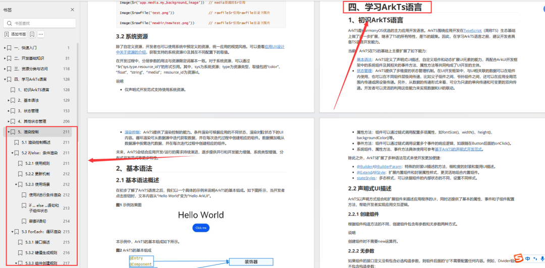
第四章 学习ArkTs语言
1、初识ArkTS语言
2、基本语法
3、状态管理
4、其他状态管理
5、渲染控制
6、…
第五章 UI开发
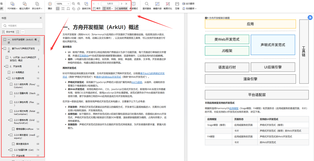
1.方舟开发框架(ArkUI)概述
2.基于ArkTS声明式开发范式
3.兼容JS的类Web开发范式
4…
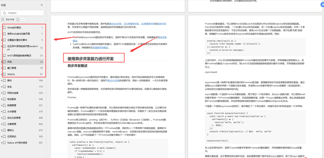
第六章 Web开发
1.Web组件概述
2.使用Web组件加载页面
3.设置基本属性和事件
4.在应用中使用前端页面JavaScript
5.ArkTS语言基础类库概述
6.并发
7…
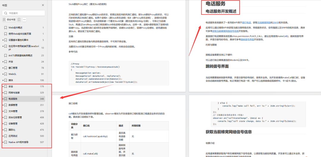
11.网络与连接
12.电话服务
13.数据管理
14.文件管理
15.后台任务管理
16.设备管理
17…
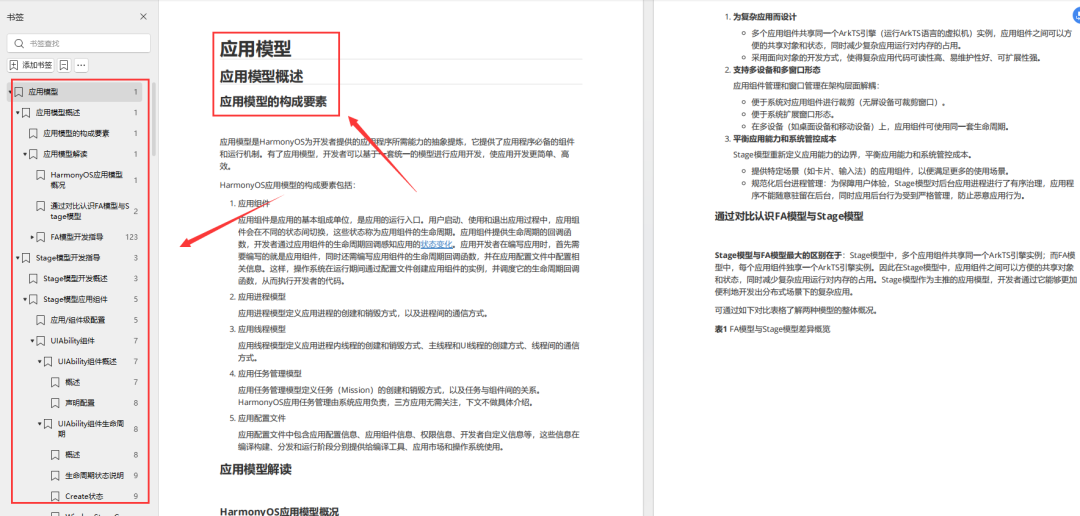
第七章 应用模型
1.应用模型概述
2.Stage模型开发指导
3.FA模型开发指导
4…
扫描下方二维码免费领取,《鸿蒙(HarmonyOS)开发学习指南》


 被折叠的 条评论
为什么被折叠?
被折叠的 条评论
为什么被折叠?
 到【灌水乐园】发言


