


class LoadingMoreList extends StatelessWidget {
final ListConfig listConfig;
-
LoadingMoreList(this.listConfig,{Key key})
-
super(key: key);
@override
Widget build(BuildContext context) {
return StreamBuilder(
builder: (d, s) {
return NotificationListener(
//key: _key,
onNotification: _handleScrollNotification,
child: NotificationListener(
onNotification: _handleGlowNotification,
child: listConfig.buildContent(context, s.data)),
);
},
stream: listConfig.sourceList?.rebuild,
);
}
}
ListConfig 里面提供了ListView/GridView的全部参数,这里我也提供了去掉滚动越界效果(就是列表滚不动的时候出现的水波纹效果)的2个属性showGlowLeading/showGlowTrailing。
final Axis scrollDirection;
final bool reverse;
final ScrollController controller;
final bool primary;
final ScrollPhysics physics;
final bool shrinkWrap;
final EdgeInsetsGeometry padding;
final double itemExtent;
final int itemCount;
final bool addAutomaticKeepAlives;
final bool addRepaintBoundaries;
final bool addSemanticIndexes;
final double cacheExtent;
final int semanticChildCount;
/// Whether to show the overscroll glow on the side with negative scroll
/// offsets.
final bool showGlowLeading;
/// Whether to show the overscroll glow on the side with positive scroll
/// offsets.
final bool showGlowTrailing;
ListConfig(
@required itemBuilder,
@required sourceList, {
this.showGlowLeading: true,
this.showGlowTrailing: true,
LoadingMoreIndicatorBuilder indicatorBuilder,
SliverGridDelegate gridDelegate,
this.scrollDirection = Axis.vertical,
this.reverse = false,
this.controller,
this.primary,
this.physics,
this.shrinkWrap = false,
this.padding,
this.itemExtent,
this.itemCount,
this.addAutomaticKeepAlives = true,
this.addRepaintBoundaries = true,
this.addSemanticIndexes = true,
this.cacheExtent,
this.semanticChildCount,
}) : super(itemBuilder, sourceList,
indicatorBuilder: indicatorBuilder, gridDelegate: gridDelegate);
sourceList 就是之前我们完成的loadingmore 数据源 itemBuilder 是每个item长什么样子
Demo code
class ListViewDemo extends StatefulWidget {
@override
_ListViewDemoState createState() => _ListViewDemoState();
}
class _ListViewDemoState extends State {
TuChongRepository listSourceRepository;
@override
void initState() {
// TODO: implement initState
listSourceRepository = new TuChongRepository();
super.initState();
}
@override
void dispose() {
listSourceRepository?.dispose();
// TODO: implement dispose
super.dispose();
}
@override
Widget build(BuildContext context) {
return Material(
child: Column(
children: [
AppBar(
title: Text(“ListViewDemo”),
),
Expanded(
child: LoadingMoreList(
ListConfig(
ItemBuilder.itemBuilder, listSourceRepository,
// showGlowLeading: false,
// showGlowTrailing: false,
padding: EdgeInsets.all(0.0)),),
)
],
),
);
}
}
这样子实现了一个加载更多的ListView,如果是GridView的话请给gridDelegate赋值.
SliverList/SliverGrid 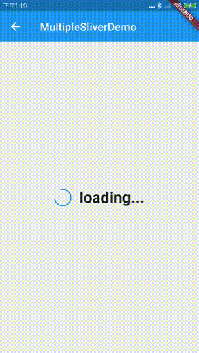 支持多个loadmore列表 SliverListConfig 里面包含了SliverList/SliverGrid里面的参数
//config for SliverList and SliverGrid
class SliverListConfig extends LoadingMoreListConfig {
//whether show no more .
bool showNoMore = true;
//whether show fullscreenLoading for multiple sliver
bool showFullScreenLoading = true;
final bool addAutomaticKeepAlives;
final bool addRepaintBoundaries;
final bool addSemanticIndexes;
final SemanticIndexCallback semanticIndexCallback;
final int semanticIndexOffset;
final int childCount;
SliverListConfig(
@required itemBuilder,
@required sourceList, {
LoadingMoreIndicatorBuilder indicatorBuilder,
SliverGridDelegate gridDelegate,
this.addAutomaticKeepAlives = true,
this.addRepaintBoundaries = true,
this.addSemanticIndexes = true,
this.semanticIndexCallback = _kDefaultSemanticIndexCallback,
this.semanticIndexOffset = 0,
this.childCount,
}) : super(itemBuilder, sourceList,
indicatorBuilder: indicatorBuilder, gridDelegate: gridDelegate);
LoadingMoreCustomScrollView使用来创建Sliver组件,它包括了CustomScrollView的属性以及showGlowLeading/showGlowTrailing
//support for LoadingMoreSliverList
class LoadingMoreCustomScrollView extends StatefulWidget {
final List slivers;
final Axis scrollDirection;
final bool reverse;
final ScrollController controller;
final bool primary;
final ScrollPhysics physics;
final bool shrinkWrap;
final double cacheExtent;
final int semanticChildCount;
/// Whether to show the overscroll glow on the side with negative scroll
/// offsets.
final bool showGlowLeading;
/// Whether to show the overscroll glow on the side with positive scroll
/// offsets.
final bool showGlowTrailing;
LoadingMoreCustomScrollView({
Key key,
this.scrollDirection = Axis.vertical,
this.reverse = false,
this.controller,
this.primary,
this.physics,
this.shrinkWrap = false,
this.cacheExtent,
this.slivers = const [],
this.semanticChildCount,
this.showGlowLeading: true,
this.showGlowTrailing: true,
}) : assert(slivers != null),
super(key: key);
Demo code
简单的一个Sliver
class SliverListDemo extends StatefulWidget {
@override
_SliverListDemoState createState() => _SliverListDemoState();
}
class _SliverListDemoState extends State {
TuChongRepository listSourceRepository;
@override
void initState() {
// TODO: implement initState
listSourceRepository = new TuChongRepository();
super.initState();
}
@override
void dispose() {
listSourceRepository?.dispose();
// TODO: implement dispose
super.dispose();
}
@override
Widget build(BuildContext context) {
return Material(
child: LoadingMoreCustomScrollView(
slivers: [
SliverAppBar(
pinned: true,
title: Text(“SliverListDemo”),
),
LoadingMoreSliverList(
SliverListConfig(
ItemBuilder.itemBuilder, listSourceRepository,
//isLastOne: false
))
],
),
);
}
}
多个Sliver
class MultipleSliverDemo extends StatefulWidget {
@override
_MultipleSliverDemoState createState() => _MultipleSliverDemoState();
}
class _MultipleSliverDemoState extends State {
TuChongRepository listSourceRepository;
TuChongRepository listSourceRepository1;
@override
void initState() {
// TODO: implement initState
listSourceRepository = new TuChongRepository();
listSourceRepository1 = new TuChongRepository();
super.initState();
}
@override
void dispose() {
listSourceRepository?.dispose();
listSourceRepository1?.dispose();
// TODO: implement dispose
super.dispose();
}
@override
Widget build(BuildContext context) {
return Material(
child: LoadingMoreCustomScrollView(
slivers: [
SliverAppBar(
pinned: true,
title: Text(“MultipleSliverDemo”),
),
LoadingMoreSliverList(SliverListConfig(
ItemBuilder.itemBuilder,
listSourceRepository,
)),
SliverToBoxAdapter(
child: Container(
alignment: Alignment.center,
child: Text(“Next list”),
color: Colors.blue,
height: 100.0,
),
),
SliverPersistentHeader(
delegate: CommonSliverPersistentHeaderDelegate(
Container(
alignment: Alignment.center,
child: Text(“Pinned Content”),
color: Colors.red,
),
100.0),
pinned: true,
),
LoadingMoreSliverList(SliverListConfig(
ItemBuilder.itemBuilder,
listSourceRepository1,
gridDelegate: SliverGridDelegateWithFixedCrossAxisCount(
crossAxisCount: 2,
crossAxisSpacing: 3.0,
mainAxisSpacing: 3.0,
// childAspectRatio: 0.5
),
))
],
),
);
}
}
那么怎么自定义这些状态的显示内容呢? 我在config里面提供了indicatorBuilder,你可以根据当前list的状态自定义显示效果
demo code
@override
Widget build(BuildContext context) {
return Material(
child: Column(
children: [
AppBar(
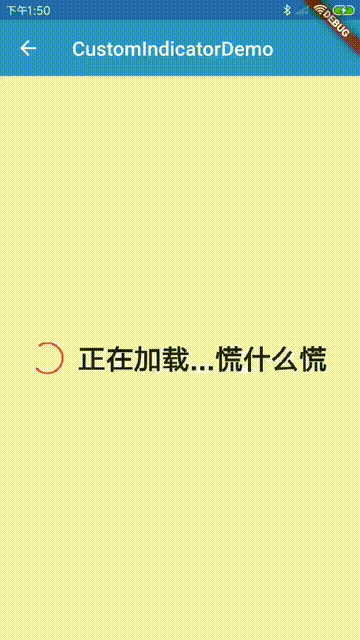
title: Text(“CustomIndicatorDemo”),
),
Expanded(
child: LoadingMoreList(
ListConfig(
ItemBuilder.itemBuilder, listSourceRepository,
indicatorBuilder: _buildIndicator,
padding: EdgeInsets.all(0.0),
),
),
)
],
),
);
}
//you can use IndicatorWidget or build yourself widget
//in this demo, we define all status.
Widget _buildIndicator(BuildContext context, IndicatorStatus status) {
Widget widget;
bool full = (status == IndicatorStatus.FullScreenBusying);
double height = 35.0;
switch (status) {
case IndicatorStatus.None:
widget = Container(height: 0.0);
height = 0.0;
break;
case IndicatorStatus.LoadingMoreBusying:
case IndicatorStatus.FullScreenBusying:
double indicatorSize = full ? 30.0 : 15.0;
widget = Row(
mainAxisAlignment: MainAxisAlignment.center,
crossAxisAlignment: CrossAxisAlignment.center,
children: [
Container(
margin: EdgeInsets.only(right: 15.0),
height: indicatorSize,
width: indicatorSize,
child: getIndicator(context)),
(!full
? Text(
“正在加载…慌什么慌”,
)
: Text(“正在加载…慌什么慌”,
style: TextStyle(
fontWeight: FontWeight.bold, fontSize: 28.0))),
],
);
break;
case IndicatorStatus.Error:
widget = Text(
“加载失败,搞个川川”,
);
break;
case IndicatorStatus.NoMoreLoad:
widget = Text(“没有了,不要拖了”);
break;
case IndicatorStatus.Empty:
widget = EmptyWidget(
“这里只有空”,
);
break;
}
widget = Container(
width: double.infinity,
height: full ? double.infinity : height,
child: widget,
color: Colors.grey[200],
alignment: Alignment.center);
// if (isSliver) {
// if (status == IndicatorStatus.FullScreenBusying) {
// widget = SliverFillRemaining(
// child: widget,
// );
// } else if (status == IndicatorStatus.Empty) {
// widget = SliverToBoxAdapter(
// child: widget,
// );
// }
// }
if (status == IndicatorStatus.Error) {
widget = GestureDetector(
onTap: () {
最后
代码真的是重质不重量,质量高的代码,是当前代码界提倡的,当然写出高质量的代码肯定需要一个相当高的专业素养,这需要在日常的代码书写中逐渐去吸收掌握,谁不是每天都在学习呀,目的还不是为了一个,为实现某个功能写出高质量的代码。
所以,长征路还长,大家还是好好地做个务实的程序员吧。
最后,小编这里有一系列Android提升学习资料,有兴趣的小伙伴们可以来看下哦~
《Android学习笔记总结+移动架构视频+大厂面试真题+项目实战源码》,点击传送门,即可获取!
ld: widget,
// );
// }
// }
if (status == IndicatorStatus.Error) {
widget = GestureDetector(
onTap: () {
最后
代码真的是重质不重量,质量高的代码,是当前代码界提倡的,当然写出高质量的代码肯定需要一个相当高的专业素养,这需要在日常的代码书写中逐渐去吸收掌握,谁不是每天都在学习呀,目的还不是为了一个,为实现某个功能写出高质量的代码。
所以,长征路还长,大家还是好好地做个务实的程序员吧。
最后,小编这里有一系列Android提升学习资料,有兴趣的小伙伴们可以来看下哦~
《Android学习笔记总结+移动架构视频+大厂面试真题+项目实战源码》,点击传送门,即可获取!


 1606
1606

 被折叠的 条评论
为什么被折叠?
被折叠的 条评论
为什么被折叠?
 到【灌水乐园】发言


