


def prepare_data(df,forecast_col,forecast_out,test_size):
label = df[forecast_col].shift(-forecast_out) #creating new column called label with the last 5 rows are nan
X = np.array(df[[forecast_col]]) #creating the feature array
X = preprocessing.scale(X) #processing the feature array
X_lately = X[-forecast_out:] #creating the column i want to use later in the predicting method
X = X[:-forecast_out] # X that will contain the training and testing
label.dropna(inplace=True) #dropping na values
y = np.array(label) # assigning Y
X_train, X_test, Y_train, Y_test = train_test_split(X, y, test_size=test_size, random_state=0) #cross validation
response = [X_train,X_test , Y_train, Y_test , X_lately]
return response
df = pd.read_csv(“prices.csv”)
df = df[df.symbol == “GOOG”]
现在,我们需要准备三个输入变量,就像上面小节中创建的函数中准备的那样。我们需要声明一个输入变量,说明我们想预测哪一列。我们需要声明的下一个变量是我们希望预测的距离。


我们需要声明的最后一个变量是测试集的大小应该是多少。现在让我们声明所有的变量:


### 1.2 将机器学习应用于股票价格预测


现在我将对数据进行分割,并拟合到线性回归模型中:
X_train, X_test, Y_train, Y_test , X_lately =prepare_data(df,forecast_col,forecast_out,test_size); #calling the method were the cross validation and data preperation is in
learner = LinearRegression() #initializing linear regression model
learner.fit(X_train,Y_train) #training the linear regression model
现在让我们预测产出,看看股票价格的价格:
score=learner.score(X_test,Y_test)#testing the linear regression model
forecast= learner.predict(X_lately) #set that will contain the forecasted data
response={}#creting json object
response[‘test_score’]=score
response[‘forecast_set’]=forecast
print(response)
{‘test_score’: 0.9481024935723803, ‘forecast_set’: array([786.54352516, 788.13020371, 781.84159626, 779.65508615, 769.04187979])}
## 2.美国总统身高统计


如果你是数据科学的初学者,你必须解决这个项目,因为你将学到很多关于处理来自csv文件或任何其他格式的数据的知识。


该数据可在文件height.Csv中找到,它是标签和值的简单逗号分隔列表:


>
> 链接:<https://pan.baidu.com/s/1tW-3TBzCzyeX1U2vtdEhFw>
>  提取码:qz25
>
>
>
data = pd.read_csv(“heights.csv”)
print(data.head())
我们将使用Pandas package 读取文件并提取此信息 (请注意,高度以厘米为单位):
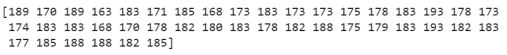
height = np.array(data[“height(cm)”])
print(height)
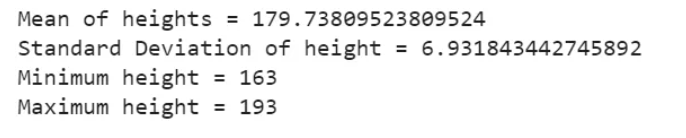
现在我们有了这个数据数组,我们可以计算各种摘要统计信息:
print(“Mean of heights =”, height.mean())
print(“Standard Deviation of height =”, height.std())
print(“Minimum height =”, height.min())
print(“Maximum height =”, height.max())
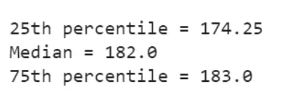
请注意,在每种情况下,聚合操作将整个数组简化为一个汇总值,这为我们提供了有关值分布的信息。我们也可以计算分位数:
print(“25th percentile =”, np.percentile(height, 25))
print(“Median =”, np.median(height))
print(“75th percentile =”, np.percentile(height, 75))
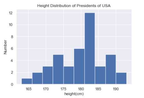
我们看到美国总统的平均身高是182厘米,或略低于6英尺。当然,有时查看这些数据的可视化表示会更有用,我们可以使用Matplotlib中的工具来完成:
import matplotlib.pyplot as plt
import seaborn as sns
sns.set()
plt.hist(height)
plt.title(“Height Distribution of Presidents of USA”)
plt.xlabel(“height(cm)”)
plt.ylabel(“Number”)
plt.show()
这些集合是探索性数据科学的一些基本部分,我们将在以后的项目中更深入地探讨。
## 3.出生率分析
让我们来看看美国疾病控制中心 (CDC) 提供的免费出生数据。这些数据可以在born s.csv中找到
>
> 链接:<https://pan.baidu.com/s/1lrCuMvGGqtxfmuVHocZCpA>
> 提取码:8ovj
>
>
>
import pandas as pd
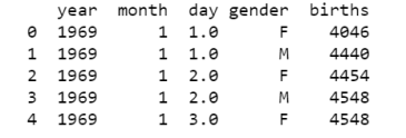
births = pd.read_csv(“births.csv”) print(births.head()) births[‘day’].fillna(0, inplace=True) births[‘day’] = births[‘day’].astype(int)
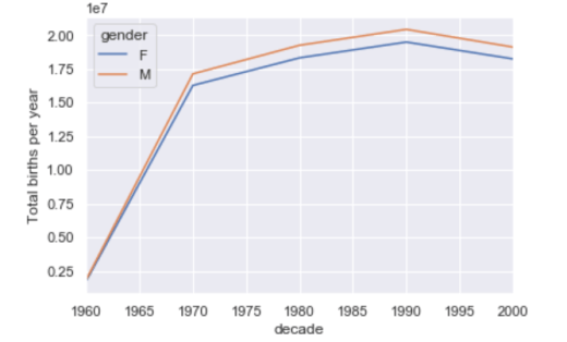
births[‘decade’] = 10 * (births[‘year’] // 10)
births.pivot_table(‘births’, index=‘decade’, columns=‘gender’, aggfunc=‘sum’)
print(births.head())
我们立即看到,每十年男性出生数超过女性出生数。为了更清楚地看到这一趋势,我们可以使用Pandas 中的内置绘图工具来可视化按年出生的总数:
import matplotlib.pyplot as plt
import seaborn as sns
sns.set()
birth_decade = births.pivot_table(‘births’, index=‘decade’, columns=‘gender’, aggfunc=‘sum’)
birth_decade.plot()
plt.ylabel(“Total births per year”)
plt.show()
### 3.1 进一步数据探索:
这里有一些有趣的特性,我们可以使用Pandas工具从这个数据集中提取出来。我们必须从清理数据开始,删除由于输入错误的日期或丢失的值而引起的异常值。一个简单的方法是一次性删除这些异常值,我们将通过一个健壮的sigma-clipping操作来做到这一点:
import numpy as np
quartiles = np.percentile(births[‘births’], [25, 50, 75])
mu = quartiles[1]
sig = 0.74 * (quartiles[2] - quartiles[0])
最后这条线是样本均值的稳健估计,其中0.74来自高斯分布的四分位数范围。这样我们就可以使用query()方法来过滤出这些值之外的诞生行:
births = births.query(‘(births > @mu - 5 * @sig) & (births < @mu + 5 * @sig)’)
births[‘day’] = births[‘day’].astype(int)
births.index = pd.to_datetime(10000 * births.year +
100 * births.month +
births.day, format=‘%Y%m%d’)
births[‘dayofweek’] = births.index.dayofweek
利用这个数据,我们可以连续几十年按工作日计算出生人数:
births.pivot_table(‘births’, index=‘dayofweek’,
columns=‘decade’, aggfunc=‘mean’).plot()
plt.gca().set_xticklabels([‘Mon’, ‘Tues’, ‘Wed’, ‘Thurs’, ‘Fri’, ‘Sat’, ‘Sun’])
plt.ylabel(‘mean births by day’);
plt.show()
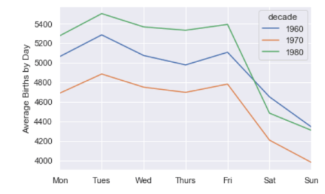
显然,周末出生的孩子比工作日出生的要少一些!需要注意的是,由于CDC的数据只包含了从1989年开始的出生月份,所以没有包括1990年代和2000年代。
另一个有趣的观点是画出每年的平均出生人数。让我们首先将数据按月和日分别分组:
births_month = births.pivot_table(‘births’, [births.index.month, births.index.day])
print(births_month.head())
births_month.index = [pd.datetime(2012, month, day)
for (month, day) in births_month.index]
print(births_month.head())
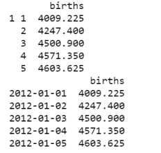
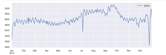
只关注月和日,我们现在有了一个时间序列,反映了每年出生的平均人数。由此,我们可以使用plot方法来绘制数据。它揭示了一些有趣的趋势:
fig, ax = plt.subplots(figsize=(12, 4))
births_month.plot(ax=ax)
plt.show()
## 4.时间序列数据科学项目-自行车计数
作为处理时间序列数据的一个例子,让我们看看西雅图弗里蒙特桥上的自行车数量。这些数据来自于2012年底安装的一个自动自行车计数器,它在大桥的东西两侧人行道上安装了感应传感器。每小时的自行车计数可以在这里下载。
一旦下载了这个数据集,我们就可以使用Pandas将CSV输出读取到一个DataFrame中。我们将指定我们想要的日期作为索引,并且我们想要这些日期被自动解析:
import pandas as pd
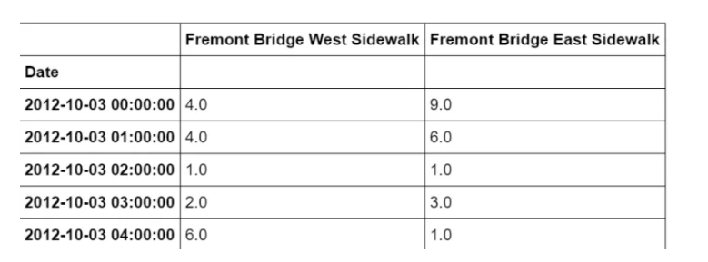
data = pd.read_csv(“fremont-bridge.csv”, index_col= ‘Date’, parse_dates=True)
data.head()
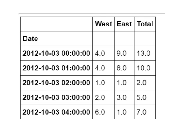
为方便起见,我们将通过缩短列名并添加 “总计” 列来进一步处理此数据集:
data.columns = [“West”, “East”]
data[“Total”] = data[“West”] + data[“East”]
data.head()
现在,让我们看一下此数据的摘要统计信息:
data.dropna().describe()
### 4.1 可视化数据
我们可以通过可视化来深入了解数据集。让我们从绘制原始数据开始:
import matplotlib.pyplot as plt
import seaborn
seaborn.set()
data.plot()
plt.ylabel(“Hourly Bicycle count”)
plt.show()
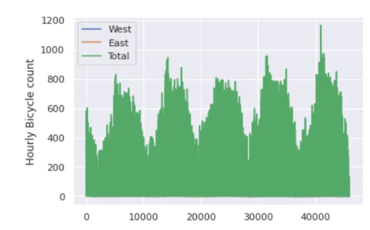
每小时约25000个样本的密度太大了,我们无法理解。我们可以通过将数据重新采样到一个粗糙的网格来获得更多的见解。让我们按周重新取样:
weekly = data.resample(“W”).sum()
weekly.plot(style=[‘:’, ‘–’, ‘-’])
plt.ylabel(‘Weekly bicycle count’)
plt.show()
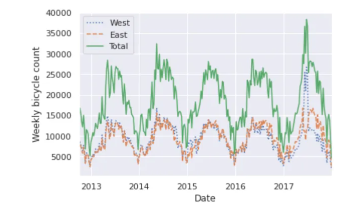
这向我们展示了一些有趣的季节趋势:如你所料,人们在夏天比在冬天骑自行车更多,甚至在一个特定的季节里,自行车的使用每周都不同。
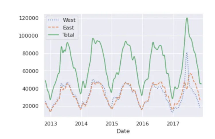
另一种便于聚合数据的方法是使用滚动平均数,利用pd.rolling\_mean()函数。这里我们将对我们的数据做一个30天的滚动平均值,确保窗口居中:
daily = data.resample(‘D’).sum()
daily.rolling(30, center=True).sum().plot(style=[‘:’, ‘–’, ‘-’])
plt.ylabel(‘mean hourly count’)
plt.show()
结果的锯齿状是由于窗户的硬切断。我们可以使用窗口函数得到滚动均值的平滑版本——例如高斯窗。
daily.rolling(50, center=True,
win_type=‘gaussian’).sum(std=10).plot(style=[‘:’,‘–’, ‘-’])
plt.show()
### 4.2 挖掘数据
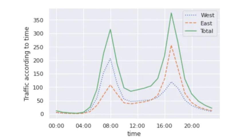
虽然平滑数据视图有助于了解数据的总体趋势,但它们隐藏了许多有趣的结构。例如,我们可能希望将平均流量看作是一天中时间的函数。我们可以使用GroupBy功能来做到这一点:
import numpy as np
by_time = data.groupby(data.index.time).mean()
hourly_ticks = 4 60 60 * np.arange(6)
by_time.plot(xticks= hourly_ticks, style=[‘:’, ‘–’, ‘-’])
plt.ylabel(“Traffic according to time”)
plt.show()
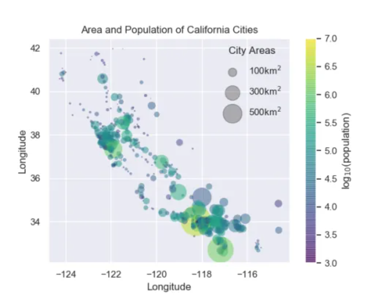
## 5.区域与人口分析
在这个项目中,我们将使用点的大小来指示加利福尼亚城市的面积和人口。我们想要一个指定点大小比例的图例,我们将通过绘制一些没有条目的标记数据来实现这一点。
您可以从此处下载此项目所需的数据集。
>
> 链接:<https://pan.baidu.com/s/1_KoQ7zTT8fJpRYrxksr0aQ>
> 提取码:guqw
>
>
>
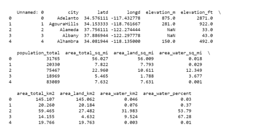
import pandas as pd
cities = pd.read_csv(“california_cities.csv”)
print(cities.head())
### 5.1 提取我们感兴趣的数据
latitude, longitude = cities[“latd”], cities[“longd”]
population, area = cities[“population_total”], cities[“area_total_km2”]
### 5.2 分散点,使用尺寸和颜色,但不使用标签
import numpy as np
import matplotlib.pyplot as plt
import seaborn
seaborn.set()
plt.scatter(longitude, latitude, label=None, c=np.log10(population),
cmap=‘viridis’, s=area, linewidth=0, alpha=0.5)
plt.axis(aspect=‘equal’)
plt.xlabel(‘Longitude’)
plt.ylabel(‘Longitude’)
plt.colorbar(label=‘log(population)’)
plt.clim(3, 7)
### 5.3 现在我们将创建一个图例,我们将绘制具有所需大小和标签的空列表
for area in [100, 300, 500]:
plt.scatter([], [], c=‘k’, alpha=0.3, s=area, label=str(area) + ‘km’)
plt.legend(scatterpoints=1, frameon=False, labelspacing=1, title=‘City Areas’)
plt.title(“Area and Population of California Cities”)
plt.show()
## 6.一个完整的Python机器学习项目实战
在本文中,我将带您完成一个使用Python编程语言的完整机器学习项目演练。这个完整的机器学习项目演练包括由Scikit-Learn提供的算法的实现,Scikit-Learn是用于机器学习的最佳Python库之一。
以下是本机器学习项目演练中涵盖的步骤:
1. 导入数据
2. 数据可视化
3. 数据清理和转换
4. 对数据进行编码
5. 将数据拆分为训练和测试集
6. 微调算法
7. 使用KFold交叉验证
8. 对测试集的预测
使用Python的机器学习项目演练
现在,在本节中,我将带您完成一个使用Python编程语言的完整机器学习项目演练。我将首先导入必要的Python库和数据集:
>
> 链接:<https://pan.baidu.com/s/1ShfQd-ig8JhLqwigxfP_-g>
> 提取码:3zgw
>
>
>
import numpy as np
import pandas as pd
import matplotlib.pyplot as plt
import seaborn as sns
%matplotlib inline
data_train = pd.read_csv(‘train.csv’)
data_test = pd.read_csv(‘test.csv’)

既有适合小白学习的零基础资料,也有适合3年以上经验的小伙伴深入学习提升的进阶课程,涵盖了95%以上大数据知识点,真正体系化!
由于文件比较多,这里只是将部分目录截图出来,全套包含大厂面经、学习笔记、源码讲义、实战项目、大纲路线、讲解视频,并且后续会持续更新
mport numpy as np
import pandas as pd
import matplotlib.pyplot as plt
import seaborn as sns
%matplotlib inline
data_train = pd.read_csv(‘train.csv’)
data_test = pd.read_csv(‘test.csv’)
[外链图片转存中…(img-6XSvz6OZ-1714776729119)]
[外链图片转存中…(img-NjvQAZ1e-1714776729119)]
[外链图片转存中…(img-nT4uMY6Z-1714776729119)]
既有适合小白学习的零基础资料,也有适合3年以上经验的小伙伴深入学习提升的进阶课程,涵盖了95%以上大数据知识点,真正体系化!
由于文件比较多,这里只是将部分目录截图出来,全套包含大厂面经、学习笔记、源码讲义、实战项目、大纲路线、讲解视频,并且后续会持续更新


 530
530

 被折叠的 条评论
为什么被折叠?
被折叠的 条评论
为什么被折叠?
 到【灌水乐园】发言


