


 文章讲述了使用Python爬虫技术抓取动漫网站的数据,包括播放量、评论数、收藏数和综合评分,然后通过Matplotlib进行数据可视化,展示不同指标之间的对比。最后将数据存储到Excel并提供代码示例。
pl = ‘%.1f’ % (float(pl) / 10000)
print(123, pl)
else:
pl = re.search(r’\d*(\.)?\d’, pl).group()
review.append(float(pl))
print(review)
******************************************** 收藏数
for tag in soup.find_all(‘div’, class_=‘detail’):
sc = tag.find(‘span’, class_=‘data-box’).next_sibling.next_sibling.next_sibling.next_sibling.get_text()
sc = re.search(r’\d*(\.)?\d’, sc).group()
favorite.append(float(sc))
print(favorite)
******************************************** 综合评分
for tag in soup.find_all(‘div’, class_=‘pts’):
zh = tag.find(‘div’).get_text()
TScore.append(int(zh))
print(‘综合评分’, TScore)
其中有个.next_sibling是用于提取同级别的相同标签信息,如若没有这个方法,当它找到第一个’span’标签之后,就不会继续找下去了(根据具体情况来叠加使用此方法);
还用到了正则表达式来提取信息(需要导入库‘re’)
最后我们将提取的信息,存进excel表格之中,并返回结果集
# 存储至excel表格中
info = {‘动漫名’: name, ‘播放量(万)’: play, ‘评论数(万)’: review,‘收藏数(万)’: favorite, ‘综合评分’: TScore}
dm_file = pandas.DataFrame(info)
dm_file.to_excel(‘Dongman.xlsx’, sheet_name=“动漫数据分析”)
将所有列表返回
return name, play, review, favorite, TScore
我们可以打开文件看一看存储的信息格式(双击打开)
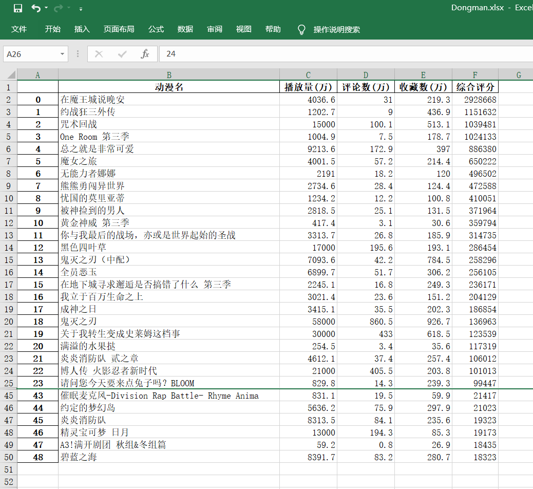
成功!
三、数据可视化分析
我们先做一些基础设置
要先准备一个文件: STHeiti Medium.ttc [注意存放在项目中的位置]
my_font = font_manager.FontProperties(fname=‘./data/STHeiti Medium.ttc’) # 设置中文字体(图表中能显示中文)
为了坐标轴上能显示中文
plt.rcParams[‘font.sans-serif’] = [‘SimHei’]
plt.rcParams[‘axes.unicode_minus’] = False
dm_name = info[0] # 番剧名
dm_play = info[1] # 番剧播放量
dm_review = info[2] # 番剧评论数
dm_favorite = info[3] # 番剧收藏数
dm_com_score = info[4] # 番剧综合评分
print(dm_com_score)
然后,开始使用matplot来绘制图形,实现数据可视化分析
文中有详细注释,这里就不再赘述了,聪明的你一定一看就懂了~
# **********************************************************************综合评分和播放量对比
*******综合评分条形图
fig, ax1 = plt.subplots()
plt.bar(dm_name, dm_com_score, color=‘red’) #设置柱状图
plt.title(‘综合评分和播放量数据分析’, fontproperties=my_font) # 表标题
ax1.tick_params(labelsize=6)
plt.xlabel(‘番剧名’) # 横轴名
plt.ylabel(‘综合评分’) # 纵轴名
plt.xticks(rotation=90, color=‘green’) # 设置横坐标变量名旋转度数和颜色
*******播放量折线图
ax2 = ax1.twinx() # 组合图必须加这个
ax2.plot(dm_play, color=‘cyan’) # 设置线粗细,节点样式
plt.ylabel(‘播放量’) # y轴
plt.plot(1, label=‘综合评分’, color=“red”, linewidth=5.0) # 图例
plt.plot(1, label=‘播放量’, color=“cyan”, linewidth=1.0, linestyle=“-”) # 图例
plt.legend()
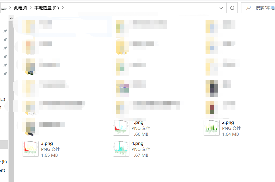
plt.savefig(r’E:1.png’, dpi=1000, bbox_inches=‘tight’) #保存至本地
plt.show()
来看看效果

有没有瞬间就感觉高大上~~了(嘿嘿~)
然后我们用相同的方法来多绘制几个对比图:
# **********************************************************************评论数和收藏数对比
********评论数条形图
fig, ax3 = plt.subplots()
plt.bar(dm_name, dm_review, color=‘green’)
plt.title(‘番剧评论数和收藏数分析’)
plt.ylabel(‘评论数(万)’)
ax3.tick_params(labelsize=6)
plt.xticks(rotation=90, color=‘green’)
*******收藏数折线图
ax4 = ax3.twinx() # 组合图必须加这个
ax4.plot(dm_favorite, color=‘yellow’) # 设置线粗细,节点样式
plt.ylabel(‘收藏数(万)’)
plt.plot(1, label=‘评论数’, color=“green”, linewidth=5.0)
plt.plot(1, label=‘收藏数’, color=“yellow”, linewidth=1.0, linestyle=“-”)
plt.legend()
plt.savefig(r’E:2.png’, dpi=1000, bbox_inches=‘tight’)
**********************************************************************综合评分和收藏数对比
*******综合评分条形图
fig, ax5 = plt.subplots()
plt.bar(dm_name, dm_com_score, color=‘red’)
plt.title(‘综合评分和收藏数量数据分析’)
plt.ylabel(‘综合评分’)
ax5.tick_params(labelsize=6)
plt.xticks(rotation=90, color=‘green’)
*******收藏折线图
ax6 = ax5.twinx() # 组合图必须加这个
ax6.plot(dm_favorite, color=‘yellow’) # 设置线粗细,节点样式
plt.ylabel(‘收藏数(万)’)
plt.plot(1, label=‘综合评分’, color=“red”, linewidth=5.0)
plt.plot(1, label=‘收藏数’, color=“yellow”, linewidth=1.0, linestyle=“-”)
plt.legend()
plt.savefig(r’E:3.png’, dpi=1000, bbox_inches=‘tight’)
**********************************************************************播放量和评论数对比
*******播放量条形图
fig, ax7 = plt.subplots()
plt.bar(dm_name, dm_play, color=‘cyan’)
plt.title(‘播放量和评论数 数据分析’)
plt.ylabel(‘播放量(万)’)
ax7.tick_params(labelsize=6)
plt.xticks(rotation=90, color=‘green’)
*******评论数折线图
ax8 = ax7.twinx() # 组合图必须加这个
ax8.plot(dm_review, color=‘green’) # 设置线粗细,节点样式
plt.ylabel(‘评论数(万)’)
plt.plot(1, label=‘播放量’, color=“cyan”, linewidth=5.0)
plt.plot(1, label=‘评论数’, color=“green”, linewidth=1.0, linestyle=“-”)
plt.legend()
plt.savefig(r’E:4.png’, dpi=1000, bbox_inches=‘tight’)
plt.show()
我们来看看最终效果

Nice!很完美~ 大家可以根据自己的想法按照相同的方法进行数据组合分析。
最后,附上全部代码
import re
import pandas
import requests
from bs4 import BeautifulSoup
import matplotlib.pyplot as plt
from matplotlib import font_manager
def get_html(url):
try:
r = requests.get(url) # 使用get来获取网页数据
r.raise_for_status() # 如果返回参数不为200,抛出异常
r.encoding = r.apparent_encoding # 获取网页编码方式
return r.text # 返回获取的内容
except:
return ‘错误’
def save(html):
解析网页
soup = BeautifulSoup(html, ‘html.parser’) # 指定Beautiful的解析器为“html.parser”
with open(‘./data/B_data.txt’, ‘r+’, encoding=‘UTF-8’) as f:
f.write(soup.text)
定义好相关列表准备存储相关信息
TScore = [] # 综合评分
name = [] # 动漫名字
bfl = [] # 播放量
pls = [] # 评论数
scs = [] # 收藏数
******************************************** 动漫名字存储
for tag in soup.find_all(‘div’, class_=‘info’):
print(tag)
bf = tag.a.string
name.append(str(bf))
print(name)
******************************************** 播放量存储
for tag in soup.find_all(‘div’, class_=‘detail’):
print(tag)
bf = tag.find(‘span’, class_=‘data-box’).get_text()
统一单位为‘万’
if ‘亿’ in bf:
num = float(re.search(r’\d(.\d)?', bf).group()) * 10000
print(num)
bf = num
else:
bf = re.search(r’\d*(\.)?\d’, bf).group()
bfl.append(float(bf))
print(bfl)
******************************************** 评论数存储
for tag in soup.find_all(‘div’, class_=‘detail’):
pl = tag.span.next_sibling.next_sibling
pl = tag.find(‘span’, class_=‘data-box’).next_sibling.next_sibling.get_text()
*********统一单位
if ‘万’ not in pl:
pl = ‘%.1f’ % (float(pl) / 10000)
print(123, pl)
else:
pl = re.search(r’\d*(\.)?\d’, pl).group()
pls.append(float(pl))
print(pls)
******************************************** 收藏数
for tag in soup.find_all(‘div’, class_=‘detail’):
sc = tag.find(‘span’, class_=‘data-box’).next_sibling.next_sibling.next_sibling.next_sibling.get_text()
sc = re.search(r’\d*(\.)?\d’, sc).group()
scs.append(float(sc))
print(scs)
******************************************** 综合评分
for tag in soup.find_all(‘div’, class_=‘pts’):
zh = tag.find(‘div’).get_text()
TScore.append(int(zh))
print(‘综合评分’, TScore)
存储至excel表格中
info = {‘动漫名’: name, ‘播放量(万)’: bfl, ‘评论数(万)’: pls, ‘收藏数(万)’: scs, ‘综合评分’: TScore}
dm_file = pandas.DataFrame(info)
dm_file.to_excel(‘Dongman.xlsx’, sheet_name=“动漫数据分析”)
将所有列表返回
return name, bfl, pls, scs, TScore
def view(info):
my_font = font_manager.FontProperties(fname=‘./data/STHeiti Medium.ttc’) # 设置中文字体(图标中能显示中文)
dm_name = info[0] # 番剧名
dm_play = info[1] # 番剧播放量
dm_review = info[2] # 番剧评论数
dm_favorite = info[3] # 番剧收藏数
dm_com_score = info[4] # 番剧综合评分
print(dm_com_score)
为了坐标轴上能显示中文
plt.rcParams[‘font.sans-serif’] = [‘SimHei’]
plt.rcParams[‘axes.unicode_minus’] = False
**********************************************************************综合评分和播放量对比
*******综合评分条形图
fig, ax1 = plt.subplots()
plt.bar(dm_name, dm_com_score, color=‘red’) #设置柱状图
plt.title(‘综合评分和播放量数据分析’, fontproperties=my_font) # 表标题
ax1.tick_params(labelsize=6)
plt.xlabel(‘番剧名’) # 横轴名
plt.ylabel(‘综合评分’) # 纵轴名
plt.xticks(rotation=90, color=‘green’) # 设置横坐标变量名旋转度数和颜色
*******播放量折线图
ax2 = ax1.twinx() # 组合图必须加这个
ax2.plot(dm_play, color=‘cyan’) # 设置线粗细,节点样式
plt.ylabel(‘播放量’) # y轴
plt.plot(1, label=‘综合评分’, color=“red”, linewidth=5.0) # 图例
plt.plot(1, label=‘播放量’, color=“cyan”, linewidth=1.0, linestyle=“-”) # 图例
plt.legend()
plt.savefig(r’E:1.png’, dpi=1000, bbox_inches=‘tight’) #保存至本地
plt.show()
**********************************************************************评论数和收藏数对比
********评论数条形图
fig, ax3 = plt.subplots()
plt.bar(dm_name, dm_review, color=‘green’)
plt.title(‘番剧评论数和收藏数分析’)
plt.ylabel(‘评论数(万)’)
ax3.tick_params(labelsize=6)
plt.xticks(rotation=90, color=‘green’)
*******收藏数折线图
ax4 = ax3.twinx() # 组合图必须加这个
ax4.plot(dm_favorite, color=‘yellow’) # 设置线粗细,节点样式
plt.ylabel(‘收藏数(万)’)
plt.plot(1, label=‘评论数’, color=“green”, linewidth=5.0)
plt.plot(1, label=‘收藏数’, color=“yellow”, linewidth=1.0, linestyle=“-”)
plt.legend()
plt.savefig(r’E:2.png’, dpi=1000, bbox_inches=‘tight’)
现在能在网上找到很多很多的学习资源,有免费的也有收费的,当我拿到1套比较全的学习资源之前,我并没着急去看第1节,我而是去审视这套资源是否值得学习,有时候也会去问一些学长的意见,如果可以之后,我会对这套学习资源做1个学习计划,我的学习计划主要包括规划图和学习进度表。
分享给大家这份我薅到的免费视频资料,质量还不错,大家可以跟着学习
网上学习资料一大堆,但如果学到的知识不成体系,遇到问题时只是浅尝辄止,不再深入研究,那么很难做到真正的技术提升。
一个人可以走的很快,但一群人才能走的更远!不论你是正从事IT行业的老鸟或是对IT行业感兴趣的新人,都欢迎加入我们的的圈子(技术交流、学习资源、职场吐槽、大厂内推、面试辅导),让我们一起学习成长!


 1496
1496


 被折叠的 条评论
为什么被折叠?
被折叠的 条评论
为什么被折叠?
 到【灌水乐园】发言


