


当一个任务需要多个步骤时,可以使用stepper组件展示当前进展。具体用法请参考stepper API。
创建stepper组件
在pages/index目录下的hml文件中创建一个stepper组件。
<!-- xxx.hml -->
<div class="container">
 <stepper>
   <stepper-item>
     <text>Step 1</text>
   </stepper-item>
   <stepper-item>
     <text>Step 2</text>
   </stepper-item>
 </stepper>
</div>
/* xxx.css */
.container {
width:100%;
height:100%;
flex-direction: column;
justify-content: center;
align-items: center;
background-color: #F1F3F5;
}
text{
width: 100%;
height: 100%;
text-align: center;
}
设置index属性
页面默认显示索引值为index的步骤。
<!-- xxx.hml -->
<div class="container">
 <stepper index="2">
   <stepper-item>
     <text>stepper-item1</text>
   </stepper-item>
   <stepper-item>
     <text>stepper-item2</text>
   </stepper-item>
   <stepper-item>
     <text>stepper-item3</text>
   </stepper-item>
  </stepper>
</div>
/* xxx.css */
.container {
width:100%;
height:100%;
flex-direction: column;
background-color: #F1F3F5;
}
text{
width: 100%;
height: 100%;
text-align: center;
}
通过设置label属性,自定义stepper-item的提示按钮。
<!-- xxx.hml -->
<div class="container">
 <stepper index="1">
   <stepper-item label="{{label_1}}">
     <text>stepper-item1</text>
   </stepper-item>
   <stepper-item label="{{label_2}}">
     <text>stepper-item2</text>
   </stepper-item>
   <stepper-item label="{{label_3}}">
     <text>stepper-item3</text>
   </stepper-item>
   <stepper-item>
     <text>stepper-item4</text>
   </stepper-item>
 </stepper>
</div>
/* xxx.css */
.container {
width:100%;
height:100%;
flex-direction: column;
background-color: #F1F3F5;
}
text{
width: 100%;
height: 100%;
text-align: center;
}// xxx.js
export default {
data: {
label_1:{
nextLabel: 'NEXT',
status: 'normal'
},
label_2:{
prevLabel: 'BACK',
nextLabel: 'NEXT',
status: 'normal'
},
label_3:{
prevLabel: 'BACK',
nextLabel: 'END',
status: 'disabled'
},
},
}
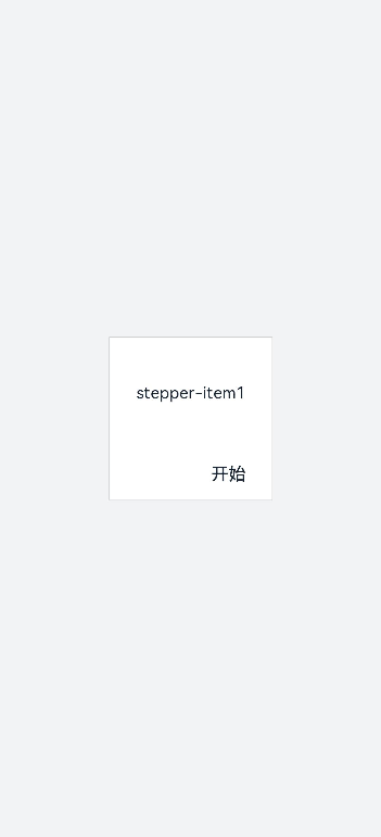
设置样式
stepper组件默认填充父容器,通过border和background-color设置边框、背景色。
<!-- xxx.hml -->
<div class="container" >
  <div class="stepperContent">
    <stepper class="stepperClass">
      <stepper-item>
        <text>stepper-item1</text>
      </stepper-item>
    </stepper>
  </div>
</div>
/* xxx.css */
.container {
width:100%;
height:100%;
flex-direction: column;
align-items: center;
justify-content: center;
background-color:#F1F3F5;
}
.stepperContent{
width: 300px;
height: 300px;
}
.stepperClass{
border:1px solid silver ;
background-color: white;
}
text{
width: 100%;
height: 100%;
text-align: center;
}
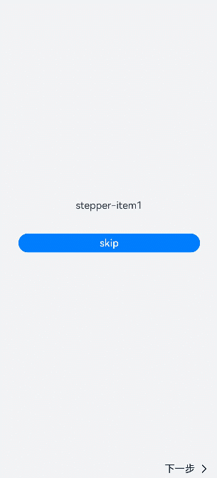
添加事件
stepper分别添加finish,change,next,back,skip事件。
-
当change与next或back同时存在时,会先执行next或back事件再去执行change事件。
-
重新设置index属性值时要先清除index的值再重新设置,否则检测不到值的改变。
<!-- xxx.hml -->
<div class="container"  style="background-color:#F1F3F5;">
  <div >
    <stepper onfinish="stepperFinish" onchange="stepperChange" onnext="stepperNext" onback="stepperBack" onskip="stepperSkip" id="stepperId" index="{{index}}">
      <stepper-item>
        <text>stepper-item1</text>
        <button value="skip" onclick="skipClick"></button>
      </stepper-item>
      <stepper-item>
         <text>stepper-item2</text>
         <button value="skip" onclick="skipClick"></button>
      </stepper-item>
      <stepper-item>
        <text>stepper-item3</text>
      </stepper-item>
    </stepper>
  </div>
</div>
/* xxx.css */
.doc-page {
width:100%;
height:100%;
flex-direction: column;
align-items: center;
justify-content: center;
}
stepper-item{
width: 100%;
flex-direction: column;
align-self: center;
justify-content: center;
}
text{
margin-top: 45%;
justify-content: center;
align-self: center;
margin-bottom: 50px;
}
button{
width: 80%;
height: 60px;
margin-top: 20px;
}// xxx.js
import promptAction from '@ohos.promptAction';
export default {
data: {
index:0,
},
stepperSkip(){
this.index = null;
this.index=2;
},
skipClick(){
this.$element('stepperId').setNextButtonStatus({status: 'skip', label: 'SKIP'});
},
stepperFinish(){
promptAction.showToast({
message: 'All Finished'
})
},
stepperChange(e){
console.log("stepperChange"+e.index)
promptAction.showToast({
// index表示当前步骤的序号
message: 'Previous step: '+e.prevIndex+"-------Current step:"+e.index
})
},
stepperNext(e){
console.log("stepperNext"+e.index)
promptAction.showToast({
// pendingIndex表示将要跳转的序号
message: 'Current step:'+e.index+"-------Next step:"+e.pendingIndex
})
var index = {pendingIndex:e.pendingIndex }
return index;
},
stepperBack(e){
console.log("stepperBack"+e.index)
var index = {pendingIndex: e.pendingIndex }
return index;
}
}
场景示例
在本场景中,开发者可以在界面上点击选择并实时显示选择结果,点击下一步按钮后可动态修改页面的字体颜色和字体大小。
用stepper组件实现分步,再创建Toggle组件实现选择显示功能,再使用Select组件实现改变选中值动态修改字体颜色或大小。
<!-- xxx.hml -->
<div class="container">
  <stepper id="mystep" index="0" onfinish="back" style="text-color: indigo;">
    <stepper-item label="{{label1}}">
      <div style="flex-direction: column;padding: 0px 10px;">
        <text class="text" style="margin-top: 10%;text-align: center;width: 100%;">Select error types:</text>
        <text style="margin-top: 20px;padding: 10px">
          <span>{{error}}</span>
        </text>
        <div style="justify-content: space-around;flex-wrap: wrap;">
          <toggle for="{{togglelist1}}" value="{{$item}}" class="tog" onchange="multiTog({{$item}})"></toggle>
        </div>
      </div>
    </stepper-item>
    <stepper-item label="{{label2}}">
      <div style="flex-direction: column;align-items: center;">
        <text class="txt" style="margin-top: 10%;">Toggle</text>
        <div style="justify-content: space-around;flex-wrap: wrap;;margin-top:10%">
          <toggle class="tog" for="{{togglelist1}}" value="{{$item}}" style="text-color: {{tcolor}};font-size: {{tsize}}; font-style: {{tstyle}};font-weight: {{tweight}};font-family: {{tfamily}};">
          </toggle>
        </div>
        <div style="flex-wrap: wrap;width: 700px;margin-top:10%">
          <div style="flex-direction: column;width: 350px;height: 185px;align-items: center;">
            <text class="txt">text-color</text>
            <select onchange="settcolor">
              <option for="{{color_list}}" value="{{$item}}">{{$item}}</option>
            </select>
          </div>
          <div style="flex-direction: column;width: 350px;height: 185px;align-items: center;">
            <text class="txt">font-size</text>
            <select onchange="settsize">
              <option for="{{size_list}}" value="{{$item}}">{{$item}}</option>
            </select>
          </div>
        </div>
      </div>
    </stepper-item>
  </stepper>
</div>
/* xxx.css */
.container {
width:100%;
height:100%;
flex-direction: column;
align-items: center;
justify-content: center;
background-color:#F1F3F5;
}
.dvd {
stroke-width: 8px;
color: orangered;
margin: 65px;
}
.tog{
margin-right: 20px;
margin-top: 30px;
}// xxx.js
import promptAction from '@ohos.promptAction';
import router from '@ohos.router';
let myset = new Set();
export default {
data: {
error: '',
tcolor:'#FF4500',
color_list:['#FF4500','#5F9EA0','#0000FF'],
tsize: '12px',
size_list: ['12px', '30px', '8px', '50px'],
label1: {
prevLabel: 'The text on the left of the starting step is invalid.',
nextLabel: 'Toggle'
},
label2: {
prevLabel: 'toggle',
nextLabel: 'END'
},
togglelist1:['Program error', 'Software', 'System', 'Application'],
},
multiTog(arg, e) {
this.error = ' '
if (e.checked) {
myset.add(arg)
} else {
myset.delete(arg)
}
for (let item of myset) {
this.error += item + ' '
}
},
settcolor(e) {
this.tcolor = e.newValue
},
settsize(e) {
this.tsize = e.newValue
}
}
最后
有很多小伙伴不知道学习哪些鸿蒙开发技术?不知道需要重点掌握哪些鸿蒙应用开发知识点?而且学习时频繁踩坑,最终浪费大量时间。所以有一份实用的鸿蒙(HarmonyOS NEXT)资料用来跟着学习是非常有必要的。
点击→【纯血版鸿蒙全套最新学习资料】希望这一份鸿蒙学习资料能够给大家带来帮助!~
鸿蒙(HarmonyOS NEXT)最新学习路线
该路线图包含基础技能、就业必备技能、多媒体技术、六大电商APP、进阶高级技能、实战就业级设备开发,不仅补充了华为官网未涉及的解决方案
路线图适合人群:
IT开发人员:想要拓展职业边界
零基础小白:鸿蒙爱好者,希望从0到1学习,增加一项技能。
技术提升/进阶跳槽:发展瓶颈期,提升职场竞争力,快速掌握鸿蒙技术
2.视频学习资料+学习PDF文档
这份鸿蒙(HarmonyOS NEXT)资料包含了鸿蒙开发必掌握的核心知识要点,内容包含了(ArkTS、ArkUI开发组件、Stage模型、多端部署、分布式应用开发、音频、视频、WebGL、OpenHarmony多媒体技术、Napi组件、OpenHarmony内核、(南向驱动、嵌入式等)鸿蒙项目实战等等)鸿蒙(HarmonyOS NEXT)技术知识点。
HarmonyOS Next 最新全套视频教程
大厂面试必问面试题
鸿蒙南向开发技术
鸿蒙APP开发必备
《鸿蒙 (OpenHarmony)开发基础到实战手册》
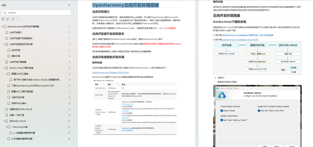
OpenHarmony北向、南向开发环境搭建
《鸿蒙开发基础》

《鸿蒙开发进阶》
《鸿蒙进阶实战》
总结
总的来说,华为鸿蒙不再兼容安卓,对程序员来说是一个挑战,也是一个机会。只有积极应对变化,不断学习和提升自己,才能在这个变革的时代中立于不败之地。


 810
810

 被折叠的 条评论
为什么被折叠?
被折叠的 条评论
为什么被折叠?
 到【灌水乐园】发言


