


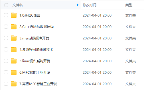
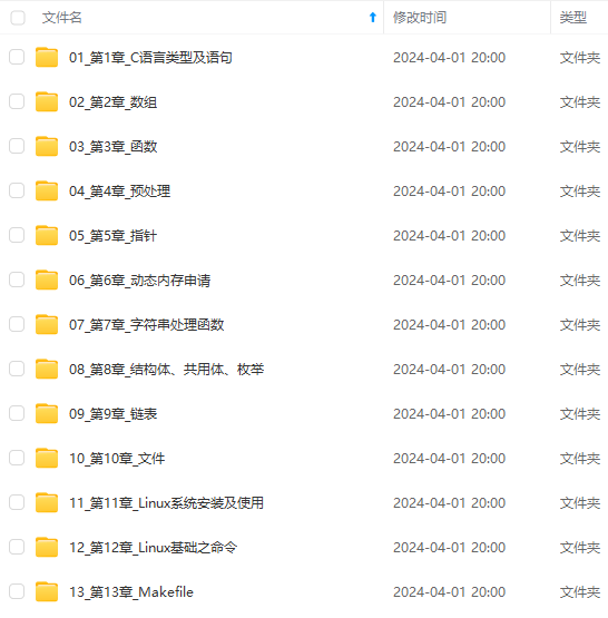
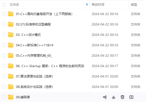
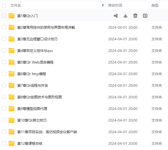
既有适合小白学习的零基础资料,也有适合3年以上经验的小伙伴深入学习提升的进阶课程,涵盖了95%以上C C++开发知识点,真正体系化!
由于文件比较多,这里只是将部分目录截图出来,全套包含大厂面经、学习笔记、源码讲义、实战项目、大纲路线、讲解视频,并且后续会持续更新
9. 一样的,给其它两个勾玉动画:
.zuoYu .yu:nth-child(2){
            animation: yu2 2s ease-in 2s forwards;
        }
        @keyframes yu2{
            0%{
                opacity: 0;
                left: 50%;
                top: 50%;

                transform: translate(-50%,-50%) scale(0.1) ;
            }
            100%{
                top: 60%;
                left: -9%;
                transform: scale(1) rotate(-60deg);
            }
        }
        .zuoYu .yu:nth-child(3){
            animation: yu3 2s ease-in 2s forwards;
        }
        @keyframes yu3{
            0%{
                opacity: 0;
                right: 50%;
                top: 50%;

                transform: translate(-50%,-50%) scale(0.1);
            }
            100%{
                top: 60%;
                right: -9%;
                transform: scale(1) rotate(180deg);
            }
        }
10.给两个眼睛都设置一个白点,相当于反光效果吧,至此血轮眼做完了:
.zuo::before,.you::before{
            content: '';
            position: absolute;
            left: 38%;
            top: 30%;
            width: 12px;
            height: 12px;
            border-radius: 50%;
            background-color: rgb(255, 255, 255);
            z-index: 10;
        }
position: absolute;
left: 38%;
top: 30%; 定位相应的位置。
background-color: rgb(255, 255, 255); 白色。
z-index: 10; 设置为10,显示在最上层。
11.设置轮回眼基本css样式,跟血轮眼一样:
 .you{
            transform: translateX(135px);
            border-radius:  120px 0 120px 0;
            box-shadow: inset -3px 2px 3px  rgba(17, 17, 17, 0.8);
        }
12.设置眼球宽高等:
.you::after{
            content: '';
            position: absolute;
            top: 50%;
            left: 50%;
            transform: translate(-50%,-50%);
            width: 95px;
            height: 95px;
            border-radius: 50%;
            border: 2px solid #000;
            animation: youcolor 2s linear forwards;
         }
         @keyframes youcolor{
            0%,30%{
                background-color: rgb(0, 0, 0);
            }
            100%{
                 background-color: rgb(144, 130, 183);

             }
         }
position: absolute; 绝对定位
top: 50%;
left: 50%;
transform: translate(-50%,-50%); 居中对齐。
animation:设置动画,让其变紫色。forward:继承最后一帧的属性。
background-color: rgb(0, 0, 0); 黑色
background-color: rgb(144, 130, 183); 紫色。
13. 设置眼球最中间的黑点,跟血轮眼也差不多:
.dian{
             position: absolute;
            top: 50%;
            left: 50%;
            background-color: #000;
            transform: translate(-50%,-50%);
            border-radius: 50%;
            z-index: 10;
            animation: youda 3s linear forwards;
         }
         @keyframes youda{
             0%{
                height: 0px;
            width: 0px;
             }
             100%{
                height: 15px;
            width: 15px;
             }
         }
14. 设置轮回眼每个圈,同时设置动画让其变大:
 .youYu{
            position: absolute;
          top: 50%;
          left: 50%;
          transform: translate(-50%,-50%);
       }
       .quan{
           position: absolute;
           border-radius: 50%;
           border: 2px solid #000;
           z-index: calc(1 - var(--r));
           animation: zhi 2s ease-out 2s forwards;
       }
       @keyframes zhi{
           0%{
            top: calc(var(--r) * 1px);
           left: calc(var(--r) * 1px);
           right: calc(var(--r) * 1px);
           bottom: calc(var(--r) * 1px);
           }
           100%{
            top: calc(var(--r) * -35px);
           left: calc(var(--r) * -35px);
           right: calc(var(--r) * -35px);
           bottom: calc(var(--r) * -35px);

               background-color: rgb(187, 177, 214);
           }
       }
z-index: calc(1 - var(–r)); 计算,让最开始的圈显示在最上层。
animation:设置动画,让轮回圈慢慢变大,同时变成紫色。
完整代码:
<!DOCTYPE html>
<html lang="zh-CN">
<head>
<meta charset="UTF-8">
<meta http-equiv="X-UA-Compatible" content="IE=edge">
<meta name="viewport" content="width=device-width, initial-scale=1.0">
<title>Document</title>
<style>
\*{
margin: 0;
padding: 0;
box-sizing: border-box;
}
body{
height: 100vh;
display: flex;
justify-content: center;
align-items: center;
background-color: #000;
}
.zuo , .you{
width: 250px;
height: 120px;
background-color: rgb(255, 255, 255);
border-bottom: 5px solid rgb(70, 70, 70);
overflow: hidden;
position: relative;
}
.zuo{
transform: translateX(-135px);
border-radius: 0 120px 0 120px;
box-shadow: inset 3px 2px 3px rgba(17, 17, 17, 0.8);
}
.zuo::after{
content: '';
position: absolute;
top: 50%;
left: 50%;
transform: translate(-50%,-50%);
width: 95px;
height: 95px;
border-radius: 50%;
border: 2px solid #000;
animation: colour 2s linear forwards;
}
@keyframes colour{
0%,30%{
background-color: rgb(0, 0, 0);
}
100%{
background-color: rgb(255, 4, 4);
}
}
.zuoZong{
position: absolute;
top: 50%;
left: 50%;
transform: translate(-50%,-50%);
width: 0px;
height: 0px;
border-radius: 50%;
background-color: rgb(0, 0, 0);
z-index: 1;
animation: da 3s linear forwards;
}
@keyframes da{
100%{
width: 15px;
height: 15px;
}
}
.zuoYu{
position: absolute;
top: -25px;
left: -25px;
bottom: -25px;
right: -25px;
border-radius: 50%;
border: 2px solid rgb(0, 0, 0);
animation: zhuan 2s linear 2s forwards;
opacity: 0;
}
@keyframes zhuan{
100%{
opacity: 1;
transform: rotate(720deg);
}
}
.zuoYu .yu{
position: absolute;
width: 15px;
height: 15px;
border-radius: 50%;
background-color: rgb(0, 0, 0);
}
.zuoYu .yu::after{
content: '';
position: absolute;
top: -6px;
left: -1px;
width: 6px;
height: 20px;
border-radius: 50%;
border-left: 6px solid rgb(0, 0, 0);
}
.zuoYu .yu:nth-child(1){
animation: yu1 2s ease-in 2s forwards;
}
@keyframes yu1{
0%{
opacity: 0;
left: 50%;
top: 50%;
transform:translate(-50%,-50%) scale(0.1) ;
}
100%{
left: 50%;
top: -9%;
transform: scale(1) rotate(80deg);
}
}
.zuoYu .yu:nth-child(2){
animation: yu2 2s ease-in 2s forwards;
}
@keyframes yu2{
0%{
opacity: 0;
left: 50%;
top: 50%;
transform: translate(-50%,-50%) scale(0.1) ;
}
100%{
top: 60%;
left: -9%;
transform: scale(1) rotate(-60deg);
}
}
.zuoYu .yu:nth-child(3){
animation: yu3 2s ease-in 2s forwards;
}
@keyframes yu3{
0%{
opacity: 0;
right: 50%;
top: 50%;
transform: translate(-50%,-50%) scale(0.1);
}
100%{
top: 60%;
right: -9%;
transform: scale(1) rotate(180deg);
}
}
.zuo::before,.you::before{
content: '';
position: absolute;
left: 38%;
top: 30%;
width: 12px;
height: 12px;
border-radius: 50%;
background-color: rgb(255, 255, 255);
z-index: 10;
}
.you{
transform: translateX(135px);
border-radius: 120px 0 120px 0;
box-shadow: inset -3px 2px 3px rgba(17, 17, 17, 0.8);
/\* filter: drop-shadow( 8px -5px 3px rgb(216, 59, 59));
\*/ }
.you::after{
content: '';
position: absolute;
top: 50%;
left: 50%;
transform: translate(-50%,-50%);
width: 95px;
height: 95px;
border-radius: 50%;
border: 2px solid #000;
animation: youcolor 2s linear forwards;
}
@keyframes youcolor{
0%,30%{
background-color: rgb(0, 0, 0);
}
100%{
background-color: rgb(144, 130, 183);
}
}
.dian{
position: absolute;
top: 50%;
left: 50%;
background-color: #000;
transform: translate(-50%,-50%);
border-radius: 50%;
z-index: 10;
animation: youda 3s linear forwards;
}
@keyframes youda{
0%{
height: 0px;
width: 0px;
}
100%{
height: 15px;
width: 15px;
}
}
.youYu{
position: absolute;
top: 50%;
left: 50%;
transform: translate(-50%,-50%);
}
.quan{
position: absolute;
border-radius: 50%;
border: 2px solid #000;
z-index: calc(1 - var(--r));
animation: zhi 2s ease-out 2s forwards;
}
@keyframes zhi{
0%{
top: calc(var(--r) \* 1px);
left: calc(var(--r) \* 1px);
right: calc(var(--r) \* 1px);
bottom: calc(var(--r) \* 1px);
}
100%{
top: calc(var(--r) \* -35px);
left: calc(var(--r) \* -35px);
right: calc(var(--r) \* -35px);
bottom: calc(var(--r) \* -35px);
background-color: rgb(187, 177, 214);
}
}
</style>
</head>
<body>
<!-- 血轮眼 -->
<div class="zuo">
<!-- 眼睛最中间那个黑点 -->
<div class="zuoZong">
<!-- 三勾玉所在的圈 -->
<div class="zuoYu">
<!-- 三个勾玉 -->
<span class="yu"></span>
**网上学习资料一大堆,但如果学到的知识不成体系,遇到问题时只是浅尝辄止,不再深入研究,那么很难做到真正的技术提升。**
**[需要这份系统化的资料的朋友,可以添加戳这里获取](https://bbs.csdn.net/topics/618668825)**
**一个人可以走的很快,但一群人才能走的更远!不论你是正从事IT行业的老鸟或是对IT行业感兴趣的新人,都欢迎加入我们的的圈子(技术交流、学习资源、职场吐槽、大厂内推、面试辅导),让我们一起学习成长!**
Zong">
<!-- 三勾玉所在的圈 -->
<div class="zuoYu">
<!-- 三个勾玉 -->
<span class="yu"></span>
[外链图片转存中...(img-pc5gwDMY-1715709837341)]
[外链图片转存中...(img-nHuHrhdT-1715709837341)]
**网上学习资料一大堆,但如果学到的知识不成体系,遇到问题时只是浅尝辄止,不再深入研究,那么很难做到真正的技术提升。**
**[需要这份系统化的资料的朋友,可以添加戳这里获取](https://bbs.csdn.net/topics/618668825)**
**一个人可以走的很快,但一群人才能走的更远!不论你是正从事IT行业的老鸟或是对IT行业感兴趣的新人,都欢迎加入我们的的圈子(技术交流、学习资源、职场吐槽、大厂内推、面试辅导),让我们一起学习成长!**


 4902
4902


 被折叠的 条评论
为什么被折叠?
被折叠的 条评论
为什么被折叠?
 到【灌水乐园】发言


