


plt.ylabel(‘Real label’)
plt.xlabel(‘Prediction’)
plt.tight_layout()
#plt.show()
保存每次生成的图像
f = plt.gcf() #获取当前图像
f.savefig(r’./{}.png’.format(‘result’))# 一定要放到plt.show()前面,否则保存图像为空白
plt.show()#plt.show() 后实际上已经创建了一个新的空白的图片
#f.clear() #释放内存,迭代保存的时候,plt.plot()会出现多根线在一张图叠加,可以加这句话
print(‘混淆矩阵图像绘制结束并保存在当前路径下。’)
结果显示如下,并在代码路径下保存生成结果:
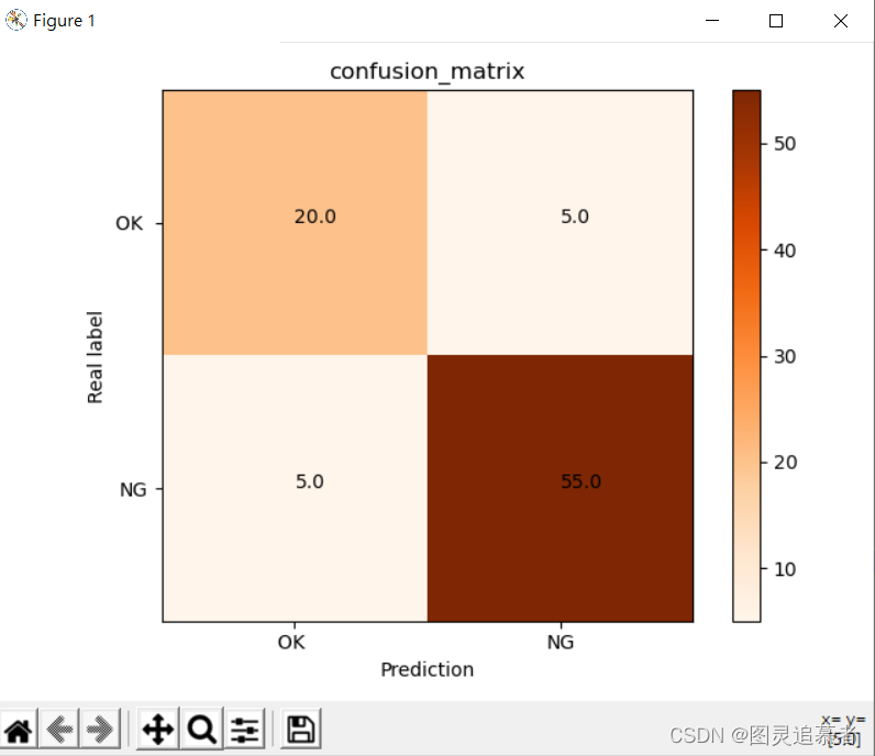
**混淆矩阵图分析:**
该混淆矩阵结果图表示的是,OK实际测试样本有25个,预测为OK的样本有20个,预测为NG的样本有5个。NG实际测试样本有60个,预测为NG的有55个,预测为OK的样本有5个。
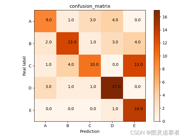
**绘制多类分类矩阵:**
#confusion_matrix
import numpy as np
import matplotlib.pyplot as plt
classes = [‘A’,‘B’,‘C’,‘D’,‘E’]
confusion_matrix = np.array([(9,1,3,4,0),(2,13,1,3,4),(1,4,10,0,13),(3,1,1,17,0),(0,0,0,1,14)],dtype=np.float64)
plt.imshow(confusion_matrix, interpolation=‘nearest’, cmap=plt.cm.Oranges) #按照像素显示出矩阵
plt.title(‘confusion_matrix’)
plt.colorbar()
tick_marks = np.arange(len(classes))
plt.xticks(tick_marks, classes)
plt.yticks(tick_marks, classes)
thresh = confusion_matrix.max() / 2.
#iters = [[i,j] for i in range(len(classes)) for j in range((classes))]
#ij配对,遍历矩阵迭代器
iters = np.reshape([[[i,j] for j in range(5)] for i in range(5)],(confusion_matrix.size,2))
for i, j in iters:
plt.text(j, i, format(confusion_matrix[i, j])) #显示对应的数字
plt.ylabel(‘Real label’)
plt.xlabel(‘Prediction’)
plt.tight_layout()
plt.show()
结果如下:
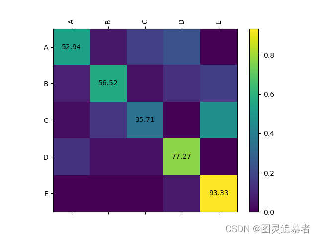
**封装成函数绘制矩阵:**
from future import division
import numpy as np
import matplotlib.pyplot as plt
from matplotlib.ticker import MultipleLocator
def plotCM(classes, matrix, savname):
“”“classes: a list of class names”“”
# Normalize by row
matrix = matrix.astype(np.float)
linesum = matrix.sum(1)
linesum = np.dot(linesum.reshape(-1, 1), np.ones((1, matrix.shape[1])))
matrix /= linesum
# plot
plt.switch_backend(‘agg’)
fig = plt.figure()
ax = fig.add_subplot(111)
cax = ax.matshow(matrix)
fig.colorbar(cax)
ax.xaxis.set_major_locator(MultipleLocator(1))
ax.yaxis.set_major_locator(MultipleLocator(1))
for i in range(matrix.shape[0]):
ax.text(i, i, str(‘%.2f’ % (matrix[i, i] * 100)), va=‘center’, ha=‘center’)
ax.set_xticklabels([''] + classes, rotation=90)
ax.set_yticklabels([''] + classes)
#save
plt.savefig(savname)
classes = [‘A’,‘B’,‘C’,‘D’,‘E’]
matrix = np.array(([9,1,3,4,0],[2,13,1,3,4],[1,4,10,0,13],[3,1,1,17,0],[0,0,0,1,14]),dtype=int)
savname = ‘test’
plotCM(classes, matrix, savname)
结果展示:
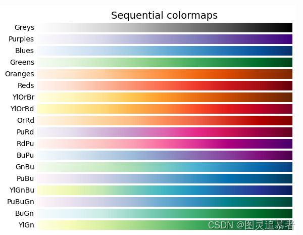
如果要改变绘制矩阵的颜色,在代码中cmap=plt.cm.Oranges按照如下修改即可:
**有时候我们需要将混淆矩阵的标签显示为中文,这时候需要我们进行适当的修改才可以 ,否则会出现乱码,代码和效果如下:**
#coding=utf-8
import matplotlib.pyplot as plt
import numpy as np
confusion = np.array(([91,0,0],[0,92,1],[0,0,95]))
热度图,后面是指定的颜色块,可设置其他的不同颜色
plt.imshow(confusion, cmap=plt.cm.Blues)
ticks 坐标轴的坐标点
label 坐标轴标签说明
indices = range(len(confusion))
第一个是迭代对象,表示坐标的显示顺序,第二个参数是坐标轴显示列表
#plt.xticks(indices, [0, 1, 2])
#plt.yticks(indices, [0, 1, 2])
plt.xticks(indices, [‘圆形’, ‘三角形’, ‘方形’])
plt.yticks(indices, [‘圆形’, ‘三角形’, ‘方形’])
plt.colorbar()
plt.xlabel(‘预测值’)


 6041
6041

 被折叠的 条评论
为什么被折叠?
被折叠的 条评论
为什么被折叠?
 到【灌水乐园】发言


