


效果图:
 代码:
代码:
<!DOCTYPE html>
<html lang="en">
<head>
<meta charset="UTF-8">
<meta name="viewport" content="width=device-width, initial-scale=1.0">
<title>Document</title>
<style>
.box{
width: 300px;
height: 200px;
border: 1px solid black;
float: left;
margin-left: 5px;
font-size: 30px;
}
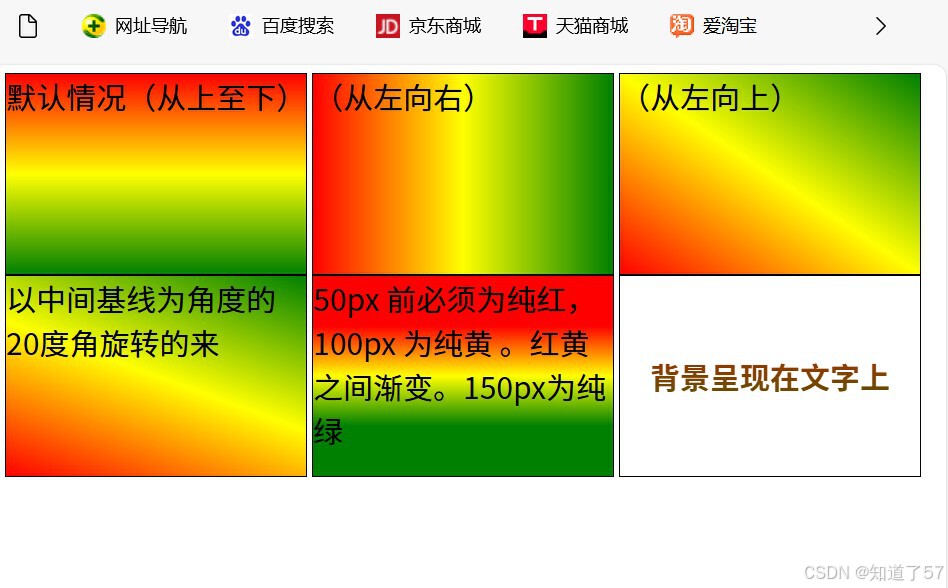
.box1{
background-image: linear-gradient(red,yellow,green);
}
.box2{
background-image: linear-gradient( to right ,red,yellow,green);
}
.box21{
background-image: linear-gradient(to right top,red,yellow,green);
}
.box3{
background-image: linear-gradient(20deg,red,yellow,green);
}
.box4{
background-image: linear-gradient(red 50px,yellow 100px,green 150px);
}
.box5{
background-image: linear-gradient(red,green);
text-align: center;
line-height: 200px;
font-size: 30px;
font-weight: bold; /*加粗*/
/* 使文字透明 */
color: transparent;
/* 使背景呈现在文字上 */
background-clip: text;
}
</style>
</head>
<body>
<!-- 线性渐变 -->
<div class="box box1">默认情况(从上至下)</div>
<div class="box box2">(从左向右)</div>
<div class="box box21">(从左向上)</div>
<div class="box box3">以中间基线为角度的20度角旋转的来</div>
<div class="box box4">50px 前必须为纯红,100px 为纯黄 。红黄之间渐变。150px为纯绿</div>
<div class="box box5">背景呈现在文字上</div>
</body>
</html>


 扫一扫
扫一扫


 2316
2316

 被折叠的 条评论
为什么被折叠?
被折叠的 条评论
为什么被折叠?
 到【灌水乐园】发言


