


import QtQuick 2.0
import QtQuick.Controls 1.4
import QtQuick.Controls.Styles 1.4
import QtGraphicalEffects 1.0
//使用背景色的按钮
Item {

        width: 320;
        height: 480;
        Button{
                id:btn;
                height: 40;
                width:100;
                anchors.left: parent.left
                text:"按钮";
                style:component_btnstyle;//注意 用Component封装了!否则错误
               layer.enabled: true
               layer.effect: DropShadow {
                   transparentBorder: true//绘制边框阴影
                   color: "#80000000";
                   radius: 15.0;
                   id:drop;

                   //cached: true;
                   horizontalOffset: 0;
                   verticalOffset: 0;
                   samples: 16;
                   smooth: true;
                            }

        }


        Component {
            id: component_btnstyle
            ButtonStyle{
                id:btnstyle;

                background:Rectangle{
                    id:rect;
                    width: control.windth
                    height: control.height;
                    color:setcolor(control)
                     radius:2;
                    border.color: "#ccc"
                    antialiasing: true
                    Rectangle {
                    //再嵌套一层矩形 可用作内边框 颜色透。比用border灵活
                        anchors.fill: parent
                        anchors.margins: 1
                        color: "transparent"
                        antialiasing: true
                        visible: !control.pressed  //点击的时候隐藏
                        border.color: "#aaffffff"
                        radius: height/2

                    }


                }
            }
        }


function setcolor(mcontrol)
{
    if(mcontrol.pressed===true)
    {
   return "#ccc";
    }

     return "white"

}


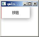
}Qt quick中,控件阴影效果
最新推荐文章于 2024-08-08 16:23:57 发布


 扫一扫
扫一扫
 235
235

 被折叠的 条评论
为什么被折叠?
被折叠的 条评论
为什么被折叠?
 到【灌水乐园】发言


