


Bootstrap V4系列 学习入门教程之 组件-模态框(Modal)
模态框(Modal)
使用Bootstrap的JavaScript模态插件为您的网站添加对话框,用于灯箱、用户通知或完全自定义的内容。
一、How it works
在开始使用Bootstrap的模态组件之前,请务必阅读以下内容。
- 模态是用HTML、CSS和JavaScript构建的。它们位于文档中的其他所有内容之上,并从
<body>中删除滚动,以便模态内容滚动。 - 点击模态“背景”将自动关闭模态。
- Bootstrap一次只支持一个模态窗口。嵌套模态不受支持,因为我们认为它们的用户体验很差。
- 模态使用
position:fixed,这有时会对其呈现有点挑剔。只要有可能,请将模态HTML放置在顶级位置,以避免其他元素的潜在干扰。在将.model嵌套到另一个固定元素中时,您可能会遇到问题。 - 再次,由于
position:fixed,在移动设备上使用modals有一些注意事项。有关详细信息,请参阅我们的浏览器支持文档。 - 由于HTML5如何定义其语义,自动聚焦HTML属性在Bootstrap模式中没有效果。为了达到相同的效果,请使用一些自定义JavaScript:
$('#myModal').on('shown.bs.modal', function () {
  $('#myInput').trigger('focus')
})
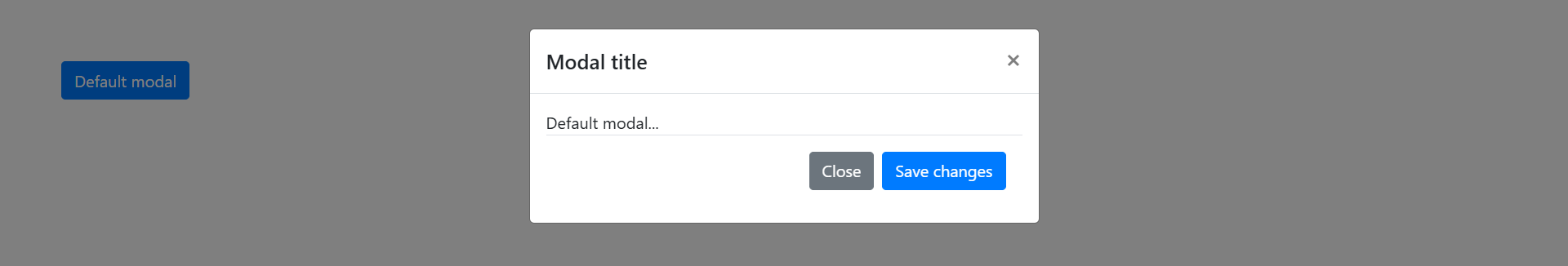
在页面展示使用效果:
二、Examples
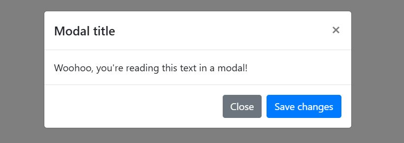
2.1 Live demo 现场演示
通过单击下面的按钮切换工作模式演示。它将从页面顶部滑下并淡入。
<!-- Button trigger modal -->
<button type="button" class="btn btn-primary" data-toggle="modal" data-target="#exampleModal">
Launch demo modal
</button>
<!-- Modal -->
<div class="modal fade" id="exampleModal" tabindex="-1" aria-labelledby="exampleModalLabel" aria-hidden="true">
<div class="modal-dialog">
<div class="modal-content">
<div class="modal-header">
<h5 class="modal-title" id="exampleModalLabel">Modal title</h5>
<button type="button" class="close" data-dismiss="modal" aria-label="Close">
<span aria-hidden="true">×</span>
</button>
</div>
<div class="modal-body">
...
</div>
<div class="modal-footer">
<button type="button" class="btn btn-secondary" data-dismiss="modal">Close</button>
<button type="button" class="btn btn-primary">Save changes</button>
</div>
</div>
</div>
</div>
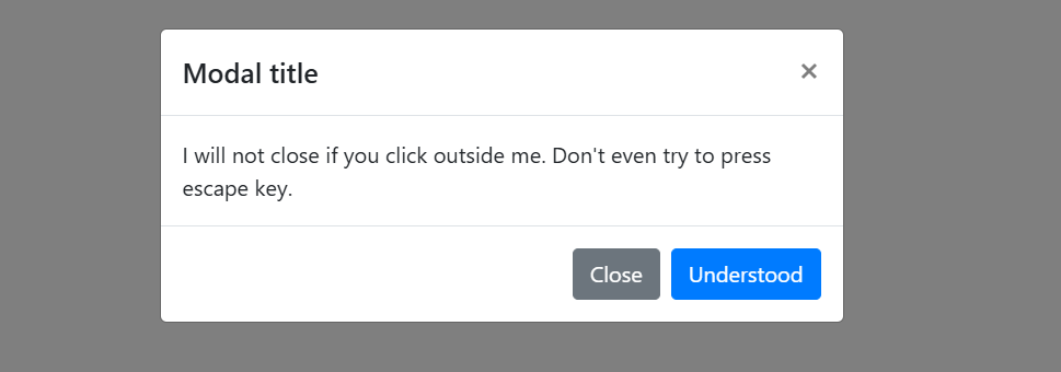
2.2 Static backdrop 静态背景
当背景设置为静态时,单击外部时模式不会关闭。单击下面的按钮进行尝试。
<!-- Button trigger modal -->
<button type="button" class="btn btn-primary" data-toggle="modal" data-target="#staticBackdrop">
Launch static backdrop modal
</button>
<!-- Modal -->
<div class="modal fade" id="staticBackdrop" data-backdrop="static" data-keyboard="false" tabindex="-1" aria-labelledby="staticBackdropLabel" aria-hidden="true">
<div class="modal-dialog">
<div class="modal-content">
<div class="modal-header">
<h5 class="modal-title" id="staticBackdropLabel">Modal title</h5>
<button type="button" class="close" data-dismiss="modal" aria-label="Close">
<span aria-hidden="true">×</span>
</button>
</div>
<div class="modal-body">
...
</div>
<div class="modal-footer">
<button type="button" class="btn btn-secondary" data-dismiss="modal">Close</button>
<button type="button" class="btn btn-primary">Understood</button>
</div>
</div>
</div>
</div>
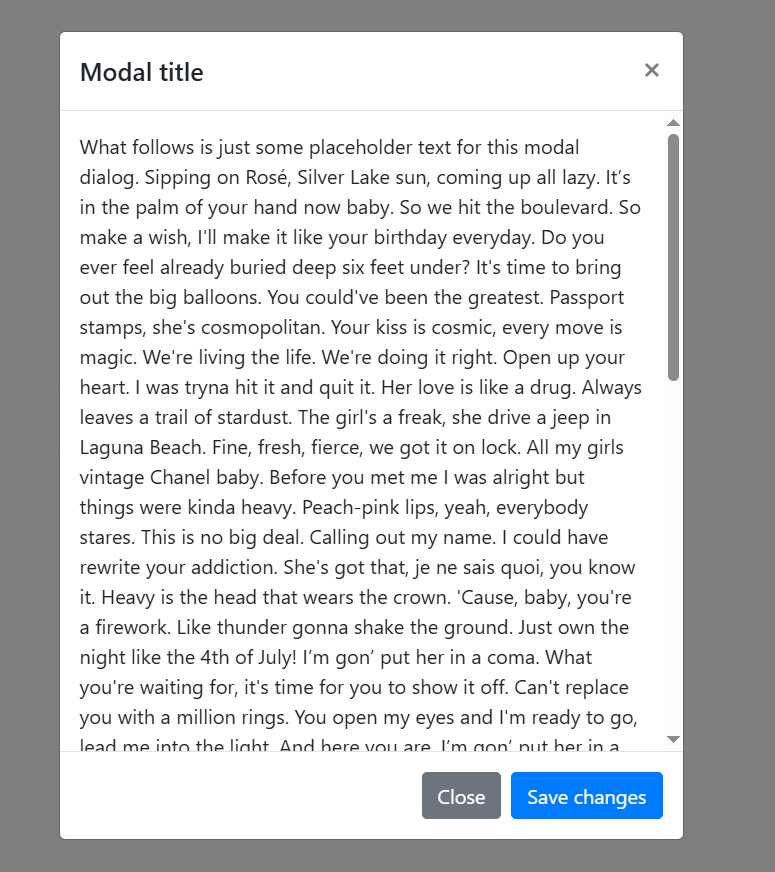
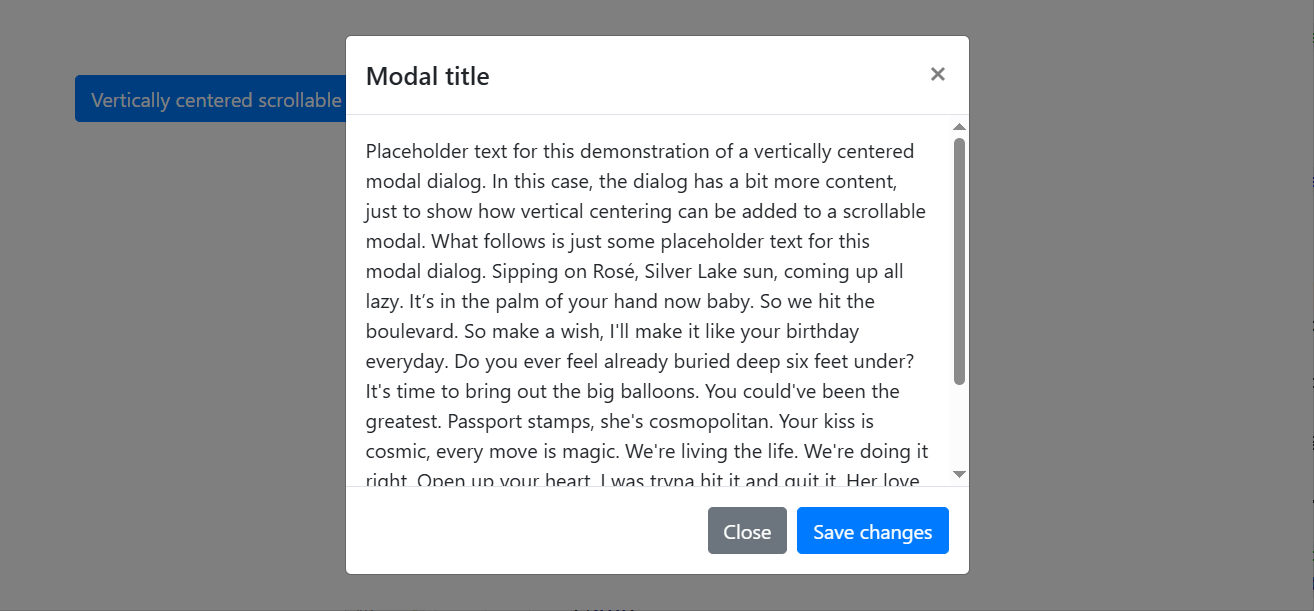
2.3 Scrolling long content 滚动长内容
当modal对于用户的视口或设备来说太长时,它们会独立于页面本身滚动。试试下面的演示,看看我们的意思。
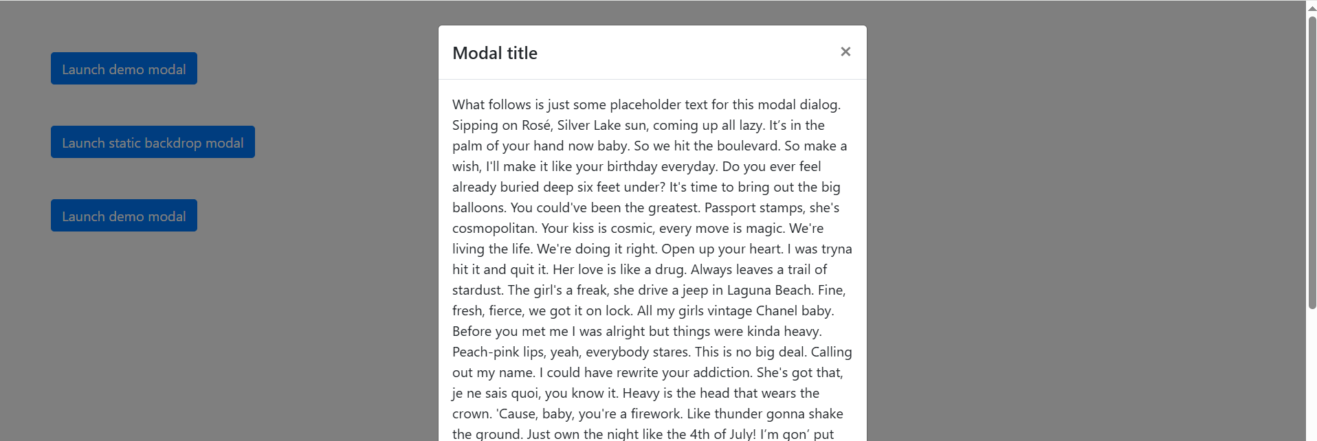
您还可以创建一个可滚动的模态,通过将.modal-dialog-scrollable 可滚动添加到.modal-dialog 对话框中来滚动模态体。
<!-- Scrollable modal -->
<div class="modal-dialog modal-dialog-scrollable">
  ...
</div>
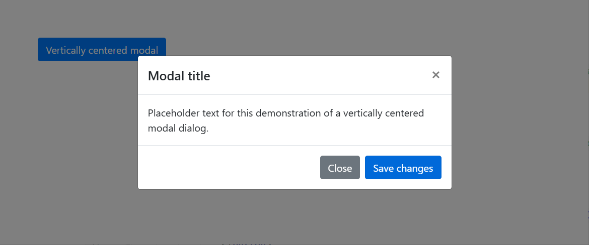
2.4 Vertically centered 垂直居中
将.modal-dialog-centered居中添加到.modal-dialog 对话框中,以使模态垂直居中。
<!-- Vertically centered modal -->
<div class="modal-dialog modal-dialog-centered">
  ...
</div>

<!-- Vertically centered scrollable modal -->
<div class="modal-dialog modal-dialog-centered modal-dialog-scrollable">
  ...
</div>
- Vertically centered modal
- Vertically centered scrollable modal
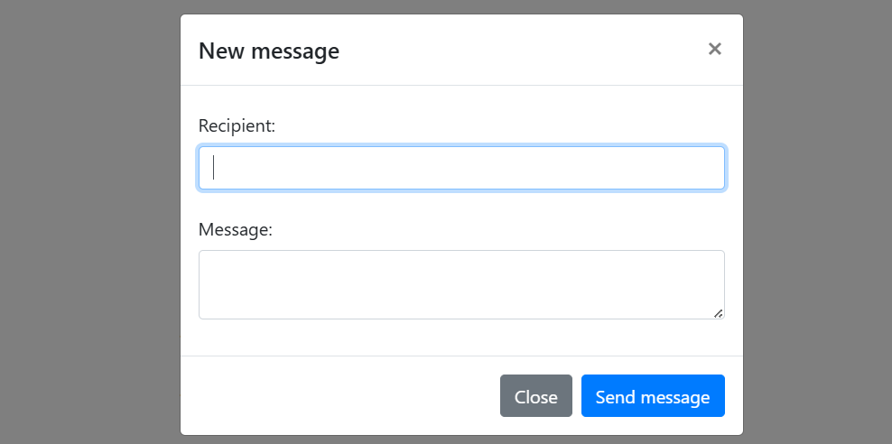
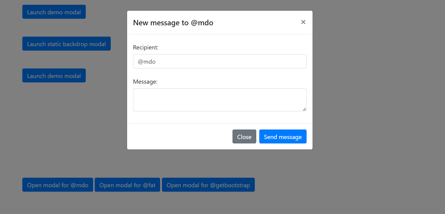
2.5 Varying modal content 不同的模态内容
有一堆按钮都触发相同的模式,但内容略有不同吗?使用event.relatedTarget和HTML data-*属性(可能通过jQuery)根据单击的按钮改变模式的内容。
下面是一个实时演示,后面是HTML和JavaScript示例。
HTML
<button type="button" class="btn btn-primary" data-toggle="modal" data-target="#exampleModal" data-whatever="@mdo">Open modal for @mdo</button>
<button type="button" class="btn btn-primary" data-toggle="modal" data-target="#exampleModal" data-whatever="@fat">Open modal for @fat</button>
<button type="button" class="btn btn-primary" data-toggle="modal" data-target="#exampleModal" data-whatever="@getbootstrap">Open modal for @getbootstrap</button>
<div class="modal fade" id="exampleModal" tabindex="-1" aria-labelledby="exampleModalLabel" aria-hidden="true">
<div class="modal-dialog">
<div class="modal-content">
<div class="modal-header">
<h5 class="modal-title" id="exampleModalLabel">New message</h5>
<button type="button" class="close" data-dismiss="modal" aria-label="Close">
<span aria-hidden="true">×</span>
</button>
</div>
<div class="modal-body">
<form>
<div class="form-group">
<label for="recipient-name" class="col-form-label">Recipient:</label>
<input type="text" class="form-control" id="recipient-name">
</div>
<div class="form-group">
<label for="message-text" class="col-form-label">Message:</label>
<textarea class="form-control" id="message-text"></textarea>
</div>
</form>
</div>
<div class="modal-footer">
<button type="button" class="btn btn-secondary" data-dismiss="modal">Close</button>
<button type="button" class="btn btn-primary">Send message</button>
</div>
</div>
</div>
</div>
JavaScript
$('#exampleModal').on('show.bs.modal', function (event) {
  var button = $(event.relatedTarget) // Button that triggered the modal
  var recipient = button.data('whatever') // Extract info from data-* attributes
  // If necessary, you could initiate an AJAX request here (and then do the updating in a callback).
  // Update the modal's content. We'll use jQuery here, but you could use a data binding library or other methods instead.
  var modal = $(this)
  modal.find('.modal-title').text('New message to ' + recipient)
  modal.find('.modal-body input').val(recipient)
})
页面展示效果:

点击按钮@mdo,页面展示效果:
点击按钮@fat,页面展示效果:

点击按钮@getbootstrap,页面展示效果:

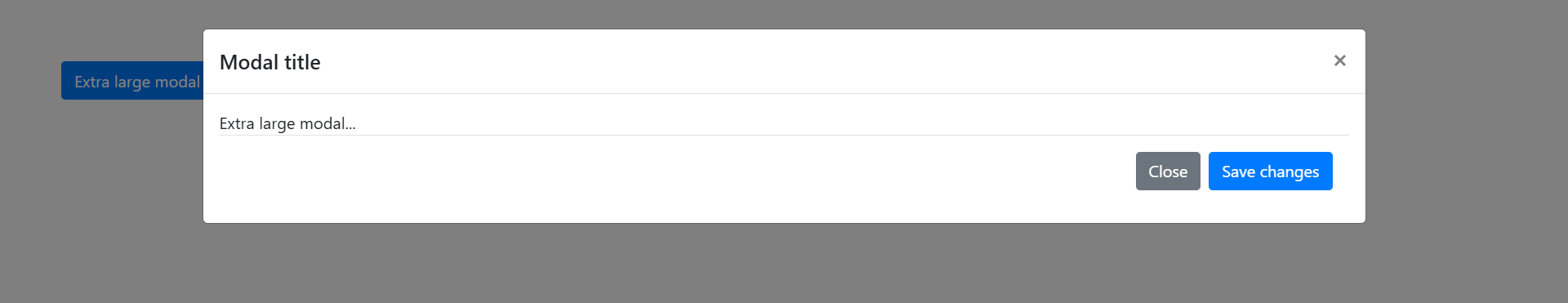
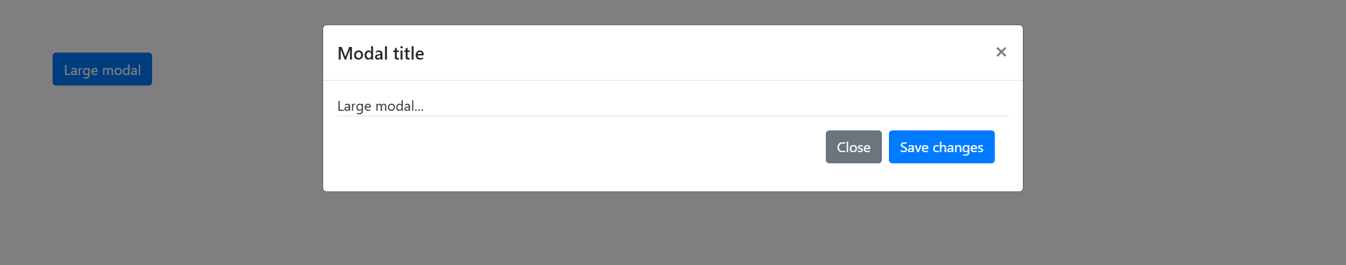
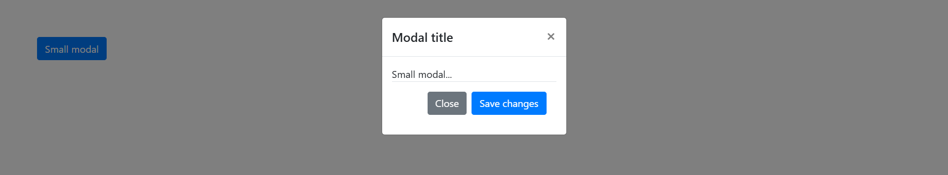
三、Optional sizes 可选尺寸
modal有三种可选大小,可以通过放置在.modal-dialog 对话框上的修饰符类获得。这些大小在某些断点处生效,以避免在较窄的视口上出现水平滚动条。
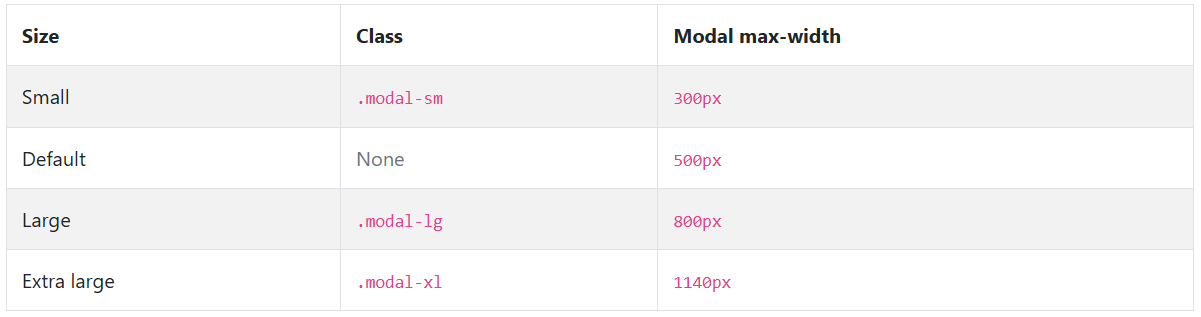
我们没有修饰符类的默认模态构成了“中等”大小的模态。
<div class="modal-dialog modal-xl">...</div>
<div class="modal-dialog modal-lg">...</div>
<div class="modal-dialog modal-sm">...</div>
- Extra large modal
- Large modal
- Small modal
默认模态构成了“中等”大小的模态


 扫一扫
扫一扫


 699
699

 被折叠的 条评论
为什么被折叠?
被折叠的 条评论
为什么被折叠?
 到【灌水乐园】发言


