


前言
看到codepen里面有的按钮搞得很炫酷,但其实也不是很难,就学习记录一下
逐渐出现边框
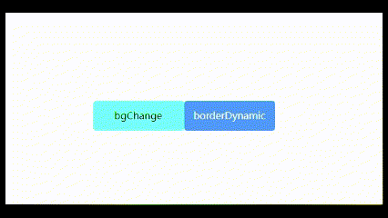
大体上来说就是当鼠标悬浮的时候触发四个transition,用after、before和span的after和before四个伪类做hover出来的边框
<div class="btn btn-2"><span>borderDynamic</span></div>
.btn-2 {
      color: white;
      background-color: rgb(0, 153, 255);
      transition: all 0.3s ease;
    }
    .btn-2 span {
      display: inline-block;
      width: 100%;
      height: 100%;
    }
    .btn-2::after,
    .btn-2::before {
      content: "";
      position: absolute;
      top: 0;
      right: 0;
      background-color: rgb(2, 2, 155);
      transition: all 0.3s ease;
    }
    .btn-2 span::after,
    .btn-2 span::before {
      content: "";
      position: absolute;
      bottom: 0;
      left: 0;
      background-color: rgb(2, 2, 155);
      transition: all 0.3s ease;
    }
    .btn-2::after,
    .btn-2 span::after {
      width: 1px;
      height: 0;
    }
    .btn-2::before,
    .btn-2 span::before {
      width: 0;
      height: 1px;
    }
    .btn-2:hover {
      background-color: transparent;
      color: rgb(22, 102, 85);
    }
    .btn-2:hover::after,
    .btn-2 span:hover::after {
      height: 100%;
    }
    .btn-2:hover::before,
    .btn-2 span:hover::before {
      width: 100%;
    }
图形变化
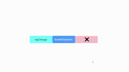
原理和上面类似,都是用伪类去实现
    .btn-3 {
      background-color: rgb(255, 192, 203);
    }
    .btn-3::before {
      content: "";
      position: absolute;
      top: 10%;
      left: 50%;
      width: 4%;
      height: 80%;
      border-radius: 50%;
      transform: rotate(45deg);
      background-color: black;
      transition: all 0.3s ease;
    }
    .btn-3::after {
      content: "";
      position: absolute;
      top: 10%;
      left: 50%;
      width: 4%;
      height: 80%;
      border-radius: 50%;
      transform: rotate(-45deg);
      background-color: black;
      transition: all 0.3s ease;
    }
    .btn-3:hover::before {
      transform: translateX(-100%) scaleY(80%);
    }
    .btn-3:hover::after {
      transform: translateX(100%) scaleY(80%);
    }
hover展开的btn

<div class="roundBtn btn-4">
        <span class="arrow"></span>
        <div class="icon"></div>
        <span class="text">hover</span>
      </div>
/* 圆形动画button */
    .roundBtn {
      margin: 10px;
      width: 50px;
      height: 50px;
      border-radius: 25px;
      background-color: rgb(160, 243, 171);
      position: relative;
      transition: all 0.3s ease;
    }
    .icon {
      position: absolute;
      top: 23px;
      left: 30px;
      width: 0px;
      height: 4px;
      border-radius: 2px;
      background-color: black;
      transform: scale(80%);
      transition: all 0.3s ease;
    }
    .arrow::before {
      content: "";
      position: absolute;
      top: 10px;
      left: 23px;
      height: 20px;
      width: 4px;
      border-radius: 2px;
      background-color: black;
      transform: rotate(-45deg) scale(80%);
      transition: all 0.3s ease;
    }
    .arrow::after {
      content: "";
      position: absolute;
      bottom: 10px;
      left: 23px;
      height: 20px;
      width: 4px;
      border-radius: 2px;
      background-color: black;
      transform: rotate(45deg) scale(80%);
      transition: all 0.3s ease;
    }

    .roundBtn:hover .icon {
      width: 20px;
    }
    .roundBtn:hover .arrow::before {
      transform: translateX(20px) rotate(-45deg) scale(80%);
    }
    .roundBtn:hover .arrow::after {
      transform: translateX(20px) rotate(45deg) scale(80%);
    }
    .roundBtn .text {
      display: inline-block;
      position: absolute;
      left: 50px;
      top: 0px;
      width: 80px;
      height: 50px;
      line-height: 50px;
      text-align: center;
    }
    .roundBtn:hover {
      width: 150px;
    }


 4573
4573


 被折叠的 条评论
为什么被折叠?
被折叠的 条评论
为什么被折叠?
 到【灌水乐园】发言


