


Flutter初学
- 代码
- 运行入口 - 写得任何类都要在main方法里去启动
- 基本展示
- GestureDetector 相当于onClickListener点击事件
- FloatingActionButton 悬浮按钮
- Scaffold是实现基本质感设计可视化的布局结构:
- Container容器:
- 文本展示:
- 获取网络图片和本地图片:
- Flexible 可拓展 自带涟漪效果
- Stack 层叠
- Listview 列表滚动
- 对齐:
- 内填充:
- 强制大小
- 强制宽高比:
- 装饰容器:DecoratedBox 渐变
- 透明度: Opacity
- PopupMenuButton 弹出菜单控件
- 底部导航栏: bottomNavigationBar
- 网络请求
- 读取写入文件
- 进度条 linearProgressIndicator
- 卡片Card TabBarView
- 底部面板
- 表单 Form TextFormField
- 效果控件 InkWell
- AutomaticKeepAliveClientMixin 保持页面状态
可同时运行在Android和IOS系统上,方便。控件布局不用写xml文件,与功能代码一起写。
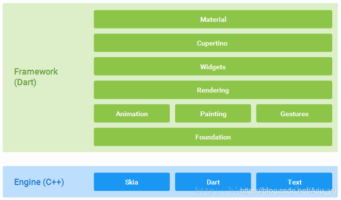
Flutter是谷歌的移动UI框架 ,可以快速在iOS和Android上构建高质量的原生用户界面。 Flutter可以与现有的代码一起工作。在全世界,Flutter正在被越来越多的开发者和组织使用,并且Flutter是完全免费、开源的。它也是构建未来的Google Fuchsia应用的主要方式。
Flutter组件采用现代响应式框架构建,这是从React中获得的灵感,中心思想是用组件(widget)构建你的UI。 组件描述了在给定其当前配置和状态时他们显示的样子。当组件状态改变,组件会重构它的描述(description),Flutter会对比之前的描述, 以确定底层渲染树从当前状态转换到下一个状态所需要的最小更改。
代码
运行入口 - 写得任何类都要在main方法里去启动
void main(){
  //接受指定的控件  - 覆盖全屏
  runApp(new MaterialApp(
    title: '我的应用',
    //启动功能类
    home: new Counter()
  ));
}
stateless(无状态) 控件没有内部状态来管理,Icon,IconButton,Text都是无状态控件的示例,它们都是StatelessWidget的子类。
stateful(有状态)控件是动态的,用户可以与有状态的控件(比如通过键入内容或者移动滑块)进行交互,或者随着时间的推移而变化(比如有数据时UI更新),Checkbox,Radio ,From,StatefulWidget的子类
基本展示
两个类一起运行
//
class MyAppBar extends StatelessWidget{
  MyAppBar({this.title});
  final Widget title;
  @override
  Widget build(BuildContext context) {
    // container容器 -矩形方块
    return new Container(
      //容器高
      height: 100,
      //内边距 左右水平填充8像素
      padding: const EdgeInsets.symmetric(horizontal: 8.0),
      //BoxDecoration矩形设计样式 -  背景 边框 阴影
      decoration: new BoxDecoration(color: Colors.blue[500]),

      //容器内部为Row ,横向
      child: new Row(
        //控件组
        children: <Widget>[
          //iconbutton - 功能
          new IconButton(
            //具体描述
              icon: new Icon(Icons.menu),tooltip: '导航菜单', onPressed: null),
          //expanded的作用是展开Row,Column和Flex的子控件,可以使用剩余空间
          new Expanded(child: title),
          new IconButton(icon: new Icon(Icons.search),tooltip: '搜索', onPressed: null)
        ],
      ),
    );
  }
}

class MyLinearLayout extends StatelessWidget{
  @override
  Widget build(BuildContext context) {
    //Material 和 center类似
    return new Material(
      //垂直纵向
      child: new Column(
        //能多个子控件
        children: <Widget>[
          new MyAppBar(
            title: new Text('实例标题',
        style: Theme.of(context).primaryTextTheme.title,//标题的风格
            ),
          ),
          //可拓展文本域
          new Expanded(
            //子控件放在中间
              child: new Center(
                child: new Text('hellow'),
              )
          )
        ],
      ),
    );
  }
}
效果

手势处理:
GestureDetector 相当于onClickListener点击事件
onTap 相当于点击事件
print 打印控制台
///手势处理
class MyButton extends StatelessWidget{
  @override
  Widget build(BuildContext context) {
    ///GestureDetector == onClickLisenter
    return new GestureDetector(
      //文本输出
      onTap: (){
        print("被监听");
      },
      child: new Container(

        height: 10.0,
        //内边距 四个方向
        padding: const EdgeInsets.all(8.0),
        //外边距 - 左右
        margin: const EdgeInsets.symmetric(horizontal: 8.0),
        //对矩形进行操作 - 添加圆角、背景颜色
        decoration: new BoxDecoration(
          //背景圆角
          borderRadius: new BorderRadius.circular(100.0),
          //背景色
          color: Colors.lightGreen[500]
        ),
        child: new Center(
          //点击文本 , onTap才被触发
          child: new Text('点击监听'),
        ),
      ),
    );
  }
}
效果

根据用户操作改变控件:
这里需要更新UI界面,要继承StatefulWidget
加载的另一个类的泛型要写第一个类才能启动加载出功能类
FloatingActionButton 悬浮按钮
///根据用户输入改变控件
class Counter extends StatefulWidget{
  @override
  State<StatefulWidget> createState() {
    //加载另一个类
    return new CounterState();
  }
}
//功能都在这个类里
class CounterState extends State<Counter>{
  int count = 0;
  //数字++
  void _increment(){
    setState(() {
      count+=1;
    });
  }
  @override
  Widget build(BuildContext context) {
    return new Scaffold(
      appBar: new AppBar(title: new Text('Flutter 实例')),
      body: new Center(
        //点击通过 _increment方法 改变文本
        child: new Text('按钮点击$count次${count == 0 ? '':''}'),
      ),
      //悬浮按钮
      floatingActionButton: new FloatingActionButton(
        //调用数量计算方法
        onPressed: _increment,
        tooltip: '增加',
        //按钮的功能 - ++
        child: new Icon(Icons.add),
      ),
    );
  }

}
效果:

Scaffold是实现基本质感设计可视化的布局结构:
appbar
class TutoriaHome extends StatelessWidget{
  @override
  Widget build(BuildContext context) {
    /**
     * Scaffold 是实现基本质感设计可视化的布局结构,
     * 使用多种不同的控件作为命名参数,并将每一个布置在Scaffold适当的位置
     */
    return new Scaffold(
      //头部标题部分
      appBar: new AppBar(
        leading: new IconButton(icon: new Icon(Icons.menu), tooltip: '导航菜单',onPressed: null),
        title: new Text('实例标题'),
        actions: <Widget>[
          new IconButton(icon: new Icon(Icons.search),tooltip: '搜索', onPressed: null)
        ],
      ),
      body: new Center(
        child: new Text('hellow'),
      ),
      //悬浮按钮
      floatingActionButton: new FloatingActionButton(tooltip: '增加',child: new Icon(Icons.add),onPressed: null),
    );
  }
}
效果对比:
之前的:
现在的:

Container容器:
//边框容器  center 是出现在中间,Container矩形方块
class ContainerDemo extends StatelessWidget{
  @override
  Widget build(BuildContext context) {
    return new Center(
      child: new Container(
        //具体范围
        width: 300.0,
        height: 300.0,
        child: new Text('边框'),
        decoration: new BoxDecoration(
          //盒子背景
          color: Colors.blue[100],
          //边框色 all 是四周
          border: new Border.all(color: const Color(0xff6d9eed),width: 8.0),
        ),
      ),
    );
  }
}
效果:

文本展示:
///文本控件
class TextDemo extends StatelessWidget{
  @override
  Widget build(BuildContext context) {
    return new Scaffold(
      appBar: new AppBar(
        title: new Text('文本控件'),
      ),
      body: new Column(
        children: <Widget>[
          new Text('红色+黑色删除线+25号',style: new TextStyle(
            color: const Color(0xffff0000),
            decoration: TextDecoration.lineThrough,
            decorationColor: const Color(0xff000000),
            fontSize: 25.0,
          ),),
          new Text('橙色+下划线+24号',style: new TextStyle(
            color: const Color(0xffff9900),
            decoration: TextDecoration.underline,
            fontSize: 24.0,
          ),),
          new Text('虚线上划线+23号+倾斜',style: new TextStyle(
            decoration: TextDecoration.overline,
            decorationStyle: TextDecorationStyle.dashed,
            fontSize: 23.0,
            fontStyle: FontStyle.italic,
          ),),
          new Text('serif字体 +22号',style: new TextStyle(
            fontFamily: 'serif',
            fontSize: 22.0,
          ),),
          new Text('monospace+21号,+加粗',style: new TextStyle(
            fontFamily: 'monospace',
            fontSize: 21.0,
            fontWeight: FontWeight.bold,
          ),),
          new Text('天蓝色+20号+2行跨度',style: new TextStyle(
            color: const Color(0xff4a86e8),
            fontSize: 20.0,
            height: 2.0,
          ),),
          new Text('19号,2个字母跨度',style: new TextStyle(
            fontSize: 19.0,
            letterSpacing: 2.0,
          ),)
        ],
      ),
    );
  }
}
效果:

获取网络图片和本地图片:
创建Assets文件夹
本地获取图片需要在
写出图片路径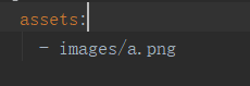
class ImageDemo extends StatelessWidget{
  @override
  Widget build(BuildContext context) {
    // TODO: implement build
    return new Scaffold(
      appBar: new AppBar(
        title: new Text('URL获取图片'),
      ),
      body: new Column(
        children: <Widget>[
        //网络图片
          new Image.network('https://timgsa.baidu.com/timg?image&quality=80&size=b9999_10000&sec=1562587162663&di=58b961a5726901f5d3b97f8924ddc189&imgtype=0&src=http%3A%2F%2Fb-ssl.duitang.com%2Fuploads%2Fitem%2F201811%2F10%2F20181110102045_jwqny.jpg',scale: 1.0,),
//          new Image(image: new AssetImage('images/a/png'))
		//本地图片
        new Image.asset('images/a.png'),
        ],
      ),
    );
  }
}

效果:

布局:
水平和垂直一样,只需把排版方式Row(横向)换成Column(纵向)
Flexible 可拓展 自带涟漪效果
//水平布局
class Layout_demo extends StatelessWidget{
  @override
  Widget build(BuildContext context) {
    return new Scaffold(
      appBar: new AppBar(
        title: new Text('水平布局'),
      ),
      body: new Row(
        children: <Widget>[
          new RaisedButton(onPressed: (){
            print('点击红色按钮');
          },
            color: const Color(0xffcc0000),
            child: new Text('红色按钮'),
          ),
          //可拓展
          new Flexible(
            //强制对剩余空间进行分配
              flex: 1,
              fit: FlexFit.tight,
              child: new RaisedButton(onPressed: (){
            print('点击黄色按钮');
          },
              color:  const Color(0xfff1c232),
              child: new Text('黄色按钮'),)),
          new RaisedButton(onPressed: (){
            print('点击粉色按钮');
          },
            color: const Color(0xffea9999),
            child: new Text('粉色按钮'),),
        ],
      ),

    );
  }
}
效果:

层叠效果:
Stack 层叠
///层叠定位控件
class StackDemo extends StatelessWidget{
  @override
  Widget build(BuildContext context) {
    return new Scaffold(
      appBar: new AppBar(
        title: new Text( '层叠布局'),
      ),
      body: new Center(
        //层叠控件 后面的出现在最上面
        child: new Stack(
          children: <Widget>[

            new Image.network('http://img2.cxtuku.com/00/13/12/s97783873391.jpg'),
            //展示的文本
            new Positioned(
              left: 30.0,
              top: 30.0,
              child: new Text('文本',style: new TextStyle(fontSize: 20.0,fontFamily: 'serif'),),)
          ],
        ),
      ),
    );
  }
}
效果:

列表展示滚动:
Listview 列表滚动
class listDemo extends StatelessWidget{
  @override
  Widget build(BuildContext context) {
    // TODO: implement build
    return new Scaffold(
      appBar: new AppBar(
        title: new Text('list布局'),
      ),
      //列表展示
      body: new ListView(
        children: <Widget>[
          new Center(
            child: new Text('aaaa',style: new TextStyle(fontSize: 20.0,fontFamily: 'serif'),),
          ),
          new Center(
            child: new Image.network('http://img2.cxtuku.com/00/13/12/s97783873391.jpg'),
          ),
          new Center(
            child: new Text('''这是文本内容,
                这是文本内容,
                这是文本内容,
                这是文本内容,
                这是文本内容,
                这是文本内容,
                这是文本内容,
                这是文本内容,
                这是文本内容,
                这是文本内容,
                这是文本内容,
                这是文本内容,
                这是文本内容,
                这是文本内容,
                这是文本内容,
                这是文本内容,
                这是文本内容,
                这是文本内容,
                这是文本内容,
                这是文本内容,
                这是文本内容,
                这是文本内容,
                这是文本内容,
                这是文本内容,
                这是文本内容,
                这是文本内容,
                这是文本内容,
                这是文本内容,
                这是文本内容,
                这是文本内容,
                这是文本内容,
                这是文本内容,
                这是文本内容,
                ''',style: new TextStyle(fontSize: 16.0,fontFamily: 'serif'),),
          )
        ],
      ),
    );
  }
}
对齐:
///对齐
class AlignDemo extends StatelessWidget{
  @override
  Widget build(BuildContext context) {
    return new Scaffold(
      appBar: new AppBar(
        title: new Text('对齐'),
      ),
      //层叠
      body: new Stack(
        children: <Widget>[
          new Align(
            //坐标左上角
            alignment: new FractionalOffset(0, 0),
            child: new Image.network('http://img03.sogoucdn.com/app/a/100520021/6442EAF86C408DE5F9CCB58B729434D0'),
          ),
          new Align(
            //对齐方式 - 右下角
            alignment: FractionalOffset.bottomRight,
            child: new Image.network('http://img03.sogoucdn.com/app/a/100520021/6442EAF86C408DE5F9CCB58B729434D0'),
          )
        ],
      ),
    );
  }
}
效果:

内填充:
///填充
class PaddingDemo extends StatelessWidget{
  @override
  Widget build(BuildContext context) {
    // TODO: implement build
    return new Scaffold(
      appBar: new AppBar(
        title: new Text('内填充'),
      ),
      body: new Padding(
        //内边距 - 四周
          padding: const EdgeInsets.all(10.0),
        child: new Image.network('http://img03.sogoucdn.com/app/a/100520021/6BBA67224AAE9528C0790FD9E7EB05F7'),
      ),
    );
  }
}
强制大小
///强制大小
class SizeBoxDemo extends StatelessWidget{
  @override
  Widget build(BuildContext context) {
    // TODO: implement build
    return new Scaffold(
      appBar: new AppBar(
        title: new Text('强制大小'),
      ),
      body: new SizedBox(
        //强制容器大小
        width: 200.0,
        height: 200.0,
        child: new Container(
          decoration: new BoxDecoration(
            color: Colors.lightBlueAccent,
          ),
        ),
      ),
    );
  }
}
强制宽高比:
///强制比
class AspectRatioDemo extends StatelessWidget{
  @override
  Widget build(BuildContext context) {
    // TODO: implement build
    return new Scaffold(
      appBar: new AppBar(
        title: new Text('强制比'),
      ),
      body: new AspectRatio(
        //宽:高
        aspectRatio: 2.0/5.0,
      child: new Container(
        decoration: new BoxDecoration(color: Colors.lightBlueAccent),
      ),),
    );
  }
}
装饰容器:DecoratedBox 渐变
///装饰容器 DecoratedBox
class DecoratedBoxDemo extends StatelessWidget{
  @override
  Widget build(BuildContext context) {
    // TODO: implement build
    return new Scaffold(
      appBar: new AppBar(
        title: new Text('装饰容器'),
      ),
      body: new DecoratedBox(decoration: new BoxDecoration(
        gradient: new LinearGradient(//线性渐变
          begin: const FractionalOffset(0.0, 0.0),//渐变从左上角
            end: const FractionalOffset(1.0, 1.0),//结束于右下角
            colors: <Color>[const Color(0xfffff2cc),const Color(0xffff6eb4),const Color(0xffff00ff)]
        )
      ),
      //展现的容器
      child: new Container(
        width: 200,
        height: 200,
      ),),
    );
  }
}
效果:

透明度: Opacity
///Opacity 不透明度 调整的是子控件的不透明度 , 0.0~1.0之间
class OpacityDemo extends StatelessWidget{
  @override
  Widget build(BuildContext context) {
    // TODO: implement build
    return new Scaffold(
      appBar: new AppBar(
        title: new Text('不透明度'),
      ),
      body: new Center(
        child: new Opacity(
          //透明度
          opacity: 0.2,
          //展示容器
          child: new Container(
            width: 200,
            height: 200,
            //颜色
            decoration: new BoxDecoration(color: const Color(0xfff00000)),
        ),),
      ),
    );
  }
}
效果:

PopupMenuButton 弹出菜单控件
点击即可消失菜单
用了GestureDetector点击后,不会消失菜单
///popupMenuButton 弹出菜单控件
class MenuDemo extends StatefulWidget{
  @override
  State<StatefulWidget> createState() {
    // TODO: implement createState
    return new _MenuDemo();
  }

}
///
class _MenuDemo extends State<MenuDemo>{
  String bodyStr='点击显示';
  @override
  Widget build(BuildContext context) {
    // TODO: implement build
    return new Scaffold(
      appBar: new AppBar(
        title: new Text('菜单演示'),
        actions: <Widget>[
          new PopupMenuButton(
              itemBuilder: (BuildContext context) => [
                new PopupMenuItem(
                  //GestureDetector 相当于onClickListener
                  child: new GestureDetector(
                    onTap: (){
                      print('选项1的值');
                    },
                    child: new Text('选项1'),
                  ),
                  value: '选项1的值',
                ),
                new PopupMenuItem(
                  child: new Text('选项2'),
                  value: '选项2的值',
                )
              ]
          )
        ],
      ),
      body: new Center(
        child: new Text(bodyStr),
      ),
    );
  }
}
效果:

底部导航栏: bottomNavigationBar
///底部导航页
class NavigationBarWidgeDemo extends StatefulWidget{
  @override
  State<StatefulWidget> createState() {
    // TODO: implement createState
    return new _NavigationBarWidgetDemoState();
  }

}

class _NavigationBarWidgetDemoState extends State<NavigationBarWidgeDemo>{

  String _menuStr='menu';
  var _currentIndex= 0;

  @override
  Widget build(BuildContext context) {
    // TODO: implement build
    return new Scaffold(
      appBar: new AppBar(
        title: new Text('底部导航'),
        actions: <Widget>[
          new PopupMenuButton(
              itemBuilder: (BuildContext context) => [
                new PopupMenuItem(
                  //GestureDetector 相当于onClickListener
                  child: new GestureDetector(
                    onTap: (){
                      print('选项1的值');
                    },
                    child: new Text('选项1'),
                  ),
                  value: '选项1的值',
                ),
                new PopupMenuItem(
                  child: new Text('选项2'),
                  value: '选项2的值',
                )
              ]
          )
        ],
      ),
      body: new Center(
        child: new Text(_menuStr),
      ),
      bottomNavigationBar:
      //底部导航栏数组
      	new BottomNavigationBar(items: <BottomNavigationBarItem>[
        new BottomNavigationBarItem(icon: new Icon(Icons.settings),title: new Text('tools')),
        new BottomNavigationBarItem(icon: new Icon(Icons.games),title: new Text('games')),
        new BottomNavigationBarItem(icon: new Icon(Icons.person),title: new Text('person')),
      ],
        //选中颜色
        selectedItemColor: Colors.blue,
        //未选中颜色
        unselectedItemColor: Colors.black38,
        //选中下标
        currentIndex: _currentIndex,
        onTap: (int index){
            //事件
          setState(() {
            _currentIndex=index;
            _menuStr="menu index is $index";
          });

        },
      ),
    );
  }

}
效果:

网络请求
dio: ^3.0.9
http: 0.12.0+4
网络请求依赖

void gethttp() async{

//    try{
      Response response=await Dio().get('http://vueshop.glbuys.com/api/home/index/slide?token=1ec949a15fb709370f')   ;
      return print(response);
//    }catch(e){
//      return print(e);
//    }

  }
读取写入文件
path_provider: 1.6.1
读写内存需要
//读取写入文件
class ReadAndWriteDemo extends StatefulWidget{
  @override
  State<StatefulWidget> createState() {
    // TODO: implement createState
    return new _ReadAndWriteDemo();
  }
}
class _ReadAndWriteDemo extends State<ReadAndWriteDemo>{
  //全局变量,点击数
  int _count;

  //创建状态对象 - 状态发生改变时,作为构造方法把点击数传给变量_count
  @override
  void initState() {

    super.initState();
    /**
     * 调用_readCount,读取点击数
     * 将点击数作为参数,创建一个方法
     */
    _readCount().then((int value){
      setState(() {
        _count=value;
      });
    });
  }

  @override
  Widget build(BuildContext context) {
    // TODO: implement build
    return new Scaffold(
      appBar: new AppBar(
        title: new Text('读取文件操作'),
      ),
      body: new Center(
        child: new Text('点击按钮${_count==0 ? '' : '$_count次'}!'),
      ),
      floatingActionButton: new FloatingActionButton(
          onPressed: _incrementCount,
        tooltip: '增加',
        child: new Icon(Icons.add),
      ),
    );
  }

  /// 读取点击数,关键字async表示异步操作
  /// 返回Future类型,表示延迟处理的对象  --读取本地文件中的数字
  Future<int> _readCount() async{
    try{
      File file = await _getLocalFile();
      //使用给定的编码将整个文件内容读取为字符串
      String contents=await file.readAsString();
      //返回点击数
      return int.parse(contents);
    }on FileSystemException{
      //发生异常时返回默认值
      return 0;
    }


  }

  ///得到本地文件
  Future<File> _getLocalFile() async{
    //获取本地文档目录
    String dir = (await getApplicationDocumentsDirectory()).path;
    //返回本地文件目录
    return new File('$dir/counter.text');
  }
  ///_incrementCount 点击增加按钮时的回调 - 点击按钮时,写入文件
  Future<Null> _incrementCount() async{
    setState(() {
      //存储点击数的变量 自动+1
      _count++;
    });
    //将点击数作为字符串写入文件
    await (await _getLocalFile()).writeAsString('$_count');
  }
}
进度条 linearProgressIndicator
///进度条  linearProgressIndicator 是质感设计中的线性进度指示器
class linearProgressIndicatorDemo extends StatelessWidget{
  int maxEmergy; //能量
  int maxHunger; // 饥饿
  int maxMood; //情绪
  int currentEmergy;
  int currentHunger;
  int currentMood;

  //构造 传递参数
  linearProgressIndicatorDemo({
    this.maxEmergy, this.maxHunger, this.maxMood,
    this.currentEmergy, this.currentHunger, this.currentMood
  });

  @override
  Widget build(BuildContext context) {
    // TODO: implement build
    return new Scaffold(
      appBar: new AppBar(
        title: new Text('线性进度条'),
      ),
      body: new Container(
        child: new Column(
          children: <Widget>[
            _getNameText(context, '能量($currentEmergy/$maxEmergy)'),
            //进度条 backgroundColor总长度背景色 ,valueColor进度背景色
            new LinearProgressIndicator(value: currentEmergy/maxEmergy,
            backgroundColor: Colors.deepOrange,valueColor: new AlwaysStoppedAnimation(Colors.orange),),
            _getNameText(context, '饥饿($currentHunger/$maxHunger)'),
            new LinearProgressIndicator(value: currentHunger / maxHunger,
            backgroundColor: Colors.amberAccent,valueColor: new AlwaysStoppedAnimation(Colors.brown)),
            _getNameText(context, '心情($currentMood/$maxMood)'),
            new LinearProgressIndicator(value: currentMood / maxMood,
            backgroundColor: Colors.pink,valueColor: new AlwaysStoppedAnimation(Colors.greenAccent))

          ],
        ),
      ),
    );
  }

  Align _getNameText(BuildContext context,String text){
    return new Align(
      //文本出现的位置
      alignment: FractionalOffset.topLeft,
      child: new Text(text,style: new TextStyle(fontSize: 15.0,color: Colors.black,height: 1.5),),

    );
  }
}
效果:

卡片Card TabBarView
切换页面
///枚举类 标签演示样式
enum TabsDemoStyle { iconsAndText,iconOnly,textOnly}
///页面类,图标,文本
class _Page{

  final IconData icon;
  final String text;
//  final MaterialColor color;

  _Page({
    this.icon,
    this.text,
  });


//  //获取卡变标签颜色
//  Color get labelColor => color !=null ? color[300] : Colors.grey[300];
//  //获取浮动按钮定义是否为空
//  bool get fabDefined => color != null && icon !=null;
//  //获取浮动按钮的颜色
//  Color get fabColor => color[400];
//  //获取浮动按钮的图标
//  Icon get fabIcon => new Icon(icon);
//  //获取浮动按钮的键值
//  Key get fabKey => new ValueKey(fabColor);

}

//存储所有页面的列表
final List<_Page> _allPages =   <_Page>[
  new _Page(icon: Icons.event,text: 'EVENT'),
  new _Page(icon: Icons.home,text: 'HOME'),
  new _Page(icon: Icons.android,text: 'Android'),
  new _Page(icon: Icons.alarm,text: 'Alarm'),
  new _Page(icon: Icons.face,text: 'face'),
  new _Page(icon: Icons.language,text: 'LANGIAGE'),
];

class ScrollableTabsDemo extends StatefulWidget{
  @override
  State<StatefulWidget> createState() {
    // TODO: implement createState
    return new _ScrollableTabsDemo();
  }
}

const String _exmplanatoryText="当Scaffold的浮动操作按钮改变时,新按钮消失并变成视图"
    "在这Demo中,改变选项卡会导致应用程序与浮动操作按钮重建"
    "Scaffold通过键值与其他区分";

//继承SingleTickerProviderStateMixin ,提供单个Ticker(每个动画调用它的回调一次)
class _ScrollableTabsDemo extends State<ScrollableTabsDemo> with SingleTickerProviderStateMixin{
  /**
   * 在TabBar和TabBarView之间的坐标选项卡选择
   * TabBar:质感设计控件,显示水平的一行选项卡
   * TabBarView:可分布列表,显示与当前所选标签对应的控件
   */
  TabController _controller;

  /**
   * 改变Tabs样式
   *  iconsAndText
   *  textOnly
   *  iconOnly
   */
  TabsDemoStyle _demoStyle=TabsDemoStyle.iconsAndText;


  @override
  void initState() {
    super.initState();
    ///创建一个对象,用于管理TabBar和  TabBarView所需的状态
    ///length:选项卡的总数
    _controller=new TabController(length: _allPages.length, vsync: this);
  }
  ///相当于生命周期中销毁的方法
  @override
  void dispose() {
    super.dispose();
    _controller.dispose();//释放资源
  }

  ///改变demo的style
  void changeDemoStyle(TabsDemoStyle style){
    setState(() {
      _demoStyle=style;
    });
  }
  @override
  Widget build(BuildContext context) {
    //获取当前主题的控件前景色
    final Color iconColor=Theme.of(context).accentColor;
    "当Scaffold的浮动操作按钮改变时,新按钮消失并变成视图"
        "在这Demo中,改变选项卡会导致应用程序与浮动操作按钮重建"
        "Scaffold通过键值与其他区分";
    return new Scaffold(
      appBar: new AppBar(
        title: new Text('可滚动标签页'),
        actions: <Widget>[
          new PopupMenuButton(itemBuilder: (BuildContext context) => <PopupMenuItem<TabsDemoStyle>>[
              new PopupMenuItem(child: new Text('图标和文字'),
                value: TabsDemoStyle.iconsAndText,),
              new PopupMenuItem(child: new Text('图标'),
                value: TabsDemoStyle.iconOnly,),
              new PopupMenuItem(child: new Text('文字'),
                value: TabsDemoStyle.textOnly,),
          ])
        ],
        bottom: new TabBar(
            controller: _controller,//控件的选择和动画状态
            isScrollable: true,//标签是否可以水平滚动
            //标签控件的列表
            tabs: _allPages.map((_Page page){
              switch(_demoStyle){
                case TabsDemoStyle.iconsAndText:
                  return new Tab(text: page.text,icon: new Icon(page.icon));
                case TabsDemoStyle.iconOnly:
                  return new Tab(icon: new Icon(page.icon));
                case TabsDemoStyle.textOnly:
                  return new Tab(text: page.text);
              }
            }).toList()
        ),
      ),
      body: new TabBarView(
          controller: _controller,//控件的选择和动画状态
          children: _allPages.map((_Page page){
            return new Container(
              key: new ObjectKey(page.icon),
              padding: const EdgeInsets.all(12.0),
              //质感设计卡片
              child: new Card(
                child: new Icon(
                  page.icon,
                  color: iconColor,
                  size: 128.0,
                ),
              ),
            );

          }).toList()
      ),
    );
  }
}
效果:

切换页面更换颜色
const String _explanatoryText = "当Scaffold的浮动操作按钮改变时,新按钮消失并变成视图"
    "在这Demo中,改变选项卡会导致应用程序与浮动操作按钮重建"
    "Scaffold通过键值与其他区分";

class _Page {
  _Page({this.label, this.colors, this.icon});

  final String label;
  final MaterialColor colors;
  final IconData icon;

  Color get labelColor => colors != null ? colors[300] : Colors.grey[300];

  bool get fabDefined => colors != null && icon != null;

  Color get fabColor => colors[400];

  Icon get fabIcon => new Icon(icon);

  Key get fabKey => new ValueKey<Color>(fabColor);
}

//所有页面的列表
final List<_Page> _allPages = <_Page>[
  new _Page(label: '蓝色', colors: Colors.indigo, icon: Icons.add),
  new _Page(label: '绿色', colors: Colors.green, icon: Icons.create),
  new _Page(label: '空白'),
  new _Page(label: '蓝绿色', colors: Colors.teal, icon: Icons.add),
  new _Page(label: '红色', colors: Colors.red, icon: Icons.create),
];

class MyApp extends StatelessWidget {
  @override
  Widget build(BuildContext context) {
    return new MaterialApp(
      title: 'CardDemo',
      theme: new ThemeData(primarySwatch: Colors.blue), //主题颜色
      home: new MyHomePage(
        title: 'Flutter Demo Home Page',
      ),
    );
  }
}

class MyHomePage extends StatefulWidget {
  MyHomePage({Key key, this.title}) : super(key: key);
  final String title;

  @override
  _MyHomePageState createState() => _MyHomePageState();
}

class _MyHomePageState extends State<MyHomePage>
    with SingleTickerProviderStateMixin {
  //应用程序的唯一键值,Scaffold的状态
  final GlobalKey<ScaffoldState> _scaffoldKey = new GlobalKey<ScaffoldState>();
  TabController _controller;

  //局部变量,选择页面
  _Page _selectedPage;

  @override
  void initState() {
    super.initState();
    _controller = new TabController(length: _allPages.length, vsync: this);
    _controller.addListener(_handleTabSelection);
    _selectedPage = _allPages[0];
  }

  @override
  void dispose() {
    super.dispose();
    _controller.dispose();
  }

  //处理选项卡的选择
  void _handleTabSelection() {
    setState(() {
      _selectedPage = _allPages[_controller.index]; //把选择的页面和controller的下标进行一一对应
    });
  }

  //显示说明文本函数
  void _showExplanatoryText() {
    //currentState:当前控件树种具有此键的控件的状态
    //showBottomSheet:显示持久的质感设计底部板块
    _scaffoldKey.currentState.showBottomSheet<Null>((BuildContext context) {
      return new Container(
        decoration: new BoxDecoration(
          //容器顶部的边界颜色为当前主题颜色
            border: new Border(
                top: new BorderSide(color: Theme.of(context).dividerColor))),
        child: new Padding(
          padding: const EdgeInsets.all(32.0),
          child: new Text(_explanatoryText),
        ),
      );
    });
  }

  Widget buildTabView(_Page _page) {
    //Builder:将其构建委托给回调的控件
    return new Builder(builder: (BuildContext context) {
      //调用获取控件
      return new Container(
        key: new ValueKey(_page.label),
        padding: const EdgeInsets.fromLTRB(48.0, 48.0, 48.0, 96.0),
        //创建质感设计卡片
        child: new Card(
          child: new Center(
            child: new Text(
              _page.label,
              style: new TextStyle(color: _page.labelColor, fontSize: 32.0),
            ),
          ),
        ),
      );
    });
  }

  @override
  Widget build(BuildContext context) {
    return new Scaffold(
      key: _scaffoldKey,
      appBar: new AppBar(
        title: new Text(widget.title),
        //bottom:显示在应用栏底部的控件
        bottom: new TabBar(
            controller: _controller,
            tabs: _allPages.map((_Page page) {
              return new Tab(
                text: page.label,
              );
            }).toList()),
      ),
      floatingActionButton: !_selectedPage.fabDefined
          ? null
          : new FloatingActionButton(
        //点击显示文本
        onPressed: _showExplanatoryText,
        key: _selectedPage.fabKey,
        tooltip: '显示说明',
        backgroundColor: _selectedPage.fabColor,
        child: _selectedPage.fabIcon,
      ),
      body: new TabBarView(
        children: _allPages.map(buildTabView).toList(),
        controller: _controller,
      ),
    );
  }
}
效果:

底部面板
有状态
面板可拖动关闭,面板出现时左上角出现返回按钮,点击也可关闭面板
GlobalKey
ScaffoldState
class MyApp extends StatefulWidget{

  @override
  State<StatefulWidget> createState() {
    // TODO: implement createState
    return new _MyAppState();
  }

}
class _MyAppState extends State<MyApp>{
  // GlobalKey : 整个应用程序的唯一键
  //ScaffoldState:Scaffold框架的状态
  //_ScaffoldKey的值是Scaffold框架的唯一键
  final GlobalKey<ScaffoldState> _ScaffoldKey =new GlobalKey();
  //VoidCallBack:没有参数并且不返回数据的回调
  VoidCallback _showBottomSheetCallBack;

  @override
  Widget build(BuildContext context) {
    // TODO: implement build
    return new Scaffold(
      key: _ScaffoldKey,
      appBar: new AppBar(
        title: new Text('底部面板'),
      ),
      floatingActionButton: new FloatingActionButton(
        onPressed: _showMessage,
        backgroundColor: Colors.redAccent[200],
        child: new Icon(Icons.add),),
      body: new Center(
        child: new RaisedButton(
          onPressed: _showBottomSheetCallBack,
          child: new Text('显示底部面板'),),
      ),
    );
  }

  @override
  void initState() {
    super.initState();
    _showBottomSheetCallBack=_showBottomSheet;
  }
  void _showBottomSheet(){
    setState(() {
      //禁用按钮
      _showBottomSheetCallBack=null;
    });
    //currentState:获取具有此全局键的树中的控件状态
    //showBottomSheet:显示持久性的底部面板
    //联系上文,_scaffoldKey是Scaffold框架状态的唯一键,此代码在Scaffold框架中显示出就行的底部面板
    _ScaffoldKey.currentState.showBottomSheet((BuildContext context){
      final ThemeData themeData = Theme.of(context);
      return new Container(
        decoration: new BoxDecoration(
          border: new Border(
            top: new BorderSide(color: themeData.disabledColor)
          )
        ),
        child: new Padding(
          padding: const EdgeInsets.all(32.0),
          child: new Text('这是一个持久性的底部面板,向下拖动即可关闭',
          textAlign: TextAlign.center,
          style: new TextStyle(color: themeData.accentColor,fontSize: 24.0),),),
      );
    })
    //closed 当此对象控制的元素不再可见时
    //whenComplete : 注册将在此完成时调用的函数
        .closed
        .whenComplete((){
          //mounted:bool值,这个state对象当前是否在树(控件树)中
          if(mounted){
            setState(() {
              //重新启动按钮
              _showBottomSheetCallBack=_showBottomSheet;
            });
          }
        });
  }

  void _showMessage(){
    //showDislog<T>:显示应用程序当前内容上方的对话框
    showDialog(context: context,child: new AlertDialog(
      content: new Text('点击了浮动按钮'),
      actions: <Widget>[
        new FlatButton(child: new Text('确定'),onPressed: (){
          Navigator.pop(context);
        })
      ],
    ));
  }
}
效果:

无状态
class BottomDemo extends StatelessWidget{

  @override
  Widget build(BuildContext context) {
    // TODO: implement build
    return new Scaffold(
      appBar: new AppBar(
        title: new Text('无状态底部面板'),
      ),
      body: new Center(
        child: new RaisedButton(
            child: new Text('显示底部面板'),
            onPressed: (){
              //showModalBottomSheet:显示无状态底部面板
              showModalBottomSheet(context: context, builder: (BuildContext context){
                return new Container(
                  child: new Padding(
                      padding: const EdgeInsets.all(32.0),
                    child: new Text('无状态底部面板,点击关闭',
                    textAlign: TextAlign.center,
                        style: new TextStyle(color: Theme.of(context).accentColor,fontSize: 24.0),),
                  ),
                );
              });
        }),
      ),
    );
  }
}
效果:

表单 Form TextFormField
class _MyAppState extends State<MyApp>{
  String _lastName;
  String _firstName;
  String _phone;
  GlobalKey<FormState> _fromKey=new GlobalKey();

  void _showMessage(String name){
    showDialog(context: context,
    child: new AlertDialog(
      content: new Text(name),
      actions: <Widget>[
        new FlatButton(
            onPressed: (){
              Navigator.pop(context);
            },
            child: new Text('确定'))
      ],
    ));
  }

  @override
  Widget build(BuildContext context) {
    // TODO: implement build
    return new Scaffold(
      appBar: new AppBar(
        title: new Text('表单输入'),
      ),
      body: new Form(
        key: _fromKey,
          child: new Column(
            children: <Widget>[
              new TextFormField(
                //包含输入的表单控件,每个表单字段都应该在Form中
                decoration: new InputDecoration(
                  labelText: '姓氏'
                ),
                onSaved: (String value){
                  _lastName=value;
                },),
              new TextFormField(
                //控制长度
                maxLength: 4,
                //光标颜色
                cursorColor: Colors.redAccent,
                cursorWidth: 16.0,
                cursorRadius: Radius.circular(16.0),
                decoration: new InputDecoration(
                  //标题
                  labelText: '名字',
                  //提示文字
                  hintText: '请输入名字',
                  //左侧图标
                  icon: new Icon(Icons.text_format),
				//右侧图标
                  suffixIcon: new Icon(Icons.title)
                ),
                onSaved: (String value){
                  _firstName=value;
                },),
              new Row(
                children: <Widget>[
                  new RaisedButton(
                    child: new Text('重置'),
                      onPressed: (){
                        //将Form表单下的每个TextField重置为初始状态
                        _fromKey.currentState.reset();
                        _showMessage('已重置');
                      }),
                  new RaisedButton(
                    child: new Text('提交'),
                      onPressed: (){
                        _fromKey.currentState.save();
                        _showMessage('你的姓名是' + _lastName + _firstName);
                      })
                ],
              ),
              new TextFormField(
                decoration: new InputDecoration(
                  border: new OutlineInputBorder(),
                  hintText: '请输入电话',
                  labelText: '电话',
                  //图标
                  icon: new Icon(Icons.phone),
                ),
                //键盘属性
                keyboardType: TextInputType.number,
                onSaved: (String value){
                  _phone=value;
                },
                //正在编辑的文本更改时
                onChanged: (String phone){
                  setState(() {
                    _phone=phone;
                  });
                },
              )
            ],
          ),
      ),
    );
  }
效果:

效果控件 InkWell
AutomaticKeepAliveClientMixin 保持页面状态
AutomaticKeepAliveClientMixin 保持页面状态不被销毁重建,但是会占用内存
注意事项:
- 使用的页面必须是继承 StatefulWidget,如果是 StatelessWidget 是没办法办法使用的。
- 需要两个变量 PageView 和 IndexedStack。
- wantKeepAlive 方法必须重写。
class IndexPage extends StatefulWidget {
  @override
  _IndexPageState createState() => _IndexPageState();
}
/**
 * AutomaticKeepAliveClientMixin 保持页面状态不被销毁重建,但是会占用内存
 * wantKeepAlive方法必须重写
 */
class _IndexPageState extends State<IndexPage> with AutomaticKeepAliveClientMixin{

  PageController _pageController;

  final List<BottomNavigationBarItem> bottomTabs = [
    BottomNavigationBarItem(icon: Icon(CupertinoIcons.home), title: Text('首页')),
    BottomNavigationBarItem(icon: Icon(CupertinoIcons.tags), title: Text('分类')),
    BottomNavigationBarItem(icon: Icon(CupertinoIcons.shopping_cart), title: Text('购物车')),
    BottomNavigationBarItem(icon: Icon(CupertinoIcons.profile_circled), title: Text('会员中心')),
  ];

  final List tabBodies = [HomePage(), CategoryPage(), CartPage(), MemberPage()];
  //点击的下标
  int currentIndex = 0;
  //点击的页面
  var currentPage;

  @override
  void initState() {
    currentPage = tabBodies[currentIndex];
    _pageController = new PageController()
    ..addListener((){
      if(currentPage != _pageController.page.round()){
        setState(() {
          currentPage = _pageController.page.round();
        });
      }
    });
    super.initState();
  }

  @override
  Widget build(BuildContext context) {
    return Scaffold(
      backgroundColor: Color.fromRGBO(244, 245, 245, 1.0),
      bottomNavigationBar: BottomNavigationBar(
        type: BottomNavigationBarType.fixed,
        currentIndex: currentIndex,
        items: bottomTabs,
        onTap: (index) {
          setState(() {
            currentIndex = index;
            currentPage = tabBodies[currentIndex];
          });
        },
      ),
      //保存当前页面 ,不用初始化
      body: IndexedStack(
        index: currentIndex,
        children: <Widget>[
          HomePage(),
          CategoryPage(),
          CartPage(),
          MemberPage()
        ],
      ),
    );
  }

  @override
  // TODO: implement wantKeepAlive
  bool get wantKeepAlive => true;//是否保持当前状态
}


 269
269


 被折叠的 条评论
为什么被折叠?
被折叠的 条评论
为什么被折叠?
 到【灌水乐园】发言


