


面向医学生/医生的实用机器学习教程系列推文
caret包全称Classification And REgression Traing,是专门用于分类和回归的综合性机器学习R包。目前涵盖238个模型!所有支持的模型可以在这里找到:https://topepo.github.io/caret/available-models.html
语法统一,简单易懂,主要包含以下功能:
- 可视化
- 数据划分
- 数据预处理
- 特征选择
- 模型调优
- 变量重要性估计
目前caret不会增加新功能了,因为包的作者max Kuhn已经加入rstudio,目前是tidymodels的开发者!但是这并不影响caret的简单好用!
虽然目前tidymodels和mlr3发展迅速,但是就功能而言,还是和caret有些差距!
今天主要介绍它的可视化功能,可以看做是正式建模前的探索性数据分析,不过你完全可以使用ggplot2及其扩展包完成这部分任务。
caret中的探索性数据可视化部分主要是featureplot()完成的,这个函数是lattice包中的画图函数的封装,简单易用,lattice包在ggplot2之前也是R中最常用的画图包,只不过ggplot2图形语法太强了,导致逐渐没落了。
所以这部分内容现在完全可以通过ggplot2实现,大家不必拘泥于此!
分类数据展示,以iris为例
str(iris)
## 'data.frame':	150 obs. of  5 variables:
##  $ Sepal.Length: num  5.1 4.9 4.7 4.6 5 5.4 4.6 5 4.4 4.9 ...
##  $ Sepal.Width : num  3.5 3 3.2 3.1 3.6 3.9 3.4 3.4 2.9 3.1 ...
##  $ Petal.Length: num  1.4 1.4 1.3 1.5 1.4 1.7 1.4 1.5 1.4 1.5 ...
##  $ Petal.Width : num  0.2 0.2 0.2 0.2 0.2 0.4 0.3 0.2 0.2 0.1 ...
##  $ Species     : Factor w/ 3 levels "setosa","versicolor",..: 1 1 1 1 1 1 1 1 1 1 ...

library(AppliedPredictiveModeling)
transparentTheme(trans = .4)
library(caret)
## Loading required package: ggplot2
## Loading required package: lattice
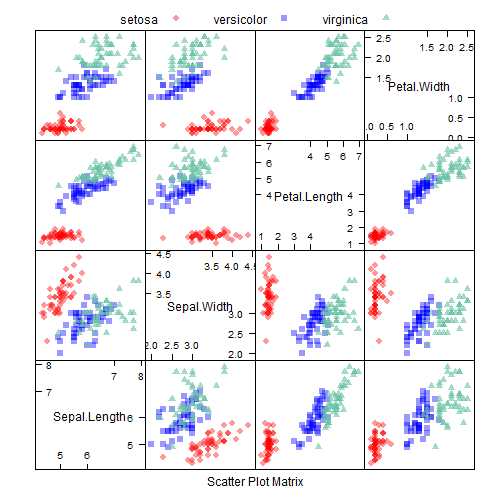
散点矩阵图:
# scatterplot matrix
featurePlot(x = iris[, 1:4],
            y = iris$Species,
            plot = "pairs",
            ## 分组变量所在的列
            auto.key = list(columns = 3))
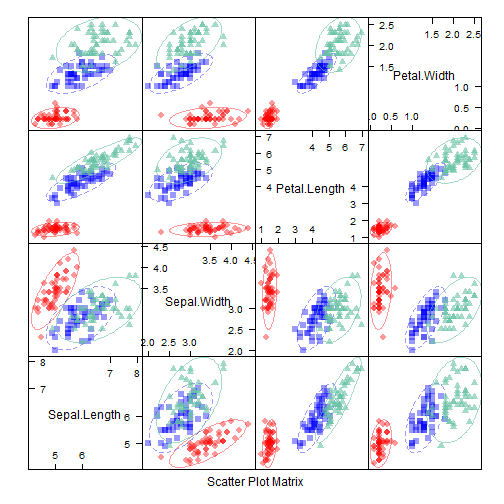
增加置信椭圆:
# scatterplot matrix with ellipse
featurePlot(x = iris[, 1:4],
            y = iris$Species,
            plot = "ellipse",
            anto.key = list(columns = 3))
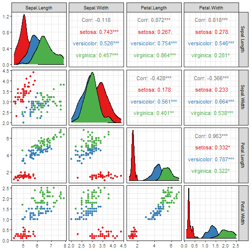
像这种散点矩阵图,现在我们有更多更棒的选择。
我以前也介绍过很多,下面为大家简单展示下,关于详细的使用细节,大家可以参考之前的推文:GGally系列。
library(GGally)
## Registered S3 method overwritten by 'GGally':
##   method from
##   +.gg   ggplot2
library(ggplot2)

ggpairs(iris, columns = 1:4,
        mapping = aes(color=Species)
        )+
  scale_color_brewer(palette = "Set1")+
  scale_fill_brewer(palette = "Set1")+
  theme_bw()
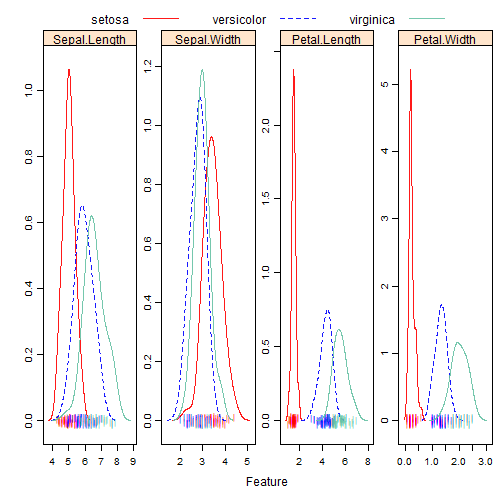
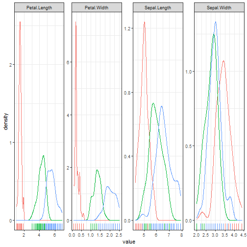
密度曲线图:
# Overlayed Density Plots
transparentTheme(trans = 0.9)
featurePlot(x = iris[, 1:4],
            y = iris$Species,
            plot = "density",
            ## Pass in options to xyplot() to
            ## make it prettier
            scales = list(x = list(relation="free"),
                          y = list(relation="free")),
            adjust = 1.5,
            pch = "|",
            layout = c(4, 1),
            auto.key = list(columns = 3))
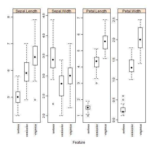
箱线图
# box plot
featurePlot(x = iris[, 1:4],
            y = iris$Species,
            plot = "box",
            ## Pass in options to bwplot()
            scales = list(y = list(relation="free"),
                          x = list(rot = 90)),
            layout = c(4,1 ),
            auto.key = list(columns = 2))
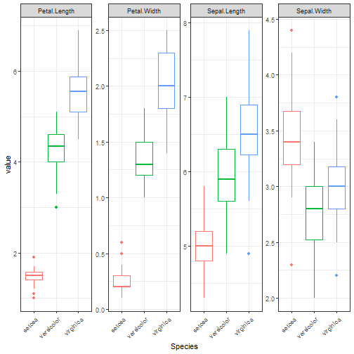
像这种密度图和箱线图可以直接用ggplot2画,分面或者拼图都行。
library(tidyr)
## 密度曲线
iris %>% pivot_longer(cols = 1:4,names_to = "feature",values_to = "value") %>%
  ggplot(aes(x=value))+
  geom_density(aes(color=Species))+
  geom_rug(aes(color=Species), sides = "b")+
  facet_wrap(~feature, nrow = 1,scales = "free")+
  theme_bw()+
  theme(legend.position = "none")
## 箱线图

iris %>% pivot_longer(cols = 1:4,names_to = "feature",values_to = "value") %>%
  ggplot()+
  geom_boxplot(aes(Species, value,color=Species))+
  facet_wrap(~feature, nrow = 1,scales = "free")+
  theme_bw()+
  theme(legend.position = "none",
        axis.text.x = element_text(angle = 45,hjust = 1)
        )
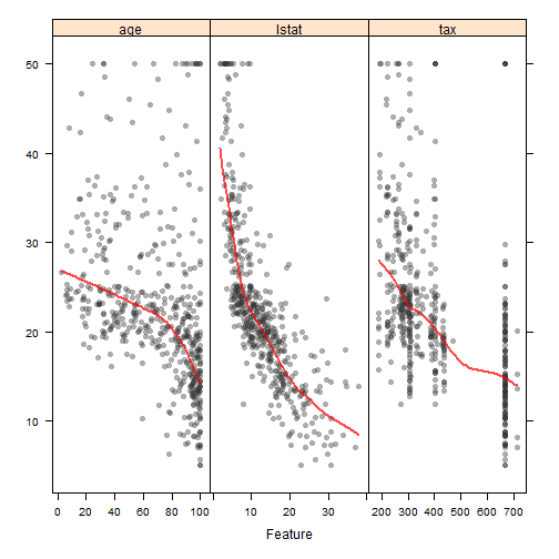
连续性结果变量展示,以Boston Housing为例
library(mlbench)
data(BostonHousing)
regVar <- c("age", "lstat", "tax")
str(BostonHousing[, regVar])
## 'data.frame':	506 obs. of  3 variables:
##  $ age  : num  65.2 78.9 61.1 45.8 54.2 58.7 66.6 96.1 100 85.9 ...
##  $ lstat: num  4.98 9.14 4.03 2.94 5.33 ...
##  $ tax  : num  296 242 242 222 222 222 311 311 311 311 ...
# scatter plot
theme1 <- trellis.par.get()
theme1$plot.symbol$col = rgb(.2, .2, .2, .4)
theme1$plot.symbol$pch = 16
theme1$plot.line$col = rgb(1, 0, 0, .7)
theme1$plot.line$lwd <- 2
trellis.par.set(theme1)

featurePlot(x = BostonHousing[, regVar],
            y = BostonHousing$medv,
            plot = "scatter",
            type = c("p", "smooth"),
            span = .5,
            layout = c(3, 1))
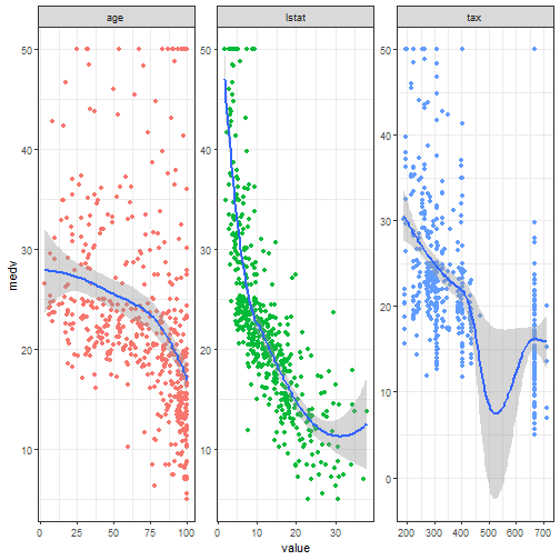
library(dplyr)
library(tidyr)

BostonHousing %>%
  select(age, lstat, tax, medv) %>%
  pivot_longer(cols = 1:3, names_to = "feature",values_to = "value") %>%
  ggplot(aes(value, medv))+
  geom_point(aes(color=feature))+
  geom_smooth(aes(group=feature))+
  facet_wrap(~feature, nrow = 1, scales = "free")+
  theme_bw()+
  theme(legend.position = "none")
## `geom_smooth()` using method = 'loess' and formula 'y ~ x'
这部分内容比较少,但是探索性数据分析的方法是很多的,并不是只有这几种图形,你可以发挥自己的想象力,探索更多的关系。
这里的探索性数据分析过程中的数据可视化只是开胃小菜,更多的结果可视化会在后面继续介绍。
面向医学生/医生的实用机器学习教程,往期系列推文:


 1009
1009


 被折叠的 条评论
为什么被折叠?
被折叠的 条评论
为什么被折叠?
 到【灌水乐园】发言


