


 这篇博客介绍了两种使用CSS实现锚点定位的技巧,以创建多页面滚动效果。方法一是利用radio按钮和绝对定位,通过切换input的选中状态改变内容的显示位置。方法二是结合HTML锚点和CSS动画,实现导航浮窗和页面内容的平滑滚动。这些方法适用于前端开发中的页面布局和交互设计。
css锚点定位的一些方法
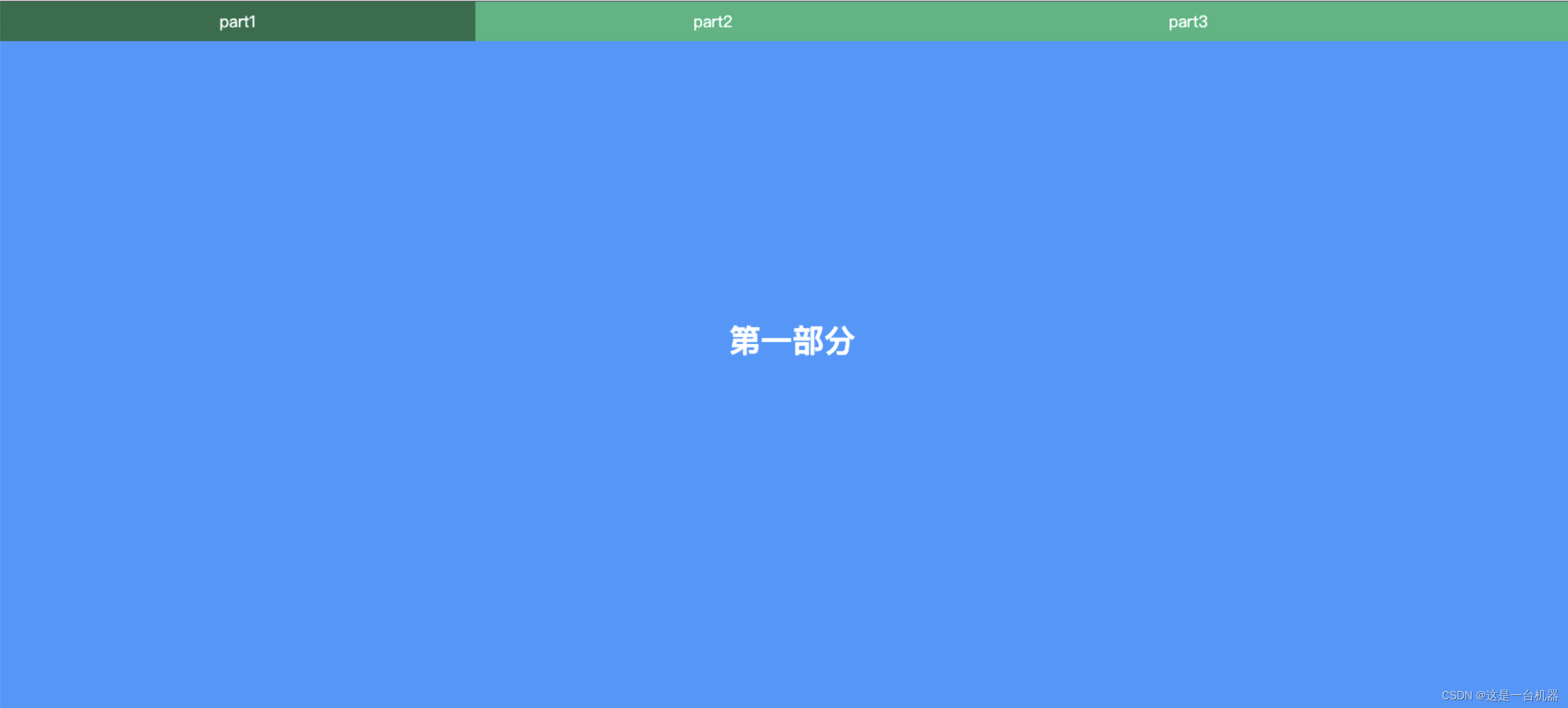
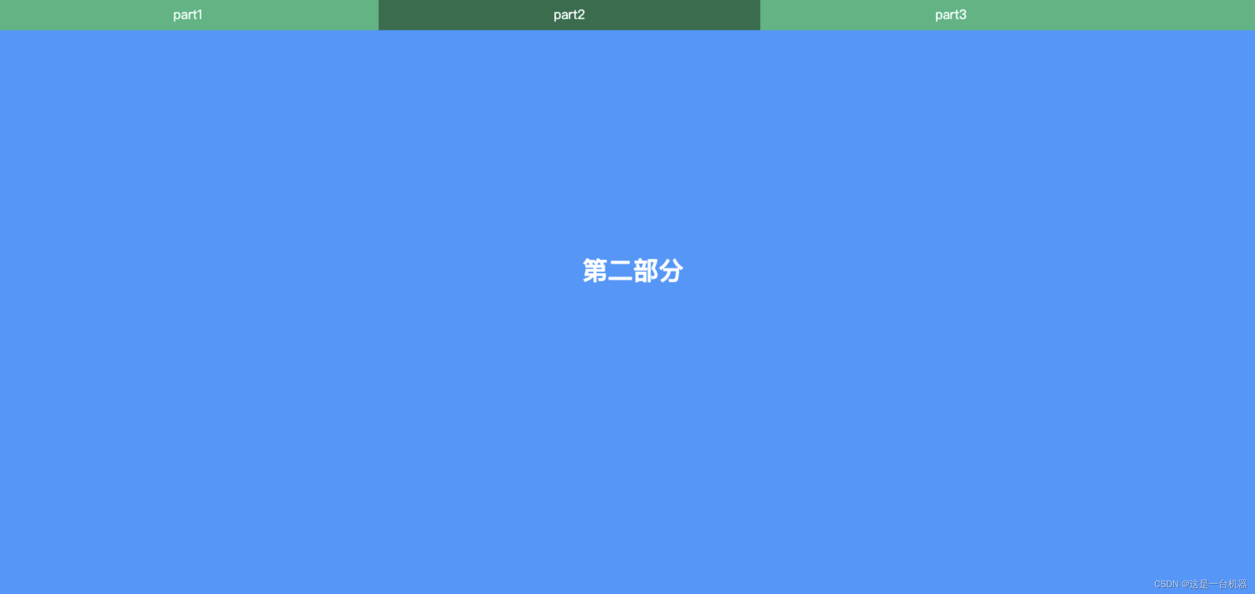
方法一
1.效果图
2.实现代码
html代码
import React from 'react';
import './index.css';

const Anchor = () => {
    return (
        <div>
            <div className="top">
                <label htmlFor="c1">part1</label>
                <label htmlFor="c2">part2</label>
                <label htmlFor="c3">part3</label>
            </div>
            <input type="radio" name="page" id="c1" checked />
            <div id="div-1" className="page">
                <h1>第一部分</h1>
            </div>
            <input type="radio" name="page" id="c2" />
            <div id="div-2" className="page">
                <h1>第二部分</h1>
            </div>
            <input type="radio" name="page" id="c3" />
            <div id="div-3" className="page">
                <h1>第三部分</h1>
            </div>
        </div>
    );
}
export default Anchor;
css代码
* {
    margin: 0;
    padding: 0
}

html,
body {
    height: 100%;
    height: 100%;
    background: #a3ceff;
    overflow: hidden;
}

.top {
    width: 100%;
    height: 40px;
    line-height: 40px;
    background: rgba(63, 202, 13, 0.6);
    position: fixed;
    z-index: 9;
}

.top label {
    display: inline-block;
    width: 30%;
    color: #fff;
    text-align: center;
    cursor: pointer;
}

.top label:hover {
    background: rgba(0, 0, 0, .4);
}

input {
    display: none;
}

h1 {
    color: #fff;
    padding-top: 20%;
}

.page {
    position: absolute;
    top: 0;
    left: 0;
    width: 100%;
    height: 100%;
    min-height: 100%;
    background: #3C98FF;
    text-align: center;
    transform: translateY(-100%);
    transition: .6s;
}


/**
* 作用是为了控制过渡动画 执行的时间
* 具体效果可依据实际需求来确定
*/
input[type=radio]:checked+.page {
    transform: translateY(0);
    animation: fromBtm 0.5s;
}

@keyframes fromBtm {

    /**
    * 过渡动画效果在Y轴距离上的占比
    */
    from {
        transform: translateY(100%);
    }

    to {}
}
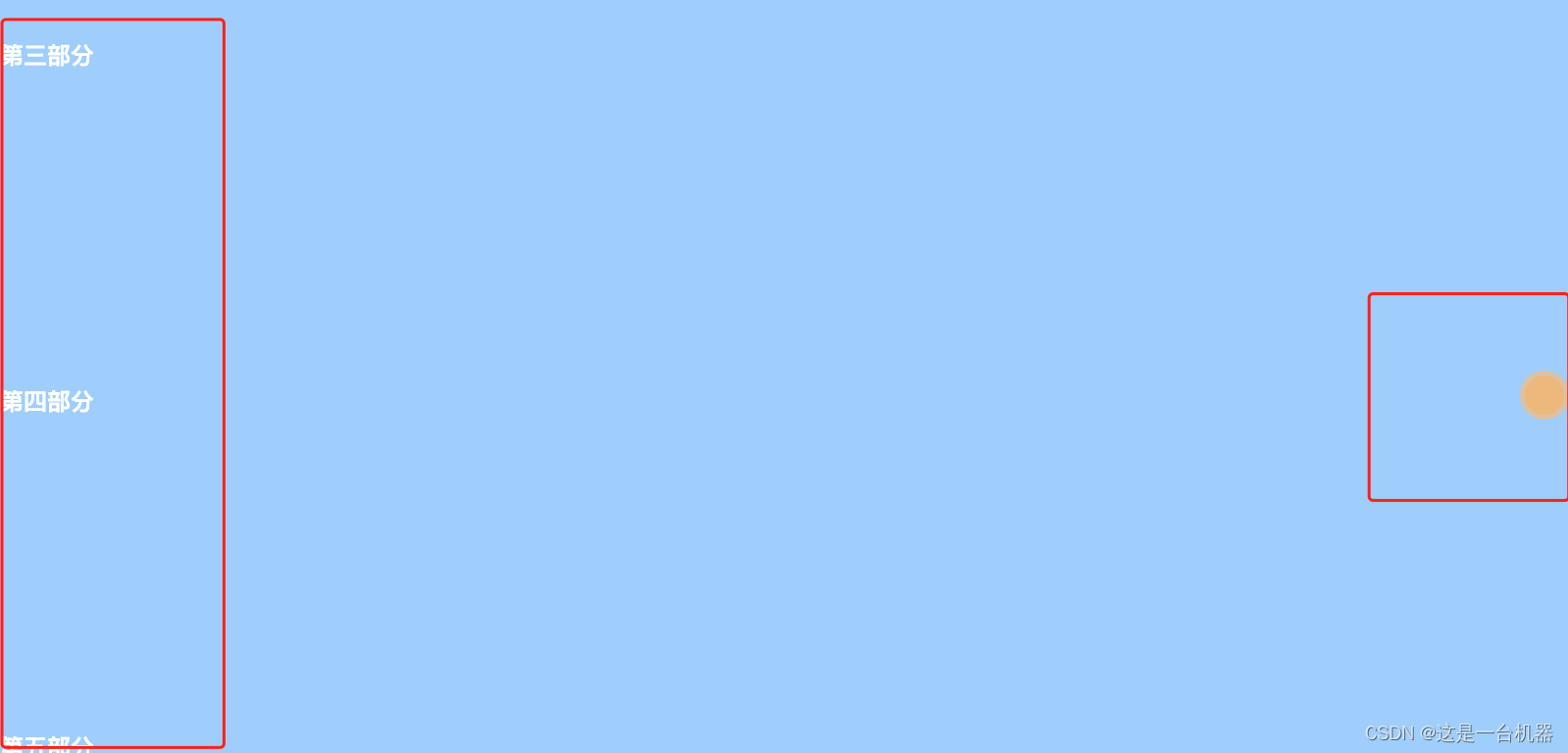
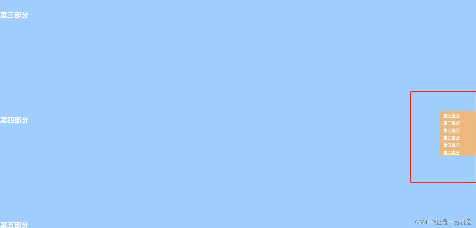
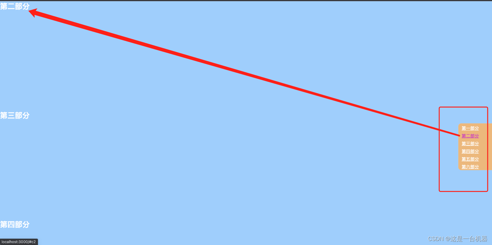
方法二
1.效果图
html代码
import React from 'react';
import './AnchorExample.css'

const AnchorExample = () => {
    return (
        <div>
            <section>
                <h1>
                    {/**可以使用id也可以使用name的方法,本例使用name */}
                    {/**如果有面包屑遮挡可视区域,可以通过相对定位让内容向下移出被面包屑遮挡部分 */}
                    <a name='c1' style={{ position: 'relative', top: '-100px' }} />
                    <div>第一部分</div>
                </h1>
            </section>
            <section>
                <h1>
                    <a name='c2' />
                    <div>第二部分</div>
                </h1>
            </section>
            <section>
                <h1>
                    <a name='c3' />
                    <div>第三部分</div>
                </h1>
            </section>
            <section>
                <h1>
                    <a name='c4' />

                    <div>第四部分</div>
                </h1>
            </section>
            <section>
                <h1>
                    <a name='c5' />

                    <div>第五部分</div>
                </h1>
            </section>
            <section>
                <h1>
                    <a name='c6' />
                    <div>第六部分</div>
                </h1>
            </section>
            {
                <nav>
                    <ul>
                        <li><a href="#c1">第一部分</a></li>
                        <li><a href="#c2">第二部分</a></li>
                        <li><a href="#c3">第三部分</a></li>
                        <li><a href="#c4">第四部分</a></li>
                        <li><a href="#c5">第五部分</a></li>
                        <li><a href="#c6">第六部分</a></li>
                    </ul>
                </nav>
            }
        </div>
    );
}
export default AnchorExample;
css代码
* {
    margin: 0;
    padding: 0
}

html,
body {
    /* height: 100%; */
    /* height: 100%; */
    background: #a3ceff;
    overflow: auto;
}


/**
* 鼠标没有划上去的效果
* 通过定位可实现锚点 浮框定位到可视页面的中间
*/
nav {
    position: fixed;
    top: 50%;
    right: 0;

    width: 40px;
    height: 40px;
    background-color: rgba(250, 179, 80, 0.8);
    border: 5px solid rgba(204, 204, 204, 0.5);
    border-radius: 50%;

    font-size: 0;
    overflow: hidden;
    cursor: pointer;
}

/**
* 鼠标划上去后的效果
*/
nav:hover {
    position: fixed;
    top: 50%;
    right: 0;

    width: 120px;
    height: 150px;
    background-color: rgba(250, 179, 80, 0.8);
    border: 1px solid rgba(204, 204, 204, 0.5);
    border-radius: 10px;
    font-size: 14px;
}

nav li {
    margin: 5px 10px;

}

li a {
    color: #fff;
}

li a:hover {
    color: #bb29d5;
}


 扫一扫
扫一扫


 566
566

 被折叠的 条评论
为什么被折叠?
被折叠的 条评论
为什么被折叠?
 到【灌水乐园】发言


