


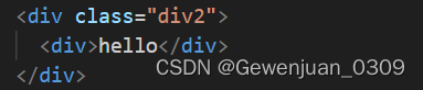
1、_鼠标悬浮文字阴影跳动
【效果】
【代码】
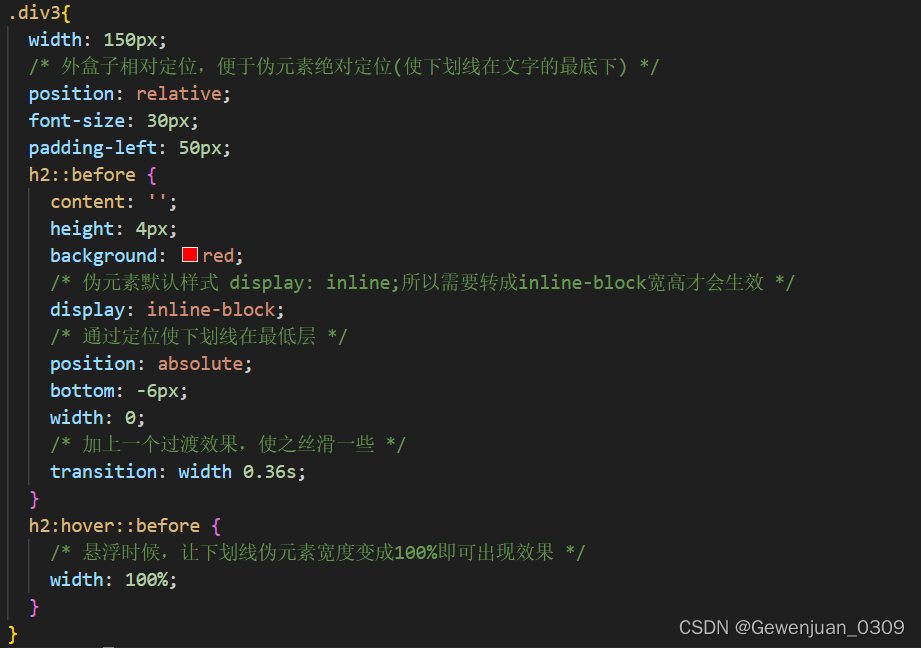
2、_鼠标悬浮文字底部出现下划线并变宽
【效果】
【代码】
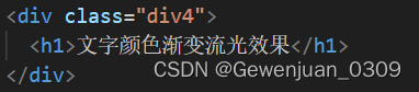
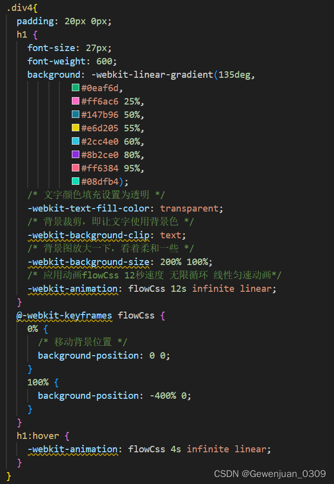
3、_文字颜色渐变流光效果
【效果】
【代码】
4、_打字机效果
【效果】
【代码】

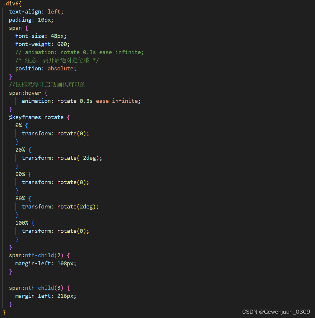
5、_鼠标悬浮文字左右旋转晃动效果
【效果】
代码
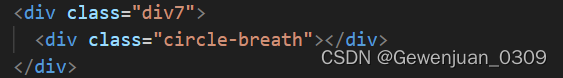
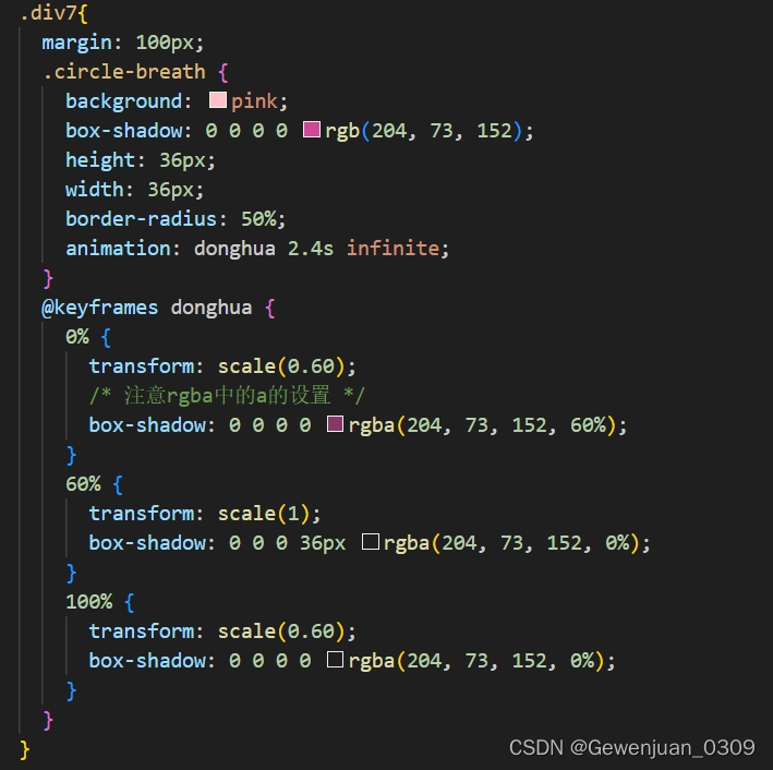
6、_圆圈呼吸扩散效果
【效果】
代码
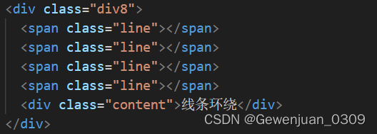
7、_四周线条环绕流动效果
【效果】
7
.div8{
width: 160px;
height: 80px;
position: relative;
/* 超出隐藏需要加上 */
overflow: hidden;
margin-top: -60px;
margin-left: 50px;
.content {
width: 160px;
height: 80px;
line-height: 80px;
text-align: center;
background-color: #cde;
}
.line {
/* 结合外层元素的相对定位 */
position: absolute;
}
.line:nth-child(1) {
top: 0;
left: 0;
width: 100%;
height: 3px;
/* 加上渐变效果,方可形成拖尾效果 */
background: linear-gradient(90deg, transparent, orange);
animation: animate1 8s linear infinite;
}
/* 分别控制其上下左右的定位距离,从而形成线条跟随效果 */
@keyframes animate1 {
0% {
left: -100%;
}
50%,
100% {
left: 100%;
}
}
.line:nth-child(2) {
top: -100%;
right: 0;
width: 3px;
height: 100%;
background: linear-gradient(180deg, transparent, red);
animation: animate2 8s linear infinite;
/* 注意要加上延时触发动画效果,这样线条才会依次触发 */
animation-delay: 2s;
}
@keyframes animate2 {
0% {
top: -100%;
}
50%,
100% {
top: 100%;
}
}
.line:nth-child(3) {
bottom: 0;
right: 0;
width: 100%;
background: linear-gradient(270deg, transparent, green);
animation: animate3 8s linear infinite;
animation-delay: 4s;
}
@keyframes animate3 {
0% {
right: -100%;
height: 3px;
}
50%,
100% {
height: 2px;
right: 100%;
}
}
.line:nth-child(4) {
bottom: -100%;
left: 0;
width: 3px;
height: 100%;
background: linear-gradient(360deg, transparent, #3a86ff);
animation: animate4 8s linear infinite;
animation-delay: 6s;
}
@keyframes animate4 {
0% {
bottom: -100%;
}
50%,
100% {
bottom: 100%;
}
}
}


 412
412


 被折叠的 条评论
为什么被折叠?
被折叠的 条评论
为什么被折叠?
 到【灌水乐园】发言


