


Cartopy和Matplotlib fill_betweenx可视化nc数据

01 引言:
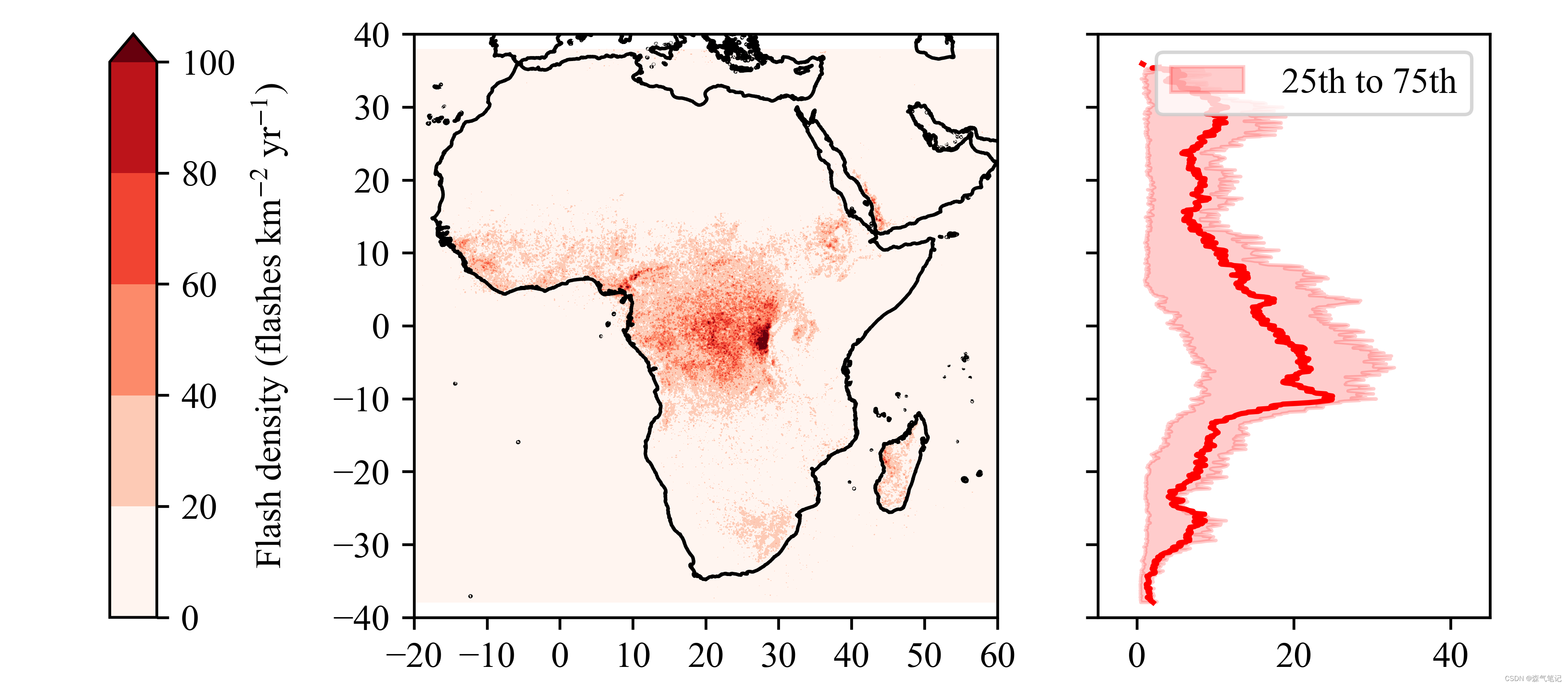
最近读文献【African Lightning and its Relation to Rainfall and Climate Change in a Convection‐Permitting Mode】发现文中图表的排版布局非常好,故借鉴一下。懒得下载文中的数据,利用手头的数据进行了代替,故而有所差异。

02 代码如下:
# -*- encoding: utf-8 -*-
'''
@File    :   sci2.py
@Time    :   2022/06/17 15:38:10
@Author  :   HMX
@Version :   1.0
@Contact :   kzdhb8023@163.com
'''

# here put the import lib
import matplotlib.pyplot as plt
import matplotlib as mpl
import numpy as np
import cartopy.crs as ccrs
import cartopy.feature as cfeature
import xarray as xr
import pandas as pd


def cm2inch(x,y):
    return (x/2.54,y/2.54)


size1 = 10.5
fontdict = {'weight': 'bold','size':size1,'family':'SimHei'}
mpl.rcParams.update(
    {
    'text.usetex': False,
    'font.family': 'stixgeneral',
    'mathtext.fontset': 'stix',
    "font.family":'serif',
    "font.size": size1,
    "mathtext.fontset":'stix',
    "font.serif": ['Times New Roman'],
    }
    )

ds = xr.open_dataset(r'C:\Users\HMX\Desktop\VHRFC.nc')
proj = ccrs.PlateCarree()
region = [-20,60,-40,40]
norm = mpl.colors.Normalize(vmin=0, vmax=100)#将颜色映射到 vmin~vmax 之间
fig = plt.figure(figsize=cm2inch(16,7))
ax0 = fig.add_axes([0.07,0.1,0.03,.85])
ax1 = fig.add_axes([0.25,0.1,0.4,.85], projection=ccrs.PlateCarree())
ax2 = fig.add_axes([0.7,0.1,0.25,0.85])
ax1.add_feature(cfeature.COASTLINE.with_scale('10m'),zorder = 10)
ds = ds.VHRFC_LIS_FRD
ds = ds.sel(Longitude = slice(-20,60), Latitude = slice(-40,40))
img = ds.plot.contourf(transform = proj,cmap = 'Reds',ax = ax1,add_colorbar=False,norm = norm,add_xlabel = False,add_ylabel = False)
fig.colorbar(img,cax = ax0,extend='max',label = 'Flash density (flashes km$^{-2}$ yr$^{-1}$)')
ax1.set_ylabel([],color = 'none')
ax1.set_extent(region,crs = proj)
ax1.set_xticks(np.arange(region[0], region[1] + 1, 10), crs = proj)
ax1.set_yticks(np.arange(region[-2], region[-1] + 1,10), crs = proj)

# 首先计算均值和上下四分位
ds2 = xr.open_dataarray(r'C:\Users\HMX\Desktop\VHRF_land.nc')
ds2 = ds2.sel(Longitude = slice(-20,60))
q1s, q4s, mus = [], [], []
x,y = ds2.values.shape
for i in range(x):
    data = ds2.values[:,i]
    res = pd.DataFrame({'cg':data})
    res = res[res.cg>0]
    mu = res.describe().values[1][0]
    mus.append(mu)
    sd = np.std(data)
    n = len(ds)
    q1, q4 =res.describe().values[4][0], res.describe().values[6][0]
    q1s.append(q1)
    q4s.append(q4)


ax2.fill_betweenx(ds2.Latitude.values,q1s,q4s, alpha=0.2,label = ' 25th to 75th',color = 'r')
ax2.plot(mus,ds2.Latitude.values,color = 'r')
ax2.set_xlim(-20,60)
ax2.set_ylim(-40,40)
ax2.set_xticks(np.arange(0,60+ 1, 20))
ax2.set_xlim(-5,45)
ax2.set_yticklabels([])
fig.legend(loc=1, bbox_to_anchor=(1,1), bbox_transform=ax2.transAxes)
plt.savefig(r'.\sci2.png',dpi = 600)
plt.show()
03 结果如下:
如果对你有帮助的话,请‘点赞’、‘收藏’,‘关注’,你们的支持是我更新的动力。
欢迎关注公众号【森气笔记】。


 258
258


 被折叠的 条评论
为什么被折叠?
被折叠的 条评论
为什么被折叠?
 到【灌水乐园】发言


