


源自《Python编程:从入门到实践》
作者: Eric Matthes
01 生成数据
1.1 安装matplotlib
$ python3 -m pip install --user matplotlib1.2 绘制简单折线图
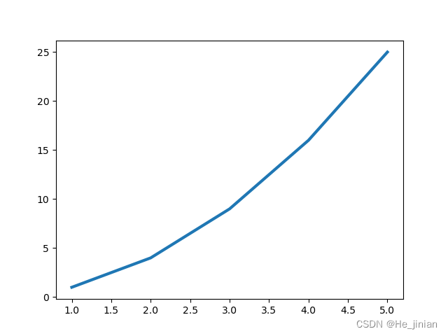
import matplotlib.pyplot as plt

values=[1, 2, 3, 4, 5]
squares=[1, 4, 9, 16, 25]

fig, ax=plt.subplots()
ax.plot(values,squares,linewidth=3)

plt.show()
ax.plot(x,y)
使用 pyplot 中的 subplot() 和 subplots() 方法来绘制多个子图
subplot() 方法在绘图时需要指定位置,subplots() 方法可以一次生成多个,在调用时只需要调用生成对象的 ax 即可
subplot
subplot(nrows, ncols, index, **kwargs)
以上函数将整个绘图区域分成 nrows 行和 ncols 列,然后从左到右,从上到下的顺序对每个子区域进行编号,编号可以通过参数 index 设置
设置 numRows = 1,numCols = 2,就是将图表绘制成 1x2 的图片区域
import matplotlib.pyplot as plt
import numpy as np

#plot 1:
xpoints = np.array([0, 5])
ypoints = np.array([0, 10])

plt.subplot(1, 2, 1)
plt.plot(xpoints,ypoints)
plt.title("plot 1")

#plot 2:
x = np.array([1, 2, 3, 4])
y = np.array([1, 4, 9, 16])

plt.subplot(1, 2, 2)
plt.plot(x,y)
plt.title("plot 2")

plt.suptitle("USE SUBPLOT")
plt.show()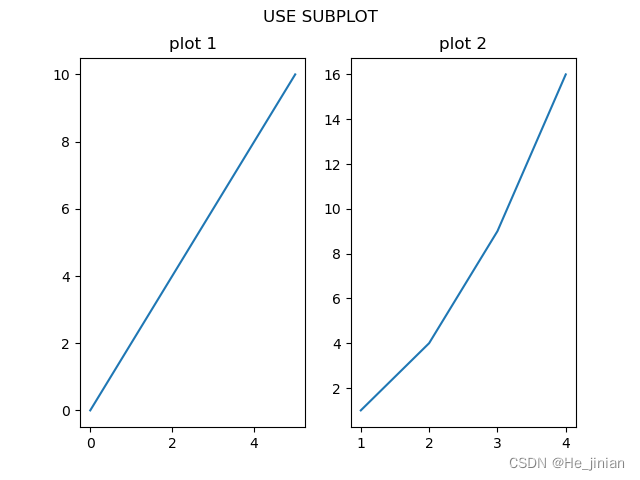
subplots()
matplotlib.pyplot.subplots(nrows=1, ncols=1, *, sharex=False, sharey=False, squeeze=True, subplot_kw=None, gridspec_kw=None, **fig_kw)
nrows:默认为 1, 设置图表的行数
ncols:默认为 1, 设置图表的列数
sharex、sharey:设置 x、y 轴是否共享属性,默认为 false,可设置为 'none'、'all'、'row' 或 'col'。 False 或 none :每个子图的 x 轴或 y 轴都是独立的;True 或 'all':所有子图共享 x 轴或 y 轴,'row' 设置每个子图行共享一个 x 轴或 y 轴,'col':设置每个子图列共享一个 x 轴或 y 轴
squeeze:布尔值,默认为 True,表示额外的维度从返回的 Axes(轴)对象中挤出,对于 N*1 或 1*N 个子图,返回一个 1 维数组,对于 N*M,N>1 和 M>1 返回一个 2 维数组。如果设置为 False,则不进行挤压操作,返回一个元素为 Axes 实例的2维数组,即使它最终是1x1
subplot_kw:可选,字典类型。把字典的关键字传递给 add_subplot() 来创建每个子图
gridspec_kw:可选,字典类型。把字典的关键字传递给 GridSpec 构造函数创建子图放在网格里(grid)
**fig_kw:把详细的关键字参数传给 figure() 函数
import matplotlib.pyplot as plt
import numpy as np
# 创建一些测试数据 -- 图1
x = np.linspace(0, 2*np.pi)
y = np.sin(x)
# 创建一个画像和子图 -- 图2
fig, ax = plt.subplots()
ax.plot(x, y)
ax.set_title('Simple plot')
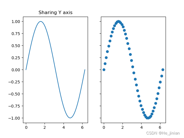
# 创建两个子图 -- 图3
f, (ax1, ax2) = plt.subplots(1, 2, sharey=True)
ax1.plot(x, y)
ax1.set_title('Sharing Y axis')
ax2.scatter(x, y)
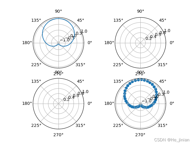
# 创建四个子图 -- 图4
fig, axs = plt.subplots(2, 2, subplot_kw=dict(projection="polar"))
axs[0, 0].plot(x, y)
axs[1, 1].scatter(x, y)
plt.show()
修改标签文字和线条粗细
import matplotlib.pyplot as plt

values=[1, 2, 3, 4, 5]
squares=[1, 4, 9, 16, 25]

fig, ax=plt.subplots()
ax.plot(values, squares, linewidth=3)

ax.set_title('Square Numbers', fontsize=24)
ax.set_xlabel('Value', fontsize=14)
ax.set_ylabel('Square of Value', fontsize=14)

ax.tick_params(labelsize=14)

plt.show()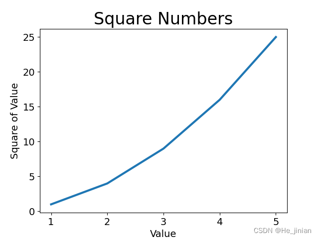
ax.set_title()
ax.set_xlabel()
ax.tick_params()
用于更改刻度、刻度标签和网格线的外观
内置样式
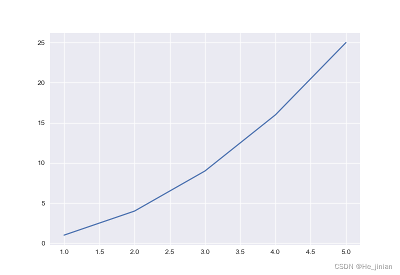
import matplotlib.pyplot as plt
plt.style.available

values = [1, 2, 3, 4, 5]
squares = [1, 4, 9, 16, 25]

plt.style.use('seaborn-v0_8')
fig, ax = plt.subplots()
ax.plot(values, squares)

plt.show()
plt.style.available
plt.style.use( '样式' )
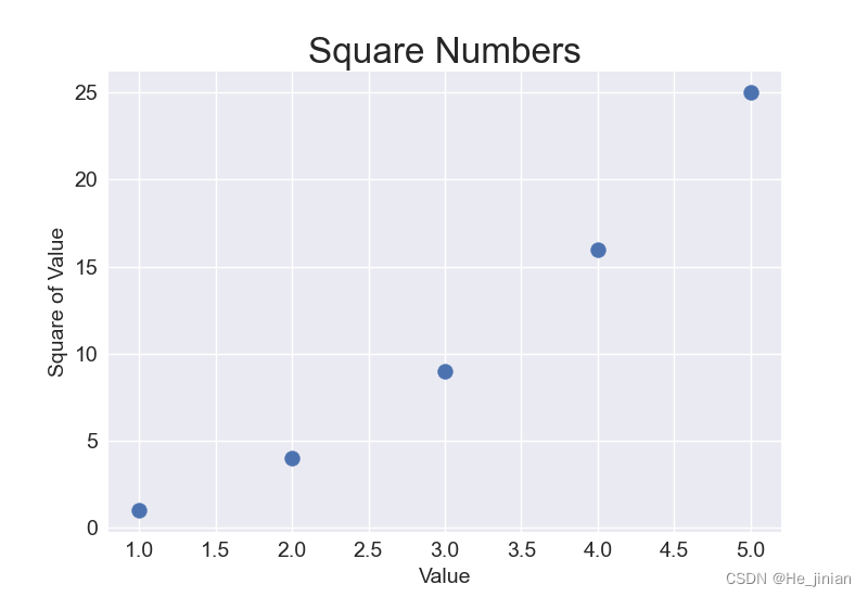
scatter()绘制散点图
import matplotlib.pyplot as plt
plt.style.available
plt.style.use('seaborn-v0_8')

x=[1, 2, 3, 4, 5]
y=[1, 4, 9, 16, 25]

fig, ax = plt.subplots()
ax.scatter(x, y, s=100)

ax.set_title('Square Numbers', fontsize=24)
ax.set_xlabel('Value', fontsize=14)
ax.set_ylabel('Square of Value', fontsize=14)
ax.tick_params(labelsize=14)

plt.show()
ax.scatter(x,y)
自动计算数据
import matplotlib.pyplot as plt

x = range(1, 101)
y = [i**2 for i in x]   #自动计算

fig, ax = plt.subplots()
ax.plot(x, y)

ax.set_title('Square Numbers', fontsize=24)
ax.set_xlabel('Value', fontsize=14)
ax.set_ylabel('Square of Value', fontsize=14)
ax.tick_params(labelsize=14)
ax.axis([1, 110, 0, 10000])

plt.show()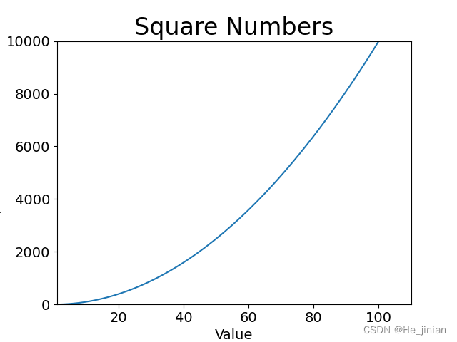
定制刻度标记
ax.scatter(x,y,color='red',s=10)ax.scatter(x,y,color='颜色',s=大小)
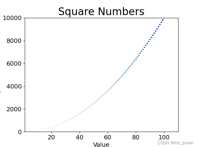
颜色映射
import matplotlib.pyplot as plt

x = range(1, 101)
y = [i**2 for i in x]

fig, ax = plt.subplots()
ax.scatter(x, y, c=y, cmap=plt.cm.Blues, s=5)

ax.set_title('Square Numbers', fontsize=24)
ax.set_xlabel('Value', fontsize=14)
ax.set_ylabel('Square of Value', fontsize=14)
ax.tick_params(labelsize=14)
ax.axis([1, 110, 0, 10000])

plt.show()
ax.scatter(x, y, c=y, cmap=plt.cm.Blues)
1.3 随机游走
创建 Randomwalk 类
from random import choice

class RandomWalk:

    def __init__(self, num_points=5000):
        self.num_points = num_points

        self.x_values = [0]   #所有随机游走都始于(0,0)
        self.y_values = [0]

    def fill_walk(self):
        while len(self.x_values) < self.num_points:
            x_direction = choice([-1, 1])
            x_distance = choice([0, 1, 2, 3, 4])
            x_step = x_direction*x_distance

            y_direction = choice([-1, 1])
            y_distance = choice([0, 1, 2, 3, 4])
            y_step = y_direction * y_distance

            if x_step == 0 and y_step == 0:
                continue

            x = self.x_values[-1] + x_step
            y = self.y_values[-1] + y_step

            self.x_values.append(x)
            self.y_values.append(y)


import matplotlib.pyplot as plt

rw = RandomWalk()
rw.fill_walk()

fig, ax = plt.subplots()
ax.scatter(rw.x_values, rw.y_values, s=10, c=range(rw.num_points), cmap=plt.cm.Blues)

ax.set_aspect('equal')
plt.show()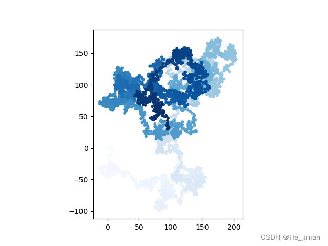
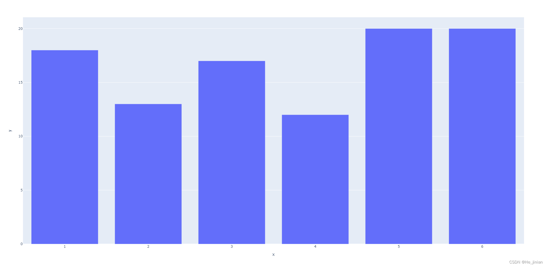
1.4 使用 Plotly 模拟掷色子
创建Die类
from random import randint
import matplotlib.pyplot as plt

class Die:

    def __init__(self, num_sides=6):
        self.num_sides = num_sides

    def roll(self):
        return randint(1, self.num_sides)

die = Die()
results = []
for roll_num in range(100):
    result = die.roll()
    results.append(result)

print(results)
分析结果
from random import randint
import matplotlib.pyplot as plt
import plotly.express as px

class Die:

    def __init__(self, num_sides=6):
        self.num_sides = num_sides

    def roll(self):
        return randint(1, self.num_sides)

die = Die()
results = []
for roll_num in range(100):
    result = die.roll()
    results.append(result)

print(results)

frequencies = []
poss_results = range(1, die.num_sides+1)

for value in poss_results:
    frequency = results.count(value)
    frequencies.append(frequency)

print(frequencies)

fig = px.bar(x=poss_results, y=frequencies)
fig.show()
直方图
import plotly.express as px
fig=px.bar(x= ,y= )


 3637
3637


 被折叠的 条评论
为什么被折叠?
被折叠的 条评论
为什么被折叠?
 到【灌水乐园】发言


