


matplotlib
1、常用统计图对比
1、折线图:以折线的上升或下降来表示统计数量的增减变化的统计图
特点:能够显示数据的变化趋势,反映事物的变化情况。(变化)
2、直方图:由一系列高度不等的纵向条纹或线段表示数据分布的情况。一般用横轴表示数据范围,纵轴表示分布情况。
特点:绘制连续性的数据,展示一组或者多组数据的分布情况。(统计)
3、条形图:排列在工作表的列或行中的数据可以绘制到条形图中
特点:绘制连离散的数据,能够一眼看出各个数据的大小,比较数据之间的差别。(统计)
4、散点图:用两组数据构成多个坐标点,考察坐标点的分布,判断两变量之间是否存在某种关联或总结坐标点的分布模式。
特点:判断变量之间是否存在数量关联趋势,展示离群点。(分布规律)
2、折线图
from matplotlib import pyplot as plt

x = range(2, 26, 2)
y = [15, 13, 14.5, 17, 20, 25, 26, 26, 24, 22, 18, 15]
# 绘图
plt.plot(x, y)
# 展示图形
plt.show()
1、设置图片大小
# 设置宽和高,dpi
plt.figure(figsize=(10, 5), dpi=80)
#在图像模糊的时候可以传入dpi参数,让图片更加清晰
2、保存图片
#可以保存为svg这种矢量图格式,放大不会有锯齿
plt.savefig('./t1.png')
3、调整X或Y轴上刻度
#调整X轴刻度
plt.xticks(x)
#调整Y轴刻度
plt.yticks(y)
4、设置matplotlib中文字体显示(默认为乱码)
# 设置中文字体显示
matplotlib.rc("font", family='MicroSoft YaHei', weight='bold')
5、plot方法使用
plt.plot(
	x,	#x轴数据
	y,	#y轴数据
	color='r',	#线条颜色
	linestyle='--',	#线条样式
	linewidth=5,	#线条粗细
	alpha=0.5	#透明度(0-1)
)
6、为每条线添加图例
#通过label指定图例内容
plt.plot(range(len(y)),y,label='test',linestyle='--',color='red',alpha=0.5)
#通过loc指定图例位置,默认右上角
#'best', 'upper right', 'upper left', 'lower left', 'lower right', 'right', 'center left', 'center right', 'lower center', 'upper center', 'center'
plt.legend(loc='best)
7、添加图形描述
# x轴标题
plt.xlabel()
# y轴标题
plt.ylabel()
# 图形标题
plt.title()
8、绘制网格
plt.grid(alpha=0.4)
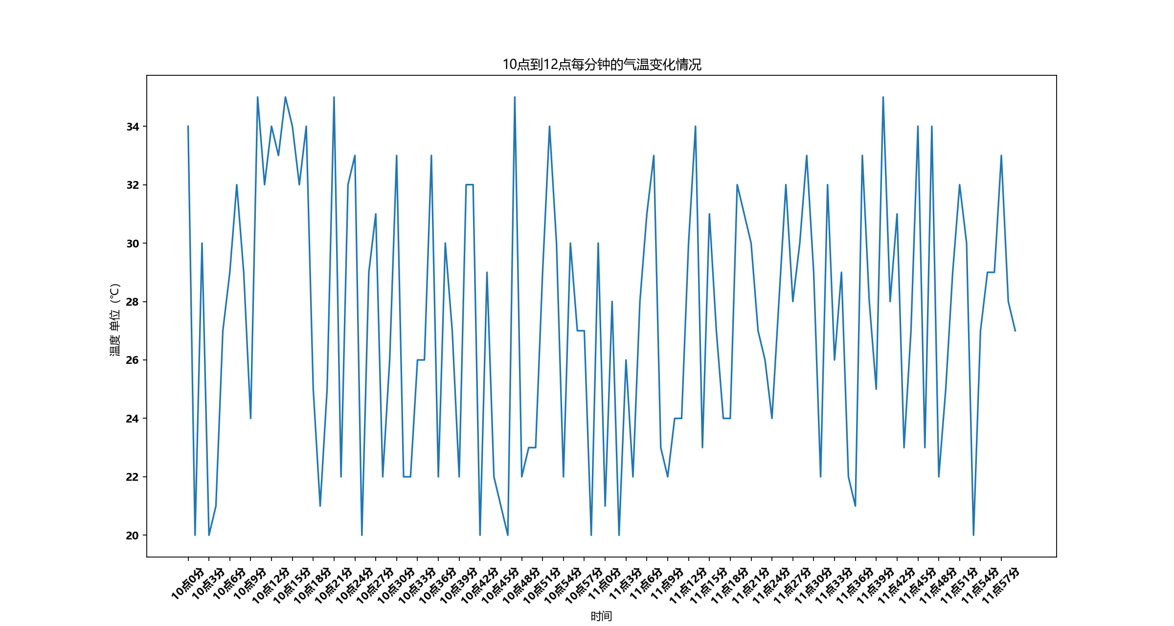
9、绘制10到12点的气温折线图
import random
import matplotlib
from matplotlib import pyplot as plt
# 设置中文字体显示
matplotlib.rc("font", family='MicroSoft YaHei', weight='bold')
x = range(0, 120)
y = [random.randint(20, 35) for i in range(120)]
plt.figure(figsize=(15, 8), dpi=80)
plt.plot(x, y)
# 调整x轴的刻度
_xtick_labels = ["10点{}分".format(i) for i in range(60)]
_xtick_labels += ["11点{}分".format(i) for i in range(60)]
# 取步长,数字和字符串一一对应,数据的长度一样
plt.xticks(list(x)[::3], _xtick_labels[::3], rotation=45)  # rotation 旋转的度数
# 添加描述信息
plt.xlabel('时间')
plt.ylabel('温度 单位(℃)')
plt.title('10点到12点每分钟的气温变化情况')
#展示图像
plt.show()
3、散点图
1、使用scatter绘制散点图
plt.scatter(x,y) # 与绘制条形图的唯一区别
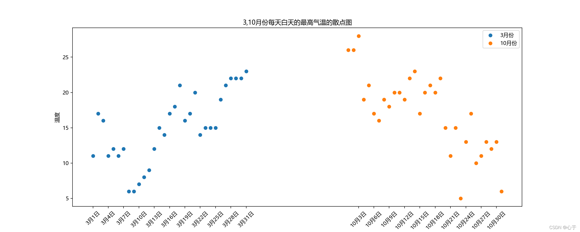
2、绘制3,10月份每天白天的最高气温的散点图
import matplotlib
from matplotlib import pyplot as plt

#  绘制3,10月份每天白天的最高气温的散点图
# 设置字体
matplotlib.rc("font", family='MicroSoft YaHei')
y_3 = [11, 17, 16, 11, 12, 11, 12, 6, 6, 7, 8, 9, 12, 15, 14, 17, 18, 21, 16, 17, 20, 14, 15, 15, 15, 19, 21, 22, 22,
       22, 23]
y_10 = [26, 26, 28, 19, 21, 17, 16, 19, 18, 20, 20, 19, 22, 23, 17, 20, 21, 20, 22, 15, 11, 15, 5, 13, 17, 10, 11, 13,
        12, 13, 6]
x_3 = range(1, 32)
x_10 = range(51, 82)
# 设置图形大小
plt.figure(figsize=(15, 6), dpi=80)
# 使用scatter绘制散点图
plt.scatter(x_3, y_3, label="3月份")
plt.scatter(x_10, y_10, label="10月份")

# 调整x轴的刻度
_x = list(x_3) + list(x_10)
_xtick_labels = ["3月{}日".format(i) for i in x_3]
_xtick_labels += ["10月{}日".format(i - 50) for i in x_10]
plt.xticks(_x[::3], _xtick_labels[::3], rotation=45)

# 添加图例
plt.legend(loc="best")

# 添加描述信息
plt.xlabel("时间")
plt.ylabel("温度")
plt.title("3,10月份每天白天的最高气温的散点图")

# 展示
plt.show()
4、条形图
1、使用bar绘制竖着的条形图
plt.bar(range(len(x)), y, width = 0.3, color = 'red') # bar绘制条形图,只能接受含数字的可迭代对象 width表示线条粗细
2、使用barh绘制横着的条形图
plt.bar(range(len(a)), b, height = 0.3, color = 'red')
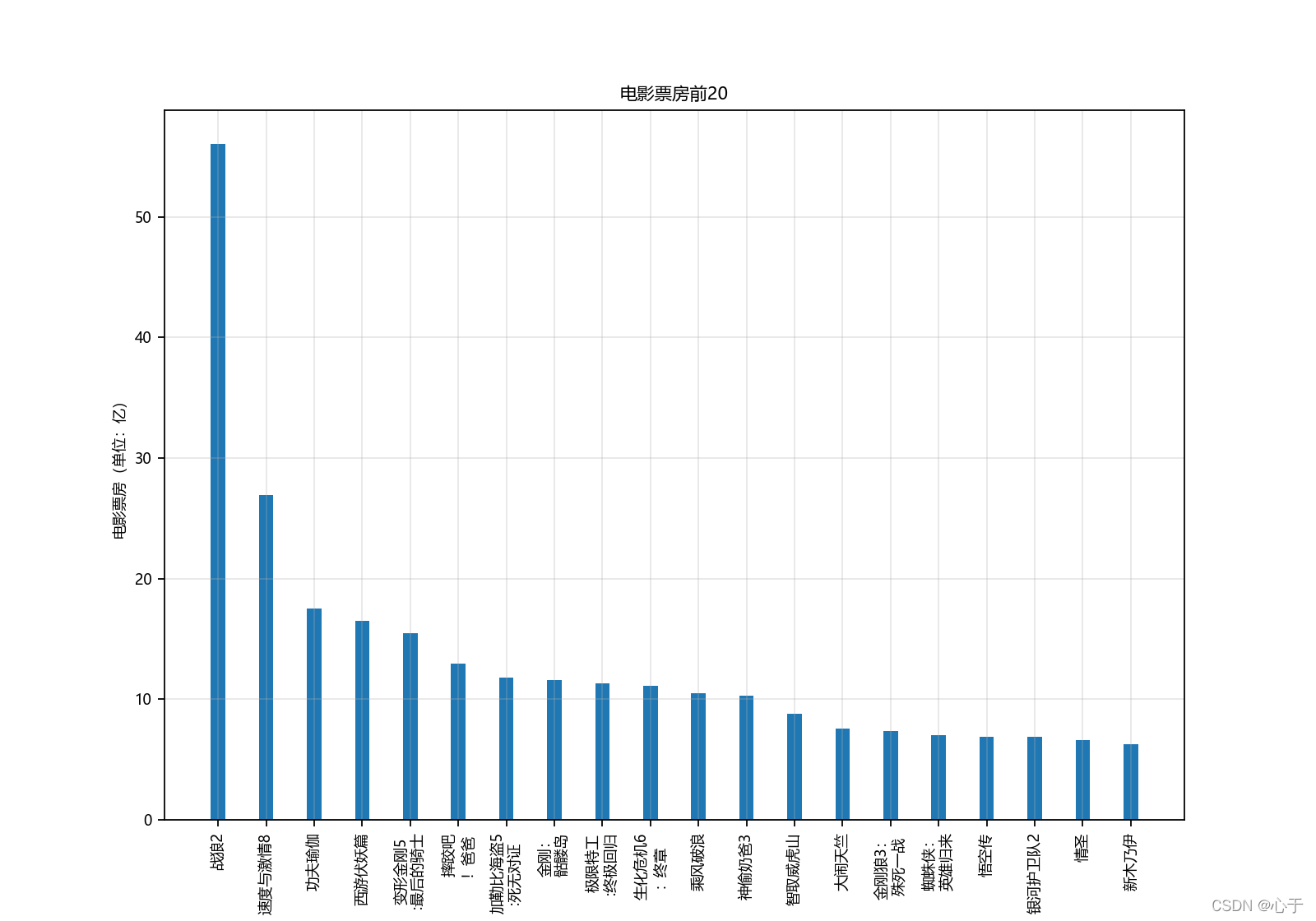
3、绘制电影票房前20条形图
1、绘制竖着的条形图
from matplotlib import pyplot as plt
import matplotlib

# 绘制电影票房前20条形图
matplotlib.rc("font", family="MicroSoft YaHei", size="8")
a = ["战狼2", "速度与激情8", "功夫瑜伽", "西游伏妖篇", "变形金刚5\n:最后的骑士", "摔跤吧\n!爸爸", "加勒比海盗5\n:死无对证", "金刚:\n骷髅岛", "极限特工\n:终极回归",
     "生化危机6\n:终章",
     "乘风破浪", "神偷奶爸3", "智取威虎山", "大闹天竺", "金刚狼3:\n殊死一战", "蜘蛛侠:\n英雄归来", "悟空传", "银河护卫队2", "情圣", "新木乃伊", ]
b = [56.01, 26.94, 17.53, 16.49, 15.45, 12.96, 11.8, 11.61, 11.28, 11.12, 10.49, 10.3, 8.75, 7.55, 7.32, 6.99, 6.88,
     6.86, 6.58, 6.23]
# 设置图形大小
plt.figure(figsize=(10, 7), dpi=80)
# 绘制条形图,设置线条粗细
plt.bar(range(len(a)), b, width=0.3)
# 设置字符串到x轴
plt.xticks(range(len(a)), a, rotation=90)
# 绘制图例信息
plt.xlabel("电影名称")
plt.ylabel("电影票房(单位:亿)")
plt.title("电影票房前20")
# 绘制网格
plt.grid(alpha=0.3)
plt.show()
2、绘制横着的条形图
# 设置图形大小
plt.figure(figsize=(10, 7), dpi=80)
# 绘制横着的条形图
plt.barh(range(len(a)), b, height=0.3)
# 设置字符串到y轴
plt.yticks(range(len(a)), a)
# 绘制图例信息
plt.xlabel("电影票房(单位:亿)")
plt.ylabel("电影名称")
plt.title("电影票房前20")
# 绘制网格
plt.grid(alpha=0.3)
plt.show()

4、绘制多次条形图
from matplotlib import pyplot as plt
import matplotlib

# 绘制多次条形图
matplotlib.rc("font", family="Microsoft YaHei")
a = ["猩球崛起3:终极之战", "敦刻尔克", "蜘蛛侠:英雄归来", "战狼2"]
b_16 = [15746, 312, 4497, 319]
b_15 = [12357, 156, 2045, 168]
b_14 = [2358, 399, 2358, 362]
bar_width = 0.2
# 设置每个图形的位置
x_14 = list(range(len(a)))
x_15 = [i + bar_width for i in x_14]
x_16 = [i + bar_width * 2 for i in x_14]
# 设置图形大小
plt.figure(figsize=(10, 5), dpi=80)
# 绘制图形
plt.bar(x_14, b_14, width=bar_width,label="14日")
plt.bar(x_15, b_15, width=bar_width,label="15日")
plt.bar(x_16, b_16, width=bar_width,label="16日")
#设置图例
plt.legend(loc="best")
plt.xlabel("电影名称")
plt.ylabel("票房(万元)")
plt.title("14、15、16三日电影票房情况")
plt.xticks(x_15, a)
plt.show()
[外链图片转存失败,源站可能有防盗链机制,建议将图片保存下来直接上传(img-FHiNV66f-1648901389327)(E:\file\notes\python数据分析\picture\三日票房条形图.png)]
5、直方图
1、使用hist绘制直方图
plt.hist(a, b)	# 绘制频数直方图,a表示数据列表,b表示组数
plt.hist(a, b, density = True)	# 绘制频率直方图
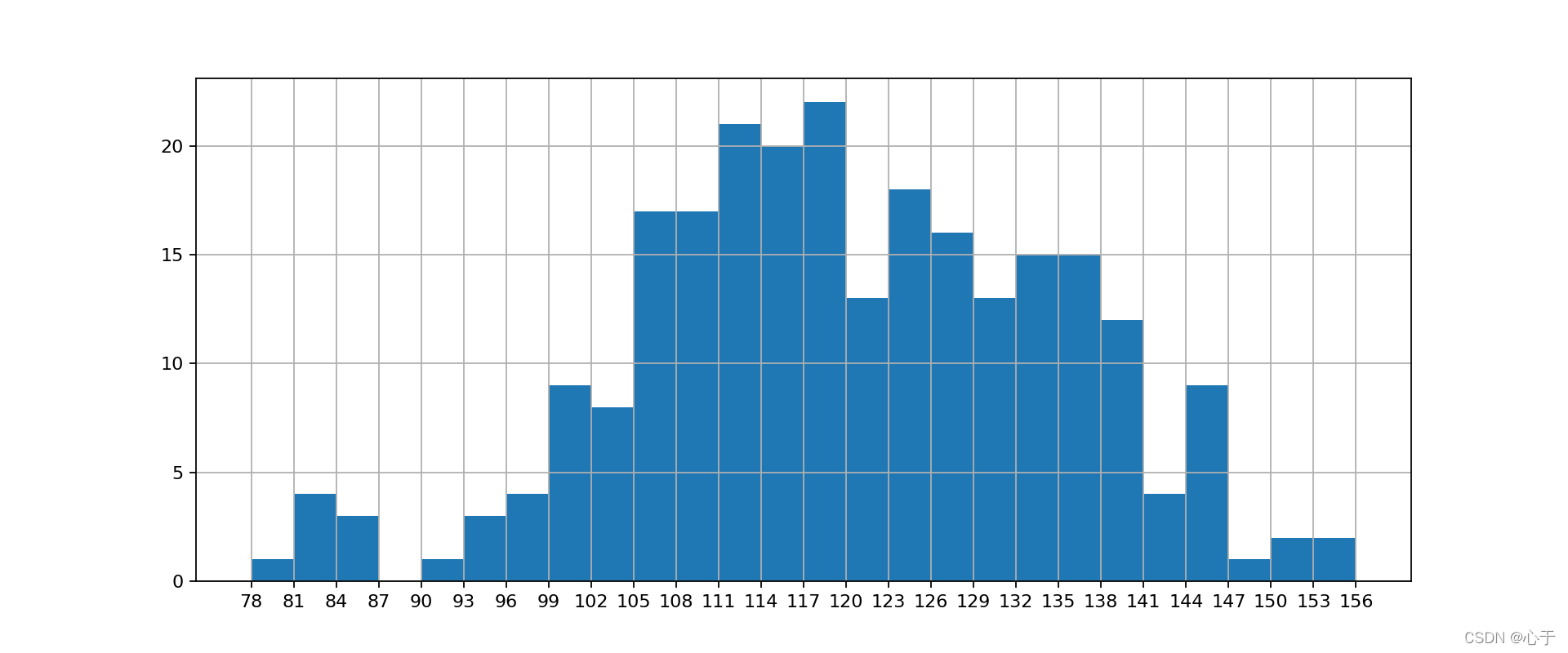
2、绘制频数/频率直方图
from matplotlib import pyplot as plt
# 数据准备
a = [131, 98, 125, 131, 124, 139, 131, 117, 128, 108, 135, 138, 131, 102, 107, 114, 119, 128, 121, 142, 127, 130, 124,
     101, 110, 116, 117, 110, 128, 128, 115, 99, 136, 126, 134, 95, 138, 117, 111, 78, 132, 124, 113, 150, 110, 117, 86,
     95, 144, 105, 126, 130, 126, 130, 126, 116, 123, 106, 112, 138, 123, 86, 101, 99, 136, 123, 117, 119, 105, 137,
     123, 128, 125, 104, 109, 134, 125, 127, 105, 120, 107, 129, 116, 108, 132, 103, 136, 118, 102, 120, 114, 105, 115,
     132, 145, 119, 121, 112, 139, 125, 138, 109, 132, 134, 156, 106, 117, 127, 144, 139, 139, 119, 140, 83, 110, 102,
     123, 107, 143, 115, 136, 118, 139, 123, 112, 118, 125, 109, 119, 133, 112, 114, 122, 109, 106, 123, 116, 131, 127,
     115, 118, 112, 135, 115, 146, 137, 116, 103, 144, 83, 123, 111, 110, 111, 100, 154, 136, 100, 118, 119, 133, 134,
     106, 129, 126, 110, 111, 109, 141, 120, 117, 106, 149, 122, 122, 110, 118, 127, 121, 114, 125, 126, 114, 140, 103,
     130, 141, 117, 106, 114, 121, 114, 133, 137, 92, 121, 112, 146, 97, 137, 105, 98, 117, 112, 81, 97, 139, 113, 134,
     106, 144, 110, 137, 137, 111, 104, 117, 100, 111, 101, 110, 105, 129, 137, 112, 120, 113, 133, 112, 83, 94, 146,
     133, 101, 131, 116, 111, 84, 137, 115, 122, 106, 144, 109, 123, 116, 111, 111, 133, 150]
# 计算组数
d = 3  # 组距
num_bins = (max(a) - min(a)) // d  # 组数,取整
# 设置图形大小
plt.figure(figsize=(12, 5), dpi=80)
# plt.hist(a, num_bins)					# 频数
plt.hist(a, num_bins, density=True)		# 频率
# 设置x轴的刻度
plt.xticks(range(min(a), max(a) + d, d))
plt.grid()
plt.show()


 2211
2211


 被折叠的 条评论
为什么被折叠?
被折叠的 条评论
为什么被折叠?
 到【灌水乐园】发言


