


一、去除点击涟漪(水波纹)效果
1.1 Modifier.clickable { }
针对的是给控件添加点击功能的场景(如Text),通过 Modifier 扩展函数实现。
fun Modifier.clickableNoRipple(
    onClick: () -> Unit
) = composed {
    this.then(
        Modifier.clickable(
            onClick = onClick,
            interactionSource = remember { MutableInteractionSource() },
            indication = null
        )
    )
}
1.2 onClick( )
针对的是自带点击效果的控件,通过主题实现。
@Composable
fun AppTheme(
    content: @Composable () -> Unit
) {
    CompositionLocalProvider(
        LocalRippleTheme provides NoRippleTheme
    ) {
        content()
    }
}

object NoRippleTheme : RippleTheme {
    @Composable
    override fun defaultColor(): Color {
        return Color.Transparent
    }
    @Composable
    override fun rippleAlpha(): RippleAlpha {
        return RippleAlpha(0f, 0f, 0f, 0f)
    }
}
二、倒计时
private val countDownTimer = flow {
    repeat(5) {
        emit(5 - it)    //从0开始的
        delay(1000)
    }
}

@Composable
fun CountDownTimerDialog(
    isShowDialog: Boolean,
    onDismissRequest: () -> Unit,
    text: String,
) {
    if (isShowDialog) {
        val countDownTimer = countDownTimer.collectAsState(initial = 0).value
        Dialog(
            onDismissRequest = onDismissRequest,
            properties = DialogProperties(
                dismissOnBackPress = false,
                dismissOnClickOutside = false
            )
        ) {
            Text(
                modifier = Modifier.wrapContentSize(Alignment.Center),
                text = "倒计时:${ countDownTimer}秒"
            )
        }
    }
}
三、下拉菜单

@Preview
@Composable
private fun PulldownMenuPreview() {
    var selectedIndex by remember{ mutableStateOf(0) }
    Box(modifier = Modifier.fillMaxSize()) {
        PulldownMenu(
            modifier = Modifier.width(200.dp),
            items = immutableListOf("1级部门","2级部门","3级部门"),
            selectedIndex = selectedIndex,
            onSelectedIndexChange =  { selectedIndex = it }
        )
    }
}

@Composable
fun PulldownMenu(
    items: List<String>,
    selectedIndex: Int,
    onSelectedIndexChange:(Int) -> Unit,
    modifier: Modifier = Modifier,
    isDefaultHint: Boolean = true    //第一个默认选项是否显示灰色
) {
    var expanded by remember { mutableStateOf(false)}
    BoxWithConstraints(
        modifier = modifier,
    ) {
        Row(
            modifier = Modifier
                .fillMaxWidth()
                .height(AppDimens.heightButton)
                .border(
                    width = 1.dp,
                    color = AppColors.Hint,
                    shape = RoundedCornerShape(AppDimens.radius)
                )
                .clickableNoRipple { if (items.isNotEmpty()) expanded = !expanded }
                .padding(horizontal = AppDimens.paddingContent),
            verticalAlignment = Alignment.CenterVertically
        ) {
            Text(
                modifier = Modifier.weight(1F),
                text = items[selectedIndex],
                maxLines = 1,
                fontSize = AppDimens.textPrimary,
                color = if (isDefaultHint && selectedIndex == 0) {
                    AppColors.Hint
                } else {
                    AppColors.Black
                }
            )
            Icon(
                imageVector = if (expanded) {
                    Icons.Default.KeyboardArrowUp
                } else {
                    Icons.Default.KeyboardArrowDown
                },
                contentDescription = null,
                tint = AppColors.Hint
            )
        }

        DropdownMenu(
            modifier = Modifier
                .width(maxWidth)
                .background(AppColors.White)
                .padding(horizontal = AppDimens.marginContent)
                .sizeIn(maxHeight = 400.dp),  //设置下拉项最大显示高度
            expanded = expanded,
            onDismissRequest = { expanded = false }
        ) {
            items.forEachIndexed { index, label ->
                DropdownMenuItem(
                    modifier = Modifier
                        .fillMaxWidth()
                        .background(
                            color = if (selectedIndex == index) AppColors.Primary else AppColors.White,
                            shape = RoundedCornerShape(AppDimens.radius)
                        ),
                    text = {
                        Text(
                            modifier = Modifier.fillMaxWidth().padding(start = AppDimens.marginContent),
                            text = label,
                            color = if (selectedIndex == index) AppColors.White else AppColors.Black,
                        )
                    },
                    onClick = {
                        onSelectedIndexChange(index)
                        expanded =false
                    },
                    contentPadding = PaddingValues(0.dp)
                )
            }
        }
    }
}
四、对话框
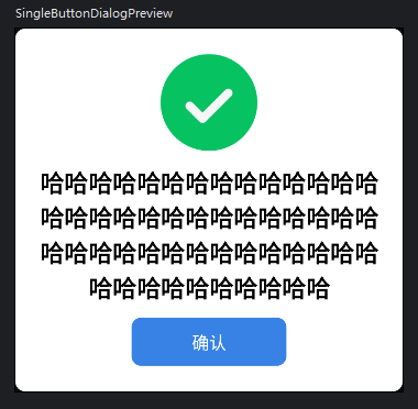
4.1 单按钮对话框
enum class DialogPic {
SUCCESS, ERROR, NOTIFY
}
@Preview
@Composable
private fun SingleButtonDialogPreview() {
SingleButtonDialog(
isShowDialog = true,
onDismissRequest = {},
pic = DialogPic.SUCCESS,
contentText = "哈哈哈哈哈哈哈哈哈哈哈哈哈哈哈哈哈哈哈哈哈哈哈哈哈哈哈哈哈哈哈哈哈哈哈哈哈哈哈哈哈哈哈哈哈哈哈哈哈哈哈哈",
buttonText = "确认",
onButtonClick = {}
)
}
/**
* 单按钮对话框
*/
@Composable
fun SingleButtonDialog(
isShowDialog: Boolean,
onDismissRequest: () -> Unit,
pic: DialogPic,
contentText: String,
onButtonClick: () -> Unit = onDismissRequest,
buttonText: String = "确认",
) {
if (isShowDialog) {
Dialog(
onDismissRequest = onDismissRequest,
properties = DialogProperties(
dismissOnBackPress = false,
dismissOnClickOutside = false
)
) {
Column(
modifier = Modifier
.width(AppDimens.widthDialog)
.height(AppDimens.heightDialog)
.background(
color = AppColors.White,
shape = RoundedCornerShape(AppDimens.radius)
)
.padding(AppDimens.paddingContent),
horizontalAlignment = Alignment.CenterHorizontally,
verticalArrangement = Arrangement.SpaceEvenly
) {
Image(
modifier = Modifier.size(AppDimens.dialogPic),
painter = painterResource(
when (pic) {
DialogPic.SUCCESS -> R.drawable.pic_success
DialogPic.ERROR -> R.drawable.pic_error
DialogPic.NOTIFY -> R.drawable.pic_notify
}
),
contentDescription = null
)
Text(
modifier = Modifier.wrapContentSize(Alignment.Center),
text = contentText,
fontWeight = FontWeight.Bold,
textAlign = TextAlign.Center,
fontSize = AppDimens.textTitle
)
FilledButton(
modifier = Modifier.width(128.dp),
text = buttonText,
onButtonClicked = onButtonClick
)
}
}
}
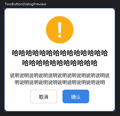
}4.2 双按钮对话框
enum class DialogPic {
    SUCCESS, ERROR, NOTIFY
}

@Preview
@Composable
private fun TwoButtonDialogPreview() {
    TwoButtonDialog(
        isShowDialog = true,
        onDismissRequest = {},
        pic = DialogPic.NOTIFY,
        contentText = "哈哈哈哈哈哈哈哈哈哈哈哈哈哈哈哈哈哈哈哈哈哈哈哈哈",
        noteText = "说明说明说明说明说明说明说明说明说明说明说明说明说明说明说明说明说明说明说明说明",
        positiveButtonText = "确认",
        negativeButtonText = "取消",
        isShowNote = true,
        onPositiveButtonClick = {},
        onNegativeButtonClicked = {}
    )
}

/**
 * 双按钮对话框
 */
@Composable
fun TwoButtonDialog(
    isShowDialog: Boolean,
    onDismissRequest: () -> Unit,
    pic: DialogPic,
    contentText: String,
    onPositiveButtonClick: () -> Unit,
    positiveButtonText: String = "确认",
    negativeButtonText: String = "取消",
    onNegativeButtonClicked: () -> Unit = onDismissRequest,
    isShowNote: Boolean = false,
    noteText: String = ""
) {
    if (isShowDialog) {
        Dialog(
            onDismissRequest = onDismissRequest,
            properties = DialogProperties(
                dismissOnBackPress = false,
                dismissOnClickOutside = false
            )
        ) {
            Column(
                modifier = Modifier
                    .width(AppDimens.widthDialog)
                    .height(AppDimens.heightDialog)
                    .background(
                        color = AppColors.White,
                        shape = RoundedCornerShape(AppDimens.radius)
                    )
                    .padding(AppDimens.paddingContent),
                horizontalAlignment = Alignment.CenterHorizontally,
                verticalArrangement = Arrangement.SpaceEvenly
            ) {
                Image(
                    modifier = Modifier.size(AppDimens.dialogPic),
                    painter = painterResource(
                        when (pic) {
                            DialogPic.SUCCESS -> R.drawable.pic_success
                            DialogPic.ERROR -> R.drawable.pic_error
                            DialogPic.NOTIFY -> R.drawable.pic_notify
                        }
                    ),
                    contentDescription = null
                )
                Text(
                    text = contentText,
                    fontWeight = FontWeight.Bold,
                    textAlign = TextAlign.Center,
                    fontSize = AppDimens.textTitle
                )
                if (isShowNote) {
                    Text(
                        text = noteText,
                        fontSize = AppDimens.textPrimary,
                        textAlign = TextAlign.Center
                    )
                }
                Row(
                    modifier = Modifier.fillMaxWidth(),
                    horizontalArrangement = Arrangement.Center
                ) {
                    StrokedButton(
                        text = negativeButtonText,
                        onButtonClicked = onNegativeButtonClicked
                    )
                    FilledButton(
                        modifier = Modifier.padding(start = 16.dp),
                        text = positiveButtonText,
                        onButtonClicked = onPositiveButtonClick
                    )
                }
            }
        }
    }
}
五、输入框
5.1 提示
5.1.1 无边框
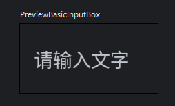
@Preview
@Composable
private fun BasicInputBoxPreview() {
    var text by remember { mutableStateOf("") }
    Box(
        modifier = Modifier
            .width(100.dp)
            .height(50.dp),
        contentAlignment = Alignment.Center
    ) {
        BasicInputBox(
            modifier = Modifier
                .width(194.dp)
                .height(37.dp),
            value = text,
            onValueChange = { text = it },
            hint = "请输入文字"
        )
    }
}

/**
 * 带提示的输入框
 */
@Composable
fun BasicInputBox(
    value: String,
    onValueChange: (String) -> Unit,
    modifier: Modifier = Modifier,
    hint: String = "",
    singleLine: Boolean = true,
    keyboardOptions: KeyboardOptions = KeyboardOptions.Default,
    keyboardActions: KeyboardActions = KeyboardActions.Default,
) {
    BasicTextField(
        modifier = modifier,
        value = value,
        onValueChange = onValueChange,
        keyboardOptions = keyboardOptions,
        keyboardActions = keyboardActions,
        singleLine = singleLine,
        textStyle = TextStyle.Default.copy(color = AppColors.Black, fontSize = AppDimens.textPrimary),
        decorationBox = { innerTextField ->
            Row(
                modifier = Modifier.padding(horizontal = AppDimens.marginContent),
                verticalAlignment = Alignment.CenterVertically
            ) {
                Box(contentAlignment = Alignment.CenterStart) {
                    if (value.isEmpty()) {
                        Text(
                            text = hint,
                            color = AppColors.Hint,
                            fontSize = AppDimens.textPrimary,
                            textAlign = TextAlign.Center
                        )
                    }
                    innerTextField()
                }
            }
        }
    )
}
5.1.2 有边框
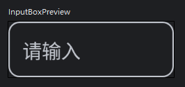
@Preview
@Composable
private fun BasicBorderInputBoxPreview() {
    var text by remember { mutableStateOf("") }
    Box(
        modifier = Modifier
            .width(250.dp)
            .height(50.dp),
        contentAlignment = Alignment.Center
    ) {
        BasicInputBox(
            modifier = Modifier
                .width(194.dp)
                .height(37.dp),
            value = text,
            onValueChange = { text = it },
            hint = "请输入文字",
        )
    }
}

/**
 * 带边框的基本输入框
 */
@Composable
fun BasicBorderInputBox(
    value: String,
    onValueChange: (String) -> Unit,
    modifier: Modifier = Modifier,
    hint: String = "",
    singleLine: Boolean = true,
    keyboardOptions: KeyboardOptions = KeyboardOptions.Default,
    keyboardActions: KeyboardActions = KeyboardActions.Default,
) {
    BasicTextField(
        modifier = modifier,
        value = value,
        onValueChange = onValueChange,
        keyboardOptions = keyboardOptions,
        keyboardActions = keyboardActions,
        singleLine = singleLine,
        textStyle = TextStyle.Default.copy(color = AppColors.TextContent, fontSize = 13.sp),
        decorationBox = { innerTextField ->
            Row(
                modifier = Modifier
                    .border(
                        width = 1.dp,
                        color = AppColors.TextHint,
                        shape = RoundedCornerShape(AppDimens.Radius_InputCorner)
                    )
                    .padding(horizontal = 10.dp),
                verticalAlignment = Alignment.CenterVertically
            ) {
                Box(contentAlignment = Alignment.CenterStart) {
                    if (value.isEmpty()) {
                        Text(text = hint, color = AppColors.TextHint, textAlign = TextAlign.Center)
                    }
                    innerTextField()
                }
            }
        }
    )
}
5.2 标签
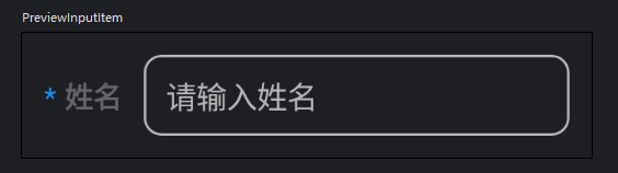
@Preview
@Composable
private fun LabelInputBoxPreview() {
    Box(modifier = Modifier.padding(10.dp)) {
        TextInputItem(
            title = "姓名",
            value = "",
            hint = "请输入姓名",
            required = true,
            onValueChange = {}
        )
    }
}

/**
 * 带标签的输入框
 */
@Composable
fun LabelInputBox(
    title: String,
    hint: String,
    value: String,
    onValueChange: (String) -> Unit,
    modifier: Modifier = Modifier,
    required: Boolean = false,   //是否必填(显示星号)
    singleLine: Boolean = true,
    keyboardOptions: KeyboardOptions = KeyboardOptions.Default,
    keyboardActions: KeyboardActions = KeyboardActions.Default,
) {
    Row(
        modifier = modifier,
        verticalAlignment = Alignment.CenterVertically
    ) {
        Text(
            text = buildAnnotatedString {
                if (required){
                    withStyle(
                        SpanStyle(fontSize = AppDimens.Text_InputLabel, color = AppColors.TextBlue)
                    ) { append("* ") }
                }
                withStyle(
                    SpanStyle(fontSize = AppDimens.Text_InputHint, color = AppColors.TextOption, fontWeight = FontWeight.Bold)
                ) { append(title) }
            }
        )
        BasicBorderInputBox(
            modifier = Modifier
                .padding(start = 10.dp)
                .width(194.dp)
                .height(37.dp),
            value = value,
            onValueChange = onValueChange,
            hint = hint,
            keyboardOptions = keyboardOptions,
            keyboardActions = keyboardActions,
            singleLine = singleLine
        )
    }
}
5.3 按钮(搜索栏)
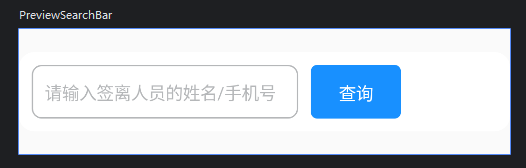
@Preview(showBackground = true)
@Composable
private fun PreviewSearchBar() {
    Box(
        modifier = Modifier
            .fillMaxWidth()
            .height(100.dp),
        contentAlignment = Alignment.Center
    ) {
        SearchBar(
            text = "",
            onTextChange = {},
            onSearchButtonClicked = {},
        )
    }
}

/**
 * 搜索栏
 */
@Composable
fun SearchBar(
    text: String,
    onTextChange: (String) -> Unit,
    onSearchButtonClicked: () -> Unit,
    modifier: Modifier = Modifier
) {
    Row(
        modifier = modifier
            .fillMaxWidth()
            .background(
                color = AppColors.White,
                shape = RoundedCornerShape(AppDimens.Radius_Background)
            )
            .padding(10.dp),
        verticalAlignment = Alignment.CenterVertically
    ) {
        BasicBorderInputBox(
            modifier = Modifier
                .height(43.dp)
                .width(213.dp),
            value = text,
            onValueChange = onTextChange,
            hint = "请输入签离人员的姓名/手机号",
            singleLine = true
        )
        FilledButton(
            modifier = Modifier
                .padding(start = 10.dp)
                .height(43.dp)
                .width(72.dp),
            text = "查询",
            onButtonClicked = onSearchButtonClicked
        )
    }
}
六、标题栏
6.1 屏幕标题栏
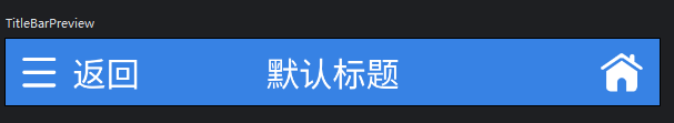
@Preview
@Composable
private fun TitleBarPreview() {
    ScreenTitleBar(
        title = "默认标题",
        isShowLeftButton = true,
        isShowRightButton = true
    )
}

@Composable
fun ScreenTitleBar(
    title: String,
    modifier: Modifier = Modifier,
    isShowLeftButton: Boolean = false,
    isShowLeftText: Boolean = false,
    isShowRightButton: Boolean = false,
    @DrawableRes leftPic: Int = R.drawable.icon_title_menu,
    @DrawableRes rightPic: Int = R.drawable.icon_title_home,
    leftText: String = "返回",
    onLeftClick: () -> Unit = {},
    onRightClick: () -> Unit = {}
) {
    Box(
        modifier = modifier
            .fillMaxWidth()
            .height(AppDimens.heightTitleBar)
            .background(color = AppColors.Primary)
            .padding(horizontal = 10.dp),
    ) {
        Row(
            modifier= Modifier
                .align(Alignment.CenterStart)
                .clickableNoRipple { onLeftClick() },
            verticalAlignment = Alignment.CenterVertically
        ) {
            if (isShowLeftButton) {
                Icon(
                    modifier = Modifier.size(20.dp),
                    painter = painterResource(id = leftPic),
                    contentDescription = null,
                    tint = AppColors.White
                )
            }
            if (isShowLeftText) {
                Text(
                    modifier = Modifier.padding(start = AppDimens.marginContent),
                    text = leftText,
                    color = AppColors.White,
                    fontSize = AppDimens.textTitle
                )
            }
        }
        Text(
            modifier= Modifier.align(Alignment.Center),
            text = title,
            color = AppColors.White,
            fontSize = AppDimens.textTitle,
            textAlign = TextAlign.Center
        )
        if (isShowRightButton) {
            Icon(
                modifier= Modifier
                    .size(25.dp)
                    .align(Alignment.CenterEnd)
                    .clickableNoRipple { onRightClick() },
                painter = painterResource(id = rightPic),
                contentDescription = null,
                tint = AppColors.White
            )
        }
    }
}
6.2 对话框标题栏
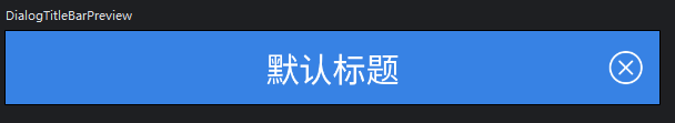
@Preview
@Composable
private fun DialogTitleBarPreview() {
    DialogTitleBar(
        title = "默认标题",
        onCloseButtonClick = {}
    )
}

@Composable
fun DialogTitleBar(
    title: String,
    onCloseButtonClick: () -> Unit
) {
    Box(
        modifier = Modifier
            .fillMaxWidth()
            .height(AppDimens.heightDialogTitleBar)
            .background(AppColors.Primary)
    ) {
        Text(
            modifier = Modifier.align(Alignment.Center),
            text = title,
            color = AppColors.White,
            fontSize = AppDimens.textTitle
        )
        Icon(
            modifier = Modifier
                .padding(end = AppDimens.paddingContent)
                .size(20.dp)
                .align(Alignment.CenterEnd)
                .clickableNoRipple { onCloseButtonClick() },
            painter = painterResource(R.drawable.icon_close),
            contentDescription = null,
            tint = AppColors.White
        )
    }
}
七、按钮
7.1 填充
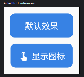
@Preview(showBackground = true)
@Composable
private fun FilledButtonPreview() {
    Column(
        modifier = Modifier.padding(10.dp),
        horizontalAlignment = Alignment.CenterHorizontally
    ) {
        FilledButton(
            text = "默认效果",
            onButtonClicked = {},
        )
        FilledButton(
            modifier = Modifier.padding(top = 10.dp),
            text = "显示图标",
            onButtonClicked = {},
            isShowLeft = true,
        )
    }
}

/**
 * 填充按钮
 */
@Composable
fun FilledButton(
    text: String,
    onButtonClicked: () -> Unit,
    modifier: Modifier = Modifier,
    textColor: Color = AppColors.White,
    backgroundColor: Color = AppColors.Primary,
    isShowLeft: Boolean = false,
    leftPic:  ImageVector? = null
) {
    Row(
        modifier = modifier
            .height(AppDimens.heightButton)
            .background(
                color = backgroundColor,
                shape = RoundedCornerShape(AppDimens.radius)
            )
            .padding(horizontal = if (isShowLeft) 13.dp else 25.dp)
            .clickableNoRipple { onButtonClicked() },
        verticalAlignment = Alignment.CenterVertically,
        horizontalArrangement = Arrangement.Center
    ) {
        if (isShowLeft) {
            Icon(
                modifier = Modifier
                    .padding(end = 5.dp)
                    .size(17.dp),
                imageVector = leftPic ?: Icons.Default.TouchApp,
                contentDescription = null,
                tint = AppColors.White
            )
        }
        Text(
            text = text,
            color = textColor,
            textAlign = TextAlign.Center,
            maxLines = 1,
            fontSize = AppDimens.textPrimary
        )
    }

}
7.2 描边
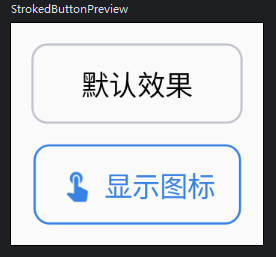
@Preview(showBackground = true)
@Composable
private fun StrokedButtonPreview() {
    Column(
        modifier = Modifier.padding(10.dp),
        horizontalAlignment = Alignment.CenterHorizontally,
    ) {
        StrokedButton(
            text = "默认效果",
            onButtonClicked = {}
        )
        StrokedButton(
            modifier = Modifier.padding(top = 10.dp),
            text = "显示图标",
            onButtonClicked = {},
            isShowLeft = true,
        )
    }
}

/**
 * 描边按钮
 */
@Composable
fun StrokedButton(
    text: String,
    onButtonClicked: () -> Unit,
    modifier: Modifier = Modifier,
    isShowLeft: Boolean = false,
    leftPic:  ImageVector? = null
) {
    Row(
        modifier = modifier
            .height(AppDimens.heightButton)
            .border(
                width = 1.dp,
                color = if (isShowLeft) AppColors.Primary else AppColors.Hint,
                shape = RoundedCornerShape(AppDimens.radius)
            )
            .padding(horizontal = if (isShowLeft) 13.dp else 25.dp)
            .clickableNoRipple { onButtonClicked() },
        verticalAlignment = Alignment.CenterVertically,
        horizontalArrangement = Arrangement.Center
    ) {
        if (isShowLeft) {
            Icon(
                modifier = Modifier
                    .padding(end = 5.dp)
                    .size(17.dp),
                imageVector = leftPic ?: Icons.Default.TouchApp,
                contentDescription = null,
                tint = AppColors.Primary
            )
        }
        Text(
            text = text,
            color = if (isShowLeft) AppColors.Primary else AppColors.Black,
            textAlign = TextAlign.Center,
            maxLines = 1,
            fontSize = AppDimens.textPrimary
        )
    }
}
7.3 展开
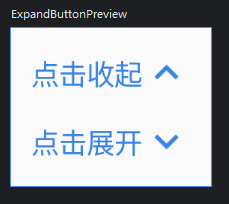
@Preview(showBackground = true)
@Composable
private fun ExpandButtonPreview() {
    Column(
        modifier = Modifier.padding(10.dp),
        horizontalAlignment = Alignment.CenterHorizontally,
    ) {
        ExpandButton(
            isExpand = true,
            onButtonClicked = {}
        )
        ExpandButton(
            modifier = Modifier.padding(top = 10.dp),
            isExpand = false,
            onButtonClicked = {}
        )
    }
}

/**
 * 展开按钮
 */
@Composable
fun ExpandButton(
    isExpand: Boolean,
    onButtonClicked: () -> Unit,
    modifier: Modifier = Modifier,
    expandText: String = "点击展开",
    collapseText: String = "点击收起",
    color: Color = AppColors.Primary,
) {
    Row(
        modifier = modifier
            .clickableNoRipple {
                onButtonClicked()
            },
        verticalAlignment = Alignment.CenterVertically
    ) {
        Text(
            text = if (isExpand) collapseText else expandText,
            color = color,
            fontSize = AppDimens.textPrimary
        )
        Icon(
            imageVector = if (isExpand) {
                Icons.Default.KeyboardArrowUp
            } else {
                Icons.Default.KeyboardArrowDown
            },
            contentDescription = null,
            tint = color
        )
    }
}
八、日期选择器
8.1 单日期
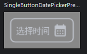
@Preview
@Composable
private fun SingleButtonDatePickerPreView() {
    var value by remember { mutableStateOf("选择时间") }
    PreviewView {
        SingleButtonDatePickerView(
            value = value,
            onValueChange = { value = it },
        )
    }
}

@OptIn(ExperimentalMaterial3Api::class)
@Composable
fun SingleButtonDatePickerView(
    modifier: Modifier = Modifier,
    value: String = "选择时间",
    onValueChange: (String) -> Unit,
    borderColor: Color = AppColors.Hint,
) {
    var isOpenDialog by remember { mutableStateOf(false) }
    var isDefaultValue by remember { mutableStateOf(true) }
    val datePickerState = rememberDatePickerState()
    val sdf = remember { SimpleDateFormat("yyy-MM-dd") }
    Row(
        modifier = modifier
            .height(AppDimens.heightButton)
            .border(
                width = 1.dp,
                color = borderColor,
                shape = RoundedCornerShape(AppDimens.radius)
            )
            .padding(horizontal = AppDimens.paddingContent)
            .clickableNoRipple { isOpenDialog = true },
        verticalAlignment = Alignment.CenterVertically,
        horizontalArrangement = Arrangement.SpaceBetween
    ) {
        Text(
            text = value,
            maxLines = 1,
            color = if(isDefaultValue) AppColors.Hint else AppColors.Black,
            fontSize = AppDimens.textPrimary,
        )
        Icon(
            modifier = Modifier.padding(start = 5.dp),
            imageVector = Icons.Default.CalendarMonth,
            contentDescription = null,
            tint = AppColors.Hint
        )
    }
    if (isOpenDialog) {
        DatePickerDialog(
            onDismissRequest = { isOpenDialog = false},
            colors = DatePickerDefaults.colors(containerColor = AppColors.White),   //背景色(这个在下面的DatePicker中设置无效)
            confirmButton = {
                Text(
                    modifier = Modifier
                        .clickableNoRipple {
                            val date = datePickerState.selectedDateMillis
                            if (date != null) {
                                onValueChange(sdf.format(date))
                                isDefaultValue = false
                            } else {
                                isDefaultValue = true
                            }
                            isOpenDialog = false
                        }
                        .padding(end = 20.dp),
                    text = "确定",
                    color = AppColors.Primary,
                    fontSize = AppDimens.textTitle
                )
            },
            dismissButton = {
                Text(
                    modifier = Modifier
                        .clickableNoRipple {
                            isOpenDialog = false
                        }
                        .padding(end = 20.dp),
                    text = "取消",
                    color = AppColors.textGray,
                    fontSize = AppDimens.textTitle
                )
            }
        ) {
            DatePicker(
                state = datePickerState,
                colors = DatePickerDefaults.colors(
                    todayDateBorderColor = AppColors.Primary,   //默认选中的当天日期的边框色
                    selectedDayContentColor = AppColors.White,  //选中的文字颜色
                    selectedDayContainerColor = AppColors.Primary,  //选中的填充颜色
                )
            )
        }
    }
}
8.2 双日期
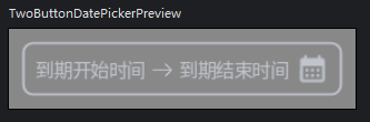
@Preview
@Composable
private fun TwoButtonDatePickerPreview() {
    var startDate by remember { mutableStateOf("到期开始时间") }
    var endDate by remember { mutableStateOf("到期结束时间") }
    PreviewView {
        TwoButtonDatePickerView(
            startDate = startDate,
            endDate = endDate,
            onStartChange = { startDate = it },
            onEndChange = { endDate = it },
        )
    }
}

@OptIn(ExperimentalMaterial3Api::class)
@Composable
fun TwoButtonDatePickerView(
    modifier: Modifier = Modifier,
    startDate: String = "开始时间",
    endDate: String = "结束时间",
    onStartChange: (String) -> Unit,
    onEndChange: (String) -> Unit,
    borderColor: Color = AppColors.Hint,
) {
    var isOpenStartDialog by remember { mutableStateOf(false) }
    var isOpenEndDialog by remember { mutableStateOf(false) }
    val startDatePickerState = rememberDatePickerState()
    val endDatePickerState = rememberDatePickerState()
    var isStartDateDefault by remember { mutableStateOf(true) }
    var isEndDateDefault by remember { mutableStateOf(true) }
    val sdf = remember { SimpleDateFormat("yyy-MM-dd") }
    Row(
        modifier = modifier
            .height(AppDimens.heightButton)
            .border(
                width = 1.dp,
                color = borderColor,
                shape = RoundedCornerShape(AppDimens.radius)
            )
            .padding(horizontal = AppDimens.paddingContent),
        verticalAlignment = Alignment.CenterVertically,
    ) {
        Text(
            modifier = Modifier.clickableNoRipple { isOpenStartDialog = true },
            text = startDate,
            color = if (isStartDateDefault) AppColors.Hint else AppColors.Black,
            maxLines = 1,
            fontSize = AppDimens.textPrimary
        )
        Icon(
            modifier = Modifier
                .size(25.dp)
                .padding(horizontal = 5.dp),
            painter = painterResource(id = R.drawable.icon_arrow_right),
            contentDescription = null,
            tint = AppColors.Hint
        )
        Text(
            modifier = Modifier.clickableNoRipple { isOpenEndDialog = true },
            text = endDate,
            color = if (isEndDateDefault) AppColors.Hint else AppColors.Black,
            maxLines = 1,
            fontSize = AppDimens.textPrimary
        )
        Icon(
            modifier = Modifier.padding(start = 5.dp),
            imageVector = Icons.Default.CalendarMonth,
            contentDescription = null,
            tint = AppColors.Hint
        )
    }
    if (isOpenStartDialog) {
        DatePickerDialog(
            onDismissRequest = { isOpenStartDialog = false},
            colors = DatePickerDefaults.colors(containerColor = AppColors.White),
            confirmButton = {
                Text(
                    modifier = Modifier
                        .clickableNoRipple {
                            val date = startDatePickerState.selectedDateMillis
                            if (date != null) {
                                onStartChange(sdf.format(date))
                                isStartDateDefault = false
                            } else {
                                isStartDateDefault = true
                            }
                            isOpenStartDialog = false
                        }
                        .padding(end = 20.dp),
                    text = "确定",
                    color = AppColors.Primary,
                    fontSize = AppDimens.textTitle
                )
            },
            dismissButton = {
                Text(
                    modifier = Modifier
                        .clickableNoRipple {
                            isOpenStartDialog = false
                        }
                        .padding(end = 20.dp),
                    text = "取消",
                    color = AppColors.textGray,
                    fontSize = AppDimens.textTitle
                )
            }
        ) {
            DatePicker(
                state = startDatePickerState,
                colors = DatePickerDefaults.colors(
                    todayDateBorderColor = AppColors.Primary,
                    selectedDayContentColor = AppColors.White,
                    selectedDayContainerColor = AppColors.Primary,
                )
            )
        }
    }
    if (isOpenEndDialog) {
        DatePickerDialog(
            onDismissRequest = { isOpenEndDialog = false},
            colors = DatePickerDefaults.colors(containerColor = AppColors.White),
            confirmButton = {
                Text(
                    modifier = Modifier
                        .clickableNoRipple {
                            val date = endDatePickerState.selectedDateMillis
                            if (date != null) {
                                onEndChange(sdf.format(date))
                                isEndDateDefault = false
                            } else {
                                isEndDateDefault = true
                            }
                            isOpenEndDialog = false
                        }
                        .padding(end = 20.dp),
                    text = "确定",
                    color = AppColors.Primary,
                    fontSize = AppDimens.textTitle
                )
            },
            dismissButton = {
                Text(
                    modifier = Modifier
                        .clickableNoRipple {
                            isOpenEndDialog = false
                        }
                        .padding(end = 20.dp),
                    text = "取消",
                    color = AppColors.textGray,
                    fontSize = AppDimens.textTitle
                )
            }
        ) {
            DatePicker(
                state = endDatePickerState,
                colors = DatePickerDefaults.colors(
                    containerColor = AppColors.White,
                    todayDateBorderColor = AppColors.Primary,
                    selectedDayContentColor = AppColors.White,
                    selectedDayContainerColor = AppColors.Primary,
                )
            )
        }
    }
}
九、预览
9.1 屏幕
/**
 * 带上主题以1920*1080预览
 */
@Composable
fun PreviewScreen(
    content: @Composable () -> Unit
) {
    AppTheme {
        Box(modifier = Modifier
            .width(960.dp)
            .height(540.dp)
            .background(color = AppColors.Background),
            contentAlignment = Alignment.Center
        ) {
            content()
        }
    }
}
9.2 控件
@Composable
fun PreviewView(
    background: Color? = null,
    isPaddingMode: Boolean = true,
    content: @Composable () -> Unit
) {
    AppTheme {
        if (isPaddingMode) {
            Box(modifier = Modifier
                .background(background ?: Color.Gray)
                .padding(10.dp),
                contentAlignment = Alignment.Center
            ) {
                content()
            }
        } else {
            Box(modifier = Modifier
                .width(360.dp)
                .height(300.dp)
                .background(background ?: Color.Gray),
                contentAlignment = Alignment.Center
            ) {
                content()
            }
        }

    }
}
十、平板强制横屏,手机强制竖屏
fun isPad(context: Context): Boolean {
    val isPad = context.resources.configuration.screenLayout and(Configuration.SCREENLAYOUT_SIZE_MASK) >= Configuration.SCREENLAYOUT_SIZE_LARGE
    val wm = context.getSystemService(Context.WINDOW_SERVICE) as WindowManager
    val display = wm.defaultDisplay
    val dm = DisplayMetrics()
    display.getMetrics(dm)
    val x = (dm.widthPixels / dm.xdpi).pow(2)
    val y = (dm.heightPixels / dm.ydpi).pow(2)
    val screenInches = sqrt(x + y)
    return isPad || screenInches >= 7.0
}

Activity{
    requestedOrientation = if (MachineUtil.isPad(APP.context)) {
        ActivityInfo.SCREEN_ORIENTATION_SENSOR_LANDSCAPE
    } else {
        ActivityInfo.SCREEN_ORIENTATION_PORTRAIT
    }
}


 4757
4757

 被折叠的 条评论
为什么被折叠?
被折叠的 条评论
为什么被折叠?
 到【灌水乐园】发言


