


一、简介
QML是Qt推出的Qt Quick技术的一部分,它可以快速便捷实现流畅的UI。
QT Quick布局一般有四种形式,
①. 绝对坐标:x、y、z、width、height、
②. 锚(anchors) 布局
③. 定位器(Row、Column、Grid、Flow)
④. 布局管理器(GridLayout、RowLayout、ColumnLayout)。
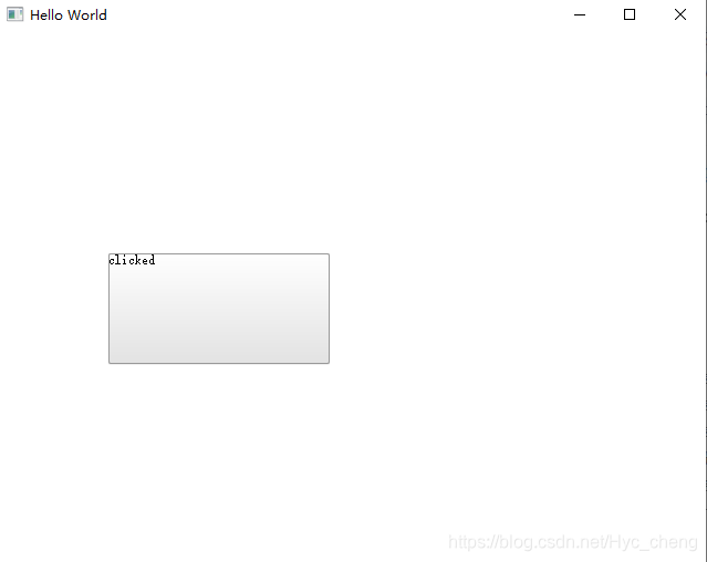
二、绝对坐标布局
import QtQuick 2.9
import QtQuick.Window 2.2
import QtQuick.Controls 1.4

Window {
    visible: true
    width: 640
    height: 480
    title: qsTr("Hello World")

    Button{
        x:100
        y:200

        width: 200
        height: 100

        Text {
            id: btntxt
            text: qsTr("my text")
        }

        onClicked: {
            btntxt.text = "clicked"
        }
    }
}
通过对Button控件 x、y 、width、height 的绝对布局,能够使其显示在我们指定的位置上,但是不建议使用此方法,扩展性太差。
运行效果如下:
三、锚(anchors) 布局
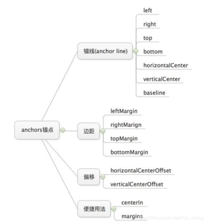
本文将会从以下四个方面来讲解锚点布局,分别是锚线、边距、偏移以及便捷用法。首先给出下面的结构图,一方面可以让大家在总体上对锚点布局的内容有一个框架,另一方面也方便后续知识的回顾梳理。先安静下来,花几分钟熟悉下总体知识结构,然后再往下阅读,阅读完成之后,再回来看看是否知识结构更加清晰明了。
1、布局简介
锚点布局anchor, 对于第一次接触QML的新手来说,可能稍微比较难理解,这里可以这么理解, 锚是船停泊时所用的器具,用来固定船只。对于界面布局来说,就是用来固定部件的位置。锚点布局使用anchors附件属性将一个元素的边定位到另一个元素的边,从而确定元素的位置和大小。
2、位置布局
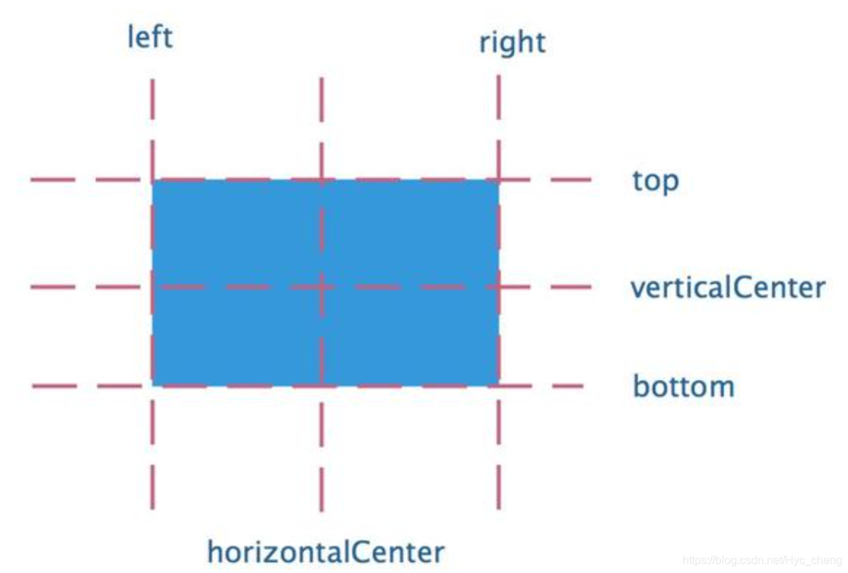
一个部件有七个锚线(anchor lines), 分别是left、right、top、bottom、horizontalCenter、verticalCenter和baseline。这里的anchor lines都是不可见的。
下图所示,蓝色区域代表一个部件,用虚线来代表锚线,left代表部件的左锚线、right代表部件的右锚线、top代表部件的顶部锚线、bottom代表部件的底部锚线、horizontalCenter代表部件的水平居中锚线、vertialCenter代表部件的垂直居中锚线。
至于baseline锚线,这里没有搞明白他的具体效果,所以没有画出。QT的官方文档说是baseline是标示文本的虚线,对于没有文本的部件,功能等同于top。
import QtQuick 2.9
import QtQuick.Window 2.2
import QtQuick.Controls 1.4
Window {
visible: true //表示部件可见
width: 640
height: 480
title: qsTr("Hello World")
Rectangle{
anchors.fill: parent //锚布局的快捷方式,表示部件的填充范围,其实相当于设置部件的宽度和高度
width: 300 // 由于上面锚布局已经设置了部件的填充范围,所以这里的宽度不起作用了
height: 300 // 由于上面锚布局已经设置了部件的填充范围,所以这里的高度不起作用了
color:"yellow"
anchors.margins: { //设置部件的边距
left:20
right:20
top:20
bottom:20
}
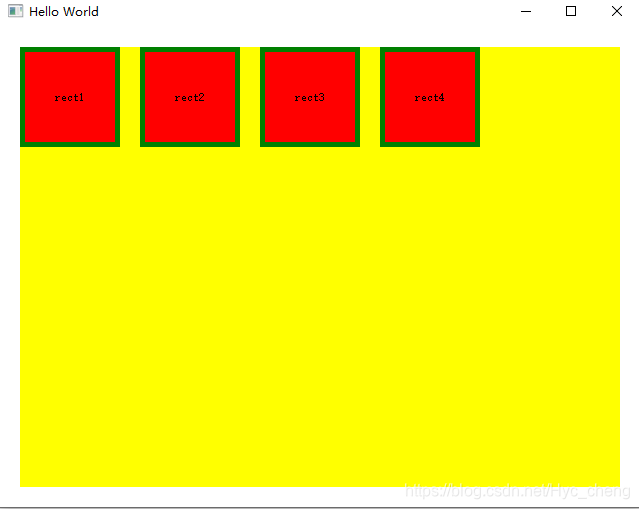
Rectangle{
id:rect1
width: 100
height: 100
anchors.left: parent.left //将rect1部件的左边设置为父项的左边,也就是左对齐
color: "red"
border.width: 5 //设置 部件的边框
border.color: "green"
Text {
id: rect1txt
anchors.centerIn: parent //锚布局的快捷方式,表示部件相对于父项居中对齐,也就是让文字显示在部件的中间。 表示位置为目标对象的中心,相当于同时设置了horizontalCenter和verticalCenter。
text: qsTr("rect1")
}
}
Rectangle{
id:rect2
width: 100
height: 100
anchors.left: rect1.right //将rect2部件的左边设置为rect1部件的右边,也就是两个部件从左到右这样子排列
border.width: 5 //设置 部件的边框
border.color: "green"
color: "red"
anchors.margins: { //设置部件的边距
left:20 //左边距设置为20,其实是将每个矩形部件设置一定的间隙
}
Text {
id: rect2txt
anchors.centerIn: parent
text: qsTr("rect2")
}
}
Rectangle{
id:rect3
width: 100
height: 100
anchors.left: rect2.right //将rect3部件的左边设置为rect2部件的右边,也就是三个部件从左到右这样子排列
color: "red"
border.width: 5 //设置 部件的边框
border.color: "green"
anchors.margins: {
left:20//左边距设置为20,其实是将每个矩形部件设置一定的间隙
}
Text {
id: rect3txt
anchors.centerIn: parent
text: qsTr("rect3")
}
}
Rectangle{
id:rect4
width: 100
height: 100
anchors.left: rect3.right //将rect4部件的左边设置为rect3部件的右边,也就是四个部件从左到右这样子排列
color: "red"
border.width: 5 //设置 部件的边框
border.color: "green"
anchors.margins: {
left:20//左边距设置为20,其实是将每个矩形部件设置一定的间隙
}
Text {
id: rect4txt
anchors.centerIn: parent
text: qsTr("rect4")
}
}
}
}
运行效果如下:
anchor也提供简易设置位置的方式,如centerIn, 表示位置为目标对象的中心,相当于同时设置了horizontalCenter和verticalCenter。比如上面例子中文本的设置anchors.centerIn: parent,表示将文本信息位置设置为父级的中心。
注意,我们采用anchor进行布局的时候,如果单单设置一个属性是没有办法确定其位置,这可能导致部件没有办法显示出来。比如如果rect1没有设置height, 那么rect1就不会显示。如果不想要显示设置rect1的高度,那么除了设置rect1左侧的锚线,还需要设置它的顶部和底部的锚线。
3、CSS盒子模型
上面有关margins 、border的属性介绍,可查看下图的盒子模型介绍。
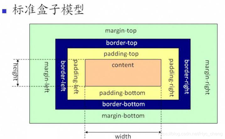
CSS盒模型(Box Model)规定了元素框处理元素内容、内边距、边框和外边距的方式。
1、content 是显示内容矩形区域,平时我们设置的最小宽度或者高度,就是定义这个矩形区。
2、padding是包围content的矩形区域,通过padding属性可以定义padding的上、下、左、右宽度,其实padding就是我们俗称的内边距。
3、border是包围padding的边框,通过border属性可以定义边框的线型和颜色,也可以分别定义border的上下左右的线宽和颜色。使用border-radius可以定义边框转角的圆弧半径,从而构造具有圆角矩形的编辑或按钮等组件。
4、margin是border之外与父组件之间的空白边距,我们一般称之为外边距,可以分别定义上下左右的边距大小。
4、偏移
anchor可以设置部件的偏移,分别为horizontalCenterOffset, verticalCenterOffset 和baselineOffset,表示水平中心的偏移、垂直中心的偏移、基线的偏移。
import QtQuick 2.9
import QtQuick.Window 2.2
import QtQuick.Controls 1.4

Window {
    visible: true //表示部件可见
    width: 640
    height: 480
    title: qsTr("Hello World")


    Rectangle{
        anchors.fill: parent //锚布局的快捷方式,表示部件的填充范围,其实相当于设置部件的宽度和高度
        width: 300  // 由于上面锚布局已经设置了部件的填充范围,所以这里的宽度不起作用了
        height: 300 // 由于上面锚布局已经设置了部件的填充范围,所以这里的高度不起作用了
        color:"yellow"
        anchors.margins: { //设置部件的边距
            left:20
            right:20
            top:20
            bottom:20
        }

        Rectangle{
            id:rect1
            width: 100
            height: 100
            anchors.left: parent.left //将rect1部件的左边设置为父项的左边,也就是左对齐
            color: "red"
            border.width: 5 //设置 部件的边框
            border.color: "green"

            Text {
                id: rect1txt
                anchors.centerIn: parent  //锚布局的快捷方式,表示部件相对于父项,居中对齐,也就是让文字显示在部件的中间
                text: qsTr("rect1")
            }
        }
        Rectangle{
            id:rect2
            width: 100
            height: 100
            anchors.left: rect1.right //将rect2部件的左边设置为rect1部件的右边,也就是两个部件从左到右这样子排列
            border.width: 5 //设置 部件的边框
            border.color: "green"
            color: "red"

            anchors.margins: { //设置部件的边距
                left:20  //左边距设置为20,其实是将每个矩形部件设置一定的间隙
            }
            Text {
                id: rect2txt
                anchors.centerIn: parent
                text: qsTr("rect2")
            }
        }

        Rectangle{
            id:rect3
            width: 100
            height: 100
            anchors.left: rect2.right //将rect3部件的左边设置为rect2部件的右边,也就是三个部件从左到右这样子排列
            color: "red"
            border.width: 5 //设置 部件的边框
            border.color: "green"

            anchors.margins: {
                left:20//左边距设置为20,其实是将每个矩形部件设置一定的间隙
            }
            Text {
                id: rect3txt
                anchors.centerIn: parent
                text: qsTr("rect3")
            }
        }

        Rectangle{
            id:rect4
            width: 100
            height: 100
            anchors.left: rect3.right //将rect4部件的左边设置为rect3部件的右边,也就是四个部件从左到右这样子排列
            color: "red"
            border.width: 5 //设置 部件的边框
            border.color: "green"

            anchors.margins: {
                left:20//左边距设置为20,其实是将每个矩形部件设置一定的间隙
            }
            Text {
                id: rect4txt
                anchors.centerIn: parent
                text: qsTr("rect4")
            }
        }
        //****************************设置部件的偏移****************************/
        Rectangle{
            id:rect5
            width: 100
            height: 100
            anchors.centerIn: parent //设置控件rect5显示在父组件的中间
            anchors.horizontalCenterOffset: 30 //水平方向偏移30像素点
            anchors.verticalCenterOffset: 30 //垂直方向偏移30像素点
            color: "red"
            border.width: 5 //设置 部件的边框
            border.color: "green"

            Text {
                id: rect5txt
                anchors.centerIn: parent
                text: qsTr("rect5")
            }
        }
    }
}
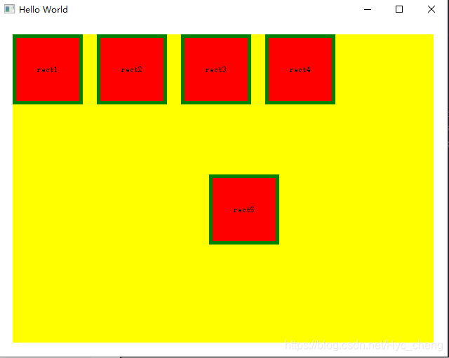
如上rect5部件,添加部件rect5, 设置显示在窗体中心,但是偏向右下角30个像素,运行效果如下:
5、局限
anchor布局也有局限性,出于性能考虑,部件只能设置锚点为同级或者直接父级。
6、anchor.fill // 设置部件范围
7、例子
import QtQuick 2.9
import QtQuick.Window 2.2
import QtQuick.Controls 1.4

Window {
    visible: true //表示部件可见
    width: 640
    height: 480
    title: qsTr("Hello World")

    property string txt: "这是一个文本,最上边水平居中对齐"

    //1). Text 靠最上边,且水平居中。
    Text {
        id: txt1;

        anchors.horizontalCenter:  parent.horizontalCenter;    //水平居中
        anchors.topMargin: 20;

        text: txt;
        color: "red";
        font.pixelSize: 32;  //像素大小
    }
    //2、方框跟文字水平左对齐
    Rectangle{
        id:rect1
        width: 300
        height: 40
        color: "blue"
        radius: 5
        border.color: "black"
        border.width: 3
        anchors.top: txt1.bottom
        anchors.left: txt1.left
        anchors.topMargin: 30

        TextInput{
            id:input1
            width: parent.width-20
            height: parent.height-10

            anchors.centerIn: parent
        }
    }
    //3、按钮,跟rect1水平右对齐
    Button{
        id:btn1
        width: 100
        height: 50
        anchors.right: rect1.right
        anchors.top: rect1.bottom
        anchors.topMargin: 20
        Text {
            id: btn1txt
            text: qsTr("btn1")
            color: "green"
            font.pixelSize: 24
            anchors.centerIn: parent

        }
    }

    //4、显示一张图片
    Image{
        anchors.centerIn: parent
        anchors.horizontalCenterOffset: 20
        anchors.verticalCenterOffset:  20

        source: "qrc:/new/prefix1/停止闪喷.png"
        fillMode: Image.PreserveAspectFit//按比列填充,不会变形
    }
}
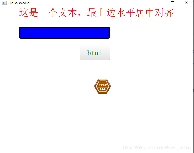
效果如下:
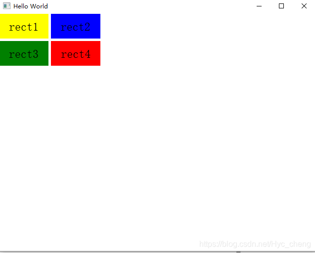
四、定位器(Row、Column、Grid、Flow)
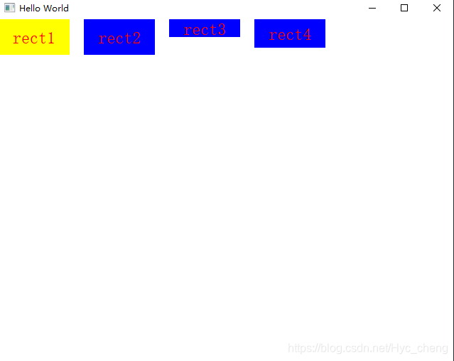
1、Row
“Row”是一种将其子项放在一行上的类型。 它可以用作在不使用锚的情况下水平放置一系列项目的便捷方法。
下面是包含三个不同大小的矩形的行:
  import QtQuick 2.0

  Row {
      spacing: 2
      Rectangle { color: "red"; width: 50; height: 50 }
      Rectangle { color: "green"; width: 20; height: 50 }
      Rectangle { color: "blue"; width: 50; height: 20 }
  }
效果如下:

如果“行”中的某个项目不可见,或者其宽度或高度为0,则该项目将不会布局,并且在行中也不可见。 此外,由于行自动将其子项水平放置,因此,行中的子项不应设置其x位置,也不应使用left,right,anchor.horizontalCenter,fill或centerIn锚点水平锚定自身。 如果需要执行这些操作,请考虑在不使用“行”的情况下放置项目。
请注意,“行”中的项目可以使用“定位器”附加属性来访问有关其在“行”中位置的更多信息。
当然,在Row中使用锚布局也是可以的,但是只是官方文档不建议这样子,因为这样子没有太大的意义。比如:
import QtQuick 2.9
import QtQuick.Window 2.2
import QtQuick.Controls 1.4

Window {
    visible: true //表示部件可见
    width: 640
    height: 480
    title: qsTr("Hello World")

    Row{
        id:row1
        anchors.fill: parent

        Rectangle{
            id:rect1
            color: "yellow"
            anchors.top: parent.top
            anchors.left: parent.left
            width: 100
            height: 50

            Text {
                id: rect1txt
                text: qsTr("rect1")
                anchors.centerIn: parent
                color: "red"
                font.pixelSize: 24
            }
        }
        Rectangle{
            id:rect2
            color: "blue"
            width: 100
            height: 50
            anchors.top: parent.top
            anchors.left: rect1.right
            anchors.leftMargin: 20
            Text {
                id: rect2txt
                text: qsTr("rect2")
                anchors.centerIn: parent
                color: "red"
                 font.pixelSize: 24
            }
        }
        Rectangle{
            id:rect3
            color: "blue"
            width: 100
            height: 25
            anchors.top: parent.top
            anchors.left: rect2.right
            anchors.leftMargin: 20
            Text {
                id: rect3txt
                text: qsTr("rect3")
                anchors.centerIn: parent
                color: "red"
                 font.pixelSize: 24
            }
        }
        Rectangle{
            id:rect4
            color: "blue"
            width: 100
            height: 40
            anchors.top: parent.top
            anchors.left: rect3.right
            anchors.leftMargin: 20
            Text {
                id: rect4txt
                text: qsTr("rect4")
                anchors.centerIn: parent
                color: "red"
                 font.pixelSize: 24
            }
        }
    }
}
运行效果如下:
在这里如果去掉Row定位器,其实结果也是一样的。
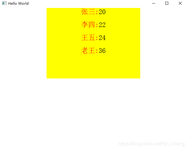
2、Column
上面的Row其实是行布局,而Column则是 列布局,很多时候这两个可以互相嵌套,代码如下:
import QtQuick 2.9
import QtQuick.Window 2.2
import QtQuick.Controls 1.4

Window {
    visible: true //表示部件可见
    width: 640
    height: 480
    title: qsTr("Hello World")


    Rectangle{
        id:rect1
        width: parent.width/2
        height: parent.height/2
        anchors.horizontalCenter: parent.horizontalCenter
        color: "yellow"

        Column{
            id:columm1
            anchors.horizontalCenter: parent.horizontalCenter

            spacing: 20

            property var stuinfo: ["张三:","李四:","王五:","老王:"]
            property var val: [20,22,24,36]

            Row{
                id:row0
                Text {
                    id: row0txt1
                    text: columm1.stuinfo[0]
                    font.pixelSize: 24
                    color:"red"
                }
                Text{
                    id:row0txt2
                    text: columm1.val[0]
                    font.pixelSize: 24
                }
            }
            Row{
                id:row1
                Text {
                    id: row1txt1
                    text: columm1.stuinfo[1]
                    font.pixelSize: 24
                    color:"red"
                }
                Text{
                    id:row1txt2
                    text: columm1.val[1]
                    font.pixelSize: 24
                }

            }
            Row{
                id:row2
                Text {
                    id: row2txt1
                    text: columm1.stuinfo[2]
                    font.pixelSize: 24
                    color:"red"
                }
                Text{
                    id:row2txt2
                    text: columm1.val[2]
                    font.pixelSize: 24
                }

            }
            Row{
                id:row3
                Text {
                    id: row3txt1
                    text: columm1.stuinfo[3]
                    font.pixelSize: 24
                    color:"red"
                }
                Text{
                    id:row3txt2
                    text: columm1.val[3]
                    font.pixelSize: 24
                }

            }
        }
    }
}
效果如下:
3、Grid
Grid是一种将其子项放置在网格结构中的类型。
Grid会创建一个单元格网格,该单元格足够容纳其所有子项,并将这些项从左到右以及从上到下放置在单元格中。 每个项目都位于其单元格的左上角,位置为(0,0)。
Grid默认为四列,并根据其所有子项创建所需的行数。 可以通过设置行和列属性来限制行和列的数量。
import QtQuick 2.9
import QtQuick.Window 2.2
import QtQuick.Controls 1.4
import QtQuick.Layouts 1.0

Window {
    visible: true //表示部件可见
    width: 640
    height: 480
    title: qsTr("Hello World")

    Grid{
        id:grid1
        anchors.fill: parent
        anchors.topMargin: 0
        rows:2
        columns: 2
        rowSpacing: 5
        columnSpacing: 5

        Rectangle{
            id:rect1
            color: "yellow"
            width: 100
            height: 50
            Text {
                id: rect1txt
                text: "rect1"
                anchors.centerIn: parent

                font.pixelSize: 24
            }
        }
        Rectangle{
            id:rect2
            color: "blue"
            width: 100
            height: 50
            Text {
                id: rect2txt
                text: "rect2"
                anchors.centerIn: parent

                font.pixelSize: 24
            }
        }
        Rectangle{
            id:rect3
            color: "green"
            width: 100
            height: 50
            Text {
                id: rect3txt
                text: "rect3"
                anchors.centerIn: parent

                font.pixelSize: 24
            }
        }
        Rectangle{
            id:rect4
            color: "red"
            width: 100
            height: 50
            Text {
                id: rect4txt
                text: "rect4"
                anchors.centerIn: parent

                font.pixelSize: 24
            }
        }
    }
}
运行效果如下:
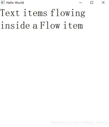
4、Flow
Flow项目将其子项目(如单词)放置在页面上,将它们包装起来以创建项目的行或列。
如果流程中的某个项目不可见,或者其宽度或高度为0,则该项目将不会布局,并且在流程中也不可见。 同样,由于Flow自动定位其子项,因此Flow中的子项不应设置其x或y位置,也不应使用任何锚点属性对其自身进行锚点。
有关使用Flow和其他相关定位器类型的更多信息,请参见项目定位器。
import QtQuick 2.9
import QtQuick.Window 2.2
import QtQuick.Controls 1.4
import QtQuick.Layouts 1.0

Window {
    visible: true //表示部件可见
    width: 640
    height: 480
    title: qsTr("Hello World")

    Flow {
        anchors.fill: parent
        anchors.margins: 4
        spacing: 10

        Text { text: "Text"; font.pixelSize: 40 }
        Text { text: "items"; font.pixelSize: 40 }
        Text { text: "flowing"; font.pixelSize: 40 }
        Text { text: "inside"; font.pixelSize: 40 }
        Text { text: "a"; font.pixelSize: 40 }
        Text { text: "Flow"; font.pixelSize: 40 }
        Text { text: "item"; font.pixelSize: 40 }
    }
}
运行效果如下:
五、布局管理器
布局管理器布局有GridLayout、ColumnLayout、RowLayout、Column、Row,其中ColumnLayout、RowLayout只是GridLayout的一种特例,ColumnLayout表示只有一列,RowLayout表示只有一行。
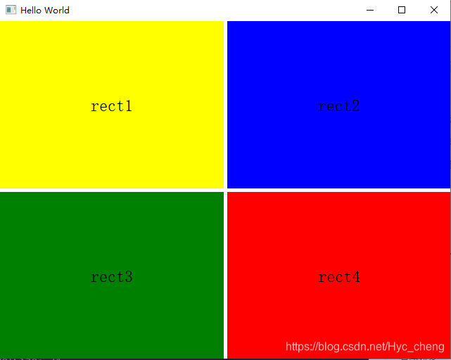
1、GridLayout
GridLayout使用columns、rows属性将空间分成若干单元格,使用columnSpacing、rowSpacing确立单元格之间的间隔。而GridLayout内部元素的大小由Layout.fillWidth、Layout.fillHeight以及Layout.preferredWidth、Layout.preferredHeight来确定,如Layout.fillWidth:true表示宽度填充整个单元格,Layout.preferredWidth则指定一个建议宽度。Layout.row、Layout.column确定内部元素处于哪个单元格。注意,不要将内部元素的宽度、高度、x、y与GridLayout进行绑定,容易导致绑定循环。
Column、Row类似于html中的float或是wpf中的StackPanel,会直接将元素一个个挨在一起,元素间的间隔使用spacing控制.
需要注意的是,Grid 和 GridLayout是两个不同的QML类型。Grid是作为网格定位器,没有布局功能,也就是说Grid里面的子项必须设置 宽度和高度,否则无法显示;而GridLayout是栅格布局管理器,里面的子项会按照栅格的形式进行布局。所以注意要区分两者的区别。其实对比上面Grid和下面GridLayout的例子,都可以发现其中的区别,Grid里面的子项指定了宽度和高度,而且显示出来也是没有布局的形式,而下面的GridLayout例子中,里面的子项没有指定宽度和高度,而且显示出来的效果是布局的形式。
GridLayout中的项目支持以下附加属性:
Layout.row
Layout.column
Layout.rowSpan
Layout.columnSpan
Layout.minimumWidth
Layout.minimumHeight
Layout.preferredWidth
Layout.preferredHeight
Layout.maximumWidth
Layout.maximumHeight
Layout.fillWidth
Layout.fillHeight
Layout.alignment
Layout.margins
Layout.leftMargin
Layout.rightMargin
Layout.topMargin
Layout.bottomMargin
import QtQuick 2.9
import QtQuick.Window 2.2
import QtQuick.Controls 1.4
import QtQuick.Layouts 1.0

Window {
    visible: true //表示部件可见
    width: 640
    height: 480
    title: qsTr("Hello World")

    GridLayout{
        id:gridlayout1
        anchors.fill: parent
        anchors.topMargin: 0
        rows:2
        columns: 2
        rowSpacing: 5
        columnSpacing: 5

        Rectangle{
            id:rect1
            color: "yellow"
            Layout.fillWidth: true
            Layout.fillHeight: true

            Text {
                id: rect1txt
                text: "rect1"
                anchors.centerIn: parent

                font.pixelSize: 24
            }
        }
        Rectangle{
            id:rect2
            color: "blue"
            Layout.fillWidth: true
            Layout.fillHeight: true

            Text {
                id: rect2txt
                text: "rect2"
                anchors.centerIn: parent

                font.pixelSize: 24
            }
        }
        Rectangle{
            id:rect3
            color: "green"
            Layout.fillWidth: true
            Layout.fillHeight: true

            Text {
                id: rect3txt
                text: "rect3"
                anchors.centerIn: parent

                font.pixelSize: 24
            }
        }
        Rectangle{
            id:rect4
            color: "red"
            Layout.fillWidth: true
            Layout.fillHeight: true

            Text {
                id: rect4txt
                text: "rect4"
                anchors.centerIn: parent

                font.pixelSize: 24
            }
        }
    }
}
运行效果如下:
2、RowLayout
与GridLayout相同,但只有一行。 RowLayout 其实就是跟我们QT widget传统的水平布局是一样的。但是这里需要注意的是,RowLayout 和上面所说的Row 还是有区别的,Row只是作为一行的定位器,并不提供一行的布局功能。
它提供了更简洁的API,为开发人员提供了便利。
RowLayout中的项目支持以下附加属性:
Layout.minimumWidth
Layout.minimumHeight
Layout.preferredWidth
Layout.preferredHeight
Layout.maximumWidth
Layout.maximumHeight
Layout.fillWidth
Layout.fillHeight
Layout.alignment
Layout.margins
Layout.leftMargin
Layout.rightMargin
Layout.topMargin
Layout.bottomMargin
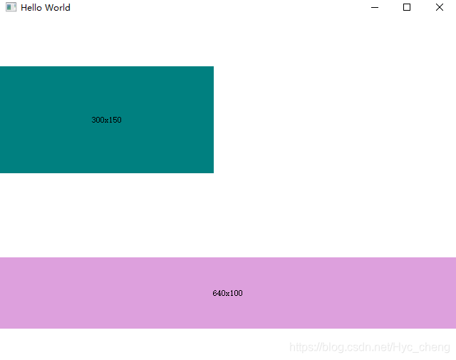
import QtQuick 2.9
import QtQuick.Window 2.2
import QtQuick.Controls 1.4
import QtQuick.Layouts 1.0

Window {
    visible: true //表示部件可见
    width: 640
    height: 480
    title: qsTr("Hello World")


    RowLayout {
         id: layout
         anchors.fill: parent
         spacing: 6
         Rectangle {
             color: 'teal'
             Layout.fillWidth: true //尽可能填充宽度
             Layout.minimumWidth: 50
             Layout.preferredWidth: 100
             Layout.maximumWidth: 300
             Layout.minimumHeight: 150
             Text {
                 anchors.centerIn: parent
                 text: parent.width + 'x' + parent.height
             }
         }
         Rectangle {
             color: 'plum'
             Layout.fillWidth: true
             Layout.minimumWidth: 100
             Layout.preferredWidth: 200
             Layout.preferredHeight: 100
             Text {
                 anchors.centerIn: parent
                 text: parent.width + 'x' + parent.height
             }
         }
     }

}
运行效果如下:

3、ColumnLayout
ColumnLayout 的用法与 RowLayout是差不多的,只不过ColumnLayout 是一列的垂直布局。
import QtQuick 2.9
import QtQuick.Window 2.2
import QtQuick.Controls 1.4
import QtQuick.Layouts 1.0

Window {
    visible: true //表示部件可见
    width: 640
    height: 480
    title: qsTr("Hello World")

    ColumnLayout {
         id: layout
         anchors.fill: parent
         spacing: 6
         Rectangle {
             color: 'teal'
             Layout.fillWidth: true
             Layout.minimumWidth: 50
             Layout.preferredWidth: 100
             Layout.maximumWidth: 300
             Layout.minimumHeight: 150
             Text {
                 anchors.centerIn: parent
                 text: parent.width + 'x' + parent.height
             }
         }
         Rectangle {
             color: 'plum'
             Layout.fillWidth: true
             Layout.minimumWidth: 100
             Layout.preferredWidth: 200
             Layout.preferredHeight: 100
             Text {
                 anchors.centerIn: parent
                 text: parent.width + 'x' + parent.height
             }
         }
     }
}
效果如下:


 2578
2578


 被折叠的 条评论
为什么被折叠?
被折叠的 条评论
为什么被折叠?
 到【灌水乐园】发言


