


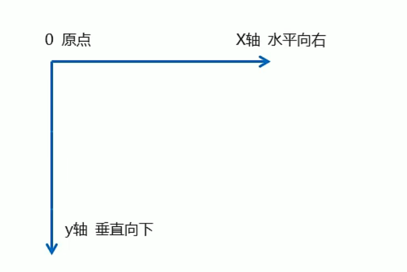
2D转换
transform是CSS3中最具有颠覆性的特性之一,可以实现元素的位移、旋转、缩放等效果
移动:translate
旋转:rotate
缩放:scale
2D转换是改变标签在二维平面上位置和形状的一种技术
移动:translate
2D移动是2D转换中的一种功能,可以改变元素的位置,类似定位
translate不会影响到其他元素的位置
translate中的百分比单位是相对于自身元素的
对行内标签没有效果
transform: translate(x,y);或者分开写
transform: translateX(x);
transform: translateY(y);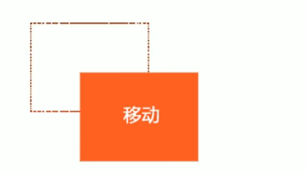
<!DOCTYPE html>
<html lang="en">
<head>
    <meta charset="UTF-8">
    <meta http-equiv="X-UA-Compatible" content="IE=edge">
    <meta name="viewport" content="width=device-width, initial-scale=1.0">
    <title>Document</title>
    <style>
        div {
            width: 300px;
            height: 300px;
            background-color: #ff0;
            /* xy轴都移动 */
            transform: translate(100px,100px);
            /* 只移动x轴  */
            /* transform: translate(100px,0); */
            /* transform: translateX(100px); */
            /* 只移动y轴  */
            /* transform: translate(0,100px); */
            /* transform: translateY(100px); */
        }
    </style>
</head>
<body>
    <div></div>
</body>
</html>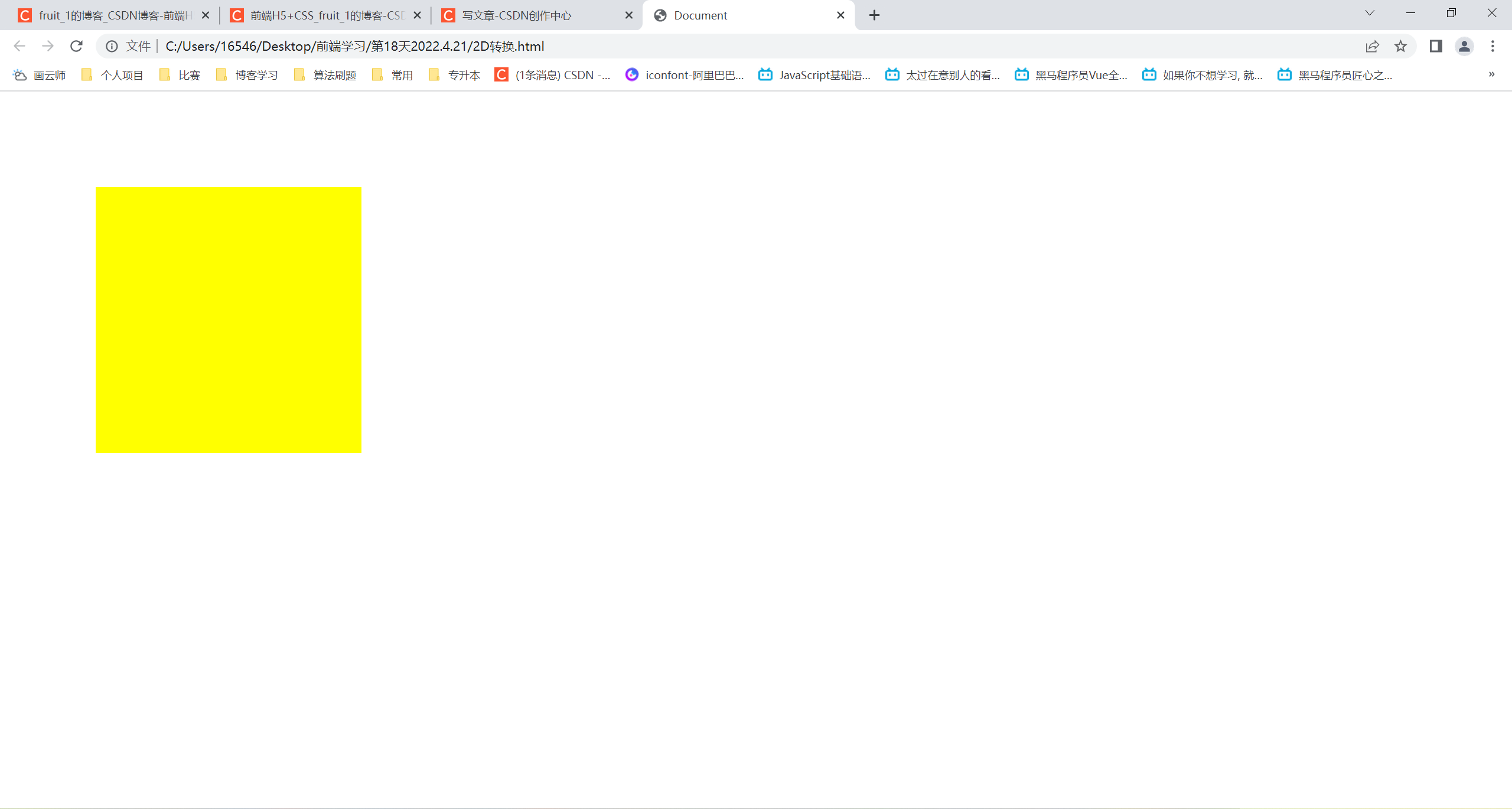
电商商品浮起效果
<!DOCTYPE html>
<html lang="en">
<head>
    <meta charset="UTF-8">
    <meta http-equiv="X-UA-Compatible" content="IE=edge">
    <meta name="viewport" content="width=device-width, initial-scale=1.0">
    <title>Document</title>
    <style>
        div {
            width: 300px;
            height: 300px;
            background-color: #ff0;
            transition: all 0.3s;
        }
        div:hover {
            transform: translate(20px,0);
        }
    </style>
</head>
<body>
    <div></div>
</body>
</html>
水平垂直居中
<!DOCTYPE html>
<html lang="en">
<head>
    <meta charset="UTF-8">
    <meta http-equiv="X-UA-Compatible" content="IE=edge">
    <meta name="viewport" content="width=device-width, initial-scale=1.0">
    <title>Document</title>
    <style>
        .f {
            position: relative;
            width: 500px;
            height: 500px;
            background-color: #f0f;
        }
        .b {
            position: absolute;
            top: 50%;
            left: 50%;
            width: 100px;
            height: 100px;
            background-color: #0ff;
            transform: translate(-50%,-50%);
        }
    </style>
</head>
<body>
    <div class="f">
        <div class="b"></div>
    </div>
</body>
</html>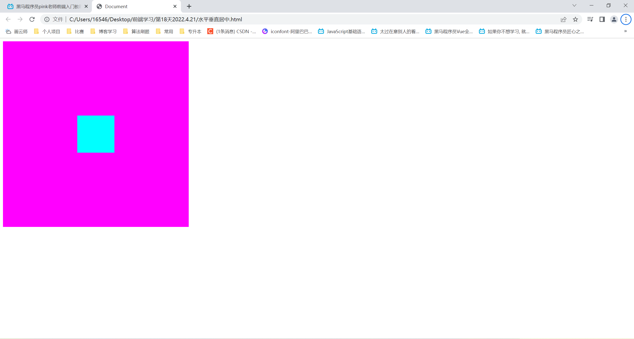
旋转:rotate
2D旋转是让元素在二维平面内顺时针或逆时针旋转
transform: rotate(45deg);rotate里面为度数,单位是deg
角度为正顺时针,角度为负逆时针
默认旋转的中心点是元素的中心点
<!DOCTYPE html>
<html lang="en">
<head>
    <meta charset="UTF-8">
    <meta http-equiv="X-UA-Compatible" content="IE=edge">
    <meta name="viewport" content="width=device-width, initial-scale=1.0">
    <title>Document</title>
    <style>
        img {
            width: 300px;
            transform: rotate(45deg);
        }
    </style>
</head>
<body>
    <img src="武士女孩.jpg" alt="">
</body>
</html>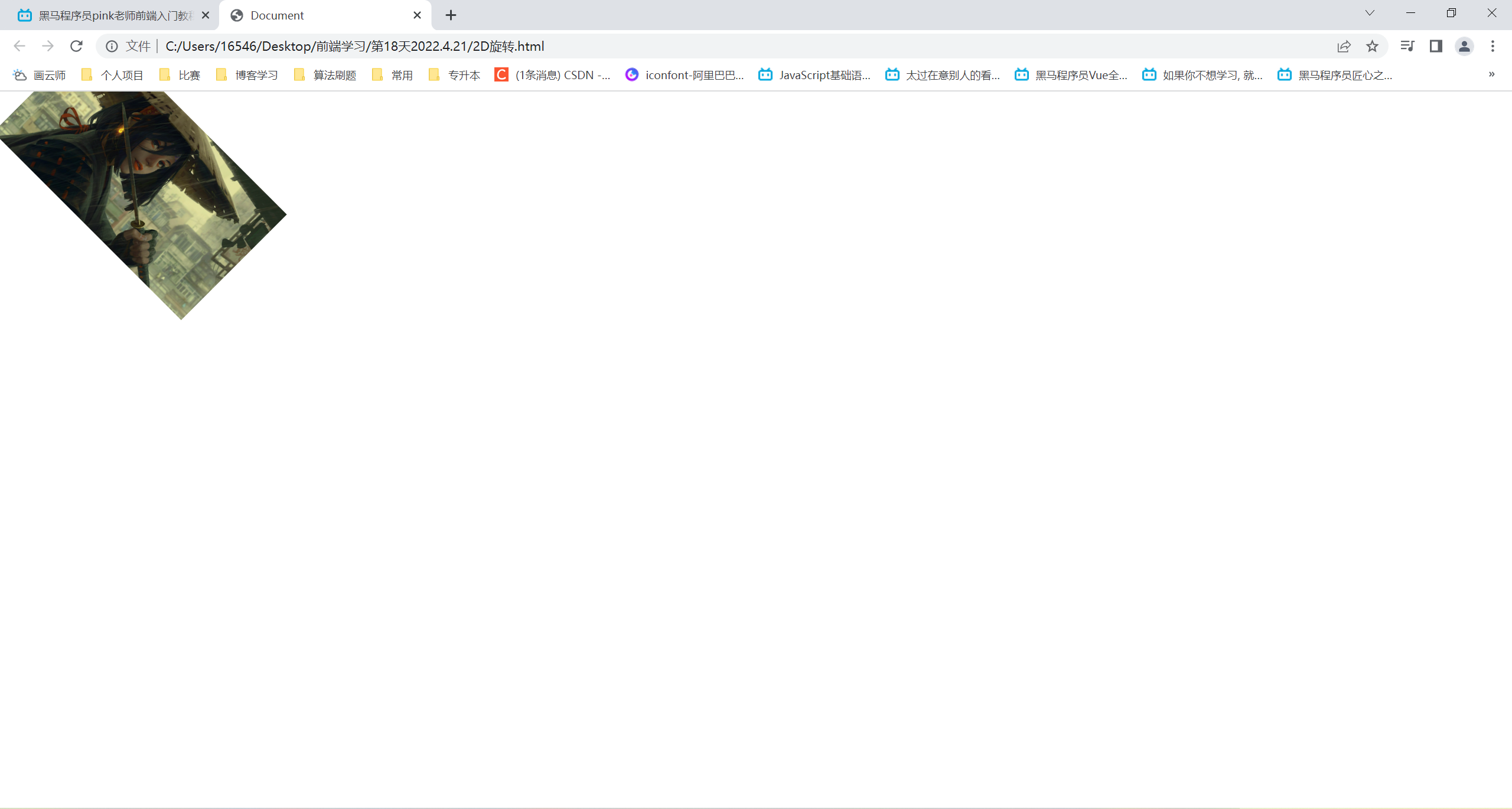
更改旋转中心点
transform-origin: x y;x y要隔开
x y的默认转换中心是元素的中心点(50% 50%)
可以给x y设置像素、百分比、方位名词(top bottem left right center)
<!DOCTYPE html>
<html lang="en">
<head>
<meta charset="UTF-8">
<meta http-equiv="X-UA-Compatible" content="IE=edge">
<meta name="viewport" content="width=device-width, initial-scale=1.0">
<title>Document</title>
<style>
div {
margin: 100px auto;
width: 200px;
height: 200px;
background-color: #f0f;
transition: all 0.3s;
/* 默认是50% 50% */
/* 方位名词 */
/* transform-origin: left bottom; */
/* 像素 */
/* transform-origin: 50px 50px; */
/* 百分比 */
transform-origin: 20% 20%;
}
div:hover {
transform: rotate(360deg);
}
</style>
</head>
<body>
<div></div>
</body>
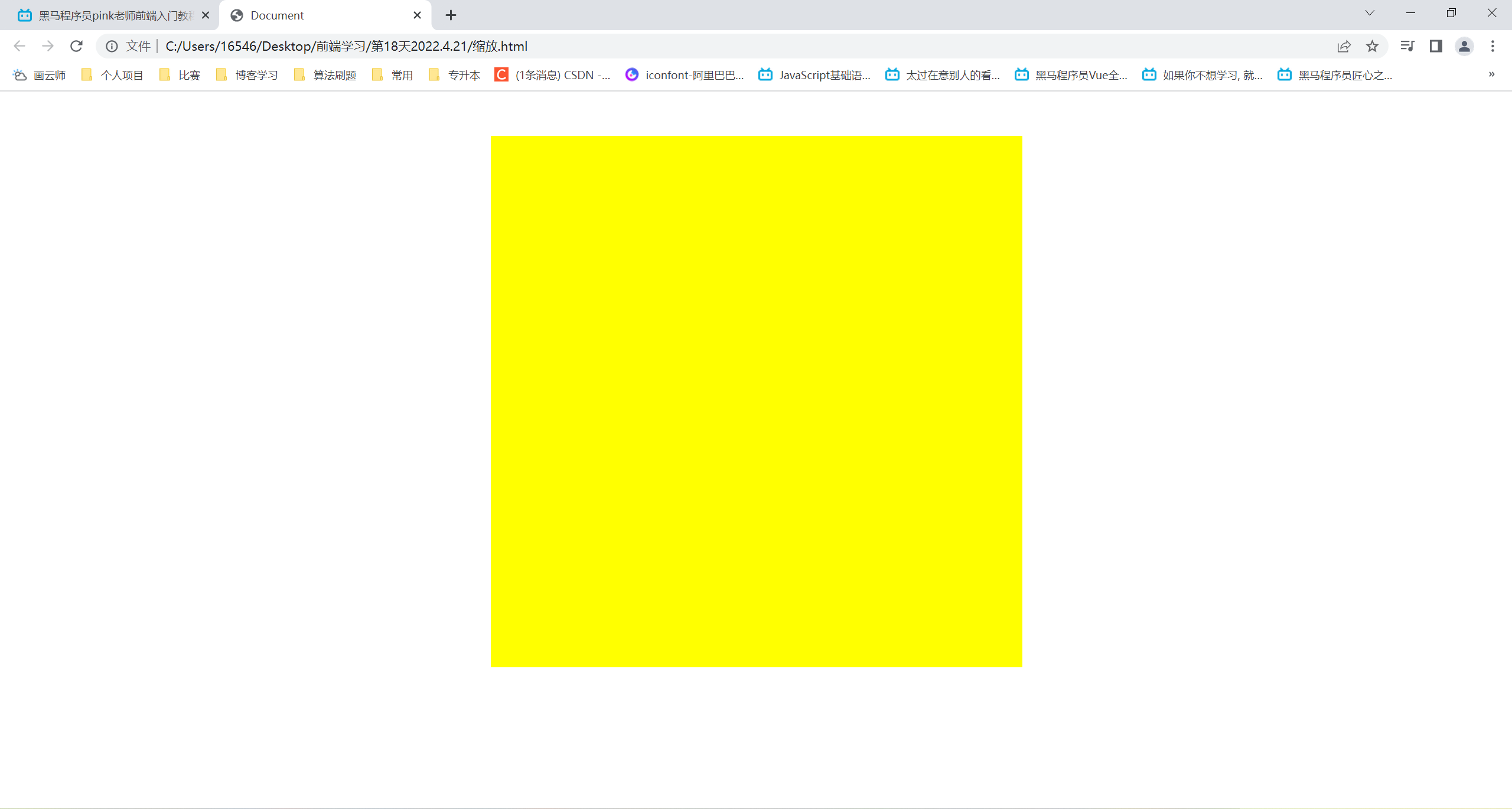
</html>缩放:scale
放大缩小元素,可以设置转换中心点transform-origin,默认以中心点缩放,缩放不影响其他盒子
x y是数字,不带单位
transform: scale(x,y);<!DOCTYPE html>
<html lang="en">
<head>
<meta charset="UTF-8">
<meta http-equiv="X-UA-Compatible" content="IE=edge">
<meta name="viewport" content="width=device-width, initial-scale=1.0">
<title>Document</title>
<style>
div {
margin: 200px auto;
width: 300px;
height: 300px;
background-color: #ff0;
transition: all 0.3s;
}
div:hover {
/* x y缩放比例 */
transform: scale(2,2);
/*transform: scale(1.5,1.5);*/
/* 缩小
transform: scale(0.5,0,5);*/
/* 等比例缩放 */
/* transform: scale(2); */
/* transform: scale(0.5); */
}
</style>
</head>
<body>
<div></div>
</body>
</html>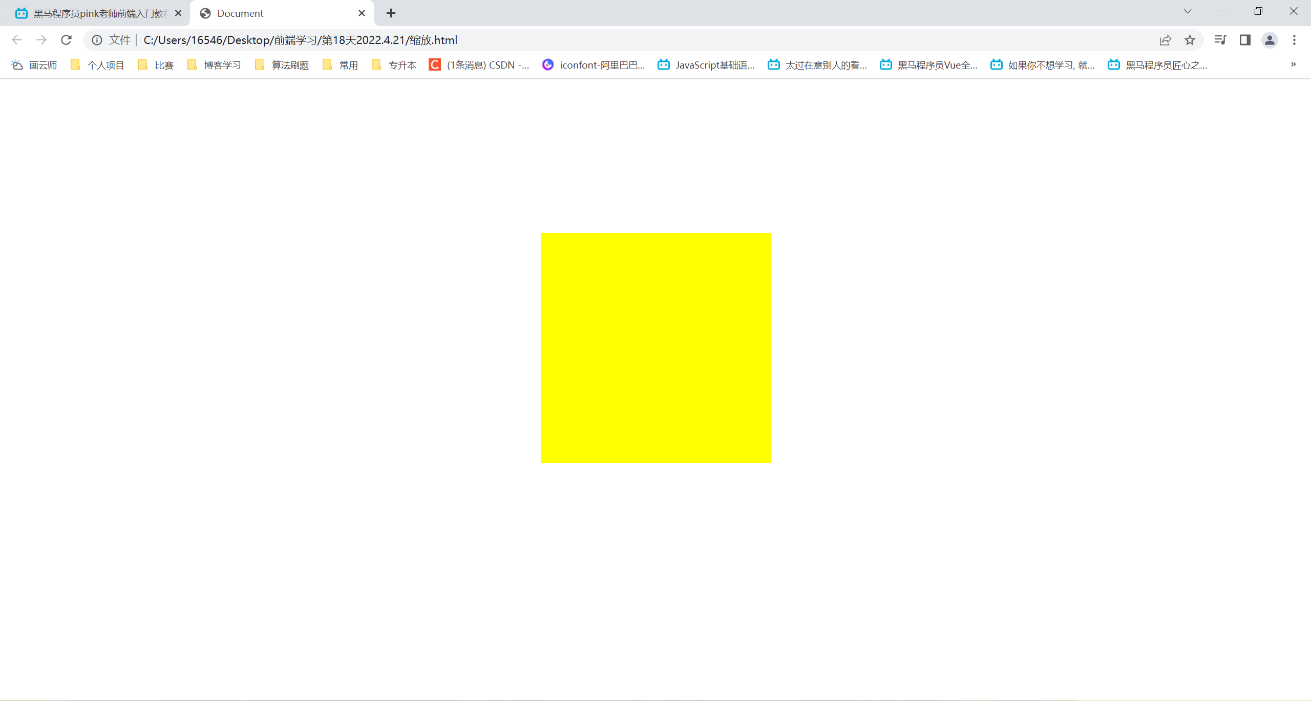
2D转换综合写法
同时使用多个转换,格式为transform: translate() rotate() scale()...等
顺序会影响转换效果(先旋转会改变坐标轴方向)
当我们同时有位移和其他属性的时候,位移放最前


 810
810


 被折叠的 条评论
为什么被折叠?
被折叠的 条评论
为什么被折叠?
 到【灌水乐园】发言


