


As a book focusing on the use of Matplotlib through elaborate[ɪˈlæbərət; ɪˈlæbəreɪt]详尽的 examples, we opted[ɑːptɪd]选择 to defer or simplify our discussion of the internals. For those of you who want to understand the nuts and bolts具体细节 that make Matplotlib tick, you are advised to read Mastering matplotlib by Duncan M. McGreggor. At some point during our Matplotlib journey, it becomes inevitable for us to discuss more about backends, which turn plotting commands to graphics. These backends can be broadly classified as non-interactive or interactive. We will give examples that are pertinent[ˈpɜːtɪnənt]相关的 to each backend class.
Matplotlib was not designed as an animation package from the get-go, thus it will appear sluggish[ˈslʌɡɪʃ]迟钝的 in some advanced usages. For animation-centric applications, PyGame is a very good alternative (https://www.pygame.org/news); it supports OpenGL- and Direct3D-accelerated graphics for the ultimate speed in animating objects. Nevertheless, Matplotlib has acceptable performance most of the time, and we will guide you through the steps to create animations that are more engaging than static plots.
The examples in this chapter will be based on unemployment rates and earnings by educational attainment (2016), available from data.gov and curated by the Bureau of Labor Statistics, U.S. Department of Labor. Here is the outline of this chapter:
- Scraping information from websites
- Non-interactive backends
- Interactive backends: Tkinter, Jupyter, and Plot.ly
- Creating an animated plot
- Exporting an animation as a video
Scraping information from websites
Governments or jurisdictions[ˌdʒʊrɪsˈdɪkʃn]司法权,管辖范围 around the world are increasingly embracing the importance of open data, which aims to increase citizen involvement and informs about decision making, making policies more open to public scrutiny[ˈskruːtəni]详细审查. Some examples of open data initiatives around the world include data.gov (United States of America), data.gov.uk (United Kingdom), and data.gov.hk (Hong Kong).
These data portals[ˈpɔːrtl]大门,入口 often provide Application Programming Interfaces (APIs; see Chapter 7, Visualizing Online Data, for more details) for programmatic access to data. However, APIs are not available for some datasets; hence, we resort to good old web scraping techniques to extract information from websites.
BeautifulSoup (https://www.crummy.com/software/BeautifulSoup/) is an incredibly useful package used to scrape[skreɪp]用程序从网上下载(数据)挖坑,挖洞 information from websites. Basically, everything marked with an HTML tag can be scraped with this wonderful package, from text, links, tables, and styles, to images. Scrapy is also a good package for web scraping, but it is more like a framework for writing powerful web crawlers. So, if you just need to fetch a table from a page, BeautifulSoup offers simpler procedures.
We are going to use BeautifulSoup version 4.6 throughout this chapter. To install BeautifulSoup 4, we can once again rely on PyPI:
pip3 install beautifulsoup4
The data on USA unemployment rates and earnings by educational attainment (2020) is available at https://www.bls.gov/emp/tables/unemployment-earnings-education.htm. Currently, BeautifulSoup does not handle HTML requests. So we need to use the urllib.request or requests package to fetch a web page for us. Of the two options, the requests package is probably easier to use, due to its higher-level HTTP client interface. If requests is not available on your system, you can install it through PyPI:
pip install requests Let's take a look at the web page before we write the web scraping code. If we use the
Chrome browser to visit the Bureau[ˈbjʊərəʊ]局,处,科;办事 of Labor Statistics website, we can inspect the HTML code corresponding to the table we need by right-clicking: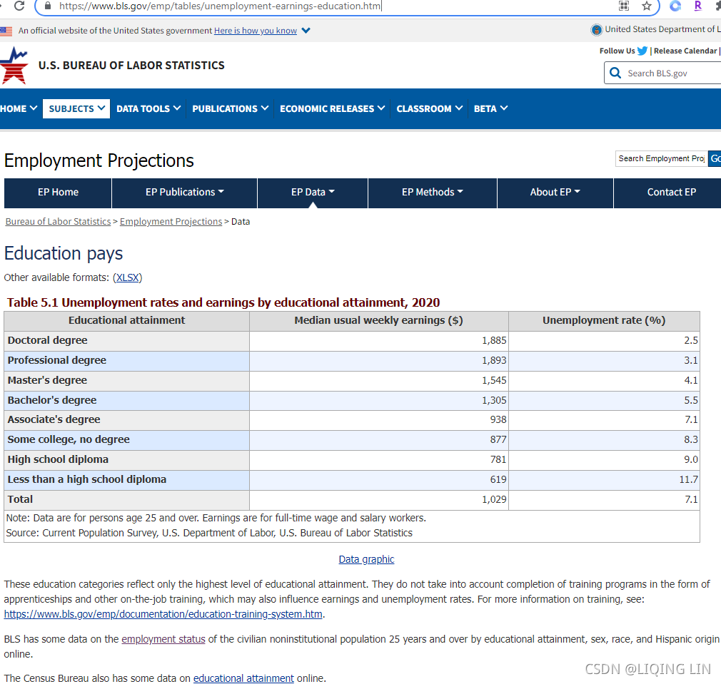
A pop-up window for code inspection will be shown, which allows us to read the code for
each of the elements on the page.
More specifically, we can see that the column names are defined in the <thead>...</thead> section, while the table content is defined in the <tbody>...</tbody> section.
In order to instruct BeautifulSoup to scrape the information we need, we need to give clear directions to it. We can right-click on the relevant section in the code inspection window and copy the unique identifier in the format of the CSS selector.
Cascading Style Sheets (CSS) selectors were originally designed for applying element-specific styles to a website. For more information, visit the following page: https://www.w3schools.com/cssref/css_selectors.asp.
Let's try to get the CSS selectors for thead and tbody, and use the BeautifulSoup.select() method to scrape the respective HTML code:
import requests
from bs4 import BeautifulSoup

# Specify the url
url = "https://www.bls.gov/emp/tables/unemployment-earnings-education.htm"

# Query the website and get the html response
response = requests.get(url)

# Parse the returned html using BeautifulSoup
bs = BeautifulSoup(response.text)

# Select the table header by CSS selector
# right click <thead> ==> click "Copy selector"
# #container > div > div.emp--tables > table > thead
# note : select() method return all the matching elements(in a list)
thead = bs.select( "#container > div > div.emp--tables > table > thead" )[0]

# Select the table body by CSS selector
# #container > div > div.emp--tables > table > tbody
tbody = bs.select( "#container > div > div.emp--tables > table > tbody" )[0]

# Make sure the code works
print( thead )
We see the following output from the previous code:

print(tbody)Next, we are going to find all instances of <th>...</th> in <thead>...</thead>, which contains the name of each column. We will build a dictionary of lists with headers as keys to hold the data:
# Get the column names
headers = []

# Find all header columns in <thead> as specified by <th> html tags
for col in thead.find_all('th'):
    headers.append( col.text.strip() )

# Dictionary of lists for storing parsed data
columnName_rowDatas = { header:[] for header in headers }

headers 
columnName_rowDatas 
Finally, we parse the remaining rows (<tr>...</tr>) from the body (<tbody>...</tbody>) of the table and convert the data into a pandas DataFrame:
import pandas as pd

# Parse the rows in table body
for row in tbody.find_all( "tr" ):# [-1:]
    # Find all columns in a row as specified by <th> or <td> html tags
    # find_all :
    #           If you pass a list to find_all,
    #           Beautiful Soup will allow a string match against any item in that list.
    cols = row.find_all( ['th', 'td'] )
#     [<th id="ep_table_001.r.7" scope="row">
#      <p class="sub0" style="text-align: left;" valign="bottom">Total</p> ######
#      </th>, <td style="text-align: right;">
#      <p class="datacell">1,029</p>                                       ######
#      </td>, <td style="text-align: right;">
#      <p class="datacell">7.1</p>                                         ######
#      </td>]

    # enumerate() allows us to loop over an iterable,
    # and return each item preceded by a counter
    for i, col in enumerate( cols ):
#         0 <th id="ep_table_001.r.7" scope="row">
#         <p class="sub0" style="text-align: left;" valign="bottom">Total</p>
#         </th>
#         1 <td style="text-align: right;">
#         <p class="datacell">1,029</p>
#         </td>
#         2 <td style="text-align: right;">
#         <p class="datacell">7.1</p>
#         </td>

        # Strip white space around the text
        value = col.text.strip()
        # Try to convert the columns to float, except the first column
        if i > 0:
            value = float( value.replace( ',', '' )# Remove all commas in string
                         )

        # Append the float number to the dict of lists
        columnName_rowDatas[ headers[i] ].append( value )

# Create a dataframe from the parsed dictionary
df = pd.DataFrame( columnName_rowDatas )

# Show an excerpt of parsed data
df.head()
We have now fetched the HTML table and formatted it as a structured pandas DataFrame.
Non-interactive backends
The code for plotting graphs is considered the frontend in Matplotlib terminology. We first mentioned backends in Chapter 6 https://blog.csdn.net/Linli522362242/article/details/121045744, Hello Plotting World!, when we were talking about output formats. In reality, Matplotlib backends differ much more than just in the support of graphical formats. Backends handle so many things behind the scenes! And that determines the support for plotting capabilities. For example, LaTeX text layout is only supported by AGG, PDF, PGF, and PS backends.https://matplotlib.org/stable/tutorials/introductory/usage.html#what-is-a-backend
We have been using non-interactive backends so far, which include AGG, Cairo, GDK, PDF, PGF, PS, and SVG. Most of these backends work without extra dependencies, yet Cairo and GDK would require the Cairo graphics library or GIMP Drawing Kit, respectively, to work.
Non-interactive backends can be further classified into two groups--vector and raster[ˈræstər]光栅;试映图. Vector graphics describe images in terms of points, paths, and shapes that are calculated using mathematical formulas. A vector graphic will always appear smooth, irrespective[ˌɪrɪˈspektɪv]不考虑,不顾 of scale and its size is usually much smaller than its raster counterpart. PDF, PGF, PS, and SVG backends belong to the "vector" group.
Raster graphics describe images in terms of a finite number of tiny color blocks (pixels). So, if we zoom in enough, we start to see a blurry[ˈblɜːri] image, or in other words, pixelation像素化. By increasing the resolution or Dots Per Inch (DPI) of the image, we are less likely to observe pixelation. AGG, Cairo, and GDK belong to this group of backends. This table summarizes the key functionalities and differences among the non-interactive backends:
Normally, we don't need to manually select a backend, as the default choice would work great for most tasks. On the other hand, we can specify a backend through the matplotlib.use() method before importing matplotlib.pyplot: 
import matplotlib
# specify a backend before importing matplotlib.pyplot
matplotlib.use('SVG') # Change to SVG backend
import matplotlib.pyplot as plt
import textwrap # Standard library for text wraping


# Create a figure
fig, ax = plt.subplots( figsize=(6,7) )

# Create a list of x ticks positions
ind = range( df.shape[0] )

# Plot a bar chart of "Median usual weekly earnings ($)" by "Educational attainment"
rects = ax.barh( ind,
                 df["Median usual weekly earnings ($)"],
                 height=0.5 # The heights of the bars.
               ) # a bar list or a rectangle list
# Set the x-axis label
ax.set_xlabel( "Median weekly earnings (USD)" )

# Label the x ticks
# The tick labels are a bit too long, let's wrap them in 15-char lines
# https://docs.python.org/3/library/textwrap.html
# textwrap.fill
#              Wraps the single paragraph in text,
#              and returns a single string containing the wrapped paragraph
ylabels = [ textwrap.fill( text=label, width=15 )
            for label in df["Educational attainment"]
          ]
ax.set_yticks( ind )
ax.set_yticklabels( ylabels )

# Give extra margin at the bottom to display the tick labels(left size)
fig.subplots_adjust( left=0.3 )

# Save the figure in SVG format
# plt.show()
# Matplotlib is currently using svg, which is a non-GUI backend, so cannot show the figure.
# so
plt.savefig("test.svg") ![]() open it with your browser
open it with your browser 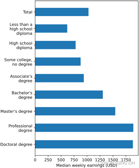
Interactive backends
Matplotlib can build interactive figures that are far more engaging for readers. Sometimes, a plot might be overwhelmed[,ovɚ'wɛlmd]使应接不暇;淹没 with graphical elements, making it hard to discern[dɪˈsɜːrn](艰难地或努力地)看出,辨别 individual data points. On other occasions, some data points may appear so similar that it becomes hard to spot the differences发现差异 with the naked eye. An interactive plot can address these two scenarios by allowing us to zoom in, zoom out, pan平移, and explore the plot in the way we want.
Through the use of interactive backends, plots in Matplotlib can be embedded in Graphical User Interface (GUI) applications. By default, Matplotlib supports the pairing of the Agg raster graphics renderer with a wide variety of GUI toolkits, including wxWidgets (Wx), GIMP Toolkit (GTK+), Qt, and Tkinter (Tk). As Tkinter is the de facto[ˌdɪ ˈfæktoʊ]事实上的 standard GUI for Python, which is built on top of Tcl/Tk, we can create an interactive plot just by calling plt.show() in a standalone Python script.
Tkinter-based backend
Let's try to copy the following code to a separate text file and name it chapter6_gui.py. After that, type python chapter6_gui.py in your terminal (Mac/Linux) or Command Prompt (Windows). If you are unsure about how to open a terminal or Command Prompt, refer to Chapter 6 https://blog.csdn.net/Linli522362242/article/details/121045744, Hello Plotting World!, for more details:
# chapter6_gui.py
import matplotlib
matplotlib.use("TkAgg")
import matplotlib.pyplot as plt
import textwrap # Standard library for text wraping
import requests
import pandas as pd
from bs4 import BeautifulSoup
# Specify the url
url = "https://www.bls.gov/emp/tables/unemployment-earnings-education.htm"
# Query the website and get the html response
response = requests.get(url)
# Parse the returned html using BeautifulSoup
bs = BeautifulSoup(response.text)
# Select the table header by CSS selector
# right click <thead> ==> click "Copy selector"
# #container > div > div.emp--tables > table > thead
# note : select() method return all the matching elements(in a list)
thead = bs.select( "#container > div > div.emp--tables > table > thead" )[0]
# Select the table body by CSS selector
# #container > div > div.emp--tables > table > tbody
tbody = bs.select( "#container > div > div.emp--tables > table > tbody" )[0]
# Get the column names
headers = []
# Find all header columns in <thead> as specified by <th> html tags
for col in thead.find_all('th'):
headers.append( col.text.strip() )
# Dictionary of lists for storing parsed data
columnName_rowDatas = { header:[] for header in headers }
# Parse the rows in table body
for row in tbody.find_all( "tr" ):# [-1:]
# Find all columns in a row as specified by <th> or <td> html tags
# find_all :
# If you pass a list to find_all,
# Beautiful Soup will allow a string match against any item in that list.
cols = row.find_all( ['th', 'td'] )
# [<th id="ep_table_001.r.7" scope="row">
# <p class="sub0" style="text-align: left;" valign="bottom">Total</p> ######
# </th>, <td style="text-align: right;">
# <p class="datacell">1,029</p> ######
# </td>, <td style="text-align: right;">
# <p class="datacell">7.1</p> ######
# </td>]
# enumerate() allows us to loop over an iterable,
# and return each item preceded by a counter
for i, col in enumerate( cols ):
# 0 <th id="ep_table_001.r.7" scope="row">
# <p class="sub0" style="text-align: left;" valign="bottom">Total</p>
# </th>
# 1 <td style="text-align: right;">
# <p class="datacell">1,029</p>
# </td>
# 2 <td style="text-align: right;">
# <p class="datacell">7.1</p>
# </td>
# Strip white space around the text
value = col.text.strip()
# Try to convert the columns to float, except the first column
if i > 0:
value = float( value.replace( ',', '' )# Remove all commas in string
)
# Append the float number to the dict of lists
columnName_rowDatas[ headers[i] ].append( value )
# Create a dataframe from the parsed dictionary
df = pd.DataFrame( columnName_rowDatas )
# Create a figure
fig, ax = plt.subplots( figsize=(6,7) )
# Create a list of x ticks positions
ind = range( df.shape[0] )
# Plot a bar chart of "Median usual weekly earnings ($)" by "Educational attainment"
rects = ax.barh( ind,
df["Median usual weekly earnings ($)"],
height=0.5 # The heights of the bars.
)
# Set the x-axis label
ax.set_xlabel( "Median weekly earnings (USD)" )
# Label the x ticks
# The tick labels are a bit too long, let's wrap them in 15-char lines
# https://docs.python.org/3/library/textwrap.html
# textwrap.fill
# Wraps the single paragraph in text,
# and returns a single string containing the wrapped paragraph
ylabels = [ textwrap.fill( text=label, width=15 )
for label in df["Educational attainment"]
]
ax.set_yticks( ind )
ax.set_yticklabels( ylabels )
# Give extra margin at the bottom to display the tick labels(left size)
fig.subplots_adjust( left=0.3 )
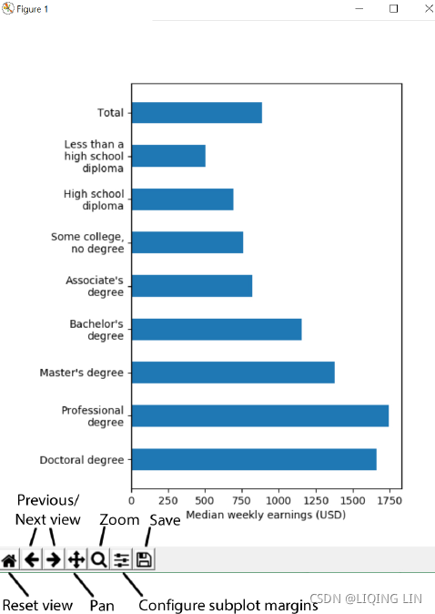
plt.show() We see a pop-up window similar to the following. We can pan, zoom to selection, configure subplot margins, save, and go back and forth between different views by clicking on the buttons on the bottom toolbar. If we put our mouse over the plot, we can also observe the exact coordinates in the bottom-right corner. This feature is extremely useful for dissecting data points that are close to each other. ![]()
Configure subplot margins

Next, we are going to extend the application by adding a radio button widget[ˈwɪdʒɪt]小部件 on top of the figure, such that we can switch between the display of weekly earnings or unemployment rates. The radio button can be found in matplotlib.widgets, and we are going to attach a data updating function to the .on_clicked() event of the button. You can paste the following code right before the plt.show() line in the previous code example (chapter6_gui.py). Let's see how it works: 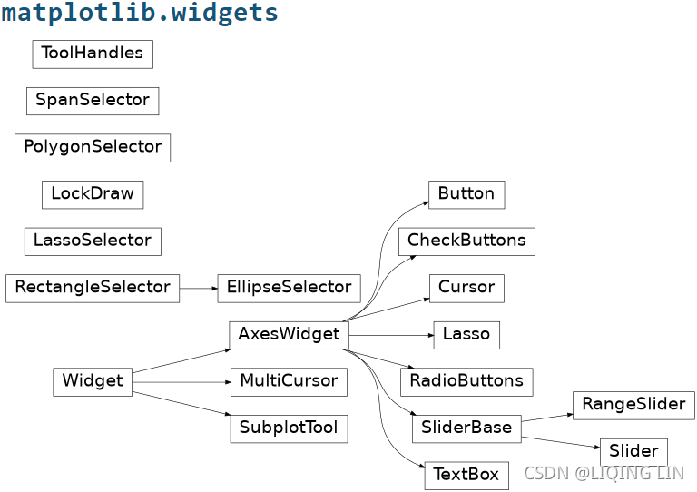
https://matplotlib.org/stable/api/widgets_api.html
# chapter6_gui.py

import matplotlib
matplotlib.use("TkAgg")
import matplotlib.pyplot as plt
import textwrap # Standard library for text wraping
import requests
import pandas as pd
from bs4 import BeautifulSoup

# Specify the url
url = "https://www.bls.gov/emp/tables/unemployment-earnings-education.htm"

# Query the website and get the html response
response = requests.get(url)

# Parse the returned html using BeautifulSoup
bs = BeautifulSoup(response.text)

# Select the table header by CSS selector
# right click <thead> ==> click "Copy selector"
# #container > div > div.emp--tables > table > thead
# note : select() method return all the matching elements(in a list)
thead = bs.select( "#container > div > div.emp--tables > table > thead" )[0]

# Select the table body by CSS selector
# #container > div > div.emp--tables > table > tbody
tbody = bs.select( "#container > div > div.emp--tables > table > tbody" )[0]

# Get the column names
headers = []

# Find all header columns in <thead> as specified by <th> html tags
for col in thead.find_all('th'):
    headers.append( col.text.strip() )

# Dictionary of lists for storing parsed data
columnName_rowDatas = { header:[] for header in headers }

# Parse the rows in table body
for row in tbody.find_all( "tr" ):# [-1:]
    # Find all columns in a row as specified by <th> or <td> html tags
    # find_all :
    #           If you pass a list to find_all,
    #           Beautiful Soup will allow a string match against any item in that list.
    cols = row.find_all( ['th', 'td'] )
#     [<th id="ep_table_001.r.7" scope="row">
#      <p class="sub0" style="text-align: left;" valign="bottom">Total</p> ######
#      </th>, <td style="text-align: right;">
#      <p class="datacell">1,029</p>                                       ######
#      </td>, <td style="text-align: right;">
#      <p class="datacell">7.1</p>                                         ######
#      </td>]

    # enumerate() allows us to loop over an iterable,
    # and return each item preceded by a counter
    for i, col in enumerate( cols ):
#         0 <th id="ep_table_001.r.7" scope="row">
#         <p class="sub0" style="text-align: left;" valign="bottom">Total</p>
#         </th>
#         1 <td style="text-align: right;">
#         <p class="datacell">1,029</p>
#         </td>
#         2 <td style="text-align: right;">
#         <p class="datacell">7.1</p>
#         </td>

        # Strip white space around the text
        value = col.text.strip()
        # Try to convert the columns to float, except the first column
        if i > 0:
            value = float( value.replace( ',', '' )# Remove all commas in string
                         )

        # Append the float number to the dict of lists
        columnName_rowDatas[ headers[i] ].append( value )

# Create a dataframe from the parsed dictionary
df = pd.DataFrame( columnName_rowDatas )

# Create a figure
fig, ax = plt.subplots( figsize=(6,7) )

# Create a list of x ticks positions
ind = range( df.shape[0] )

# Plot a bar chart of "Median usual weekly earnings ($)" by "Educational attainment"
rects = ax.barh( ind,
                 df["Median usual weekly earnings ($)"],
                 height=0.5 # The heights of the bars.
               )########### a bar list or a rectangle list
# Set the x-axis label
ax.set_xlabel( "Median weekly earnings (USD)" )

# Label the x ticks
# The tick labels are a bit too long, let's wrap them in 15-char lines
# https://docs.python.org/3/library/textwrap.html
# textwrap.fill
#              Wraps the single paragraph in text,
#              and returns a single string containing the wrapped paragraph
ylabels = [ textwrap.fill( text=label, width=15 )
            for label in df["Educational attainment"]
          ]
ax.set_yticks( ind )
ax.set_yticklabels( ylabels )

# Give extra margin at the bottom to display the tick labels(left size)
fig.subplots_adjust( left=0.3 )

############## Import Matplotlib radio button widget ##############
from matplotlib.widgets import RadioButtons

# Create axes for holding the radio selectors.
# supply [left, bottom, width, height] in normalized (0, 1) units
bax = plt.axes( [0.3, # since fig.subplots_adjust( left=0.3 )
                 0.9, 0.4, 0.1] )
radio = RadioButtons( bax,
                      ("Weekly earnings", "Unemployment rate")
                    )

# Define the function for updating the displayed values
# when the radio button is clicked
def radiofunc( label ):
    # Select columns from dataframe, and change axis label depending on selection
    if label == "Weekly earnings":
        data = df["Median usual weekly earnings ($)"]
        ax.set_xlabel( "Median weekly earnings (USD)" )
    elif label == "Unemployment rate":
        data = df["Unemployment rate (%)"]
        ax.set_xlabel( "Unemployment rate (%)" )

    # Update the bar heights
    for i, rect in enumerate( rects ):
        rect.set_width( data[i] ) # Rectangle width.

    # Rescale the x-axis range
    ax.set_xlim( xmin=0, xmax=data.max()*1.1 )# click Weekly earnings will be different with privous(default)

    # Redraw the figure
    plt.draw()

# Attach radiofunc to the on_clicked event of the ratio button
radio.on_clicked( radiofunc )
plt.show()
You will be welcomed by a new radio selector box at the top of the figure. Try switching between the two states and see if the figure is updated accordingly. The complete code is also available as chapter6_tkinter.py in our code repository.
Interactive backend for Jupyter Notebook
Before we conclude this section, we are going to introduce two more interactive backends that are rarely covered by books. Starting with Matplotlib 1.4, there is an interactive backend specifically designed for Jupyter Notebook. To invoke that, we simply need to paste %matplotlib notebook at the start of our notebook. We are going to adapt one of the earlier examples in this chapter to use this backend:
# Import the interactive backend for Jupyter notebook
# similar to a Tkinter-based
%matplotlib notebook
import matplotlib
import matplotlib.pyplot as plt
import textwrap # Standard library for text wraping


# Create a figure
fig, ax = plt.subplots( figsize=(6,7) )

# Create a list of x ticks positions
ind = range( df.shape[0] )

# Plot a bar chart of "Median usual weekly earnings ($)" by "Educational attainment"
rects = ax.barh( ind,
                 df["Median usual weekly earnings ($)"],
                 height=0.5 # The heights of the bars.
               ) # a bar list or a rectangle list
# Set the x-axis label
ax.set_xlabel( "Median weekly earnings (USD)" )

# Label the x ticks
# The tick labels are a bit too long, let's wrap them in 15-char lines
# https://docs.python.org/3/library/textwrap.html
# textwrap.fill
#              Wraps the single paragraph in text,
#              and returns a single string containing the wrapped paragraph
ylabels = [ textwrap.fill( text=label, width=15 )
            for label in df["Educational attainment"]
          ]
ax.set_yticks( ind )
ax.set_yticklabels( ylabels )

# Give extra margin at the bottom to display the tick labels(left size)
fig.subplots_adjust( left=0.3 )

# Save the figure in SVG format
plt.show()
You will see an interactive interface coming up, with buttons similar to a Tkinter-based application:
Plot.ly-based backend
Lastly, we will talk about Plot.ly, which is a D3.js-based interactive graphing library with many programming language bindings, including Python. Plot.ly has quickly gained traction in the area of online data analytics due to its powerful data dashboard, high performance, and detailed documentation. For more information, please visit Plot.ly's website (https://plotly.com/).
Plot.ly offers easy transformation of Matplotlib figures into online interactive charts through its Python bindings. To install Plotly.py, we can use PyPI:
pip install plotly
import plotly.plotly as py 
Solution:
pip install chart-studio
import matplotlib.pyplot as plt
import numpy as np
# import plotly.plotly as py
import chart_studio.plotly as py
from plotly.offline import init_notebook_mode, enable_mpl_offline, iplot_mpl
Let us show you a quick example of integrating Matplotlib with Plot.ly:
import matplotlib.pyplot as plt
import numpy as np
# import plotly.plotly as py
import chart_studio.plotly as py
from plotly.offline import init_notebook_mode, enable_mpl_offline, iplot_mpl

# Plot offline in Jupyter Notebooks, not required for standalone script
# Note: Must be called before any plotting actions
init_notebook_mode()

# Convert mpl plots to locally hosted HTML documents, not required if you
# are a registered plot.ly user and have a API key
enable_mpl_offline()

# Create two subplots with shared x-axis
fig, axarr = plt.subplots(2, sharex=True)

#########################################
# The code for generating "df" is skipped for brevity, please refer to the
# "Tkinter-based backend" section for details of generating "df"
import requests
import pandas as pd
from bs4 import BeautifulSoup
import textwrap # Standard library for text wraping

# Specify the url
url = "https://www.bls.gov/emp/tables/unemployment-earnings-education.htm"

# Query the website and get the html response
response = requests.get(url)

# Parse the returned html using BeautifulSoup
bs = BeautifulSoup(response.text)

# Select the table header by CSS selector
# right click <thead> ==> click "Copy selector"
# #container > div > div.emp--tables > table > thead
# note : select() method return all the matching elements(in a list)
thead = bs.select( "#container > div > div.emp--tables > table > thead" )[0]

# Select the table body by CSS selector
# #container > div > div.emp--tables > table > tbody
tbody = bs.select( "#container > div > div.emp--tables > table > tbody" )[0]

# Get the column names
headers = []

# Find all header columns in <thead> as specified by <th> html tags
for col in thead.find_all('th'):
    headers.append( col.text.strip() )

# Dictionary of lists for storing parsed data
columnName_rowDatas = { header:[] for header in headers }

# Parse the rows in table body
for row in tbody.find_all( "tr" ):# [-1:]
    # Find all columns in a row as specified by <th> or <td> html tags
    # find_all :
    #           If you pass a list to find_all,
    #           Beautiful Soup will allow a string match against any item in that list.
    cols = row.find_all( ['th', 'td'] )
#     [<th id="ep_table_001.r.7" scope="row">
#      <p class="sub0" style="text-align: left;" valign="bottom">Total</p> ######
#      </th>, <td style="text-align: right;">
#      <p class="datacell">1,029</p>                                       ######
#      </td>, <td style="text-align: right;">
#      <p class="datacell">7.1</p>                                         ######
#      </td>]

    # enumerate() allows us to loop over an iterable,
    # and return each item preceded by a counter
    for i, col in enumerate( cols ):
#         0 <th id="ep_table_001.r.7" scope="row">
#         <p class="sub0" style="text-align: left;" valign="bottom">Total</p>
#         </th>
#         1 <td style="text-align: right;">
#         <p class="datacell">1,029</p>
#         </td>
#         2 <td style="text-align: right;">
#         <p class="datacell">7.1</p>
#         </td>

        # Strip white space around the text
        value = col.text.strip()
        # Try to convert the columns to float, except the first column
        if i > 0:
            value = float( value.replace( ',', '' )# Remove all commas in string
                         )

        # Append the float number to the dict of lists
        columnName_rowDatas[ headers[i] ].append( value )

# Create a dataframe from the parsed dictionary
df = pd.DataFrame( columnName_rowDatas )
#########################################
ind = np.arange( df.shape[0] )
width = 0.35

# Plot a bar chart of the weekly earnings in the first axes
axarr[0].bar( ind, df["Median usual weekly earnings ($)"], width )

# Plot a bar chart of the unemployment rate in the second axes
axarr[1].bar( ind, df['Unemployment rate (%)'], width )

# Set the ticks and labels
axarr[1].set_xticks( ind )

# Label the x ticks
# The tick labels are a bit too long, let's wrap them in 15-char lines
# https://docs.python.org/3/library/textwrap.html
# textwrap.fill
#              Wraps the single paragraph in text,
#              and returns a single string containing the wrapped paragraph
xlabels = [ textwrap.fill( text=label.replace( " degree", ""),
                           width=15 )
            for label in df["Educational attainment"]
          ]

axarr[1].set_xticklabels(xlabels,
                         rotation="45")

# Give extra margin at the bottom to display the tick labels(left size)
fig.subplots_adjust( bottom=0.3 )

# Offline Interactive plot using plot.ly
# Note: import and use plotly.offline.plot_mpl instead for standalone
# Python scripts
iplot_mpl( fig )
# plt.show()
Exported from plotly.offline, the xticklabels are not preserved. notice that the tick labels cannot be displayed properly, despite clear specifications in the code. This issue is also reported on the official GitHub page (`tickmode` set to invalid value in mpltools · Issue #1100 · plotly/plotly.py · GitHub). Unfortunately, there is no fix for this issue to date.
plt.show()
We admit that there are numerous materials online that describe the integration of Matplotlib plots in different GUI applications. Due to page limits, we are not going to go through each of these backends here. For readers who want to read more about these interactive backends, Alexandre Devert has written an excellent chapter (Chapter 8, User Interface) in matplotlib Plotting Cookbook. In Chapter 8, User Interface of that book, Alexandre has provided recipes for creating GUI applications using wxWidgets, GTK, and Pyglet as well.
Creating animated plots
As explained at the start of this chapter, Matplotlib was not originally designed for making animations, and there are GPU-accelerated Python animation packages that may be more suitable for such a task (such as PyGame). However, since we are already familiar with Matplotlib, it is quite easy to adapt existing plots to animations.
Installation of FFmpeg
Before we start making animations, we need to install either FFmpeg, avconv, MEncoder, or ImageMagick on our system. These additional dependencies are not bundled with Matplotlib, and so we need to install them separately. We are going to walk you through the steps of installing FFmpeg.
The installation steps for Windows users are quite a bit more involved, as we need to
download the executable ourselves, followed by adding the executable to the system path.
Therefore, we have prepared a series of screen captures to guide you through the process.
First, we need to obtain a prebuilt binary from https://web.archive.org/web/20200916091820mp_/https://ffmpeg.zeranoe.com/builds/win64/shared/ffmpeg-4.3.1-win64-shared.zip.Choose the CPU architecture that matches with your system, and select the latest release and static linked libraries.
OR https://ffmpeg.org/download.html and How to Install FFmpeg on Windows: 15 Steps (with Pictures)
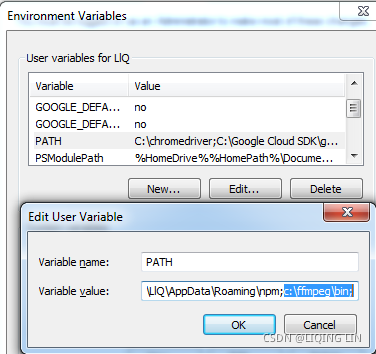
Next, we need to extract the downloaded ZIP file to the C drive as c:\ffmpeg, and add the folder c:\ffmpeg\bin to the Path variable. To do this, go to Control Panel and click on the System and Security link, followed by clicking on System. In the System window, click on the Advanced system settings link to the left:

 ==>
==>
For Window7:
For window10:
In the Edit environmental variable window, create a new entry that shows c:\ffmpeg\bin. Click on OK in all pop-up windows to save your changes. Restart Command Prompt and Jupyter Notebook and you are good to go(It doesn't work for me, I choose another way ).
Installation of FFmpeg in anaconda:
conda install -c conda-forge ffmpeg 

Creating animations
Matplotlib provides two main interfaces for creating animations: TimedAnimation and FuncAnimation. TimedAnimation is useful for creating time-based animations, while FuncAnimation can be used to create animations according to a custom-defined function. Given the much higher level of flexibility offered by FuncAnimation, we will only explore the use of FuncAnimation in this section. Readers can refer to the official documentation (https://matplotlib.org/stable/api/animation_api.html) for more information about TimedAnimation.
FuncAnimation works by repeatedly calling a function that changes the properties of Matplotlib objects in each frame. In the following example, we've simulated the change in median weekly earnings by assuming a 5% annual increase. We are going to create a custom function--animate--which returns Matplotlib Artist objects that are changed in each frame. This function will be supplied to animation.FuncAnimation() together with a few more extra parameters:
For google colab:
import textwrap # Standard library for text wraping
import matplotlib.pyplot as plt
import random
# Matplotlib animation module
from matplotlib import animation
# Used for generating HTML video embed code
from IPython.display import HTML

# Adapted from previous example, codes that are modified are commented
fig, ax = plt.subplots( figsize=(6,7) )

ind = range( df.shape[0] )
rects = ax.barh( ind,
                 df["Median usual weekly earnings ($)"],
                 height = 0.5
               )
ax.set_xlabel( "Median weekly earnings (USD)" )
ylabels = [ textwrap.fill( label, 15 )
            for label in df["Educational attainment"]
          ]
ax.set_yticks( ind )
ax.set_yticklabels( ylabels )

fig.subplots_adjust( left=0.3 )

# Change the x-axis range
ax.set_xlim( 0, 7600 )

# Add a text annotation to show the current year
# https://matplotlib.org/stable/api/_as_gen/matplotlib.axes.Axes.text.html
title = ax.text( 0.5, 1.05,
                 "Median weekly earnings (USD) in 2020",
                 bbox={'facecolor':'w', 'alpha':0.5, 'pad':5},
                 transform=ax.transAxes, ha="center"
               )

# Animation related stuff
n=30   # Number of frames

# Function for animating Matplotlib objects
def animate( frame ):
    # Simulate 5% annual pay rise
    data = df["Median usual weekly earnings ($)"] * (1.05**frame)

    # Update the bar heights
    for i, rect in enumerate( rects ):
        rect.set_width( data[i] )

    # Update the title
    title.set_text( "Median weekly earnings (USD) in {}".format( 2020+frame ) )

    return rects, title

# Call the animator. Re-draw only the changed parts when blit=True.
# Redraw all elements when blit=False
anim = animation.FuncAnimation( fig, func=animate,
                                # If blit == True, func must return an iterable of
                                # all artists that were modified or created.
                                # This information is used by the blitting algorithm to
                                # determine which parts of the figure have to be updated.
                                # The return value is unused if blit == False and
                                # may be omitted in that case.
                                blit=False,
                                repeat=False,
                                frames=n
                              )


# Save the animation in MPEG-4 format
anim.save( 'test.mp4' )

# OR--Embed the video in Jupyter notebook
HTML( anim.to_html5_video() )
For anaconda jupyter notebook without FFmpeg:
import textwrap # Standard library for text wraping
import matplotlib.pyplot as plt
import random
# Matplotlib animation module
from matplotlib import animation
# Used for generating HTML video embed code
# from IPython.display import HTML

import matplotlib as mpl           ##############
mpl.rc('animation', html='jshtml') ##############

# Adapted from previous example, codes that are modified are commented
fig, ax = plt.subplots( figsize=(6,7) )

ind = range( df.shape[0] )
rects = ax.barh( ind,
                 df["Median usual weekly earnings ($)"],
                 height = 0.5
               )
ax.set_xlabel( "Median weekly earnings (USD)" )
ylabels = [ textwrap.fill( label, 15 )
            for label in df["Educational attainment"]
          ]
ax.set_yticks( ind )
ax.set_yticklabels( ylabels )

fig.subplots_adjust( left=0.3 )

# Change the x-axis range
ax.set_xlim( 0, 7600 )

# Add a text annotation to show the current year
# https://matplotlib.org/stable/api/_as_gen/matplotlib.axes.Axes.text.html
title = ax.text( 0.5, 1.05,
                 "Median weekly earnings (USD) in 2020",
                 bbox={'facecolor':'w', 'alpha':0.5, 'pad':5},
                 transform=ax.transAxes, ha="center"
               )

# Animation related stuff
n=30   # Number of frames

# Function for animating Matplotlib objects
def animate( frame ):
    # Simulate 5% annual pay rise
    data = df["Median usual weekly earnings ($)"] * (1.05**frame)

    # Update the bar heights
    for i, rect in enumerate( rects ):
        rect.set_width( data[i] )

    # Update the title
    title.set_text( "Median weekly earnings (USD) in {}".format( 2020+frame ) )

    return rects, title

# Call the animator. Re-draw only the changed parts when blit=True.
# Redraw all elements when blit=False
anim = animation.FuncAnimation( fig, func=animate,
                                # If blit == True, func must return an iterable of
                                # all artists that were modified or created.
                                # This information is used by the blitting algorithm to
                                # determine which parts of the figure have to be updated.
                                # The return value is unused if blit == False and
                                # may be omitted in that case.
                                blit=False,
                                frames=n,
                                repeat=False,
                              )


# Save the animation in MPEG-4 format
# anim.save( 'test.mp4' )

# OR--Embed the video in Jupyter notebook
# HTML( anim.to_html5_video() )

plt.close()
anim
plt.close() # animation: https://blog.csdn.net/Linli522362242/article/details/119053283

For anaconda jupyter notebook with FFmpeg:
conda install -c conda-forge ffmpegimport textwrap # Standard library for text wraping
import matplotlib.pyplot as plt
import random
# Matplotlib animation module
from matplotlib import animation
# Used for generating HTML video embed code
from IPython.display import HTML
# Adapted from previous example, codes that are modified are commented
fig, ax = plt.subplots( figsize=(6,7) )
ind = range( df.shape[0] )
rects = ax.barh( ind,
df["Median usual weekly earnings ($)"],
height = 0.5
)
ax.set_xlabel( "Median weekly earnings (USD)" )
ylabels = [ textwrap.fill( label, 15 )
for label in df["Educational attainment"]
]
ax.set_yticks( ind )
ax.set_yticklabels( ylabels )
fig.subplots_adjust( left=0.3 )
# Change the x-axis range
ax.set_xlim( 0, 7600 )
# Add a text annotation to show the current year
# https://matplotlib.org/stable/api/_as_gen/matplotlib.axes.Axes.text.html
title = ax.text( 0.5, 1.05,
"Median weekly earnings (USD) in 2020",
bbox={'facecolor':'w', 'alpha':0.5, 'pad':5},
transform=ax.transAxes, ha="center"
)
# Animation related stuff
n=30 # Number of frames
# Function for animating Matplotlib objects
def animate( frame ):
# Simulate 5% annual pay rise
data = df["Median usual weekly earnings ($)"] * (1.05**frame)
# Update the bar heights
for i, rect in enumerate( rects ):
rect.set_width( data[i] )
# Update the title
title.set_text( "Median weekly earnings (USD) in {}".format( 2020+frame ) )
return rects, title
# Call the animator. Re-draw only the changed parts when blit=True.
# Redraw all elements when blit=False
anim = animation.FuncAnimation( fig, func=animate,
# If blit == True, func must return an iterable of
# all artists that were modified or created.
# This information is used by the blitting algorithm to
# determine which parts of the figure have to be updated.
# The return value is unused if blit == False and
# may be omitted in that case.
blit=False,
repeat=False,
frames=n
)
# plt.close()
# Save the animation in MPEG-4 format
anim.save( 'test.mp4' )
# OR--Embed the video in Jupyter notebook
HTML( anim.to_html5_video() ) ![]() ==>
==>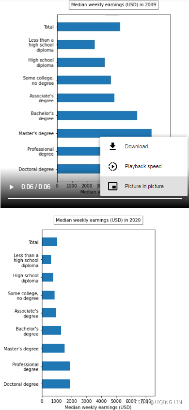
In this example, we output the animation in the form of MPEG-4-encoded videos. The video can also be embedded in Jupyter Notebook in the form of an H.264-encoded video. All you need to do is call the Animation.to_html5_video() method and supply the returned object to IPython.display.HTML. Video encoding and HTML5 code generation will happen automatically behind the scenes.
Summary
In this chapter, you further enriched your techniques for obtaining online data through the use of the BeautifulSoup web scraping library. You successfully learned the different ways of creating interactive figures and animations. These techniques will pave the way for you to create intuitive and engaging visualizations in more advanced applications.


 1万+
1万+


 被折叠的 条评论
为什么被折叠?
被折叠的 条评论
为什么被折叠?
 到【灌水乐园】发言


