


Visualizing Online Data
At this point, we have already covered the basics of creating and customizing plots using Matplotlib. In this chapter, we begin the journey of understanding more advanced Matplotlib usage through examples in specialized topics.
When considering the visualization of a concept, the following important factors have to be considered carefully:
- Source of the data
- Filtering and data processing
- Choosing the right plot type for the data:
- Visualizing the trend of data:
- Line chart, area chart, and stacked area chart
- Visualizing univariate distribution:
- Bar chart, histogram, and kernel density estimation
- Visualizing bivariate distribution:
- Scatter plot, KDE density chart, and hexbin chart
- Visualizing categorical data:
- Categorical scatter plot, box plot, swarm plot, violin plot
- Visualizing the trend of data:
- Adjusting figure aesthetics for effective storytelling
We will cover these topics via the use of demographic[ˌdeməˈɡræfɪk]人口统计的 and financial data. First, we will discuss typical data formats when we fetch data from the Application Programming Interface (API). Next, we will explore how we can integrate Matplotlib 2.0 with other Python packages such as Pandas, Scipy, and Seaborn for the visualization of different data types.
Typical API data formats
Many websites offer their data via an API, which bridges applications via standardized architecture. While we are not going to cover the details of using APIs here as site-specific documentation is usually available online; we will show you the three most common data formats as used in many APIs.
CSV
CSV (Comma-Separated Values) is one of the oldest file formats, which was introduced long before the internet even existed. However, it is now becoming deprecated as other advanced formats, such as JSON and XML, are gaining popularity. As the name suggests, data values are separated by commas. The preinstalled csv package and the pandas package contain classes to read and write data in CSV format. This CSV example defines a population table with two countries:
Country,Time,Sex,Age,Value
United Kingdom,1950,Male,0-4,2238.735
United States of America,1950,Male,0-4,8812.309
JSON
JSON (JavaScript Object NotationJavaScript 对象表示法) is gaining popularity these days due to its efficiency and simplicity. JSON allows the specification of number, string, Boolean, array, and object. Python provides the default json package for parsing JSON. Alternatively, the pandas.read_json class can be used to import JSON as a Pandas dataframe. The preceding population table can be represented as JSON in the following example:
{
    "population": [
                     {
                         "Country": "United Kingdom",
                         "Time": 1950,
                         "Sex", "Male",
                         "Age", "0-4",
                         "Value",2238.735
                     },
                     {
                         "Country": "United States of America",
                         "Time": 1950,
                         "Sex", "Male",
                         "Age", "0-4",
                         "Value",8812.309
                     },
                 ]
}
XML
XML (eXtensible Markup Language) is the Swiss Army knife of data formats, and it has become the default container for Microsoft Office, Apple iWork, XHTML, SVG(Scalable Vector Graphics), and more. XML's versatility comes with a price, as it makes XML verbose and slower. There are several ways to parse XML in Python, but xml.etree.ElementTree is recommended due to its Pythonic interface, backed by an efficient C backend由高效的 C 后端支持. We are not going to cover XML parsing in this book, but good tutorials exist elsewhere (such as http://eli.thegreenplace.net/2012/03/15/processing-xml-in-python-with-elementtree).
As an example, the same population table can be transformed into XML:
<?xml version='1.0' encoding='utf-8'?>
<populations>
     <population>
         <Country>United Kingdom</Country>
         <Time>1950</Time>
         <Sex>Male</Sex>
         <Age>0-4</Age>
         <Value>2238.735</Value>
     </population>

     <population>
         <Country>United States of America</Country>
         <Time>1950</Time>
         <Sex>Male</Sex>
         <Age>0-4</Age>
         <Value>8812.309</Value>
     </population>
</populations>
Introducing pandas
Beside NumPy and SciPy, pandas is one of the most common scientific computing libraries for Python. Its authors aim to make pandas the most powerful and flexible open source data analysis and manipulation tool available in any language, and in fact, they are almost achieving that goal. Its powerful and efficient library is a perfect match for data scientists. Like other Python packages, Pandas can easily be installed via PyPI:
pip install pandasOR
conda install PandasFirst introduced in version 1.5, Matplotlib supports the use of pandas DataFrame as the input in various plotting classes. Pandas DataFrame is a powerful two-dimensional labeled data structure that supports indexing, querying, grouping, merging, and some other common relational database operations. DataFrame is similar to spreadsheets in the sense that each row of the DataFrame contains different variables of an instance, while each column contains a vector of a specific variable across all instances.
pandas DataFrame supports heterogeneous[ˌhetərəˈdʒiːniəs] data types, such as string, integer, and float. By default, rows are indexed sequentially and columns are composed of pandas Series. Optional row labels or column labels can be specified through the index and columns attributes.
Importing online population data in the CSV format
Let's begin by looking at the steps to import an online CSV file as a pandas DataFrame. In this example, we are going to use the annual population summary published by the Department of Economic and Social Affairs[əˈfeəz]事务, United Nations, in 2015. Projected population figures towards 2100 were also included in the dataset:
# URL for Annual Population by Age and Sex - Department of Economic and Social Affairs, United Nations
The pandas.read_csv class is extremely versatile, supporting column headers, custom delimiters, various compressed formats (for example, .gzip, .bz2, .zip, and .xz), different text encodings, and much more. Readers can consult the documentation page (http://pandas.pydata.org/pandas-docs/stable/generated/pandas.read_csv.html) for more information.
import numpy as np
import pandas as pd

#or "https://github.com/PacktPublishing/Matplotlib-2.x-By-Example/raw/master/WPP2015_DB04_Population_Annual.zip"
source = "https://raw.githubusercontent.com/PacktPublishing/Matplotlib-2.x-By-Example/master/WPP2015_DB04_Population_Annual.zip"

# Pandas support both local or online files
data = pd.read_csv(source, header=0, encoding='latin_1')

data.head()
By calling the .head() function of the Pandas DataFrame object, we can quickly observe the first five rows of the data.
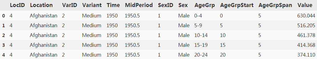
As we progress through this chapter, we are going to integrate this population dataset with other datasets in Quandl. However, Quandl uses three-letter country codes (ISO 3166 alpha-3) to denote geographical locations; therefore we need to reformat the location names accordingly.
The pycountry package is an excellent choice for conversion of country names according to ISO 3166 standards. Similarly, pycountry can be installed through PyPI:
# pip install pycountry
# Jupyter Notebook
!pip install pycountry
https://pypi.org/project/pycountry/
 ##############################################################
import pycountry

len( pycountry.countries )
249
list(pycountry.countries)[0]Country(alpha_2='AF', alpha_3='AFG', name='Afghanistan', numeric='004', official_name='Islamic Republic of Afghanistan')
germany = pycountry.countries.get(alpha_2='DE')
germany
Country(alpha_2='DE', alpha_3='DEU', name='Germany', numeric='276', official_name='Federal Republic of Germany')
germany.alpha_2'DE'
germany.alpha_3'DEU'
germany.numeric'276'
germany.name'Germany'
germany.official_name'Federal Republic of Germany'德意志联邦共和国
##############################################################
Continuing the previous code example, we are going to add a new country column to the dataframe:
#under Anaconda Prompt
#easy_install pycountry
from pycountry import countries

def get_alpha_3(location):
    '''
    Convert full country name to three letter code (ISO 3166 alpha-3)
    Args:
        location: Full location name
    Returns:
        three letter code or None if not found
    '''
    try:
        return countries.get(name=location).alpha_3
    except:
        return None

population_df=data.copy(deep=True)
# deep=True
# Modifications to the data or indices of the copy will not be reflected in the original object

#Add a new country column to the dataframe
population_df['country'] = population_df['Location'].apply( lambda x: get_alpha_3(x) )
population_df.head()
Importing online financial data in the JSON format
In this chapter, we will also draw upon financial data from Quandl's API to create insightful visualizations. If you are not familiar with Quandl, it is a financial and economic data warehouse that stores millions of datasets from hundreds of publishers. The best thing about Quandl is that these datasets are delivered via the unified API, without worrying about the procedures to parse the data correctly. Anonymous users can get up to 50 API calls per day, and you get up to 500 free API calls if you are a registered user. Readers can sign up for a free API key at https://www.quandl.com/?modal=register.
At Quandl, every dataset is identified by a unique ID, as defined by the Quandl Code on each search result webpage. For example, the Quandl code GOOG/NASDAQ_SWTX defines the historical NASDAQ index data published by Google Finance. Every dataset is available in three formats--CSV, JSON, and XML.
Although an official Python client library is available from Quandl, we are not going to use that for the sake of demonstrating the general procedures of importing JSON data. According to Quandl's documentation, we can fetch JSON formatted data tables through the following API call:
GET https://www.quandl.com/api/v3/datasets/{Quandl code}/data.json
Let's try to get the Big Mac index data from Quandl.
'The Big Mac Index is an informal measure of currency exchange rates at ppp. It measures their value against a similar basket of goods and services, in this case a Big Mac. Differing prices at market exchange rates would imply that one currency is under or overvalued.'
原理 : 是以一个国家的巨无霸以当地货币的价格,除以另一个国家的巨无霸以当地货币的价格。该商数用来跟实际的汇率比较;要是商数比汇率为低,就表示第一国货币的汇价被低估了(根据购买力平价理论);相反,要是商数比汇率为高,则第一国货币的汇价被高估了。
就是假设全世界的麦当劳巨无霸汉堡包的价格都是一样的,然后将各地的巨无霸当地价格,通过汇率换算成美元售价,就可以比较出各个国家的购买力水平差异。《经济学人》创立的巨无霸指数,用以计算货币相对美元的汇率是否合理。指数根据购买力平价理论出发,1美元在全球各地的购买力都应相同,若某地的巨无霸售价比美国低,就表示其货币相对美元的汇率被低估,相反则是高估。至於选择巨无霸的原因,是由于全球120个国家及地区均有售,而且制作规格相同,具一定参考价值。
get_bigmac_codes(), parses the list of all available dataset codes in the Quandl Economist database as a pandas DataFrame.
from urllib.request import urlopen
import json
import time
import pandas as pd

def get_bigmac_codes():
    '''
    Get a Pandas DataFrame of all codes in the Big Mac index dataset

    The first column contains the code, while the second header
    contains the description of the code.

    for example,
        ECONOMIST/BIGMAC_ARG,Big Mac Index - Argentina
        ECONOMIST/BIGMAC_AUS,Big Mac Index - Australia
        ECONOMIST/BIGMAC_BRA,Big Mac Index - Brazil

    Returns:
        codes: Pandas DataFrame of Quandl dataset codes
    '''
                # corrected
    codes_url = "https://www.quandl.com/api/v3/databases/ECONOMIST/metadata?api_key=sKqHwnHr8rNWK-3s5imS"
                #"https://www.quandl.com/api/v3/databases/ECONOMIST/metadata?api_key=sKqHwnHr8rNWK-3s5imS"
                #https://www.quandl.com/api/v3/datasets/ECONOMIST/BIGMAC_ARG.json?api_key=sKqHwnHr8rNWK-3s5imS
    codes = pd.read_csv(codes_url, header=0, compression='zip', encoding='latin_1')
    return codes[['code','description']]

codes = get_bigmac_codes()
#type(codes)
codes.head()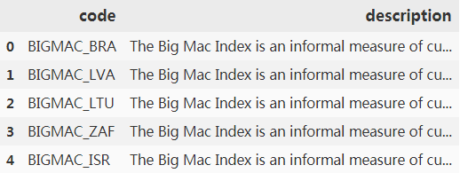
codes.code.head()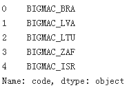
get_quandl_dataset(api_key, code), converts the JSON response of a Quandl dataset API query to a pandas DataFrame. All datasets obtained are concatenated using pandas.concat().
def get_quandl_dataset(api_key, code):
    """Obtain and parse a quandl dataset in Pandas DataFrame format

    Quandl returns dataset in JSON format, where data is stored as a
    list of lists in response['dataset']['data'], and column headers
    stored in response['dataset']['column_names'].

    E.g. {'dataset': {...,
             'column_names': ['Date',
                              'local_price',
                              'dollar_ex',
                              'dollar_price',
                              'dollar_ppp',
                              'dollar_valuation',
                              'dollar_adj_valuation',
                              'euro_adj_valuation',
                              'sterling_adj_valuation',
                              'yen_adj_valuation',
                              'yuan_adj_valuation'],
             'data': [['2017-01-31',
                       55.0,
                       15.8575,
                       3.4683903515687,
                       10.869565217391,
                       -31.454736135007,
                       6.2671477203176,
                       8.2697553162259,
                       29.626894343348,
                       32.714616745128,
                       13.625825886047],
                      ['2016-07-31',
                       50.0,
                       14.935,
                       3.3478406427854,
                       9.9206349206349,
                       -33.574590420925,
                       2.0726096168216,
                       0.40224795003514,
                       17.56448458418,
                       19.76377270142,
                       11.643103380531]
                      ],
             'database_code': 'ECONOMIST',
             'dataset_code': 'BIGMAC_ARG',
             ... }}

    A custom column--country is added to denote the 3-letter country code.

    Args:
        api_key: Quandl API key
        code: Quandl dataset code

    Returns:
        df: Pandas DataFrame of a Quandl dataset
    """
            #corrected
            #https://www.quandl.com/api/v3/datasets/ECONOMIST/BIGMAC_ARG.json?
    api_key='sKqHwnHr8rNWK-3s5imS'
    base_url = "https://www.quandl.com/api/v3/datasets/ECONOMIST/"
    url_suffix = ".json?api_key="

    # Fetch the JSON response
    u = urlopen(base_url + code + url_suffix + api_key)
    response = json.loads( u.read().decode('utf-8') )

    # Format the response as Pandas Dataframe
    df = pd.DataFrame( response['dataset']['data'],
                       columns=response['dataset']['column_names']
                     )

    # Label the country code BIGMAC_ARG--> ARG
    df['country'] = code[-3:]

    return df

quandl_dfs = []
codes = get_bigmac_codes()

# Replace this with your own API key
api_key = "sKqHwnHr8rNWK-3s5imS" #sKqHwnHr8rNWK-3s5imS

for code in codes.code:#OR # codes.code
    # Get the DataFrame of a Quandl dataset
    df = get_quandl_dataset(api_key, code)

    # Store in a list
    quandl_dfs.append(df)

    # Prevents exceeding the API speed limit
    time.sleep(2)

# Concatenate the list of dataframes into a single one
bigmac_df = pd.concat(quandl_dfs)
bigmac_df.head()
#bigmac_df[bigmac_df.country=='ARG']
VS I got in 2018

bigmac_df[bigmac_df.country=='ARG']
VS I got in 2018

The Big Mac index was invented by The Economist in 1986 as a lighthearted guide to check whether currencies are at their correct level. It is based on the theory of purchasing power parity[ˈpærəti]平价 (PPP) and is considered an informal measure of currency exchange rates at PPP. It measures their value against a similar basket of goods and services, in this case, a Big Mac. Differing prices at market exchange rates would imply that one currency is undervalued or overvalued.
The code for parsing JSON from the Quandl API is a bit more complicated, and thus extra explanations might help you to understand it.
Visualizing the trend of data
data
Once we have imported the two datasets, we can set out on a further visualization journey. Let's begin by plotting the world population trends from 1950 to 2017. To select rows based on the value of a column, we can use the following syntax: df[df.variable_name == "target"] or df[df['variable_name'] == "target"], where df is the dataframe object. Other conditional operators, such as larger than > or smaller than <, are also supported. Multiple conditional statements can be chained together using the "and" operator &, or the "or" operator |.
To aggregate the population across all age groups within a year, we are going to rely on df.groupby().sum(), as shown in the following example:
import matplotlib.pyplot as plt
# Select the aggregated population data from the world for both genders,
# during 1950 to 2017.
selected_data = data[ (data.Location == 'WORLD') & (data.Sex == 'Both') & (data.Time <= 2017) ]
#selected_data

# Calculate aggregated population data across all age groups for each year
# Set as_index=False to avoid the Time variable to be used as index
grouped_data = selected_data.groupby('Time', as_index=False).sum()
grouped_data.head()
#help(selected_data.groupby('Time', as_index=False)) # as_index should be False since we will use new Index after group by
####################################
selected_data.groupby('Time').sum()
####################################
# Generate a simple line plot of population vs time
fig = plt.figure()
plt.plot(grouped_data.Time, grouped_data.Value)

# Label the axis
plt.xlabel('Year')
plt.ylabel('Population (thousand)')

plt.show()
Area chart and stacked area chart
Sometimes, we may want to shade the area under the line plot with color for a greater visual impact. This can be achieved via the fill_between class:
fill_between(x, y1, y2=0, where=None, interpolate=False, step=None)By default, fill_between shades the region between y=0 and the line when y2 is not specified. More complex shading behavior can be specified using the where, interpolate, and step keyword arguments. Readers can refer to the following link for more information: https://matplotlib.org/2.0.2/examples/pylab_examples/fill_between_demo.html.
Let's try to plot a more detailed chart by separating the two genders. We are going to explore the relative contribution of males and females towards the population growth. To do that, we can prepare a stacked area chart using the stackplot class:
# Select the aggregated population data from the world for each gender,
# during 1950 to 2017.
male_data = data[ (data.Location =='WORLD') & (data.Sex == 'Male') & (data.Time <= 2017) ]
female_data = data[ (data.Location =='WORLD') & (data.Sex == 'Female') & (data.Time <= 2017) ]
#female_data.head()

# Calculate aggregated population data across all age groups for each year
# Set as_index=False to avoid the Time variable to be used as index
grouped_male_data = male_data.groupby('Time', as_index=False).sum()
grouped_female_data = male_data.groupby('Time', as_index=False).sum()
grouped_male_data.head()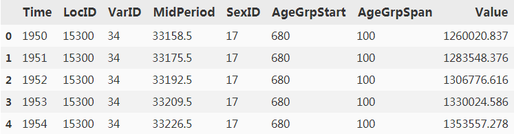
# Create two subplots with shared y-axis (sharey=True)
fig, (ax1, ax2) = plt.subplots(nrows=1, ncols=2, figsize=(12,4), sharey=True)

# Generate a simple line plot of population vs time,
# then shade the area under the line in sky blue.
ax1.plot(grouped_data.Time, grouped_data.Value)
ax1.fill_between(grouped_data.Time, grouped_data.Value, color='skyblue')

# Use set_xlabel() or set_ylabel() instead to set the axis label of an
# axes object
ax1.set_xlabel('Year')
ax1.set_ylabel('Population (thousands)')
# for matplotlib v2 we need to disable the scientific notation on the y-axis:
ax1.ticklabel_format(style='plain')

# Generate a stacked area plot of population vs time
                    #x-values               #y-base_values
ax2.stackplot(grouped_male_data.Time, grouped_male_data.Value,
                                      grouped_female_data.Value)#y-upper_values

# Add a figure legend
ax2.legend(['Male', 'Female'], loc='upper left')

# Set the x-axis label only this time
ax2.set_xlabel('Year')
plt.show()
# prevent scientific notation in matplotlib.pyplot

##########################
# Create two subplots with shared y-axis (sharey=True)
fig, (ax1, ax2) = plt.subplots(nrows=1, ncols=2, figsize=(12,4), sharey=True)

# Generate a simple line plot of population vs time,
# then shade the area under the line in sky blue.
ax1.plot(grouped_data.Time, grouped_data.Value)
ax1.fill_between(grouped_data.Time, grouped_data.Value, color='skyblue')

# Use set_xlabel() or set_ylabel() instead to set the axis label of an
# axes object
ax1.set_xlabel('Year')
ax1.set_ylabel('Population (thousands)')
# for matplotlib v2 we need to disable the scientific notation on the y-axis:
# ax1.ticklabel_format(style='plain')

# Generate a stacked area plot of population vs time
                    #x-values               #y-base_values
ax2.stackplot(grouped_male_data.Time, grouped_male_data.Value,
                                      grouped_female_data.Value)#y-upper_values

# Add a figure legend
ax2.legend(['Male', 'Female'], loc='upper left')

# Set the x-axis label only this time
ax2.set_xlabel('Year')
plt.show()
##########################
Introducing Seaborn
Seaborn by Michael Waskom is a statistical visualization library that is built on top of Matplotlib. It comes with handy functions for visualizing categorical variables, univariate distributions, and bivariate distributions. For more complex plots, various statistical methods such as linear regression models and clustering algorithms are available. Like Matplotlib, Seaborn also supports Pandas dataframes as input, plus automatically performing the necessary slicing, grouping, aggregation, and statistical model fitting to produce informative figures.
These Seaborn functions aim to bring publication-quality figures through an API with a minimal set of arguments, while maintaining the full customization capabilities of Matplotlib. In fact, many functions in Seaborn return a Matplotlib axis or grid object when invoked. Therefore, Seaborn is a great companion of Matplotlib. To install Seaborn through PyPI, you can issue the following command in the terminal:
easy_install pandasSeaborn will be imported as sns throughout this book. This section will not be a documentation of Seaborn. Rather our goal is to give a high-level overview of Seaborn's capabilities from the perspective of Matplotlib users. Readers can refer to the official Seaborn site (http://seaborn.pydata.org/index.html) for more information.
import seaborn as sns
import matplotlib.pyplot as plt

# Extract USA population data in 2017
current_population = population_df[
    (population_df.Location == 'United States of America') &\
    (population_df.Time == 2017) &\
    (population_df.Sex !='Both')
]
current_population.head()
# Population Bar chart
sns.barplot(x='AgeGrp', y='Value', hue='Sex', data = current_population)

# Use Matplotlib functions to label axes rotate tick labels
ax = plt.gca()
ax.set(xlabel = 'Age Group', ylabel = 'Population (thousands)')
ax.set_xticklabels(ax.xaxis.get_majorticklabels(), rotation=45)
plt.title("Population Barchart (USA)")

#Show the figure
plt.show()
Bar chart in Seaborn
The seaborn.barplot() function shows a series of data points as rectangular bars. If multiple points per group are available, confidence intervals will be shown on top of the bars to indicate the uncertainty of the point estimates. Like most other Seaborn functions, various input data formats are supported, such as Python lists, Numpy arrays, pandas Series, and pandas DataFrame.
A more traditional way to show the population structure is through the use of a population pyramid.
So what is a population pyramid? As its name suggests, it is a pyramid-shaped plot that shows the age distribution of a population. It can be roughly classified into three classes, namely constrictive, stationary, and expansive for populations that are undergoing negative, stable, and rapid growth respectively. For instance, constrictive populations have a lower proportion of young people, so the pyramid base appears to be constricted. Stable populations have a more or less similar number of young and middle-aged groups. Expansive populations, on the other hand, have a large proportion of youngsters, thus resulting in pyramids with enlarged bases.
We can build a population pyramid by plotting two bar charts on two subplots with a shared y-axis:
import seaborn as sns
import matplotlib.pyplot as plt

# Extract USA population data in 2017
current_population = population_df[(population_df.Location == 'United States of America') & \
                                   (population_df.Time == 2017) & (population_df.Sex != 'Both')]
current_population = current_population.iloc[::-1]
current_population
- matplotlib.axes.Axes.invert_xaxis() to flip the male population plot horizontally,
- followed by changing the location of the tick labels to the right-hand side using matplotlib.axis.YAxis.tick_right().
- We further customized the titles and axis labels for the plot using a combination of matplotlib.axes.Axes.set_title(), matplotlib.axes.Axes.set(), and matplotlib.figure.Figure.suptitle().
# Create two subplots with shared y-axis
fig, axes = plt.subplots(ncols = 2, sharey = True) #sharey = True

################################################################################
# Bar chart for male                                 #left plotting-axes[0]
sns.barplot(x='Value', y='AgeGrp', color='darkblue', ax=axes[0],
            data = current_population[(current_population.Sex == 'Male')])#####

# Bar chart for female                               #right plotting -axes[1]
sns.barplot(x='Value', y='AgeGrp', color='darkred', ax=axes[1],
            data = current_population[(current_population.Sex == 'Female')])###
################################################################################
# Increase spacing between subplots to avoid clipping of ytick labels
plt.subplots_adjust(wspace=0.3)

#Use Matplotlib function to **invert the first chart###########################
axes[0].invert_xaxis()###########

#Use Matplotlib function to show **tick labels in the middle###################
axes[0].yaxis.tick_right()

# Use Matplotlib functions to label the axes and titles
axes[0].set_title('Male')
axes[1].set_title('Female')

axes[0].set(xlabel='Population (thousands)', ylabel='Age Group')
axes[1].set(xlabel='Population (thousands)', ylabel='')

fig.suptitle('Population Pyramid (USA)')

# Show the figure
plt.show() The data of population_df is arranged in descending order of age, so we used current_population=current_population.iloc[::-1] to arrange age in ascending order (barplot from bottom to top)
####################################
# population_df[population_df['country']=='CHN']

# Extract USA population data in 2017
china_current_population = population_df[(population_df.Location == 'China') & \
                                         (population_df.Time == 2021) & (population_df.Sex != 'Both')]
#china_current_population = china_current_population.iloc[::-1]
# china_current_population

# Create two subplots with shared y-axis
fig, axes = plt.subplots(ncols = 2, sharey = True) #sharey = True

################################################################################
# Bar chart for male                                 #left plotting-axes[0]
sns.barplot(x='Value', y='AgeGrp', color='darkblue', ax=axes[0],
            data = china_current_population[(china_current_population.Sex == 'Male')])#####

# Bar chart for female                               #right plotting -axes[1]
sns.barplot(x='Value', y='AgeGrp', color='darkred', ax=axes[1],
            data = china_current_population[(china_current_population.Sex == 'Female')])###
################################################################################
# Increase spacing between subplots to avoid clipping of ytick labels
plt.subplots_adjust(wspace=0.3)

#Use Matplotlib function to **invert the first chart###########################
axes[0].invert_xaxis()

#Use Matplotlib function to show **tick labels in the middle###################
axes[0].yaxis.tick_right()

# Use Matplotlib functions to label the axes and titles
axes[0].set_title('Male')
axes[1].set_title('Female')

axes[0].set(xlabel='Population (thousands)', ylabel='Age Group')
axes[1].set(xlabel='Population (thousands)', ylabel='')

fig.suptitle('Population Pyramid (China)')

# Show the figure
plt.show() constrictive populations have a lower proportion of young people, so the pyramid base appears to be constricted
####################################
Since Seaborn is built on top of the solid foundations of Matplotlib, we can customize the plot easily using built-in functions of Matplotlib. In the preceding example, we used matplotlib.axes.Axes.invert_xaxis() to flip the male population plot horizontally, followed by changing the location of the tick labels to the right-hand side using matplotlib.axis.YAxis.tick_right(). We further customized the titles and axis labels for the plot using a combination of matplotlib.axes.Axes.set_title(), matplotlib.axes.Axes.set(), and matplotlib.figure.Figure.suptitle().
Let's try to plot the population pyramids for Cambodia and Japan as well by changing the line population_df.Location == 'United States of America' to population_df.Location == 'Cambodia' or population_df.Location == 'Japan'. Can you classify the pyramids into one of the three population pyramid classes?
To see how Seaborn simplifies the code for relatively complex plots, let's see how a similar plot can be achieved using vanilla Matplotlib.
First, like the previous Seaborn-based example, we create two subplots with shared y-axis:
fig, axes = plt.subplots(ncols=2, sharey=True)Next, we plot horizontal bar charts using matplotlib.pyplot.barh() and set the location and labels of ticks, followed by adjusting the subplot spacing:
current_population = current_population.iloc[::-1]

fig, axes = plt.subplots(ncols=2, sharey=True)
################################################################################
# Get a list of tick positions according to the data bins
y_pos = range( len( current_population.AgeGrp.unique() ) )
# y_pos = range(0, 21)

# Horizontal barchart for male
axes[0].barh( y_pos,
              current_population[(current_population.Sex== 'Male')].Value,
              color='darkblue' )

# Horizontal barchar for female
axes[1].barh( y_pos,
              current_population[(current_population.Sex=='Female')].Value,
              color='darkred' )

# Show tick for each data point, and label with the age group
axes[0].set_yticks( y_pos )
axes[0].set_yticklabels( current_population.AgeGrp.unique() )
################################################################################
# Increase spacing between subplots to avoid clipping of ytick labels
plt.subplots_adjust(wspace=0.3)

# Invert the first chart
axes[0].invert_xaxis()

# Show tick labels in the middles
axes[0].yaxis.tick_right()

# Label the axes and titles
axes[0].set_title('Male')
axes[1].set_title('Female')

axes[0].set( xlabel='Population (thousands)', ylabel='Age Group' )
axes[1].set( xlabel='Population (thousands)', ylabel='')

fig.suptitle('Populations Pyramid (USA)')

# Show the figure
plt.show()
When compared to the Seaborn-based code, the pure Matplotlib implementation requires extra lines to define the tick positions( y_pos = range( len( current_population.AgeGrp.unique() ) ), ...., axes[0].set_yticks( y_pos ) ), tick labels, and subplot spacing( axes[0].set_yticklabels( current_population.AgeGrp.unique() ) ). For some other Seaborn plot types that include extra statistical calculations such as linear regression, and pearson correlation(( Pearson product-moment correlation coefficient )Pearson's r: https://blog.csdn.net/Linli522362242/article/details/111307026), the code reduction is even more dramatic. Therefore, Seaborn is a "batteries-included" statistical visualization package that allows users to write less verbose code.
Histogram and distribution fitting in Seaborn
In the population example, the raw data was already binned into different age groups. What if the data is not binned (for example, the BigMac Index data)? Turns out, seaborn.distplot can help us to process the data into bins and show us a histogram as a result. Let's look at this example:
bigmac_df.head(n=5) #16.5 / 3.23430 = 5.10, or 14.75/3.67315 = 4.015627
VS I got in 2018

bigmac_df[ bigmac_df['country']=='CHN' ].head(n=5) # 22.4/3.964602 #################################
dollar_ex : $1 = 6.4797 RMB,美元兑人民
举例说明,假设美国的巨无霸卖3.964602 dollar (dollar_ppp)一个,中国的巨无霸卖22.4元人民币一个,按照购买力平价理论,世界上各个地区的巨无霸后面对应的购买力应该是一致的(???,理论上是,实际上还存在各种因素,比如销售价格要考虑到采购价格(涉及当地产量), 运费, 以及当地的销售情况等等),那么3.964602美元对应的购买力应该等于22.4元人民币的购买力,而购买力又决定汇率(???,理论上是,实际上还存在各种因素),那么按照这个理论1美元应该等于22.4/3.964602 = 5.650元人民币。
假设目前实际汇率为1美元兑换6.4797元人民币,那么目前中国巨无霸换成美元就是3.456950美元(22.4/6.4797 = 3.456950), 3.456950美元低于3.964602美元(dollar_ppp),那么在巨无霸指数的比较中,人民币的汇率就认为是被低估的(人民币兑美元, 1/6.4797=0.154328)。如果世界上其他地方的巨无霸价格按照当地货币和美元的实际汇率换算成的数字 比3.964602 (dollar_ppp)美元高,假如瑞士巨无霸换算成美元是6美元一个,那么就认为瑞士法郎的汇率是被高估的。
For example, suppose that the Big Mac in the United States sells for 3.964602 US dollars (dollar_ppp), and the Big Mac in China sells for 22.4 yuan. According to the purchasing power parity theory, the corresponding purchasing power behind the Big Macs in all regions of the world should be the same ( ???, in theory, there are actually various factors, such as the sales price to consider the purchase price (involving local production), freight, and local sales, etc.), then the purchasing power corresponding to $3.964602 should be equal to 22.4 The purchasing power of RMB, and purchasing power determines the exchange rate (???, in theory, in fact, there are various factors), then according to this theory, 1 US dollar should be equal to 22.4/3.964602 = 5.650 RMB.
Assuming that the current actual exchange rate is 1 U.S. dollar to 6.4797 yuan, then the current China Big Mac converted to U.S. dollars is 3.456950 U.S. dollars (22.4/6.4797 = 3.456950), 3.456950 U.S. dollars is lower than 3.964602 U.S. dollars (dollar_ppp), then in the Big Mac index comparison Among them, the exchange rate of RMB is considered to be undervalued (RMB to USD, 1/6.4797=0.154328). If the price of Big Macs in other parts of the world is converted according to the actual exchange rate between the local currency and the U.S. dollar, the figure is higher than 3.964602 (dollar_ppp) U.S. dollars. If the Swiss Big Mac is converted to U.S. dollars, it is 6 U.S. dollars, then the exchange rate of the Swiss franc is considered. Is overrated(overvalued).
1/0.55 = 1.82
Purchasing power determines the exchange rate(购买力决定汇率, US VS UK) : 2.5/2.00=1.25
Real exchange rate (US vs UK) : 1.82
The exchange rate of the British pound VS the U.S. dollar is overvalued(1/1.25=0.8 > 1/1.82=0.549), (0.8-0.5494505494505494)/0.5494505494505494=45.6% OR (1.82-1.25)/1.25=45.6%
Besides, the value of the U.S. dollar must also consider the liquidity of the U.S. dollar,so big mac can only be used as a reference, not as evidence.
Imports are paid in U.S. dollars, RMB to USD = 1/6.4797=0.154328. The lower this value is not conducive to imports, because it needs to spend more RMB to exchange for U.S. dollars, but exports have to be paid by the RMB. At this time, the higher the value, the more Good for export, because one dollar can buy more Chinese goods.
#################################https://seaborn.pydata.org/generated/seaborn.distplot.html
import seaborn as sns
import matplotlib.pyplot as plt

# Get the BigMac index in 2017
current_bigmac = bigmac_df[ bigmac_df.Date == "2017-01-31" ]
# Plot the histogram
ax = sns.distplot(current_bigmac.dollar_price,
                  kde_kws={'color':'g'})
plt.title('The price of the local Big Mac after being converted into U.S. dollars')
plt.show()
dollar_price(=local_price/ dollar_ex): local price after actual exchange rate conversion(Local price in U.S. dollars)
 There is price volatility
The seaborn.distplot function expects either pandas Series, single-dimensional numpy.array, or a Python list as input. Then, it determines the size(width) of the bins according to the Freedman-Diaconis rule(the size of the bins = ![]() , the number of bins =
, the number of bins =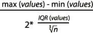 , Interquartile range( IQR = Q3-Q1 ), Freedman-Diaconisf方法偏向适用于长尾分布的数据,因为其对数据中的离群值不敏感。x表示事例的数值分布情况), and finally it fits(curve) a kernel density estimate (KDE) over the histogram.
KDE is a non-parametric method used to estimate the distribution of a variable. We can also supply a parametric distribution, such as beta, gamma, or normal distribution, to the fit argument.
In this example, we are going to fit the normal distribution from the scipy.stats package over the Big Mac Index dataset:
from scipy import stats

ax = sns.distplot( current_bigmac.dollar_price,
                   kde=False,
                   fit = stats.norm
                 )
plt.title('The price of the local Big Mac after being converted into U.S. dollars')
plt.show()
Visualizing a bivariate distribution
We should bear in mind that the Big Mac index is not directly comparable between countries. Normally, we would expect commodities in poor countries to be cheaper than those in rich ones. To represent a fairer picture of the index, it would be better to show the relationship between Big Mac pricing and Gross Domestic Product (GDP) per capita人均国内生产总值 (GDP).
We are going to acquire GDP per capita from Quandl's World Bank World Development Indicators (WWDI) dataset. Based on the previous code example of acquiring JSON data from Quandl, can you try to adapt it to download the GDP per capita dataset?
For those who are impatient, here is the full code:
import urllib
import json
import pandas as pd
import time
from urllib.request import urlopen

def get_gdp_dataset(api_key, country_code):
    """
    Obtain and parse a quandl GDP dataset in Pandas DataFrame format
    Quandl returns dataset in JSON format, where data is stored as a
    list of lists in response['dataset']['data'], and column headers
    stored in response['dataset']['column_names'].

    Args:
    api_key: Quandl API key
    country_code: Three letter code to represent country

    Returns:
    df: Pandas DataFrame of a Quandl dataset
    """
    base_url = "https://www.quandl.com/api/v3/datasets/"
    url_suffix = ".json?api_key="

    # Compose the Quandl API dataset code to get GDP per capita
    # (constant 2000 US$) dataset
    gdp_code = "WWDI/" + country_code + "_NY_GDP_PCAP_KD"

    # Parse the JSON response from Quandl API
    # Some countries might be missing, so we need error handling code

    try:
        # base_url + gdp_code + url_suffix + api_key
        #                                            #gdp_code          #
        # https://www.quandl.com/api/v3/datasets/WWDI/ARE_NY_GDP_PCAP_KD.json?api_key=sKqHwnHr8rNWK-3s5imS
        u = urlopen( base_url + gdp_code + url_suffix + api_key )
    except urllib.error.URLError as e:
        print( gdp_code, e )
        return None

    response = json.loads( u.read().decode('utf-8') )

    # Format the response as Pandas Dataframe
    df = pd.DataFrame( response['dataset']['data'],
                       columns = response['dataset']['column_names']
                     )

    # Add a new country code column
    df['country'] = country_code

    return df

api_key = "sKqHwnHr8rNWK-3s5imS"
quandl_dfs = []

# Loop through all unique country code values in the BigMac index DataFrame
for country_code in bigmac_df.country.unique():
    # Fetch the GDP dataset for the corresponding country
    df = get_gdp_dataset( api_key, country_code )

    # Skip if the response is empty
    if df is None:
        continue
    #else:
    # Store in a list DataFrames
    quandl_dfs.append(df)

    # Prevents exceeding the API speed limit
    time.sleep(2)

# Concatenate the list of DataFrames into a single one
gdp_df = pd.concat( quandl_dfs )
gdp_df.head()
We can see that the GDP per capita dataset is not available for 5 geographical locations, but we can ignore that for now.
bigmac_df.head()

Next, we will merge the two DataFrames that contain Big Mac Index and GDP per capita respectively using pandas.merge(). The most recent record in WWDI's GDP per capita dataset was collected at the end of 2015, so let's pair that up with the corresponding Big Mac index dataset in the same year.
For those who are familiar with the SQL language, pandas.merge() supports four modes, namely left, right, inner, and outer joins. Since we are interested in rows that have matching countries in both DataFrames only, we are going to choose inner join:
merged_df = pd.merge( bigmac_df[bigmac_df.Date == '2015-01-31'],
                      gdp_df[ gdp_df.Date == '2015-12-31'],
                      how = 'inner',
                      on = 'country'
                    )
merged_df.head()

Scatter plot in Seaborn
A scatter plot is one of the most common plots in the scientific and business worlds. It is particularly useful for displaying the relationship between two variables. While we can simply use matplotlib.pyplot.scatter to draw a scatter plot, we can also use Seaborn to build similar plots with more advanced features.
The two functions seaborn.regplot() and seaborn.lmplot() display a linear relationship in the form of a scatter plot, a regression line, plus the 95% confidence interval around that regression line. The main difference between the two functions is that lmplot() combines regplot() with FacetGrid such that we can create color-coded or faceted scatter plots to show the interaction between three or more pairs of variables. We will demonstrate the use of lmplot() later in this chapter and the next chapter.
The simplest form of seaborn.regplot() supports numpy arrays, pandas Series, or pandas DataFrames as input. The regression line and the confidence interval can be removed by specifying fit_reg=False.
We are going to investigate the hypothesis that Big Macs are cheaper in poorer countries, and vice versa, checking whether there is any correlation between the Big Mac index and GDP per capita:
import seaborn as sns
import matplotlib.pyplot as plt

sns.set(color_codes=True) # since sns.__version__ : '0.10.1'
# https://seaborn.pydata.org/generated/seaborn.set.html
# if your seaborn version is 0.11, then use sns.set_them(True)
# https://seaborn.pydata.org/generated/seaborn.set_theme.html#seaborn.set_theme

# seaborn.regplot() returns matplotlib.Axes object
ax = sns.regplot( x='Value', y='dollar_price', data=merged_df, fit_reg=False )
ax.set_xlabel( "GDP per capita (constant 2000 US$)" )
ax.set_ylabel( "BigMax index (US$)" )

plt.title("Relationship between GDP per capita and BigMac Index")
plt.show()
constant 2000 US: Take 2000 as the benchmark, use the price of 2000 as the constant price, and the unit of measurement is U.S. dollars

So far so good! It looks like the Big Mac index is positively correlated with GDP per capita. Let's turn the regression line back on and label a few countries that show extreme Big Mac index values:
import seaborn as sns
import matplotlib.pyplot as plt

sns.set(color_codes=True) # since sns.__version__ : '0.10.1'
# https://seaborn.pydata.org/generated/seaborn.set.html
# if your seaborn version is 0.11, then use sns.set_them(True)
# https://seaborn.pydata.org/generated/seaborn.set_theme.html#seaborn.set_theme

# seaborn.regplot() returns matplotlib.Axes object
ax = sns.regplot( x='Value', y='dollar_price', data=merged_df, fit_reg=True )
ax.set_xlabel( "GDP per capita (constant 2000 US$)" )
ax.set_ylabel( "BigMax index (US$)" )

# Label the country code for those who demonstrate extreme BigMac index
# https://pandas.pydata.org/docs/reference/api/pandas.DataFrame.itertuples.html
for row in merged_df.itertuples():
    # base on: min(merged_df.dollar_price), max(merged_df.dollar_price)
    #          (1.2008595626343,            7.5436662217838)
    if row.dollar_price >=5 or row.dollar_price <=2:
        ax.text( row.Value, row.dollar_price+0.1,
                 row.country
               )

plt.title("Relationship between GDP per capita and BigMac Index")
plt.show()
a scatter plot, a regression line, plus the 95% confidence interval around that regression line
We can see that many countries fall within the confidence interval of the regression line. Given the GDP per capita level for each country, the linear regression model predicts the corresponding Big Mac index. The currency value(unit=dollar) shows signs of under- or over-valuation if the actual index deviates from the regression model.
By labeling the countries that show extremely high or low values, we can clearly see that the average price of a Big Mac in Brazil and Switzerland(CHE) is overvalued, while it is undervalued in India, Russia, and Ukraine even if the differences in GDP are considered.
Since Seaborn is not a package for statistical analysis, we would need to rely on other packages, such as scipy.stats or statsmodels, to obtain the parameters of a regression model. In the next example, we are going to get the slope and intercept parameters from the regression model, and apply different colors for points that are above or below the regression line:
from scipy.stats import linregress

sns.set(color_codes=True) # since sns.__version__ : '0.10.1'
# https://seaborn.pydata.org/generated/seaborn.set.html
# if your seaborn version is 0.11, then use sns.set_them(True)
# https://seaborn.pydata.org/generated/seaborn.set_theme.html#seaborn.set_theme

ax = sns.regplot( x="Value", y="dollar_price", data=merged_df )
ax.set_xlabel("GDP per capita (constant 2000 US$)")
ax.set_ylabel("BigMac index (US$)")

# Calculate linear regression parameters
slope, intercept, r_value, p_value, std_err = linregress( merged_df.Value,
                                                          merged_df.dollar_price
                                                        )
colors = []
for row in merged_df.itertuples(): # for each data point
    if row.dollar_price > row.Value * slope + intercept:
        # Color markers as red if they are above the regression line
        color = "red"
    else: #row.dollar_price > row.Value * slope - intercept:
        # Color markers as blue if they are below the regression line
        color = "blue"

    # Label the country code for those who demonstrate extreme BigMac index
    # base on: min(merged_df.dollar_price), max(merged_df.dollar_price)
    #          (1.2008595626343,            7.5436662217838)
    if row.dollar_price >= 5 or row.dollar_price <= 2:
        ax.text( row.Value, row.dollar_price+0.1,
                 row.country )
    # Highlight the marker that corresponds to China
    if row.country == "CHN":
        t = ax.text( row.Value, row.dollar_price+0.1,
                     row.country )
        color = "yellow"
    colors.append( color )

# Overlay another scatter plot on top with marker-specific color
ax.scatter( merged_df.Value, merged_df.dollar_price, c=colors ) #############

# Label the r squared value and p value of the linear regression model.
# transform=ax.transAxes indicates that the coordinates are given relative
# to the axes bounding box, with 0,0 being the lower left of the axes
# and 1,1 the upper right.
ax.text( 0.1, 0.9,
         "$r^2={0:.3f}, p={1:.3e}$".format(r_value ** 2, p_value),
         transform=ax.transAxes ######
       )

from matplotlib import ticker
ax.xaxis.set_major_locator( ticker.MaxNLocator(6) )
ax.axis( xmin=-5000 , xmax=100000)

plt.show() 
Contrary to popular belief, it looks like China's currency was not significantly under-valued in 2015 since its marker lies well within the 95% confidence interval of the regression line.
To better illustrate the distribution of values, we can combine histograms of x or y values with scatter plots using seaborn.jointplot():
sns.set(color_codes=True) # since sns.__version__ : '0.10.1'
# https://seaborn.pydata.org/generated/seaborn.set.html
# if your seaborn version is 0.11, then use sns.set_them(True)
# https://seaborn.pydata.org/generated/seaborn.set_theme.html#seaborn.set_theme

# seaborn.jointplot() returns a seaborn.JointGrid object
g = sns.jointplot( x="Value", y="dollar_price", data=merged_df )

# Provide custom axes labels through accessing the underlying axes object
# We can get matplotlib.axes.Axes of the scatter plot by calling g.ax_joint
g.ax_joint.set_xlabel( "GDP per capita (constant 2000 US$)" )
g.ax_joint.set_ylabel( "BigMac index (US$)" )

# Set the title and adjust the margin
g.fig.suptitle( "Relationship between GDP per capita and BigMac Index" )
g.fig.subplots_adjust( top=0.9 )

plt.show() 
By additionally specifying the kind parameter in jointplot to reg, resid, hex, or kde, we can quickly change the plot type to regression, residual, hex bin, or KDE contour plot respectively.
sns.set(color_codes=True) # since sns.__version__ : '0.10.1'
# https://seaborn.pydata.org/generated/seaborn.set.html
# if your seaborn version is 0.11, then use sns.set_them(True)
# https://seaborn.pydata.org/generated/seaborn.set_theme.html#seaborn.set_theme

# seaborn.jointplot() returns a seaborn.JointGrid object
g = sns.jointplot( x="Value", y="dollar_price", data=merged_df,
                   kind = "hex" # kind="resid" #  kind="reg" # kind = "kde"
                 )

from scipy.stats import pearsonr
# if JointGrid annotation is deprecated
# pearson_correlation_coefficient, p_value = pearsonr( merged_df.Value,
#                                                      merged_df.dollar_price
#                                                    )
# # round(pearson_correlation_coefficient,2), p_value
# # (0.75, 1.1406214524046157e-10)
# phantom, = g.ax_joint.plot([], [], linestyle="", alpha=0.5)
# g.ax_joint.legend([phantom],
#                   ['personr={0:.2}, p={1:.1e}'.format(pearson_correlation_coefficient,
#                                                       p_value
#                                                      )
#                   ])
# if JointGrid annotation is not deprecated
g.annotate( pearsonr )

# Provide custom axes labels through accessing the underlying axes object
# We can get matplotlib.axes.Axes of the scatter plot by calling g.ax_joint
g.ax_joint.set_xlabel( "GDP per capita (constant 2000 US$)" )
g.ax_joint.set_ylabel( "BigMac index (US$)" )

# Set the title and adjust the margin
g.fig.suptitle( "Relationship between GDP per capita and BigMac Index" )
g.fig.subplots_adjust( top=0.9 )

plt.show() 

Here is a big disclaimer: with the data in our hands, it is still too early to make any conclusions about the valuation of currencies! Different business factors such as labor cost, rent, raw material costs, and taxation can all contribute to the pricing model of Big Mac, but this is beyond the scope of this book.
Visualizing categorical data
Towards the end of this chapter, let's try to integrate all datasets that we have processed so far. Remember that we briefly introduced the three categories of population structures (that is, constrictive, stable, and expansive) earlier in this chapter?
In this section, we are going to implement a naive algorithm for classifying populations into one of the three categories. After that, we will explore different techniques of visualizing categorical data.
Most references online discuss visual classification of population pyramids only (for example, https://populationeducation.org/what-are-different-types-population-pyramids/). Clustering-based methods do exist (for example, Korenjak-Cˇ erne, Kejžar, Batagelj (2008). Clustering of Population Pyramids. Informatica. 32.), but to date, mathematical definitions of population categories are scarcely discussed. We will build a naive classifier based on the ratio of populations between "0-4" and "50-54" age groups in the next example:
import pandas as pd
import seaborn as sns
import matplotlib.pyplot as plt

population_df.head()
# Select total population for each country in 2015
current_population = population_df[ ( population_df.Time==2015 ) &\
                                    ( population_df.Sex == "Both" )
                                  ]
# A list for storing the population type for each country
pop_type_list = []

# current_population = population_df[
#     (population_df.Location == 'United States of America') &\
#     (population_df.Time == 2017) &\
#     (population_df.Sex !='Both')
# ]

# merged_df = pd.merge( bigmac_df[bigmac_df.Date == '2015-01-31'],
#                       gdp_df[ gdp_df.Date == '2015-12-31'],
#                       how = 'inner',
#                       on = 'country'
#                     )

# Look through each country in the BigMac index dataset
for country in merged_df.country.unique():
    # Make sure the country also exist in the GDP per capita dataset
    if not country in current_population.country.values:
        continue

    # Calculate the ratio of population between "0-4" and "50-54"
    # age groups
    young = current_population[ ( current_population.country == country ) &\
                                ( current_population.AgeGrp == "0-4" )\
                              ].Value # Value: population
    midage = current_population[ ( current_population.country == country ) &\
                                 ( current_population.AgeGrp == "50-54" )\
                               ].Value
    ratio = float(young) / float(midage)

    # Classify the populations based on arbitratry ratio thresholds
    if ratio < 0.8:
        pop_type = "constrictive"
    elif 0.8 <= ratio < 1.2:
        pop_type = "stable"
    else:
        pop_type = "expansive"

    pop_type_list.append( [country, ratio, pop_type ] )

# Convert the list to Pandas DataFrame
pop_type_df = pd.DataFrame( pop_type_list,
                            columns = ['country', 'ratio', 'population type']
                          )

# Merge the BigMac index DataFrame with population type DataFrame
merged_df2 = pd.merge( merged_df, pop_type_df, how='inner', on='country' )
merged_df2.head()

Categorical scatter plot
With the data classified into categories, we can check whether different population types exhibit[ɪɡˈzɪbɪt]表现出 different Big Mac index distributions.
We can use seaborn.lmplot to dissect[dɪˈsekt,daɪˈsekt]仔细分析 the data and create a categorical scatter plot. As a recap, lmplot() combines regplot() with FacetGrid for visualization of three or more pairs of variables in faceted['fæsɪtɪd]有小面的 grids or color-coded scatter plots. In the upcoming examples, we are going to assign the population type variable to the col, row, or hue parameters of lmplot(). Let's see how the results look:
# Horizontal faceted grids ( col="population type" )
# https://seaborn.pydata.org/generated/seaborn.lmplot.html

sns.set(font_scale=1.5)
g = sns.lmplot( x="Value", y="dollar_price",
                col="population type", data=merged_df2,
                truncate=False)###
g.set_xlabels( "GDP per capita (constant 2000 US$)" )
g.set_ylabels( "BigMac index (US$)" )

plt.show()
#################
# Horizontal faceted grids ( col="population type" )
# https://seaborn.pydata.org/generated/seaborn.lmplot.html

sns.set(font_scale=1.5)
g = sns.lmplot( x="Value", y="dollar_price",
                col="population type", data=merged_df2,
                # truncate=False)# default truncate=True
              )
g.set_xlabels( "GDP per capita (constant 2000 US$)" )
g.set_ylabels( "BigMac index (US$)" )

plt.show()
#################
Alternatively, if we set row="population type" instead of col="population type" in the code excerpt, the following plot will be generated:
# Horizontal faceted grids ( col="population type" )
# https://seaborn.pydata.org/generated/seaborn.lmplot.html

sns.set(font_scale=1.5)
g = sns.lmplot( x="Value", y="dollar_price",
                row="population type", #####
                data=merged_df2,
                truncate=False)###
g.set_xlabels( "GDP per capita (constant 2000 US$)" )
g.set_ylabels( "BigMac index (US$)" )

plt.show() 
Finally, by changing col="population type" to hue="population type" , a colorcoded categorical scatter plot will be generated:
# Horizontal faceted grids ( col="population type" )
# https://seaborn.pydata.org/generated/seaborn.lmplot.html

sns.set(font_scale=1.5)
g = sns.lmplot( x="Value", y="dollar_price",
                hue="population type", #####
                data=merged_df2,
                truncate=False)###
g.set_xlabels( "GDP per capita (constant 2000 US$)" )
g.set_ylabels( "BigMac index (US$)" )

# plt.legend(fontsize='x-large', title_fontsize='5') #####
plt.setp(g._legend.get_title(), fontsize=15) #####

plt.show()
plt.setp(g._legend.get_title(),fontsize=15) vs None vs plt.legend(fontsize='x-large',title_fontsize='5


In fact, col, row, and hue can be mixed together to create a rich faceted grid. This is particularly useful when there are lots of dimensions in your data. Further discussion of facet grids will be available in the next chapter.
Strip plot and swarm plot
A strip is basically a scatter plot where the x-axis represents a categorical variable. Typical uses of a strip plot involve applying a small random jitter['dʒɪtər]晃动 value to each data point such that the separation between points becomes clearer:
# Strip plot with jitter value
ax = sns.stripplot( x="population type", y="dollar_price", data=merged_df2, jitter=True )
ax.set_xlabel( "Population type" )
ax.set_ylabel( "BigMac index (US$)" )

plt.show()
dollar_price(=local_price/ dollar_ex): local price after actual exchange rate conversion(Local price in U.S. dollars)
 BigMac index distribution of various population types
A swarm plot is very similar to a strip plot, yet the locations of points are adjusted automatically to avoid overlap even if the jitter value is not applied. These plots resemble bees swarming a position, and are likewise named.
# Strip plot with jitter value
ax = sns.swarmplot( x="population type", y="dollar_price", data=merged_df2 )
ax.set_xlabel( "Population type" )
ax.set_ylabel( "BigMac index (US$)" )

plt.show()
BigMac index distribution of various population types
Box plot and violin plot
The way a strip plot and swarm plot represent data makes comparison difficult. Suppose you want to find out whether the stable or constrictive population type has a higher median BigMac index value. Can you do that based on the two previous example plots?
You might be tempted to think that the constrictive group has a higher median value because of the higher maximum data point, but in fact, the stable group has a higher median value.
Could there be a better plot type for comparing the distribution of categorical data? Here you go! Let's try a box plot:
# Box plot
ax = sns.boxplot( x="population type", y="dollar_price", data=merged_df2 )

ax.set_xlabel( "Population type" )
ax.set_ylabel( "BigMac index (US$)" )

plt.show() 

https://blog.csdn.net/Linli522362242/article/details/91037961The box represents quartiles of the data方框代表数据的四分位数,
- Upper Quartile (上边缘, Q3) :The maximum value in the data other than the abnormal point
- Lower Quartile (下边缘, Q1) :The minimum value in the data other than the abnormal point
- Percentile: This is nothing but the percentage of data points below the value of the original whole data. The median is the 50th percentile, as the number of data points below the median is about 50 percent of the data.
- the center line denotes the median value, and
- the whiskers represent the full range of the data.
- Data points that deviate by more than 1.5 times the interquartile range( IQR = Q3-Q1 ) from the upper or lower quartile are deemed to be outliers( the abnormal point: <Q1-1.5*IQR or >Q3+1.5*IQR) and show as fliers
 .
.
- lower fence: Q1-1.5IQR
- upper fence: Q3 + 1.5IQR
A violin plot combines the kernel density estimate of our data with the box plot. Both box plot and violin plot display the median and interquartile range, but a violin plot goes one step further by showing the full estimated probability distribution that is fit to the data. Therefore, we can tell whether there are peaks within the data and also compare their relative amplitude[ˈæmplɪtuːd]幅度.
 中间的黑色粗条(the thick black bar in the centre represents the interquartile range)表示四分位数范围,从其延伸的幼细黑线代表 95% 置信区间(The thin black line extended from it represents the upper (max) and lower (min) adjacent values in the data(1.5* IQR = (Q3-Q1)*1.5 ). Sometimes the graph marker is clipped from the end of this line),而白点则为中位数,记住有时候在中位数附近还有一个点表示mean平均值. A violin plot depicts distributions of numeric data for one or more groups using density curves. The width of each curve corresponds with the approximate frequency of data points in each region. Densities are frequently accompanied by an overlaid chart type,
 vs
vs Violin plots are used when you want to observe the distribution of numeric data, and are especially useful when you want to make a comparison of distributions between multiple groups. The peaks(
![]() ,Higher probability), valleys
,Higher probability), valleys![]() , and tails(
, and tails(![]() or
or ![]() , lower probability)of each group’s density curve can be compared to see where groups are similar or different.https://chartio.com/learn/charts/violin-plot-complete-guide/#what-is-a-violin-plot
, lower probability)of each group’s density curve can be compared to see where groups are similar or different.https://chartio.com/learn/charts/violin-plot-complete-guide/#what-is-a-violin-plot
If we change the Seaborn function call from sns.boxplot to sns.violinplot in the code excerpt, the result would be like this:
# Box plot
ax = sns.violinplot( x="population type", y="dollar_price", data=merged_df2 )

ax.set_xlabel( "Population type" )
ax.set_ylabel( "BigMac index (US$)" )

plt.show() 
We can also overlay a strip plot or swarm plot on top of the box plot or swarm plot in order to get the best of both worlds. Here is an example code:
# Prepare a box plot
ax = sns.boxplot( x="population type", y="dollar_price", data=merged_df2 )

# Overlay a swarm plot on top of the same axes
sns.swarmplot( x="population type", y="dollar_price", data=merged_df2,
               color = "w", ax=ax ###
             )
ax.set_xlabel("Population type")
ax.set_ylabel("BigMac index (US$)")

plt.show()
The expected output:
Controlling Seaborn figure aesthetics
While we can use Matplotlib to customize the figure aesthetics[esˈθetɪks]美学, Seaborn comes with several handy functions to make customization easier. If you are using Seaborn version 0.8 or later, seaborn.set() must be called explicitly after import if you would like to enable the beautiful Seaborn default theme. In earlier versions, seaborn.set() was called implicitly on import.
Preset themes
The five default themes in Seaborn, namely darkgrid, whitegrid, dark, white, and ticks, can be selected by calling the seaborn.set_style() function.
seaborn.set_style() must be called before issuing发布 any plotting commands in order to display the theme properly.
from scipy import stats

sns.set_style('whitegrid') # white, dark, whitegrid, darkgrid, ticks

fig = plt.figure( figsize=(8,6) )
ax = sns.distplot( current_bigmac.dollar_price,
                   kde=False,
                   fit = stats.norm,
                 )
plt.title('The price of the local Big Mac after being converted into U.S. dollars')
plt.show()

Removing spines from the figure
To remove or adjust the positions of spines, we can make use of the seaborn.despine function. By default, the spines on the top and right side of a figure are removed, and additional spines can be removed by setting left=True or bottom=True. Through the use of offset and trim parameters, the location of the spines can be adjusted as well.
seaborn.despine has to be called after calling the Seaborn plotting functions.
from scipy import stats

sns.set(font_scale=1.2)
sns.set_style('ticks') # white, dark, whitegrid, darkgrid, ticks

fig = plt.figure( figsize=(8,6) )
ax = sns.distplot( current_bigmac.dollar_price,
                   kde=False,
                   fit = stats.norm,
                   hist_kws=dict(linewidth=0)
                 )

sns.despine( offset=20, trim=True)
plt.title('The price of the local Big Mac after being converted into U.S. dollars')
plt.show()
<==
<==
Here are the results of different combinations of parameters in the seaborn.despine function:
Changing the size of the figure
To control the height and width of the figure, we can rely on matplotlib.pyplot.figure(figsize=(WIDTH,HEIGHT)) as well.
import seaborn as sns
import matplotlib.pyplot as plt
from scipy import stats

# Note: Codes related to data preparation are skipped for brevity
# Reset all previous theme settings to defaults
sns.set() # since sns.__version__ : '0.10.1'
# https://seaborn.pydata.org/generated/seaborn.set.html
# if your seaborn version is 0.11, then use sns.set_them(True)
# https://seaborn.pydata.org/generated/seaborn.set_theme.html#seaborn.set_theme

# Change the size to 8 inches wide and 4 inches tall
fig = plt.figure(figsize=(8,4))
# We are going to reuse current_bigmac that was generated earlier
# Plot the histogram
ax = sns.distplot(current_bigmac.dollar_price,hist_kws=dict(linewidth=0))
plt.show()
Here is the expected output from the preceding code:

Seaborn also comes with the seaborn.set_context() function to control the scale of plot elements. There are four preset contexts, paper, notebook, talk, and poster, which are in ascending order of size. By default, the Notebook style is chosen. This is an example of setting the context to poster:
# Reset all previous theme settings to defaults
sns.set() # since sns.__version__ : '0.10.1'
# https://seaborn.pydata.org/generated/seaborn.set.html
# if your seaborn version is 0.11, then use sns.set_them(True)
# https://seaborn.pydata.org/generated/seaborn.set_theme.html#seaborn.set_theme

# Set Seaborn context to poster
sns.set_context("poster")
# We are going to reuse current_bigmac that was generated earlier
# Plot the histogram
ax = sns.distplot(current_bigmac.dollar_price,
                  hist_kws=dict(linewidth=0)
                 )
plt.show() 
Fine-tuning the style of the figure
Almost every element in a Seaborn figure can be further customized via seaborn.set.
Here is the list of parameters that are supported:
- context: One of the preset contexts--{paper, notebook, talk, poster}.
- style: One of the axes' styles--{darkgrid, whitegrid, dark, white, ticks}.
- palette: One of the color palettes as defined in https://seaborn.pydata.org/generated/seaborn.color_palette.html#seaborn.color_palette
OR https://seaborn.pydata.org/tutorial/color_palettes.html
- font: A supported font or font family name, such as serif, sans-serif, cursive, fantasy, or monospace. For more information, visit https://matplotlib.org/stable/api/font_manager_api.html
- font_scale: An independent scaling factor of font elements.
- rc: A dictionary of extra rc parameters mappings. To obtain the full list of all rc parameters, we can run seaborn.axes_style().
sns.axes_style() RC parameters that are not defined in the currently used preset context or axis style cannot be overridden. For more information on seaborn.set(), please visit seaborn.set — seaborn 0.11.2 documentation. OR seaborn.set_theme : https://seaborn.pydata.org/generated/seaborn.set_theme.html#seaborn.set_theme
Let's try to increase the font scale, increase the line width of the KDE plot, and change the color of several plot elements:
# Increase the font scale to 2, change the grid color to light grey,
# and axes label color to dark blue
sns.set( context="notebook",
         style="darkgrid",
         font_scale=2,      # increase the font scale#
         rc={ 'grid.color': '0.6',
              'axes.labelcolor':'darkblue',
              "lines.linewidth": 2.5, # increase the line width of the KDE plot
            }
       )
# Plot the histogram
ax = sns.distplot( current_bigmac.dollar_price,
                   hist_kws = dict( linewidth=0 )
                 )
plt.show()
So far, only functions that control global aesthetics were introduced. What if we want to change the style of a specific plot only?
Luckily, most Seaborn plotting functions come with specific parameters for the customization of styles. This also means that there isn't a universal styling tutorial for all Seaborn plotting functions. However, we can take a closer look at this seaborn.distplot() code excerpt to get an idea:
# Note: Codes related to data preparation and imports are skipped for
# brevity
# Reset the style

sns.set( context="notebook",
         style="darkgrid"
       )

# Plot the histogram with custom style
ax = sns.distplot( current_bigmac.dollar_price,
                   kde_kws = {"color":"g",
                              "linewidth":3,
                              "label":"KDE"
                             },
                   hist_kws = {"histtype":"step",
                               "alpha":1,
                               "color":"k",
                               "label":"histogram"
                              }
                 )
plt.show() 
Some Seaborn functions support a more direct approach of customizing aesthetics. For example, seaborn.barplot can pass through keyword arguments such as facecolor, edgecolor, ecolor, and linewidth to the underlying matplotlib.pyplot.bar function:
# Note: Codes related to data preparation and imports are skipped
# for brevity

plt.figure( figsize=(10,6) )
sns.set( font_scale=1.5,
       )
# Population Bar chart
sns.barplot( x="AgeGrp", y="Value",
             hue="Sex",
             linewidth=2, edgecolor="w",
             data = current_population
           )

# Use Matplotlib functions to label axes rotate tick labels
ax = plt.gca()
ax.set( xlabel="Age Group", ylabel="Population (thousandes)" )
ax.set_xticklabels( ax.xaxis.get_majorticklabels(),
                    rotation=45
                  )
plt.title( "Population Barchart (USA)" )

# plt.legend(frameon=False) OR plt.legend( edgecolor=None )
plt.legend(title='Sex', frameon=False)

# Show the figure
plt.show()
VS plt.legend(frameon=True)
# Note: Codes related to data preparation and imports are skipped
# for brevity

plt.figure( figsize=(10,6) )
sns.set( font_scale=1.5,
       )
# Population Bar chart
sns.barplot( x="AgeGrp", y="Value",
             hue="Sex",
             linewidth=2, edgecolor="w",
             data = current_population,

           )

# Use Matplotlib functions to label axes rotate tick labels
ax = plt.gca()
ax.set( xlabel="Age Group", ylabel="Population (thousandes)" )
ax.set_xticklabels( ax.xaxis.get_majorticklabels(),
                    rotation=45
                  )
plt.title( "Population Barchart (USA)" )

# plt.legend(frameon=True)# OR plt.legend( edgecolor=None )
# plt.legend(title='Sex', frameon=False)


# Show the figure
plt.show() 
More about colors
Color is perhaps the most important aspect of figure style, and thus it deserves its own subsection. There are many great resources that discuss the principles of choosing colors in
visualizations (for example, https://betterfigures.org/2015/06/23/picking-a-colour-scale-for-scientific-graphics/ and https://earthobservatory.nasa.gov/blogs/elegantfigures/2013/08/05/subtleties-of-color-part-1-of-6/ ). The official Matplotlib documentation also contains a good overview of color maps (https://matplotlib.org/2.0.2/users/colormaps.html).
Effective use of color adds sufficient contrast to make something stand out and draw your audience's attention. Colors can also evoke emotions; for example, red is often associated with important or passionate, while green is often associated with natural or stable. If you are trying to deliver a story from your plots, do try to use an appropriate color scheme. It's estimated that 8% of men and 0.5% of women suffer from red-green color blindness, so we need to pick colors with these individuals in mind as well.
Color scheme and color palettes
There are three general kinds of color palettes available in seaborn--qualitative, diverging, and sequential:
- Qualitative palettes are best for data with discrete levels or nominal or unordered categorical data. Custom qualitative palettes can be created by providing a list of Matplotlib colors to seaborn.color_palette.
- Diverging palettes are used for highlighting low and high values in a figure, with a neutrally colored midpoint. Custom diverging palettes can be created by passing two hue values plus the optional lightness and saturation values for the extremes to the seaborn.diverging_palette function.
- Sequential palettes are usually used for quantitative data that progresses continuously from low to high. Custom sequential palettes can be created by providing a single Matplotlib color to seaborn.light_palette or seaborn.dark_palette, which produces a palette that changes gradually from light or dark desaturated去饱和值 values to the seed color.
In the next example, we are going to plot the most commonly used qualitative, diverging, and sequential palettes, as well as a few custom palettes:
import numpy as np
import matplotlib.pyplot as plt
from matplotlib.colors import ListedColormap

def palplot( pal, ax ):
    '''Plot the values in a color palette as a horizontal array.
       Adapted from seaborn.palplot
    Args:
       pal : seaborn color palette
       ax : axes to plot the color palette
    '''
    n = len( pal )
    ax.imshow( np.arange(n).reshape(1,n),
               cmap = ListedColormap( list(pal) ),
               interpolation = "nearest",
               aspect = "auto"
             )
    ax.set_xticks( np.arange(n)-0.5 )
    ax.set_yticks( [-.5, .5] )
    ax.set_xticklabels( [] )
    ax.set_yticklabels( [] )

palettes = { "qualitative": ["deep", "pastel", "bright", "dark",
                             "colorblind", "Accent", "Paired",
                             "Set1", "Set2", "Set3",
                             "Pastel1", "Pastel2", "Dark2"
                            ],
             "diverging": ["BrBG", "PiYG", "PRGn", "PuOr", "RdBu",
                           "RdBu_r", "RdGy", "RdGy_r", "RdYlGn",
                           "coolwarm"
                          ],
             "sequential": ["husl", "Greys", "Blues", "BuGn_r",
                            "GnBu_d", "plasma", "viridis", "cubehelix"
                           ]
           }
# Reset to default Seaborn style
sns.set()

# Create one subplot per palette, the x-axis is shared
fig, axarr = plt.subplots( 13,3, sharex=True, figsize=(12,11) )

# Plot 9 color blocks for each palette
for i, palette_type in enumerate( palettes.keys() ):
    for j, palette in enumerate( palettes[palette_type] ):
        pal = sns.color_palette( palettes[palette_type][j], 9 )
        palplot( pal, axarr[j,i] )
        axarr[j,i].set_xlabel( palettes[palette_type][j] )

# Plot a few more custom diverging palette
custom_diverging_palette = [
                            sns.diverging_palette( 220, 20, n=9 ),
                            sns.diverging_palette( 10, 220, sep=80, n=9 ),
                            sns.diverging_palette( 145, 280, s=85, l=25, n=9 )
                           ]

for i, palette in enumerate( custom_diverging_palette ):
    palplot( palette, axarr[ len( palettes["diverging"] )+i, 1] )
    axarr[len(palettes["diverging"])+i, 1].set_xlabel( "custom diverging {}".format(i+1) )

# Plot a few more custom sequential palette
other_custom_palette = [
                        sns.light_palette( "green", 9 ),
                        sns.light_palette( "green", 9, reverse=True ),
                        sns.dark_palette( "navy", 9 ),
                        sns.dark_palette( "navy", 9, reverse=True ),
                        sns.color_palette( ["#49a17a", "#4aae82", "#4eb98a", "#55c091", "#c99b5f",
                                            "#cbb761", "#c5cc62", "#accd64", "#94ce65"
                                           ]
                                         )
                       ]

for i, palette in enumerate( other_custom_palette ):
    palplot( palette, axarr[len(palettes["sequential"] )+i, 2] )
    axarr[ len(palettes["sequential"])+i, 2].set_xlabel( "custom sequential {}".format(i+1) )

# Reduce unnecessary margin space
plt.tight_layout()

# Show the plot
plt.show()
To change the color scheme of a Seaborn plot, we can use either the color or palette parameter available in most Seaborn functions. The color parameter supports a single color that will be applied to all of the elements. On the other hand, palette supports a range of colors to differentiate levels of the hue variable.
Some Seaborn functions support the color parameter only (for example, dist plot), while others can support both color and palette (for example, bar plot and box plot). Readers can refer to the official documentation to see which parameter is supported.
The following three code excerpts demonstrate the use of the color or palette parameter in a dist plot, bar plot, and box plot:
# Note: Codes related to data preparation and imports are skipped
# for brevity
# Change the color of histogram and KDE line to darkred
ax = sns.distplot( current_bigmac.dollar_price, color="darkred",
                   hist_kws = dict( linewidth=0 )
                 )
plt.show()
current_population = population_df[ (population_df.Location == "United States of America") &\
                                    (population_df.Time == 2017) &\
                                    (population_df.Sex != 'Both')
                                  ]

plt.figure( figsize=(10,6) )
sns.set( font_scale=1.2 )

# Change the color palette of the bar chart to Paired
sns.barplot( x="AgeGrp", y="Value", hue="Sex", palette="Paired",
             linewidth=2, data=current_population )

# Rotate tick labels by 30 degree
plt.setp( plt.gca().get_xticklabels(), rotation=30,
          horizontalalignment = "right"
        )
plt.legend( frameon=False, title="Sex" )
plt.show() 
plt.figure( figsize=(10,6) )

# Note: Codes related to data preparation and imports are skipped
# for brevity
# Change the color palette of the bar chart to Set2 from color
# brewer library

ax = sns.boxplot( x="population type", y="dollar_price", palette="Set2",
                  data = merged_df2
                )
plt.show() 
Summary
You just learned how we can parse online data in CSV or JSON formats using the versatile Pandas package. You further learned how to filter, subset, merge, and process data into insights. You have now equipped yourself with the knowledge to visualize time series, univariate, bivariate, and categorical data. The chapter concluded with a number of useful techniques to customize figure aesthetics for effective storytelling.
Phew! We have just completed a long chapter, so go grab a burger, have a break, and relax.


 1万+
1万+


 被折叠的 条评论
为什么被折叠?
被折叠的 条评论
为什么被折叠?
 到【灌水乐园】发言


