


Connecting Tableau to data often means more than connecting to a single table in a single data source. You may need to use Tableau to join multiple tables from a single data source. For this purpose, we can use joins, which combine a dataset row with another dataset's row if a given key value matches. You can also join tables from disparate data sources or union data with a similar metadata structure.
Sometimes, you may need to merge data that does not share a common row-level key, meaning if you were to match two datasets on a row level like in a join, you would duplicate data because the row data in one dataset is of much greater detail (for example, cities) than the other dataset (which might contain countries). In such cases, you will need to blend the data. This functionality allows you to, for example, show the count of cities per country without changing the city dataset to a country level.
Also, you may find instances when it is necessary to create multiple connections to a single data source in order to pivot旋转https://blog.csdn.net/Linli522362242/article/details/123767628 the data in different ways. This is possible by manipulating the data structure, which can help you achieve data analysis from different angles, using the same dataset. It may be required in order to discover answers to questions that are difficult or simply not possible with a single data structure.
In this chapter, we will discuss the following topics:
- • Relationships
- • Joins
- • Unions
- • Blends
- • Understanding data structures
In version 2020.2, Tableau added functionality that will you allow you to join or blend without specifying one of the two methods in particular. It is called relationships. We will start this chapter off by explaining this new feature before we look into the details of joins, blends, and more.
Relationships
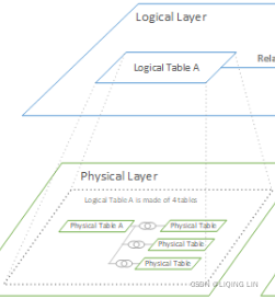
Although this chapter will primarily focus on joins, blends, and manipulation of data structures, let's begin with an introduction to relationships: a new functionality since Tableau 2020.2, and one that the Tableau community has been waiting for a long time. It is the new default option in the data canvas; therefore, we will first look into relationships, which belong on the logical layer of the data model, before diving deeper into the join and union functionalities that operate on the physical layer.
To read all about the physical and logical layers of Tableau's data model, visit the Tableau help pages: https://help.tableau.com/current/online/en-us/datasource_datamodel.htm. In Tableau 2020.2 and later, a logical layer has been added in the data source. Each logical table contains physical tables in a physical layer.
For now, you can think of the logical layer as more generic, where the specifics are dependent on each view, whereas the physical layer dives deeper, starting from the data source pane.
In the following screenshot, you can see the data source canvas, with two datasets combined in a relationship on the left-hand side, and the same datasets combined using a join on the right-hand side. Please note that relationships only show a line between the tables (DimProduct and DimProductSubcategory), whereas joins indicate the type of join by two circles:
A key difference is that the preview of the data, at the bottom, will show only data from the selected table in relationships, compared to all data when using joins. This makes sense because the granularity of data can change in relationships, depending on the fields you are using in your dashboard. Joins however have a fixed level of granularity, which is defined by the type of join and join clauses you choose.
Relationships are the default for Tableau Desktop 2020.2 and higher. However, if you still want to make use of the join functionality, you can drag a dataset into the data source canvas, click on the drop-down arrow, and select Open…:
This will open the dataset as you used to see it in the data pane in Tableau in versions before 2020.2 and you will be able to use joins the old way, as we will describe in the Joins section.
The line between two datasets in a relationship (based on the logical layer) is called a noodle. Tableau detects a relationship as soon as you drag in the second data source to the data source canvas, but you can add more key columns or remove and adjust them if needed, by clicking on the noodle itself:
If you open older dashboards in Tableau 2020.2 or later versions, you will see that the joined data will be shown as Migrated[ˈmaɪɡreɪtɪd]迁移.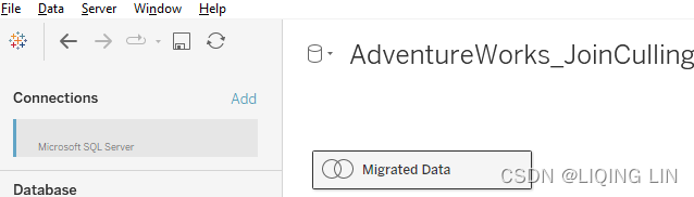 This is intentional. Just click on the migrated data source and Tableau will switch from the logical to the physical layer, meaning you will see the join-based data source canvas instead of the relationship canvas.
Looking at the worksheet, you will notice differences as well. 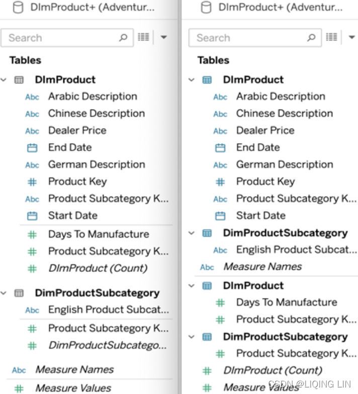 In Figure 4.3 you will see that
- in the new relationships layout (left),
the columns are divided by table name first and
then split into Dimensions and Measures per data source, - while in a join (right),
the columns are divided into dimensions and measures
and split by table name
To conclude on relationships, the new data source layout makes it a lot easier to combine datasets and you don't have to decide upfront预先 if you want to join or blend. People that are used to the old data source pane might have to get used to the new flexibility a bit, but for new Tableau users, it will be much easier to work with different datasets from the start. Nevertheless, we will still cover joins next, especially because the functionality is still part of Tableau in the physical layer.
Joins
This book assumes basic knowledge of joins, specifically inner, left-outer, right-outer, and full-outer joins. If you are not familiar with the basics of joins, consider taking W3Schools' SQL tutorial at https://www.w3schools.com/sql/default.asp. The basics are not difficult, so it won't take you long to get up to speed.
The terms simple join and complex join mean different things in different contexts. For our purposes, we will consider a simple join to be a single join between two tables. Every other instance of joining will be considered complex.
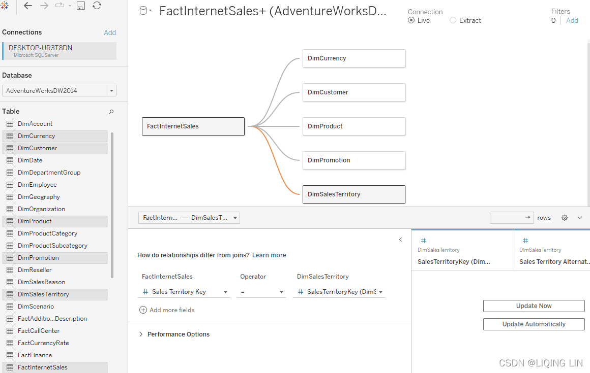
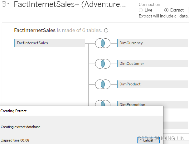
The following screenshot shows a star schema, as an example of a complex join: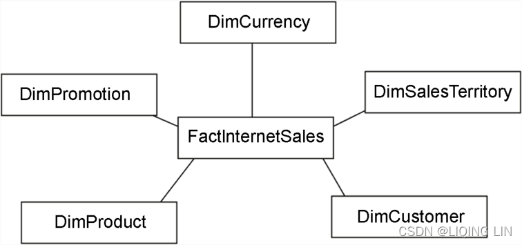
A star schema consists of a fact table (represented by FactInternetSales in Figure 4.4) that references one or more dimension tables (DimCurrency, DimSalesTerritory, DimCustomer, DimProduct, and DimPromotion). The fact table typically contains measures, whereas the dimension tables, as the name suggests, contain dimensions. Star schemas are an important part of data warehousing since their structure is optimal for reporting.
The star schema pictured is based on the AdventureWorks data warehouse for MS SQL Server 2014.https://www.sqlshack.com/install-and-configure-the-adventureworks2016-sample-database/
Install and configure the AdventureWorks2014 sample database
- you must install SQL Server Express/Standard/Enterprise Editionhttps://www.microsoft.com/en-us/sql-server/sql-server-downloads?rtc=1 and SQL Server Management Studio. https://docs.microsoft.com/en-us/sql/ssms/download-sql-server-management-studio-ssms?view=sql-server-ver15
 install
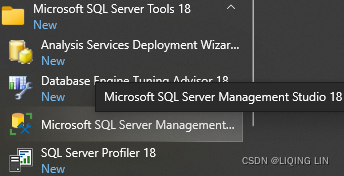
- download the AdventureWorks data warehouse for MS SQL Server 2014 (AdventureWorksDW2014.bak) from the following links:
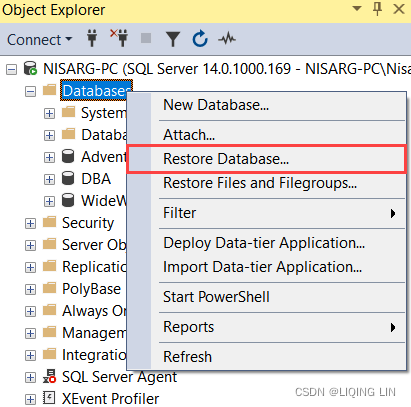
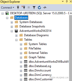
- Once the backup is downloaded, open SQL Server Management Studio and from Object Explorer, expand database engine, right-click on Databases and select Restore Database. See the following image:
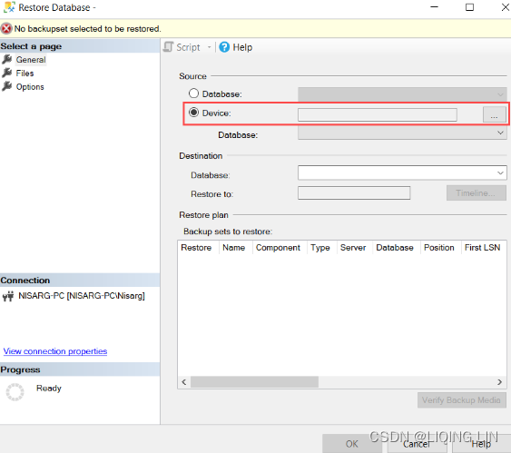
- In the Restore Database window, select Device as a source and click on ellipse (…):
- In the Locate backup devices window, select the backup media by clicking Add,
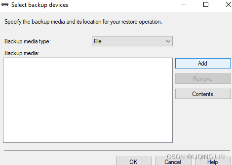 and then in the newly opened window navigate to the directory where the database backup is downloaded and select the backup (.bak) file. Click OK:https://www.sqlshack.com/install-and-configure-the-adventureworks2016-sample-database/
 -
connect to MS SQL Server
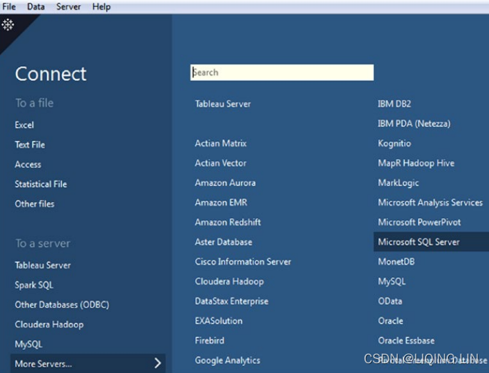 Connect to Microsoft SQL Server
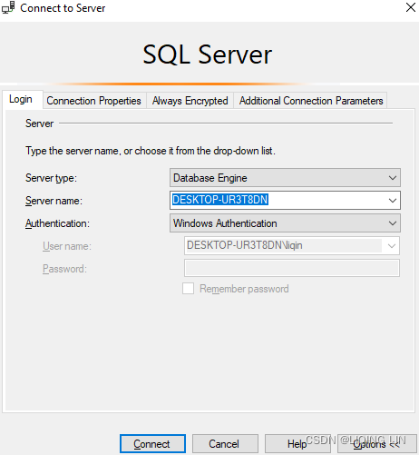 Microsoft SQL server connection window==>tableau(Fill in the details about the database server such as “server name”. Select either “Windows Authentication)
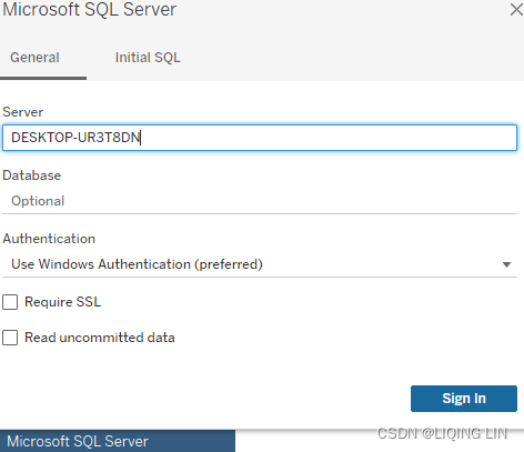 If you use a specific username and password: you need to provide a specific username and password==>Relationships
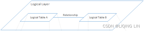
- Are displayed as flexible noodles between logical tables
- Require you to select matching fields between two logical tables
- Do not require you to select join types
- Make all row and column data from related tables potentially available in the data source
- Maintain each table's level of detail in the data source and during analysis
- Create independent domains at multiple levels of detail. Tables aren't merged together in the data source.
- During analysis, create the appropriate joins automatically, based on the fields in use.
- Do not duplicate aggregate values (when Performance Options are set to Many-to-Many)
- Keep unmatched measure values (when Performance Options are set to Some Records Match)
==> JoinJoin Your Data - Tableau
drag a dataset( ) into the data source canvas, click on the drop-down arrow, and select Open…
 Join
Join
Joins are a more static way to combine data.
- Are displayed with Venn diagram icons between physical tables
- Require you to select join types and join clauses
Joins must be defined between physical tables up front, before analysis, and can’t be changed without impacting all sheets using that data source. - Joined physical tables are merged into a single logical table
 with a fixed combination of data
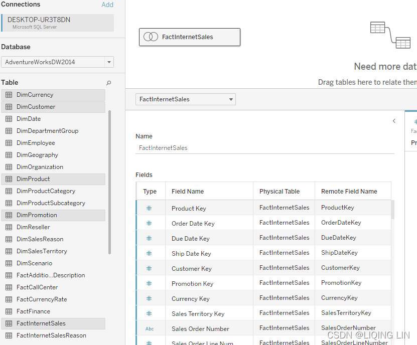 <
<
- May drop unmatched measure values
May duplicate aggregate values when fields are at different levels of detail
As a result, sometimes joined data is missing unmatched values, or duplicates aggregated values - Support scenarios that require a single table of data, such as extract filters and aggregation
Access to the database, at https://github.com/Microsoft/sql-server-samples/releases/tag/adventureworks, may prove helpful when working through some of the exercises in this chapter.
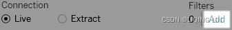
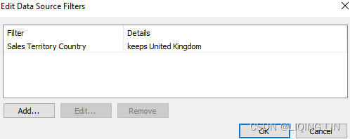
The workbook associated with this chapter does not include the whole SQL Server database but just an extract. Also, to keep the file size of the workbook small, the extract has been filtered to only include data for the United Kingdom.
Extract(Filter Data from Data Sources)
To create a data source filter
-
On the data source page, click Add in the Filters section in the upper-right corner of the page.
-
Click Add to open an Add Filter dialog box listing all fields in the data source.
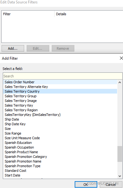 ==>Click to select a field to filter; then specify how the field should be filtered, just as you would for a field on the Filters shelf.
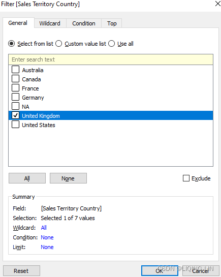
-
One feature Tableau has that is less visible to us developers is join culling[ˈkʌlɪŋ]选择,剔出, which Tableau makes use of every time multiple datasets are joined. To better understand what Tableau does to your data when joining multiple tables, let's explore join culling.
Join culling
The following screenshot is a representation of the star schema graphic shown in Figure 4.4 on the Tableau data source page using joins: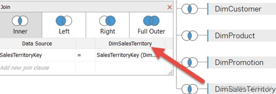
The preceding screenshot communicates an inner join between the fact table, FactInternetSales, and various dimension tables. FactInternetSales and DimSalesTerritory are connected through an inner join on the common key, SalesTerritoryKey.
In order to better understand what just has been described, we will continue with a join culling exercise. We will look at the SQL queries generated by Tableau when building a simple view using these two tables, which will show us what Tableau does under the hood while we simply drag and drop.
Note
Note that Tableau always de-normalizes or flattens extracts; that is, no joins are included in our AdventureWorks extract that ships with the Tableau workbook for this chapter. If you still want to see the SQL join queries and you don't have access to the database or the data files on GitHub, you can download the data from the Tableau workbook and put it in separate Excel sheets yourself. You can then join the tables in the manner shown in Figure 4.4.
As shown in the following screenshot, you can separate the data based on the table structure in the worksheets:
Open the tables and place the columns into separate files: ![]()
Once you have done so, please follow these steps:
- 1.
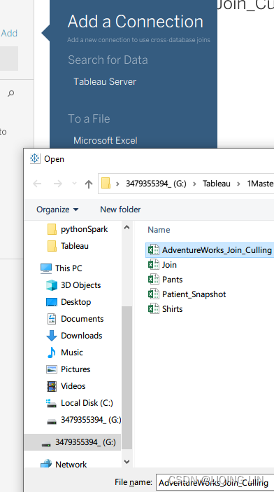
 and
and
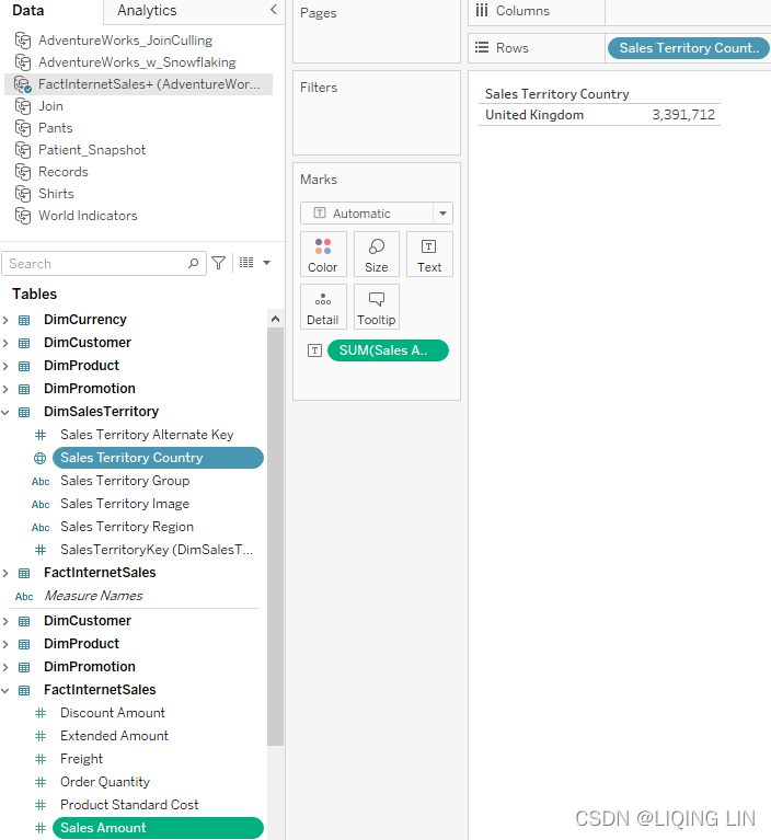
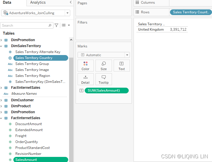
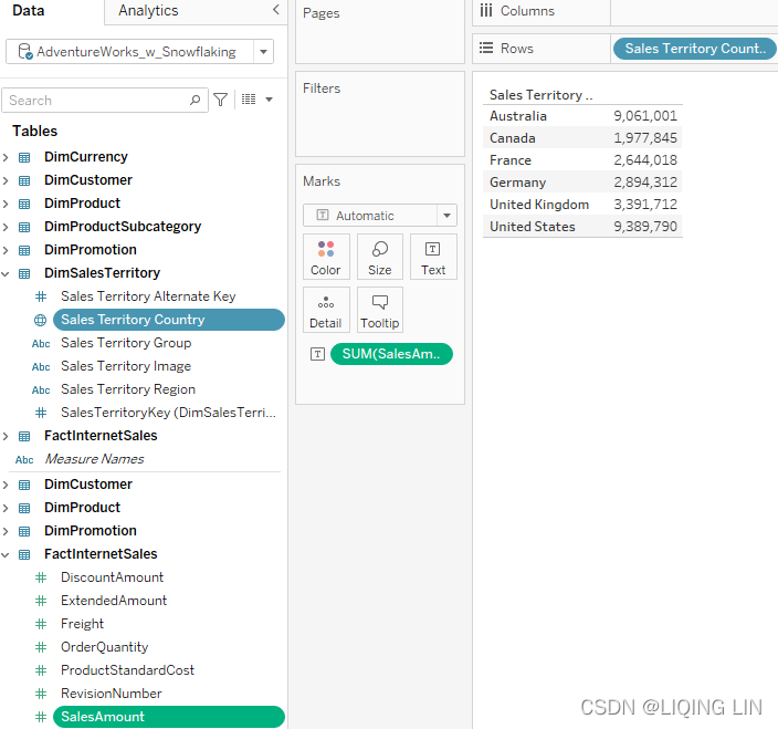
Locate and download the workbook associated with this chapter from https://public.tableau.com/profile/marleen.meier/ - 2. Select the Join Culling worksheet and click on the AdventureWorks_Join_Culling data source.
- 3. Drag Sales Territory Country to the Rows shelf and place SalesAmount on the Text shelf:
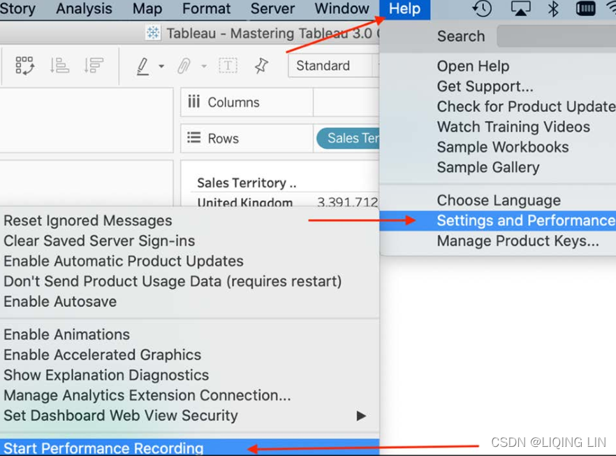
- 4. (The data source connection type must be guaranteed to be live)From the menu, select Help, then Settings and Performance, and then Start Performance Recording:
- 5. Press F5 on your keyboard to refresh the view.
- 6. Stop the recording with Help, then Settings and Performance, and finally Stop Performance Recording.
- 7. In the resulting Performance Summary dashboard, drag the time slider to 0.0000 and select Executing Query. Now you see the SQL generated by Tableau:
Figure 4.10: Performance recording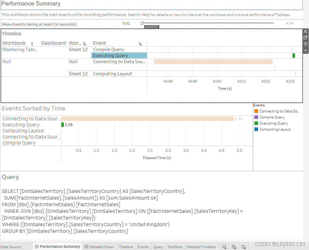
So far, we have connected Tableau to our dataset, then we created a very simple worksheet, showing us the number of sales for the United Kingdom. But, in order for Tableau to show the country and the sales amount, it needs to get data from two different tables: DimSalesTerritory and FactInternetSales. The performance recording in Figure 4.10 shows how long each step of building the dashboard took and which query was sent to the database. That query is exactly what we are interested in, to see what is going on behind the scenes. Let's look at it in detail:Command " SELECT [DimSalesTerritory].[SalesTerritoryCountry] AS [SalesTerritoryCountry], SUM([FactInternetSales].[SalesAmount]) AS [sum:SalesAmount:ok] FROM [dbo].[FactInternetSales] [FactInternetSales] INNER JOIN [dbo].[DimSalesTerritory] [DimSalesTerritory] ON ([FactInternetSales].[SalesTerritoryKey] = [DimSalesTerritory].[SalesTerritoryKey]) WHERE ([DimSalesTerritory].[SalesTerritoryCountry] = 'United Kingdom') GROUP BY [DimSalesTerritory].[SalesTerritoryCountry] "Note that a single inner join was generated, between FactInternetSales table and DimSalesTerritory table. Despite the presence of a complex join—meaning that multiple tables are being joined—Tableau only generated the SQL necessary to create the view. In other words, it only created one out of a number of possible joins. This is join culling in action.
In Tableau, join culling assumes tables in the database have referential integrity参照完整性;(select the data source connection from the Data menu or use the context menu from the data source connection(here is AdventureWorks_JoinCulling) and choose Assume Referential Integrity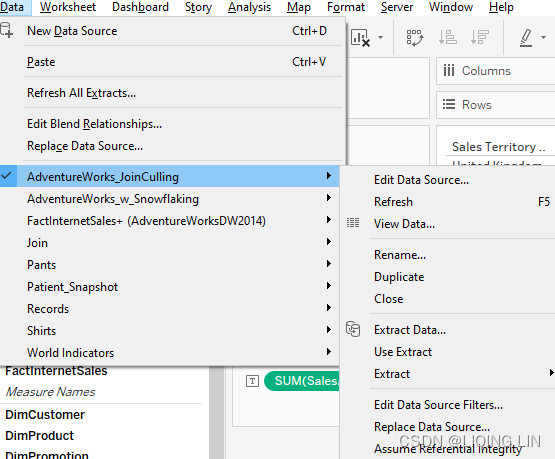 )that is, a join between the fact table and a dimension table does not require joins to other dimension tables. Join culling ensures that if a query requires only data from one table, other joined tables will not be referenced. The end result is better performance.
For referential integrity to hold in a relational database, any column in a base table that is declared a foreign key can only contain either null values or values from a parent table's primary key or a candidate key. (A candidate key is a specific type of field in a relational database that can identify each unique record independently of any other data. Experts describe a candidate key of having "no redundant attributes" and being a "minimal representation of a tuple" in a relational database table.) In other words, when a foreign key value is used it must reference a valid, existing primary key in the parent table.
For instance, deleting a record(artist_id = 4 from artist table) that contains a value referred to by a foreign key in another table(artist_id,album_id, album_name) would break referential integrity. However, the album "Eat the Rich" referred to the artist with an artist_id of 4. With referential integrity enforced, this would not have been possible.
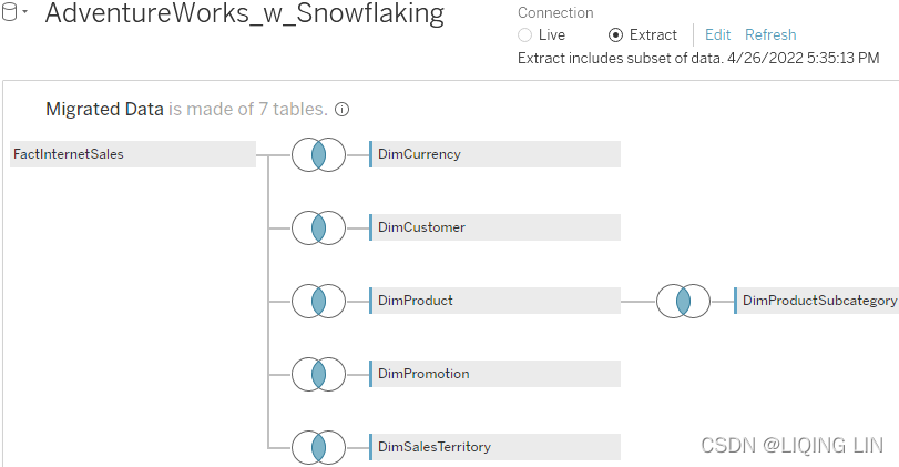
Next, we'll consider another concept in Tableau that affects how datasets are joined: snowflaking.
Snowflaking
Let's make one small change to the star schema and add the DimProductSubcategory dimension.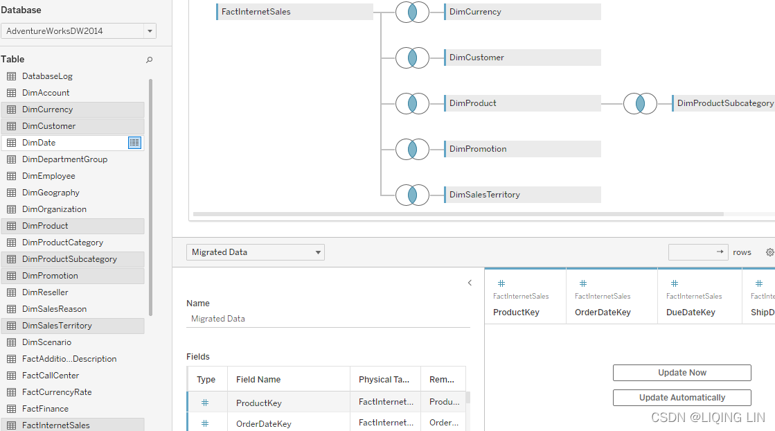 Figure 4.11: Snowflaking
In the workbook provided with this chapter, the worksheet is entitled Joins w/ Snowflaking. Viewing the joins presupposes that you have connected to a database as opposed to using the extracted data sources provided with the workbook.
Note that there is no common key between FactInternetSales and DimProductSubcategory. The only way to join this additional table is to connect it to DimProduct, so we want to understand what Tableau is doing in this case and if this will have any complications for our dashboard building.
Let's repeat the steps listed in the Join culling section to observe the underlying SQL and consider the results in the following code block:
- 1. Select the Join w/ Snowflaking worksheet and click on the AdventureWorks_w_Snowflaking data source

- 2. Drag Sales Territory Country to the Rows shelf and place SalesAmount on the Text shelf
- 3. From the menu, select Help, then Settings and Performance, and then Start Performance Recording
- 4. Press F5 on your keyboard to refresh the view
- 5. Stop the recording with Help, then Settings and Performance, and finally Stop Performance Recording
- 6. In the resulting Performance Summary dashboard, drag the time slider to 0.0000 and select Executing Query
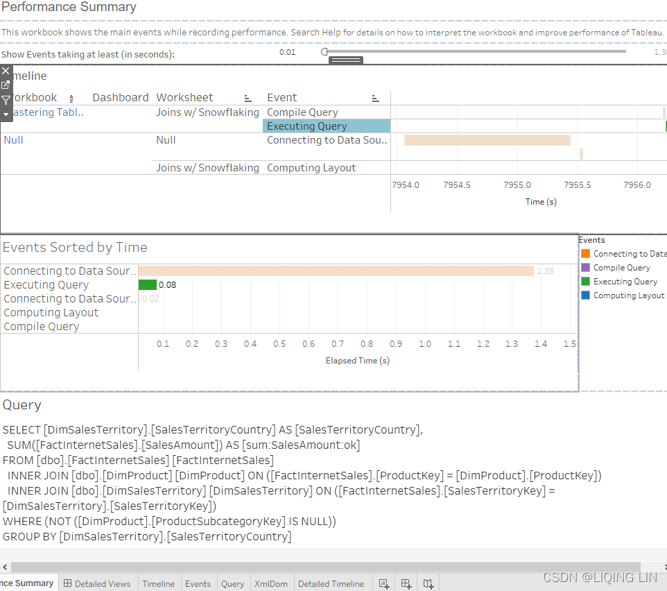
Now you should see the SQL generated by Tableau:
Command
"
SELECT [DimSalesTerritory].[SalesTerritoryCountry] AS [SalesTerritoryCountry],
       SUM([FactInternetSales].[SalesAmount]) AS [sum:SalesAmount:ok]
FROM [dbo].[FactInternetSales] [FactInternetSales]
     INNER JOIN [dbo].[DimProduct] [DimProduct] ON
                ([FactInternetSales].[ProductKey] = [DimProduct].[ProductKey])
     INNER JOIN [dbo].[DimSalesTerritory] [DimSalesTerritory] ON
                ([FactInternetSales].[SalesTerritoryKey] = [DimSalesTerritory].[SalesTerritoryKey])
WHERE ( NOT ([DimProduct].[ProductSubcategoryKey] IS NULL) )
GROUP BY [DimSalesTerritory].[SalesTerritoryCountry]
"
Although our view does not require the DimProduct table, an additional join was generated for the DimProduct table (since we need inner join DimProduct table to DimProductSubcategory table, and the ProductSubcategoryKey is a foreign key used in the inner join to the primary key of DimProductSubcategory table and therefore it is required not Null). Additionally, a WHERE clause was included. What's going on?
The additional inner join was created because of snowflaking. Snowflaking normalizes a dimension table规范化维度表 by moving attributes into one or more additional tables that are joined on a foreign key. As a result of the snowflaking, Tableau is limited in its ability to exercise join culling, and the resulting query is less efficient(such as query time). The same is true for any secondary join.
Note
A materialized view is the result of a query that is physically stored in a database. It differs from a view(or worksheet) in that a view requires the associated query to be run every time it needs to be accessed.
The important points to remember from this section are as follows:
- • Using secondary joins辅助连接
(since we need inner join DimProduct table to DimProductSubcategory table, and the ProductSubcategoryKey is a foreign key used in the inner join to the primary key of DimProductSubcategory table
) limits Tableau's ability to employ join culling. This results in less efficient queries to the underlying data source. - • Creating an extract materializes all joins.
 Thus even if secondary joins are used when connecting to the data source, any extract from that data source will be denormalized or flattened被非规范化或展平. This means that any query to an extract will not include joins and may thus perform better. Therefore, in the case of complex joins, try to use extracts where possible to improve performance.
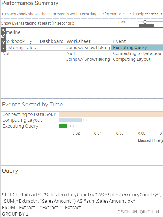
Now that the technical details have been discussed, let's take a look at joins in dashboards themselves.
Join calculations
In Tableau, it is also possible to join two files based on a calculation. You would use this functionality to resolve mismatches不匹配问题 between two data sources. The calculated join can be accessed in the dropdown of each join.
See the following screenshot:
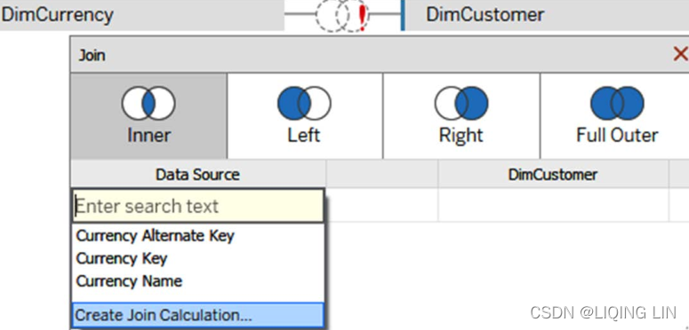
As an example, imagine
- a dataset that contains one column for First Name, and another column for Last Name.
- You want to join it to a second dataset that has one column called Name, containing the first and last name.
- One option to join those two datasets is to create a Join Calculation like the following in the first dataset:
[First Name] + ' ' + [Last Name] - Now, select the Name column in the second dataset and your keys should be matching!
If you want to know more about calculated joins, please check the Tableau Help pages: https://help.tableau.com/current/pro/desktop/en-us/joining_tables.htm#use-calculations-to-resolve-mismatches-between-fields-in-a-join
Spatial joins
In Tableau 2018.2, spatial joins were added. What this means is that you can join spatial fields from Esri shapefiles, KML, GeoJSON, MapInfo tables(Spatial file: A .kml , .shp , .tab , .mif , or .geojson file that contains spatial objects that can be rendered by Tableauhttps://blog.csdn.net/Linli522362242/article/details/123970001), Tableau extracts, and SQL Server. Imagine two datasets,
- one about the location of basins[ˈbeɪsn]盆地, indicated by a spatial field, and
- a second dataset containing the locations of waterfowl[ˈwɔːtərfaʊl]水鸟 sightings[ˈsaɪtɪŋ]瞄准,视线,目击 also in a spatial column.
- Tableau allows you to join the two, which is very hard to do otherwise because most programs don't support spatial data.
In order to join on spatial columns, you have to select the Intersects field from the Join dropdown: 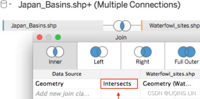
For more information on joining spatial files in Tableau, read the following resources from Tableau:
- Join Spatial Files in Tableau - Tableau
- Perform advanced spatial analysis with spatial join—now available in Tableau
Alternatively to a horizontal join, you might need a vertical join, also called a union. A typical union use case is visualizing data that is stored in multiple files or tables over time. You might have a daily report, in which the column structure is the same but collected as a new file every day, stored in a monthly or yearly folder.
Combining those files gives so much more insight than a single one at a time! You will be able to analyze trends and changes from day to day or maybe year to day. So, we will continue with an in-depth explanation of unions in Tableau next.
Unions
Sometimes you might want to analyze data with the same metadata structure, which is stored in different files, for example, sales data from multiple years, or different months, or countries. Instead of copying and pasting the data, you can union it. We already touched upon this topic in Chapter 3, Tableau Prep Builder, but a union is basically where Tableau will append new rows of data to existing columns with the same header. Let's consider how to create a union, by taking the following steps:
- 1. Create a new data source(worksheet ==>
 Data | New Data Source ) from the menu, toolbar, or Data Source screen,
  ==>
==>
starting with one of the files you wish to be part of the union.(note 14 fields 2999 rows)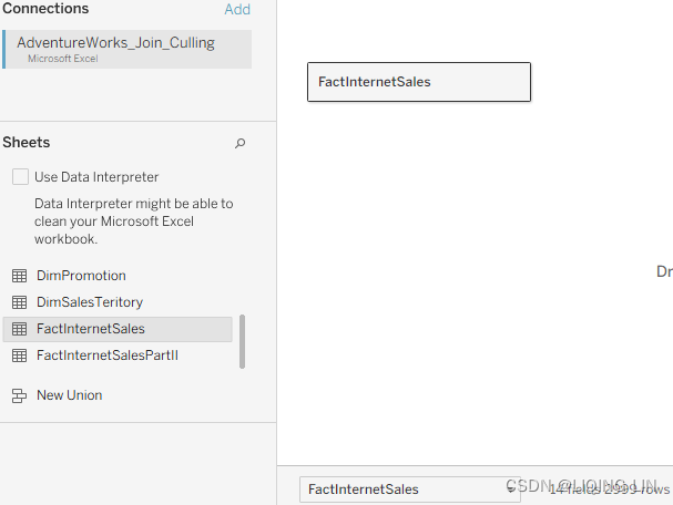
Then, drag an additional file beneath the existing table until the word Union appears,(Alternatively, right-click the dropdown menu of the primary dataset and select Convert to Union…: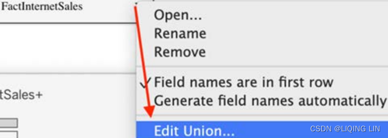 )
) a sign that when dropping the data now, the data will be used for a union:
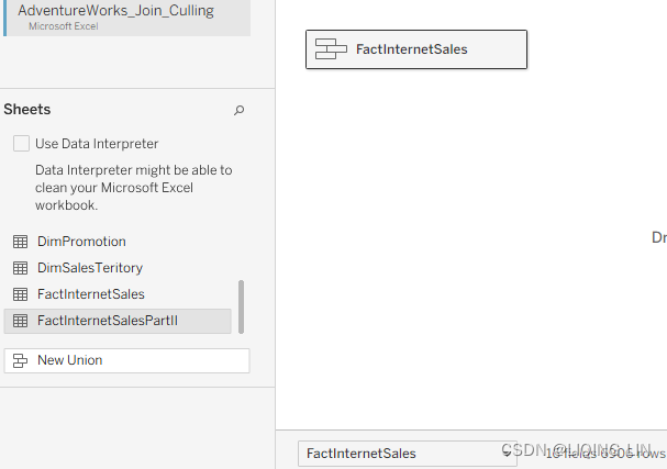 (note 14 fields 6906 rows)
Note: the previous snapshot or operation is on the Logical layer
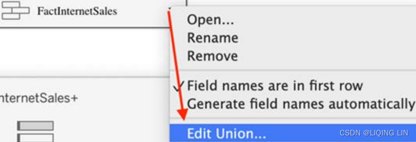
you can right click the dropdown menu of ,
,
then select Open to go to Physical layer
- 2. click the dropdown menu of , then select Edict Union...
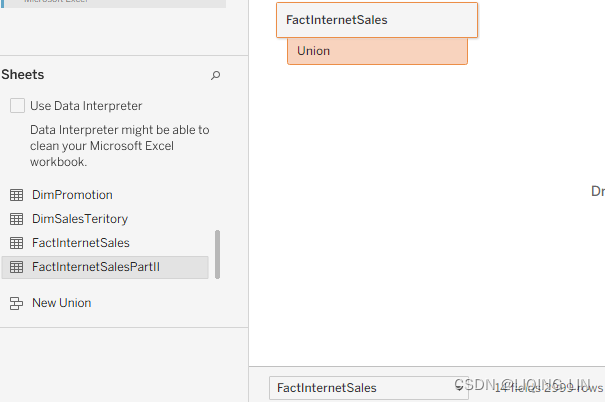
- 3. In the following popup (Figure 4.16), the user has the option to select all the data tables that should be part of the union individually by drag and drop(Specific (manual)),
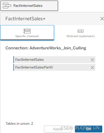 or use a Wildcard union that includes all tables in a certain directory based on the naming convention—a * represents any character. FactInternetSales* will include any file that starts with FactInternetSales
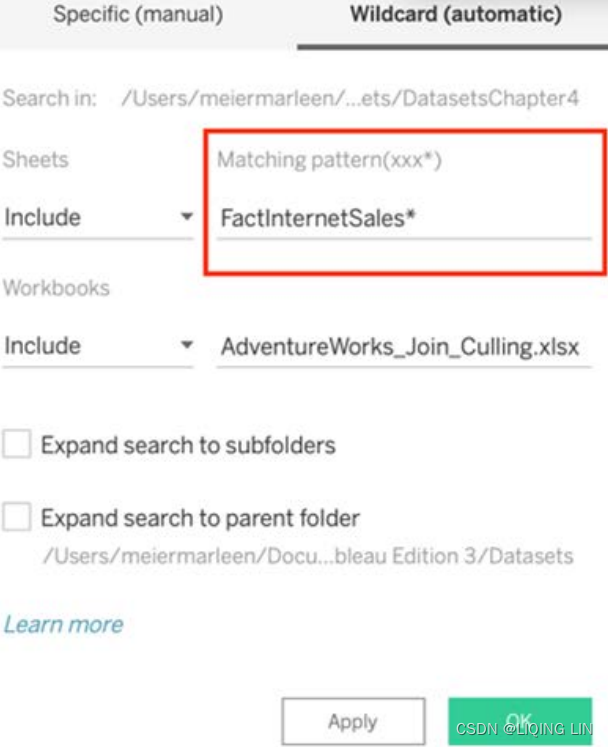
Unions are used to combine data that is very similar and can be appended underneath each other. They are most often used for multiple data files where each has a different date stamp, or a different region, or a different manager, and so forth. By using a union, you want to make the dataset more complete. We saw that Tableau allows unions by drag and drop, as well as right-clicking on the initial data source. We also talked about unions that combine one or more other datasets, using drag and drop or wildcards. Figure 4.17 presents a typical union example: 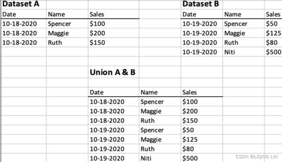
Let's look at the aspects we need to remember:
- • Unions append data in creating additional rows.
- • A union should contain datasets that have many common columns.
- • Unions should only be used for same-structured data stored across multiple data sources.
- • Keep an eye on performance when using unions. With each additional dataset in the union, you will increase the complexity of Tableau's VizQL.
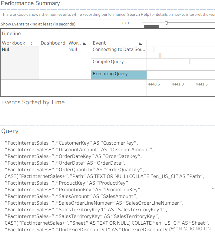
Command
"
SELECT
  ""FactInternetSales+"".""CurrencyKey"" AS ""CurrencyKey"",
  ""FactInternetSales+"".""CustomerKey"" AS ""CustomerKey"",
  ""FactInternetSales+"".""DiscountAmount"" AS ""DiscountAmount"",
  ""FactInternetSales+"".""OrderDateKey"" AS ""OrderDateKey"",
  ""FactInternetSales+"".""OrderDate"" AS ""OrderDate"",
  ""FactInternetSales+"".""OrderQuantity"" AS ""OrderQuantity"",

  CAST(""FactInternetSales+"".""Path"" AS TEXT OR NULL) COLLATE ""en_US_CI"" AS ""Path"",
  ""FactInternetSales+"".""ProductKey"" AS ""ProductKey"",
  ""FactInternetSales+"".""PromotionKey"" AS ""PromotionKey"",
  ""FactInternetSales+"".""SalesAmount"" AS ""SalesAmount"",
  ""FactInternetSales+"".""SalesOrderLineNumber"" AS ""SalesOrderLineNumber"",
  ""FactInternetSales+"".""SalesTerritoryKey 1"" AS ""SalesTerritoryKey 1"",
  ""FactInternetSales+"".""SalesTerritoryKey"" AS ""SalesTerritoryKey"",

  CAST(""FactInternetSales+"".""Sheet"" AS TEXT OR NULL) COLLATE ""en_US_CI"" AS ""Sheet"",
  ""FactInternetSales+"".""UnitPriceDiscountPct"" AS ""UnitPriceDiscountPct"",
  ""FactInternetSales+"".""UnitPrice"" AS ""UnitPrice"",
  ""FactInternetSales+"".""ctid"" AS ""$__alias__0""

FROM ""TableauTemp"".""FactInternetSales+"" ""FactInternetSales+""
ORDER BY ""$__alias__0"" ASC NULLS FIRST
LIMIT 100
"
the CAST clause convert the Path and Sheet to TEXT or NULL,
Then, use COLLATE to sort the TEXT charactersSet or Change the Column Collation - SQL Server | Microsoft Docs
here collation_name排序规则名称 is en_US_CI: ENglish United States Culture Information (Converted to English strings that conform to American culture)
COLLATE { <collation_name> | database_default }
<collation_name> :: =
{ Windows_collation_name } | { SQL_collation_name }sql语句里面的COLLATE主要用于对字符进行排序,经常出现在表的创建语句中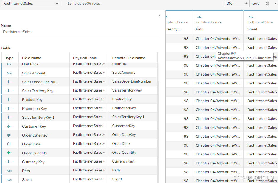
""FactInternetSales+"".""ctid"" is the Current id of FactInternetSales+ in the workbook, but will not append to the column
Another Union example:https://blog.csdn.net/Linli522362242/article/details/123767628
Since you just became a union expert, it's time to move on to the next feature Tableau offers: blending! Blending helps you to combine datasets that have a different level of granularity. Think one-to-many relationships between datasets. One dataset has a unique key per row, the other has multiple rows per key. In order to avoid duplicating rows in the first-mentioned dataset, Tableau came up with blending, long before relationships were part of the software package. 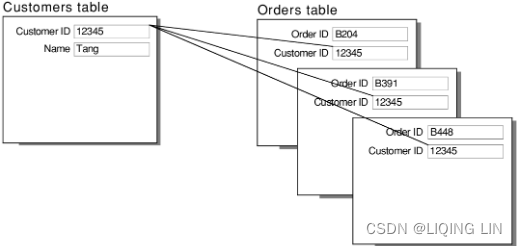
Blends
Relationships make data blending a little less needed and it can be seen as legacy functionality. But for the sake of completeness and for older Tableau versions (below 2020.2) let's consider a summary of data blending in the following sections. In a nutshell简而言之, data blending allows you to merge multiple, disparate data sources into a single view. Understanding the following four points will give you a grasp on the main points regarding data blending:
- • Data blending is typically used to merge data from multiple data sources. Although as of Tableau 10, joins are possible between multiple data sources, there are still cases when data blending is the only possible option to merge data from two or more sources. In the following sections, we will see a practical example that demonstrates such a case.
- • Data blending requires a shared dimension共享维度. A date dimension is often a good candidate理想选择 for blending multiple data sources.
- • Data blending aggregates and then matches. On the other hand, joining matches and then aggregates.
- • Data blending does not enable dimensions from a secondary data source. Attempting to use dimensions from a secondary data source will result in a * or null in the view. There is an exception to this rule, which we will discuss later, in the Adding secondary dimensions section.
Now that we've introduced relationships, joins, and unions, I would like to shift your focus a bit to data structures within your workbook. You might have set up the perfect join or union, start dragging and dropping fields onto your workbook canvas, use a filter, use a calculated field, and then receive some unexpected results. Tableau is behaving just not the way you like it. Why might that be?! The order of operation here is key. It is essential to know when which filter will be applied and how this affects your data. Therefore, next in line: order of operations操作顺序.
Exploring the order of operations
Isn't a data blend the same thing as a left join? This is a question that new Tableau authors often ask. The answer, of course, is no, but let's explore the differences. The following example is simple, even lighthearted, but does demonstrate serious consequences that can result from incorrect aggregation resulting from an erroneous join.
In this example, we will explore in which order aggregation happens聚合发生的顺序 in Tableau. This will help you understand how to more effectively use blends and joins.
One day, in the near future, you may move to fulfill a lifelong desire to open a brick and mortar[ˈmɔːrtər] store一家实体店. Let's assume that you will open a clothing store specializing in pants and shirts. Because of the fastidious[fæˈstɪdiəs]挑剔的,苛求的 tendencies[ˈtendənsi]偏好,趋向 you developed as a result of years of working with data, you are planning to keep everything quite separate, that is, you plan to normalize your business. As evidenced by the following diagram, the pants and shirts you sell in your store will be quite separated: 
You also intend to keep your data stored in separate tables, although these tables will exist in the same data source.
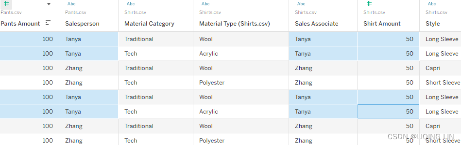
Let's view the segregation of the data in the following screenshot:
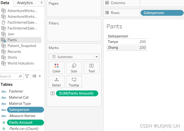
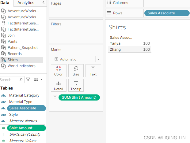
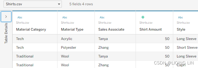
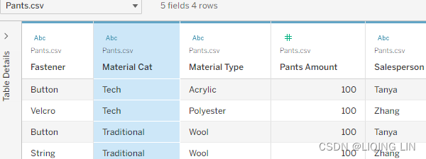
In these tables, two people are listed: Tanya and Zhang. In one table, these people are members of the Salesperson dimension, and in the other, they are members of the Sales Associate dimension. Furthermore, Tanya and Zhang both sold $200 in pants and $100 in shirts. Let's explore different ways Tableau could connect to this data to better understand joining and data blending.
When we look at the spreadsheets associated with this exercise, you will notice additional columns. These columns will be used in a later exercise.
Please take the following steps:
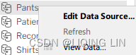
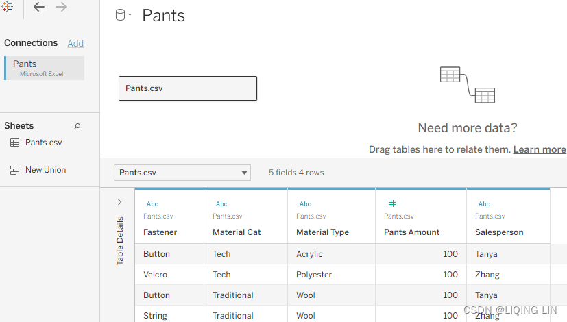
- 1. In the workbook associated with this chapter, right-click on the Pants data source and then Edit Data Source...
 . Do the same for the Shirts data source.
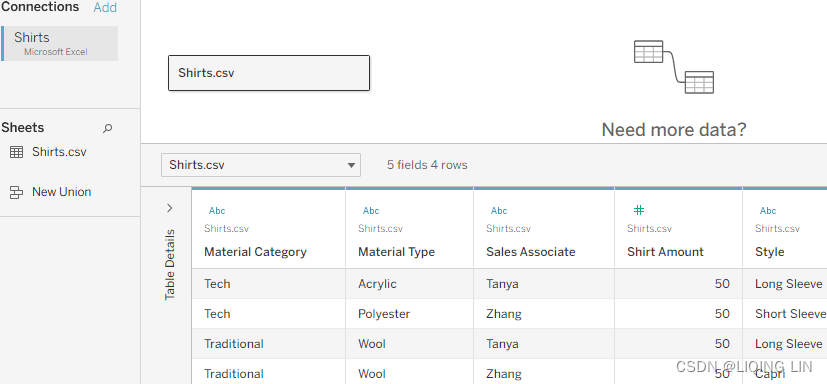
- 2. Open the Join data source by right-clicking on it and selecting Edit Data Source,
 and then right-click Pant and select Open
 , you may need to Edit Connection for both Pants and Shirts tables, and next observe the join between the Pants and Shirts tables using Salesperson/Sales Associate as the common key:
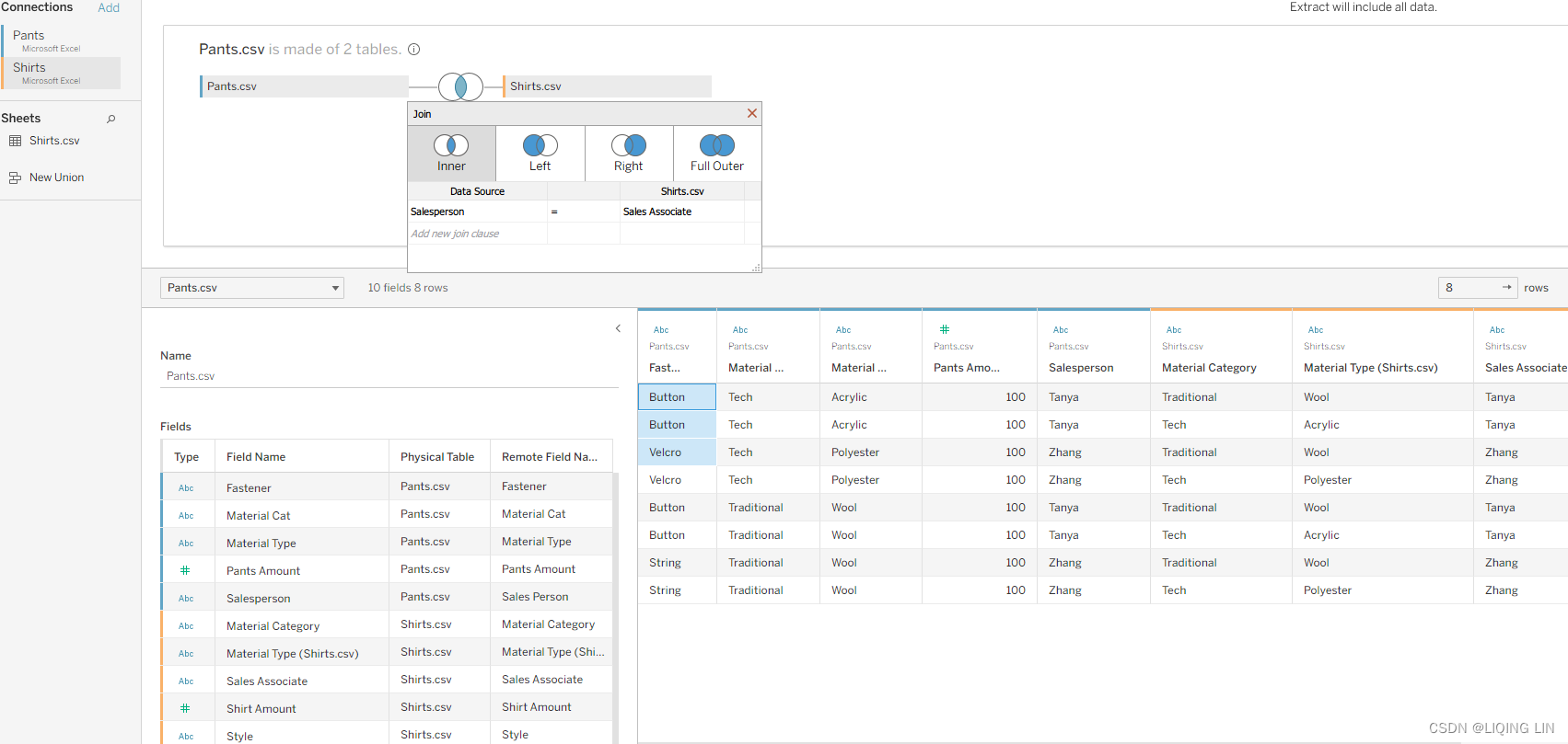
- 3.On the Pants worksheet, select the Pants data source and place Salesperson on the Rows shelf and Pants Amount on the Text shelf:
- 4. On the Shirts worksheet, select the Shirts data source and place Sales Associate on the Rows shelf and Shirt Amount on the Text shelf:
- 5. On the Join worksheet, select the Join data source and place Salesperson on
the Rows shelf. Next, double-click Pants Amount and Shirt Amount to place
both on the view: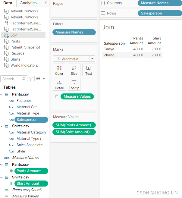
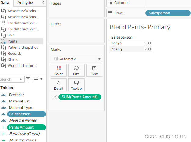
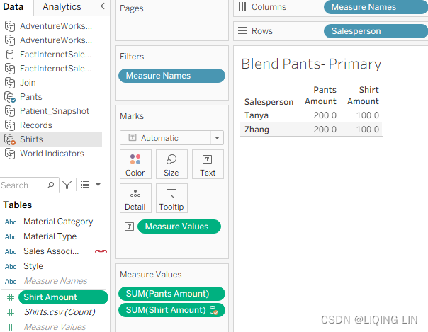
- 6. On the Blend – Pants Primary worksheet, select the Pants data source and place Salesperson on the Rows shelf and Pants Amount on the Text shelf:
- 7. Stay on the Blend – Pants Primary worksheet and select the Shirts data source from the data source pane on the left and double-click on Shirt Amount. Click OK if an error message pops up.
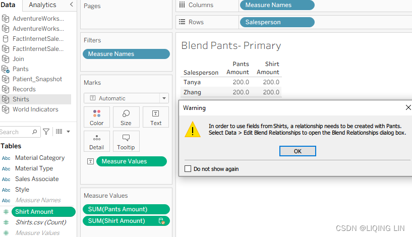
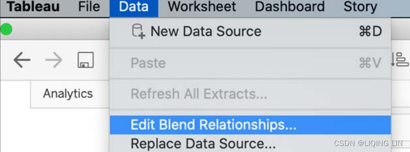
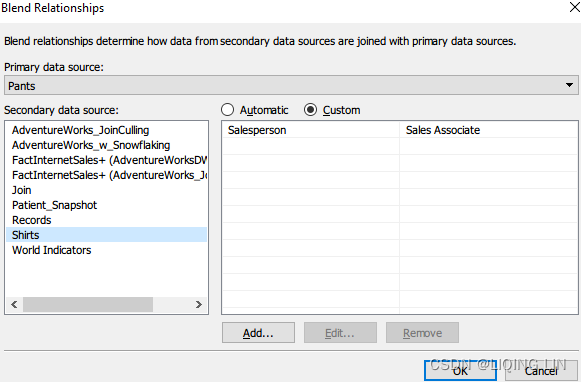
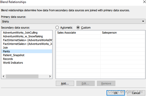
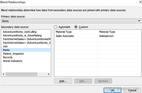
- 8. Select Data then Edit Blend Relationships…:
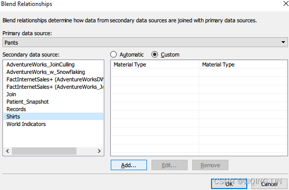
- 9. In the resulting dialog box, click on the Custom radio button as shown in Figure 4.26,
- Primary data sources : Pants
- Secondary data sources: Shirts
- then click Add….
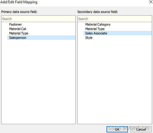
- 10. In the left column, select Salesperson, and in the right column, select Sales Associate. The left column represents data from the Primary data source and the right column represents all the data available in the Secondary data source, as shown in Figure 4.26.
- 11. Remove all other links if any and click OK. The results in the dialog box should match what is displayed in the following screenshot:
- A little recap on what we have done so far: we are working with three data
sources: Pants, Shirts, and Join, where Join consists of Pants and Shirts. We
have also created a blend with Pants being the primary data source and we
connected them by using Salesperson and Sales Associate as keys. - Don't get confused by the name Blend Relationships. This has nothing to do with the logical layer Relationships. It is just the name of the pop-up window.
- A little recap on what we have done so far: we are working with three data
- 12. On the Blend – Shirts Primary worksheet, select the Shirts data source and place Sales Associate on the Rows shelf and Shirt Amount on the Text shelf:
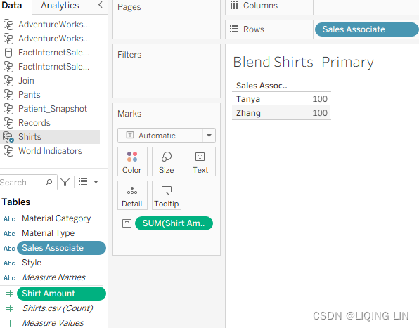
- 13. On the Blend – Shirts Primary worksheet, select the Pants data source and double-click Pants Amount in order to add it to the view:
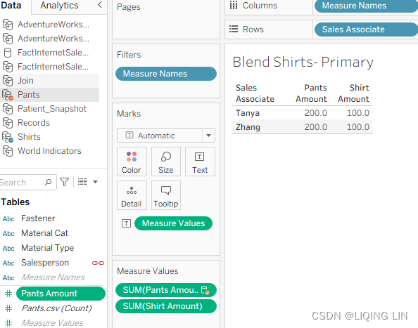
- Place all five worksheets on a dashboard. Format and arrange as desired. Now let's compare the results between the five worksheets in the following screenshot:
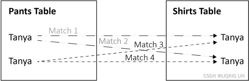
 In the preceding screenshot, the Join worksheet has double the expected results.
Why? Because a join first matches on the common key (in this case, Salesperson/
Sales Associate) and then aggregates the results. The more matches found on a
common key, the worse the problem will become. If multiple matches are found on a
common key, the results will grow exponentially.- Two matches will result in squared results(2^2),
- three matches will result in cubed results(3^3),
- and so forth.
- This exponential effect is represented graphically in the following screenshot:==>Join
On the other hand, the blend functioned more efficiently but before the blend could function properly, we had to edit the data relationship so that Tableau could connect the two data sources using the Salesperson and Sales Associate fields. If the two fields had been identically named (for example, Salesperson ), Tableau would have automatically provided an option to blend between the data sources using those fields.
-
The results for the Blend Pants – Primary and Blend Shirts – Primary worksheets are correct. There is no exponential effect. Why? Because data blending first aggregates the results from both data sources, and then matches the results on a common dimension.
In this case, it is Salesperson/Sales Associate, as demonstrated in the following screenshot: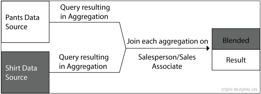
What we saw in this exercise is that joins can change the data structure, so be careful when using them and be very aware of which columns are a suitable key. Also, do checks before and after joining your data, which can be as easy as counting rows and checking if this is the expected result.
Blending has advantages and disadvantages; adding dimensions, for example, is not that straightforward. But we will explore more details regarding secondary dimensions in the next section.
Adding secondary dimensions(Blending)
Data blending, although very useful for connecting disparate data sources, has limitations. The most important limitation to be aware of is that data blending does not enable dimensions from a secondary data source. There is an exception to this limitation; that is, there is one way you can add a dimension from a secondary data source. Let's explore further.
There are other fields besides Salesperson/Sales Associate and Shirt Amount/Pants Amount in the data sources. We will reference those fields in this exercise:
- 1. In the workbook associated with this chapter, select the Adding Secondary Dimensions worksheet.
- 2. Select the Shirts data source.
- 3. Add a relationship between the Shirts and Pants data sources for Material Type, taking the following steps:
- 1. Select Data from menu then Edit Blending Relationships....
- 2. Ensure that Shirts is the primary data source and Pants is the secondary data source.
- 3. Select the Custom radio button.
- 4. Click Add…:
Click OK
-
4. Click Add… again, select Material Type in both the left and right columns:
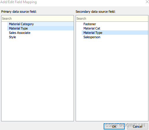
-
5. Click OK to return to the view.
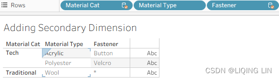
- 6. Place Material Type on the Rows shelf.
- 7. Select the Pants data source and make sure that the chain-link icon next to Material Type
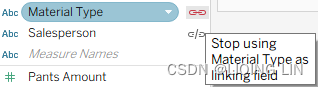 in the Data pane is activated and that the chain-link icon next to Salesperson is deactivated
 .
.
- If the icon is a broken chain-link, it is not activated.
- If it is a connected chain-link, it is activated
- 8. Place Material Cat (Categoriy:acrylic[əˈkrɪlɪk]亚克力纤维, polyester[ˈpɑːliestər]聚酯纤维,涤纶 and son) before Material Type, and Fastener紧固件(Button
 , Velcro[ˈvelkroʊ]尼龙搭扣
 and so on) after Material Type on the Rows shelf as follows:
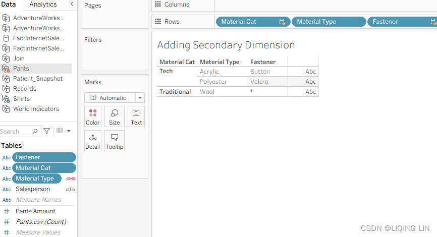 Figure 4.35: Secondary dimensions
Material Cat is a dimension from a secondary data source(Pants.csv). Data blending does not enable dimensions from a secondary data source. Why does it work in this case? There are a few reasons:
- • Every member of the Material Type dimension within the primary data source(Shirts.csv) also exists in the secondary data source(Pants.csv).
- • There is a one-to-many relationship between Material Cat and Material Type; that is, each member of the Material Type dimension is matched with one and only one member of the Material Cat dimension.
- • The view is blended on Material Type, not Material Cat. This is important because Material Type is at a lower level of granularity than Material Cat. Attempting to blend the view on Material Cat will not enable Material Type as a secondary dimension.
Fastener is also a dimension from a secondary data source(Pants.csv). In Figure 4.35,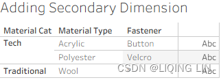 it displays * in one of the cells, thus demonstrating that Fastener is not working as a dimension should; that is, it is not slicing the data, as discussed in Chapter 1, https://blog.csdn.net/Linli522362242/article/details/124207205. The reason an asterisk displays is that there are multiple Fastener types associated with Wool(Data blending does not enable dimensions from a secondary data source). Button and Velcro display because Acrylic and Polyester each have only one Fastener type in the underlying data.
If you use blending, make sure that your main reason is to combine measures(such as Pants Amount and Shirt Amount) and that you don't need the dimensions(for example: Material Type) on a detailed level. It is very useful to know this before you create a dashboard, in order to prepare accordingly. Maybe your data needs extra prepping (check Chapter 3, Tableau Prep Builder) because neither a join nor a blend can bring you the expected data structure. Or maybe you can make use of scaffolding, a technique that uses a helper data source—we will discuss this in the next section.
Introducing scaffolding脚手架
Scaffolding is a technique that introduces a second data source through blending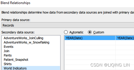
 for the purpose of reshaping and/or extending the initial data source(The actual data scaffolding occurred upon selecting Show Missing Values from the Date field dropdown after it was placed on the Rows shelf. This allowed every year between Start Date and End Date to display even when there were no matching years in the underlying data). Scaffolding enables capabilities that extend Tableau to meet visualization and analytical needs that may otherwise be very difficult or altogether impossible. Joe Mako, who pioneered scaffolding in Tableau, tells a story in which he used the technique to recreate a dashboard using four worksheets. The original dashboard, which did not use scaffolding, required 80 worksheets painstakingly aligned pixel by pixel.
Among the many possibilities that scaffolding enables is extending Tableau's forecasting functionality. Tableau's native forecasting capabilities are sometimes criticized for lacking sophistication. Scaffolding can be used to meet this criticism.
The following are the steps:
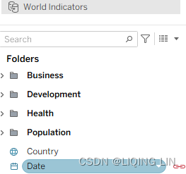
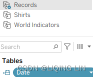
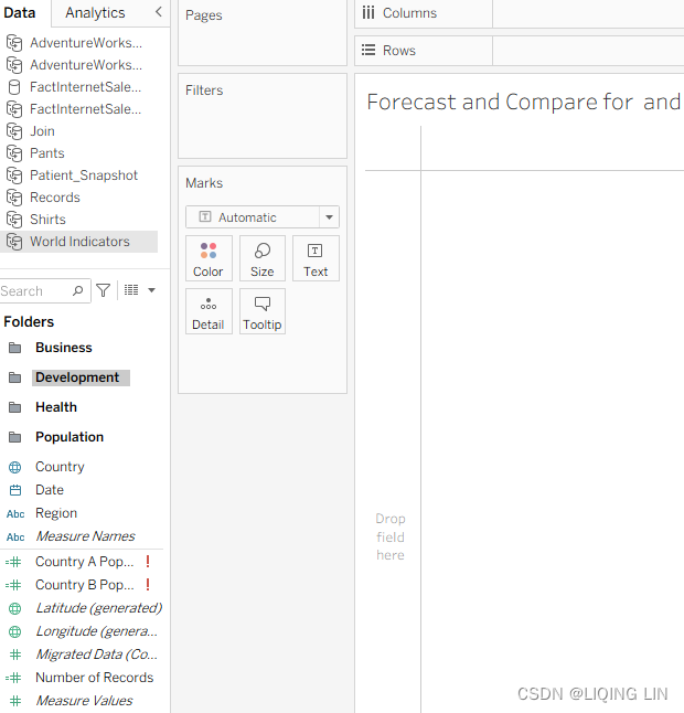
- 1. In the workbook associated with this chapter, select the Scaffolding worksheet and connect to the World Indicators data source.
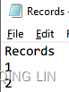
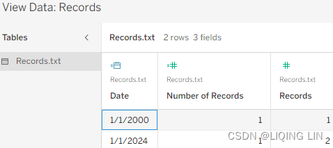
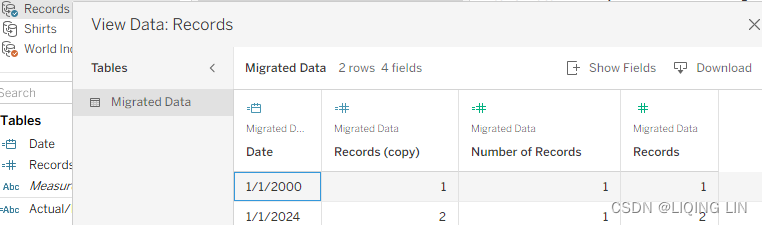
- 2. Using Excel or a text editor, create a Records dataset. The following two-row table represents the Records dataset in its entirety:
- 3. Connect Tableau to the Records dataset.
- 4. (Connect Tableau to the Records dataset) To be expedient, consider copying the Records dataset directly from Excel or Text by using Ctrl + C to copy data from text or excel and pasting it directly into Tableau with Ctrl + V.
OR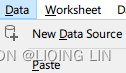 Paste
Paste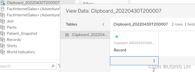
Rename it to Records - 5. Create a Start Date parameter in Tableau, with the settings seen in the following screenshot. In particular, notice the highlighted sections in the screenshot by which you can set the desired display format:
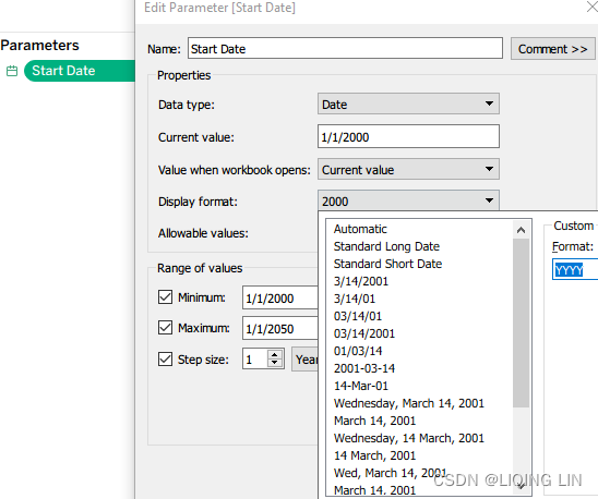
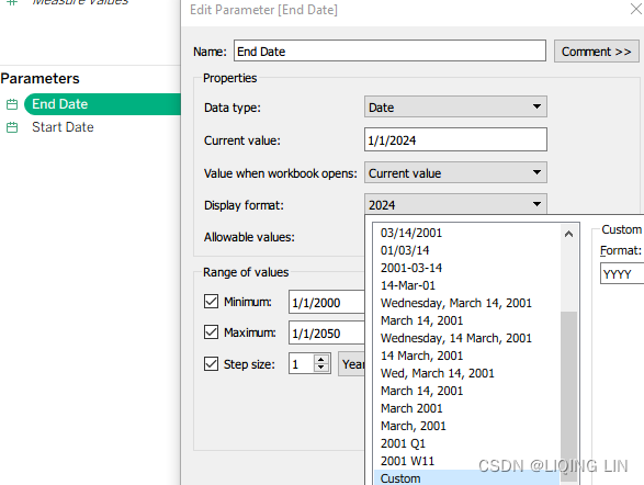
- 6. Create another parameter named End Date with identical settings.
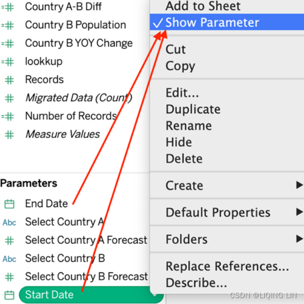
- 7. In the Data pane, right-click on the Start Date and End Date parameters you just created and select Show Parameter:
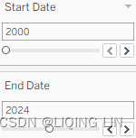
- 8. Set the start and end dates as desired, for example, 2000–2024:
- 9. Select the Records data source and create a calculated field called Date with the following code:
IIF( [Records]=1, [Start Date], [End Date] )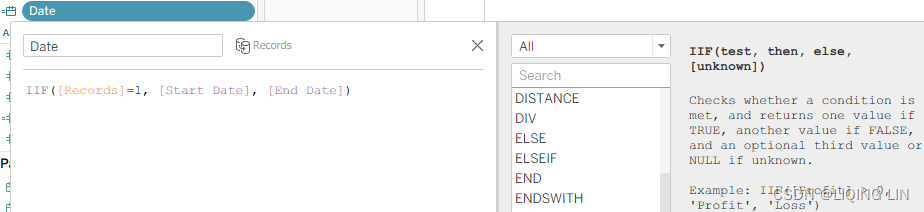
 (Note the field Number of Records was generated by tableau)
If the Records value is 1, then it is Start Date (<=2012, the data exists in the World Indicators dataset), if the Records value is 2, then it is End Date (>2012, the data does not exist in the World Indicators dataset), the function of the Records dataset is to mark whether the data exists in the World Indicators data set.
Data Blending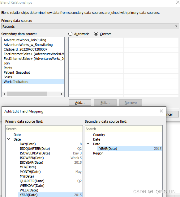
- 10. Place the Date field on the Rows shelf.
- 11. Right-click on the Date field on the Rows shelf and select Show Missing Values. Note that all the dates between the Start Date and End Date settings now:
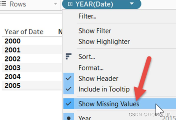
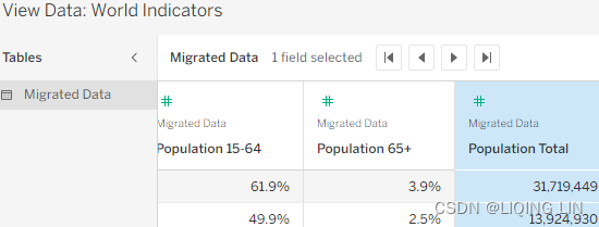
One key to this exercise is data scaffolding. Data scaffolding produces data that doesn't exist in the data source. The World Indicators dataset only includes dates from 2000 to 2012 and obviously, the Records dataset does not contain any dates.
By using the Start Date and End Date parameters coupled with the calculated Date field, we were able to produce any set of dates desired. We had to blend the data, rather than join or union, in order to keep the original data source intact and create all additional data outside of the World Indicators itself.
The actual data scaffolding occurred upon selecting Show Missing Values from the Date field dropdown after it was placed on the Rows shelf. This allowed every year between Start Date and End Date to display even when there were no matching years in the underlying data.
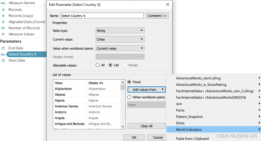
- 12. Create a parameter named Select Country A with the settings shown in the following screenshot. In particular, note that the list of countries was added with the Add from Field button:

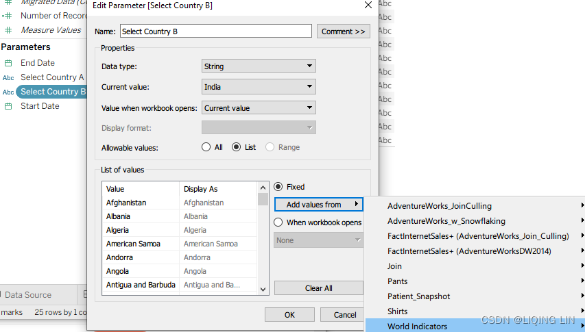
- 13. Create another parameter named Select Country B with identical settings.
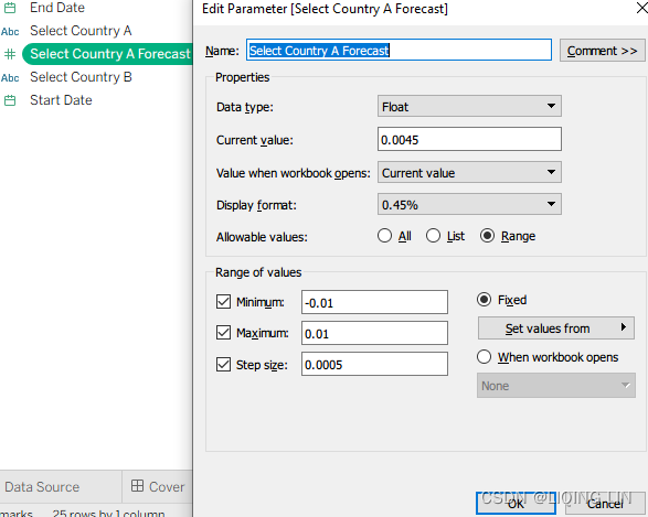
- 14. Create a parameter named Select Country A Forecast with the settings given in the following screenshot. In particular, notice the sections by which you can set the desired display format:
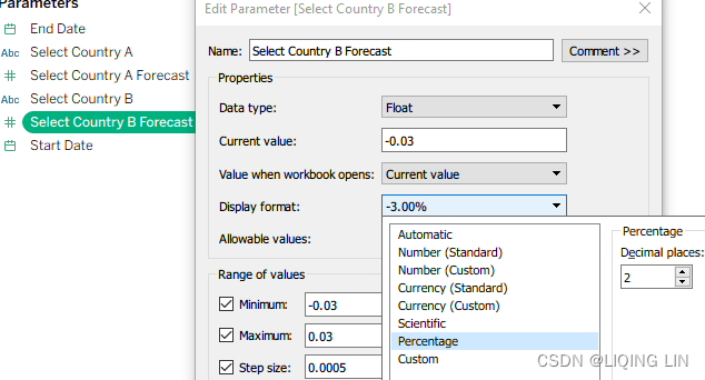
- 15. Create another parameter named Select Country B Forecast with identical settings.
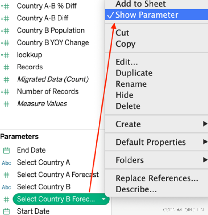
- 16. In the Data pane, right-click on the four parameters you just created (Select Country A, Select Country B, Select Country A Forecast, and Select Country B Forecast) and select Show Parameter:
- 17. Make sure that the Date field in the World Indicators data source has the orange chain-link icon deployed. This indicates it's used as a linking field:
- 18. Within the World Indicators data source, create the following calculated fields:
IIF([Country]=[Select Country A],
    [Population Total], NULL
)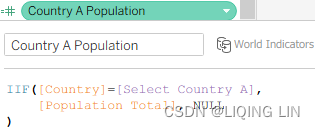
IIF([Country]=[Select Country B],
    [Population Total], NULL
)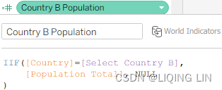
- 19. Within the Records dataset, create the following calculated fields:
Data Blending allow us to call [World Indicators].[field name]
Actual/ForecastIIF( ISNULL( AVG( [World Indicators].[Population Total] ) ), "Forecast", "Actual" )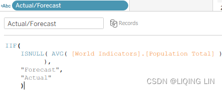 The preceding code determines whether data exists in the World Indicators dataset. If the date is after 2012, no data exists and thus Forecast is returned.
Country A PopulationIF [Actual/Forecast] = "Actual" THEN SUM( [World Indicators].[Country A Population] ) ELSE PREVIOUS_VALUE(0) * [Select Country A Forecast] + PREVIOUS_VALUE(0) END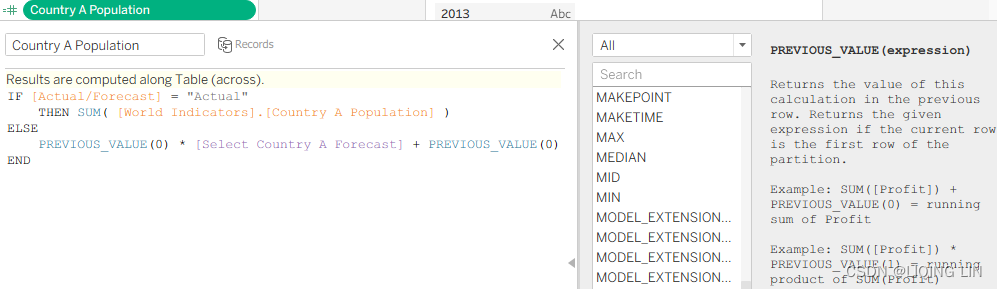 If forecasting is necessary to determine the value (that is, if the date is after 2012), the ELSE portion of this code is exercised. The PREVIOUS_VALUE function returns the value of the previous row and multiplies the results by the forecast and then adds the previous row.
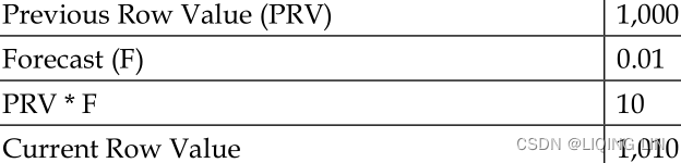
One important thing to note in the Country A Population calculated field is that the forecast is quite simple: multiply the previous population by a given forecast number and tally the results. Without changing the overall structure of the logic, this section of code could be modified with more sophisticated forecasting.
Country A YOY Change// this year Population - Previous Year Population ( [Country A Population] - LOOKUP([Country A Population],-1) )/ ABS( LOOKUP([Country A Population], -1) )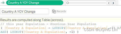
Country B PopulationIF [Actual/Forecast] = "Actual" THEN SUM( [World Indicators].[Country B Population] ) ELSE PREVIOUS_VALUE(0) * [Select Country B Forecast] + PREVIOUS_VALUE(0) END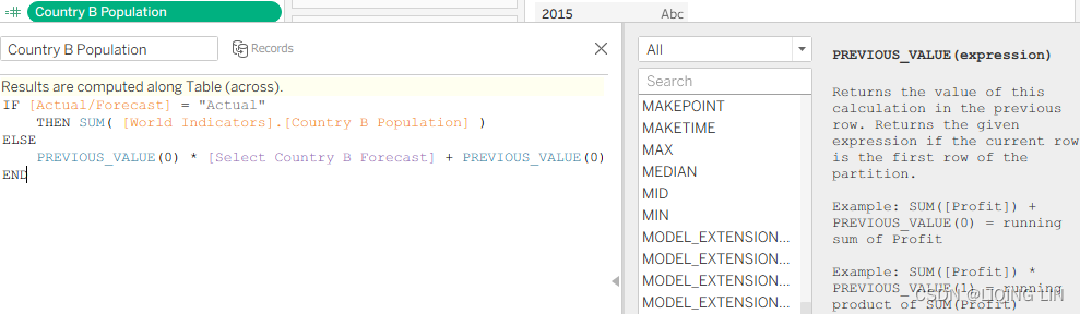
Country B YOY Change( [Country B Population] - LOOKUP( [Country B Population],-1 ) )/ ABS( LOOKUP( [Country B Population], -1 ) )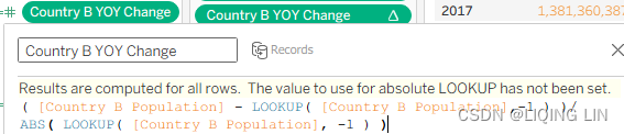
Country A-B Diff[Country A Population] - [Country B Population]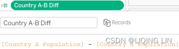
Country A-B % Diff[Country A-B Diff] / [Country A Population]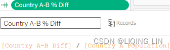
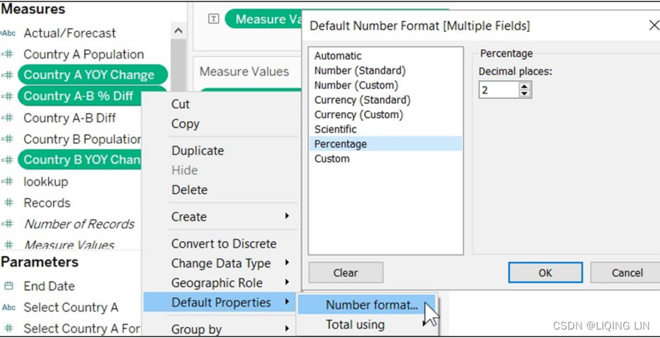
- 20. Within the Data pane, right-click on Country A YOY Change, Country B YOY Change, and Country A-B % Diff and select Default Properties | Number format… to change the default number format to Percentage, as shown in the following screenshot:
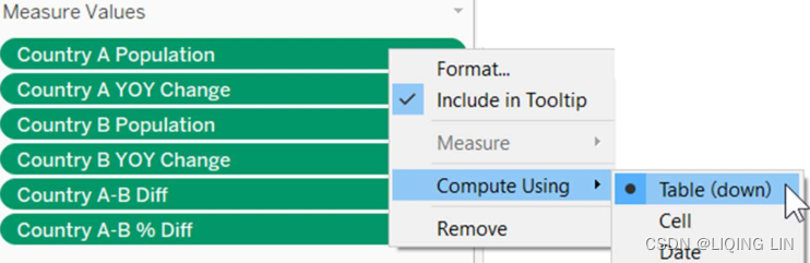
- 21. With the Records data source selected, place the Actual/Forecast, Measure
Values, and Measure Names fields on the Color, Text, and Columns shelves, respectively: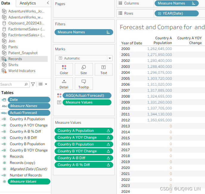
- 22. Adjust the Measure Values shelf so that the fields that display are identical to the following screenshot. Also, ensure that Compute Using for each of these fields is set to Table (down):
 Color Legend
So, what have we achieved so far? We basically created a duplicated data structure that allows us to compare two countries in two separate columns, even though the data is in one column in the original dataset. This setup allows us to ask more advanced questions.
To demonstrate this, let's ask, "When will India's population overtake China's?" You can set the parameters as desired—I chose 0.45% and 1.20% as the average yearly growth rates, but feel free to choose any parameter you think works best for a country.
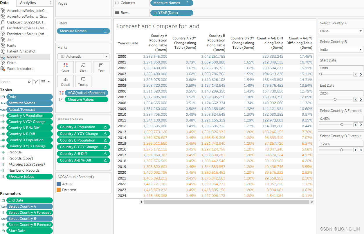
In Figure 4.48 you see that with a growth rate of 0.45% and 1.20% for China and India, respectively, India will have more inhabitants than China by 2024. You can observe this by looking at the columns Country A Population and Country B Population. Everything in orange is a forecast, while everything in blue is actual data from our dataset.
In reality, we are obviously already many years ahead; can you use this dashboard to figure out the actual average growth rate for China and India from 2012 to 2020 if I tell you that the population in 2020 was 1,439,323,776 in China and 1,380,004,385 in India?
######################################
Compared with the 1,339,724,852 people in the sixth Chinese census in 2010, the population 1,443,497,378 people in the seventh Chinese census in 2021, China has increased by 72,053,872 people, an increase of 5.38%, and the average annual growth rate is 0.53%(中国人口(中国整体人口信息)_百度百科) Note: The total population of China includes the population of Hong Kong, Macau and Taiwan.
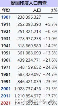 https://zh.wikipedia.org/wiki/%E5%8D%B0%E5%BA%A6%E4%BA%BA%E5%8F%A3
From 2018 to 2020, India's annual population growth rate is about 12.47‰, 11.547‰, 9.89‰, 10.55‰, and on average, the average annual population growth rate reaches 11.1‰.
The data and forecasts used by the current author may not be accurate, one reason is that the data is relatively small and only 12 years ago, and the other reason is that the world is currently facing the covid-19 virus, which has a great impact on the changes in population growth in various countries.
######################################
These exercises have shown that with a few other tricks and techniques, blending can be used to great effect in your data projects. Last but not least we will talk about data structures in general such that you will better understand why Tableau is doing what it is doing and how you can achieve your visualization goals.
Understanding data structures
The right data structure is not easily definable. True, there are ground rules. For instance, tall data is generally better than wide data. A wide dataset with lots of columns can be difficult to work withhttps://blog.csdn.net/Linli522362242/article/details/123767628 , whereas the same data structured in a tall format with fewer columns but more rows is usually easier to work with.
But this isn't always the case! Some business questions are more easily answered with wide data structures. And that's the crux[krʌks]症结 of the matter. Business questions determine the right data structure. If one structure answers all questions, great! However, your questions may require multiple data structures. The pivot feature in Tableau helps you adjust data structures on the fly in order to answer different business questions.
Before beginning this exercise, make sure you understand the following points:
- • Pivoting in Tableau is limited to Excel, text files, and Google Sheets, otherwise, you have to use Custom SQL or Tableau Prep
- • A pivot行转列 in Tableau is referred to as unpivot列转行 in database terminolog
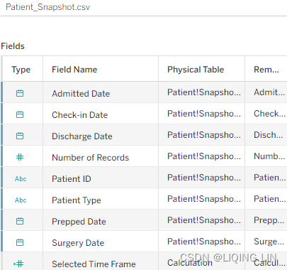
As a business analyst for a hospital, you are connecting Tableau to a daily snapshot of patient data. You have two questions:
- • How many events occur on any given date? For example, how many patients check in on a given day?
- • How much time expires时间间隔 between events? For example, what is the average stay for those patients who are in the hospital for multiple days?
To answer these questions, take the following steps:
- 1. In the starter workbook associated with this chapter, select the Time Frames worksheet, and within the Data pane, select the Patient_Snapshot data source.
- 2. Click on the dropdown in the Marks card and select Bar as the chart type.
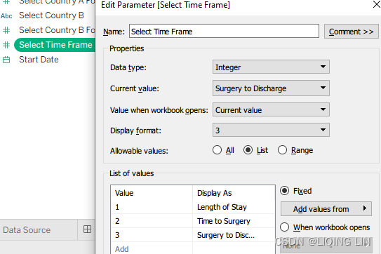
- 3. Right-click in the Data pane to create a parameter named Select Time Frame (Length of Stay, Time to Surgery, Surgery to Discharge手术出院) with the settings displayed in the following screenshot:
- 4. Right-click on the parameter we just created and select Show Parameter.
- 5. Right-click in the Data pane to create a calculated field called Selected Time Frame with the following code:
CASE [Select Time Frame]
    //Length of Stay
    WHEN 1 THEN DATEDIFF( 'day', [Check-in Date], [Discharge Date] )
    //Time to Surgery
    WHEN 2 THEN DATEDIFF( 'day', [Surgery Date], [Discharge Date] )
    //Surgery to Discharge
    WHEN 3 THEN DATEDIFF( 'day', [Check-in Date], [Surgery Date] )
END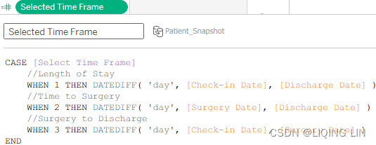
- 6. Drag the following fields to the associated shelves and define them as directed:
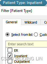
- Patient Type : Drag to the Filter shelf and check Inpatient.
- Check-in Date : Drag to the Filter shelf and select Range of dates. Also right-click
on the resulting filter and select Show Filter.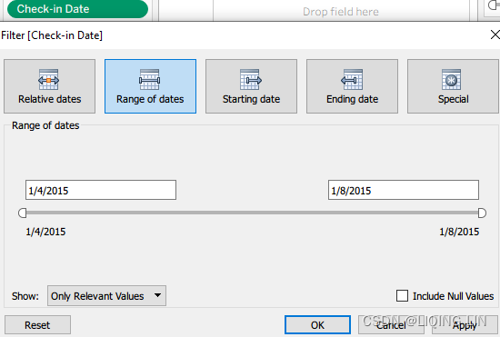
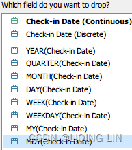
- Check-in Date : Right-click and drag to the Columns shelf and select MDY.
 OR
OR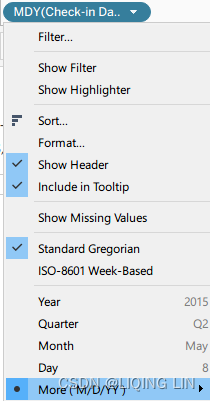 Custom
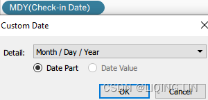
- Selected Time Frame : Right-click and drag to the Rows shelf and select AVG.
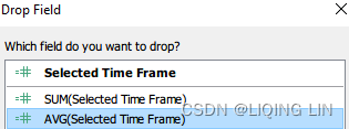
- Selected Time Frame : Right-click and drag to the Color shelf and select AVG. Set colors as desired.
After these actions, your worksheet should look like the following:
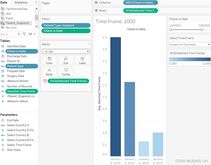
- Patient Type : Drag to the Filter shelf and check Inpatient.
-
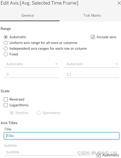
7. Right-click on the Avg Selected Time Frame axis and select Edit Axis…, as shown in the following figure. Then delete the title:
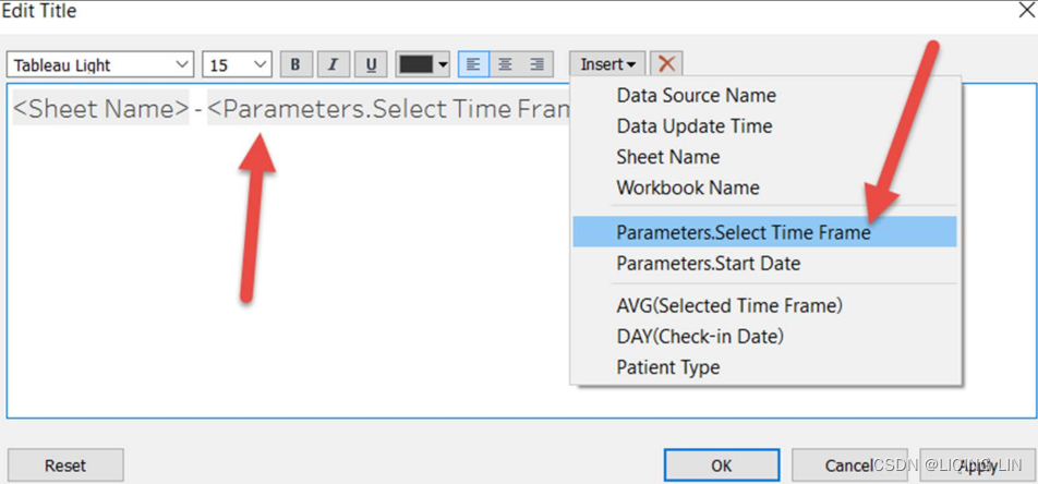
- 8. Select Worksheet | Show Title. Edit the title by inserting the parameter Select Time Frame , as shown in the following screenshot:
The data structure was ideal for the first part of this exercise. You were probably able to create the visualization quickly. The only section of moderate[ˈmɑːdərət]有限的,温和的 interest was setting up the Selected Time Frame calculated field with the associated parameter.
But what happens if you need to find out how many people were involved in a type of event per day?
This question is rather difficult to answer using the current data structure because we have one row per patient with multiple dates in that row. In Figure 4.54 you can see the difference: the right-hand side is our current data structure and the left-hand side is the data structure that would make it easier to count events per day: 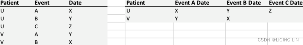
Therefore, in the second part of this exercise, we'll try a different approach by pivoting行转列 the data:
- 1. In the starter workbook associated with this chapter, select the Events Per Date worksheet.
- 2. In the Data pane, right-click the Patient_Snapshot data source and choose Duplicate.
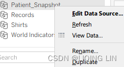
- 3. Rename the duplicate Events.
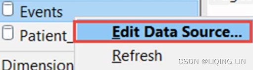
- 4. Right-click on the Events data source and choose Edit Data Source...:
- 5. Review the highlighted areas of the following screenshot and take the following steps:
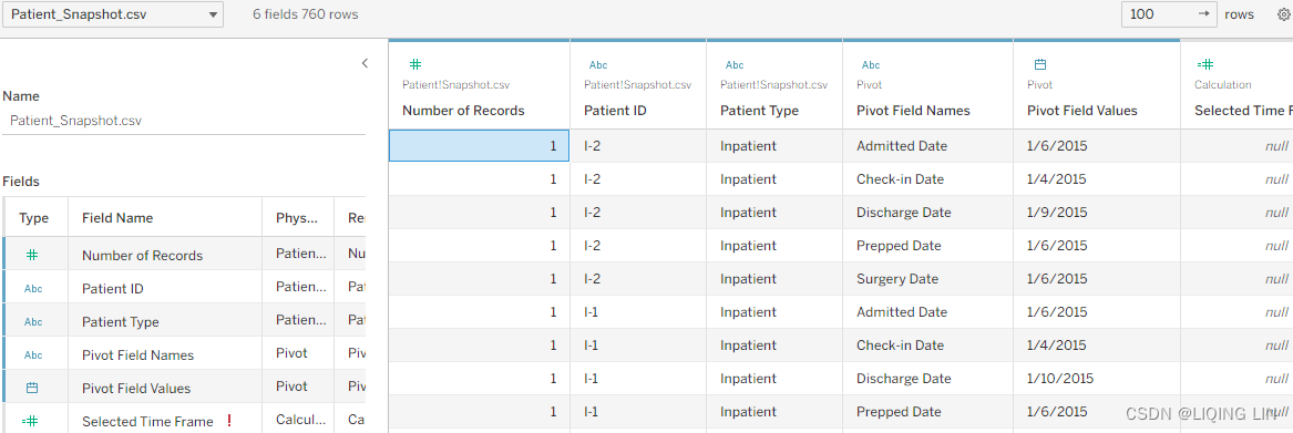 Figure 4.54
- b. Select all five of the date fields with Shift or Ctrl + click
- c. Select the drop-down option for any of the selected fields and choose
Pivot: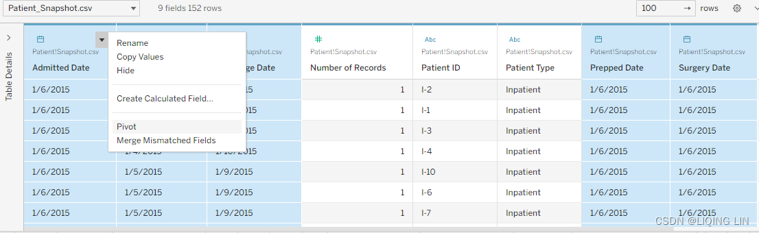
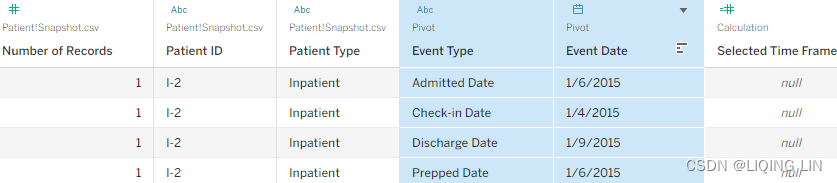
- 6. The pivot will turn rows and columns around and we will get a data structure just like in Figure 4.54 on the left-hand side. Rename the pivoted fields to Event Type and Event Date.
- 7. Select the Events Per Date worksheet and place the following fields on the associated shelves and define as directed:
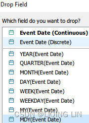
- Event Date : Right-click and drag to the Columns shelf and select MDY
- Event Type : drag Event Date to the Color shelf
- Patient Type : Right-click and select Show Filter
- Number of Records : Drag to Rows shelf
-
From this, your worksheet should look like the following:
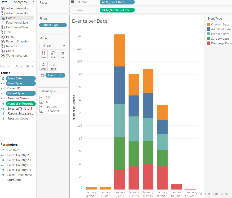
The original data structure was not well suited for this exercise; however, after duplicating the data source and pivoting, the task to count events per day was quite simple since we were able to achieve this by using only three fields: Event Date, Number of Records, and Event Type. That's the main takeaway. If you find yourself struggling to create a visualization to answer a seemingly simple business question, consider pivoting.
- Event Date : Right-click and drag to the Columns shelf and select MDY
Summary
We began this chapter with an introduction to relationships, followed by a discussion on complex joins, and discovered that, when possible, Tableau uses join culling to generate efficient queries to the data source. A secondary join, however, limits Tableau's ability to employ join culling. An extract results in a materialized, flattened view that eliminates the need for joins to be included in any queries. Unions come in handy if identically formatted data, stored in multiple sheets or data sources, needs to be appended.
Then, we reviewed data blending to clearly understand how it differs from joining. ==>the Join worksheet has double the expected results.
Why? Because a join first matches on the common key (in this case, Salesperson/
Sales Associate) and then aggregates the results. The more matches found on a
common key, the worse the problem will become. If multiple matches are found on a
common key, the results will grow exponentially.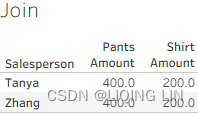
Blending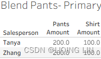
In this case, it is Salesperson/Sales Associate, as demonstrated in the following screenshot:
We discovered that the primary limitation in data blending is that no dimensions are allowed from a secondary source;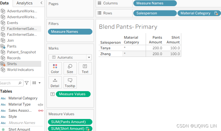 however, we also discovered that there are exceptions to this rule.
Material Cat is a dimension from a secondary data source(Pants.csv). Data blending does not enable dimensions from a secondary data source. Why does it work in this case? There are a few reasons:
- • Every member of the Material Type dimension within the primary data source(Shirts.csv) also exists in the secondary data source(Pants.csv).
- • There is a one-to-many relationship between Material Cat and Material Type; that is, each member of the Material Type dimension is matched with one and only one member of the Material Cat dimension (Material Type vs Material Cat : 1 vs 1). ( Material Cat vs Material Type : 1 vs n)
- • The view is blended on Material Type, not Material Cat.
 This is important because Material Type is at a lower level of granularity than Material Cat. Attempting to blend the view on Material Cat will not enable Material Type as a secondary dimension.
We also discussed scaffolding, which can make data blending surprisingly fruitful.
( Date vs Country : 1 vs n) (The actual data scaffolding occurred upon selecting Show Missing Values from the Date field dropdown after it was placed on the Rows shelf. This allowed every year between Start Date and End Date to display even when there were no matching years in the underlying data)
Data blending should be done at the smallest granularity possible
Finally, we discussed data structures and learned how pivoting(row to column) can make difficult or impossible visualizations easy. Having completed our second data-centric discussion, in the next chapter, we will discuss table calculations as well as partitioning and addressing. https://blog.csdn.net/Linli522362242/article/details/123767628


 被折叠的 条评论
为什么被折叠?
被折叠的 条评论
为什么被折叠?
 到【灌水乐园】发言


