


So far, most of the examples we've looked at in this book assume that data is structured well and is fairly clean. Data in the real world isn't always so pretty. Maybe it's messy or it doesn't have a good structure. It may be missing values or have duplicate values, or it might be at the wrong level of detail.
How can you deal with this messy data? We'll consider Tableau Prep Builder as a robust way to clean and structure data in the next chapter. For now, let's focus on the capabilities that are native to Tableau Desktop, which itself gives a lot of options and flexibility to deal with data issues. We'll take a look at some of the features and techniques that will enable you to overcome data structure obstacles. We'll also lay a solid foundation of a good data structure. Knowing what data structures work well with Tableau is key to understanding how you will be able to resolve certain issues.
In this chapter, we'll focus on some principals for structuring data to work well with Tableau, as well as some specific examples of how to address common data issues. This chapter will cover the following topics:
- Structuring data for Tableau
- Unions and cross database joins
- Techniques for dealing with data structure issues
- Overview of advanced fixes for data problems
Structuring data for Tableau
We've already seen that Tableau can connect to nearly any data source. Whether it's a built-in direct connection, ODBC(Open Database Connectivity), or using the Tableau data extract API to generate an extract, no data is off limits没有数据限制. However, there are certain structures that make data easier to work with in Tableau.
There are two keys to ensuring a good data structure that works well with Tableau:
- Every record of a source data connection should be at a meaningful level of detail
- Every measure contained in the source should match the same level of detail or possibly be at a higher level of detail, but should never be at a lower level of detail
For example, let's say you have a table of test scores with one record per classroom in a school. Within the record, you may have three measures: the average GPA for the classroom, the number of students in the class, and the average GPA of the school:
- The first two measures (Average GPA and Number of Students) are at the same level of detail as the individual record of data (per classroom in the school).
- Number of Students (School) is at a higher level of detail (per school).
As long as you are aware of this, you can do careful analysis. However, you would have a data structure issue if you tried to store each student's GPA in the class record. If the data were structured in an attempt to store all the students' GPA per grade level (maybe with
- a column for each student,
- or a single field containing a comma-separated list of student scores),
we'd need to do some work to make the data more usable in Tableau.
Understanding the level of detail of the source (often referred to as granularity[ˌɡrænjəˈlærəti]粒度) is vital. Every time you connect to a data source, the very first question you should ask and answer is: what does a single record represent? If, for example, you were to drag and drop the Number of Records![]() field into the view and observed 1,000 records, then you should be able to complete the statement, I have 1,000 _____. It could be 1,000 students, 1,000 test scores, or 1,000 schools. Having a good grasp of the granularity of the data will help you avoid poor analysis and allow you to determine if you even have the data that's necessary for your analysis.
field into the view and observed 1,000 records, then you should be able to complete the statement, I have 1,000 _____. It could be 1,000 students, 1,000 test scores, or 1,000 schools. Having a good grasp of the granularity of the data will help you avoid poor analysis and allow you to determine if you even have the data that's necessary for your analysis.
Tip
A quick way to find the level of detail of your data is to put the Number of Records on the Text shelf![]() , and then try different dimensions on the Rows shelf. When all of the rows display a 1 in the view and the total that's displayed in the lower left status bar equals the number of records in the data, then that dimension (or combination of dimensions) uniquely identifies a record and defines the lowest level of detail of your data.
, and then try different dimensions on the Rows shelf. When all of the rows display a 1 in the view and the total that's displayed in the lower left status bar equals the number of records in the data, then that dimension (or combination of dimensions) uniquely identifies a record and defines the lowest level of detail of your data.
With an understanding of the overarching principles regarding the granularity of the data, we'll move on and understand certain data structures that allow you to work seamlessly and efficiently in Tableau. Sometimes, it may be preferable to restructure the data at the source using tools such as Alteryx or Tableau Prep Builder. At times, restructuring the source data isn't possible or is not feasible. We'll take a look at some options in Tableau for those cases. For now, let's consider what kinds of data structures work well with Tableau.
Good structure – tall and narrow instead of short and wide
The two keys to a good structure that we mentioned in the previous section should result in a data structure where a single measure is contained in a single column. You may have multiple different measures, but any single measure should almost never be divided into multiple columns. Often, the difference is described as wide data versus tall data.
Wide data
Wide data describes a structure in which a measure in a single row is spread over multiple columns. This data is often more human readable. Wide data often results in fewer rows with more columns.
Here is an example of what wide data looks like in a table of population numbers:
![]() ==> Dropdown menu (Field names are in first row ) ==>
==> Dropdown menu (Field names are in first row ) ==>


Notice that the level of detail for this table is a row for every country. However, the single measure (population) is not stored in a single column. This data is wide because it has a single measure (population) that is being divided into multiple columns (a column for each year). The wide table violates the 2nd key of good structure since the measure is at a lower level of detail than the individual record该度量的详细程度低于单个记录 (per country per year, instead of just per country).
Tall data
Tall data describes a structure in which each distinct measure in a row is contained in a single column(每行的记录仍然可以用2个或者多个不同的度量进行细分,那么将这2个或者多个不同的度量用2列或者多列表示). Tall data often results in more rows and fewer columns.
Consider the following table, which represents the same data as earlier, but in a tall structure: Now, we have more rows (a row for each year for each country). Individual years are no longer separate columns and population measurements are no longer spread across those columns. Instead, one single column gives us a dimension of Year and another single column gives the measure of Population. The number of rows has increased while the number of columns has decreased. Now, the measure of population is at the same level of detail as the individual row, and so visual analysis in Tableau will be much easier.
Wide and tall in Tableau
You can easily see the difference between wide and tall data in Tableau. Here is what the wide table of data looks like in the left data window:
![]() ==> Dropdown menu (Field names are in first row ) ==>
==> Dropdown menu (Field names are in first row ) ==>
==>As we'd expect, Tableau treats each column in the table as a separate field. The wide structure of the data works against us. We end up with a separate measure for each year. If you wanted to plot a line graph of population per year, you will likely struggle. What dimension represents the date? What single measure can you use for population?
This isn't to say that you can't use wide data in Tableau. For example, you might use Measure Names/Measure Values to plot all of the Year measures in a single view, like this: ==>
==>
You'll notice that every year field has been placed in the Measure Values shelf. The good news is that you can create visualizations from poorly structured data. The bad news is that
views are often more difficult to create and certain advanced features may not be available.
This may occur in the preceding view due to the following reasons:
- Because Tableau doesn't have a date dimension or integer, you cannot use forecasting
- Because Tableau doesn't have a date or continuous field on Columns, you cannot enable trend lines
- Because each measure is a separate field, you cannot use quick table calculations (such as running total, percent difference, and others)
- Determining things such as average population across years will require a tedious custom calculation instead of simply changing the aggregation of a measure
- You don't have an axis for the date (just a bunch of headers for the measure names), so you won't be able to add reference lines https://blog.csdn.net/Linli522362242/article/details/123606731

In contrast, the tall data looks like this in the data pane:

This data source is much easier to work with. There's only one measure (Population) and a Year dimension to slice the measure. If you want a line chart of population by year, you can
simply drag and drop the Population and Year fields into Columns and Rows. Forecasting,
trend lines, clustering, averages, standard deviations, and other advanced features will all
work as you have come to expect them to.
Good structure – star schemas (Data Mart/Data Warehouse)
Assuming they are well-designed, star schema data models work very well with Tableau because they have well-defined granularity, measures, and dimensions. Additionally, if they are implemented well, they can be extremely efficient to query. This allows for a good experience when using live connections in Tableau.
Star schemas are so named because they consist of a single fact table surrounded by related dimension tables, thus forming a star pattern. Fact tables contain measures at a meaningful granularity, while dimension tables contain attributes for various related entities. The following diagram illustrates a simple star schema with a single fact table (Hospital Visit) and three dimension tables (Patient, Primary Physician, and Discharge Details):
Fact tables are joined to the related dimension using what is often called a surrogate key[ˈsɜːrəɡət]代理的 or foreign key that references a single dimension record. The fact table defines the level of granularity and contains measures. In this case, Hospital Visit has a granularity of one record for each visit. Each visit, in this simple example, is for one patient who saw one primary physician and was discharged每次就诊都是针对一位看过一位主治医师并出院的患者. The Hospital Visit table
- explicitly stores a measure of Visit Duration and
- implicitly defines another measure of Number of Visits (in this case, Number of Records).
Tip
Data modeling purists would point out that date values have been stored in the fact table (and even some of the dimensions) and would instead recommend having a date dimension table with extensive attributes for each date, and only a surrogate (foreign) key stored in the fact table.
A date dimension can be very beneficial. However, Tableau's built-in date hierarchy and extensive date options make storing a date in the fact table a viable[ˈvaɪəbl]切实可行的 option. Consider using a date dimension if you need specific attributes of dates that are not available in Tableau (for example, which days are corporate holidays), have complex fiscal years, or if you need to support legacy BI reporting tools.
A well-designed star schema allows for the use of inner joins since every surrogate key should reference a single dimension record. In cases where dimension values are not known or not applicable, special dimension records are used. For example, a hospital visit that is not yet complete (the patient is still in the hospital) may reference a special record in the Discharge Details table marked as Not yet discharged ( the join between Hospital Visit and Discharge Details is a left join because some records in Hospital Visit may be for patients still in the hospital (so they haven't been discharged) ). When connecting to a star schema in Tableau, start with the fact table and then add the dimension tables, as shown here:
The resulting data connection (shown as an example, but not included in the Chapter 09 workbook) allows you to see the dimensional attributes by table. The measures come from the single fact table:
Warnings or important notes
Well-implemented star schemas are particularly attractive for use in live connections because Tableau can gain performance by implementing join culling[ˈkʌlɪŋ] 连接剔除.
Join culling is Tableau's elimination of unnecessary joins in queries, since it sends them to the data source engine. For example, if you were to place the Physician Name(in Primary Physician table) on Rows and the average of Visit Duration(in Hospital Visit table) on Columns to get a bar chart of average visit duration per physician, then joins to the Treatment and Patient tables may not be needed. Tableau will eliminate unnecessary joins as long as you are using a simple star schema with joins that are only from the central fact table and have referential integrity enabled in the source or allow Tableau to assume referential integrity (select the data source connection from the Data menu or use the context menu from the data source connection and choose Assume Referential Integrity).
For referential integrity to hold in a relational database, any column in a base table that is declared a foreign key can only contain either null values or values from a parent table's primary key or a candidate key.[2] In other words, when a foreign key value is used it must reference a valid, existing primary key in the parent table. For instance, deleting a record(artist_id = 4) that contains a value referred to by a foreign key in another table would break referential integrity. However, the album "Eat the Rich" referred to the artist with an artist_id of 4. With referential integrity enforced, this would not have been possible.
Having considered some examples of good structure, let's turn our attention to handling poorly structured data.
Dealing with data structure issues
In some cases, restructuring data at the source is not an option. The source may be secured and read-only, or you might not even have access to the original data and instead receive periodic定期接收 dumps of data数据转储 in a specific format. In such cases, there are techniques for dealing with structural issues once you have connected to the data in Tableau.
We'll consider some examples of data structure issues to demonstrate various techniques for handling those issues in Tableau. None of the solutions are the only right way to resolve the given issue. Often, there are several approaches that might work. Additionally, these are only examples of issues you might encounter. Take some time to understand how the proposed solutions build on the foundational principals we've considered in previous chapters and how you can use similar techniques to solve your data issues.
Restructuring data in Tableau connections
worksheet ==>![]() ==>open World Population Data.xlsx
==>open World Population Data.xlsx
The Excel workbook World Population Data.xlsx , which is included in the Data directory of the resources that are included with this book, is typical of many Excel documents. Here is what it looks like:
Excel documents such as this are often more human readable but contain multiple issues for data analysis in Tableau. The issues in this particular document include the following:
- Excessive headers (titles, notes, and formatting) that are not part of the data
- Merged cells
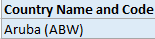
- Country name and code in a single column
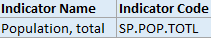
- Columns that are likely unnecessary (Indicator Name and Indicator Code
 )
) - The data is wide, that is, there is a column for each year and the population measure is spread across these columns within a single record
When we initially connect to the Excel document in Tableau, the connection screen will look similar to this: The data preview reveals some of the issues resulting from the poor structure:
- Since the column headers were not in the first Excel row, Tableau gave the defaults of F1, F2, and so on, to each column
- The title World Population Data and note about sample data were interpreted as values in the F1 column
- The actual column headers are treated as a row of data (the third row)
Fortunately, these issues can be addressed in the connection window. First, we can correct many of the excessive header issues by turning on the Tableau Data Interpreter, a component which specifically identifies and resolves common structural issues in Excel or Google Sheets documents. When you check the Use Data Interpreter option, the data preview reveals much better results:
Tip
Clicking the Review the results... link that appears under the checkbox will cause Tableau to generate a new Excel document that is color-coded to indicate how the Data Interpreter parsed the Excel document. Use this feature to verify that Tableau has correctly interpreted the Excel document and retained the data you expect. 
Observe the elimination of the excess headers and the correct names of the columns. A few additional issues still need to be corrected.
First, we can hide the Indicator Name and Indicator Code columns if we feel they are not useful for our analysis. Clicking the drop-down arrow on a column header reveals a menu of options. Hide will remove the field from the connection and even prevent it from being stored in extracts:
Second, we can use the option on the same menu to split the Country Name and Code column into two columns so that we can work with the name and code separately. In this case, the Split option on the menu works well and Tableau perfectly splits the data, even removing the parentheses from around the code. In cases where the split option does not initially work如果拆分选项最初不起作用, try the Custom Split... option.  We'll also use the Rename... option to rename the split fields from Country Name and Code - Split 1 and Country Name and Code - Split 2 to Country Name and Country Code , respectively. Then, we'll Hide the original Country Name and Code field.
At this point, most of the data structure issues have been remedied. However, you'll recognize that the data is in a wide format. We have already seen the issues that we'll run into:
Our final step is to pivot旋转 the Year columns. This means that we'll reshape the data in such a way that every country will have a row for every year. Select all the year columns by clicking the 1960 column, scrolling to the far right, and holding Shift while clicking the 2013 column. Finally, use the drop-down menu on any one of the year fields and select the Pivot option.
The result is two columns ( Pivot field names and Pivot field values ) in place of all the year columns. Rename the two new columns to Year and Population.(Select all the year columns by clicking the 1960 column, scrolling to the far right, and holding Shift while clicking the 2013 column. Finally, use the drop-down menu on any one of the year fields and select the Delete option) Your dataset is now narrow and tall instead of wide and short.
Finally, notice from the icon on the Year column that it is recognized by Tableau as a text field(By default, Tableau uses "Abc" placeholder text for any values that could potentially be displayed. In cases where you are using only dimensions or discrete values, Tableau leaves the empty column with the "Abc" placeholder text). Clicking the icon will allow you to change the data type directly. In this case, selecting Date will result in NULL values, but changing the data type to a Number (whole) will give you integer values that will work well in most cases:
Tip
Alternatively, you could use the first drop down menu![]() on the Year field and select Create Calculated Field... This would allow you to create a calculated field name Year (date) which parses the year string as a date with code such as DATE(DATEPARSE("yyyy", [Year] ) ) .This code will parse the string and then convert it into a simple date without a time. You can then hide the original Year field. You can hide any field, even if it is used in calculations, as long as it isn't used in a view. This leaves you with a very clean dataset.
on the Year field and select Create Calculated Field... This would allow you to create a calculated field name Year (date) which parses the year string as a date with code such as DATE(DATEPARSE("yyyy", [Year] ) ) .This code will parse the string and then convert it into a simple date without a time. You can then hide the original Year field. You can hide any field, even if it is used in calculations, as long as it isn't used in a view. This leaves you with a very clean dataset.
The final dataset is far easier to work with in Tableau than the original:

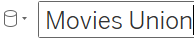
Union files together
Often, you may have multiple individual files or tables that, together, represent the entire set of data. For example, you might have a process that creates a new monthly data dump as a new text file in a certain directory. Or, you might have an Excel file where data for each department is contained in a separate sheet.
A union is a concatenation of data tables which brings together rows of each table into a single data source. For example, consider the following three tables of data:
Originals:
Prequels[ˈpriːkwəls]先行篇,前篇:
Sequels[ˈsiːkwəls]续篇,续集:
A union of these tables would give a single table containing the rows of each individual table:
Tableau allows you to union together tables from file-based data sources, including the following:
- Text files ( . csv , . txt , and other text file formats)
- Sheets (tabs) within Excel documents
- Subtables within an Excel sheet
- Multiple Excel documents
- Google Sheets
- Relational database tables
Tip
Use the Data Interpreter feature to find subtables in Excel or Google Sheets. They will show up as additional tables of data in the left sidebar.
To create a union in Tableau, follow these steps:
- 1. Create a new data source(worksheet ==>
 Data | New Data Source ) from the menu, toolbar, or Data Source screen, starting with one of the files you wish to be part of the union. Then, drag any additional files into the Drag table to union drop zone just beneath the existing table in the designer:
- 2. Once you've created a union, you can use the drop-down menu
 on the table in the designer to configure options for the union(Edit Union...).
Alternatively, you can drag the New Union object from the left sidebar into the designer to replace the existing table. This will reveal options for creating and configuring the union:

 The Specific (manual) tab allows you to drag tables into and out of the union.
The Wildcard (automatic) tab allows you to specify wildcards通配符 for filenames and
sheets (for Excel and Google Sheets) that will automatically include files and sheets in the union based on a wildcard match.- Tip
Use the Wildcard (automatic) feature if you anticipate additional files being added in the future. For example, if you have a specific directory where data files are dumped on a periodic定期转储 basis, the wildcard feature will ensure that you don't have to manually edit the connection.
- Tip
- 3. Once you have defined the union, you may use the resulting data source to visualize the data. Additionally, a union table may be joined with other tables in the designer window, giving you a lot of flexibility in working with data:

==> ==>
==>
When you create a union, Tableau will include one or more new fields in your data source that help you identify the file, sheet, and table where the data originated. Path will contain the file path (including filename), Sheet will contain the sheet name (for Excel or Google Sheets), and Table Name will contain the subtable or text filename. You can use these fields to help you identify data issues and also to extend your dataset as needed. For example, if you had a directory of monthly data dump files named 2018-01.txt , 2018-02.txt , 2018-03.txt , and so on, but no actual date field in the files, you could obtain the date using a calculated filed with code such as the following:
DATEPARSE(' yyyy-MM' , [Table Name] )- Warnings or important notes
In a union, Tableau will match columns between tables by name. Columns that exist in one file/table but not in others will appear as part of the union table, but values will be NULL in files/tables where the column did not exist.
For example, if one of the files contained a column named Job instead of Occupation, the final union table would contain a column named Job and another named Occupation, with NULL values where the column did not exist. You can merge the mismatched columns by selecting the columns and using the drop-down menu. This will coalesce[ˌkoʊəˈles]合并,联合 (keep the first non-null of) the values per row of data in a single new column.
- Warnings or important notes

Cross database joins
Tableau gives you the ability to join data across data connections. This means that you can join tables of data from completely different databases and file formats. For example, you could join a table in SQL Server with a union of text files and then join them to a Google Sheets document.
You'll recall that the concept of joins and the specifics of cross database joins were introduced in Chapter 2https://blog.csdn.net/Linli522362242/article/details/123020380 , Working with Data in Tableau. While cross database joins are quite useful in bringing together disparate不同的 data sources (data contained in different systems and formats), they can be used to solve other data issues too, such as reshaping data to make it easier to meet your objectives in Tableau.
Warnings or important notes
You can work through the following example in the Chapter 9 workbook, but the server database data source is simulated with a text file ( Hospital Patients.txt ).
A practical example – filling out missing/sparse dates
Let's say you have a table in a server database (such as SQL Server or Oracle) that contains one row per hospital patient and includes the Admit Date and Discharge Date as separate columns for each patient(If you want to know how many patients are in the hospital every day in December): ![]() ==>
==> ==>range(12/1/2018, 12/31/2018)
While this data structure works well for certain kinds of analysis, you would find it difficult to use if you want to visualize the number of patients in the hospital day-by-day for the month of December.
For one, which date field do you use for the axis? Even if you pivoted the table so that you had all of the dates in one field, you would find that you have gaps in the data. Sparse data, that is, data in which records do not exist for certain values, is quite common in certain real-world data sources. Specifically, in this case, you have a single record for each Admit or Discharge date, but no records for days in-between.
Sometimes, it might be an option to restructure the data at the source, but if the database is locked down, you may not have that option. You could also use Tableau's ability to fill in gaps in the data (data densificationhttps://blog.csdn.net/Linli522362242/article/details/123267942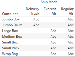 ==>
==> ) to solve the problem. However, that solution could be intricate[ˈɪntrɪkət]错综复杂的 and potentially brittle[ˈbrɪt(ə)l]不牢固的,脆弱的 or difficult to maintain.
An alternative is to use a cross database join to create the rows for all dates. So, you might quickly create an Excel sheet with a list of dates you want to see, like this:
Hospital Patients Dates.xlsx
The Excel file includes a record for each date. Our goal is to cross join (join every row from one table with every row in another) the data between the database table and the Excel table. With this accomplished, you will have a row for every patient for every date.
Tip
Joining every record in one dataset with every record in another dataset creates what is called a Cartesian product. The resulting dataset will have N1 * N2 rows (where N1 is the number of rows in the first dataset and N2 is the number of rows in the second). Take care in using this approach. It works well with smaller datasets. As you work with even larger datasets, the Cartesian product may grow so large that it is untenable[ʌnˈtenəbl]支持不住的.
You'll often have specific fields in the various tables that will allow you to join the data together. In this case, however, we don't have any keys that define a join. The dates also do not give us a way to join all the data in a way that gives us the structure we want. To achieve the cross join, we'll use a join calculation. A join calculation allows you to write a special calculated field specifically for use in joins.

In this case, we'll select Create Join Calculation...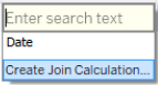 for both tables and enter the single, hard-coded value, that is, 1 , for both the left and right sides:
 ==>
==> ==>
==>
Since 1 in every row on the left matches 1 in every row on the right, we get every row matching every row—a true cross join.
Tip
As an alternative, with many other server-based data sources, you can use Custom SQL as a data source. On the Data Source screen, with the Patients Visit table(Here is Hospital Patients) in the designer, you could use the top menu to select Data | Convert to Custom SQL to edit the SQL script that Tableau uses for the source. Alternatively, you can write your own custom SQL using the New Custom SQL object on the left sidebar.
The script in this alternative example has been modified to include 1 AS Join to create a field called Join with a value of 1 for every row. Fields defined in Custom SQL can also be used in joins: 
Based on the join calculation, our new cross-joined dataset contains a record for every patient for every date and we can now create a quick calculation to see whether a patient should be counted as part of the hospital population on any given date. The calculated field, named Patients in Hospital , has the following code: ==>
==>
This allows us to easily visualize the flow of patients, and even potentially perform advanced analytics based on averages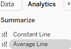 , trends, and even forecasting:
and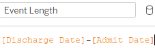 Dimension
 Ultimately, for a long-term solution, you might want to consider developing a server-based data source that gives the structure that's needed for the desired analysis. However, cross database joins allowed us to achieve the analysis without waiting on a long development cycle.
Working with different levels of detail
Remember that the two keys of good are as follows:
- Having a level of detail that is meaningful
- Having measures that match the level of detail or that are possibly at higher levels of detail
Measures at lower levels tend to result in wide data, and can make some analysis difficult or even impossible. Measures at higher levels of detail can, at times, be useful. As long as we are aware of how to handle them correctly, we can avoid some pitfalls[ˈpɪtˌfɔls]陷阱.
Consider, for example, the following data (included as Apartment Rent.xlsx in the Chapter 9 directory), which gives us a single record each month per apartment:
The two measures are really at different levels of detail:
- Rent Collected matches the level of detail of the data where there is a record of how much rent was collected for each apartment for each month.
- Square Feet, on the other hand, does not change month to month. Rather, it is at the higher level of apartment only.
This can be observed when we remove the date from the view and look at everything at the apartment level:
Generating the Measure Name in Filters and Measure Values by using the Show Me
 ==>
==> Click Text Table in Show Me==>
 ==>assign aliases to the values for Measure Names ==>
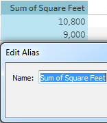 ==>format==>
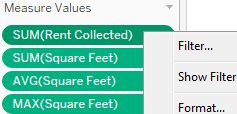
 ==>manually sort==>
Notice that the Sum(Rent Collected) makes perfect sense. You can add up the rent collected per month and get a meaningful result per apartment. However, you cannot Sum up Square Feet and get a meaningful result per apartment. Other aggregations, such as average, minimum, and maximum, do give the right results per apartment.
However, imagine that you were asked to come up with the ratio of total rent collected to square feet per apartment. You know it will be an aggregate calculation because you have to sum the rent that's collected prior to dividing. But which of these is the correct calculation?
- SUM([Rent Collected] ) /SUM([Square Feet] )
- SUM([Rent Collected] ) /AVG([Square Feet] )
- SUM([Rent Collected] ) /MIN([Square Feet] )
- SUM([Rent Collected] ) /MAX([Square Feet] )
The first one is obviously wrong. We've already seen that square feet should not be added each month. Any of the final three would be correct if we ensure that Apartment continues to define the level of detail of the view
However, once we look at the view that has a different level of detail (for example, the total for all apartments or monthly for multiple apartments), the calculations don't work. To understand why, consider what happens when we turn on column grand totals (from the menu, select Analysis | Totals | Show Column Grand Totals or drag and drop Totals from the Analytics tab): 
The problem here is that the Grand Total line is at the level of detail of all apartments (for all months). What we really want as the Grand Total of square feet is 900 + 750 = 1,650. But here, the Sum of Square Feet is the addition of square feet for all apartments for all months (900*12+750*12=19,800). The average won't work(SUM([Rent Collected] ) /AVG([Square Feet] )==>(900 + 750)/2=825) for calculating the ratio of total rent collected to square feet per apartment. The minimum finds the value 750 as the smallest measure for all apartments in the data. Likewise, the maximum picks 900 as the single largest value. Therefore, none of the proposed calculations would work at any level of detail that does not include the individual apartment.
Tip
You can adjust how sub totals and grand totals are computed by clicking the individual value of the current view 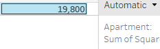 and using the drop-down menu to select how the total is computed. Alternatively, right-click the active measure field and select Total Using
 . You can change how all measures are totaled at once from the menu by selecting Analysis | Totals | Total All Using
 . Using this two pass total technique could result in correct results in the preceding view
 , but would not universally solve the problem. For example, if you wanted to show rent per square foot for each month, you'd have the same issue.
Fortunately, Tableau gives us the ability to work with different levels of detail in a view. Using Level of Detail (LOD) calculations, which we encountered previously in Chapter 4, Starting an Adventure with Calculations https://blog.csdn.net/Linli522362242/article/details/123188872, we can calculate the square feet per apartment.
Solving Rent per Square Foot with LOD
Here, we'll use a fixed LOD calculation to keep the level of detail fixed at apartment. We'll create a calculated field named Square Feet per Apartment with the following code:
{ INCLUDE [Apartment] : MIN([Square Feet]) }
The curly braces surround a LOD calculation and the key word INCLUDE indicates that we want to include Apartment as part of the level of detail for the calculation, even if it is not included in the view level of detail. MIN is used in the preceding code, but MAX or AVG could have been used as well because all give the same result per apartment.
As you can see, the calculation returns the correct result in the view at the Apartment level and at the grand total level, where Tableau includes Apartment to find 900 (the minimum for A) and 750 (the minimum for B) and then sums them to get the correct Grand Total=1,650 :
Now, we can use the LOD calculated field in another calculation to determine the desired results. We'll create a calculated field named Rent Collected per Square Foot with the following code:
SUM([Rent Collected]) / SUM([Square Feet per Apartment]) 
When that field is added to the view and formatted to show decimals , the final outcome is correct: 10,500/900=$11.67 , 7,200/750=$9.60 , 17,700/1650=$10.73 (Rent Collected per Square Foot=Rent Collected/Square Feet per Apartment)
wrong result: 17,700/750=$23.60
Tip
Alternatively, instead of using INCLUDE , we could have used a FIXED level of detail, which is always performed at the level of detail of the dimension(s) following the FIXED keywords, regardless of what level of detail is defined in the view. This would have told Tableau to always calculate the minimum square feet per apartment, regardless of what dimensions define the view level of detail. While very useful, be aware that FIXED level of detail calculations are calculated for the entire context (either the entire dataset or the subset defined by context filters). Using them without understanding this can yield unexpected results.
show rent per square foot for each month

Overview of advanced fixes for data problems
In addition to the techniques that we mentioned previously in this chapter, there are some additional possibilities for dealing with data structure issues. It is outside the scope of this book to develop these concepts fully. However, with some familiarity of these approaches, you can broaden your ability to deal with challenges as they arise:
- Custom SQL can be used in the data connection to resolve some data problems. Beyond giving a field for a cross database join, as we saw previously, custom SQL can be used to radically reshape the data that's retrieved from the source. Custom SQL is not an option for all data sources, but is for many relational databases. Consider a custom SQL script that takes the wide table of country populations we mentioned earlier in this chapter and restructures it into a tall table:
And so on. It might be a little tedious to set up, but it will make the data much easier to work with in Tableau! However, many data sources using complex custom SQL will need to be extracted for performance reasons.Connect to a Custom SQL Query - TableauSELECT [Country Name] , [1960] AS Population, 1960 AS Year FROM Countries UNION ALL SELECT [Country Name] , [1961] AS Population, 1961 AS Year FROM Countries UNION ALL SELECT [Country Name] , [1962] AS Population, 1962 AS Year FROM Countries . . . . . .
- Unions: Tableau's ability to union data sources such as Excel, text files, and Google sheets can be used in a manner similar to the Custom SQL example to reshape data into tall datasets. You can even union the same file or sheet to itself. This can be useful in cases where you need multiple records for certain visualizations.
For example, visualizing a path from a source to a destination is difficult (or impossible) with a single record that has a source and destination column. However, un-ironing the dataset to itself yields 2 rows: one that can be visualized as the source and the other as a destination.
- Table Calculations: Table calculations can be used to solve a number of data challenges from finding and eliminating duplicate records to working with multiple levels of detail. Since table calculations can work within partitions at higher levels of detail, you can use multiple table calculations and aggregate calculations together to mix levels of detail in a single view.
A simple example of this is the Percent of Total table calculation, which compares an aggregate calculation at the level of detail in the view with a total at a higher level of detail.tb4_Starting an Adventure w Calculations_row-level_aggregate-level_Vacation Rentals_parameter_Ad hoc_LIQING LIN的博客-CSDN博客 - Data Blending: Data blending数据混合 can be used to solve numerous data structure issues. Because you can define the linking fields that's used, you control the level of detail of the blend.
For example, the apartment rental data problem we looked at could be solved with a secondary source that has a single record per apartment with the square feet. Blending at the apartment level would allow you to achieve the desired results.
- Data Scaffolding: Data scaffolding extends the concept of data blending. With this approach, you construct a scaffold of various dimensional values to use as a primary source and then blend to one or more secondary sources. In this way, you can control the structure and granularity of the primary source while still being able to leverage data that's contained in secondary sources.
Summary
Up until this chapter, we'd looked at data which was, for the most part, well-structured and easy to use. In this chapter, we considered what constitutes good structure and ways to deal with poor data structure. A good structure consists of data that has a meaningful level of detail and that has measures that match that level of detail. When measures are spread across multiple columns, we get data that is wide instead of tall.
Now, you've got some experience in applying various techniques to deal with data that has the wrong shape or has measures at the wrong level of detail. Tableau gives us the power and flexibility to deal with some of these structural issues, but it is far preferable to fix a data structure at the source.
In the next chapter, we'll take a brief pause from looking at Tableau Desktop to consider another alternative to tackling challenging data—Tableau Prep!


 128
128


 被折叠的 条评论
为什么被折叠?
被折叠的 条评论
为什么被折叠?
 到【灌水乐园】发言


